|
| Group |
Round |
C/R |
Comment |
Date |
Image |
| 36 |
Jan 20 |
Reply |
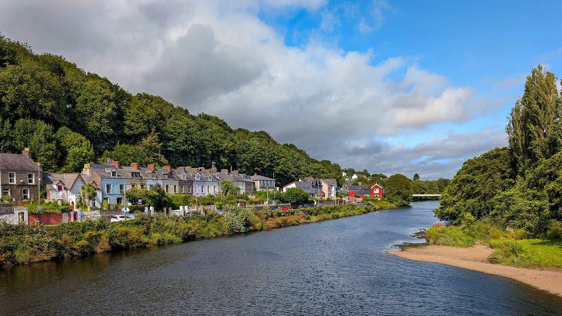
Yeah, I did notice that. Do you have a technique to get rid of noise that works well in PS? I haven't had much luck with the build in ones, I usually end up losing a lot of detail. |
Jan 20th |
| 36 |
Jan 20 |
Comment |
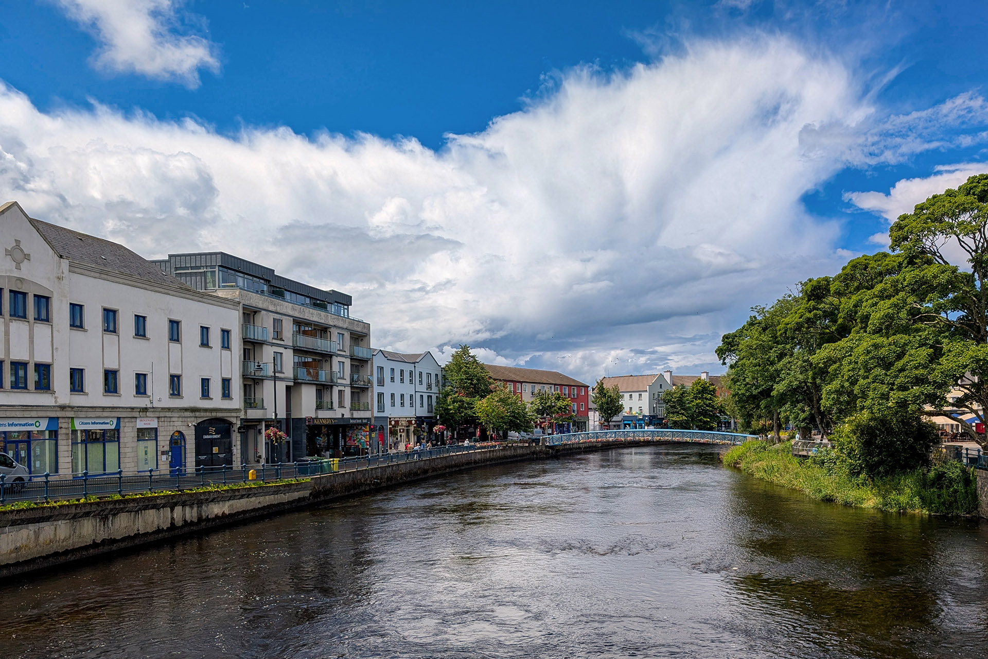
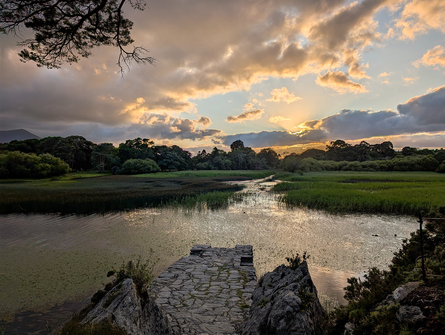
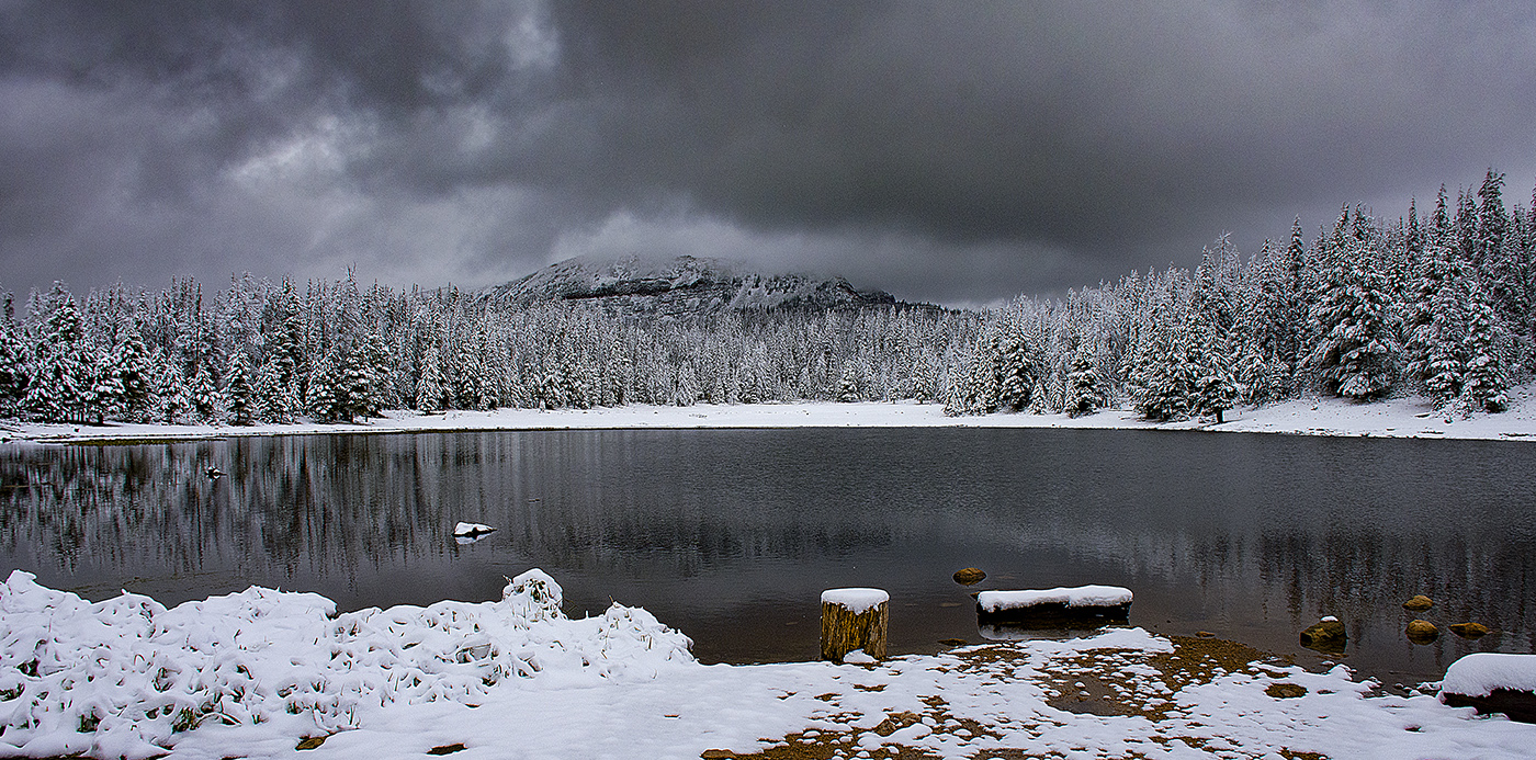
Thanks for all your comments. I incorporated some of the changes you all suggested. I kept the water in, because I think the reflections of the sky add to the image. Let me know what you think. |
Jan 19th |
 |
| 36 |
Jan 20 |
Comment |
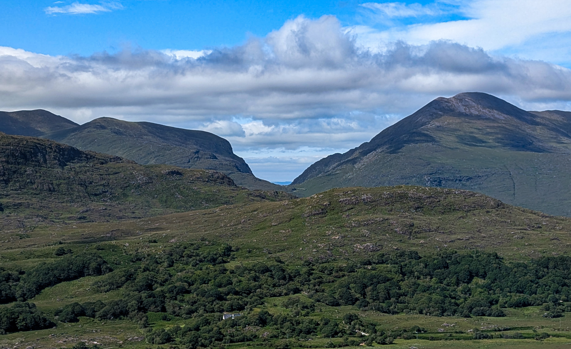
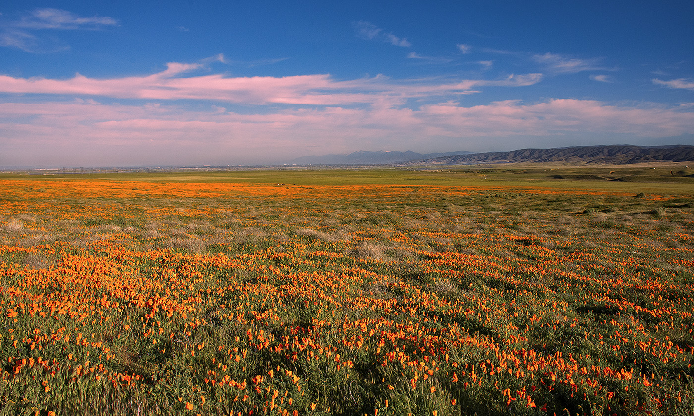
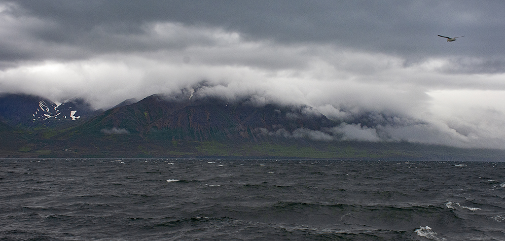
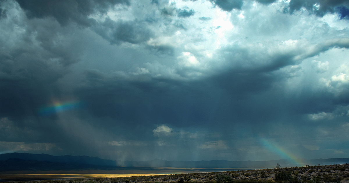
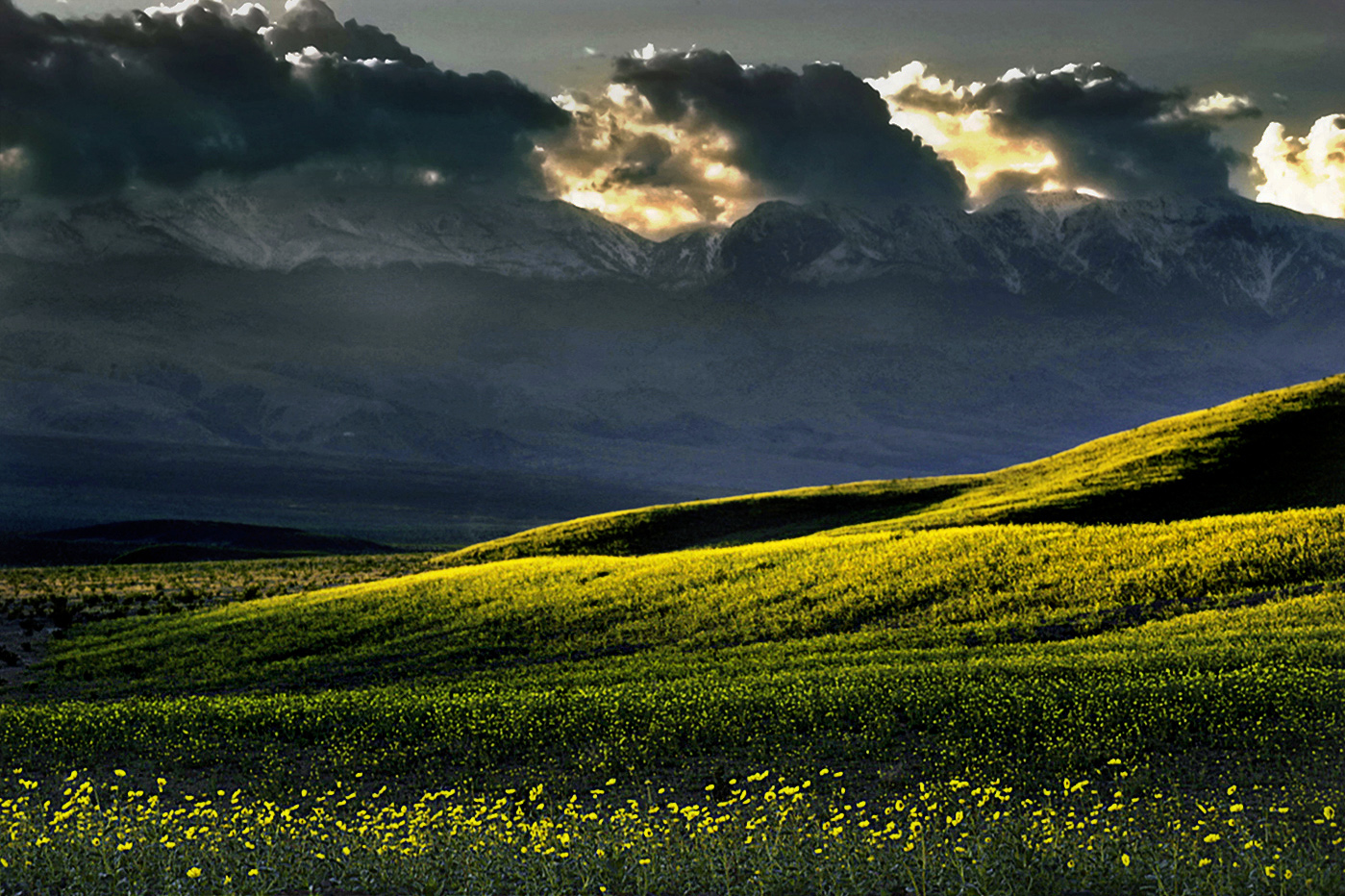
A really amazing image, the clouds are stunning. I love the way they hug the tops of the mountains! I did notice that the flowers are a little soft. There also seems to be a blue/cyan color cast on the mountains, like it is a bit over processed. You could try sharping the flowers in the foreground and perhaps increasing contrast a bit. I took a stab at that and then unsaturating the blues in the mountains and darkening the light spots. See what you think. Amazing flowers! |
Jan 19th |
 |
| 36 |
Jan 20 |
Comment |
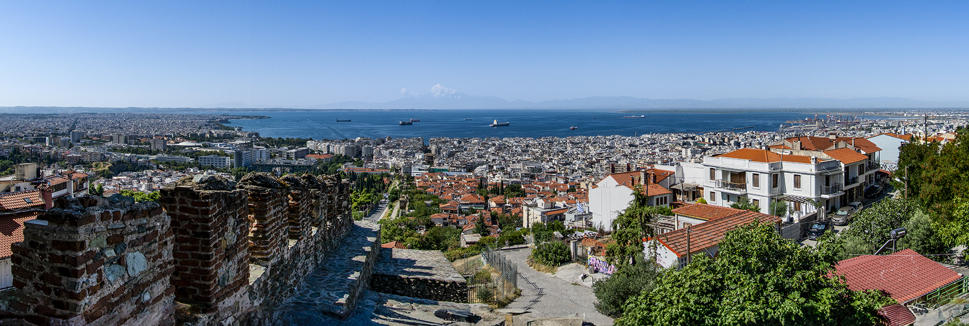
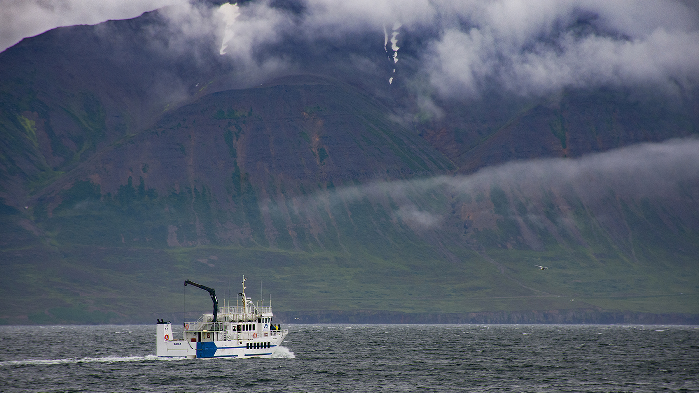
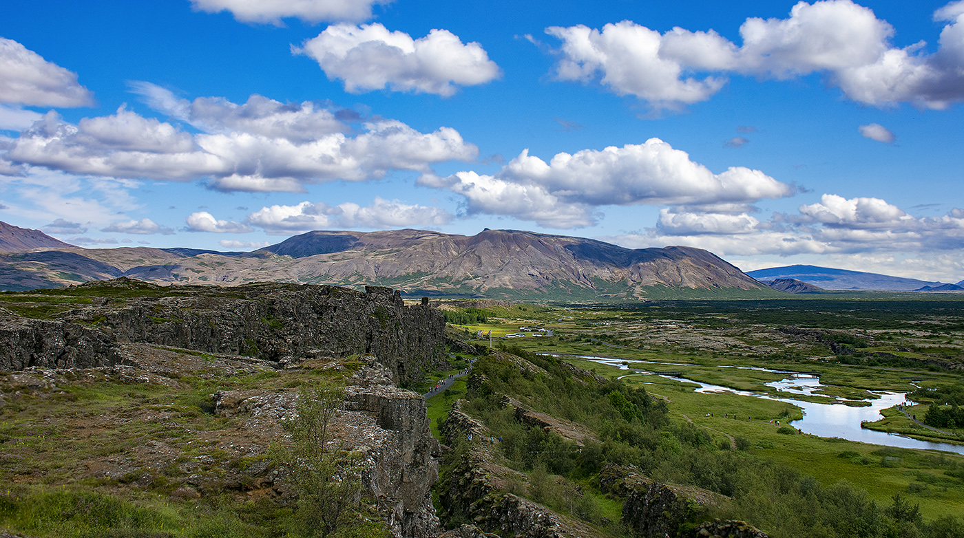
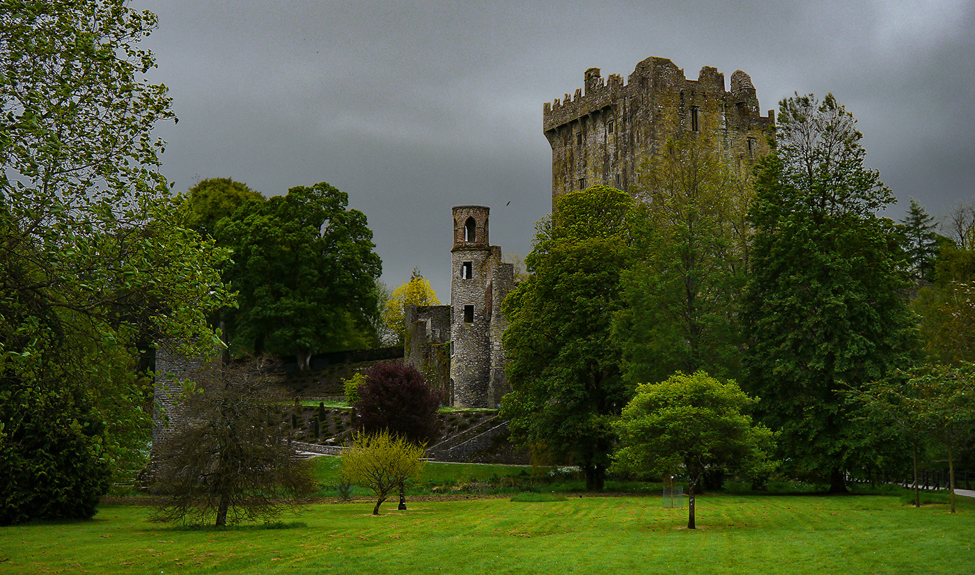
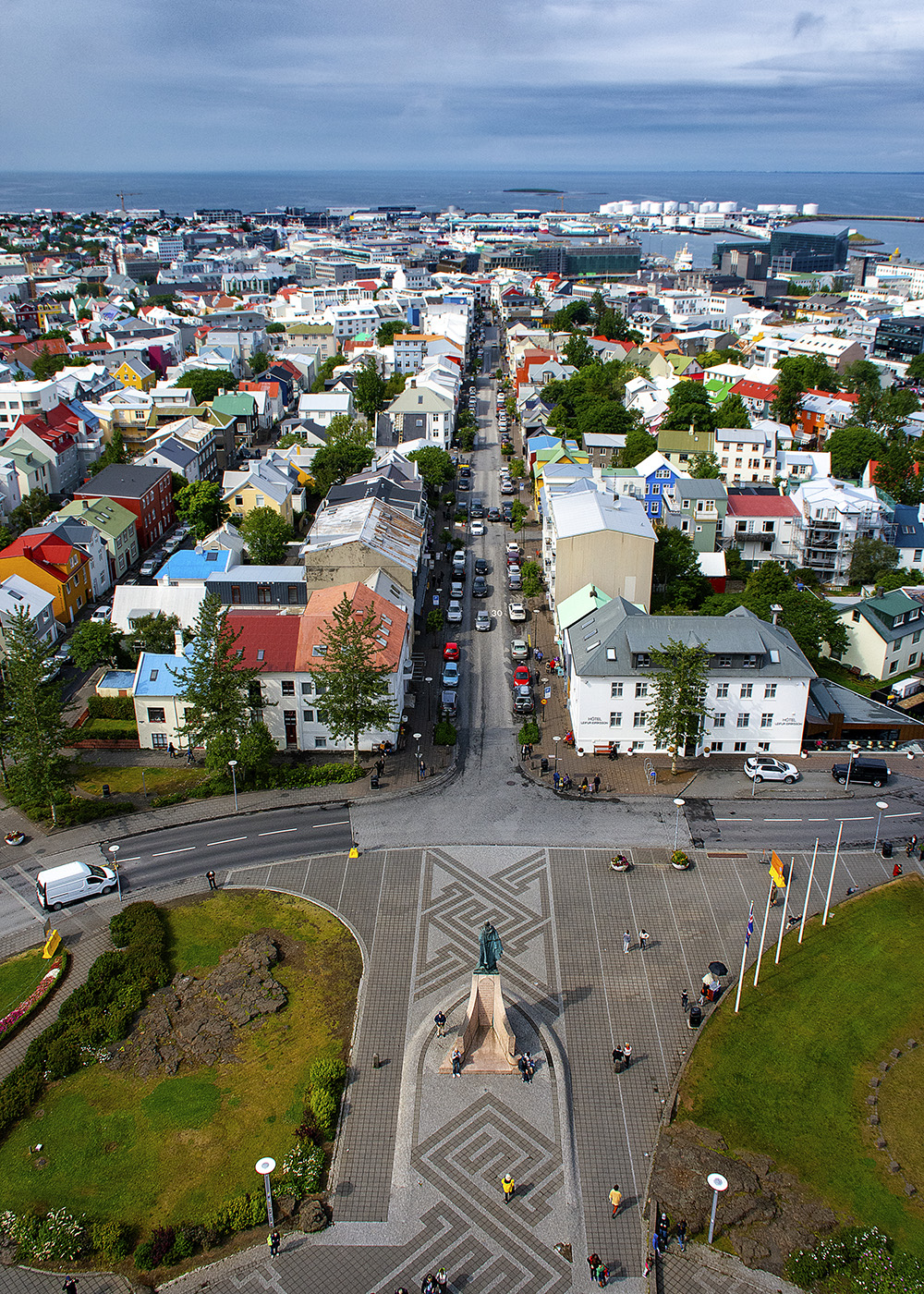
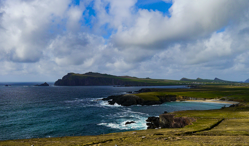
Iceland is great, I was just there in July! I like the changes that Le and Richard made to the image, I think the foreground was a little to distracting. I think Arne's suggestion is good too. Another think to consider would be to lightly sharpen the houses, since they are the subject. In PS you would create a masked layer of the houses using an unsharp filter. I'm not sure how that is done in LR. It is a great view of a typical farm, there. |
Jan 19th |
| 36 |
Jan 20 |
Comment |
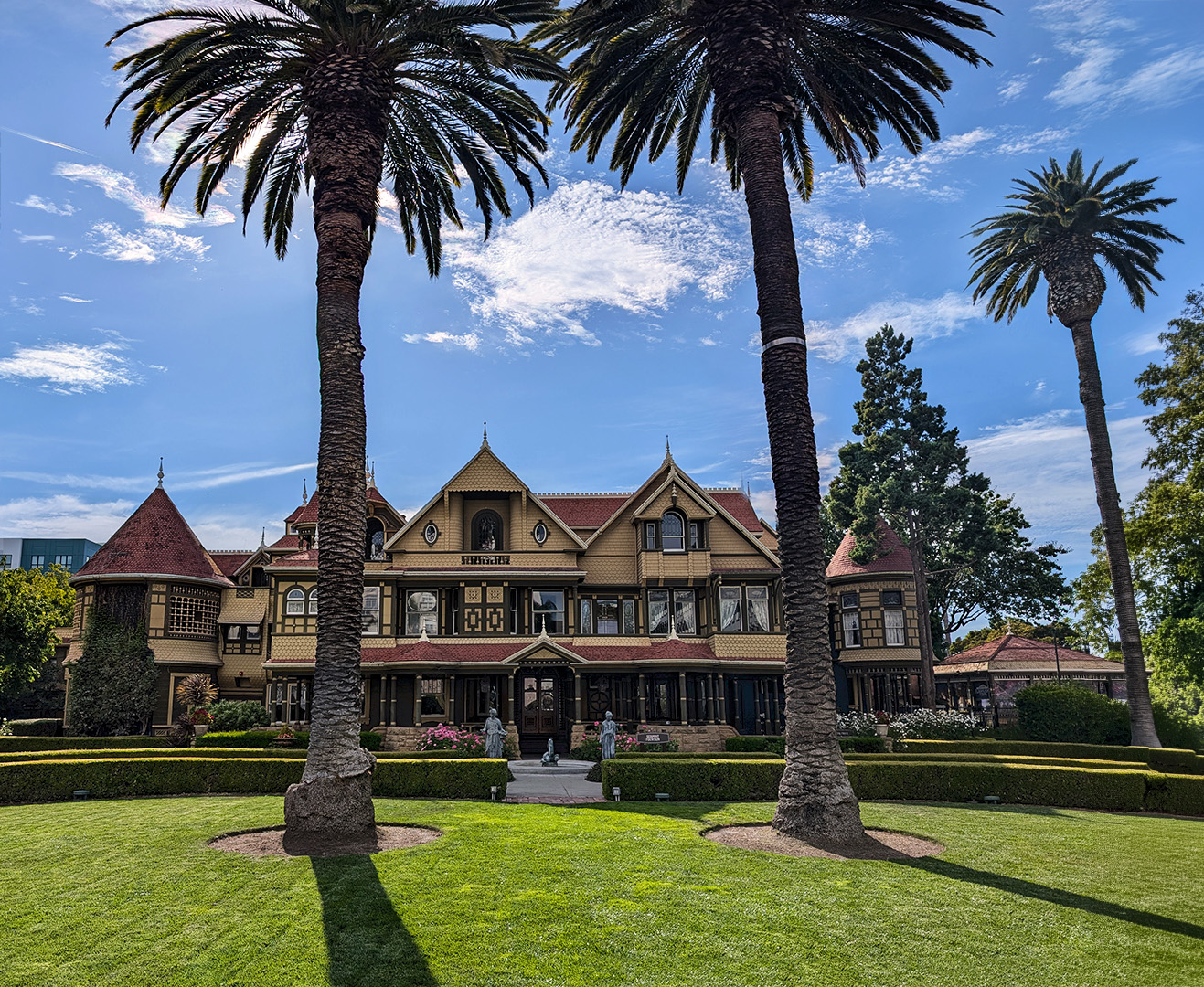
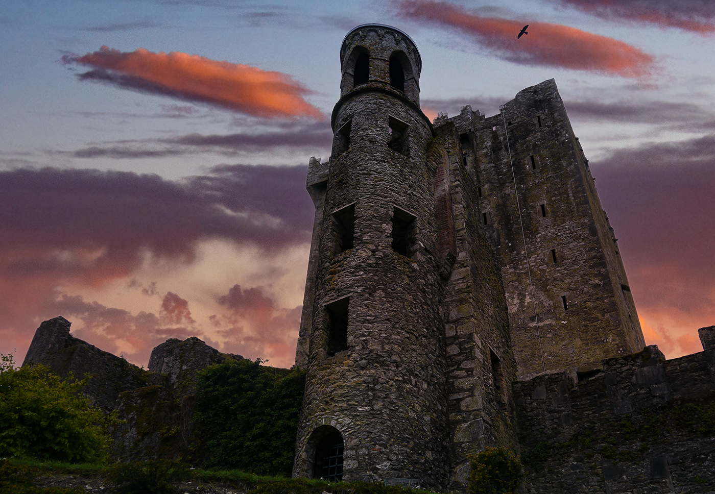
Wow! That conversion to B&W really works with the sky replacement. Great job masking in the sky, I don't see any signs of haloing. Do you hand paint the mask, or use the mask selection tool in PS? |
Jan 19th |
| 36 |
Jan 20 |
Comment |
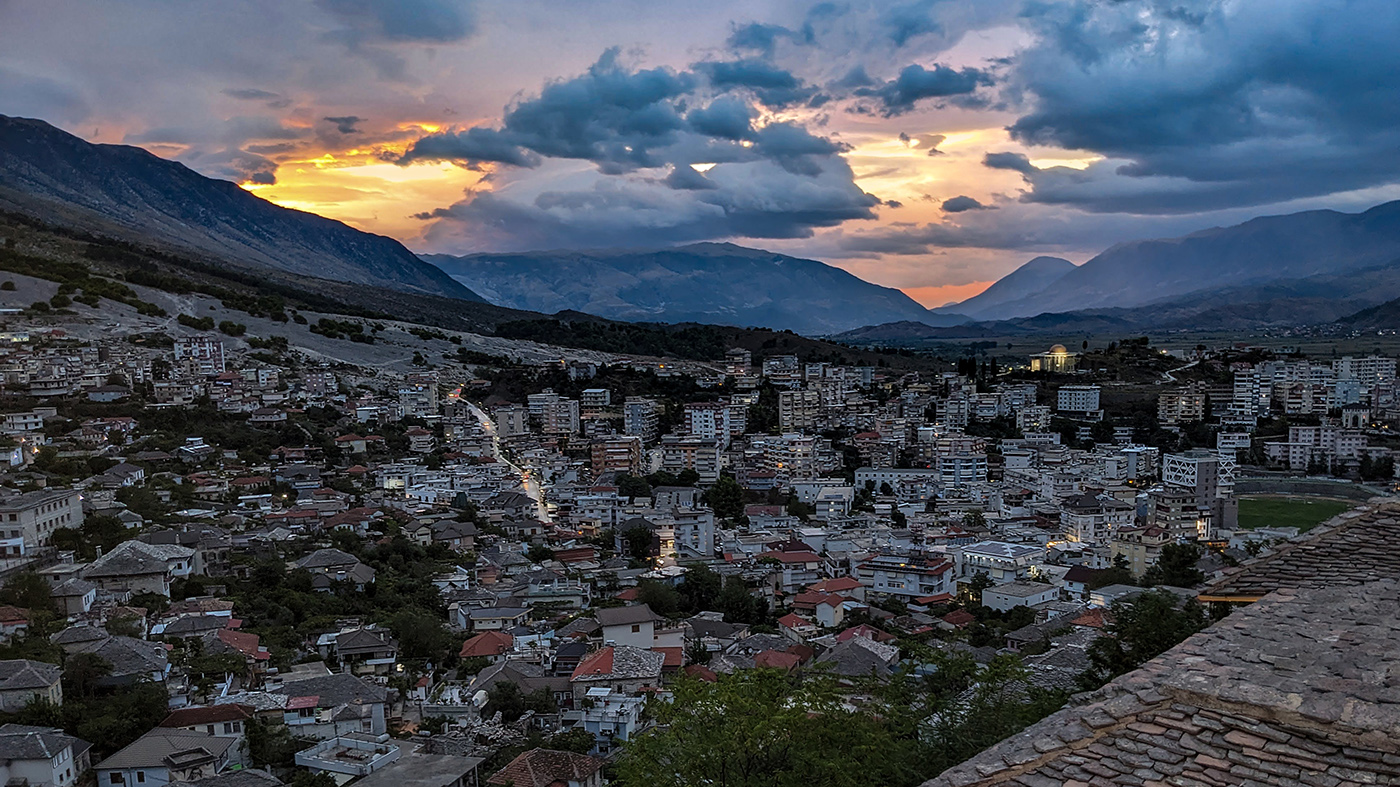
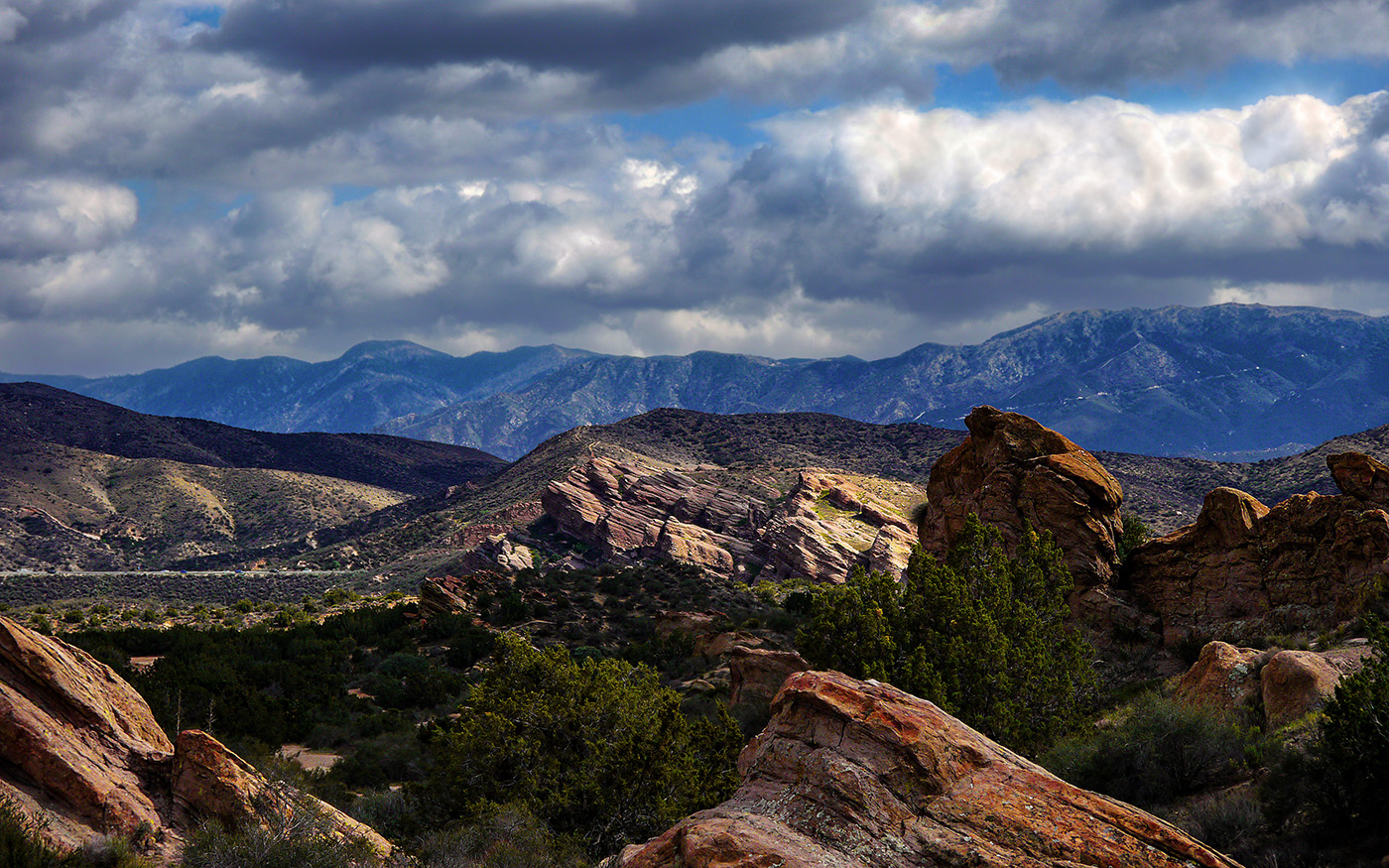
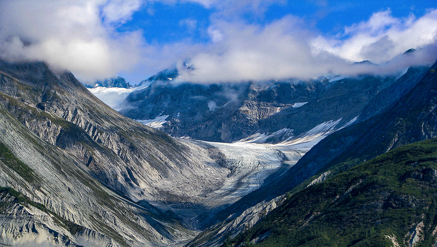
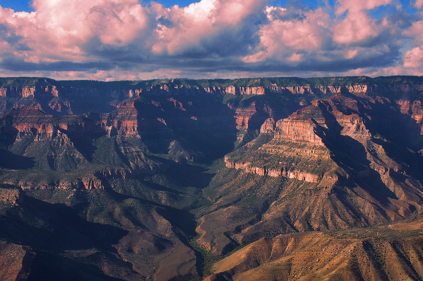
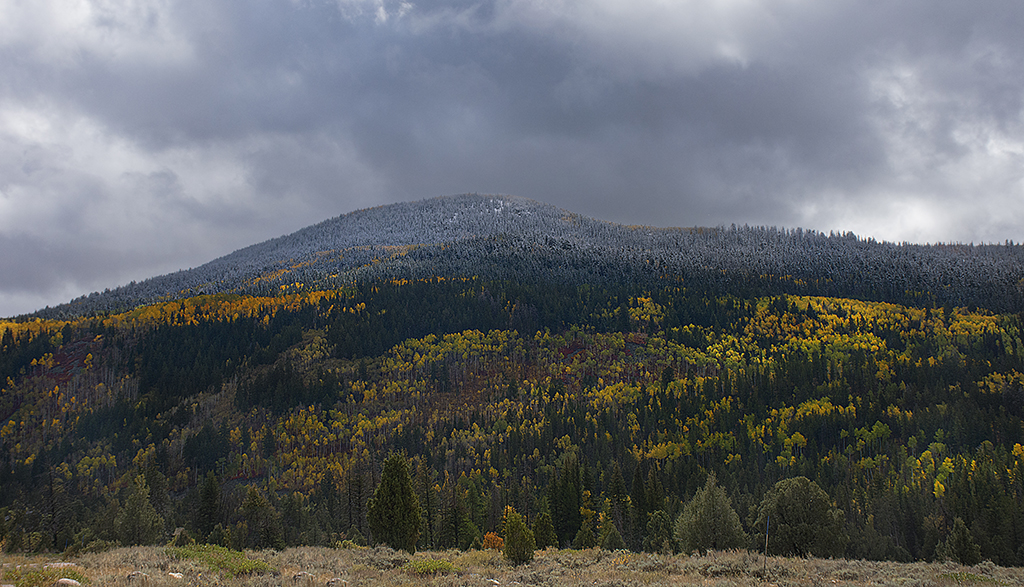
I really like this image a lot! I actually like the original composition a little better. The color in the mountains is amazing! You could consider tweaking the saturation/vibrance to bring a little more color out in the trees, but that is about the only change I would make, unless you wanted to do a sky replacement or add reflections in the water. I feel the image stands well enough on its own with those kind of manipulations, though. |
Jan 19th |
| 36 |
Jan 20 |
Comment |
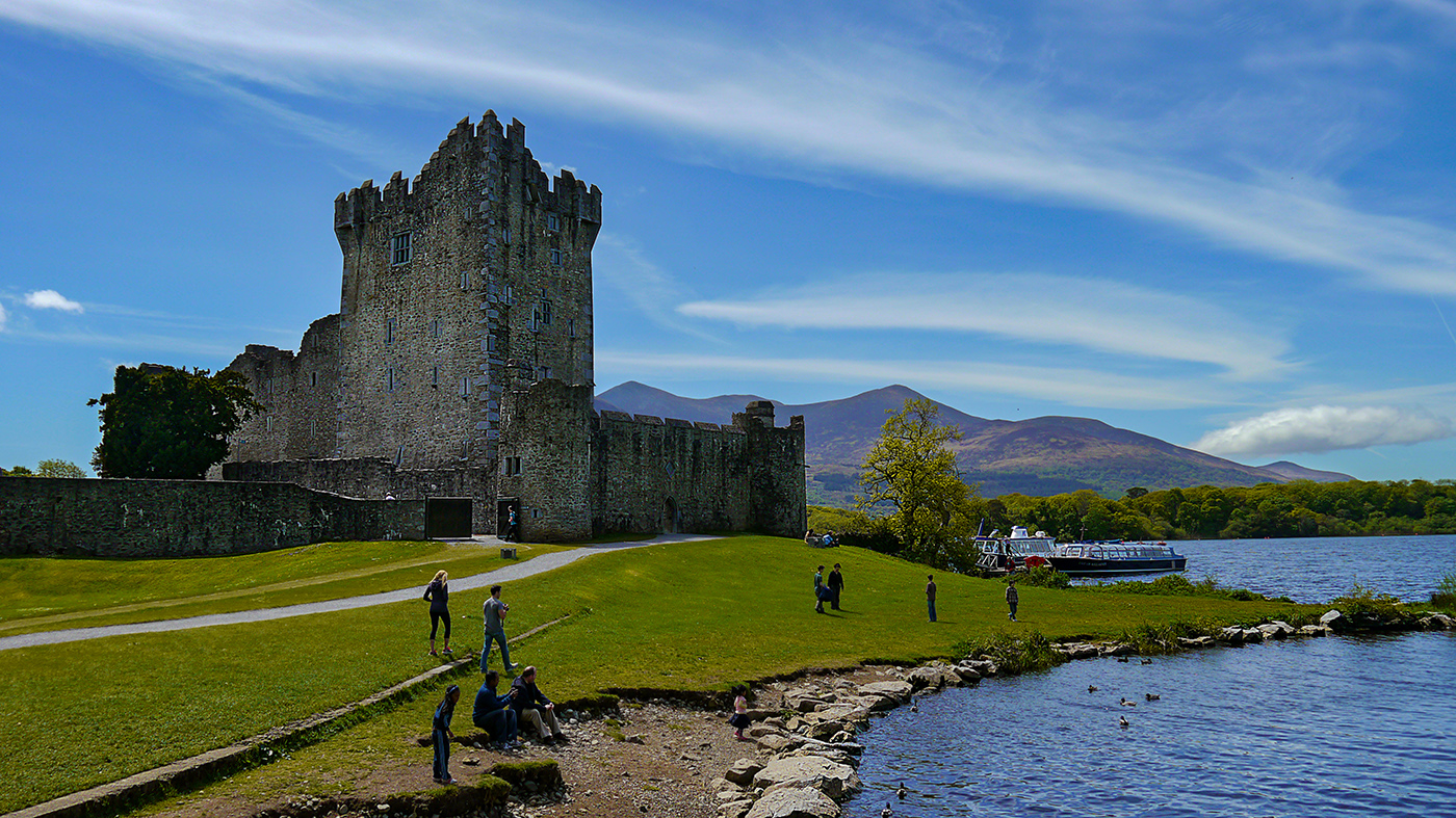
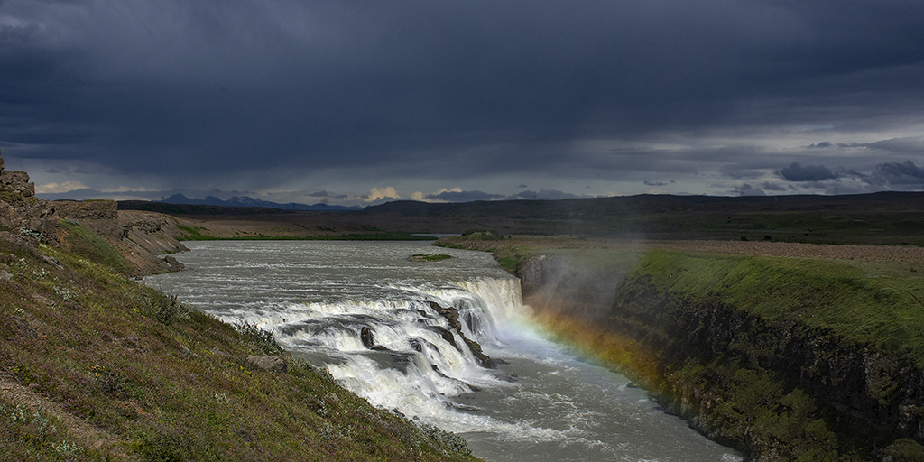
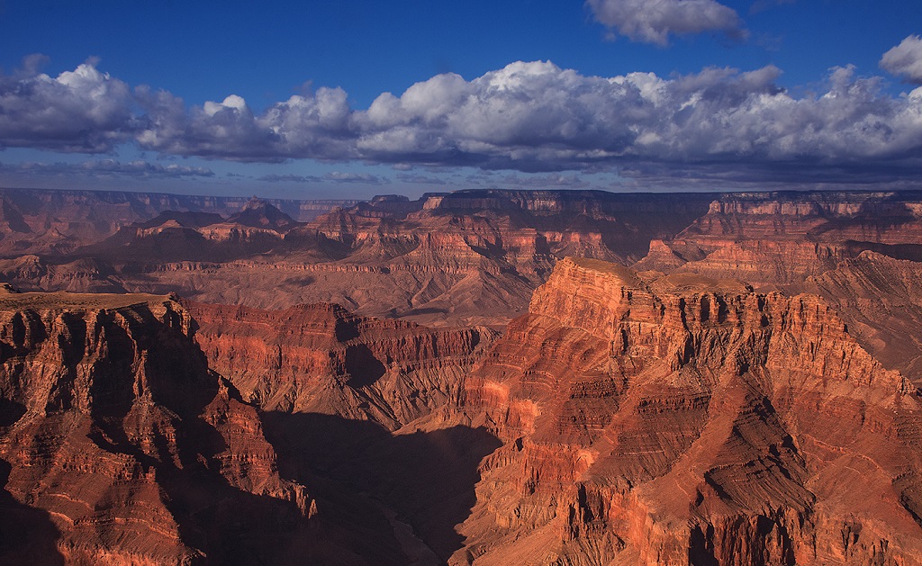
This is a really great image. I'm not sure I agree about cropping the water. I think the reflected colors really add to the image. I agree that the yellow window does attract the eye and perhaps could be toned down a little. |
Jan 19th |
| 36 |
Jan 20 |
Comment |
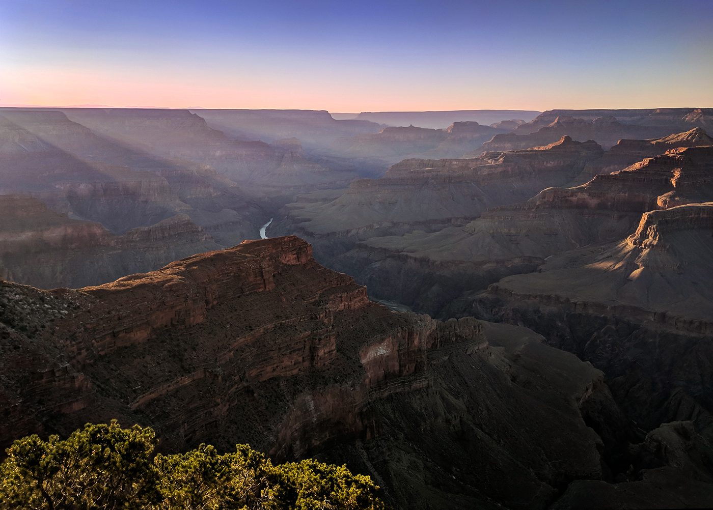
I like the way the lake creates a leading like into the valley between the two mountains. The sky replacement makes the picture pop more than the original. Luminar 4 seems to do a really good job of this. After seeing this, I know I need to try to get up to Yosemite myself! |
Jan 19th |
7 comments - 1 reply for Group 36
|
7 comments - 1 reply Total
|