|
| Group |
Round |
C/R |
Comment |
Date |
Image |
| 83 |
Mar 19 |
Comment |
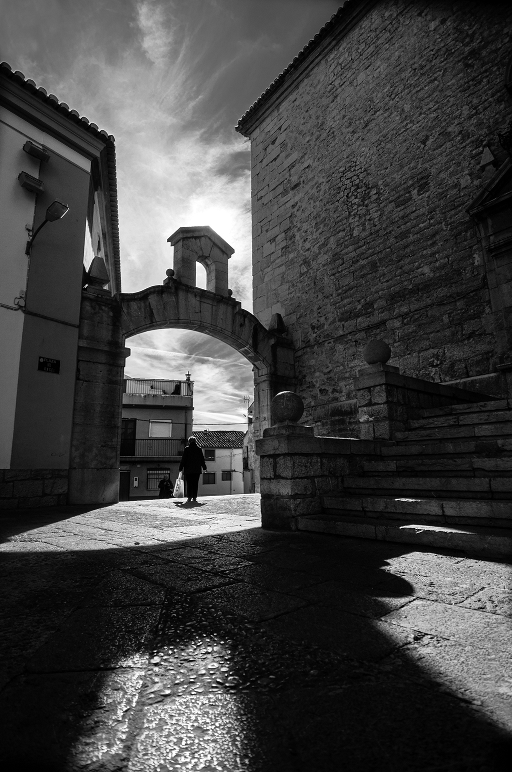
Greetings Charles , good conversion to black and white covering the entire tonal range, of the suggested I like the reflection of the bottles that added Kirk, I think it serves to unite both halves, perhaps compositionally I would like something less than the bottom of the posters and slightly correct the perspective |
Mar 25th |
| 83 |
Mar 19 |
Comment |
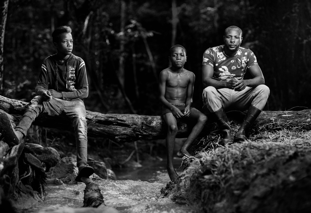
Stunning church Jane. You did not plan to do two exhibitions in the place? one for heaven and one for the church ?. Personally I prefer to do the conversion to black and white in Photoshop, in CR I always work in color.
I'm going to agree that this conversion is really gray,needs more strength in blacks and whites. |
Mar 25th |
| 83 |
Mar 19 |
Comment |
Thanks Dirk and Jane, I'm going to work something else on this image |
Mar 25th |
| 83 |
Mar 19 |
Comment |
Thanks Judith and Tracy, I will use that crop to present it in some exhibition |
Mar 8th |
| 83 |
Mar 19 |
Comment |
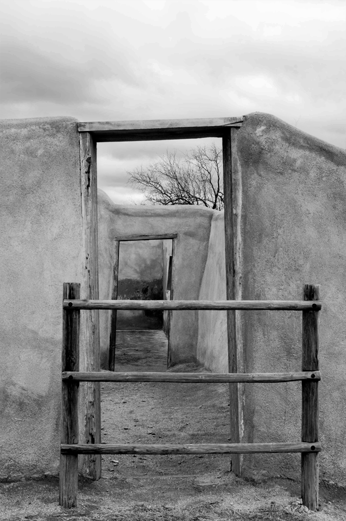
Hello Tracy
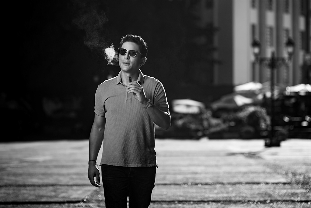
Based on the title of your image, I feel that you should frame only the subject, the wall that does not give you any additional information. I also feel that the gray scale does not cover the entire tonal range and looks off. Maybe something like that |
Mar 4th |
 |
| 83 |
Mar 19 |
Reply |
Without a doubt Peter, this image needed the color |
Mar 4th |
| 83 |
Mar 19 |
Reply |
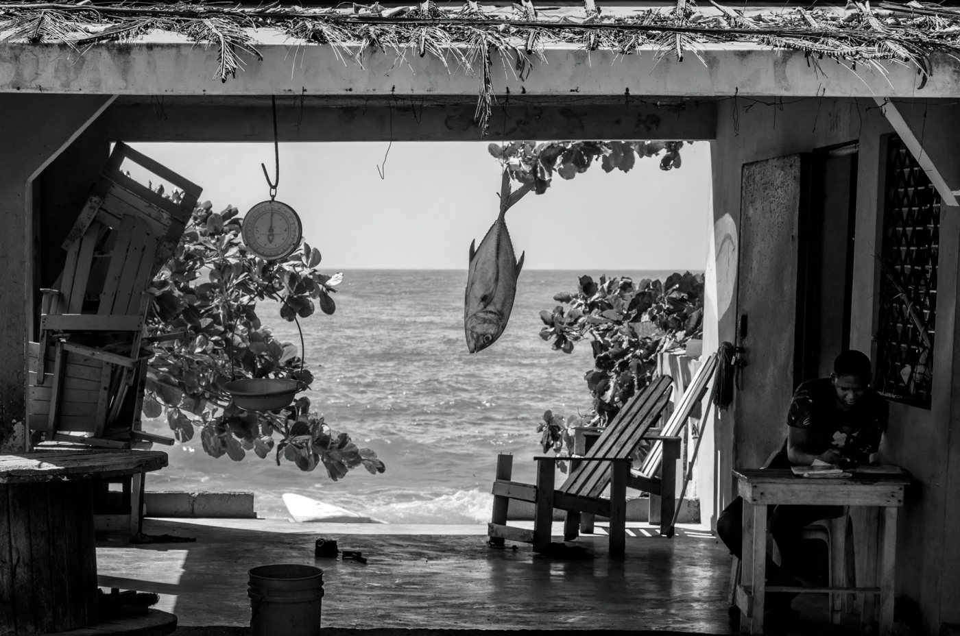
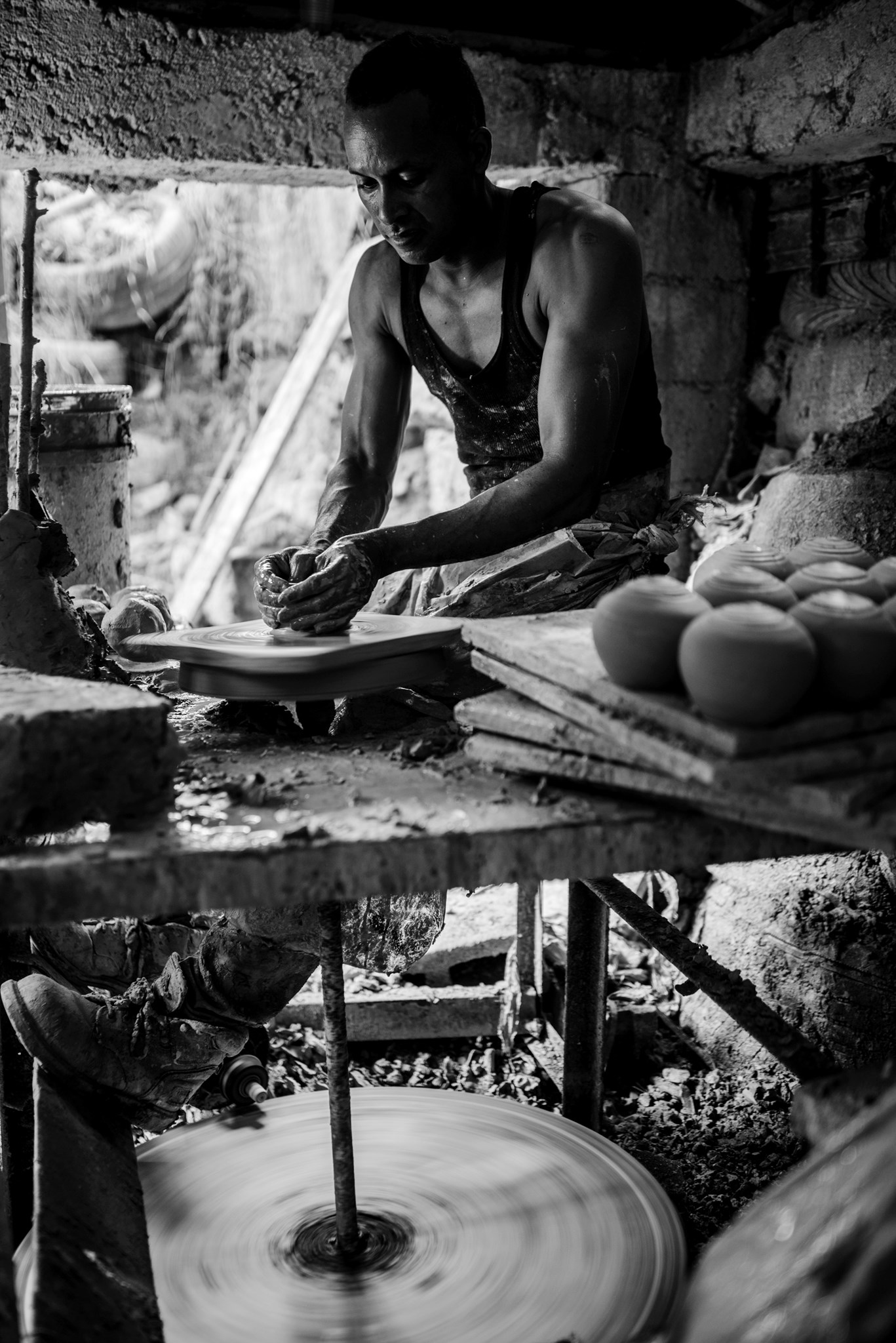
Greetings and thanks for visiting Lance
Actually that was the idea to show them the complete environment of the craftsman, the pity is not having had at hand an ultra wide-angle to capture the interior of the place. Totally agree with Peter and with you with raising the light around his head. |
Mar 4th |
| 83 |
Mar 19 |
Reply |
Good morning Peter.
If the experience was interesting, although the place and its lighting conditions were complicated, they are literally underground and the only light that enters is through that broken wall in the background. This plan was the general of the potter's wheel. I thought it would be interesting to share this plan and not so much the details and the planar means that I took. That point of light that you added to separate his head from the background looks great. Thanks for the tip. |
Mar 4th |
| 83 |
Mar 19 |
Comment |
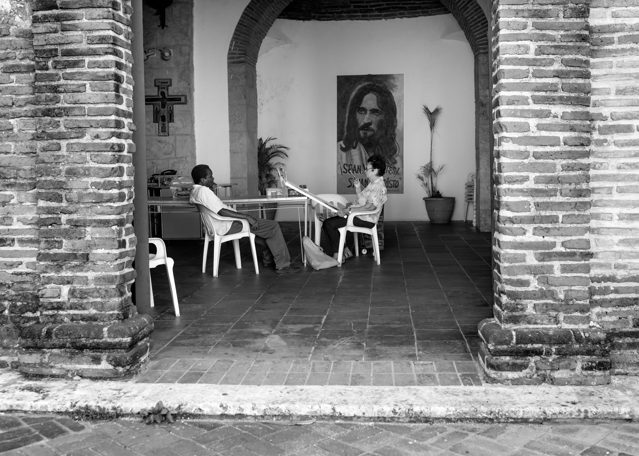
Greetings Peter and congratulations for your image that I saw in the showcase.
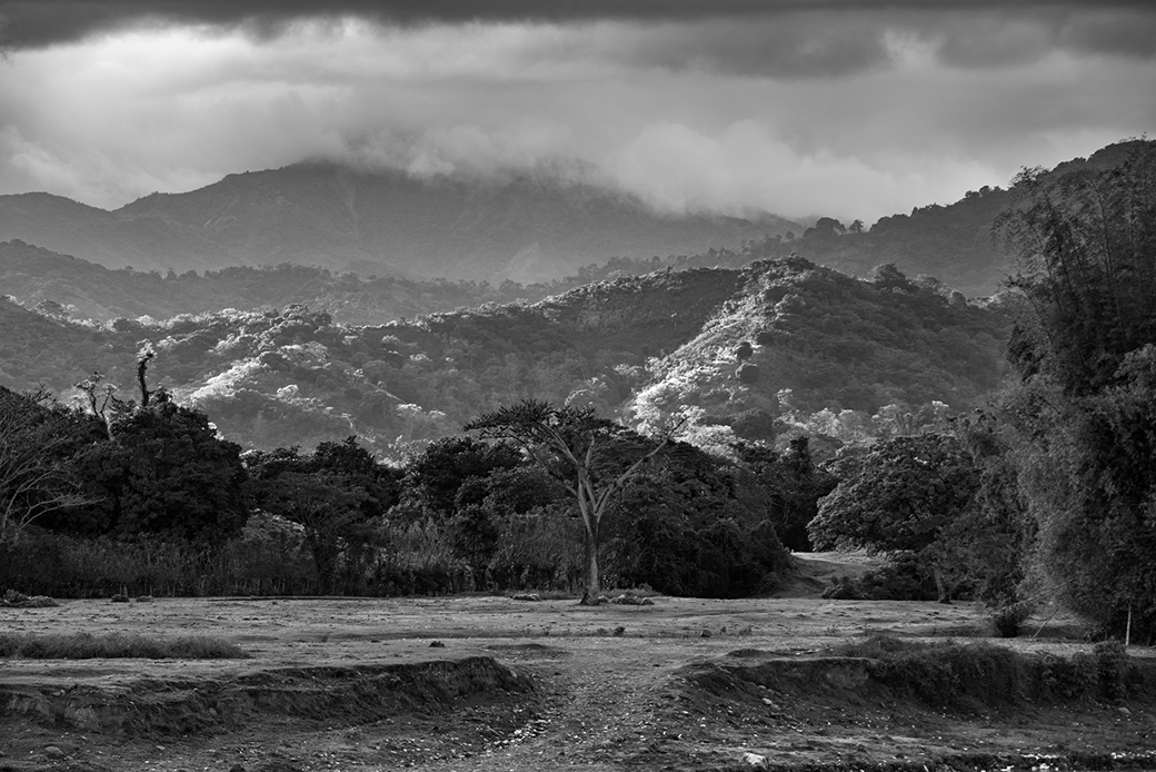
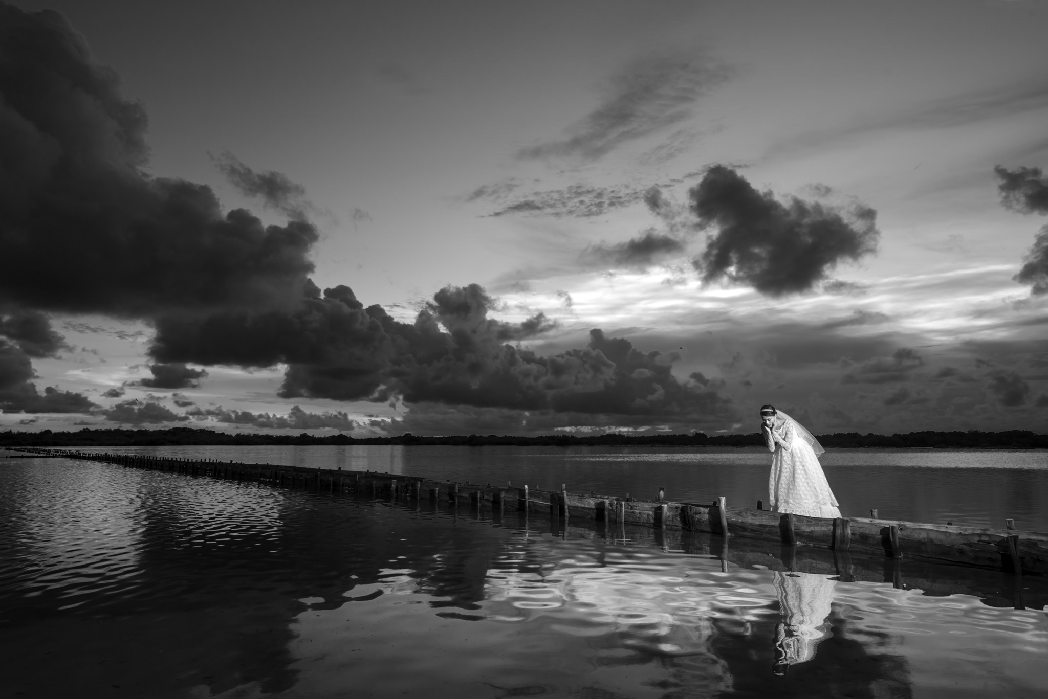
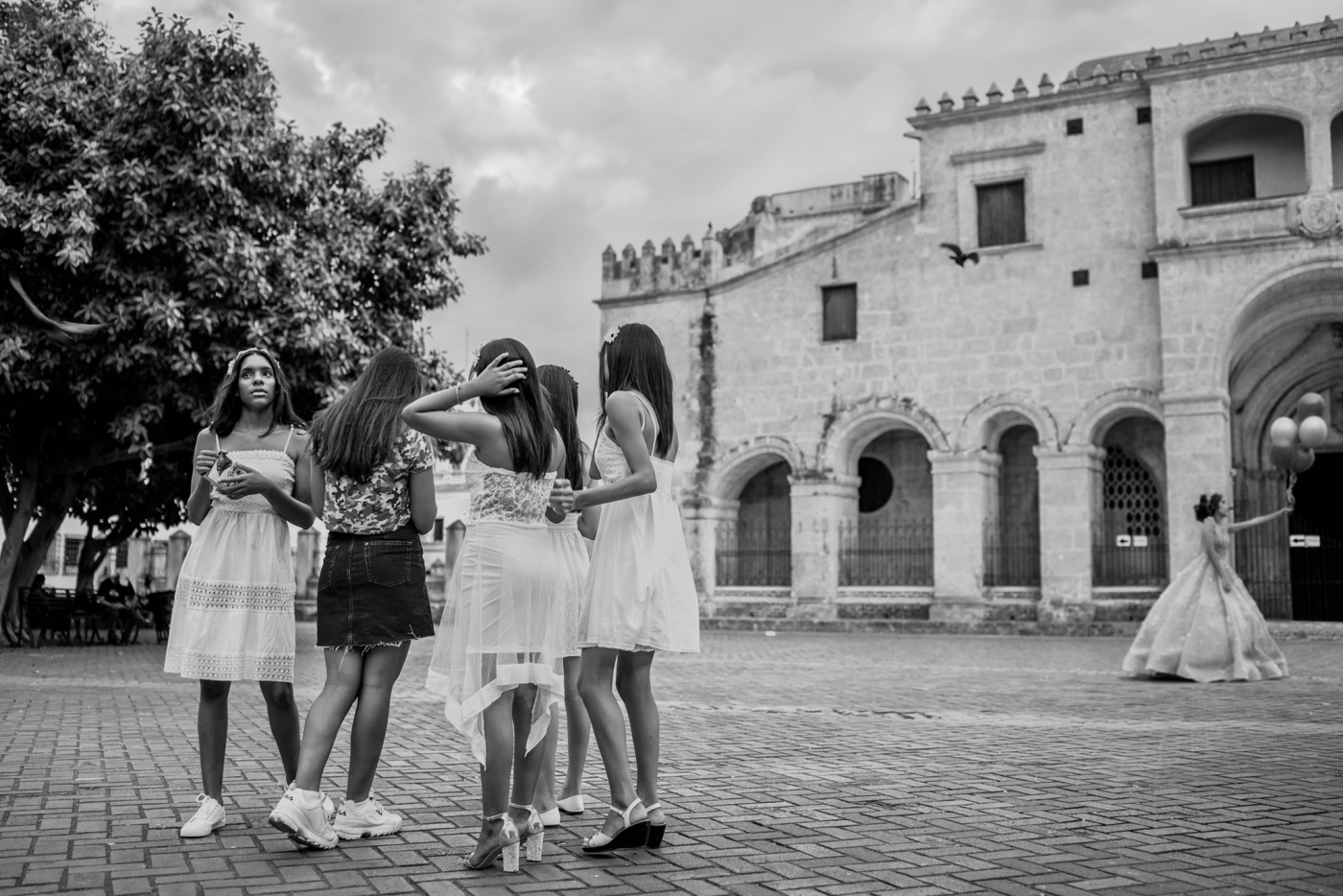
The composition of the elements of your image, plus the horizontal format, invites you to travel from one element to another. While I'm doing it, my subconscious tells me that color would have to be a show that evening. Then my technical side comes in and asks me why there is so strange a blur in the sea, I do not get any sense of movement because behind the boat the sea is ed and moves. Also my technical side asks me why the buildings have the same lighting on the sides that look towards the sun and on the opposite sides to the sun and I continue to travel and arrive at the plane, I think that the weight of the highest building is balanced well with the boat , without the airplane, the image would be balanced, but when the plane is on my technical side, he tells me again because the plane is illuminated from above if the sun is setting. In short Peter, all my simple being asks me to see the color image and enjoy that wonderful sunset in the port of NY |
Mar 1st |
| 83 |
Mar 19 |
Comment |
Greetings Dirk, great image, the shine of the metal candelabra stands out with the gloom of the interior of the cathedral, crying out for that black and white. The inclusion of the row of chairs, helps to magnify the size of the chandelier and I guess you took it with an ultra wide angle that magnifies more its dimensions. The reflection of the stained-glass window against the safe wall looked beautiful there, although I think it distracts me a little attention when contemplating the image, maybe lowering the brightness so that it does not compete. |
Mar 1st |
| 83 |
Mar 19 |
Comment |
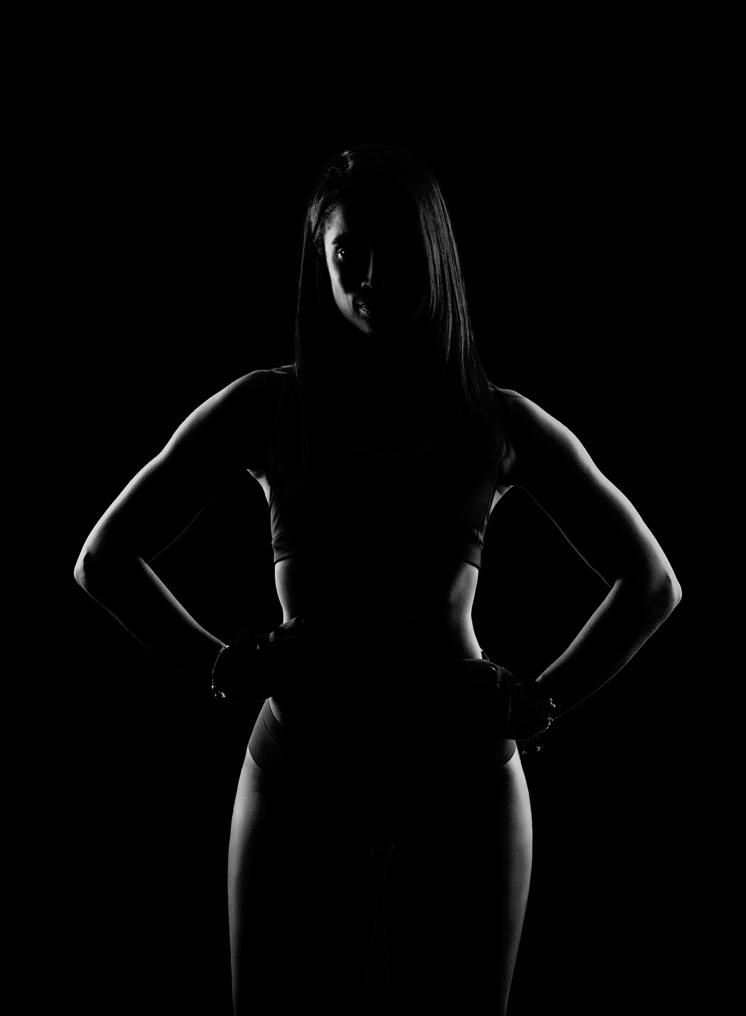
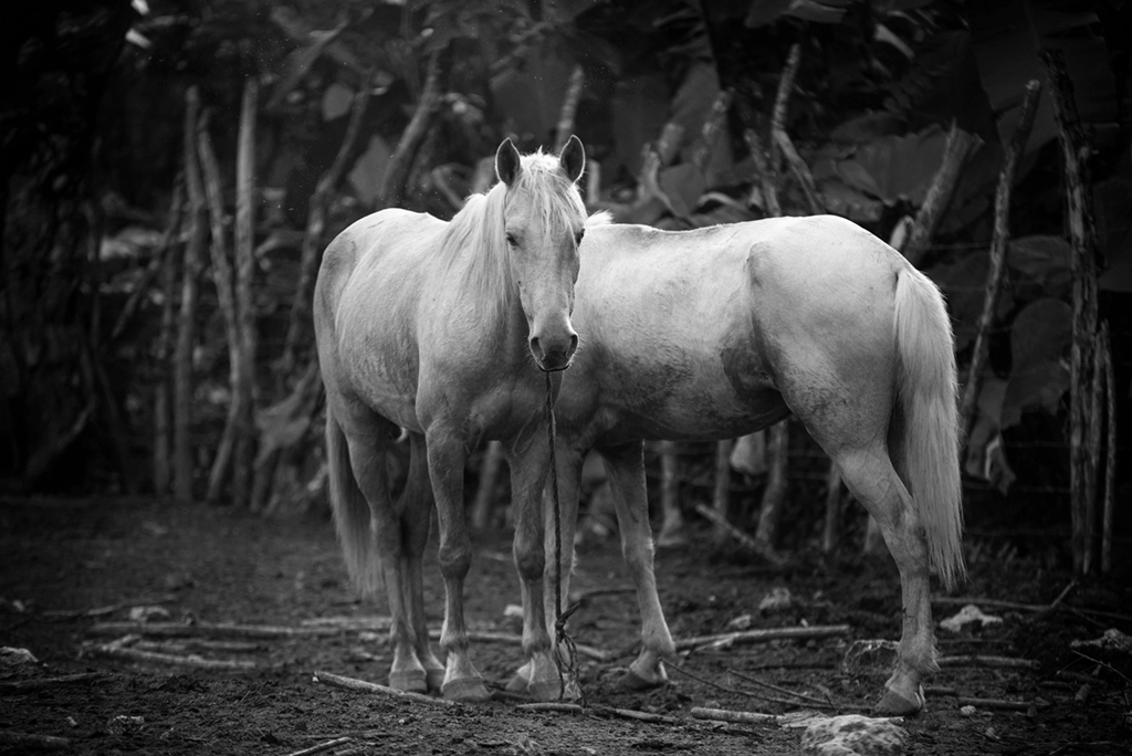
Greetings Judith, without any doubt, I stay with your second processed image, is much richer in blacks and gives greater strength and depth to the image. The composition with lines takes you to the subject, that being in pure silhouette , creates a clear point of interest and an interesting atmosphere. |
Mar 1st |
8 comments - 3 replies for Group 83
|
8 comments - 3 replies Total
|