|
| Group |
Round |
C/R |
Comment |
Date |
Image |
| 33 |
Nov 19 |
Reply |
Thanks so much, Raymond. |
Nov 22nd |
| 33 |
Nov 19 |
Reply |
Thanks so much for your detailed suggestions, Bob. I really appreciate that! I also love your black-and-white treatment of the photo. |
Nov 19th |
| 33 |
Nov 19 |
Reply |
Thanks, Elizabeth! I've definitely found this group very helpful. :) |
Nov 18th |
| 33 |
Nov 19 |
Reply |
Thanks, Paul! I've been working on masks. Sounds like a great idea for this photo. I'm looking forward to trying that along with dehaze. |
Nov 16th |
| 33 |
Nov 19 |
Reply |
I agree with you. The black-and-white photo creates much more of a mysterious mood. It's really interesting to see the difference between the two versions of the photo. |
Nov 11th |
| 33 |
Nov 19 |
Reply |
Dehazing is something I still need to learn in Photoshop. Thanks for the suggestion. I plan to re-edit this photo after I learn more in Photoshop. I figured suggestions from this group would be helpful. :) |
Nov 10th |
| 33 |
Nov 19 |
Comment |
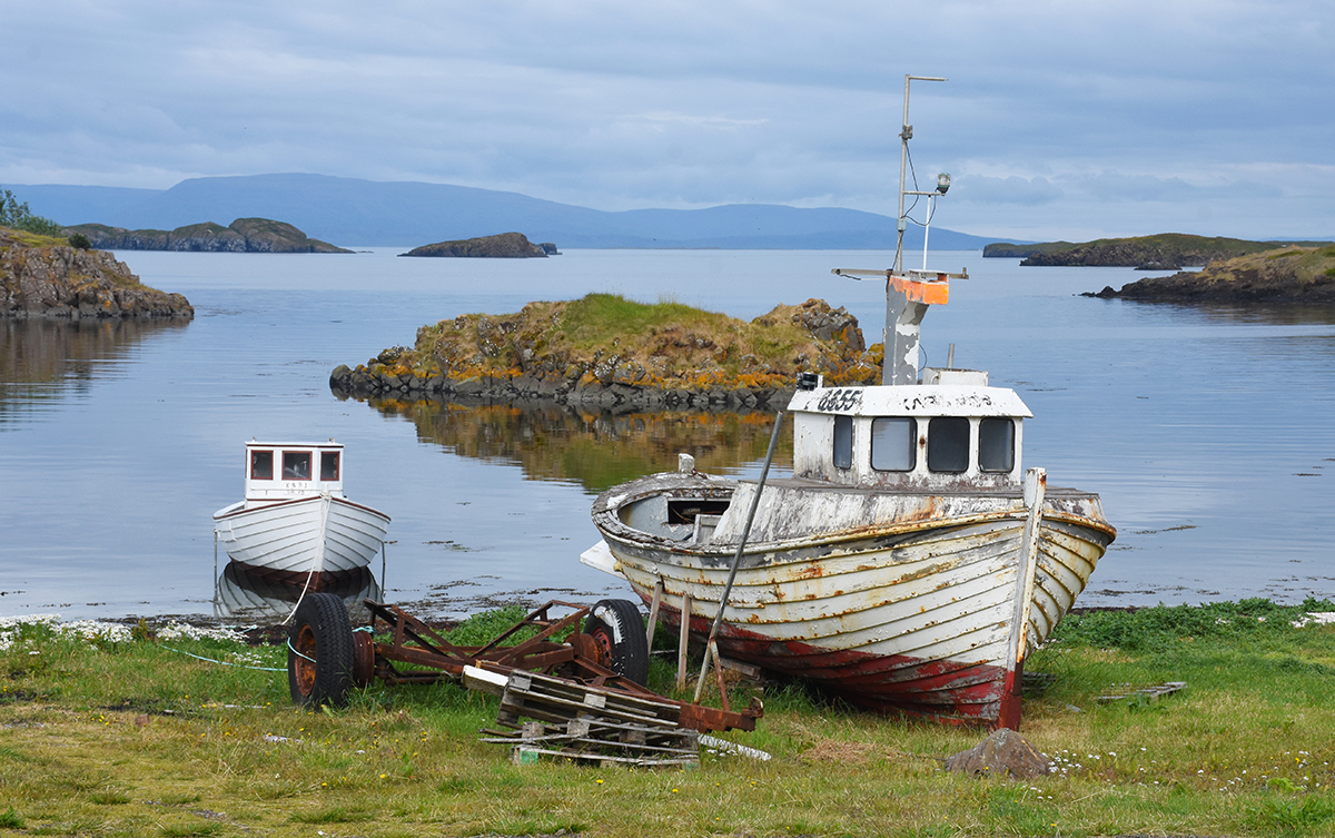
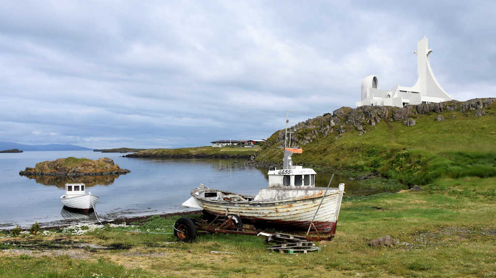
The peacefulness of this setting really comes across and the colors are gorgeous. I love how the background's muted, while the boats are colorful and clear. |
Nov 9th |
| 33 |
Nov 19 |
Comment |
That's a really cool photo! The photoshopping you did makes a huge difference. By isolating that part of the original image and editing it the way you did, it makes a much bigger impression than the original photo. It's intriguing, basically unmoored from its surroundings. |
Nov 9th |
| 33 |
Nov 19 |
Comment |
That's a really interesting photograph with a quality that reminds me of surreal landscape paintings. I'm wondering how it looks in color. |
Nov 9th |
| 33 |
Nov 19 |
Comment |
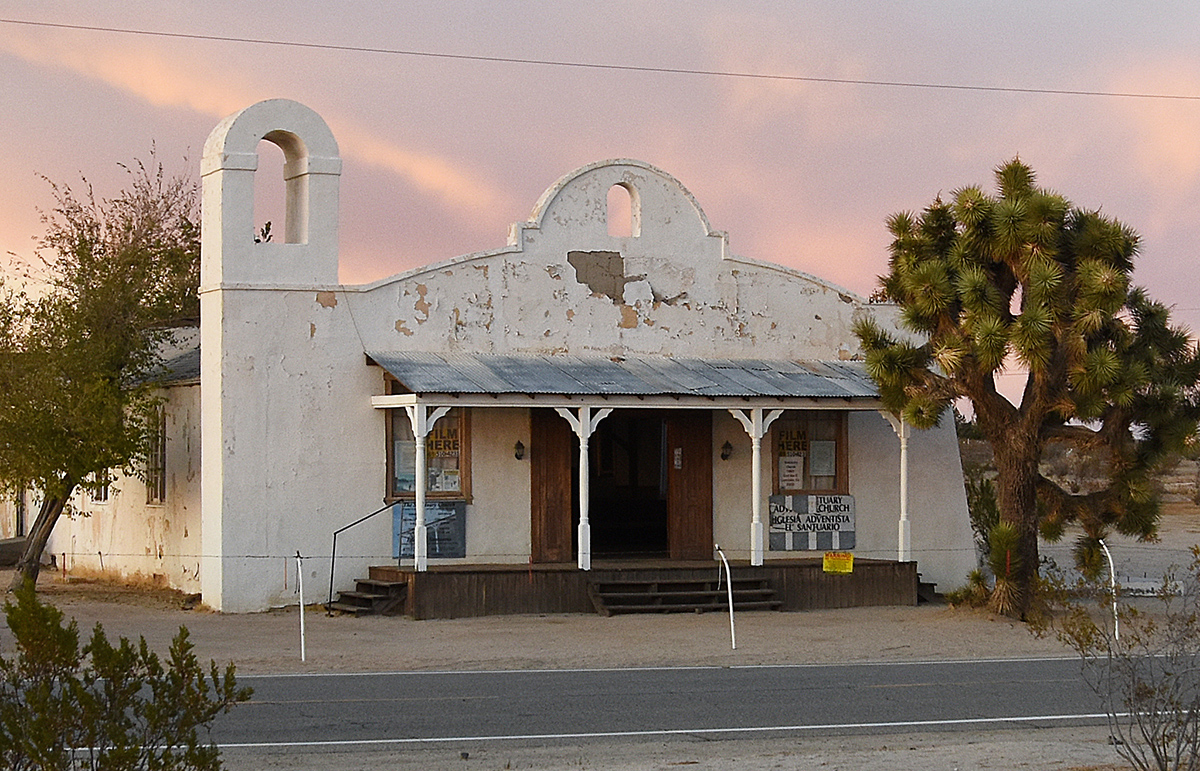
At first glance, this reminded me of a greeting card. The scene and warm colors are really nice. One problem I see is the overgrown nature of the trees and bushes that don't have leaves and the building being partially hidden by bushes. I'm not sure exactly where you want the eye to go in this photo. |
Nov 9th |
| 33 |
Nov 19 |
Comment |
Great photo! The colors and striped lines in the field against the blue of the mountains, along with a sky that's filled with blue like the mountains and orange similar to the reds in the field, really works. It might be even better if there was farming equipment in the field or something, but the colors and shapes work together to create a stunning photograph even by themselves. In photo competitions, you could enter this in either the Landscape or Color categories. |
Nov 9th |
| 33 |
Nov 19 |
Comment |
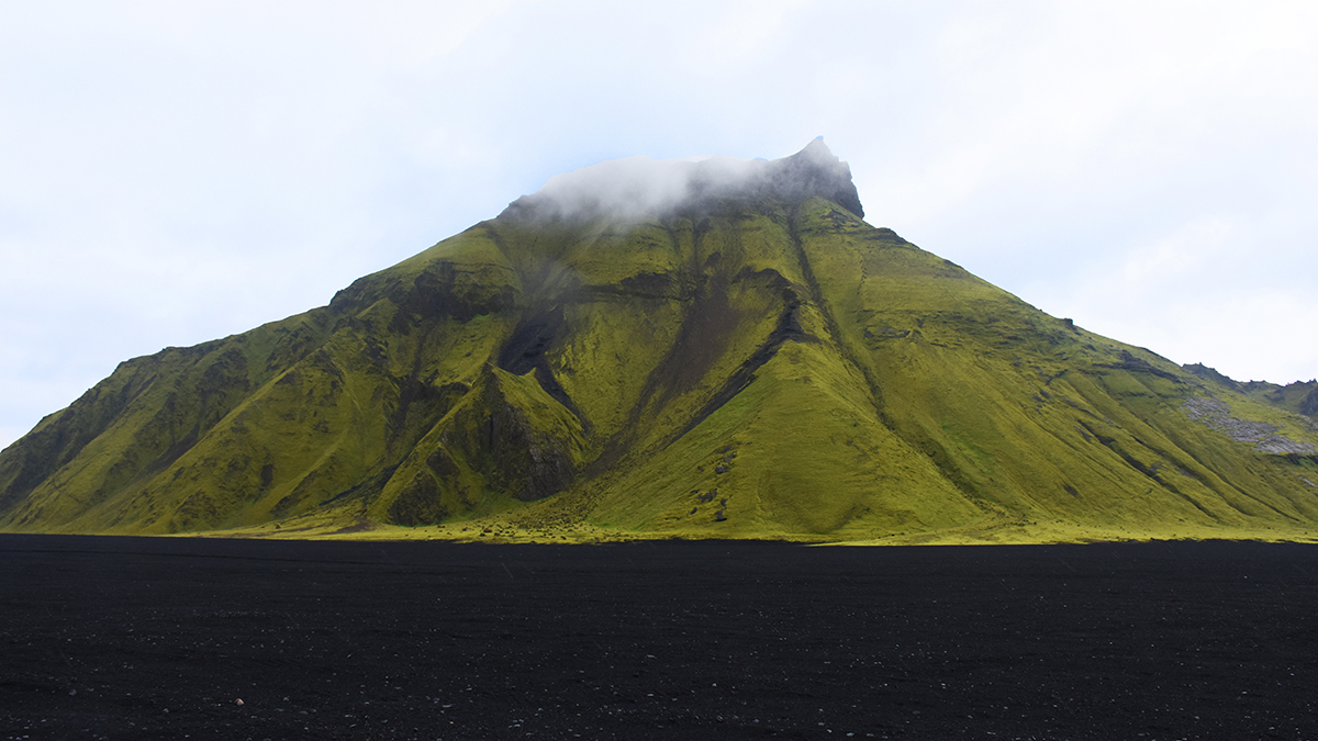
That is stunning. It looks so surreal, it suggests a village in the landscape of an alien planet. I'm not sure if it's just my computer screen, but for me the picture looks somewhat over-processed. The blacks are very dark and the buildings so bright, it almost looks like they were photoshopped into the background. I'd recommend playing around with the saturation. Otherwise, I love this photo. |
Nov 9th |
6 comments - 6 replies for Group 33
|
6 comments - 6 replies Total
|