|
| Group |
Round |
C/R |
Comment |
Date |
Image |
| 38 |
Oct 23 |
Reply |
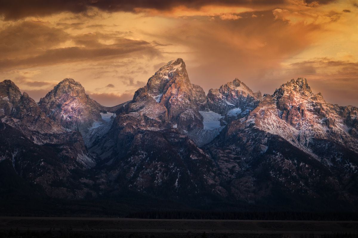
That will work too. it's actually just low clouds that make it "The Great Smokey Mtns.". |
Oct 10th |
| 38 |
Oct 23 |
Comment |
It looks to me that the original was properly exposed for the highlights of the sea foam. I don't think that at the distance you made the shot, composition was acritical because you were going to need to crop it anyway. What was properly achieved was the focus on the pelican. I like your post work because you managed to reduce the wing shadows without blowing out the highlights. That can be tricky, at best, without using a mask. For my eye, I would like to see a bit more room in front of the pelican. As for the auto-focus micro adjustment, I have had that issue (it's not a flaw but an issue of tolerances when lens and camera body are paired) with all my "long" lenses on my DSLRs. There are a number of videos on You-Tube to help you. |
Oct 9th |
| 38 |
Oct 23 |
Comment |
Just to get things started; Have you ever checked your auto focus micro adjustment? |
Oct 8th |
| 38 |
Oct 23 |
Comment |
Let me start by saying your image had me stumped for a while. Everything about it contradicted many of my prejudices. I am normally drawn to symmetry and balance and yet, as I grew to really like your composition, I realized that my rules were broken. To me, you captured not only the beautiful colors but the composition was far more stimulating and kept my interest long enough for my enthusiasm to grow. I think your exposure and focus was spot on. Shooting at windows from inside a building without blowing out the highlights is really tricky, and you nailed it. I've added nothing to your image but I've attached an image made from yours that I think demonstrates why non-symmetry can make an image better. I think mine is balanced and symmetrical and just boring. Thank for the insight. |
Oct 7th |
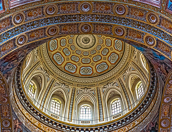 |
| 38 |
Oct 23 |
Reply |
As an aside, part two, I have this image as my computer desktop right now. |
Oct 6th |
| 38 |
Oct 23 |
Reply |
I like what you did. Thanks |
Oct 4th |
| 38 |
Oct 23 |
Comment |
Wow! Holy Wow! I love the story in this photo. The contrasting smoothness of the reel opposed by the roughness of the hands is remarkable. Without a doubt in my mind, converting to B&W was just what was needed. Looking at your originals, I get lost with all the dominant colors. This a classic example of how a good vignette can make an image pop. Well done. |
Oct 4th |
| 38 |
Oct 23 |
Comment |
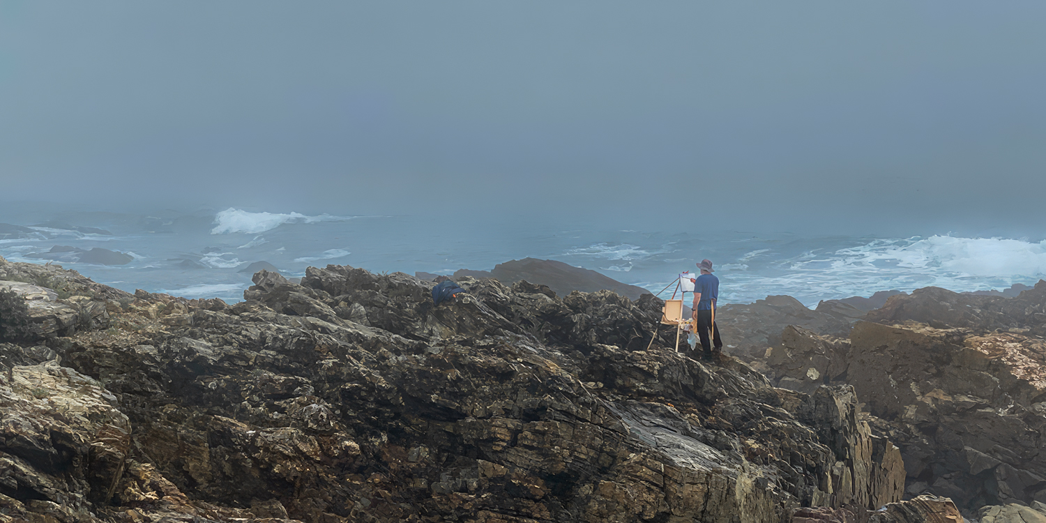
For me, this is your best ever. I think the story is just wonderful. How dedicated, to be out on a stormy day to do what you love the most? Seriously, when else can you get a picture like this? I cropped less tight to get more of the background but then lightened the painter and his equipment to highlight him. There was some dodging and burning around the rocks and I added a VERY subtle tint difference to suggest a horizon. When I did my own reprocessing, I doubled the pixels in Topaz Gigapixel to have a little more to work with. My highest compliment is that I wish I had captured this moment. Well done. |
Oct 4th |
 |
5 comments - 3 replies for Group 38
|
5 comments - 3 replies Total
|