|
| Group |
Round |
C/R |
Comment |
Date |
Image |
| 38 |
Sep 23 |
Comment |
I want to apologize for the watermark. I had put one on a previous image of mine and forgot to uncheck that box when I exported out of Lightroom. |
Sep 14th |
| 38 |
Sep 23 |
Comment |
I like what you did in post. To me you had a nice image and flipping really didn't add anything. I approached this image a little differently. First, I didn't completely eliminate the background. Although complete black certainly highlights your subject, to me just a hint of context makes the poppy more real to my eye. I did reduce highlights and increased the shadows, which effectively boosted contrast. I also added just a hint of clarity. The only manipulation was to boost pixels in Topaz Gigapixel to give me more to work with. Very nice and pleasing to the eye. Well done. |
Sep 14th |
 |
| 38 |
Sep 23 |
Reply |
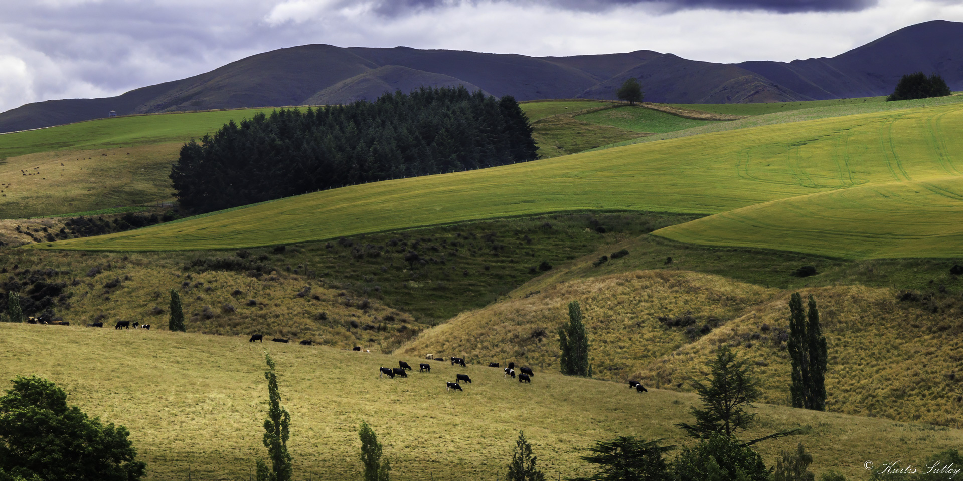
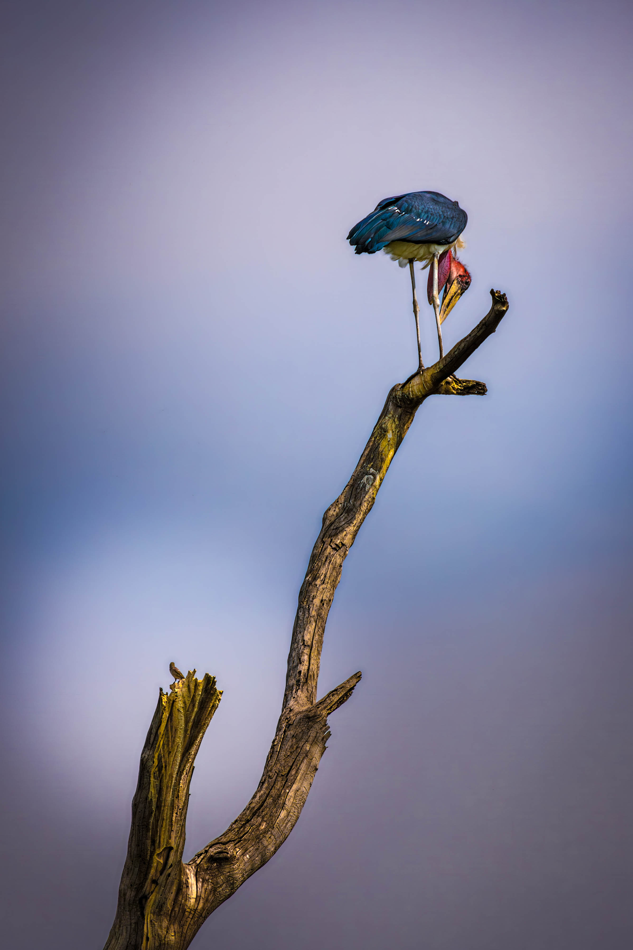
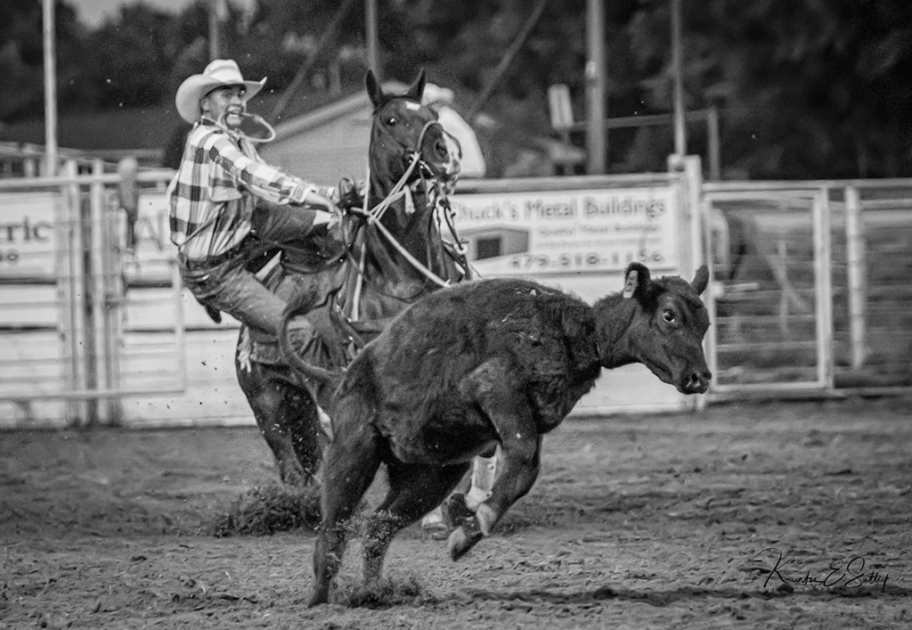
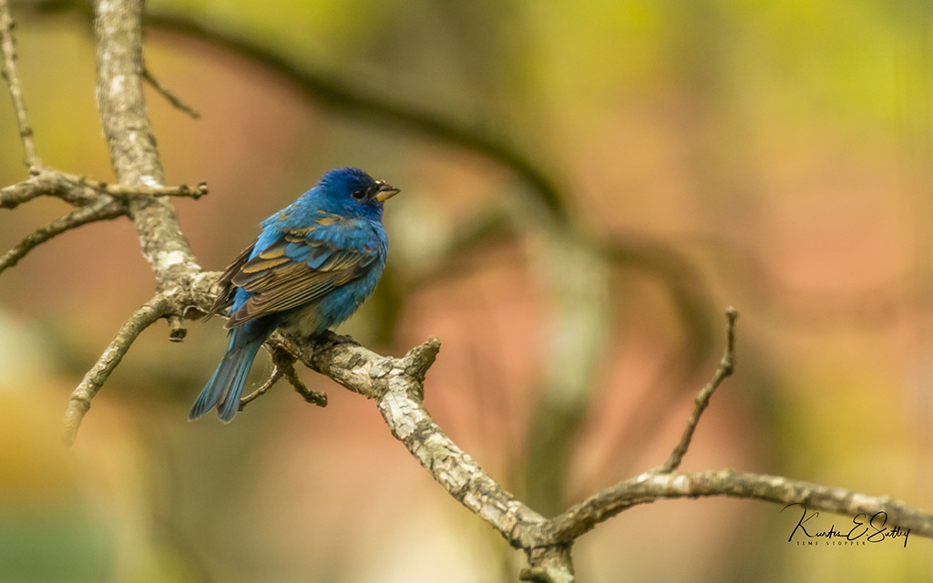
Regine, Thanks for the kind words. I used a tri-pod for this image because the subjects are usually pretty far away in old rice fields and hard to get close to. I love my R5. The auto-focus is amazing but it does take getting used to all the focusing options. I have had no problems with the Canon EF lens using the adapter. I quit trying to use my Tamron 150-600 because auto-focus was just not reliable using the EF adapter. |
Sep 10th |
| 38 |
Sep 23 |
Comment |
I think this is really nice. Not being into ICM, I will defer to Art. I love the lines and patterns of light. Art's crop surely does lead my eyes to the right. Between you, Art and Marge, this group has a pretty good handle on the abstract this month. Good to have you back and hope your health is improving. |
Sep 5th |
| 38 |
Sep 23 |
Comment |
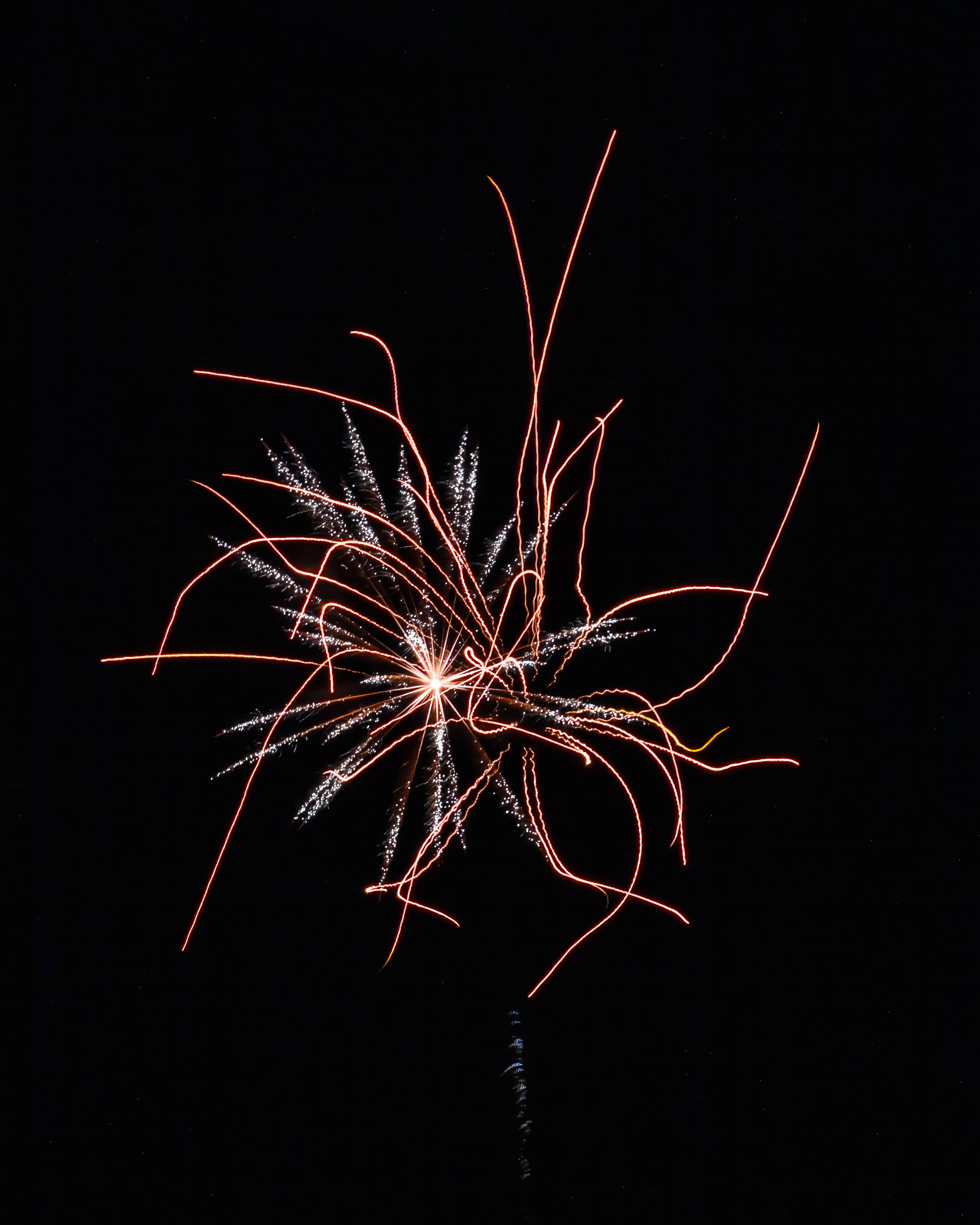
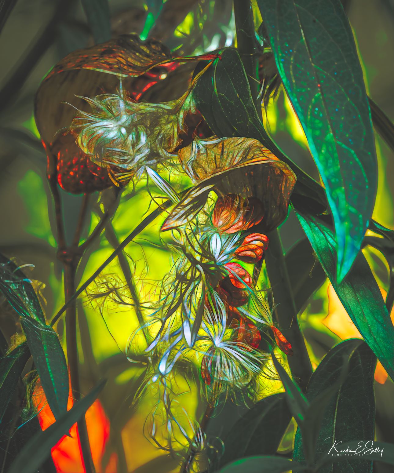
Wow! Just wow. I think imagination and courage are two attributes needed to be a successful artist. For my money, you have both in spades. I think this is an outstanding example of what can be accomplished with ICM. For me, this is the kind of art ICM brings to the table. Seriously, I can't think of how this image could get better. Amazing! |
Sep 5th |
| 38 |
Sep 23 |
Comment |
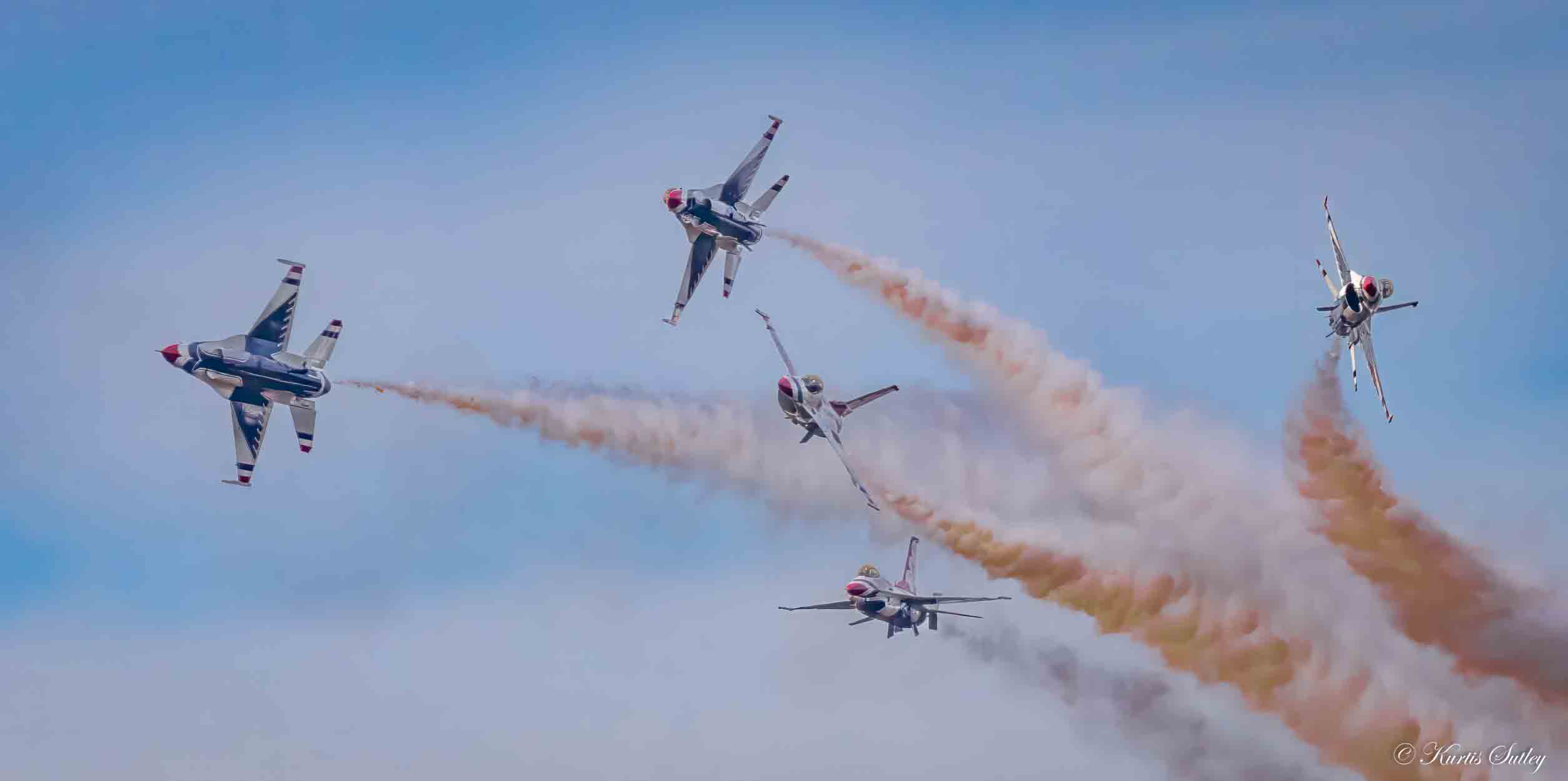
As soon as I opened our group's page, your picture just jumped out. For me, there is so much to like about this abstract. I love the color and motion. I love the balance and texture. I love the lines and contrasting colors. Did I say I love this image? I would love to have this as a metal print on my office wall. I think it's a real eye catcher. I can't think of anything I could do to improve it. Art's rotation and flip is interesting. I am a bit puzzled by how you created this. Did you melt the crayons? How did you get the waves in the colors? Just marvelous. |
Sep 5th |
| 38 |
Sep 23 |
Comment |
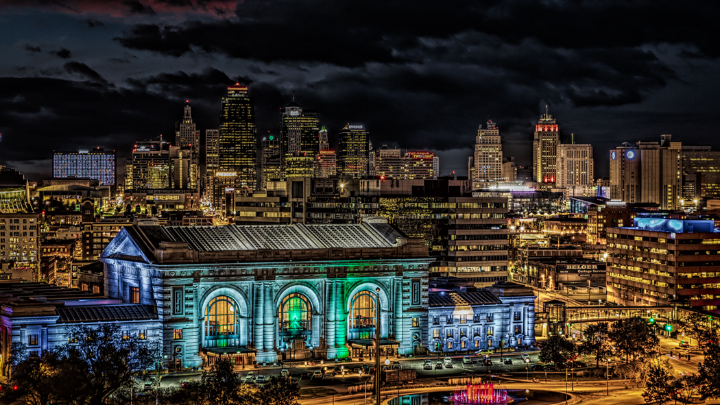
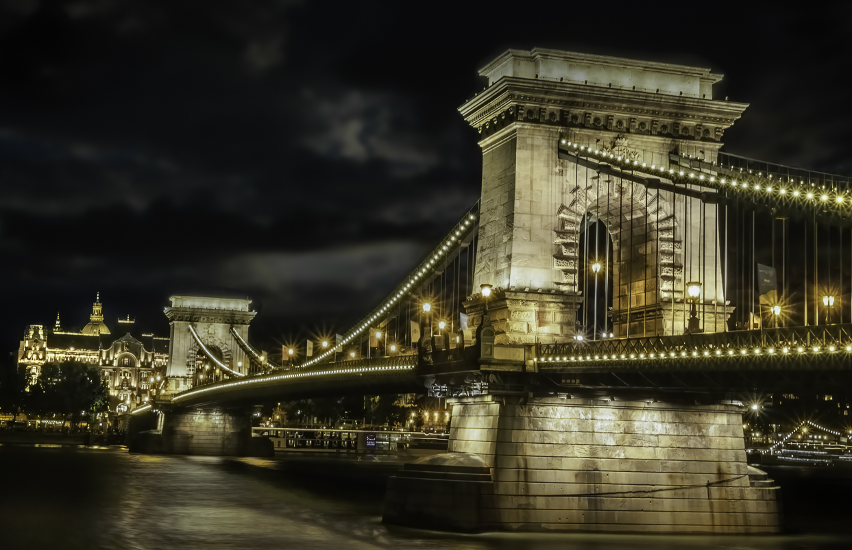
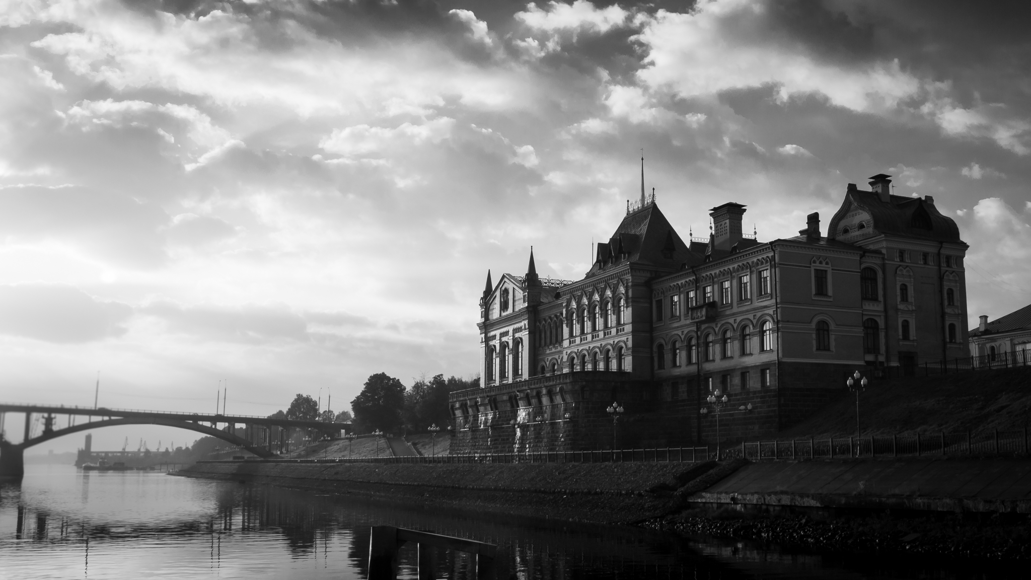
I think this is an iconic skyline of NYC. I like your take on framing/composition. I think it works well. I took the crop tool and made the composition more like a panorama. I darkened the clouds some and added contrast and vibrance to the buildings. I balanced the water, skyline and sky. A slight curves adjustment completed my work flow. Overall, you did a very nice job with your post processing. |
Sep 5th |
 |
6 comments - 1 reply for Group 38
|
6 comments - 1 reply Total
|