|
| Group |
Round |
C/R |
Comment |
Date |
Image |
| 38 |
Apr 23 |
Reply |
Thanks, Sylvia. The only way I could think of to show the immensity of the room was to include the people. Carlsbad is truly awe inspiring. |
Apr 27th |
| 38 |
Apr 23 |
Reply |
Well, I'll have to say the transition was impressive. Thanks for the original.
|
Apr 17th |
| 38 |
Apr 23 |
Reply |
LOL You weren't supposed to know.
|
Apr 15th |
| 38 |
Apr 23 |
Comment |
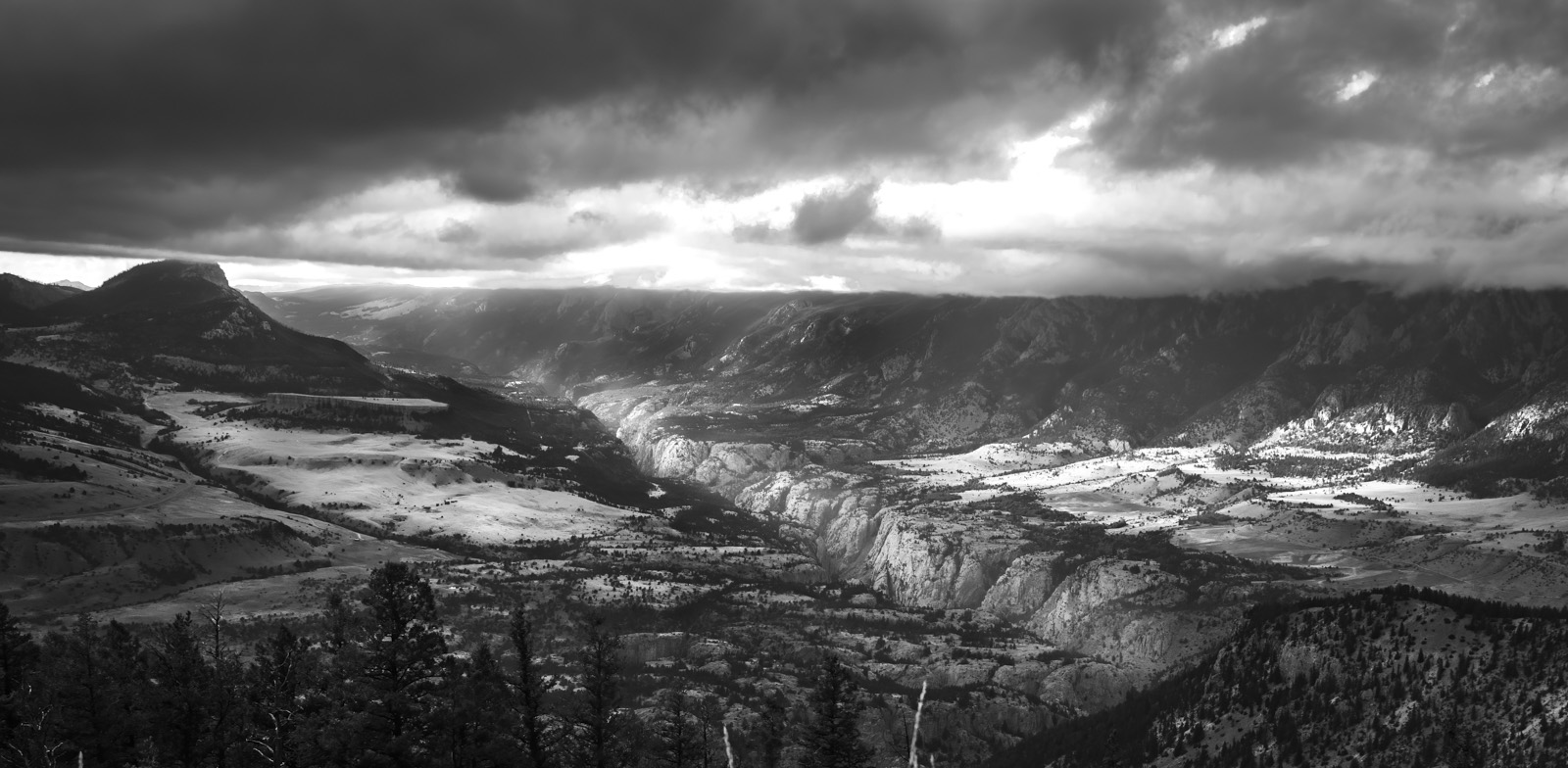
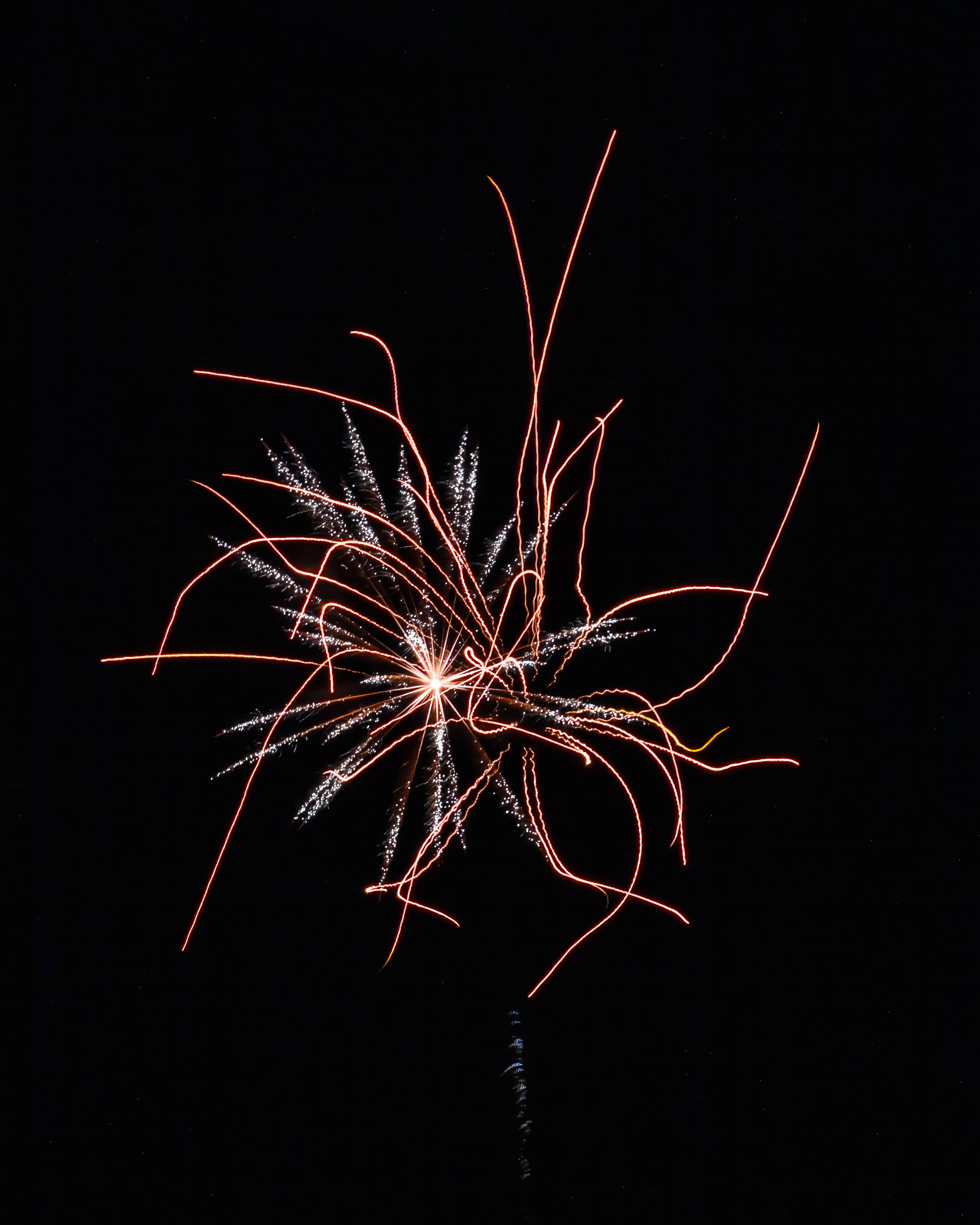
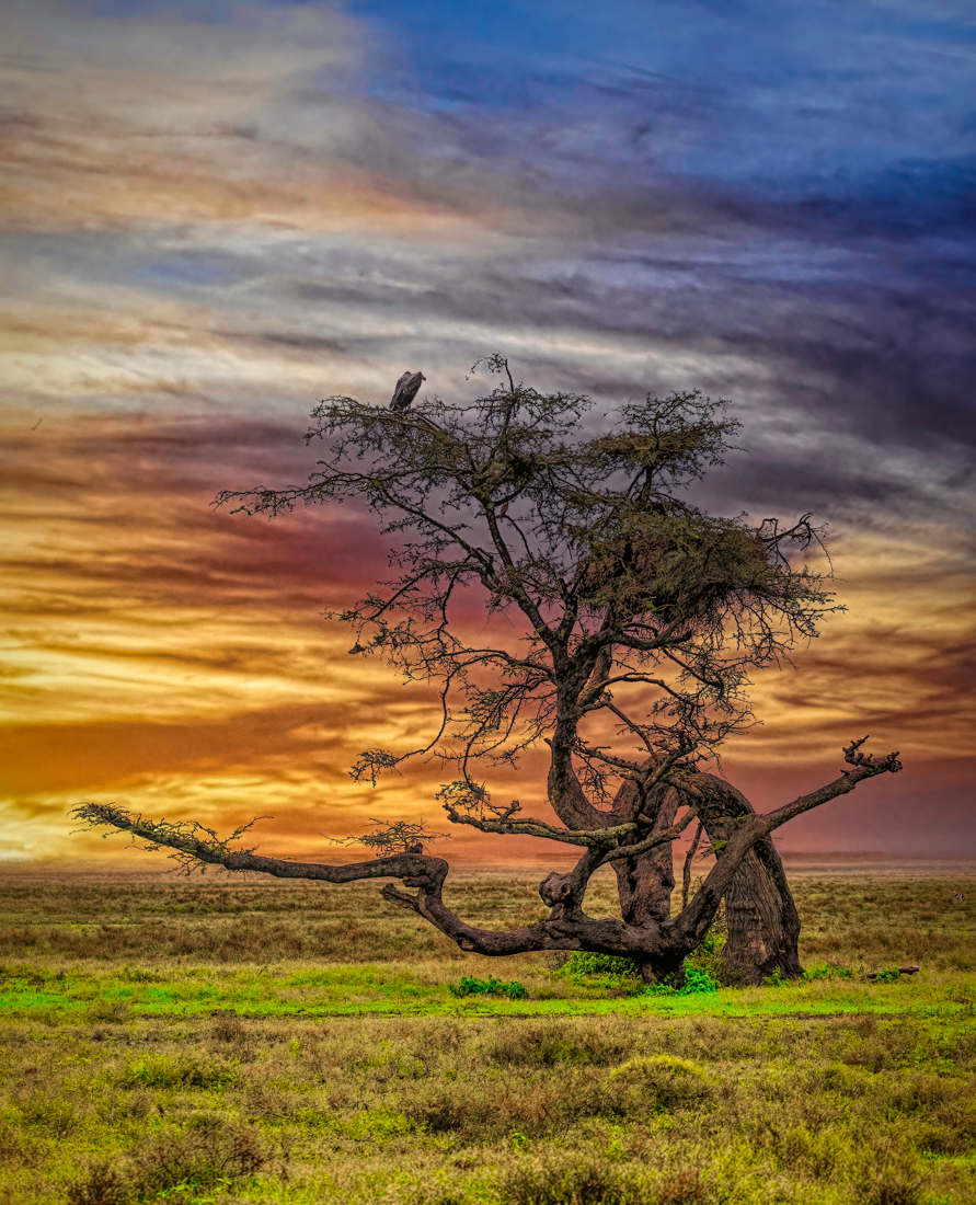
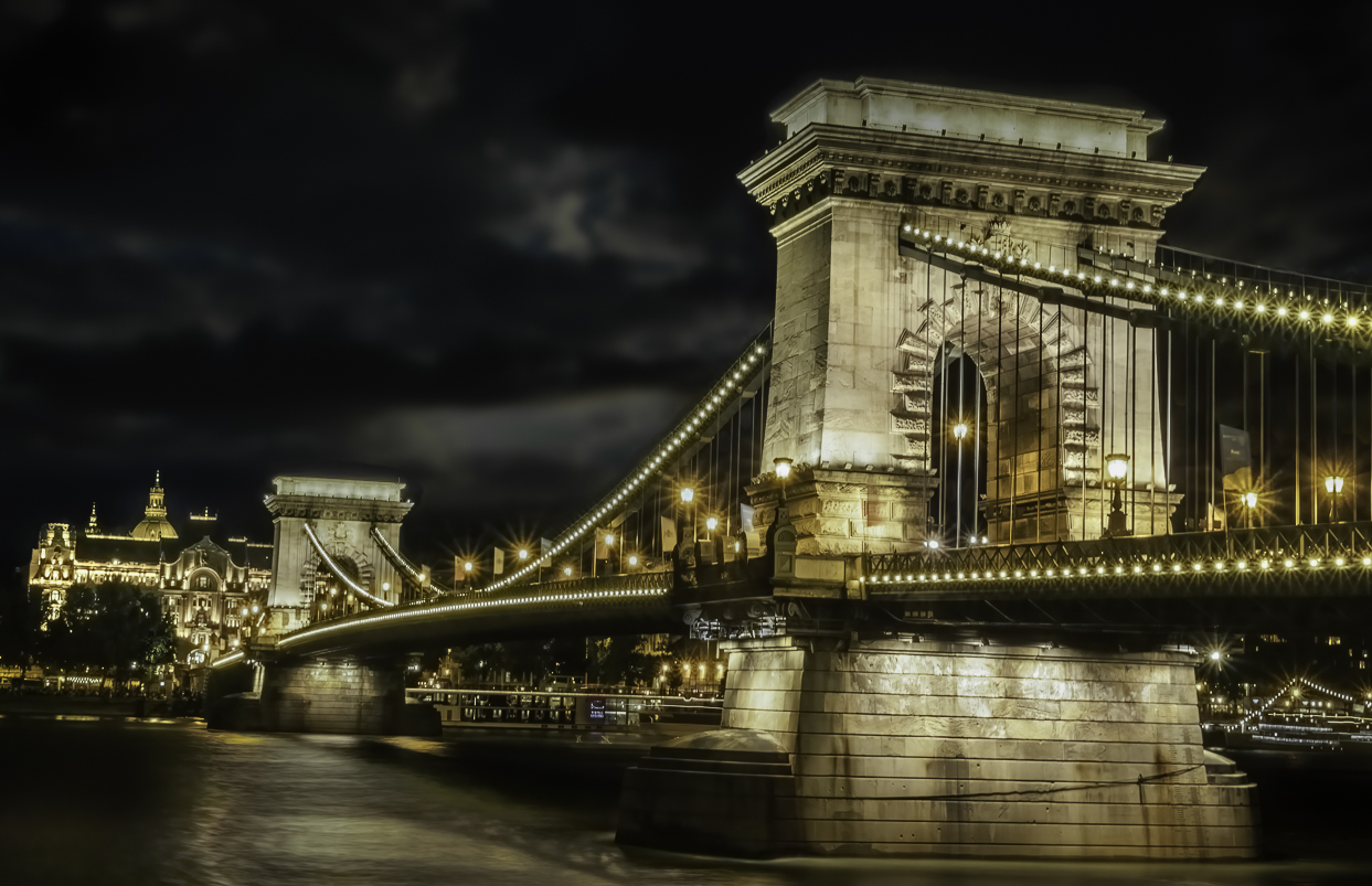
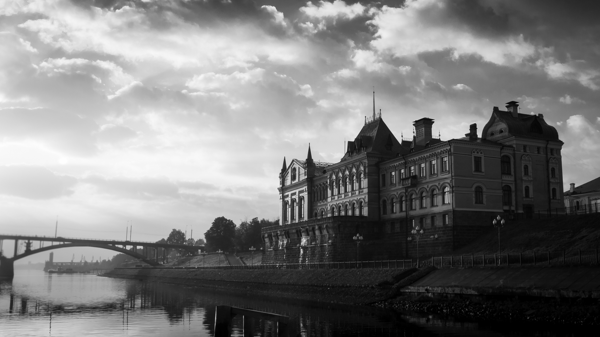
Regine, I really like the image. I'm not sure I would have known it was an ICM image if you hadn't told me. I love the diagonals and how the horizon divides the image. To me the dark foreboding sky makes the image by adding mystery and tension. Without the original I can't comment on your post processing but whatever you did I think the outcome served you well. In my opinion a very nice image. |
Apr 12th |
| 38 |
Apr 23 |
Reply |
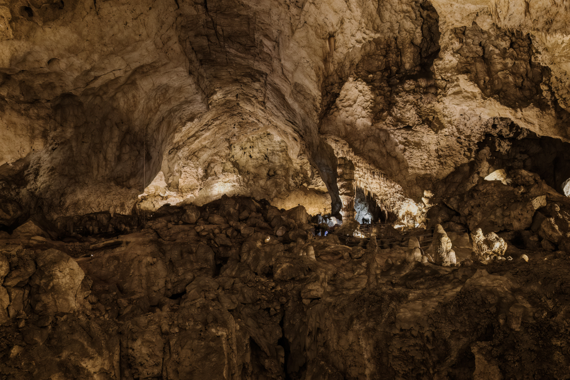
Thanks for the suggestions. I like what you did. Not sure where the green came from but it certainly wasn't in the original image or in the cavern. Darn computers. LOL |
Apr 12th |
| 38 |
Apr 23 |
Comment |
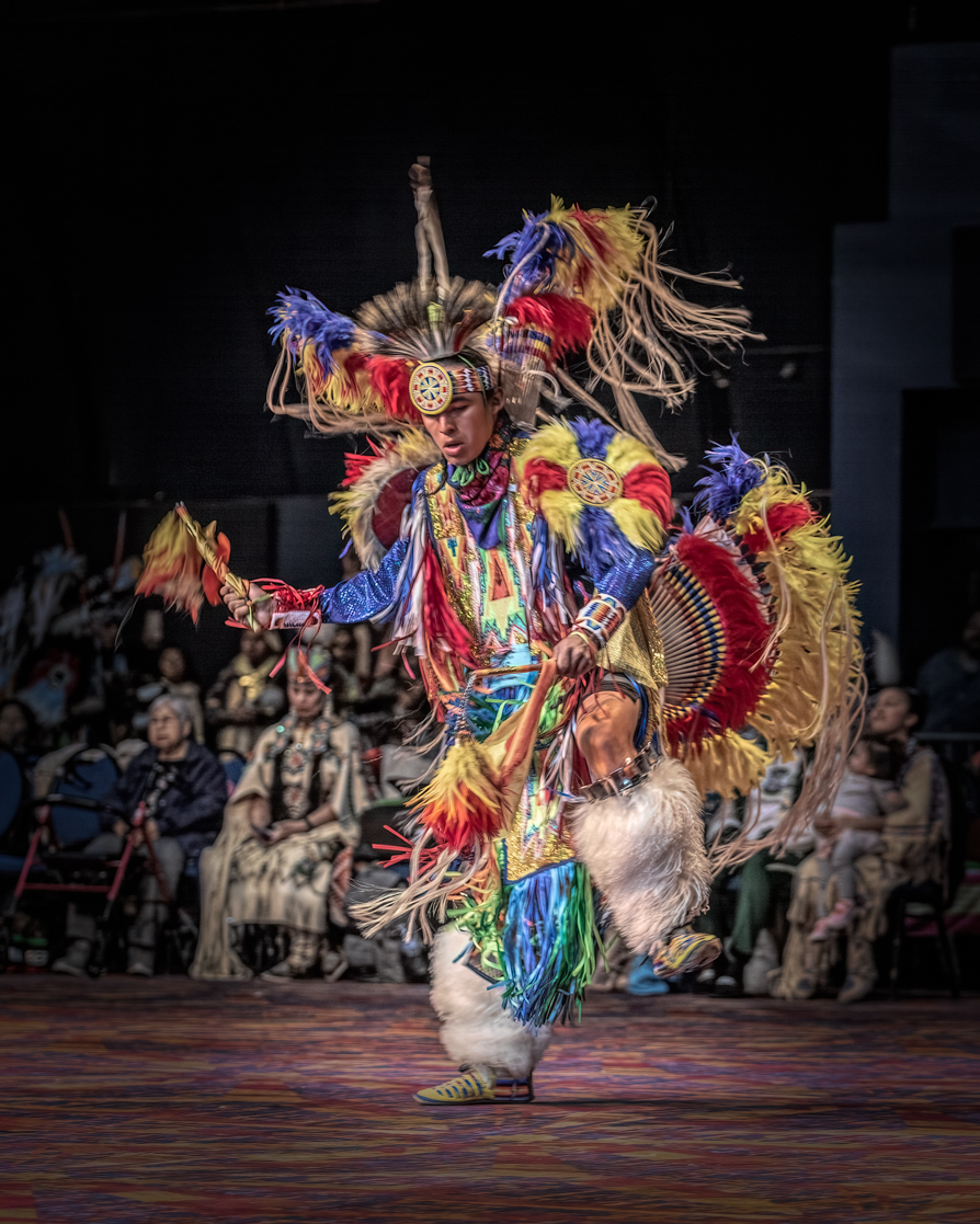
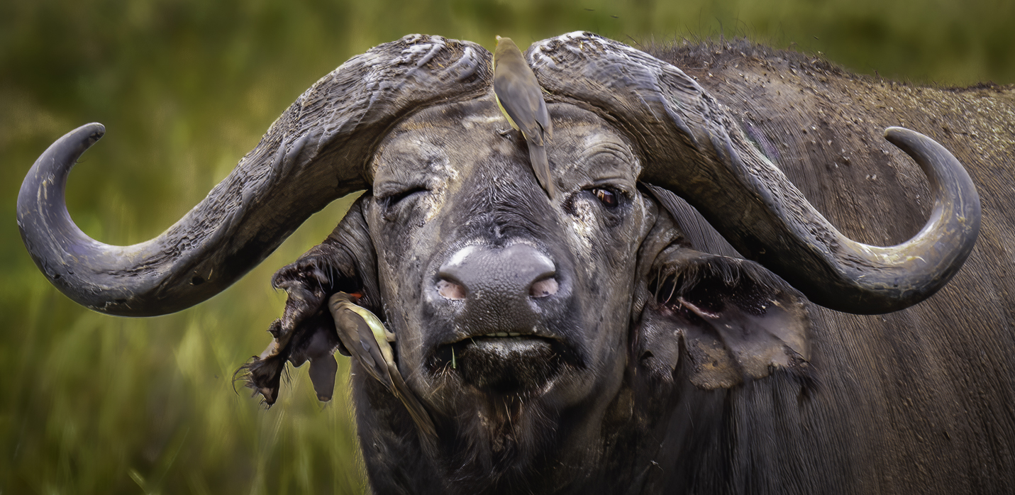
This was another tough one for me. I am still not sure exactly what the subject is. I'm going to assume the hat was a retail item. But that canumdran is what kept me coming back. In my opinion virtually all the design elements are represented. I would have liked to have seen the original for obvious reasons. To me it is busy but not too busy and the colors just leap out at me demanding that I look close. I do agree with Art's cropping suggestion. Very nice. |
Apr 12th |
| 38 |
Apr 23 |
Comment |
What a surprise this evening when it dawned on me you were our club judge for this past months "Reflections" competition. You did good. Thanks for the feedback. |
Apr 11th |
 |
| 38 |
Apr 23 |
Comment |
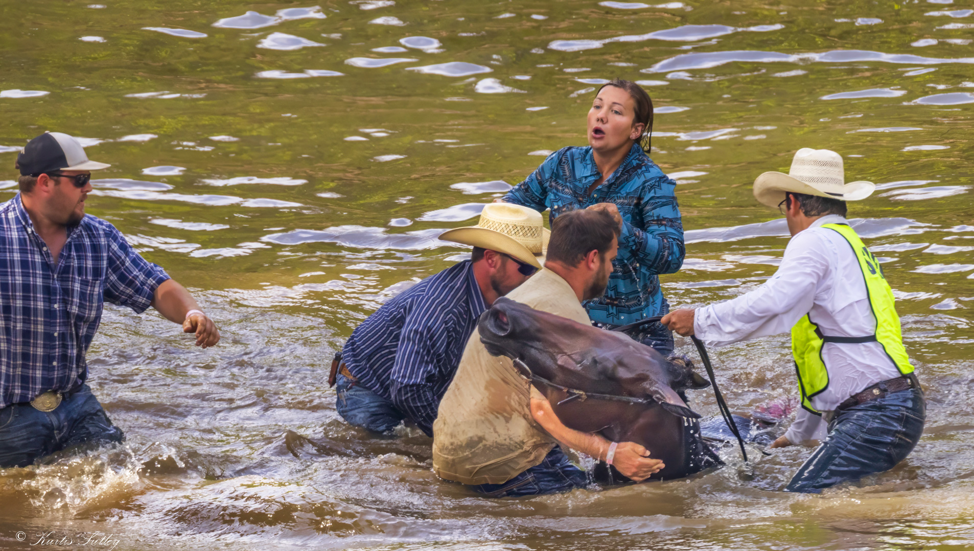
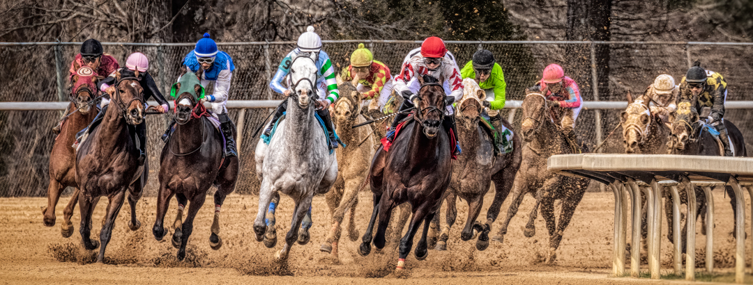
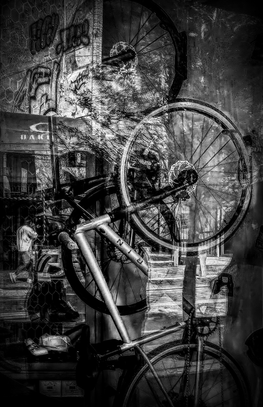
I must start by saying this image was a real challenge. Not because I didn't like it, but because to me it's one of those images that had me scrambling to get a grasp of just what it is my eyes were seeing. I like the image. I think it certainly conveys a sense of motion and urban life. I think it can be said that it is a busy image. As such, for me there are multiple subjects and my favorite attribute, little Easter eggs to surprise and complete the image. Because of the subdued nature of the colors, I tried to first boost their saturation. I wasn't happy with that approach. So, I went mono. I dodged the man, shoes and frame. I also cropped out the window frame. I did some burning and then did a universal boost of the contrast. I did a lot of that using the Lightroom Classic masking tool. I wanted to do something different. Just some thoughts and changes to think about. I think it is a nice thought provoking image that tells an interesting story. Well done. |
Apr 9th |
 |
| 38 |
Apr 23 |
Comment |
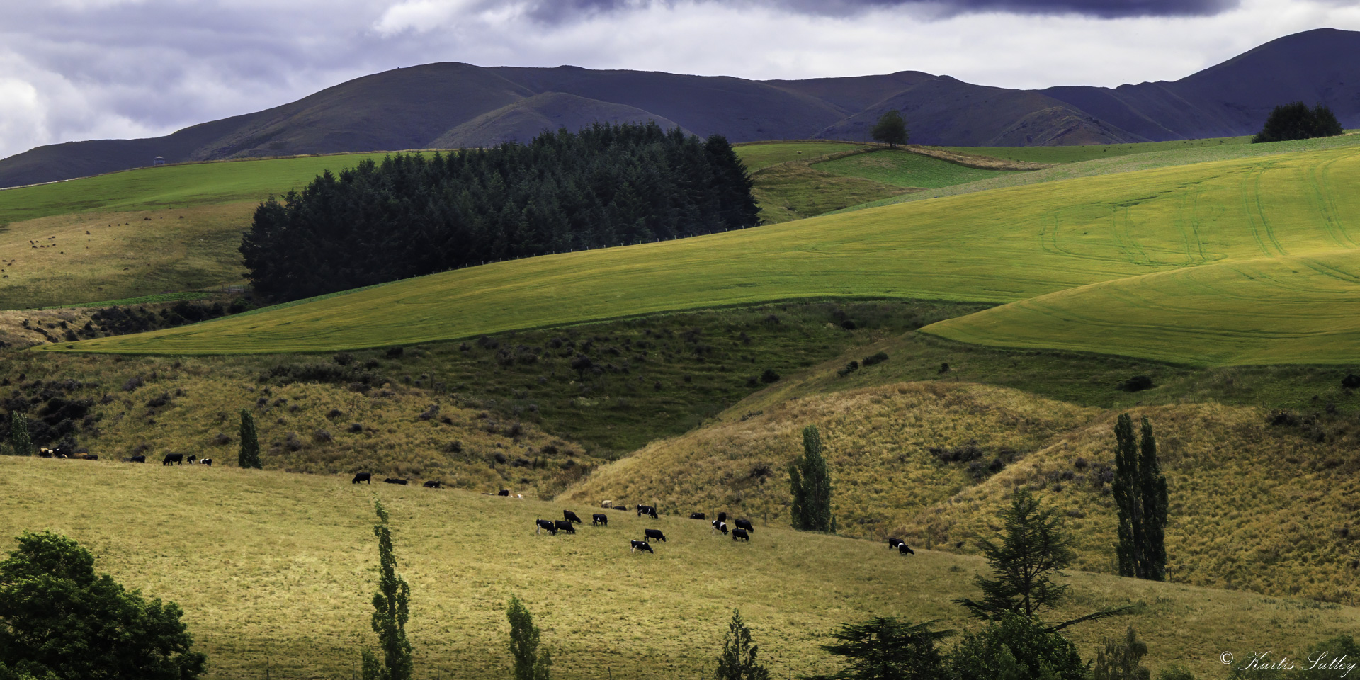
I think there are times to just leave an image right where it is. I love this image. Maybe I'm showing a lack of imagination, but for me it falls into the "perfect" category. I can't imagine you were trying to do anything other than make this image just like it is. Technically spot on and the story is compelling and complete. Congratulations. |
Apr 7th |
| 38 |
Apr 23 |
Comment |
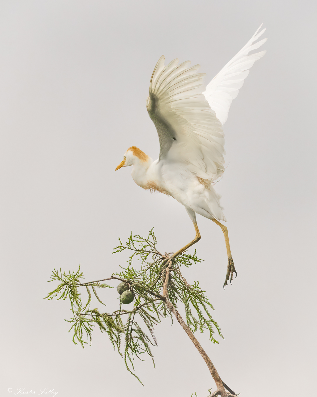
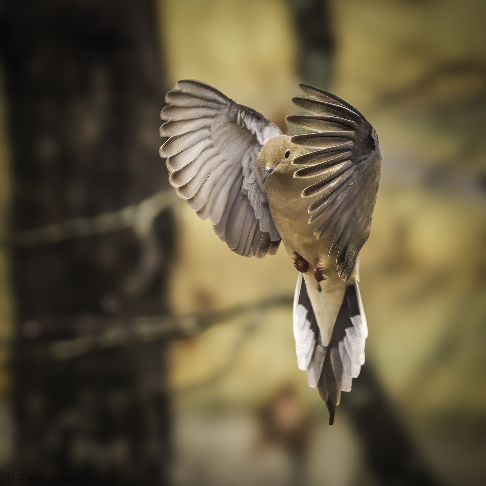
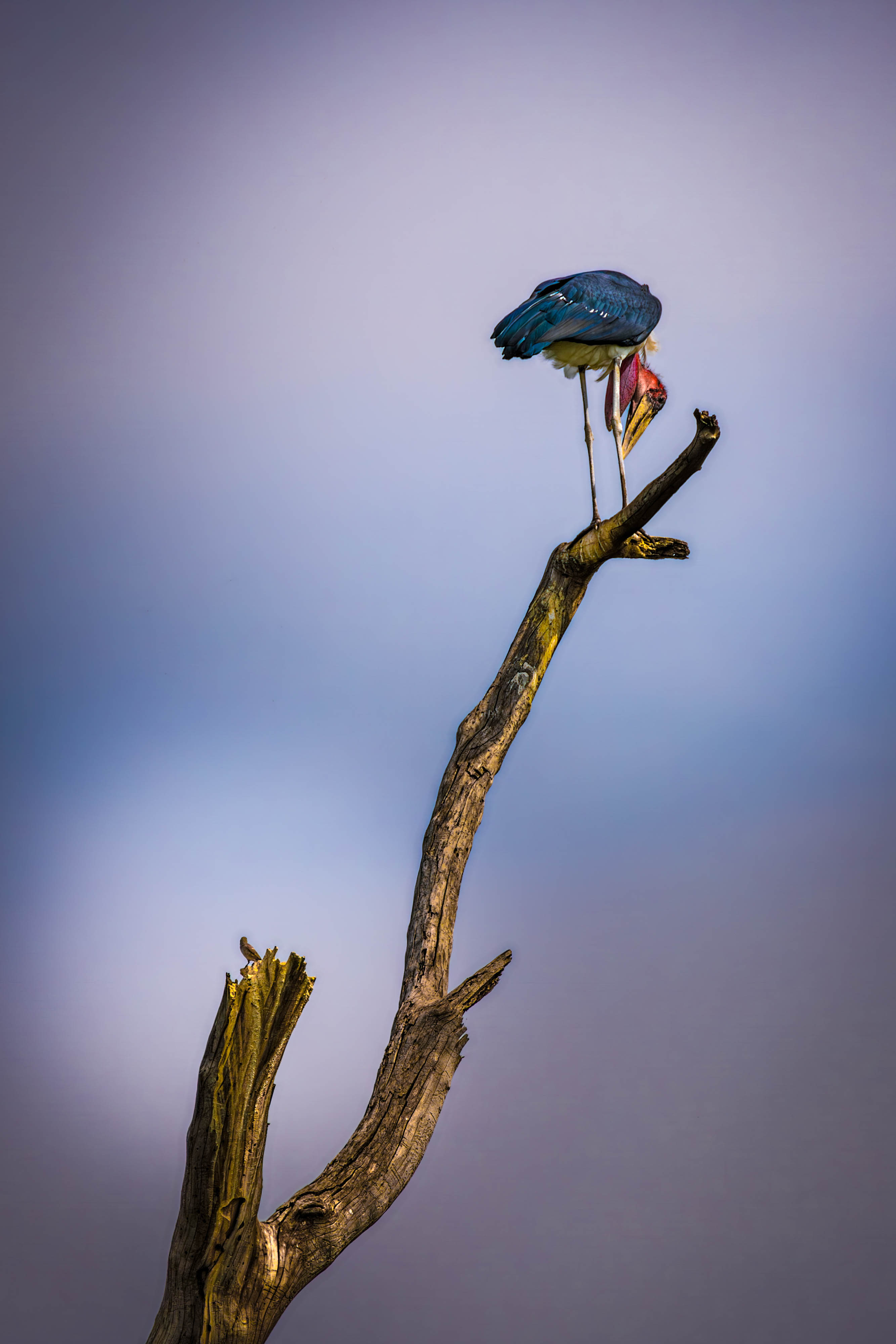
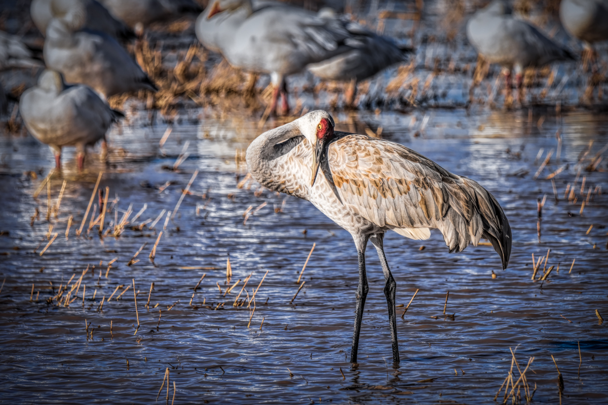
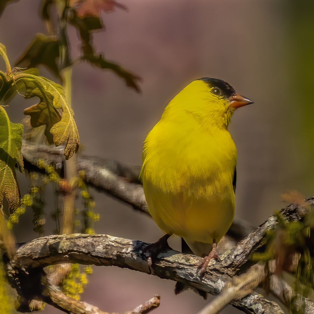
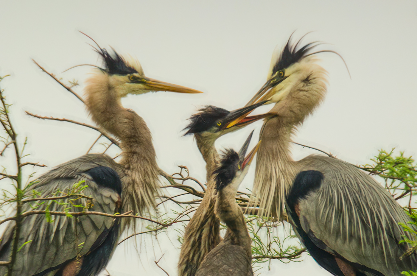
First off, were you and Art on the same trip? I love this image. I think including both adults and the chicks really tells a story. You did a nice job of removing the branches. When working with your image I initially found the small file size difficult. So I boosted pixels in Topaz Gigapixel from 670 on the short side to 2000. I could then sharpen in Topaz Sharpen AI and then I took it to Topaz Studio 2 to add a custom filter that emphasizes contrasting areas which "appears" to further sharpen the image. As you might guess by now, I felt your image was a bit soft but that was probably because of focal length and the cropping. Back in Lightroom, I did some dodging of the birds lighter areas to separate them from the background. When working with an uninteresting sky, there are a couple of ways. You tried replacement that didn't work. Because the heron family is the subject, I elected to crop down to further highlight them and reduce the amount of sky. I think that when the sky is uninteresting, you should try to show as little as possible. By cropping down I think I was also removing the need to clone out the limbs which I thought were fine and highlighted the nesting story. You have a wonderful capture that tells a great story. |
Apr 3rd |
 |
| 38 |
Apr 23 |
Comment |
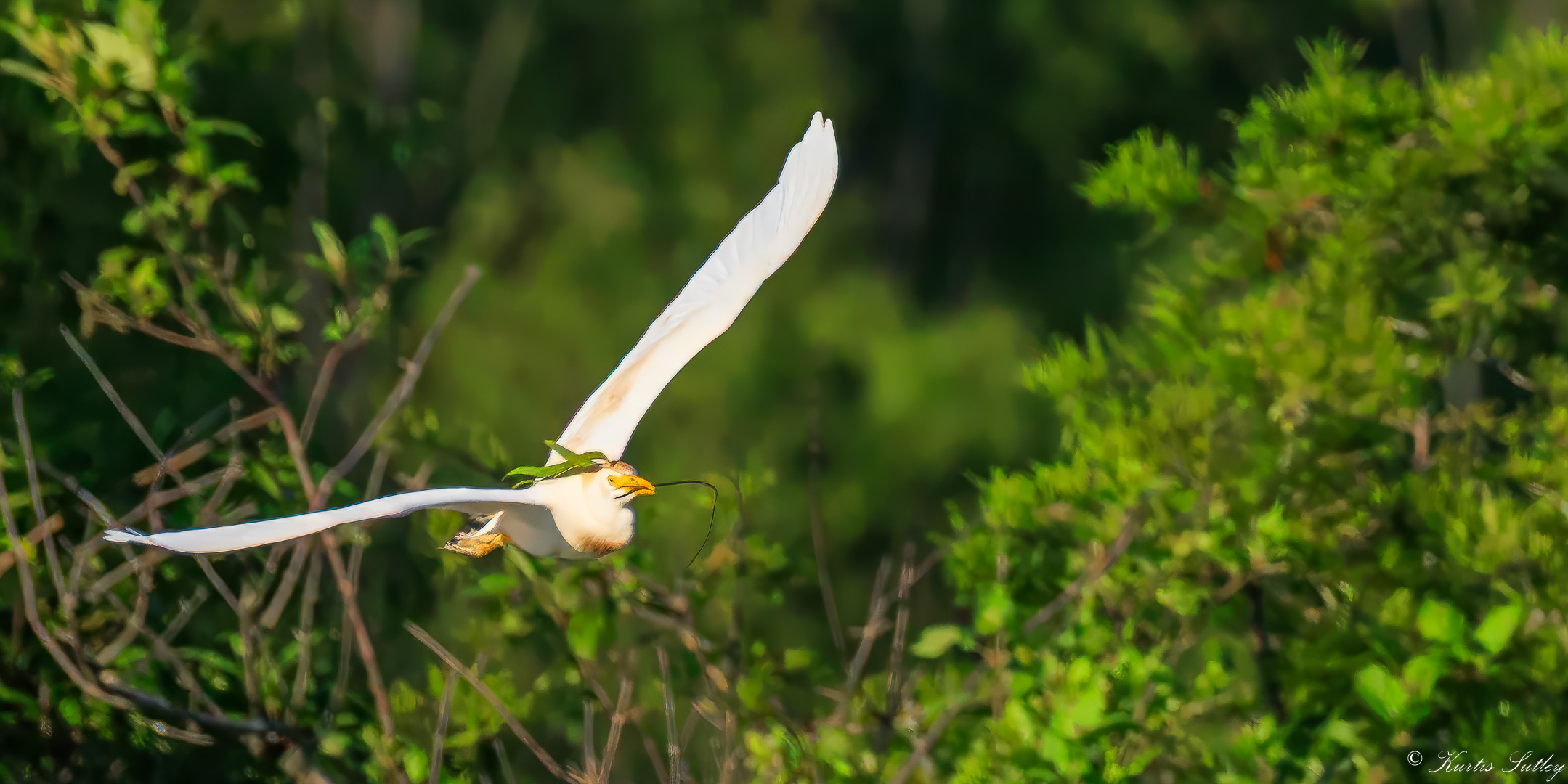
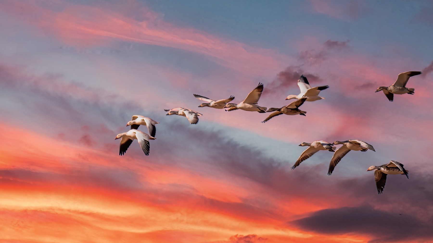
Really a wonderful image. I kept rechecking the original to see what I would do better. I kept coming back to your image. I could do something different but that's all it would be, different. I think this would make a wonderful cover for an Audubon magazine. Stunning. |
Apr 1st |
7 comments - 4 replies for Group 38
|
7 comments - 4 replies Total
|