|
| Group |
Round |
C/R |
Comment |
Date |
Image |
| 38 |
Dec 22 |
Reply |
I like the cooler atmosphere Gabriele produced. To me it really made the bird pop.
|
Dec 19th |
| 38 |
Dec 22 |
Reply |
Thanks, Gabriele. Really helpful suggestions. Happy Holidays to you too. |
Dec 19th |
| 38 |
Dec 22 |
Reply |
Yes. That's an interesting point of view. I like it. I really like and rely a lot on the LrC masking tool.
|
Dec 19th |
| 38 |
Dec 22 |
Reply |
Oops. I dodged the bright spots, not burned them. Sometimes my lightening fast "hunt and peck" gets ahead of my thoughts. |
Dec 14th |
| 38 |
Dec 22 |
Comment |
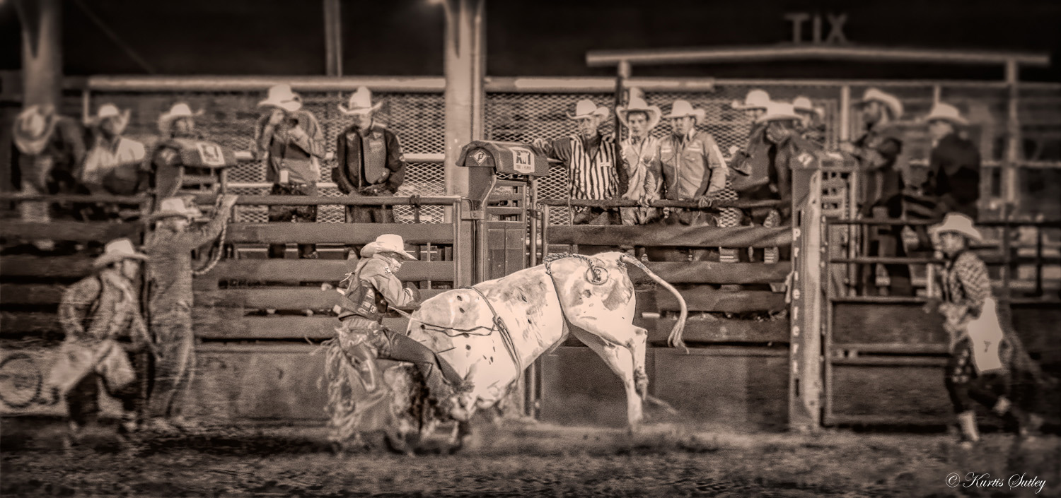
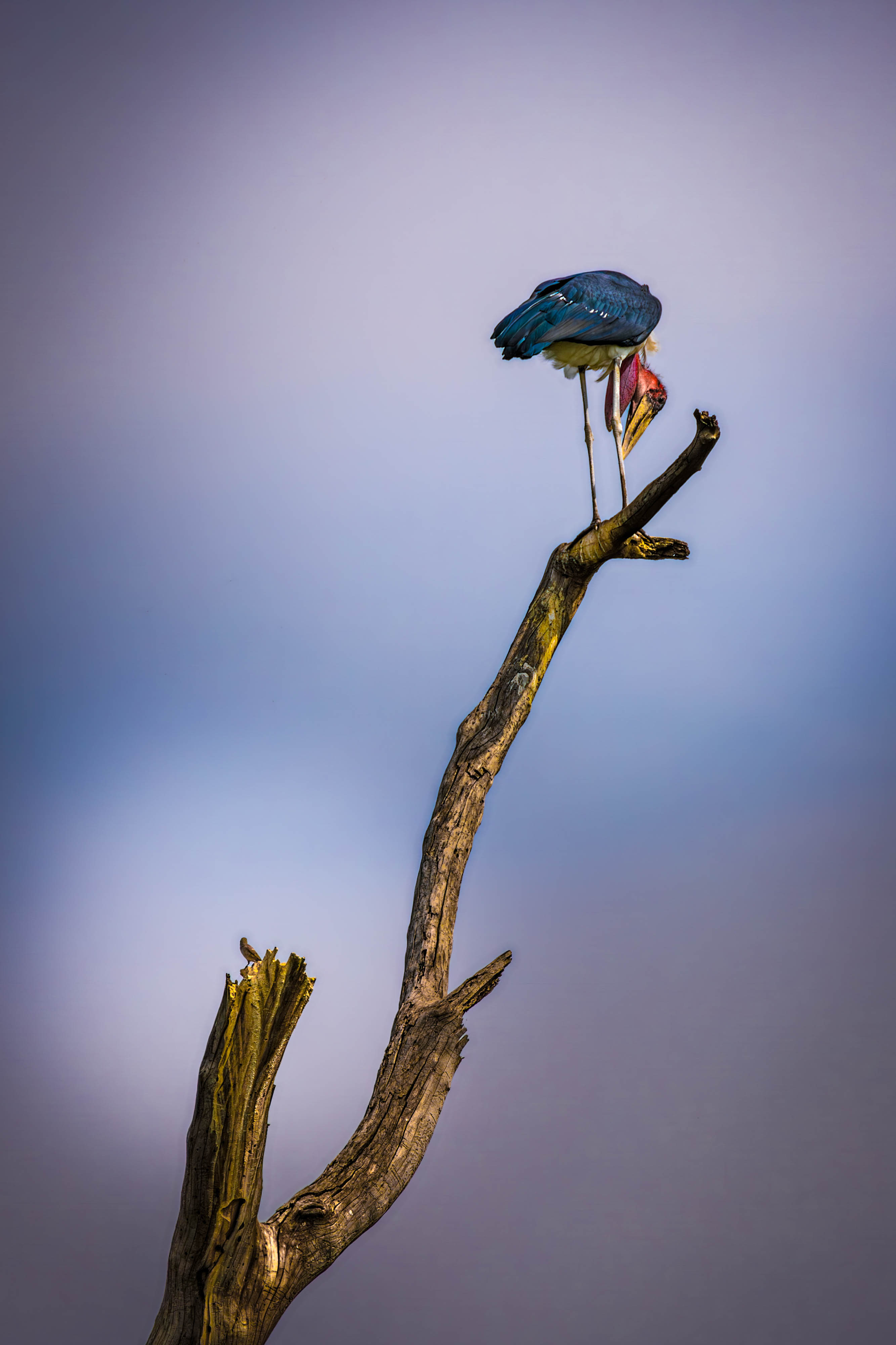
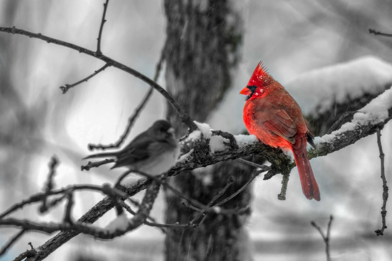
I think you have a beautiful image that creates an interesting quandary. Your primary subject is basically colorless while your framing is colorful. What to do; What to do? In my opinion your subject needs to dominate more of your image. Cropping fixes that. Just like darkening a portion of an image to emphasize a bright area, if you emphasize the color you can make the subject pop. I did that and then added contrast to the subject and dodged its midtones a little to make them separate from the color. Without any real color in the subject, what you have appears to my eye as a selective desaturation of the subject, which it isn't. I think that lack of color also contributes to the illusion that the subject focus is soft. I added a stronger vignette to further isolate the subject. I think this would work well as a print for someone who appreciates and understands this particular subject. Well done. |
Dec 8th |
 |
| 38 |
Dec 22 |
Comment |
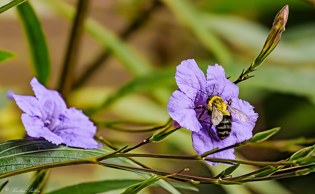
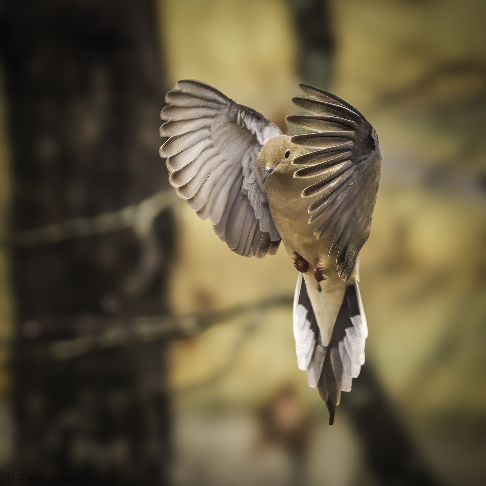
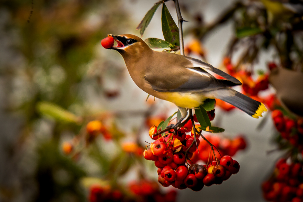
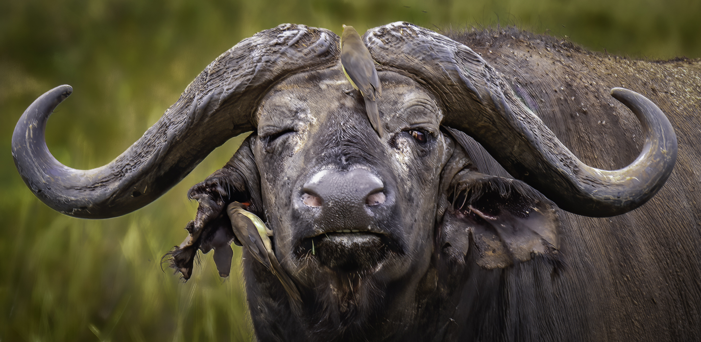
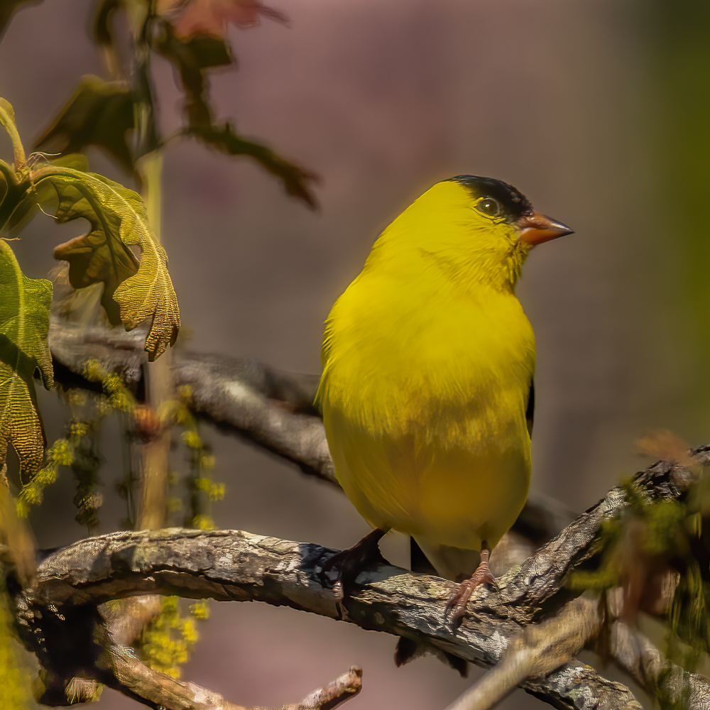
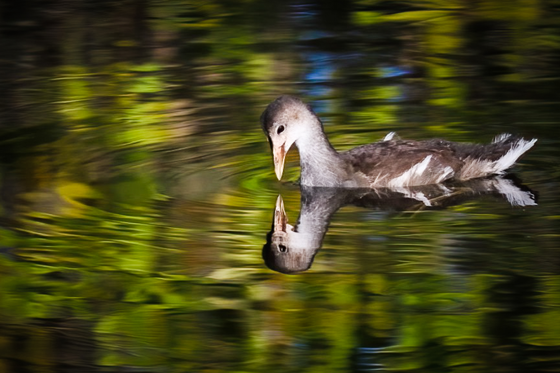
I think this is a very nice picture of a wren. It's sharp and properly exposed. I like all the diagonals and the contrasting color of the wren with the duller palm trunk. In my opinion you have a nice catch light in the wren's eye and I think the pose is very flattering. To me the vignette is just right and helps isolate the subject from the background. I think you could have strengthened the image by offsetting the subject more from center. Ah, but which direction? A photographer's dilemma. How about upper right? To my eye a very nice job of post processing. Nicely done. |
Dec 8th |
| 38 |
Dec 22 |
Comment |
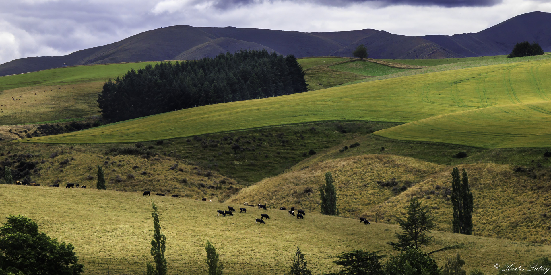
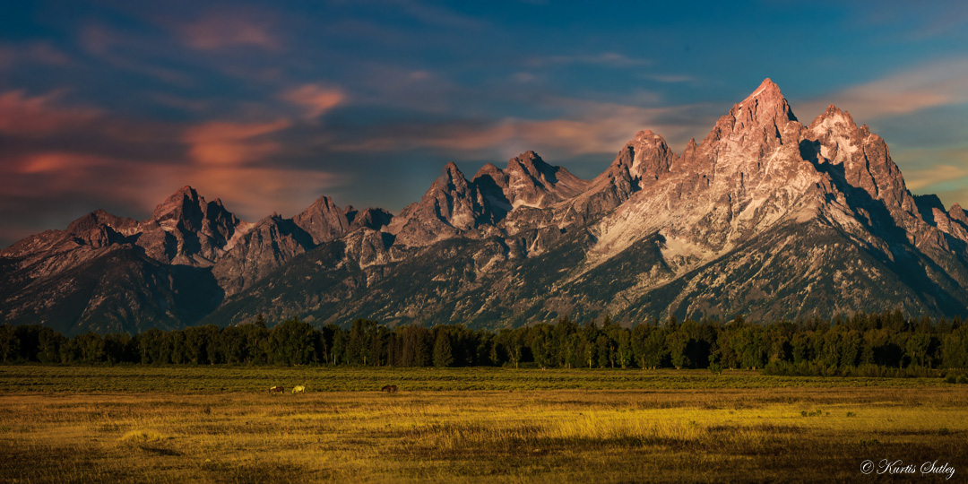
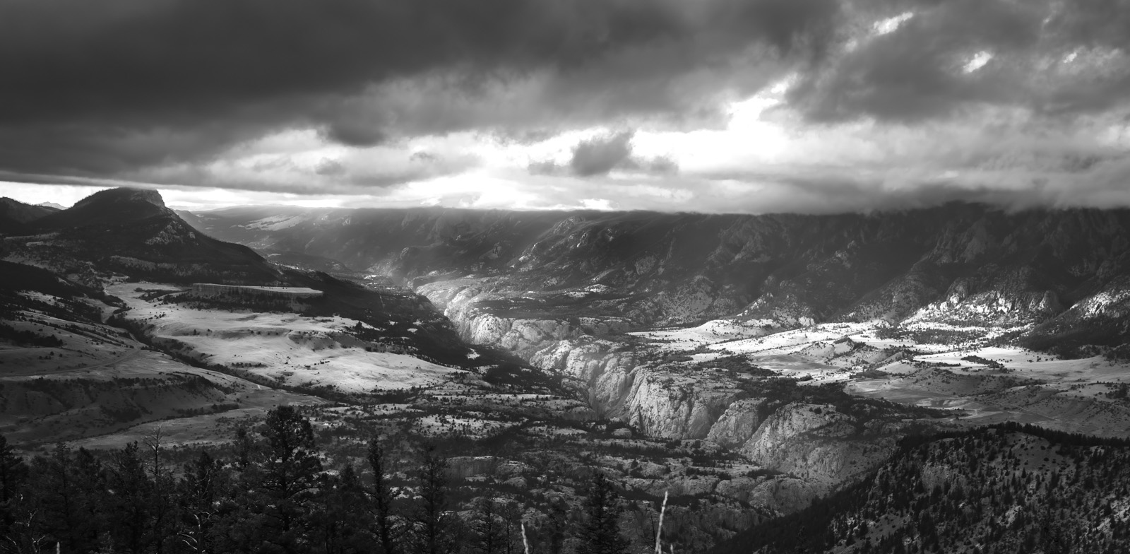
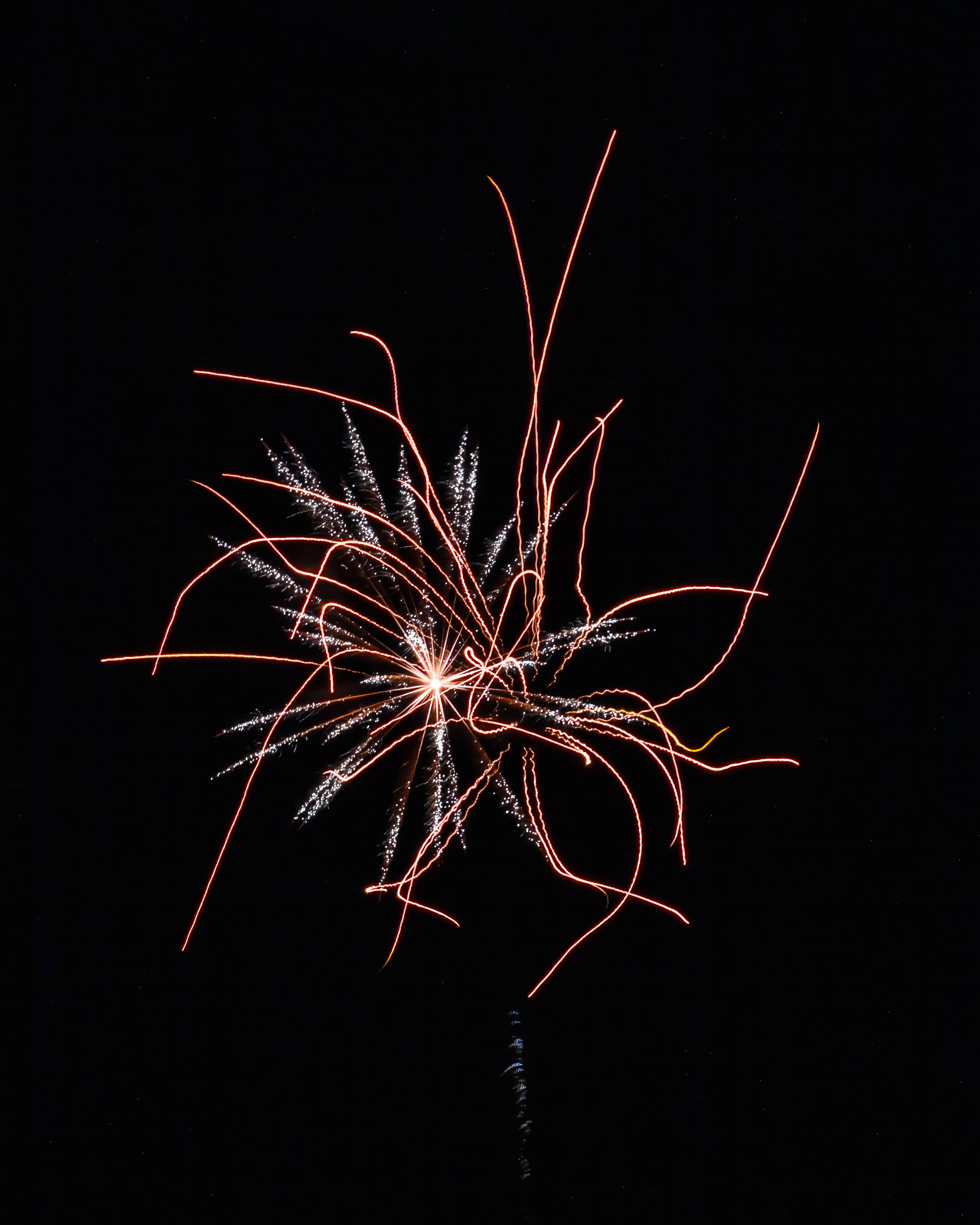
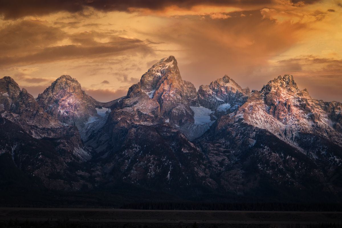
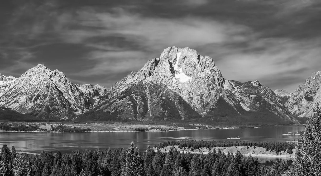
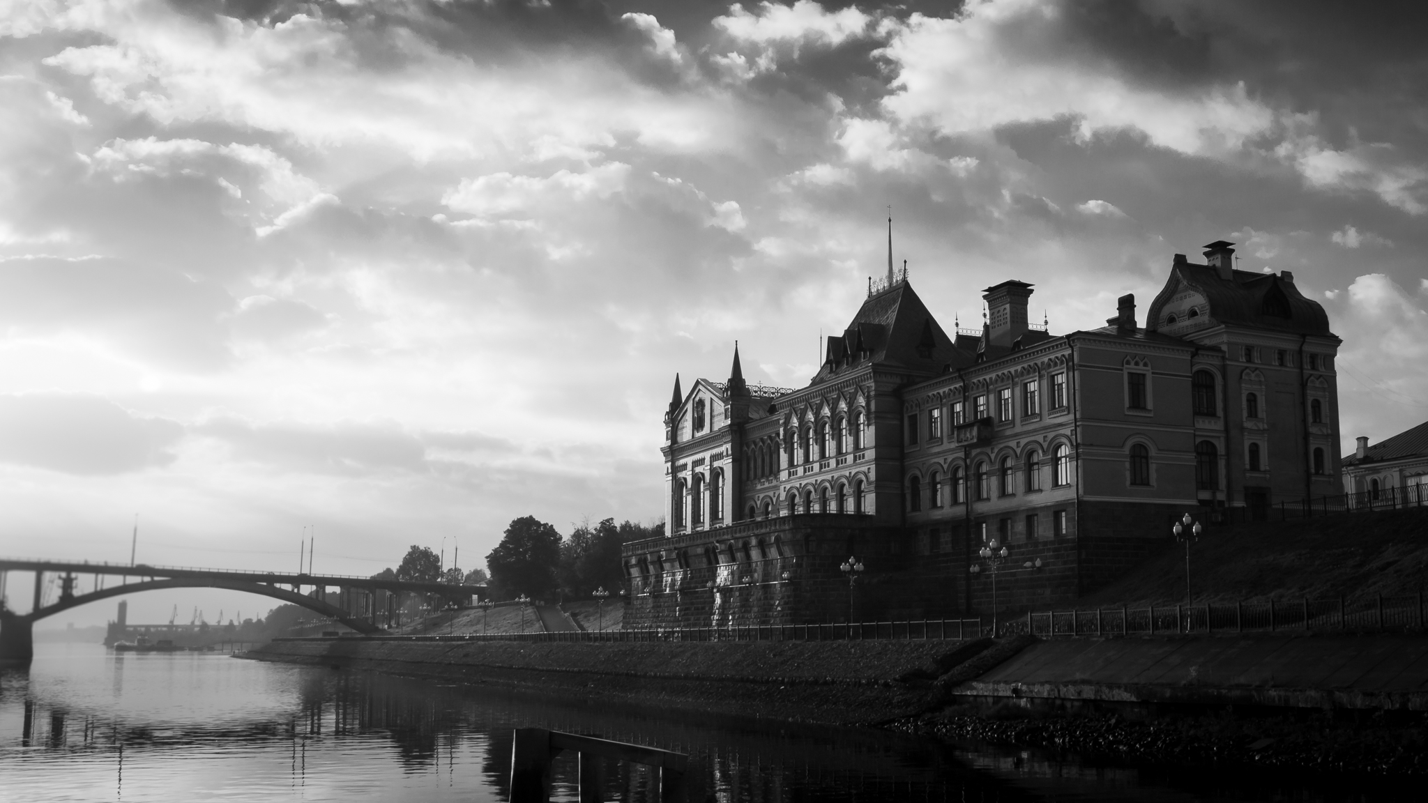
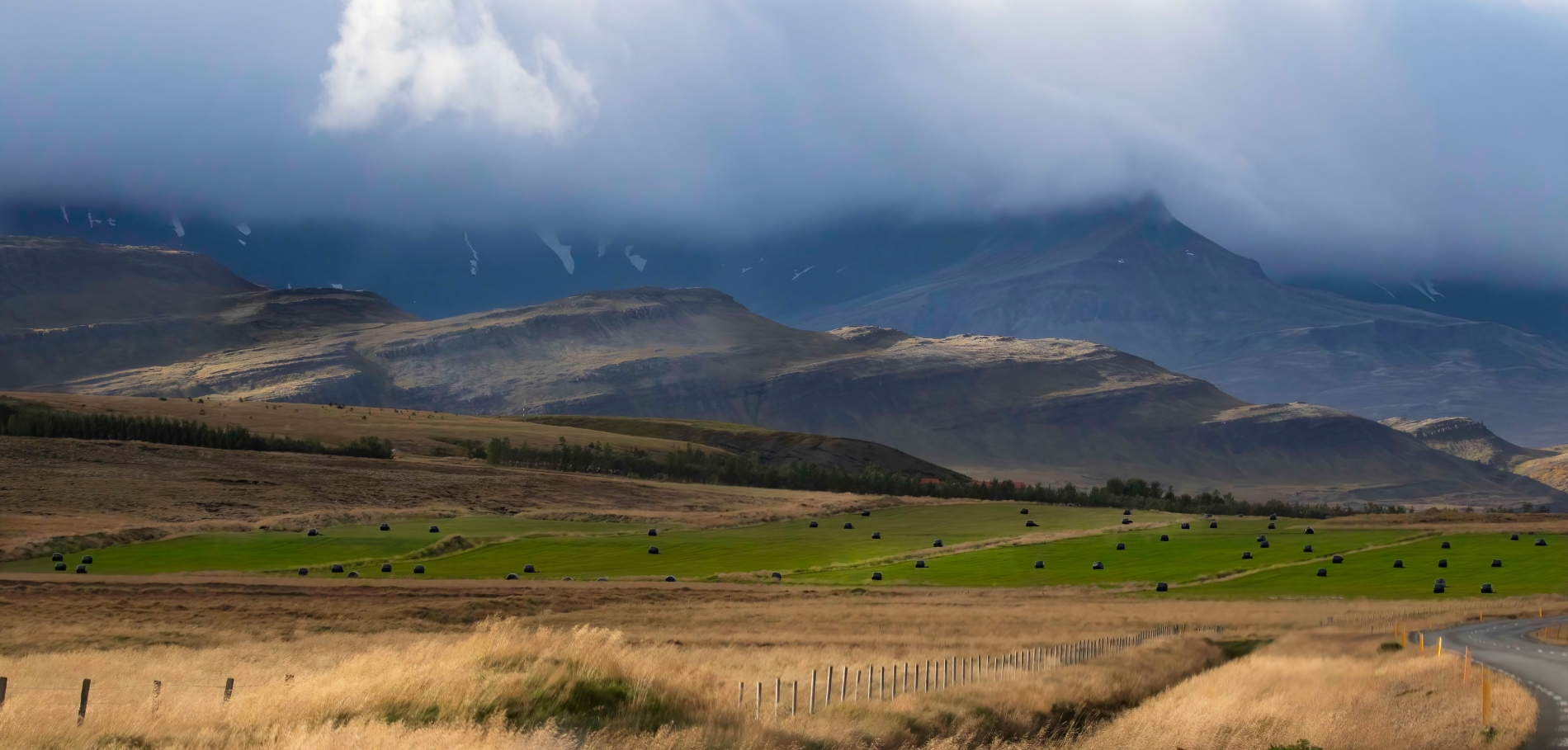
There's a lot I like about this image. I like the layers of light and textures. I like the crisscrossing diagonal lines. To me it's not an image that jumps out at me but it has a soothing personality that urges me to slow down and enjoy the view. I made a few alterations just for me because you gave me a wonderful canvas to play with and enjoy. The first thing I did was run the image through Topaz DeNoise. When editing an image I like to zoom in tight at times and the noise just becomes distracting to me. Unless you're planning to blow up the image or the noise is just horrendous, I think we over emphasize noise as a detractor of good photography. To my eye there was just a little too much luminous and color noise. I cropped the image to anchor the left lower edge with the fence line. If I have a good anchoring diagonal I use it. That's just me. I also cropped the cloud layer to balance with the foreground layer. To me the bright clouds were just too dominate even though they helped frame the mountains. I burned a lot of the bright spots on the mid-ground mountain tops. For me they were perfect dividers of foreground and background and helped guide my eyes up and through the image. I also added saturation to the green hay field and brightened the foreground grasses. I commiserated long and hard about the road. In the end I went with Art's suggestion on my doe image and decided it added context without distraction. In the end I think you have a wonderful pleasing landscape. |
Dec 8th |
 |
| 38 |
Dec 22 |
Comment |
What a fascinating study of lines, textures and light. I so envy your creativity. Maybe it's part of the mystery/story, but my eyes have an issue with the vertical line on the left and what to do with it. I like the monochrome look. Another very nice creation. |
Dec 6th |
| 38 |
Dec 22 |
Reply |
Yea. That will work too. It isolates the doe but adds to the story. Thanks. |
Dec 5th |
| 38 |
Dec 22 |
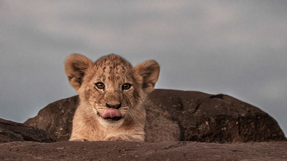
Comment |
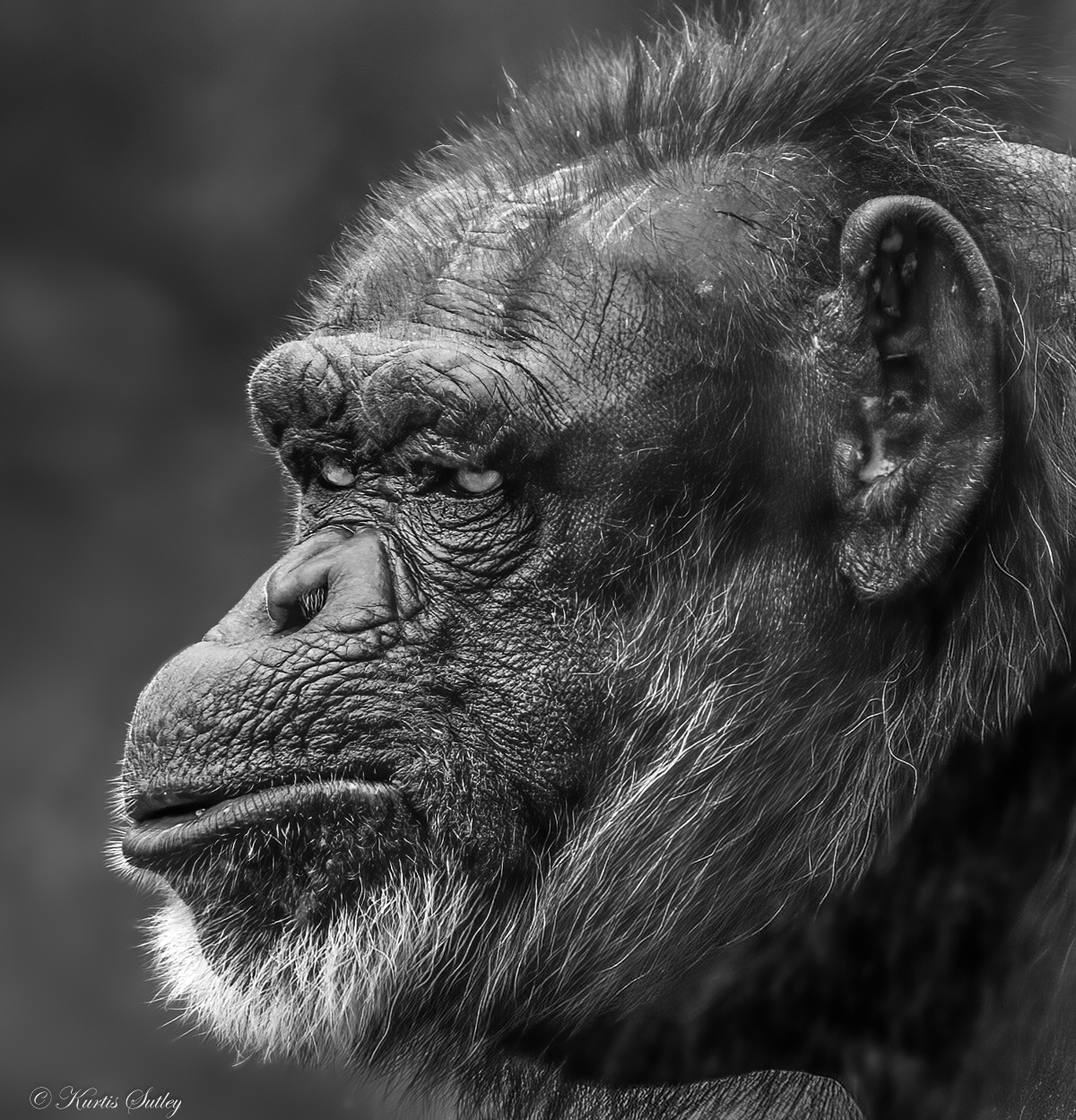
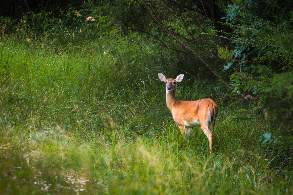
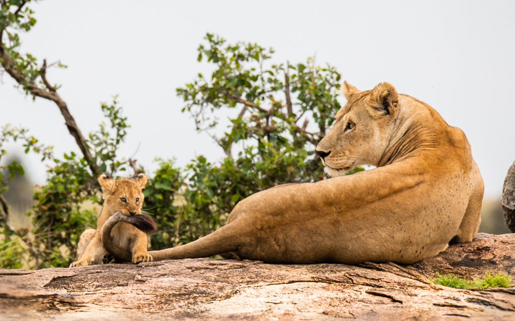
I think this is a very nice capture of an adorable subject. For me the subject gets lost in the background rock. To my eye the head and shoulders are fine but there's just enough body to get confused with the rock. I darkened the rock and reduced the shadow of the body. I also boosted sky contrast to 100 and reduced highlights to -100. I also slightly enhanced the irises. Just a very nice image well composed and exposed. |
Dec 1st |
 |
| 38 |
Dec 22 |
Comment |
Wow! I'm blown away. This image immediately caught my attention. In my opinion great color and virtually every design element and principle. I wouldn't change anything. Loved how you cropped it and I think the post processing is exquisite. It just draws me into it. Well done.
|
Dec 1st |
6 comments - 5 replies for Group 38
|
6 comments - 5 replies Total
|