|
| Group |
Round |
C/R |
Comment |
Date |
Image |
| 38 |
Jun 22 |
Comment |
I think this is an interesting image from a demonstratively creative mind. Your vision and imagination is envied. I agree with Regine about the footprints and I like Art's crop. To my eye the exposure and contrast is acceptable given the abstract nature of the image. The only suggestion would be to set the watch to a vague but significant time like the eleventh hour. (The eleventh hour of the eleventh day of the eleventh month...the end of World War One.) Just a thought, and not much of one. LOL Well done...again. |
Jun 15th |
| 38 |
Jun 22 |
Reply |
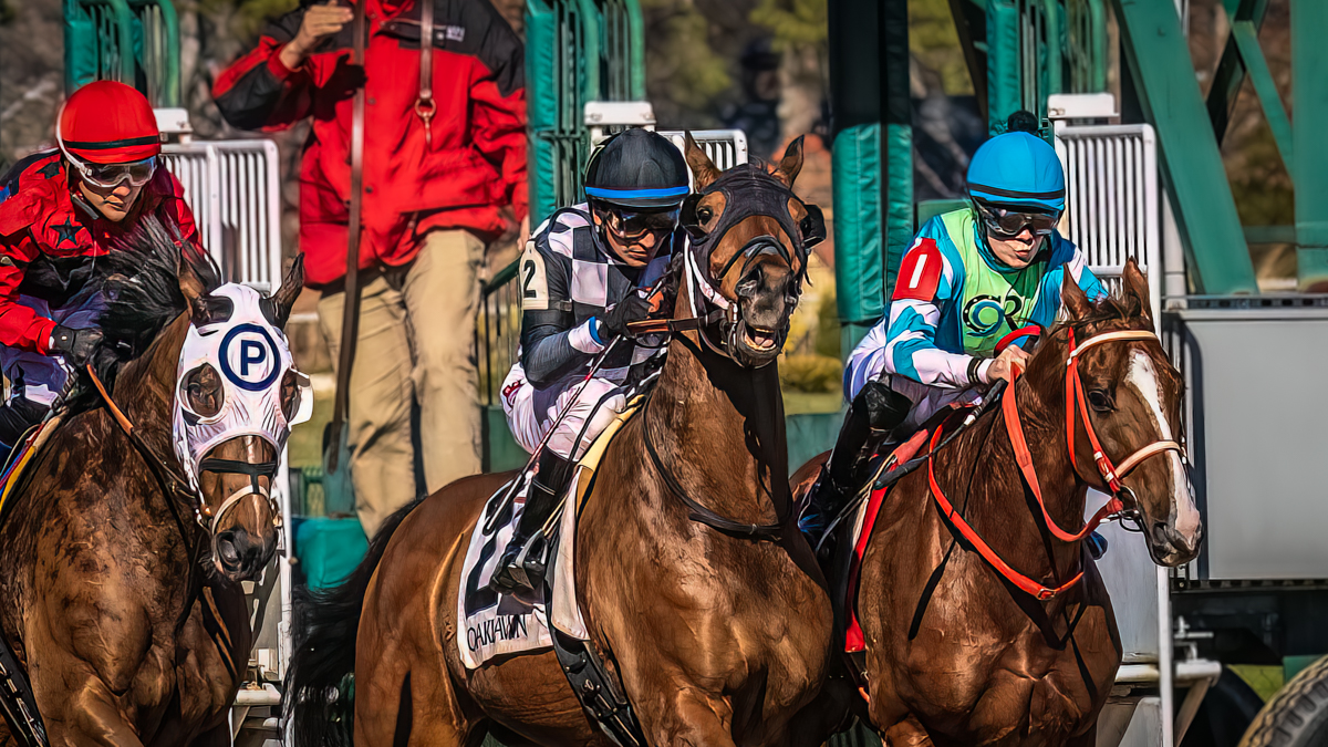
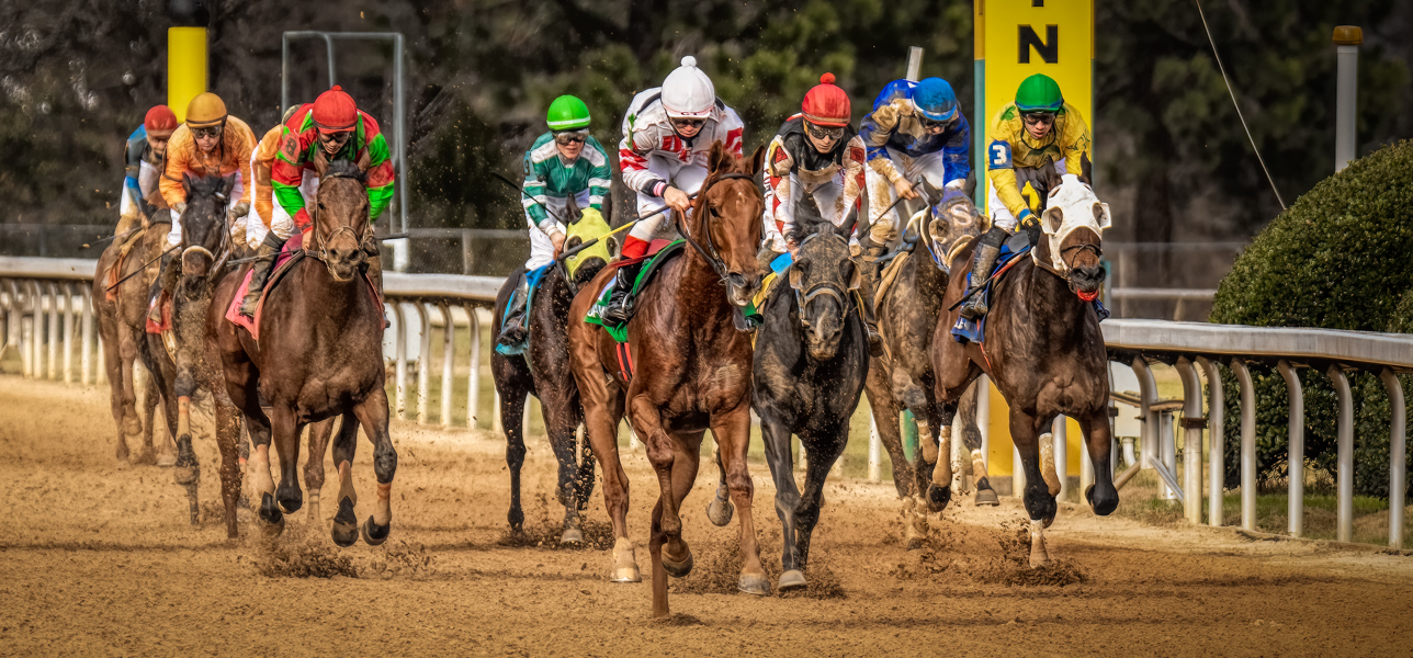
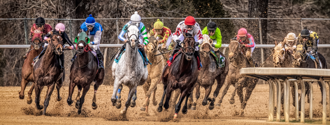
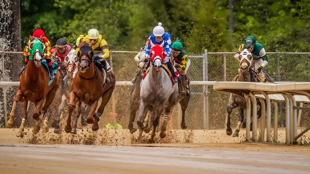
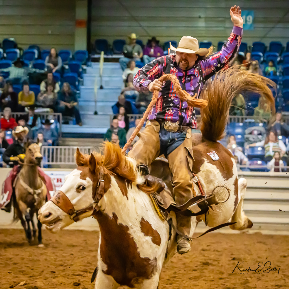
Thanks, Regine. To be honest, I only included the floating horse because I didn't want to cut off any of the #7 horse. Your crop can work but, for my taste, it doesn't leave enough room to the right for the horses to run into. To my eye there is a proportion of space that conveys the speed of the action when there is no panning blur. To me it's real but also will vary to the artist's taste. I find it interesting that the trailing horse is so distracting. I wanted the four leaders to be the story. In that respect, the image fails. Lots of ideas and suggestions make me better. I do appreciate it. |
Jun 15th |
| 38 |
Jun 22 |
Comment |
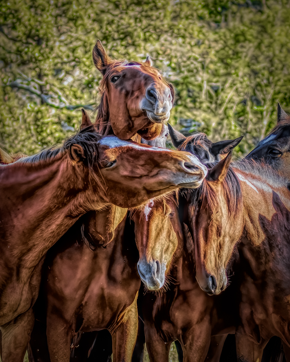
I've been watching You-Tube tutorials on ICM and am coming to the conclusion it's actually a little more difficult than just moving the camera around. That being said, I think you do a really nice job with this abstract style. There will come a time when I'll try this but it will be with a specific intent. Maybe I'll get hooked. Without any experience processing ICM images, I don't feel I can appropriately make suggestions or critique. I applaud your courage to try and establish a new technique. You seem to have a grasp of the process. Well done.
|
Jun 8th |
| 38 |
Jun 22 |
Comment |
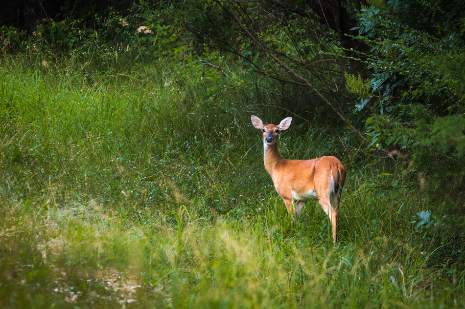
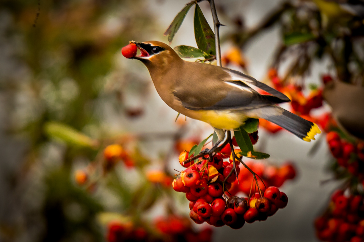
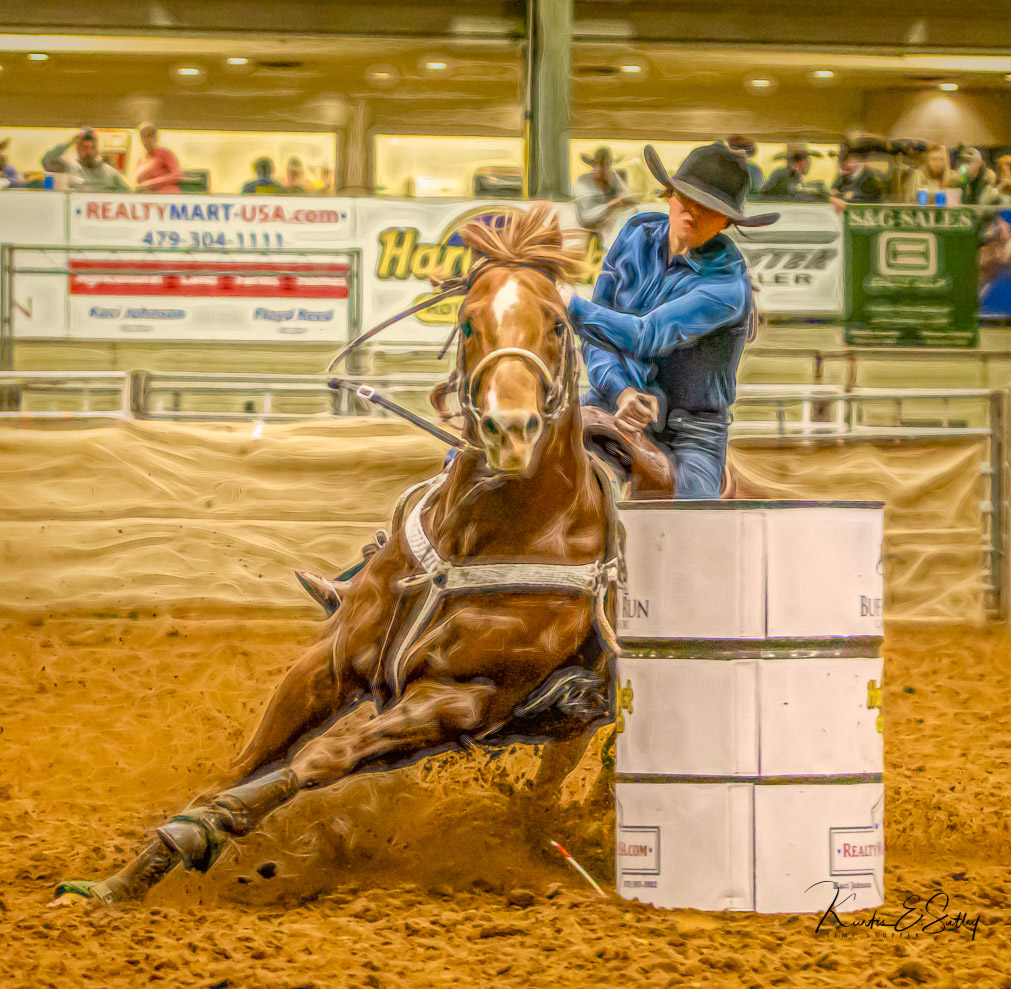
Regine, I think you did an excellent job in post. My only suggestion would be to crop a little more from the right. My personal rule-of-thumb is to leave at least twice as much room in front of my subject as I have behind. What this does is make me rethink the whole crop and just how important the space around my subject is to the image/story. There are times when more room is better. Really "fast" subjects usually need more space to move into. Of course, your intent/taste is more important than my rule-of-thumb. In my opinion you did a great job removing the leaf from in front of the subject. Very nice. |
Jun 8th |
 |
| 38 |
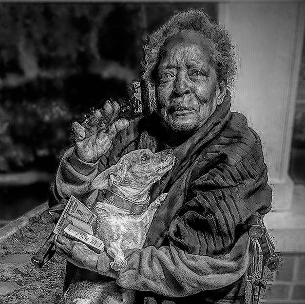
Jun 22 |
Comment |
What a powerful image. I think this is one of your best. Just to satisfy my own curiosity, I converted to monochrome using a Topaz Studio 2 filter. I cropped even more than you and reduced the highlights on the dog to balance the emotions. I also used the "select subject" mask and inverted it to slightly blur the background. There are always little things we can change on an image. We can play all day but in the end, this is a remarkably emotional image that tells a wonderful story. Wow! Just wow. |
Jun 7th |
 |
| 38 |
Jun 22 |
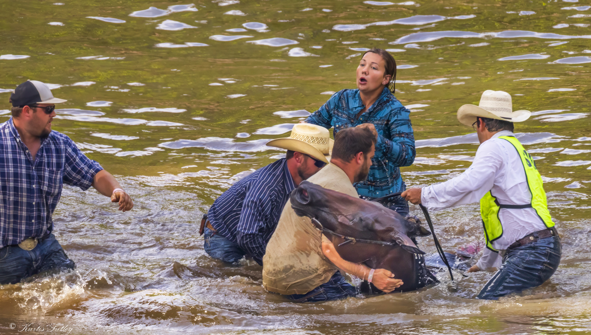
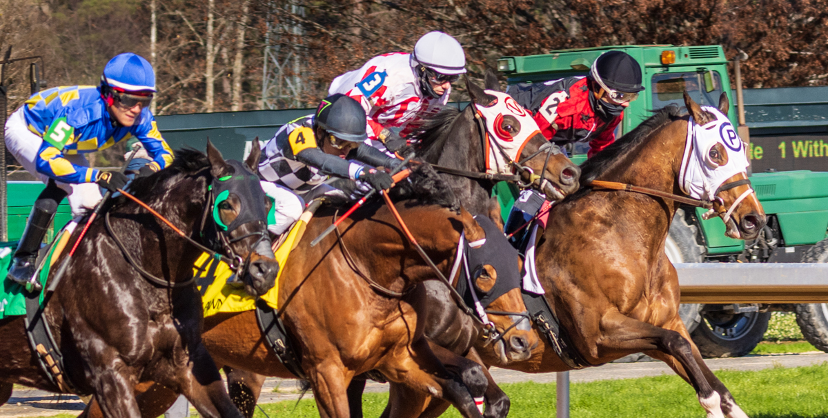
Reply |
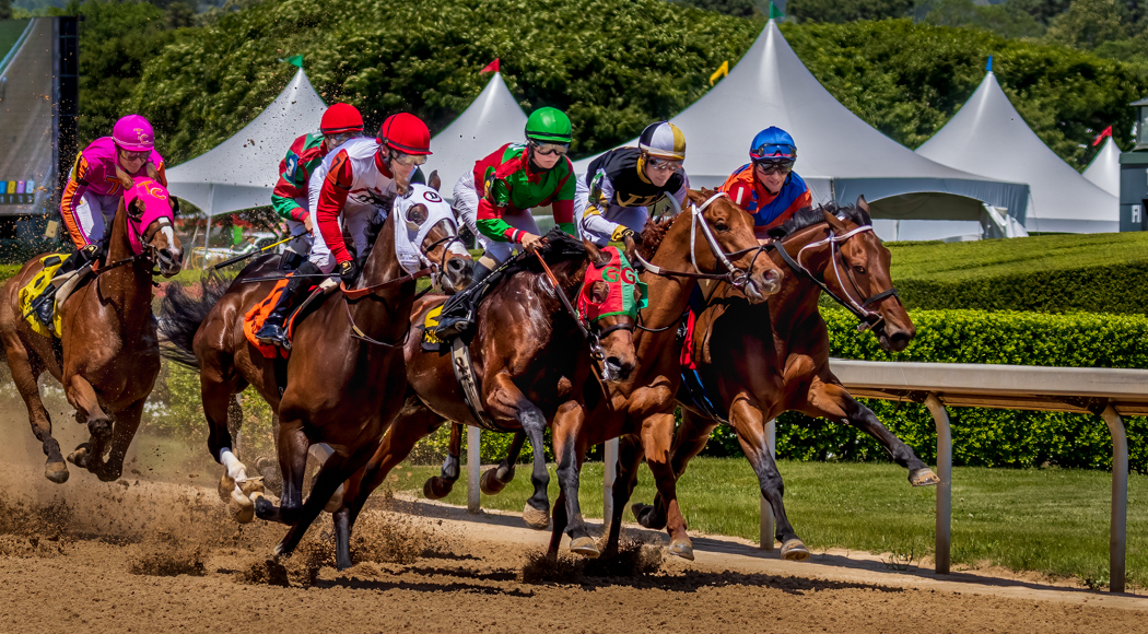
Art, horses run counter-clockwise in the U.S. Flipping definitely does not work. LOL If you were on the inside rail it might work except that would put the horses on the outside rail in the image. Toning down the saturation can work. |
Jun 6th |
| 38 |
Jun 22 |
Comment |
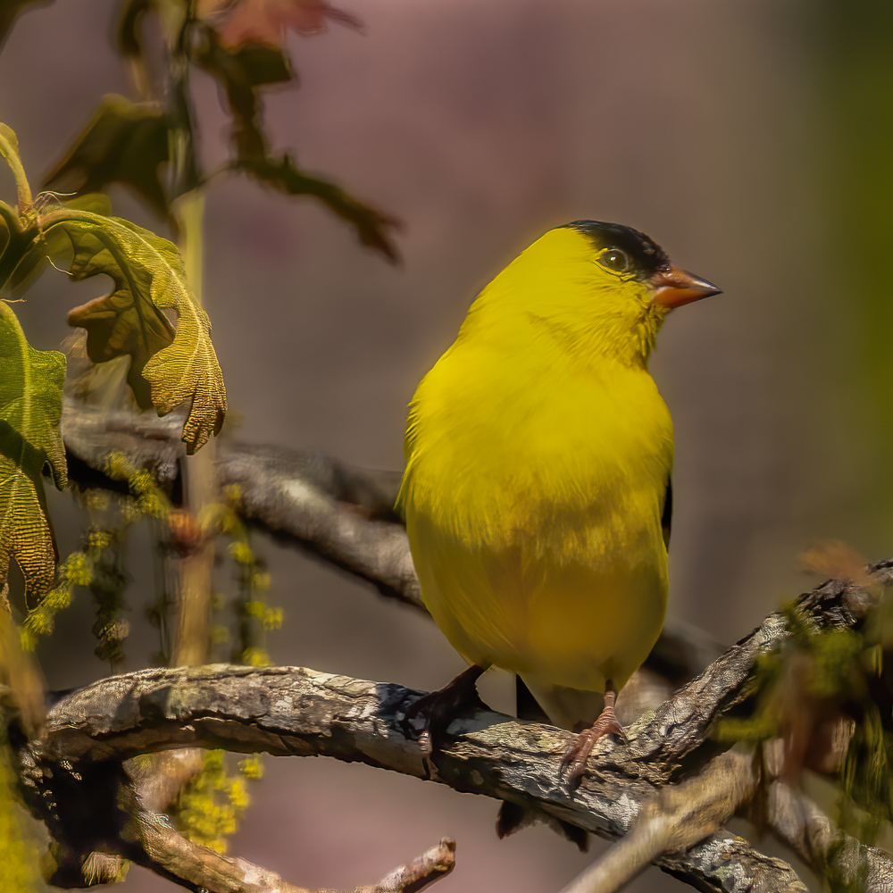
I like how you composed this image. I like how you put the subject on the right with it looking into the image. In my opinion that is so much more comfortable. I'm glad you were able to capture one eye. I left the crop as you had it but there is a case to be made for less distracting(?) background. I think the subject was a bit too dark for my taste so I reduced the shadows and darkened the background by selecting the "select subject" mask and then inverting. I also reduced saturation in the blue and added a relatively strong vignette. I ended by lightening the under-feathers and brightening the eye and beak to my taste. Overall, a very nice capture of a daytime owl. That doesn't happen often. |
Jun 5th |
 |
| 38 |
Jun 22 |
Comment |
I love this image. It caught my attention as soon as I saw it. I'm a sucker for reflections but to me this one is special. Printed and on your wall, it would bea great conversation starter. I find it nearly impossible to put into words what my minds eye is looking for. I really like the contrast of the bow of the boat to the water ripples. In my opinion the dominate blue is well complimented by the orange and vermillion reflections. To my eye it needed a slightly different crop. I also boosted the saturation of the orange reflection and added some luminance. I also added highlight to the blue interior of the bow. All that was done in Lightroom. It's not always easy to take an image where you want it to go. If you got close I would say you got it nearly perfect...for you. Isn't that what we strive for? Well done. |
Jun 1st |
 |
6 comments - 2 replies for Group 38
|
6 comments - 2 replies Total
|