|
| Group |
Round |
C/R |
Comment |
Date |
Image |
| 38 |
Mar 22 |
Reply |
Thanks, Marge. It was too much. I like the crop. |
Mar 29th |
| 38 |
Mar 22 |
Reply |
I really like how you interpreted the image. Very nice. |
Mar 29th |
| 38 |
Mar 22 |
Reply |
I do like it. I appreciate your comments and agree there was too much subject competition with my new sky. I think your more subtle sky and crop were just what the image needed. Thanks. |
Mar 22nd |
| 38 |
Mar 22 |
Reply |
I like how you made the image more relaxing. Thanks. |
Mar 16th |
| 38 |
Mar 22 |
Comment |
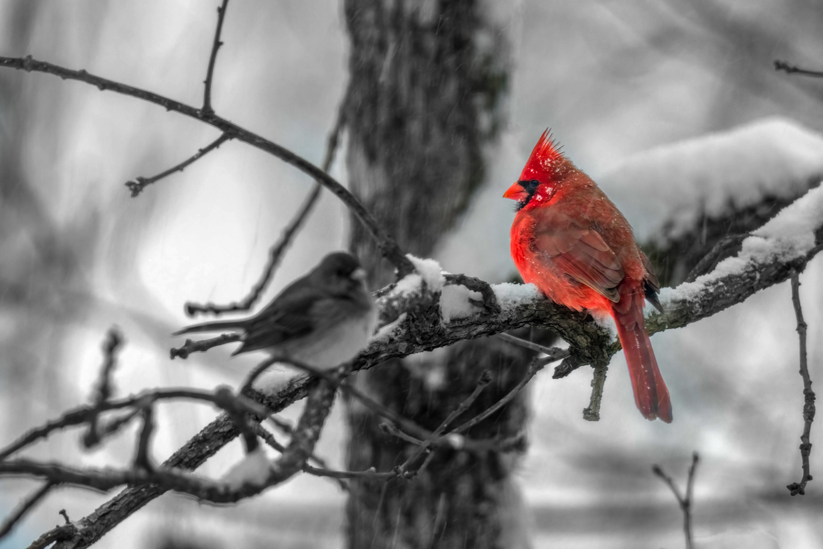
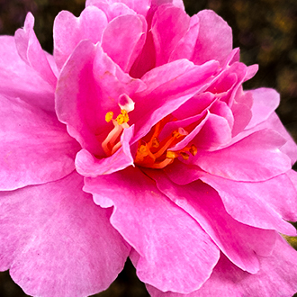
Sylvia, what a blessing to have such beauty in the winter time. I think you did it justice with your original processing but tried some different things anyway, because you asked. I did do a one-to-one crop. Just couldn't make up my mind which part I wanted to eliminate. I reduced the highlights, reduced the shadows, increased whites and increased blacks. I added clarity and contrast and used the Lightroom CC masking to darken the background. In the HSL panel I boosted orange and yellow and added orange luminance and reduced yellow luminance. I burned around the interior and further reduced highlights to take some glare off the edge of the petals. Honestly, I don't think I made much of a difference other than the crop. In my opinion you made a very nice image. Well done. |
Mar 15th |
 |
| 38 |
Mar 22 |
Comment |
How humorous and humbling to be having this discussion. When I first picked up a digital camera I was as "old school" as anyone. To me, the manipulations were not a measure of one's photographic skill as their computer skills. As I matured (I'd like to think) I came to think more and more like an artist with many brushes and less of a picture maker. My canvas became my RAW file. Do I still appreciate the pure photograph? I do even more. I appreciate that we all have our view of the world. I like my view but appreciate all artists who show me a different view...their view. And I cherish those contributions because I see in them...me. There are times I think I want to defend my point of view and then I remember, it's just MY point of view, NOT the right point of view. Every photographer is growing, learning and most importantly adjusting their own view of the world. We have a wonderful diverse group of artists and we all have something to contribute. Thank you all. |
Mar 15th |
| 38 |
Mar 22 |
Comment |
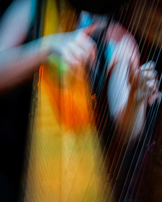
Art, I have yet to try ICM as an art form...no pun intended. So I treat it like I would if I was trying it for the first time. I'm learning a lot from your contributions. I like what you did with the colors. To me ICM should be less subtle. I see it as a subtle (but not too subtle) abstract style. As you can see I cropped it along vertical lines that I felt complimented the harp strings. The harp body inspired my tall portrait style. It also allowed more color. I erased the "u" shapes from the strings I felt were distracting. I boosted saturation, clarity, contrast and moved the tint out of magenta. All in all I have yet to pull the trigger on giving ICM a try. Hope springs eternal. Thanks for the inspiration. |
Mar 13th |
 |
| 38 |
Mar 22 |
Comment |
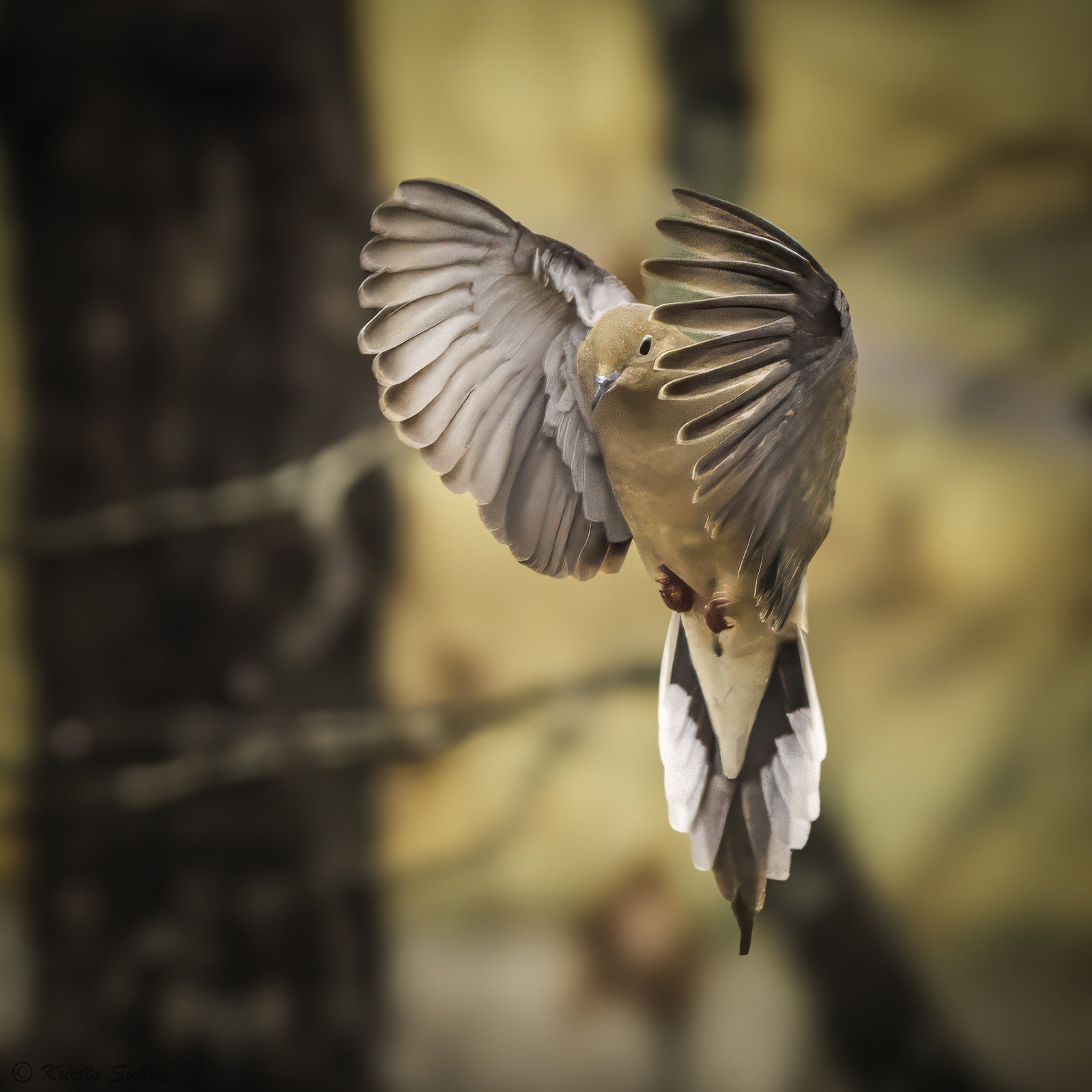
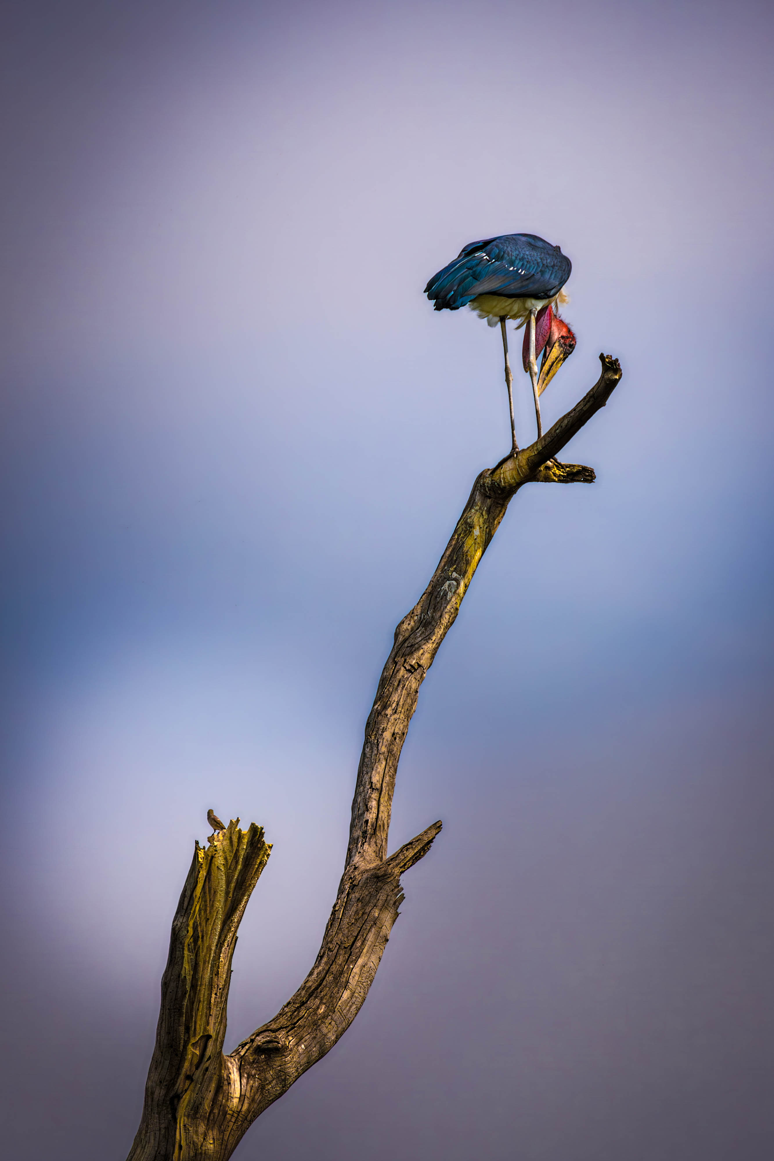
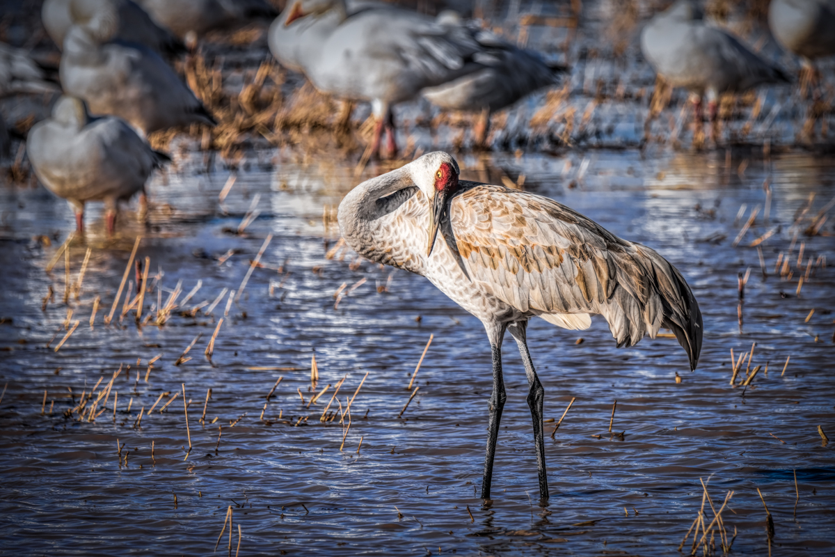
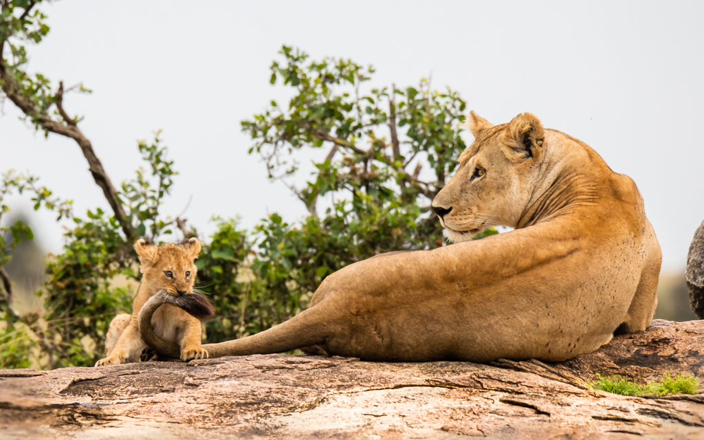
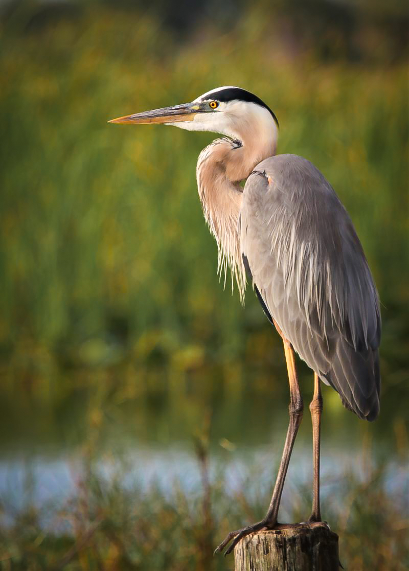
Marge, I think you have a beautiful iconic image of the great old fisherman. For me there was little to do to "make it mine". All my adjustments were done in Lightroom CC. The first think I did was crop off the jagged top that I felt added nothing to the Heron. I then added some exposure and went right to "detail" and added some sharpening. I reduced the green saturation to further highlight the heron and used an adjustment brush to eliminate a light glowing spot in front of the heron. I have found that if I need to reduce the harshness of a healing spot, I can use the texture and sharpen sliders to help blend the healed area. I then added a slight vignette and boosted vibrance and saturation just a bit to bring out a more blue tint. Either way, you have a beautiful wall hanger. Nicely done. |
Mar 10th |
 |
| 38 |
Mar 22 |
Reply |
This works for me too. Thanks. |
Mar 7th |
| 38 |
Mar 22 |
Reply |
I also like this. |
Mar 3rd |
| 38 |
Mar 22 |
Reply |
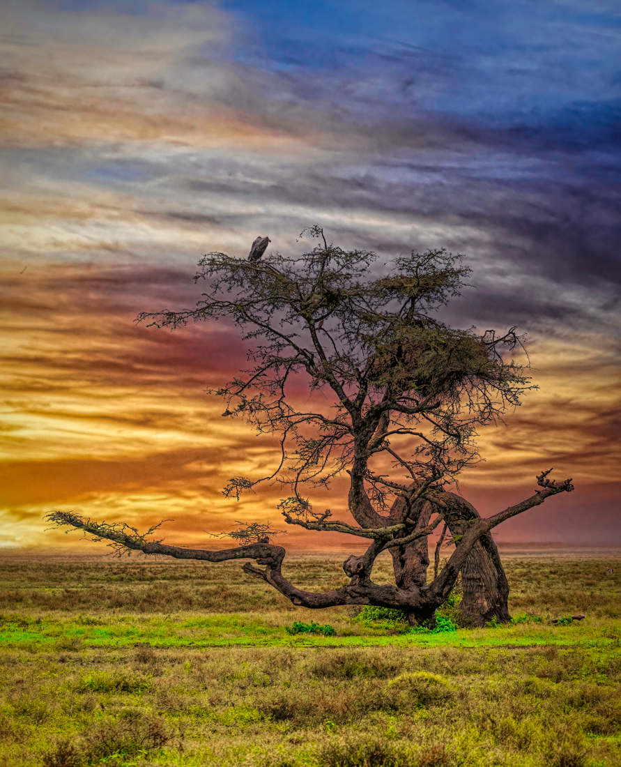
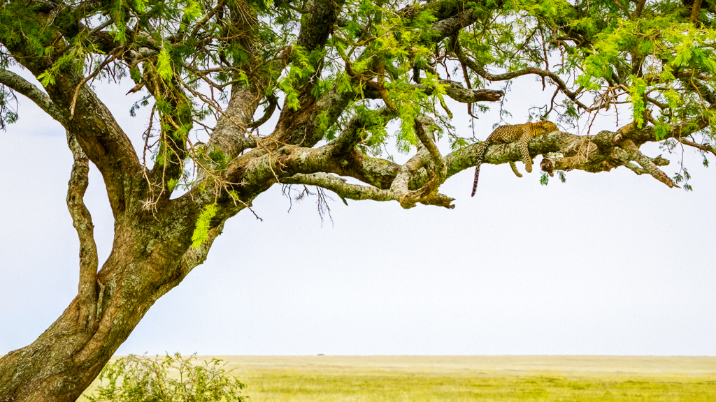
Really great comments and suggestions. As a matter of fact, I've done a mono silhouette of this tree and you're spot on about the different ways to skin this cat. Thanks. for the effort. |
Mar 2nd |
| 38 |
Mar 22 |
Comment |
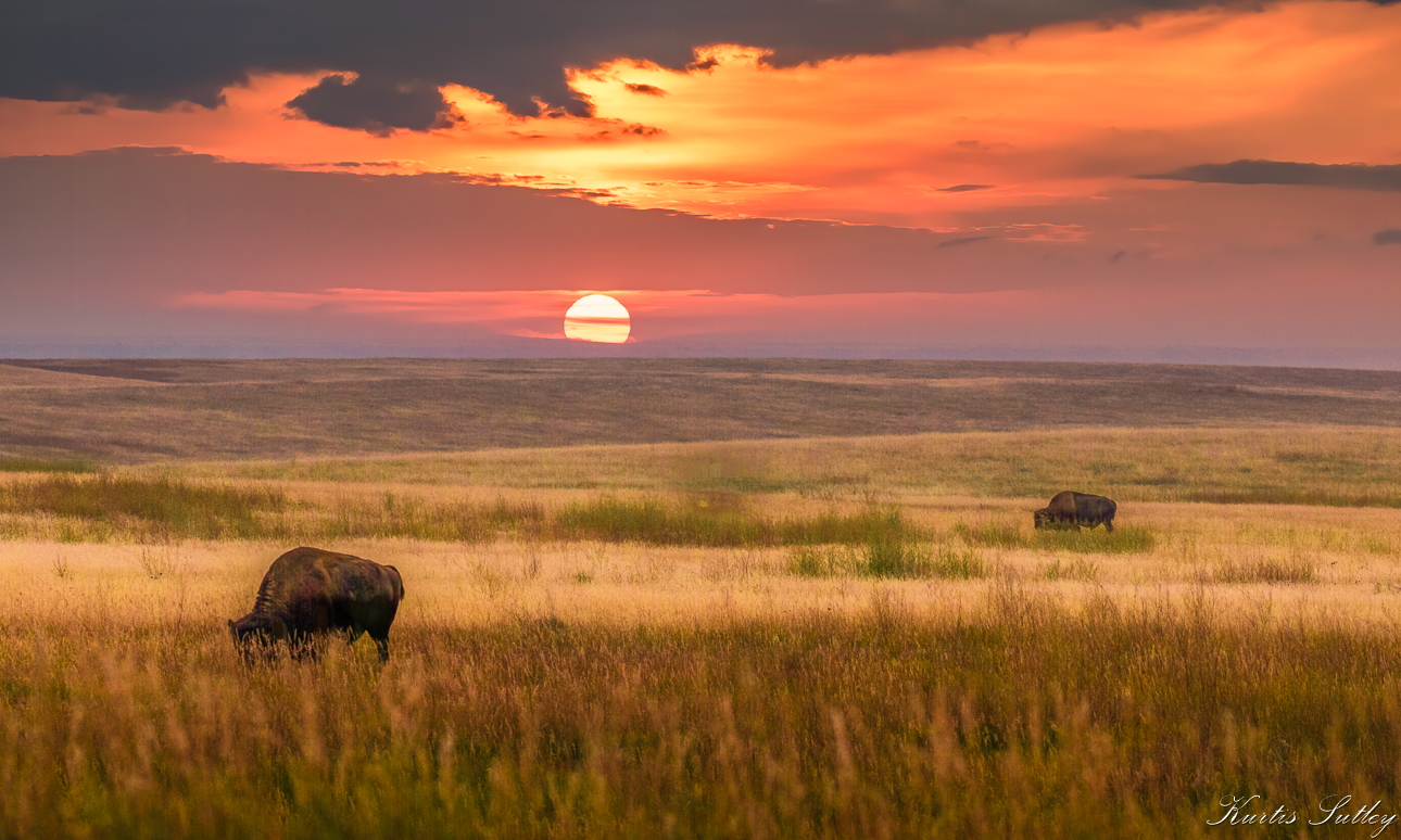
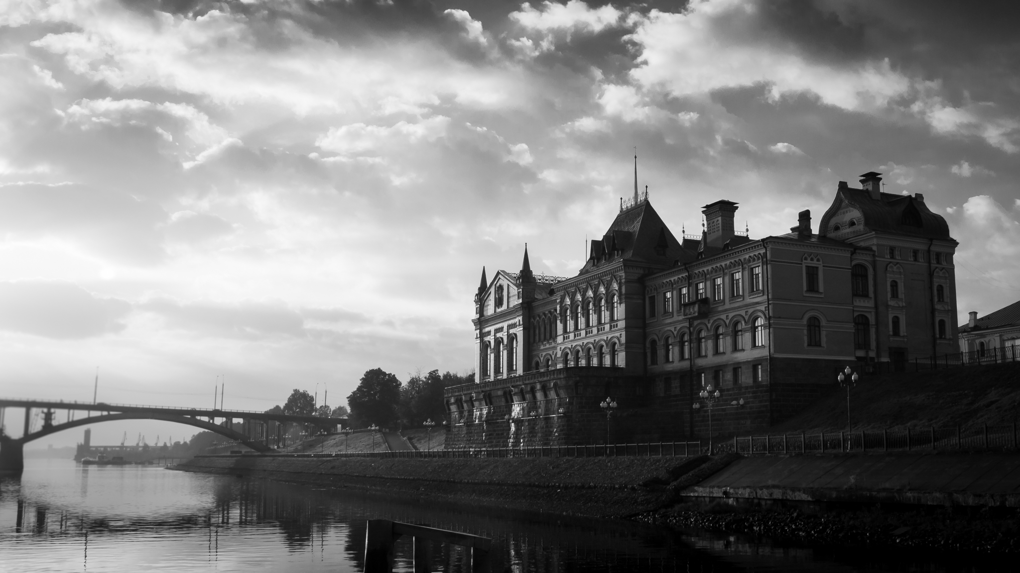
I'm with Regine on this one. I really like the layering. It has been said that luck is when opportunity meets preparation. You were very lucky. I find the difference in the cloud textures interesting. Were the distant clouds over water? Very nice. |
Mar 2nd |
| 38 |
Mar 22 |
Comment |
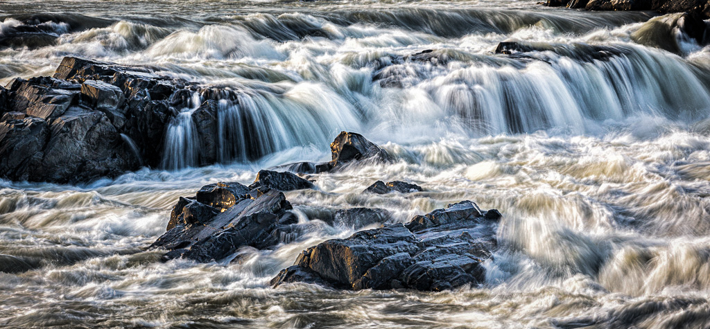
In my opinion you have an excellent example of one way to handle flowing water. The only adjustments I made was in the crop and some dodging and burning to brighten some of the water and rocks and darken areas near the edges. Very nice. |
Mar 2nd |
 |
6 comments - 7 replies for Group 38
|
6 comments - 7 replies Total
|