|
| Group |
Round |
C/R |
Comment |
Date |
Image |
| 38 |
Jan 22 |
Reply |
Thanks everyone for your candor and excellent suggestions. I learn so much from everyone. |
Jan 27th |
| 38 |
Jan 22 |
Comment |
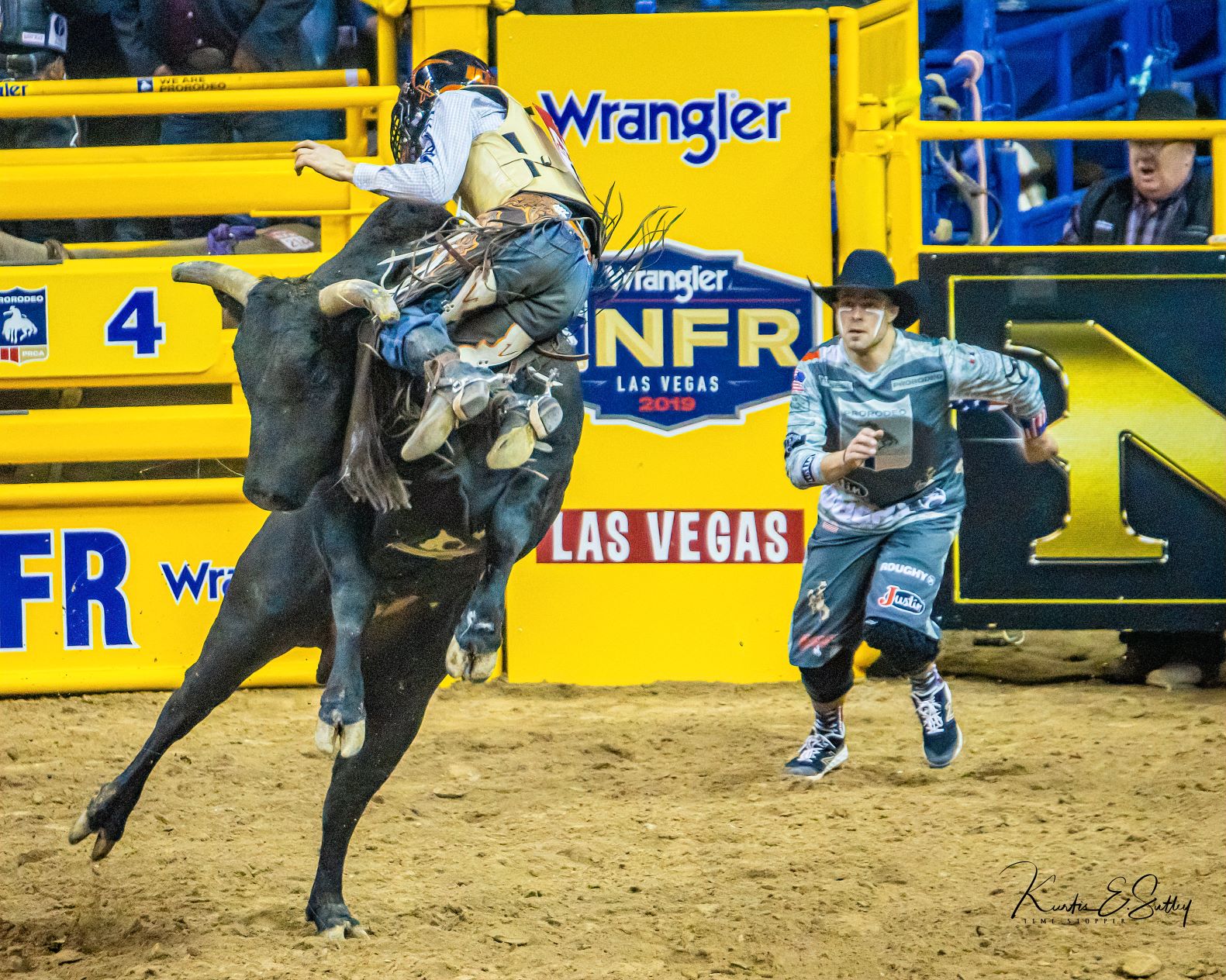
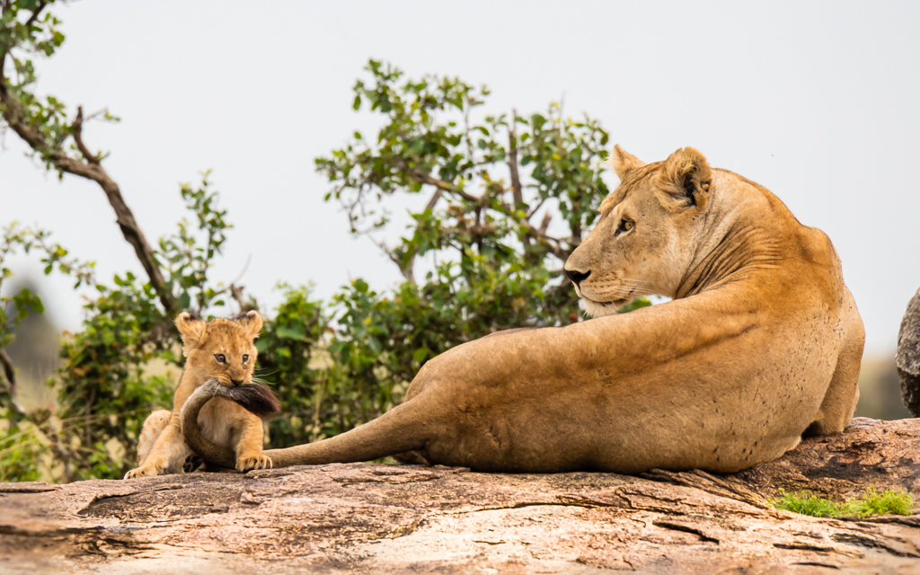
First I want to apologize for the late feedback. All of the other suggestions were really good so I took a road less traveled. As always, these are just tricks to put in your clue bag or throw away as you see fit. I like to put origins of leading lines in my corners if I can still balance the image. I really do like your use and inclusion of multiple leading lines in your image. I think your original composition was appropriate but as you can see from the feedback, everyone sees things differently. I burned the leading line next to your main subject and ignored the gate. I feel like if you can isolate your subject then the gate becomes less distracting (if at all). I also darkened the background on the right and dodged the shrubs and trees to keep my eyes occupied with the multiple leading lines. I did burn the far right walker to keep it from being a distraction. The one thing you might think about when photographing in a situation like this is to get directly behind your main subject so they are part of the vanishing lines. Great work and I look forward to next months contribution. |
Jan 26th |
 |
| 38 |
Jan 22 |
Comment |
To my eyes the colors and symmetry are stunning. I think you have captured a beautiful image. It does appear that the focus is a bit soft on Buddha but that may be a function of pixel count. My two suggested edits would be to reduce highlights slightly and I added a vignette using a radial mask in Lightroom to draw a little more attention to Buddha. Well done. |
Jan 14th |
 |
| 38 |
Jan 22 |
Comment |
I really do like what you were able to do with your image. To me monochrome is about contrast and light. In my opinion, by minimizing a relatively uninteresting sky, you brought my attention into the image with the brighter "s" pattern of the beach/shore. My one suggestion would be to maybe darken the outer waters to frame the cove. I love the painterly feel of the texture the Topaz software provided. I think that shows great imagination. Well done. |
Jan 7th |
| 38 |
Jan 22 |
Reply |
|
Jan 6th |
 |
| 38 |
Jan 22 |
Reply |
I would consider opening those shadows. Maybe I did overdo the burning of that bush (so to speak). |
Jan 5th |
| 38 |
Jan 22 |
Comment |
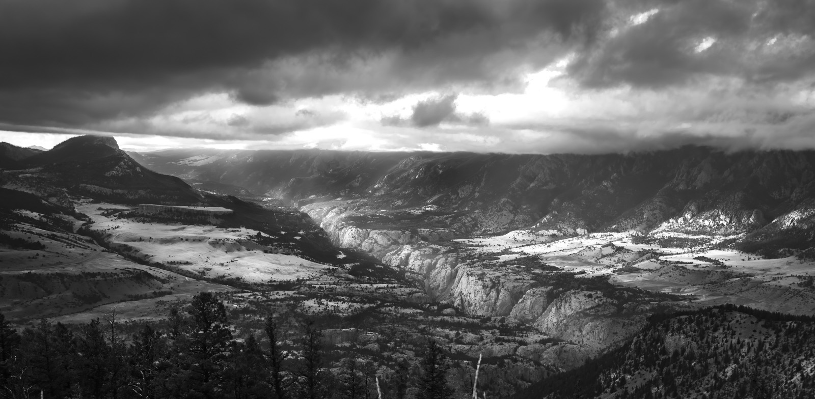
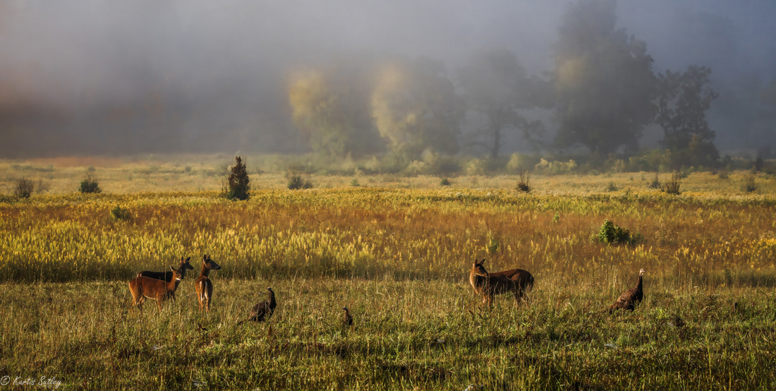
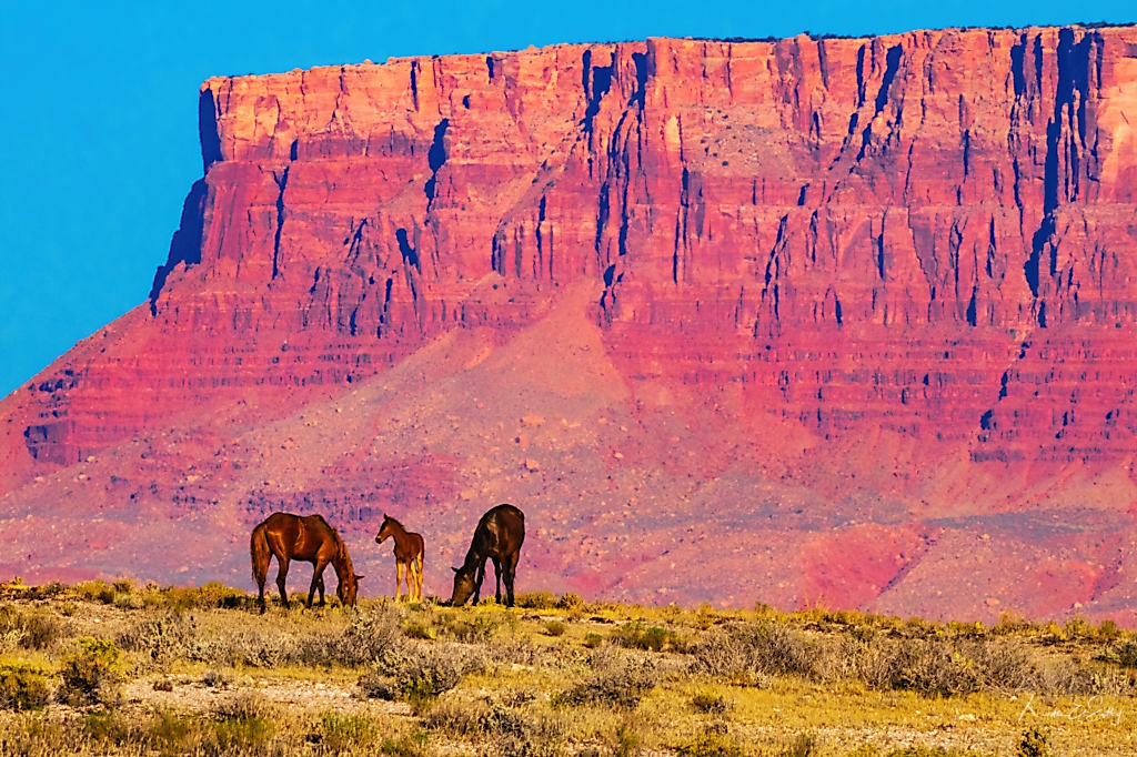
What a very nice landscape. I like the variety of layers crossing the horizon at different angles. The complimentary green and red coupled with the variety of textures is very soothing. Personally, I like the way you presented the sun and the shadows reflect the morning theme. The tonal layering is most probably a function of 16 bit verses 32 bit processing but to me it adds a little surreal quality. Very nice. |
Jan 5th |
| 38 |
Jan 22 |
Comment |
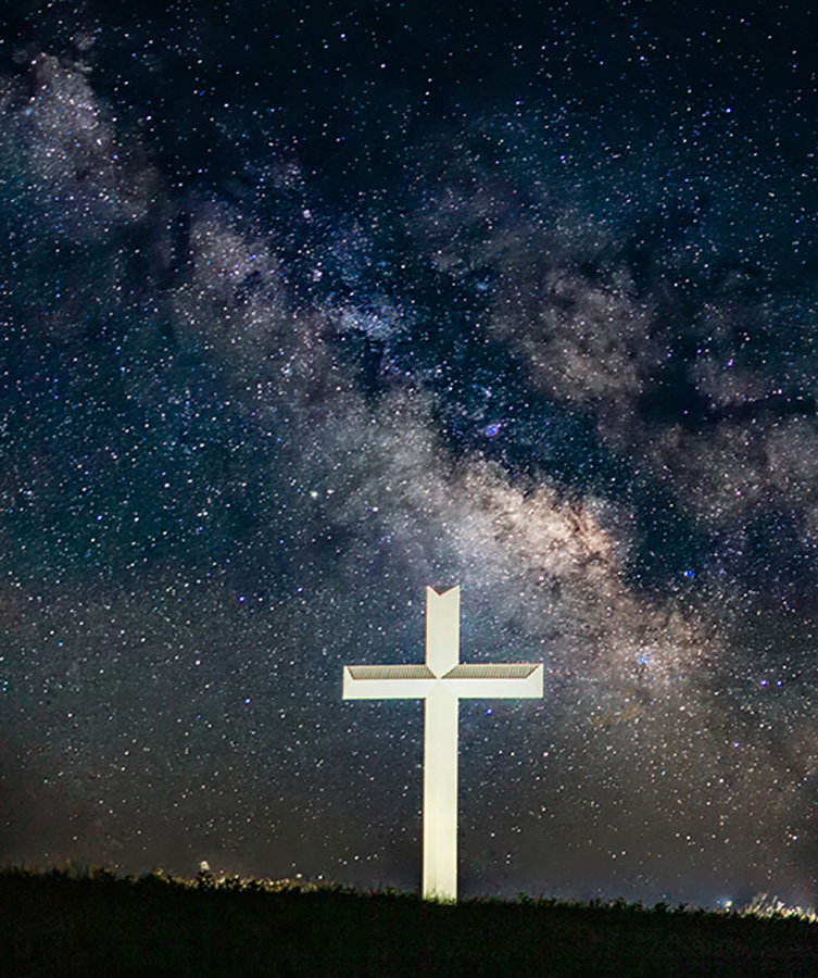
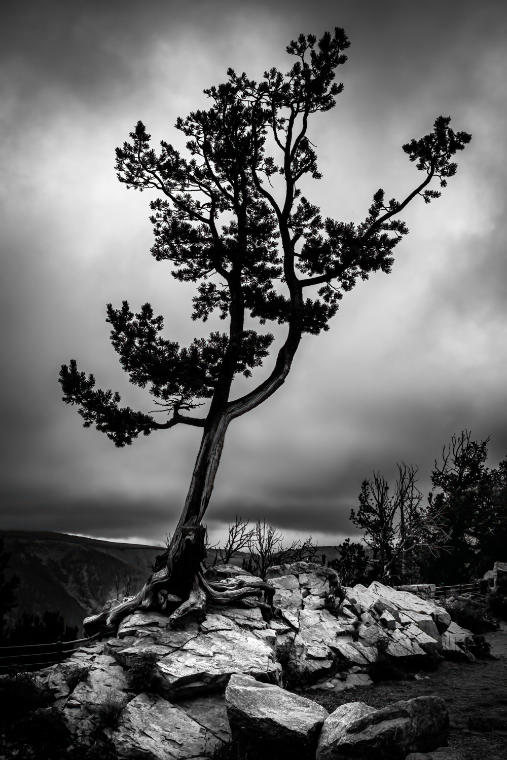
What a very nice example of framing within a frame. For me having only two dominate colors that compliment each other makes this image so soothing to my eyes. In my opinion there is balance and contrast with the tree's texture offering relief from the dramatic angles. To me your composition is just right. I like that you were able to line up all the central crosses to add symmetry and balance. I think, as artists, we "do" sometimes just because "we can". Very creative. |
Jan 5th |
| 38 |
Jan 22 |
Comment |
Regine, I think you did a bang-up job selecting an appropriate sky for your image. To my eye you nailed the exposure. It looks to me like your focus and depth of field is carried clear through to the clouds. Personally, I like your color because, to me, a cloudy sky will normally produce less vibrant colors. I agree with Gabriele, if you crop down from upper right and give the mast as much room as the keel, you can offset the main subject more to the right and give the image a better sense of motion. Very nice peaceful image that would fit nicely on the wall of a seafood restaurant or cottage. |
Jan 5th |
| 38 |
Jan 22 |
Comment |
I'm confused. Which is the original image? |
Jan 2nd |
7 comments - 3 replies for Group 38
|
| 48 |
Jan 22 |
Comment |
I think you did an excellent job with the crop. I like how you split the image with the diagonal accent white base of the stairs. To me the image balances the texture of the wood with the blank wall giving my eye a wonderful reference that emphasizes the wood. I think all this is possible because you have a well focused image with an appropriate depth of field. My only suggestion would be maybe a radial gradient from the upper left to darken that corner just a bit. You have a dark lower right corner that I think would add just a bit of drama with the upper left being a little darker. A very nice example of how texture, pattern and shapes work in a successful capture. Nicely done. |
Jan 8th |
1 comment - 0 replies for Group 48
|
| 62 |
Jan 22 |
Comment |
What a wonderful contrast of texture and shape. To my eyes your exposure and focus is spot on. To me you have achieved proportionality with a brighter feather balanced with a larger but less dominate stone. I think that all of the above begs for just a little less empty space above the feather. I would like to see an equal amount of space below and above the two primary objects of interest to carry that balance vertically through the image. Your work flow explanation cleared up a lot of questions but doesn't change my enthusiasm for a wonderful composition. |
Jan 5th |
1 comment - 0 replies for Group 62
|
9 comments - 3 replies Total
|