|
| Group |
Round |
C/R |
Comment |
Date |
Image |
| 38 |
Oct 21 |
Reply |
Now that's a piece of information worth waiting for. My bad. ROFL |
Oct 24th |
| 38 |
Oct 21 |
Comment |
I would first process the RAW file in the basic Lightroom panel. I would then "edit in" Topaz Studio using the full color version but would "Add look" of Dramatic Black and White and then reduce opacity to around 50% or where it looked like it still retained most of the grunge and enough color to boost saturation and adjust brightness in the "Add filter" panel using HSL Color Tuning. There are a couple of "Looks" in the ADD Look panel that have varying amounts of grunge and react differently to opacity adjustments. In fact, I created my own but Dramatic Black and White works for me too. After boosting saturation and adjusting luminance I accept it back into Lightroom for final processing which includes cropping and contrast adjustments. From there you can add a vignette or dodge and burn as required. Hope this helps. One last item: In my work flow I DeNoise using Topaz DeNoise AI before taking the image into Studio. For me a noisy image generates too much grunge...but that's just me. |
Oct 19th |
| 38 |
Oct 21 |
Reply |
Don't know where you looked but my image is correct. I was there. Just to my left was the Synagogue. I'm at one of two western entrances where the military enter for their parades. Sorry. |
Oct 17th |
| 38 |
Oct 21 |
Comment |
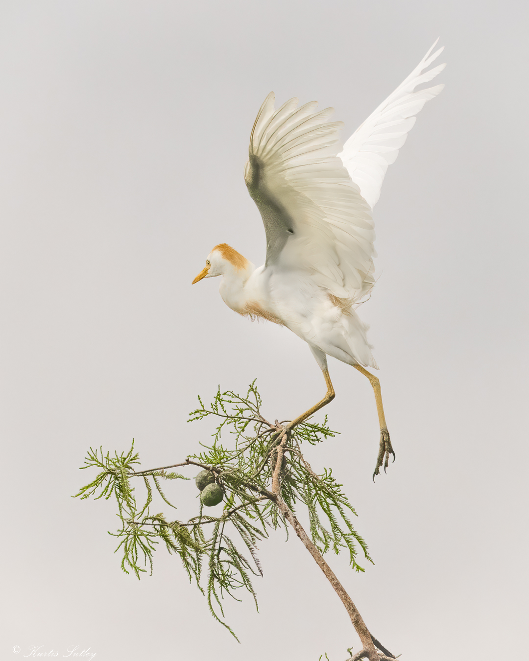
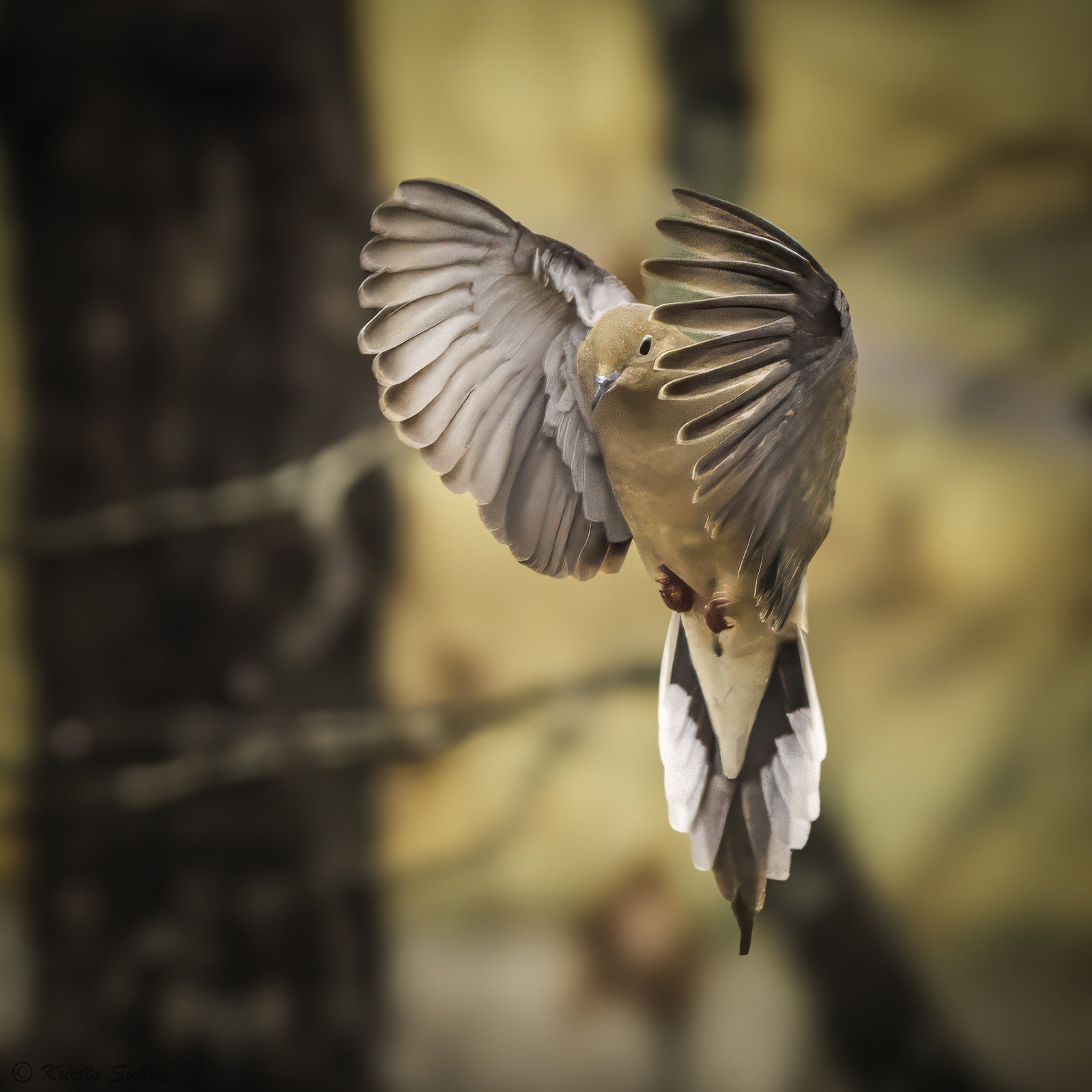
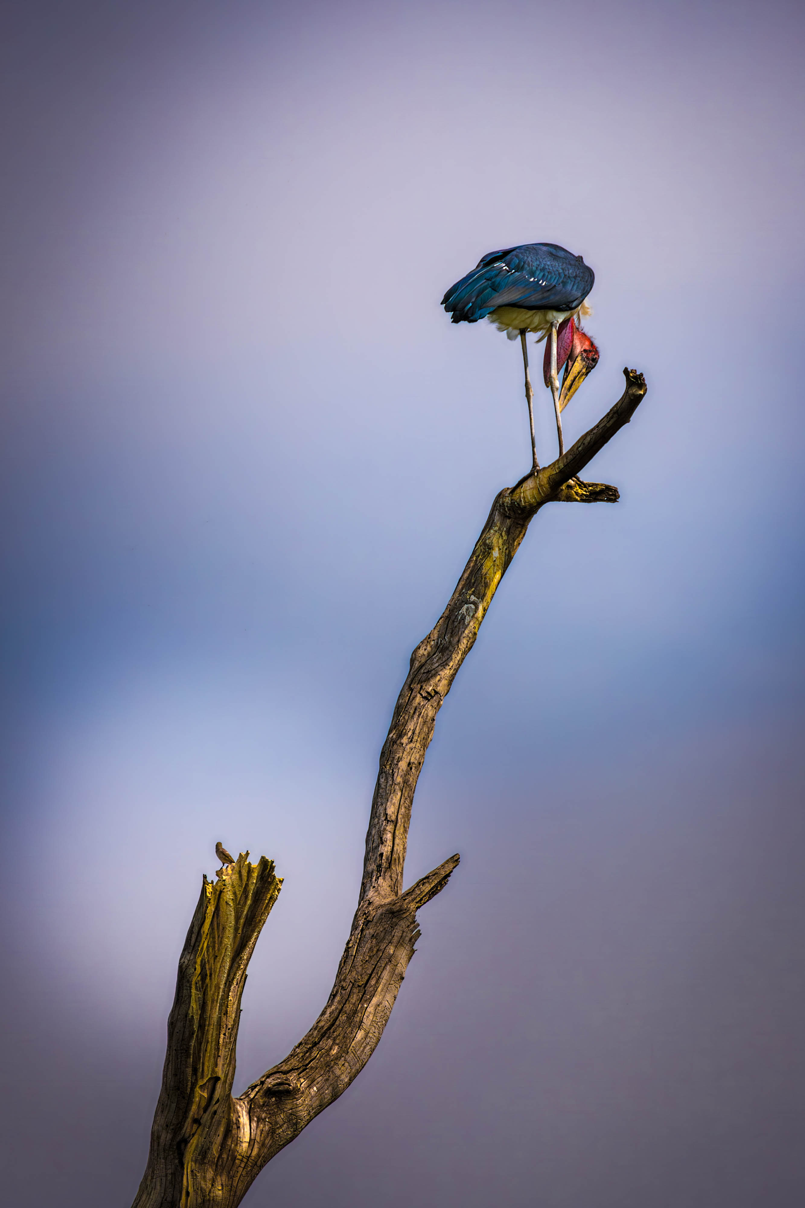
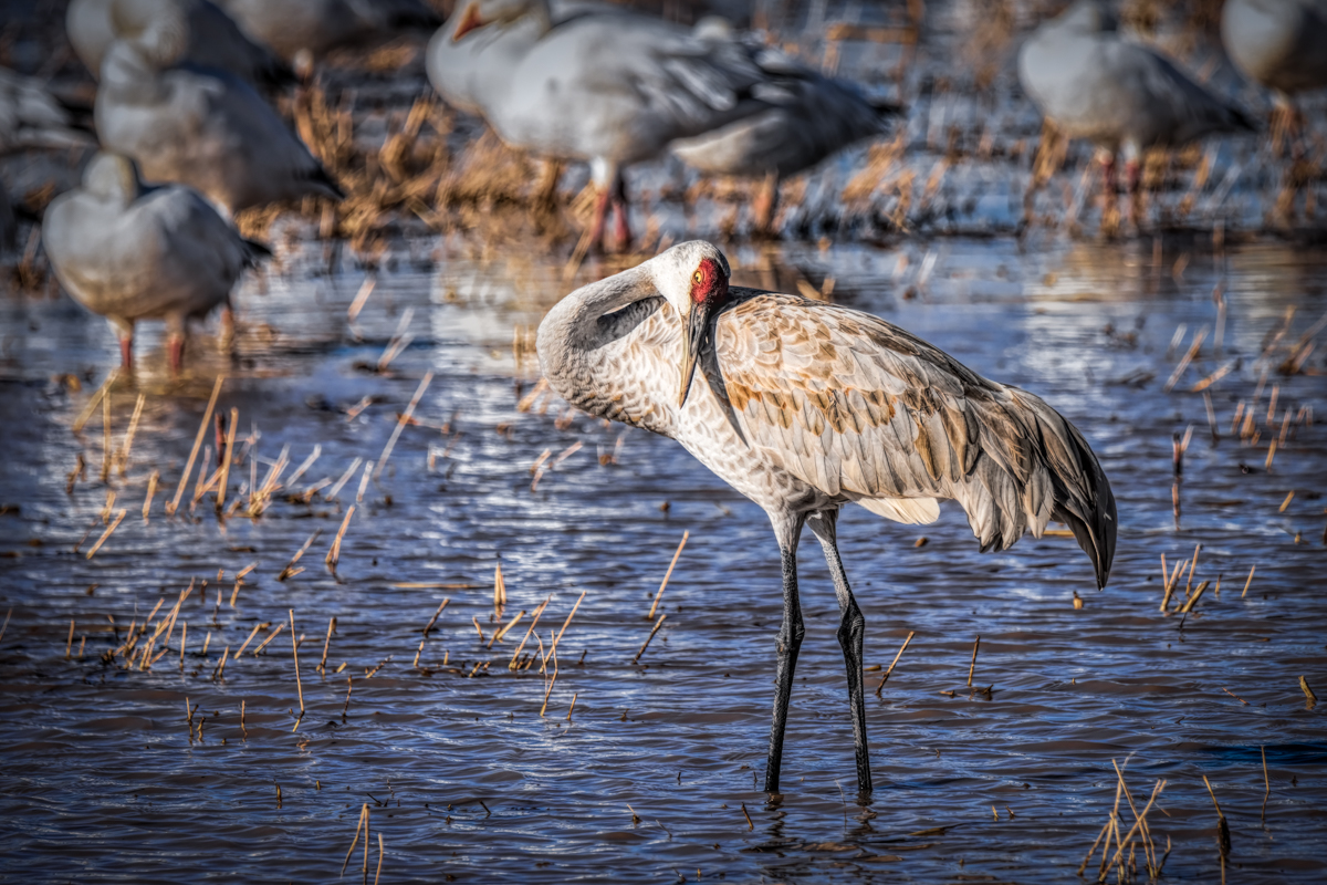
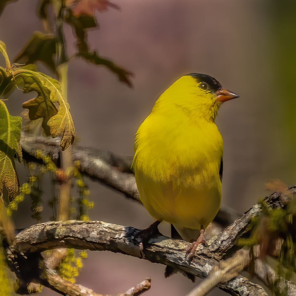
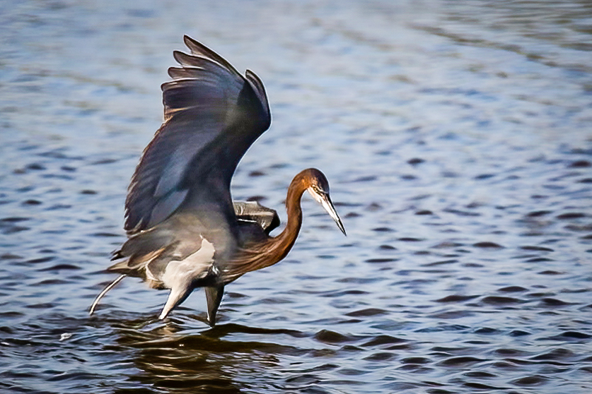
In my opinion this is not a bad picture, it's just not a particularly compelling one. I think you probably needed to be using spot metering with the focus point in the center with the metering point. I think you were probably going to crop it anyway so centering the subject was okay. As Scott Kelby might say, "It is a bird pooping in the water." One of the first things I did was reduce the shadows in Lightroom and then, using Topaz DeNoise AI, reduced the noise. Normally I'd do that before cropping. I think your image is sharp enough to work with but with the smaller file size and lack of pixels, it's hard to tell just how much was in the original image. Once I had the image back in Lightroom, I used the paint brush to further reduce the shadows under the wing and boosted contrast. I then further cropped to move the subject a little further left in frame. One last piece of useless info (sort of): This bird is preparing to leave. These birds will poop just before pushing off for flight. It is an interesting study of bird behavior. |
Oct 13th |
 |
| 38 |
Oct 21 |
Reply |
I did use the brush tool (in Lightroom) and moved the highlight slider all the way to the left and then duplicated it. |
Oct 11th |
| 38 |
Oct 21 |
Comment |
I like this photo. I like the balance of dark to light areas and how the leaves are highlighted on the edges. I think your focus and depth of field are spot on if the subject is the plant. For me there is too much bright area in the upper right that keeps drawing my attention there. I don't think all the extra foliage lower right contributes to the image. So, I cropped the right side. Boosted luminance and saturation of the leaves and added a radial filter vignette upper left and lower right. With the crop I think the balance is maintained with the plant diagonally dividing the image equally. I also saturated the blue background and reduced luminance. I think that helps isolate the plant for my attention. I also toned down the brightness of the lights in the bokeh. All that being said, I think you have a very nice capture that demonstrates simplicity and beauty with one click of the shutter. Very nice. |
Oct 11th |
 |
| 38 |
Oct 21 |
Comment |
Once again you have created a work of art I would never presume to change. I love the textures and the subtle colors of the floor. I think the blending of light leads my eyes through the image. For me the simplicity is the secret to a stunning image that allows the viewer to instantly imagine a story without being pushed to any particular conclusion. Thank you for your contribution. It just occurred to me that the thing I love about your craft is that you create the world you photograph. You don't just photograph the world. More of our world needs to be introduced to the world you create. |
Oct 10th |
| 38 |
Oct 21 |
Reply |
Thank you for your encouraging words.
|
Oct 10th |
| 38 |
Oct 21 |
Reply |
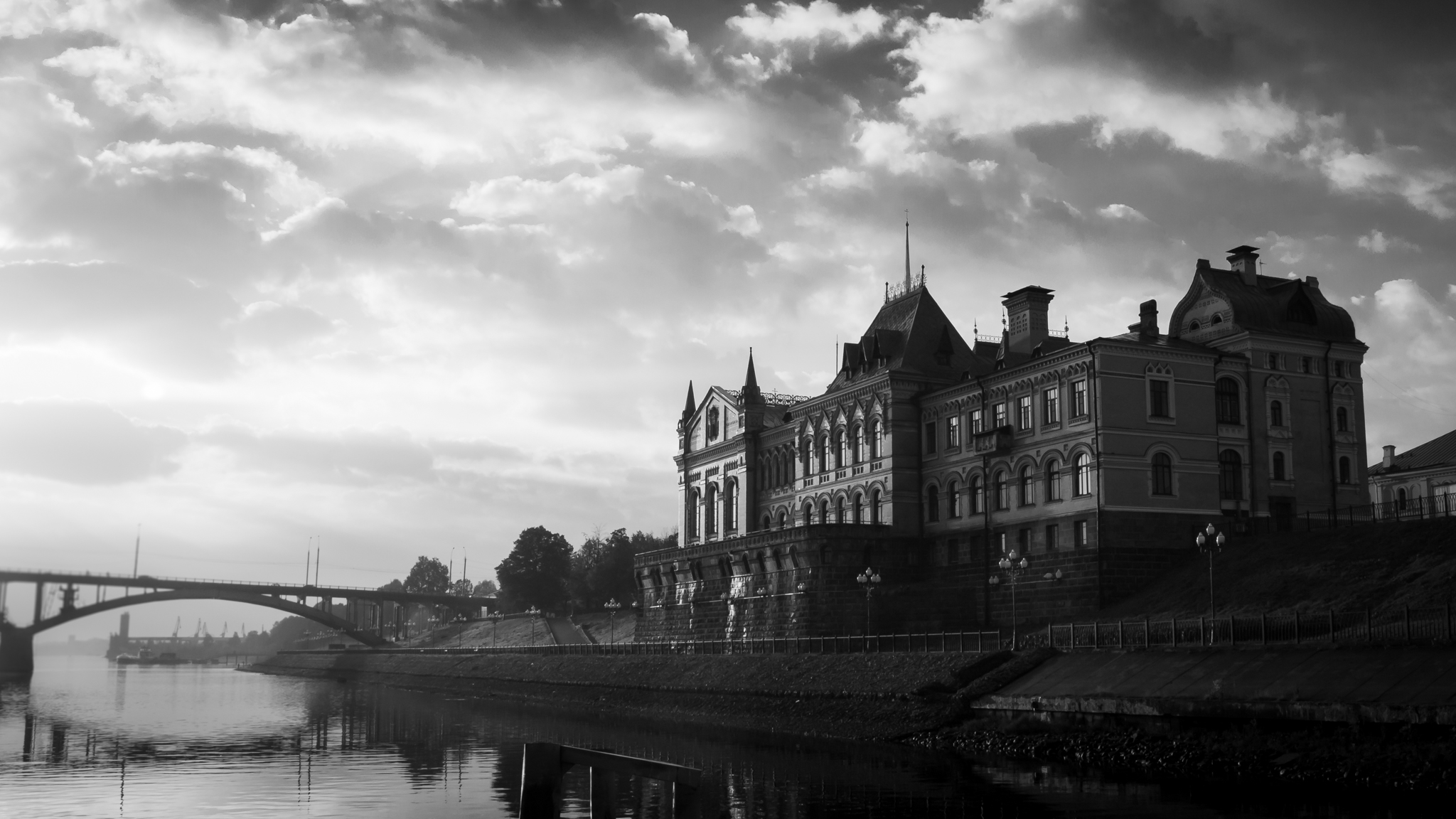
I like what you did. Another option might be to desaturate all the buildings but the central cathedral. Side note/class: What you changed was Saint Basil's Cathedral. It's a Russian Orthodox cathedral. The Kremlin (part of it) is the large wall and watch tower behind Lenin's tomb to the right. Most people associate the cathedral with the Kremlin but in reality "kremlin" is just their word for "fort". |
Oct 4th |
| 38 |
Oct 21 |
Reply |
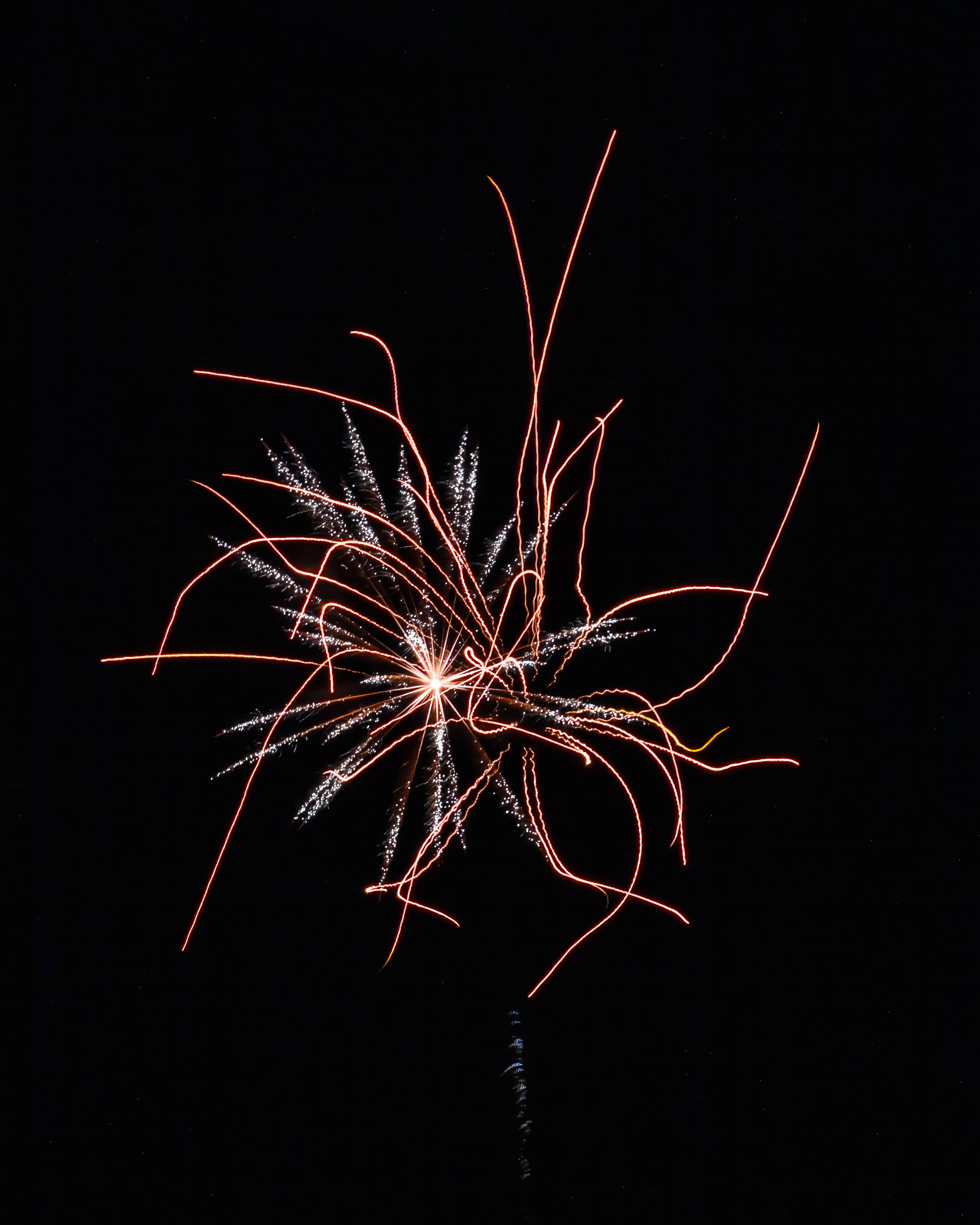
I really like this better. It is more in the "abstract" vein but I really like the colors. Like I said, I'm not a deliberate camera movement guy, yet. I think there is a happy median where the subject is recognizable but the camera movement helps to convey the spirit of the action. It's all in the eye of the beholder and the eye/intent of the maker and they won't always match up. |
Oct 4th |
| 38 |
Oct 21 |
Comment |
I think you've done a really good job integrating camera movement into your creative style. It's been said that if you're going to crop or cut off part of someone's body, you should make it look like you meant to. In my opinion a corollary would be to make the camera movement look deliberate. For me there isn't enough specific movement in this image. The subject isn't in focus and to me the only "movement" appears to be a minor "zoom" effect behind the dancer. I'm not a "deliberate camera movement" kind of guy so I may be all wet. I would like to see more movement and more vibrant colors. I know you're a really good photographer and I applaud your courage putting yourself out there with this new technique. Keep up the good work. JMHO |
Oct 3rd |
| 38 |
Oct 21 |
Comment |
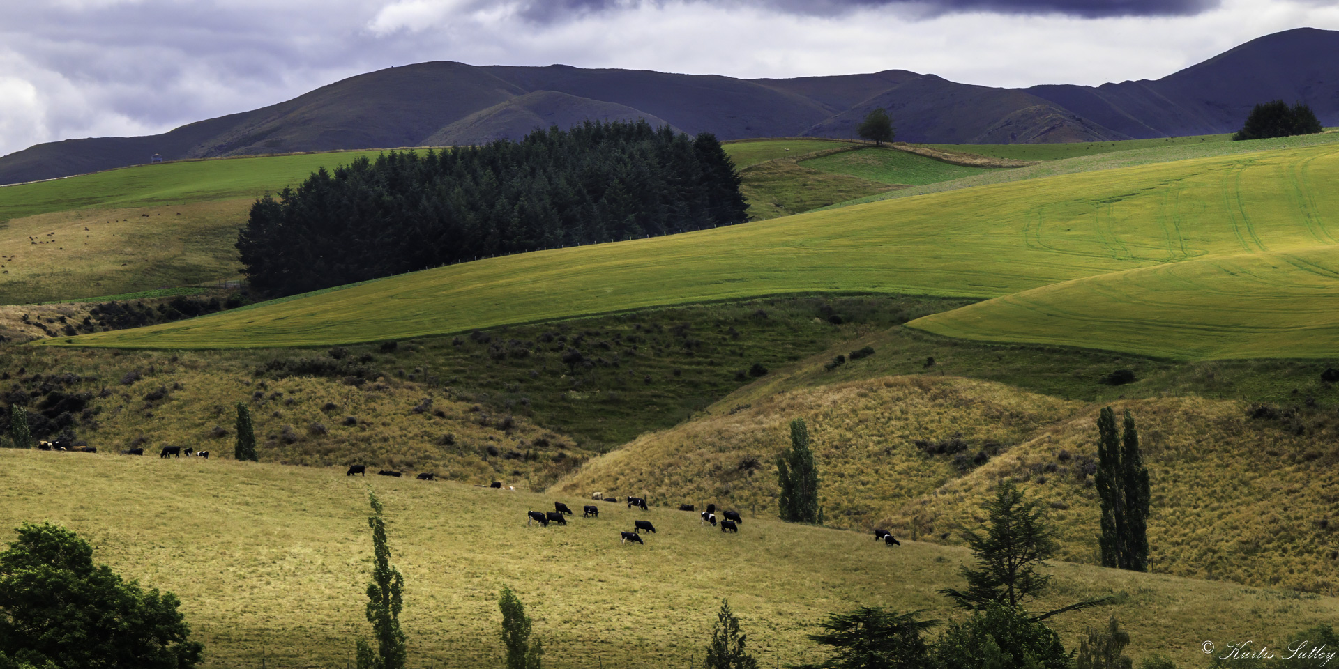
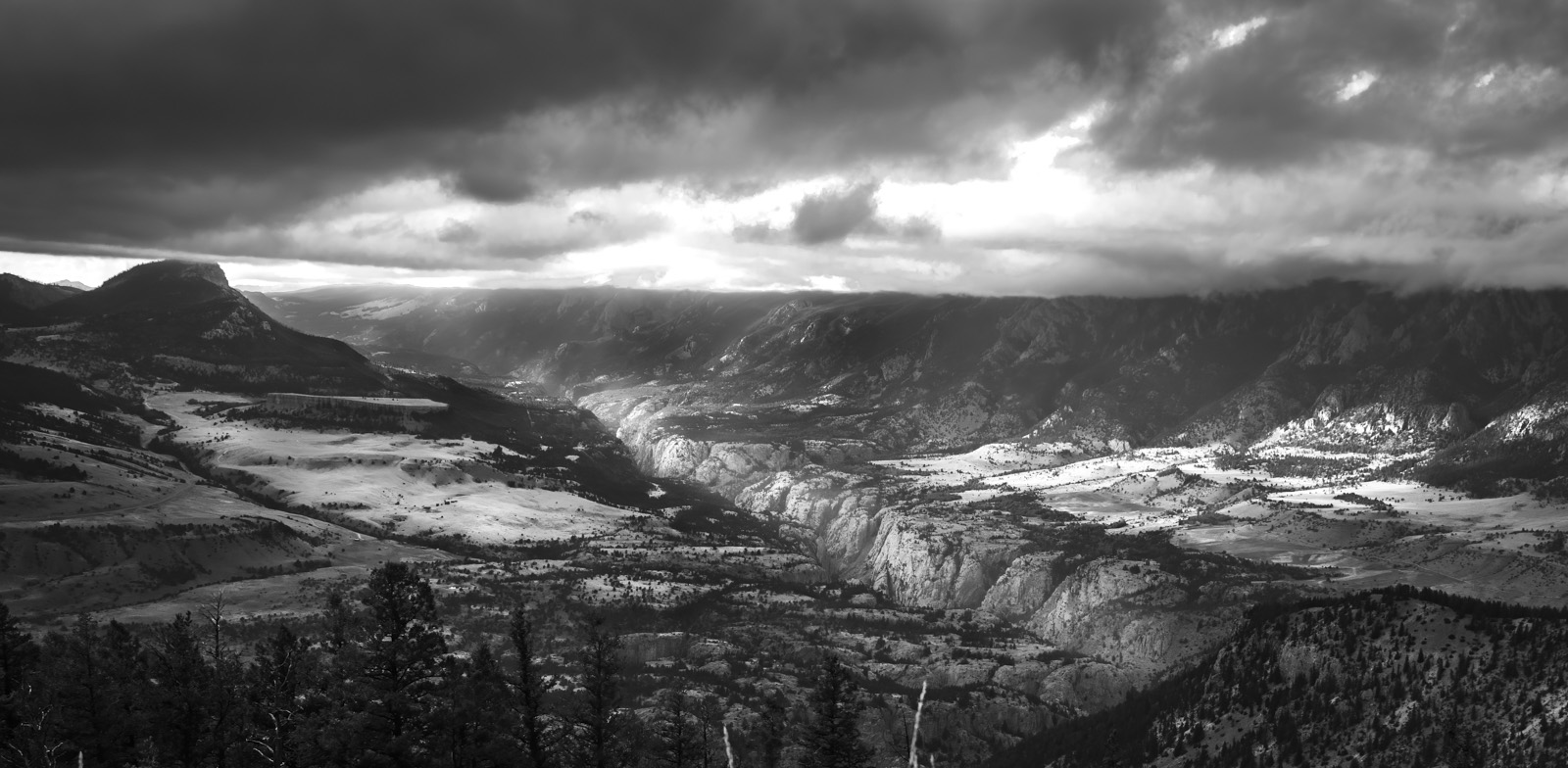
I love these grand panoramic type of images. There is so much here for my eyes to like. I like the layers of the countryside. I love the transitions of green and blue of the horizon. To me the calming pattern and texture of the vineyards soothes my mind. I find the work roads guide my eyes to the center structure I can only assume is the vineyard operation. There is a challenge to present enough of the foreground vines so as to clarify the subject and story. In my opinion the midground is sufficient so you can crop about two-thirds of the foreground and not compromise the image. I also think a graduated filter using the dehaze slider could sharpen up the horizon and better define where the horizon ends and the sky begins. For sure it makes me want to be there. Nicely done. |
Oct 1st |
6 comments - 6 replies for Group 38
|
| 48 |
Oct 21 |
Comment |
I think this is a really nice study of complimenting colors of blue and Vermillion. I like the irregular cloud pattern contrasted with the geometrics of the dock. For me what really sets this image apart from similar ones is the pattern of alternating light and dark layers. I think you added just the perfect subtle foreground elements to anchor your image. In my opinion the addition of just a very slight vignette (maybe as little as -11 in the effects panel of Lightroom) would really make this image pop. As is, you have a beautiful long exposure worthy of it's own place on someone's wall. Nicely done. |
Oct 2nd |
1 comment - 0 replies for Group 48
|
7 comments - 6 replies Total
|