|
| Group |
Round |
C/R |
Comment |
Date |
Image |
| 38 |
Jul 21 |
Reply |
Thanks. The Canon 100-400mm L lens did its job. There are times when equipment does matter. |
Jul 28th |
| 38 |
Jul 21 |
Comment |
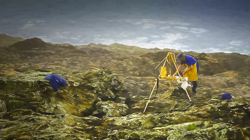
This is the Topaz Studio version. Your image really got me excited. Thanks. |
Jul 9th |
 |
| 38 |
Jul 21 |
Comment |
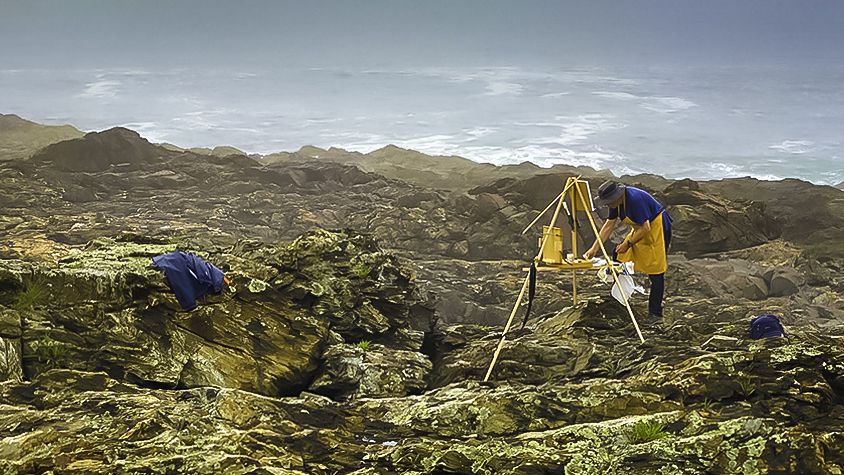
I love this image. There is so much going on and the story is compelling. I like the textures and shapes with the complimenting colors. To me your post processing works very well but given the situation, I would tone down the saturation a bit of the foreground and work to use the sea mist as a frame and mood device. I like your crop and in my opinion your depth of field works well. I did use a graduated filter to bring down the exposure of the distant sea and also removed some texture to blend in the fading distant water. One thing you can grab, this image has multiple postprocessing options and, in advance of other ideas, I think yours is completely competent. Very nice image and will post a version using Topaz Studio II using a paint brush filter. This first one is how I say the image |
Jul 9th |
 |
| 38 |
Jul 21 |
Comment |
A really interesting image. I've been watching other artists working with intentional camera movement. There is a certain uneasiness about the mouth being just about the only point not blurred. I really like the colors and how they all guide my eyes into the image. You were spot on to flip the image. I don't know why but it works for me too. The more I return to this image the more I like it. I think its the lines and textures that have me captured. Well done. |
Jul 5th |
| 38 |
Jul 21 |
Comment |
Interesting combination of lines and shapes. I like the contrast of the geometric boat and the smooth rounded edges of the iceberg. A study in shades of blue that's virtually unavoidable in that part of the world. I like the composition. I'm with Art in cropping off a little from the left. It still leaves one excursion boat to add scale. Wish I was there. Nicely done. |
Jul 5th |
| 38 |
Jul 21 |
Comment |
I have no idea where you get your ideas but your imagination and execution makes me jealous. I'm more of a photo-journalist so artwork like this amazes me. I love your use of texture, color and shapes. If there's not a shape there is color and it all works wonders to balance a very intriguing image. Well done. |
Jul 1st |
5 comments - 1 reply for Group 38
|
| 48 |
Jul 21 |
Comment |
A really nice historical documentation of a cannon. Too me you cropped it just right and your focus and exposure are spot on. I think the texture of rocks and clouds help keep my eyes around the cannon. To my eyes your choice of monochrome was appropriate. In my opinion a little stronger vignette would be nice to isolate the primary subject a bit more. Well done. |
Jul 9th |
1 comment - 0 replies for Group 48
|
| 55 |
Jul 21 |
Comment |
What a really nice monochrome. There is so much I like starting with your choice to go monochrome. The leading lines of the bridge take my eyes back in time to a day when this bridge was new. I like that you have a subject to discover at the end of my optical journey. The bent rail hints at a disaster unknown but adds to the mystery. The image appears properly focused and exposed. I really like that the bridge bed is brighter and I think that does wonders to draw my eyes back to it. The added grunge texture is a nice touch. Well done. |
Jul 9th |
| 55 |
Jul 21 |
Comment |
Love the image. I think you nailed the focus and depth of field. To me the composition is perfect. The image leads my eyes from the front orchid back and left but the lack of a visual border hints at a continued story unseen. That encourages me to scan back along the subjects. In my opinion the foliage is properly exposed just enough to add depth and provide a nice frame for the blooms. Very nicely done. |
Jul 9th |
2 comments - 0 replies for Group 55
|
| 90 |
Jul 21 |
Comment |
Very nice image of a dragonfly. It appears to be tack sharp and a very appropriate depth of field to highlight the subject. I think your composition is spot on with a balance of space above and around the subject. The green background certainly compliments the blue subject well. I think the dragonfly needs a bit of shadow reduction to bring out the wings and back. That would best be done using the adjustment brush in Lightroom set for "dodging" with the shadow slider somewhere to the right of center. Well done. |
Jul 9th |
1 comment - 0 replies for Group 90
|
| 94 |
Jul 21 |
Comment |
A very nice image of a red dragonfly. To my eyes it is tack sharp and the background is well blurred. I really like the complimenting green to the unusual red dragonfly. In my opinion you could crop a little more from the bottom to balance the empty space above the dragonfly and a subtle vignette would darken the green background and provide a nice frame. It is a very nice image. Well done. |
Jul 9th |
1 comment - 0 replies for Group 94
|
10 comments - 1 reply Total
|