|
| Group |
Round |
C/R |
Comment |
Date |
Image |
| 6 |
Apr 21 |
Reply |
Thank you for your kindness. I think I'm headed for back surgery.... |
Apr 28th |
| 6 |
Apr 21 |
Reply |
Thank you for your kindness. I think I'm headed for back surgery.... |
Apr 28th |
| 6 |
Apr 21 |
Reply |
Thank you for your kindness. I think I'm headed for back surgery.... |
Apr 28th |
| 6 |
Apr 21 |
Comment |
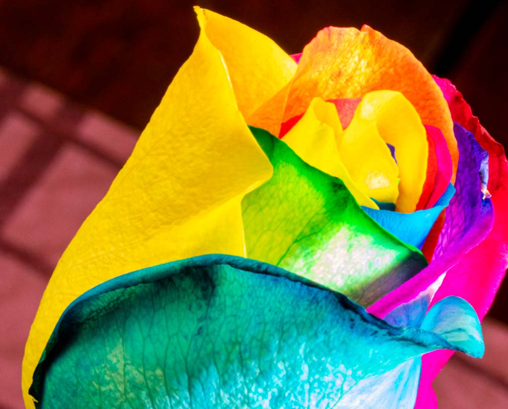
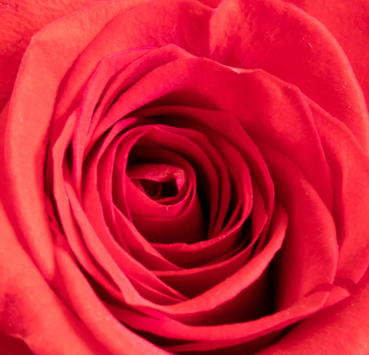
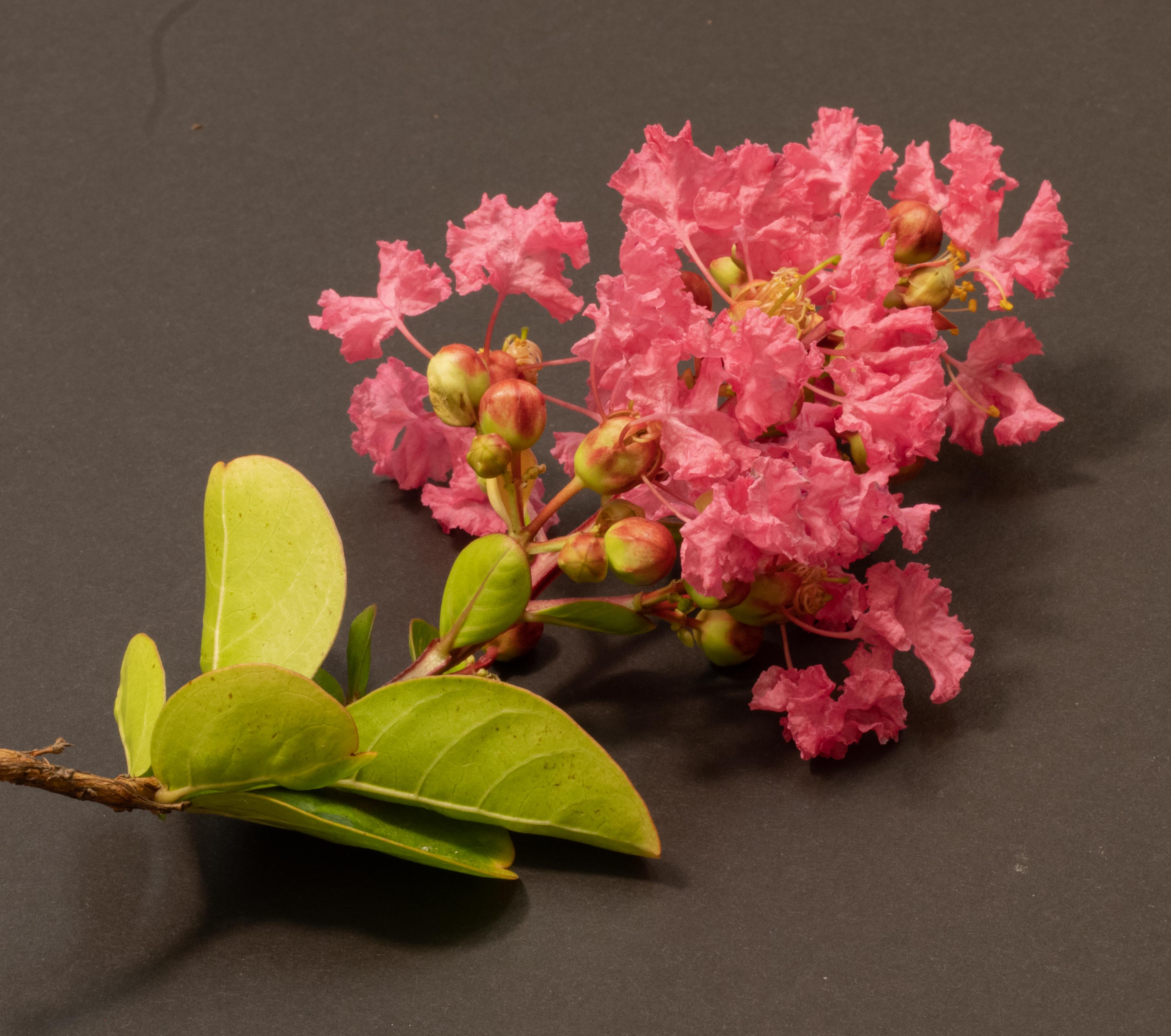
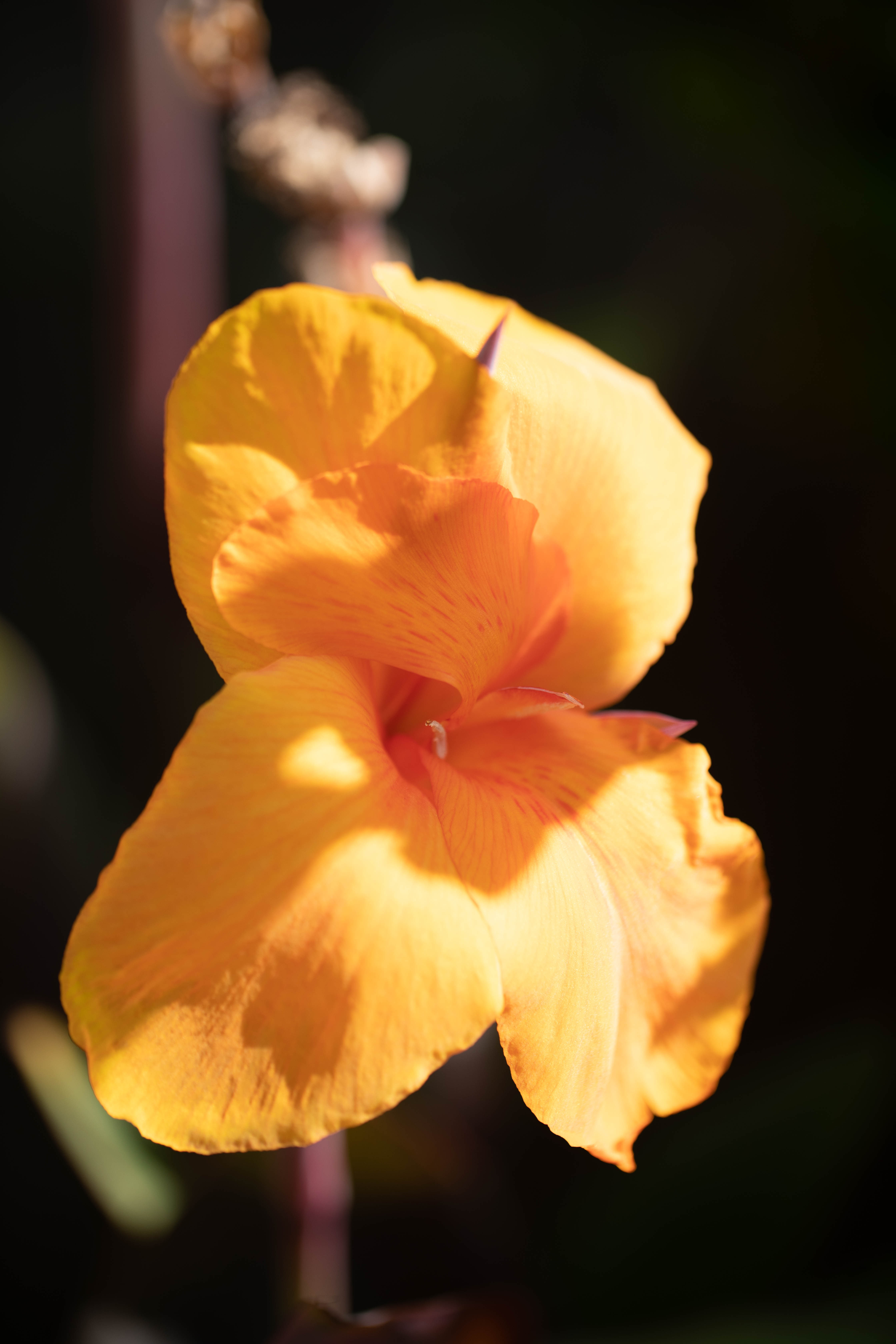
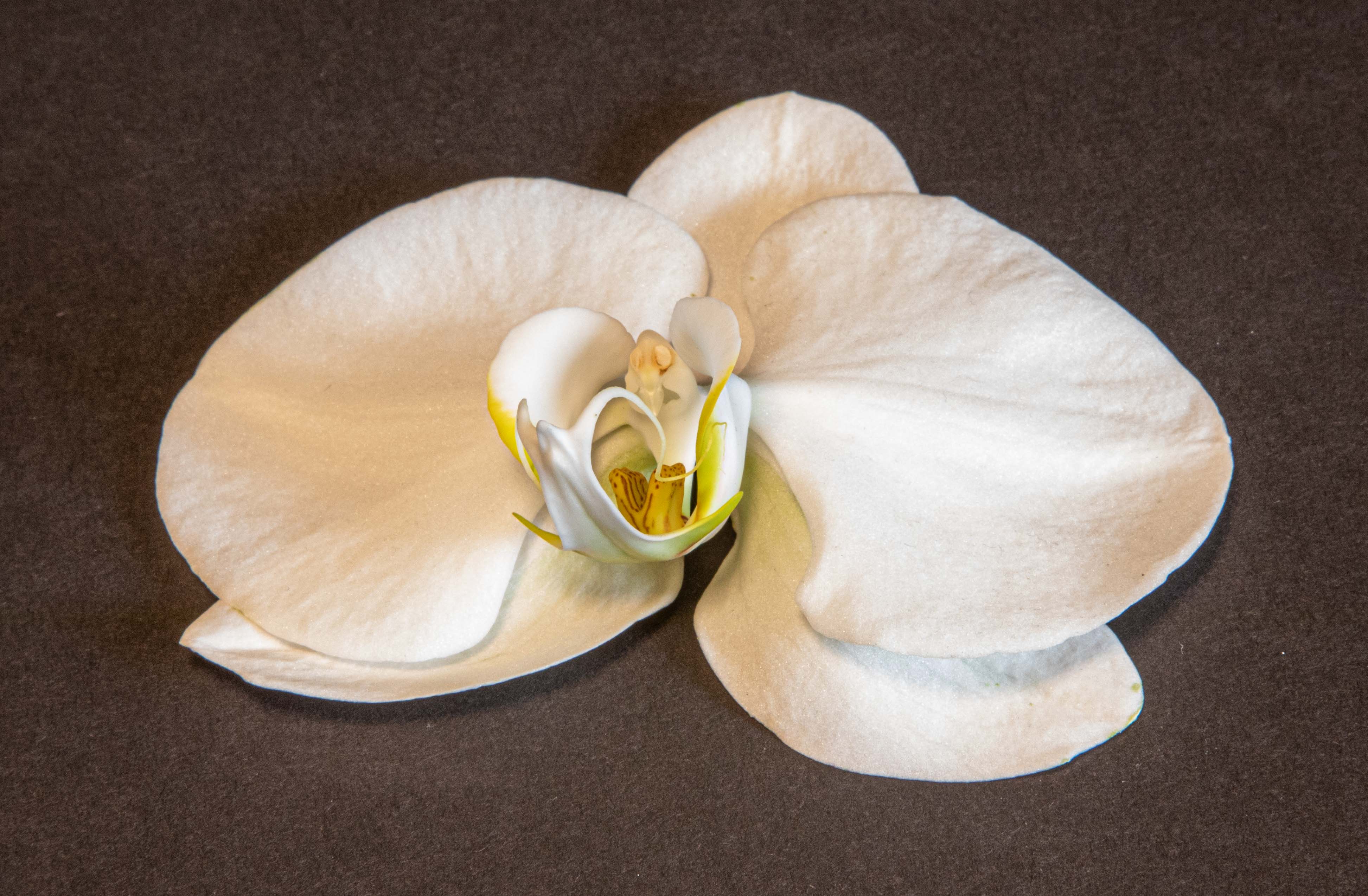
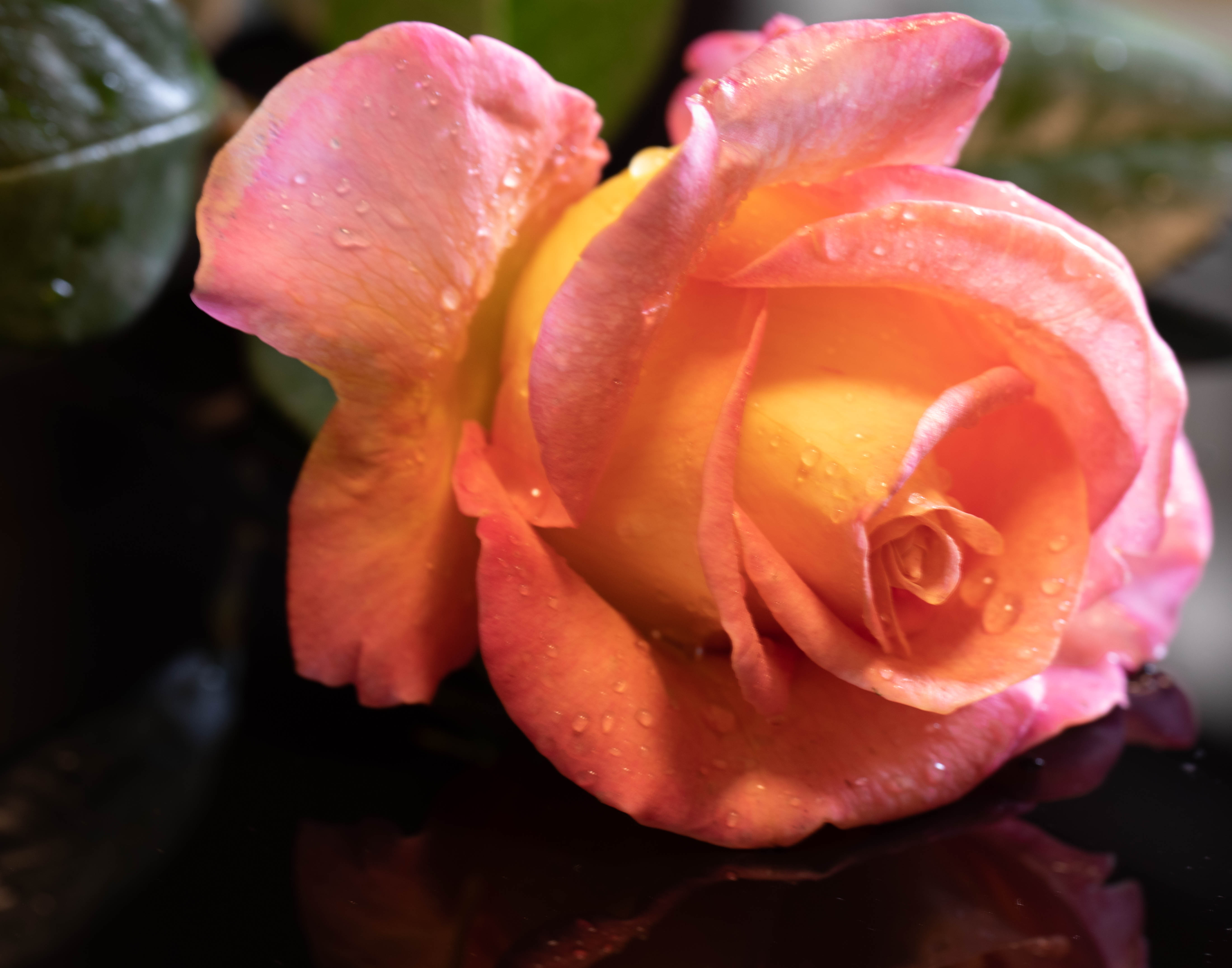
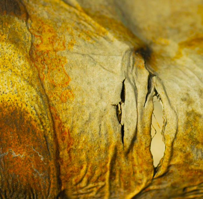
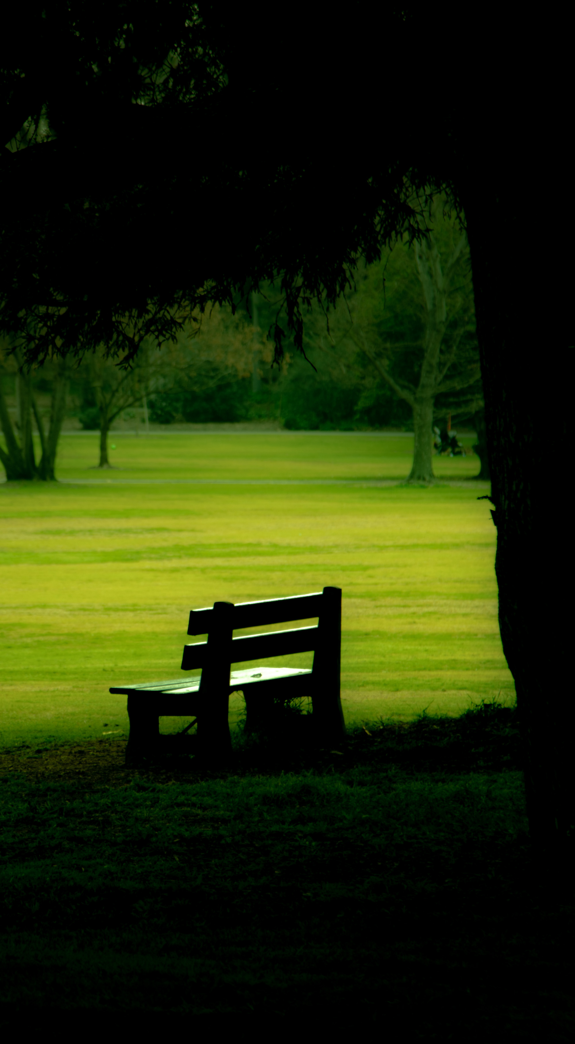
As usual, a wonderful image! I love the dark background so that the rose stands out, the composition - the diagonal angle of the rose, left to right, and the cropping. The ed edges of the rose are interesting. Thorns go with roses, and if it were higher up on the stem I would think it fine. However the location at very bottom left is distracting and I think it would be better removed. |
Apr 18th |
| 6 |
Apr 21 |
Reply |
Thank you all for your helpful comments. I have a fractured vertebrae, and after taking a series of shots with different apertures, standing behind the tripod, I was hurting so much I couldn't continue even though I could see in the computer I was in deep trouble. I had to take some medication and stay sitting down. You are all totally correct, and next time I'll check the histogram after the very first shot! |
Apr 18th |
| 6 |
Apr 21 |
Comment |
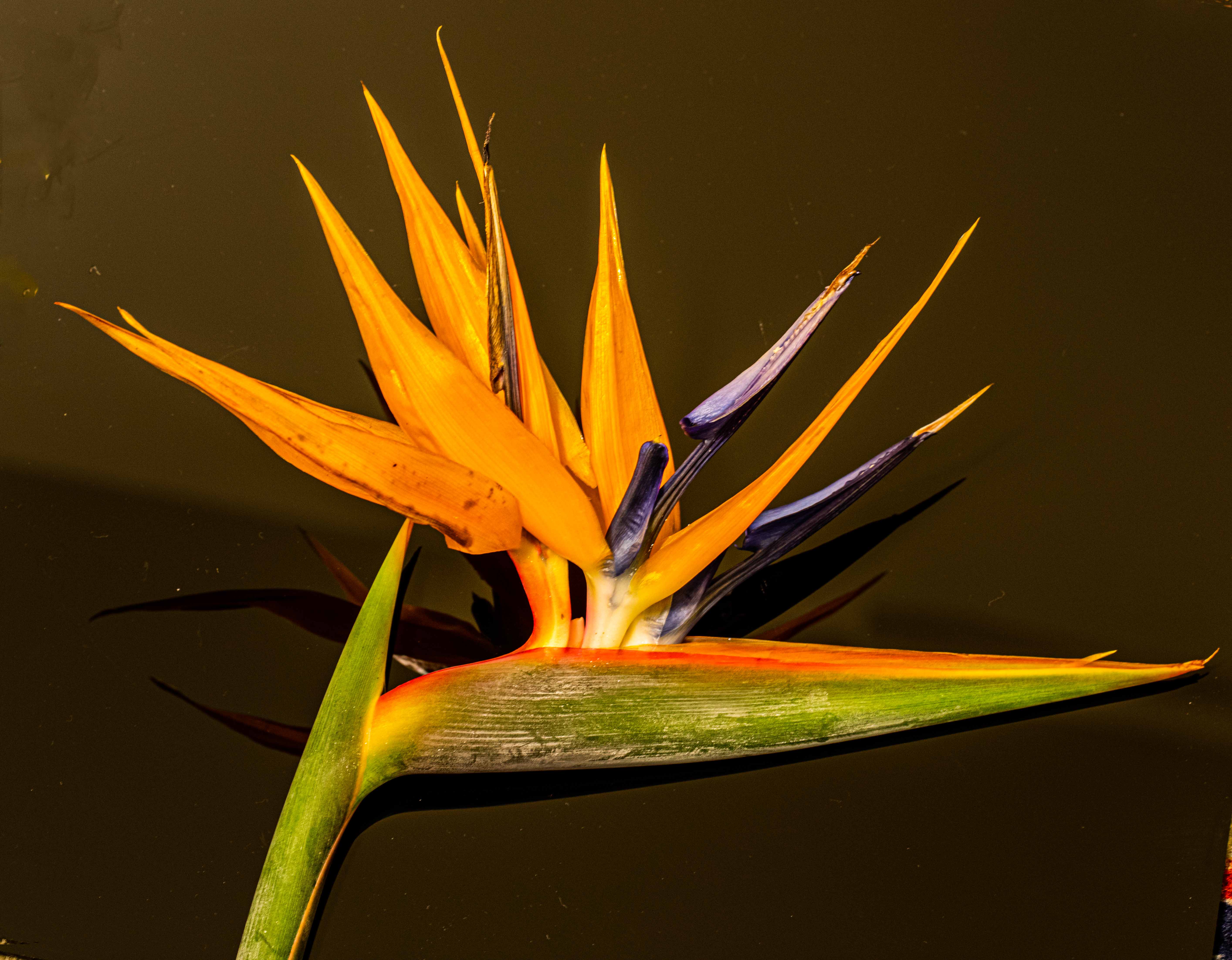
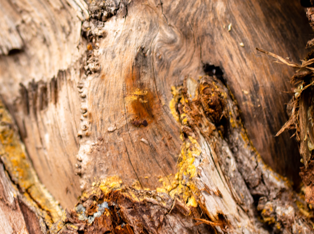
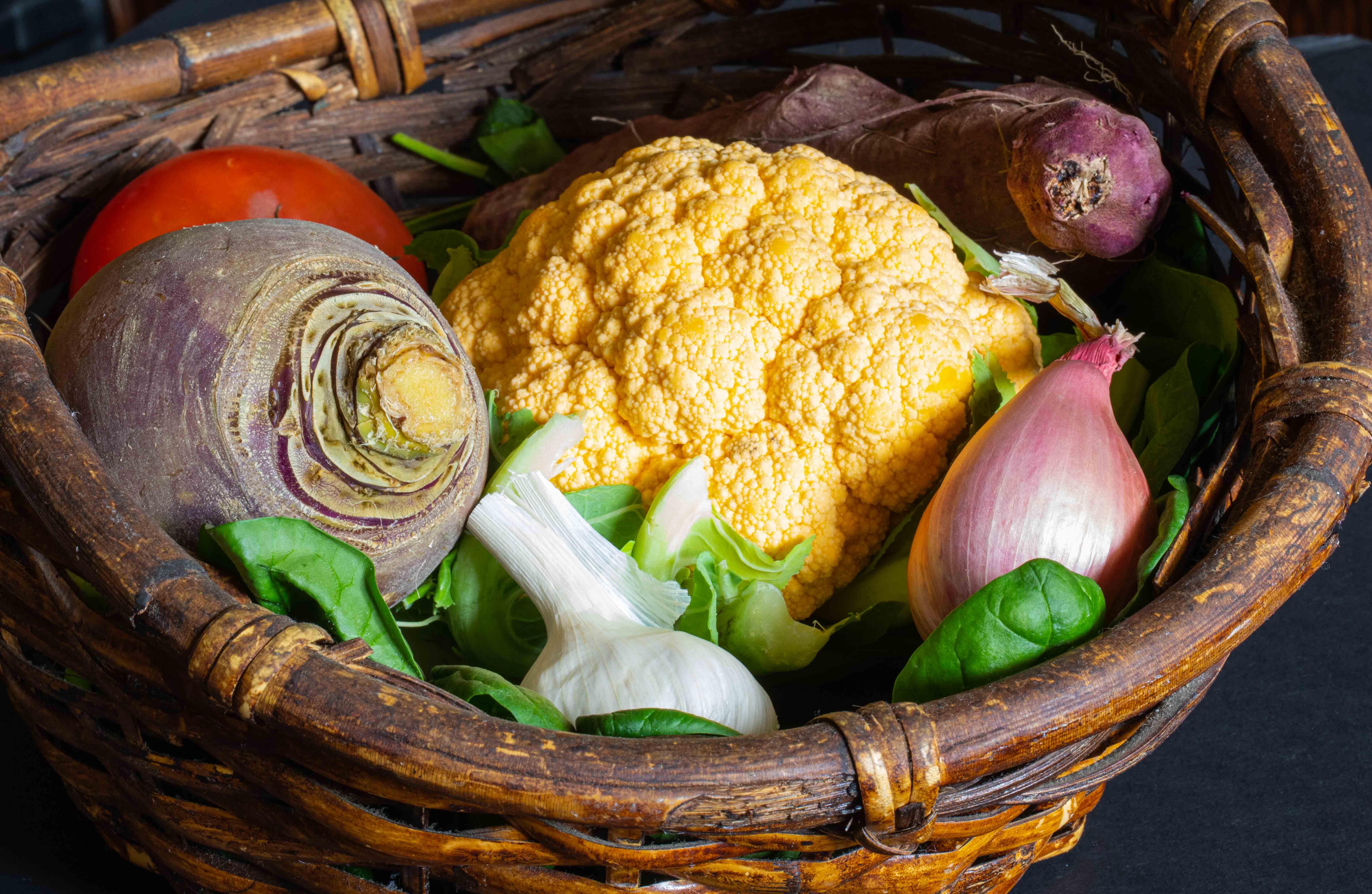
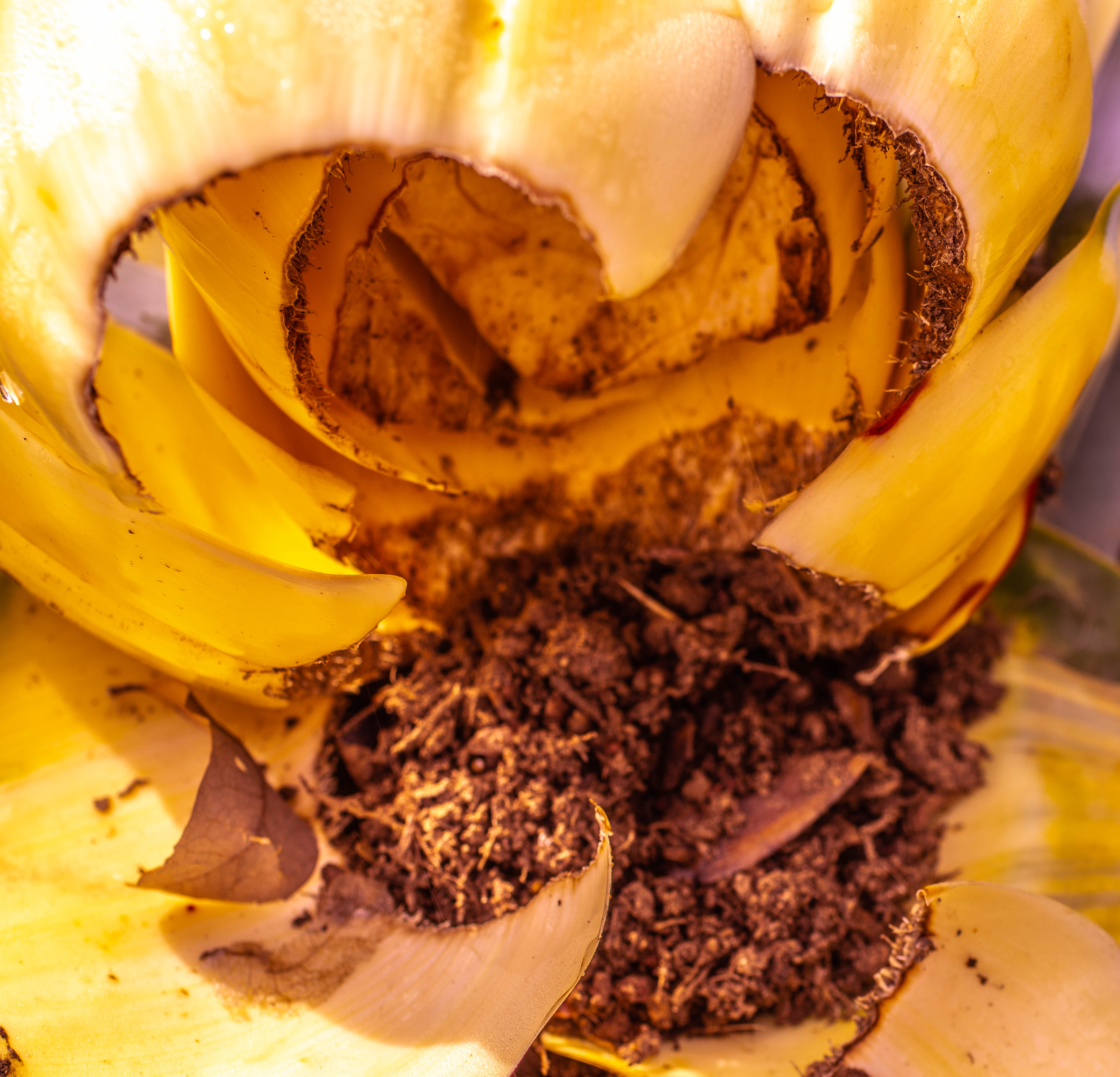
I agree the bright area is a distraction. I am not a guru on post-processing, but isn't there a way you could have decreased the brightness in that area without further cropping? I like the original crop better because it gives more emphasis to the size and strength of the yellow part. The blue part strikes me as more frail and delicate, and I see the yellow part as the stronger and more aggressive of the two - by the color and fragility and size of the blue. By changing the respective sizes the blue is larger, but I don't like that idea as much as the yellow being the sort of aggressor. It's not really recognizable as a leaf, anyway. It's abstract, which I think is fabulous!!! |
Apr 18th |
| 6 |
Apr 21 |
Comment |
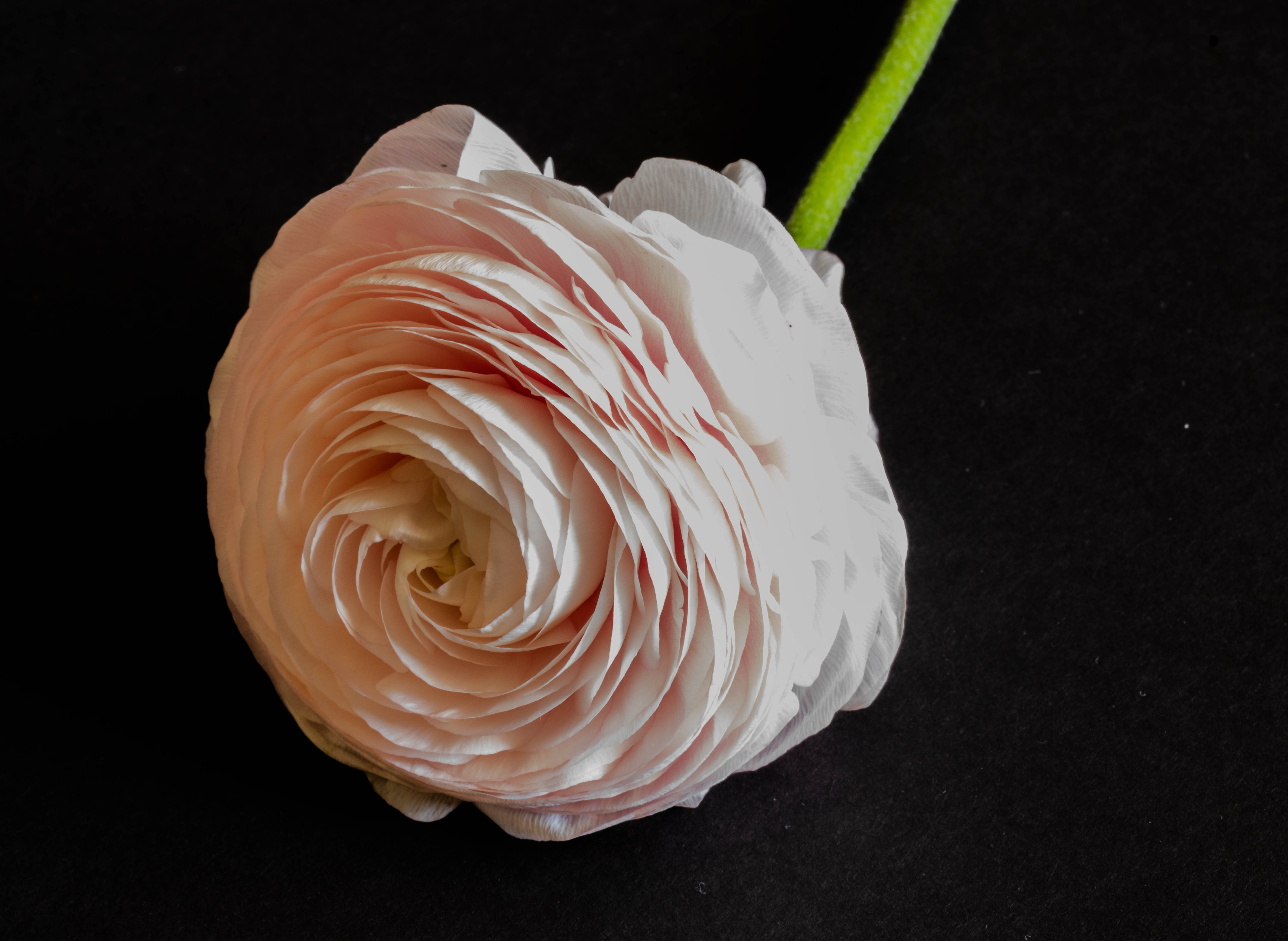
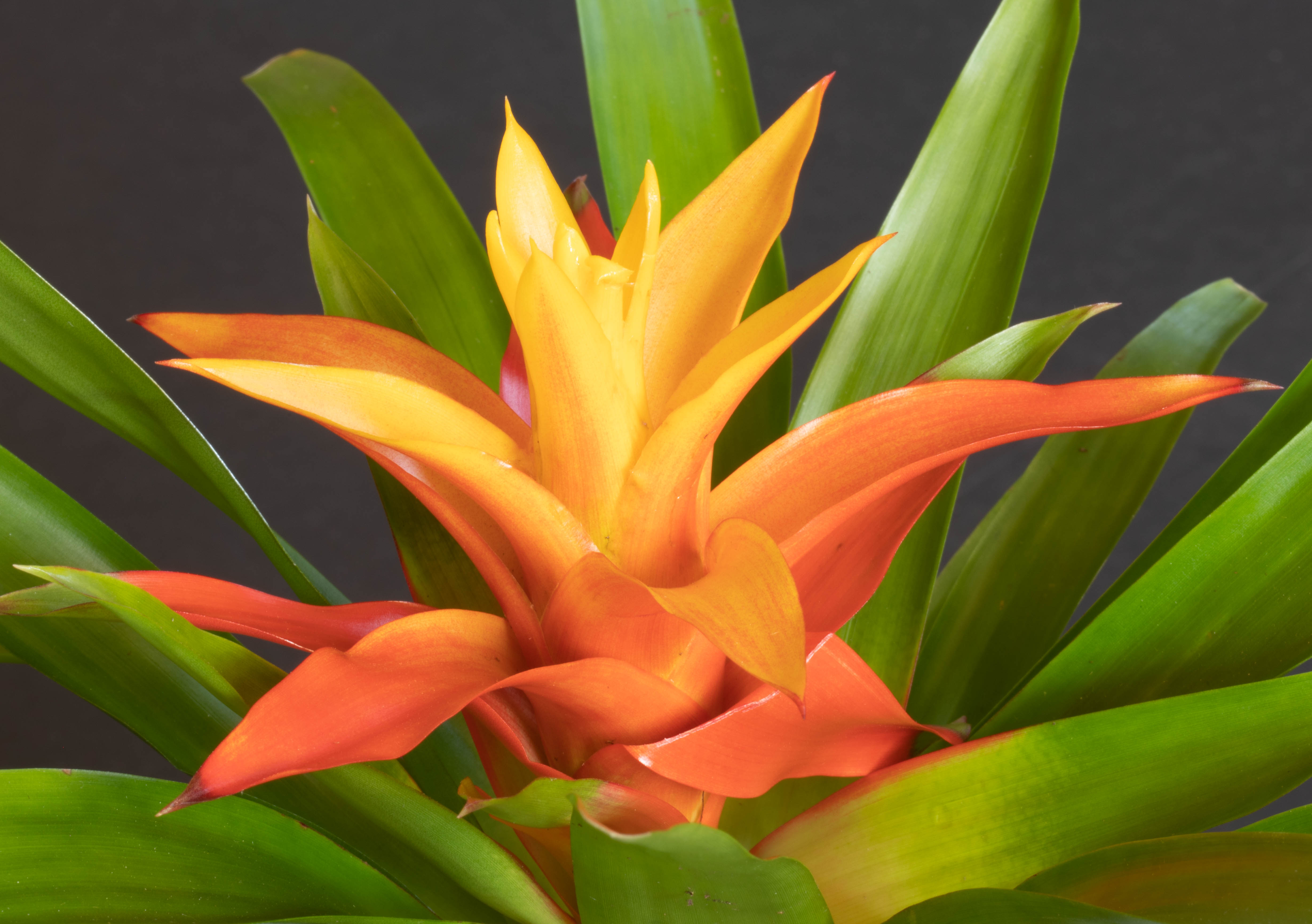
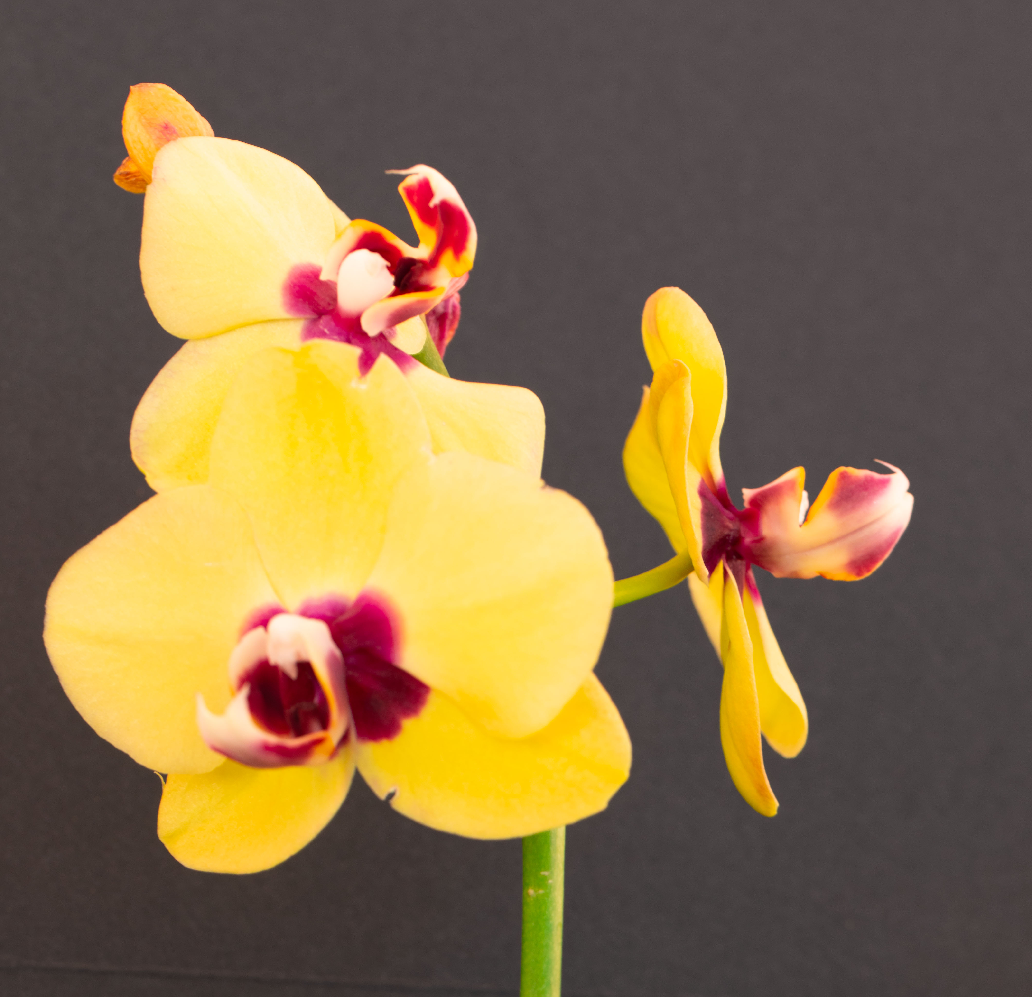
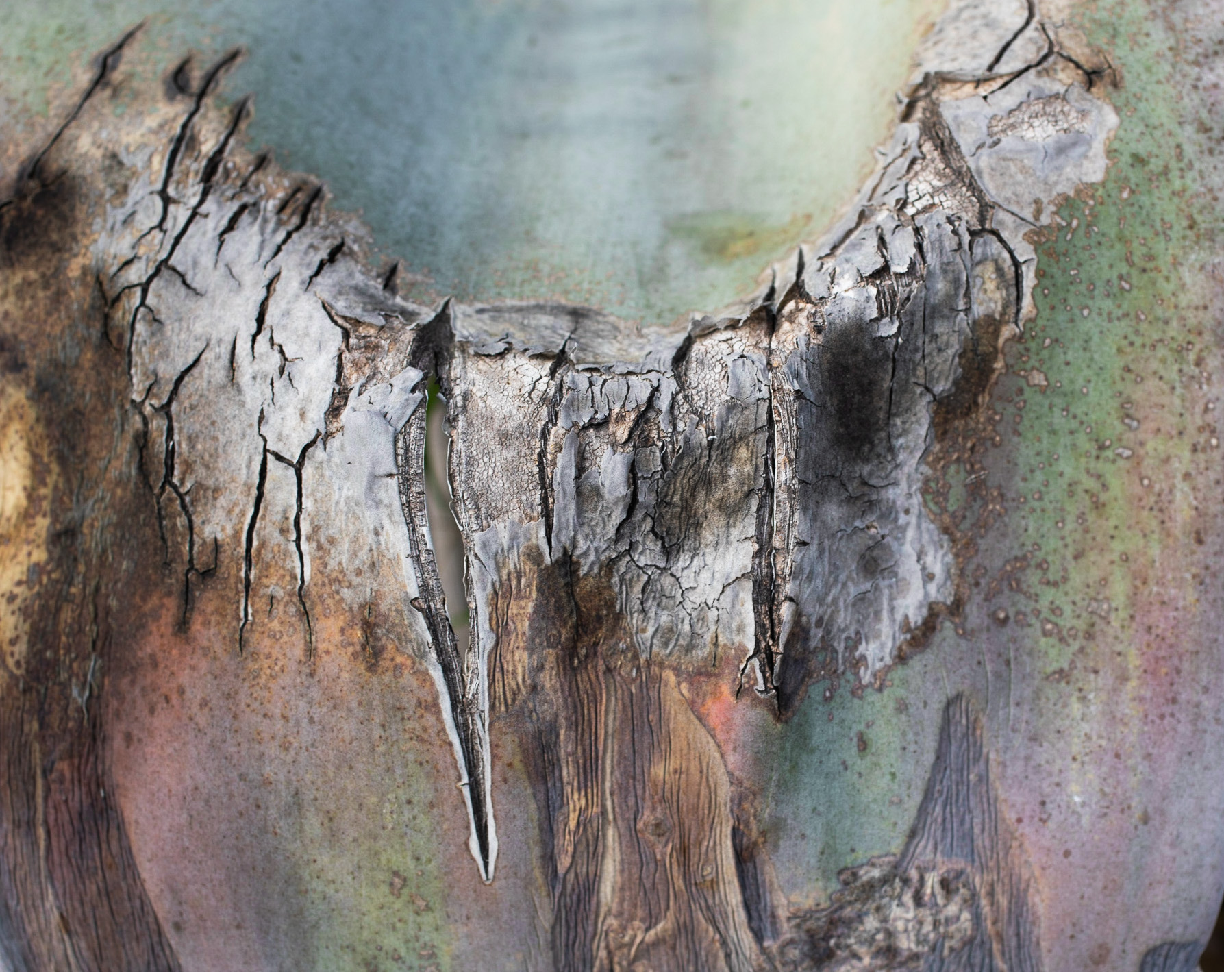
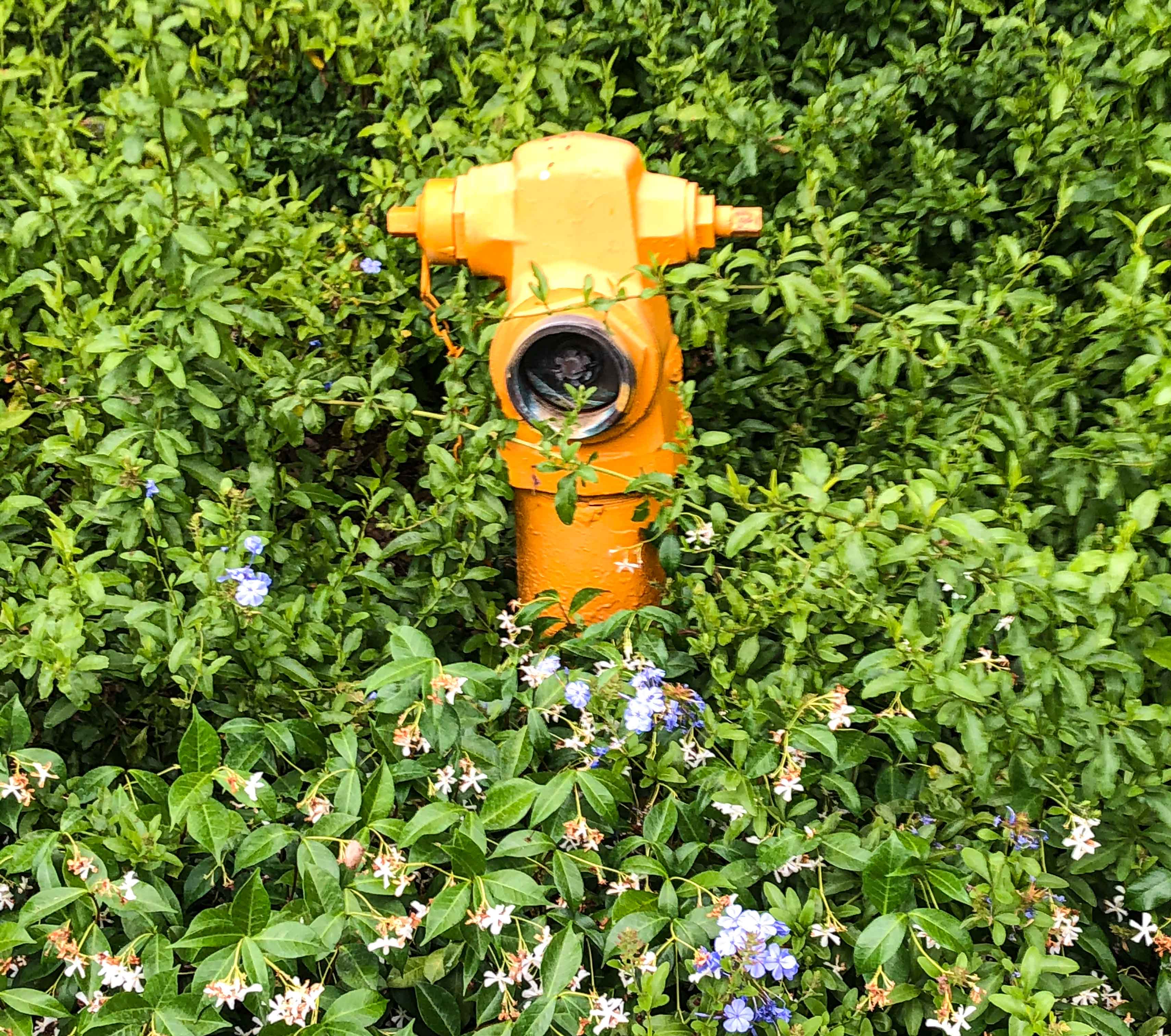
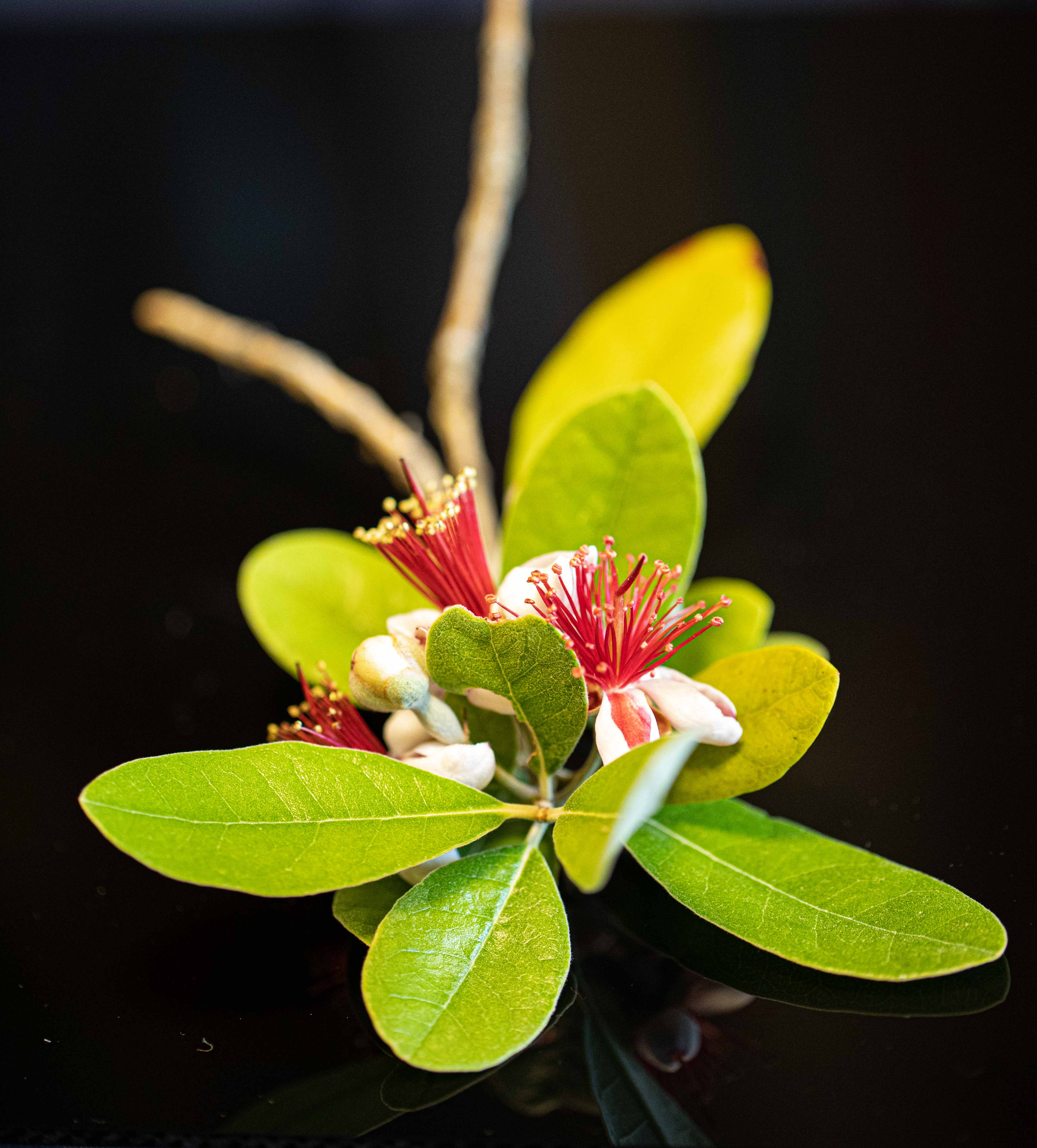
A lovely, lovely photo! Very graceful, finger-like leaves and petals. I love the composition and wouldn't crop it, at least not on the right side. If I did it in the top, it would be only the tiniest bit. I agree with Dick that the lighting is a tad harsh. Still, wonderful work! |
Apr 13th |
| 6 |
Apr 21 |
Comment |
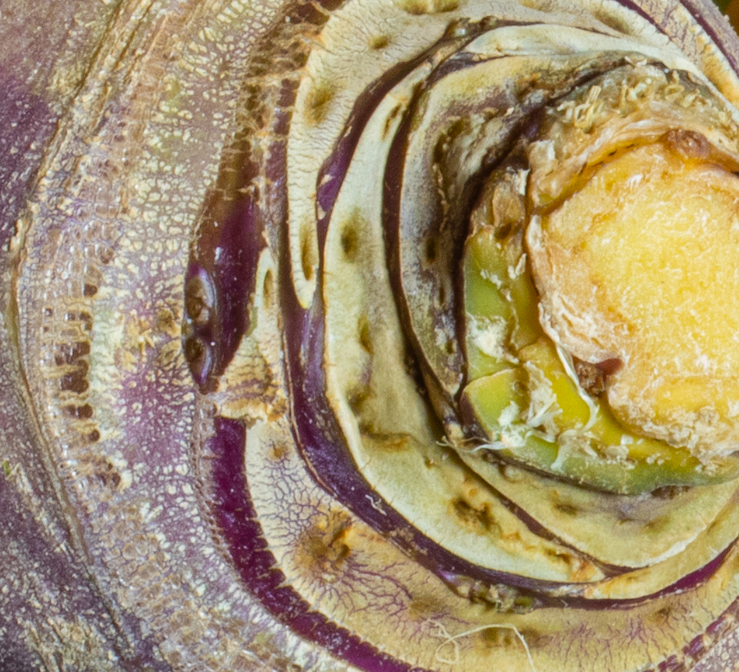
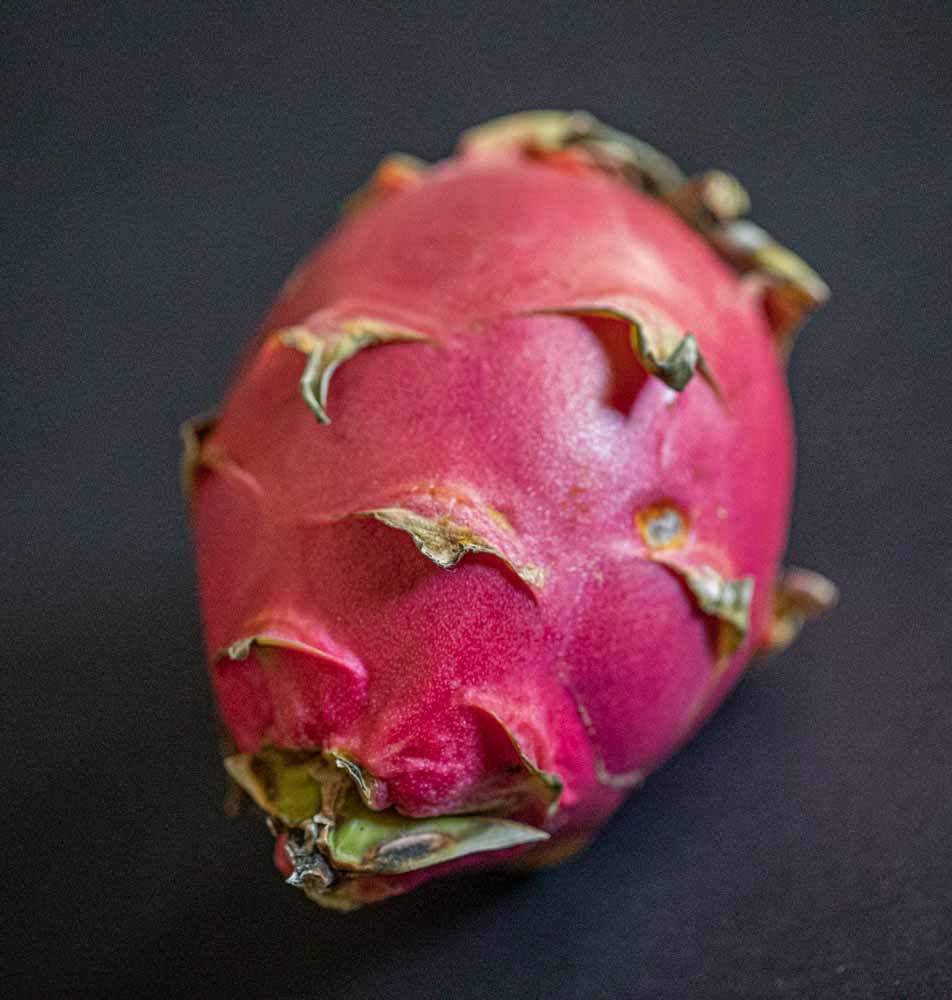
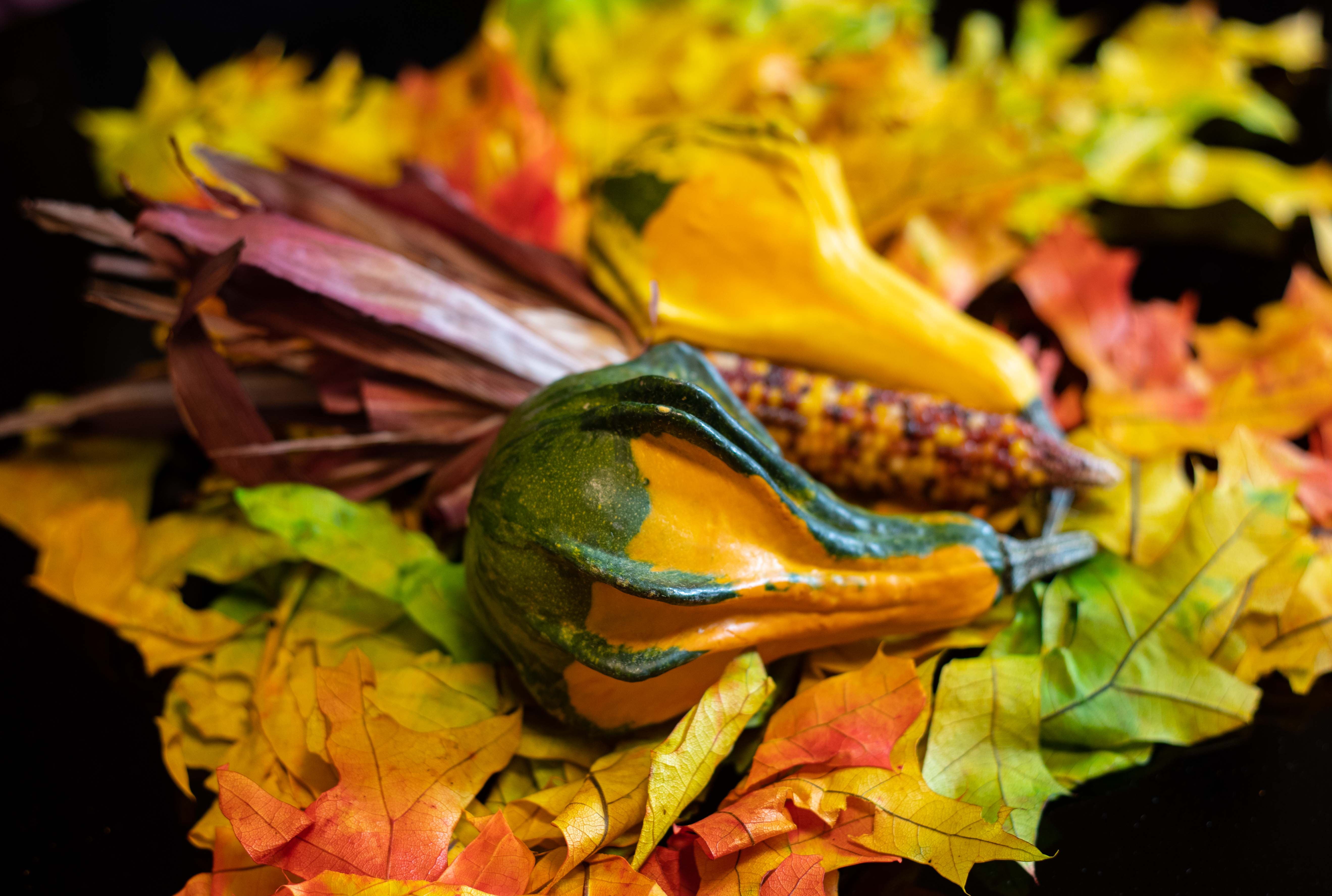
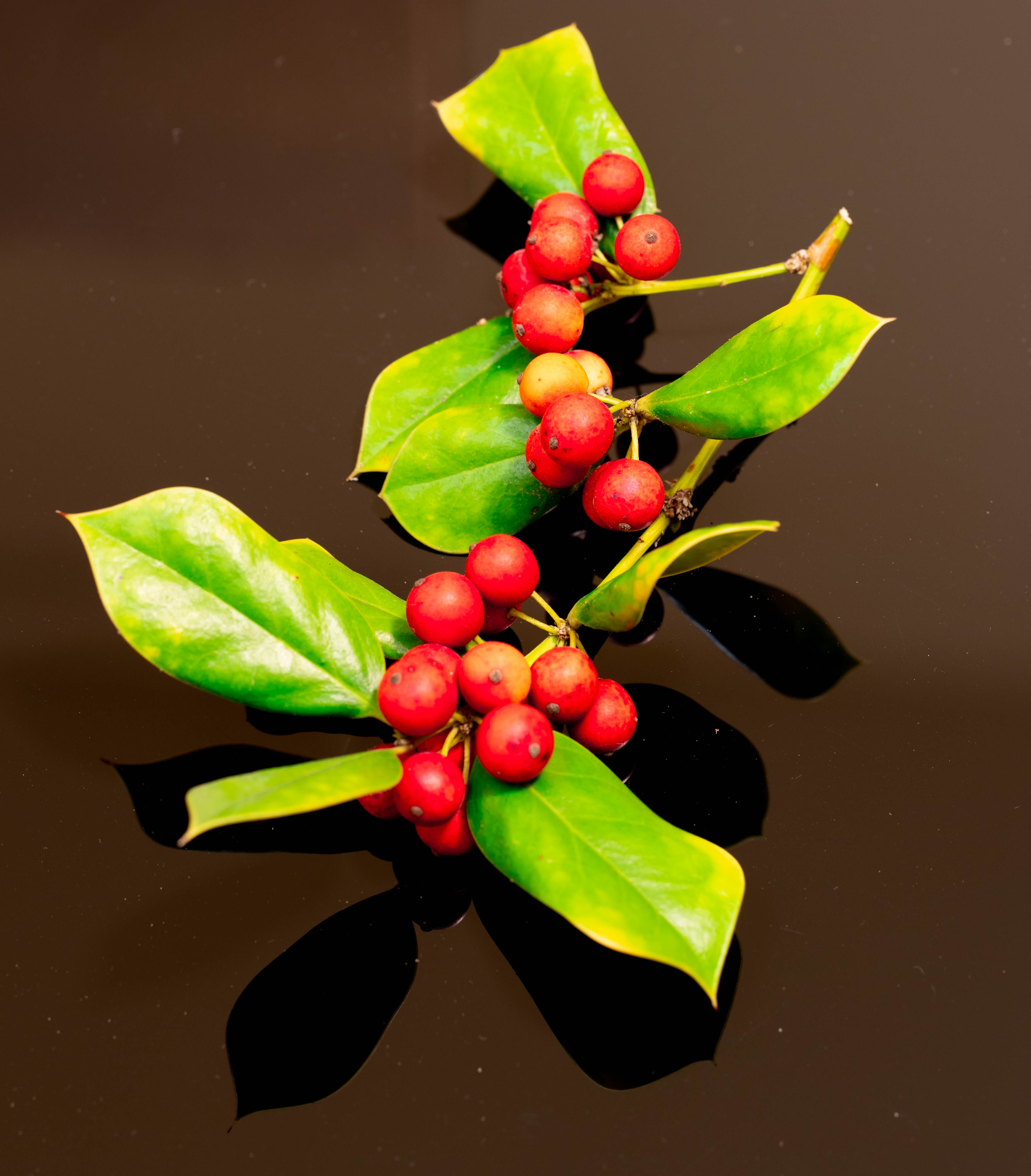
I am captivated by this photo! I feel it invites the viewer in for a close look, and an even closer study. I love the sand dotting it all, the shell, quite well covered, and the interesting green "fingers! Great composition. Also, as others have noted, the lighting was right for a great shot! |
Apr 12th |
4 comments - 4 replies for Group 6
|
| 79 |
Apr 21 |
Reply |
This was pulled into a new computer from somewhere. My computer got broken, then my phone. To the best I can determine, this is the original! It says it's part of a stack, (2 of 2 or 1 of 2 -- they look the same). Since I don't know how to stack, I don't even know what that means! Sorry. |
Apr 25th |
| 79 |
Apr 21 |
Comment |
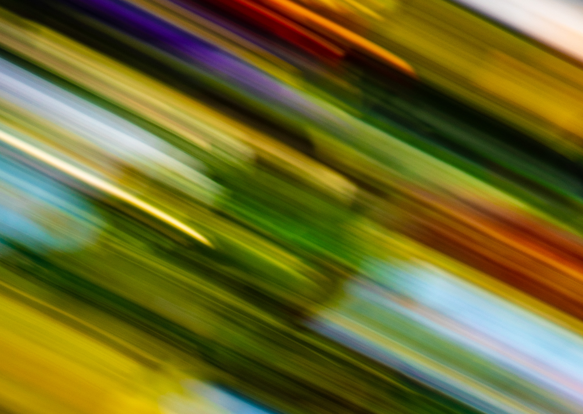
What a fabulous idea! I love both images. The original is very painterly--reminds me, as Laura mentions, of Van Gogh, especially Mulberry Tree. The cropped and processed one strikes me as abstract art, and also quite wonderful. It does, just a bit, though, call up Van Gogh's Tree Roots, if blurred. Wonderful, creative, insightful idea for a photo! Just love them both! |
Apr 18th |
| 79 |
Apr 21 |
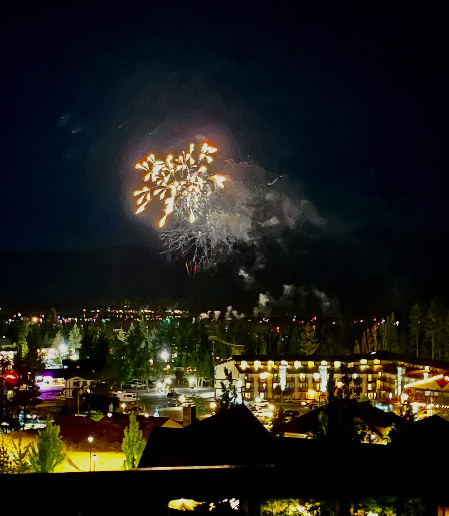
Comment |
I agree with Lauren about the letters being distracting. I like the perspective and motion. Another idea would have been to get closer to the more numerous pinwheels and shot into them. Still, I appreciate greatly what you have captured - the memorial of a terrible moment in our lives. What a tragedy this has all been! |
Apr 18th |
| 79 |
Apr 21 |
Reply |
Someone more expert than I is going to have to answer that. I exported mine from LR Classic, and it's much wider than yours. I have no idea what the issue is. |
Apr 13th |
| 79 |
Apr 21 |
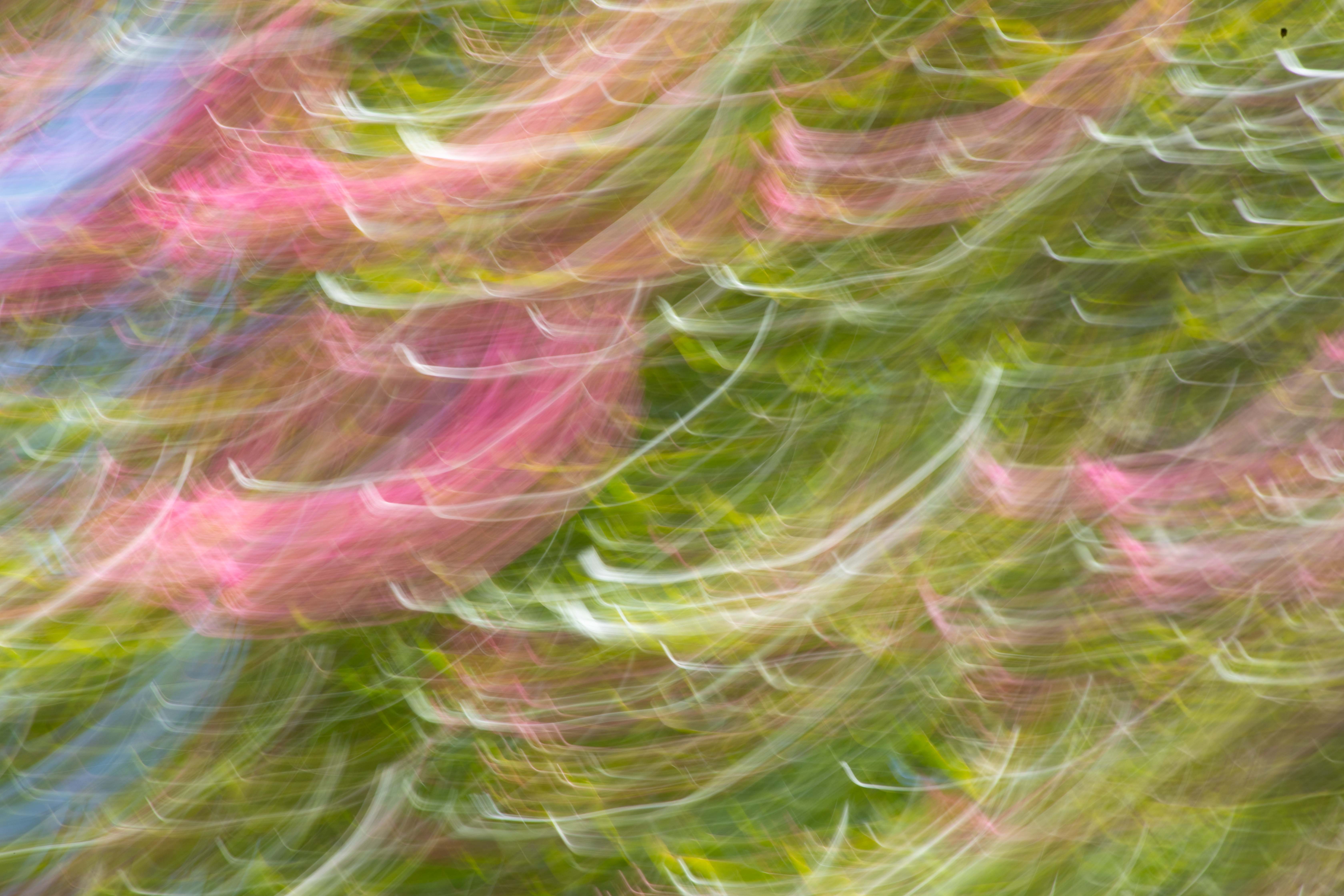
Comment |
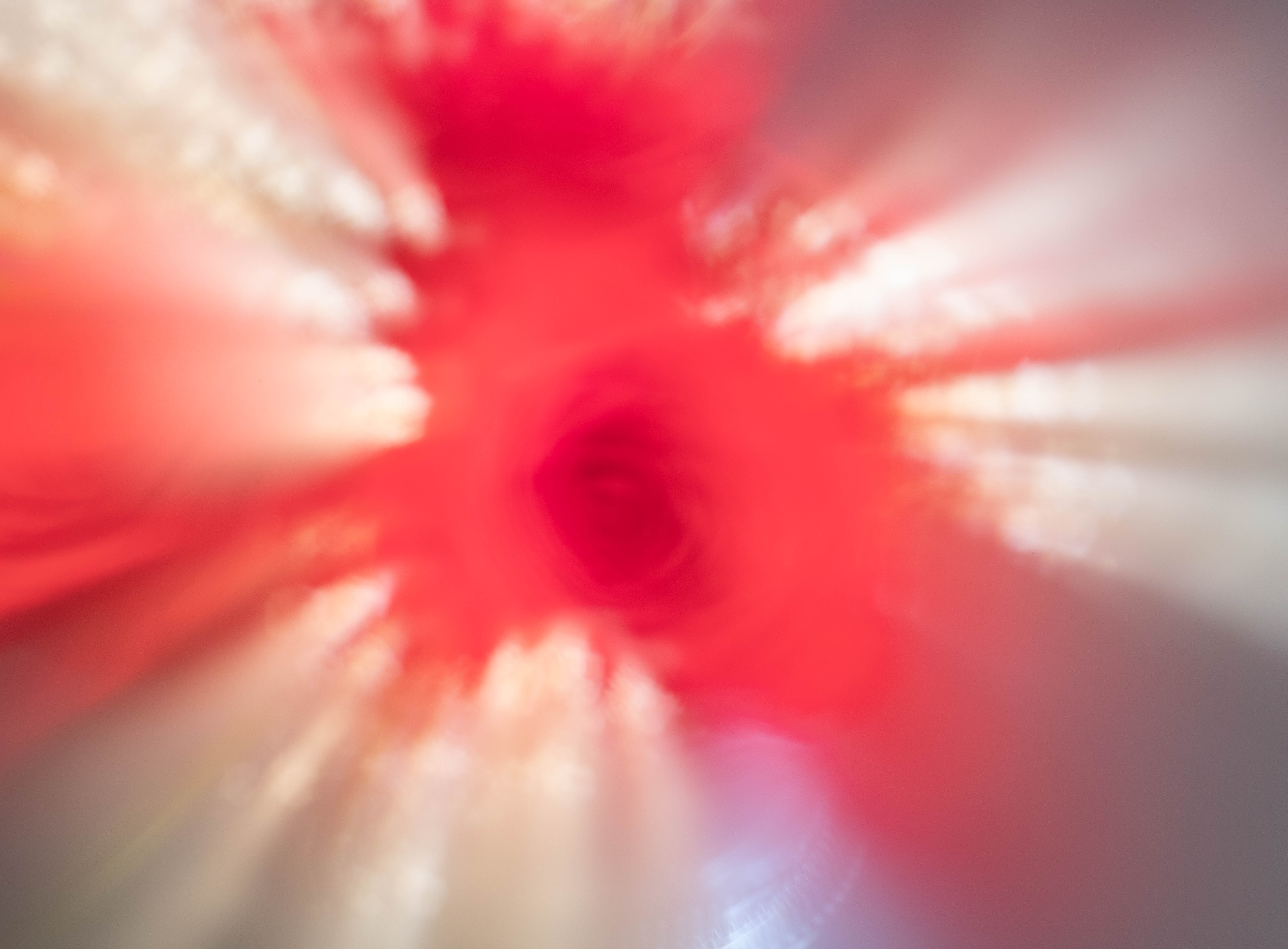
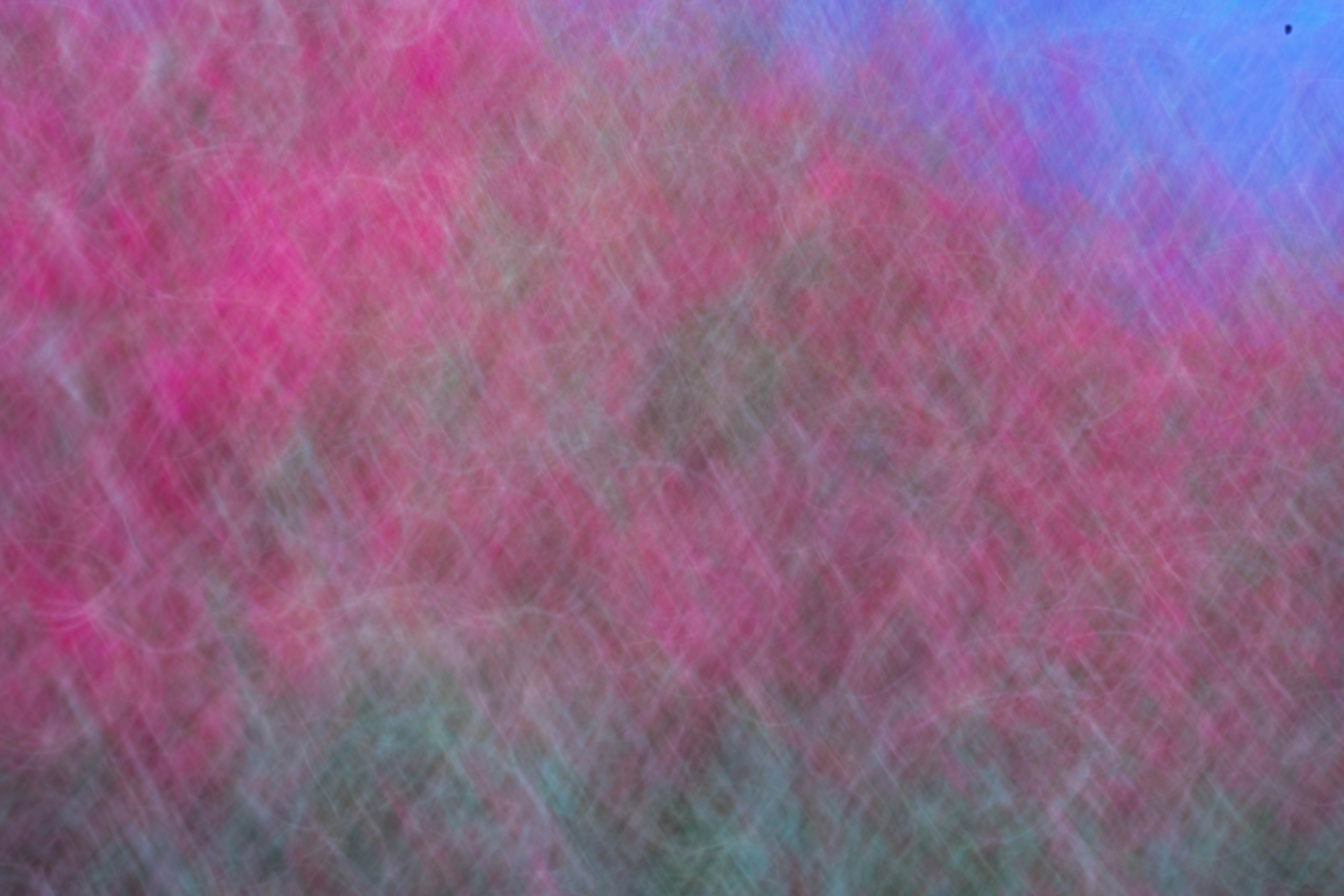
This is very interesting. I couldn't tell what it was until I read it. The curves are sexual to me, too. I guess that was intended. The stem is not recognizable to me. The photo itself is grainy. I like the lighting and the monochrome! |
Apr 13th |
| 79 |
Apr 21 |
Comment |
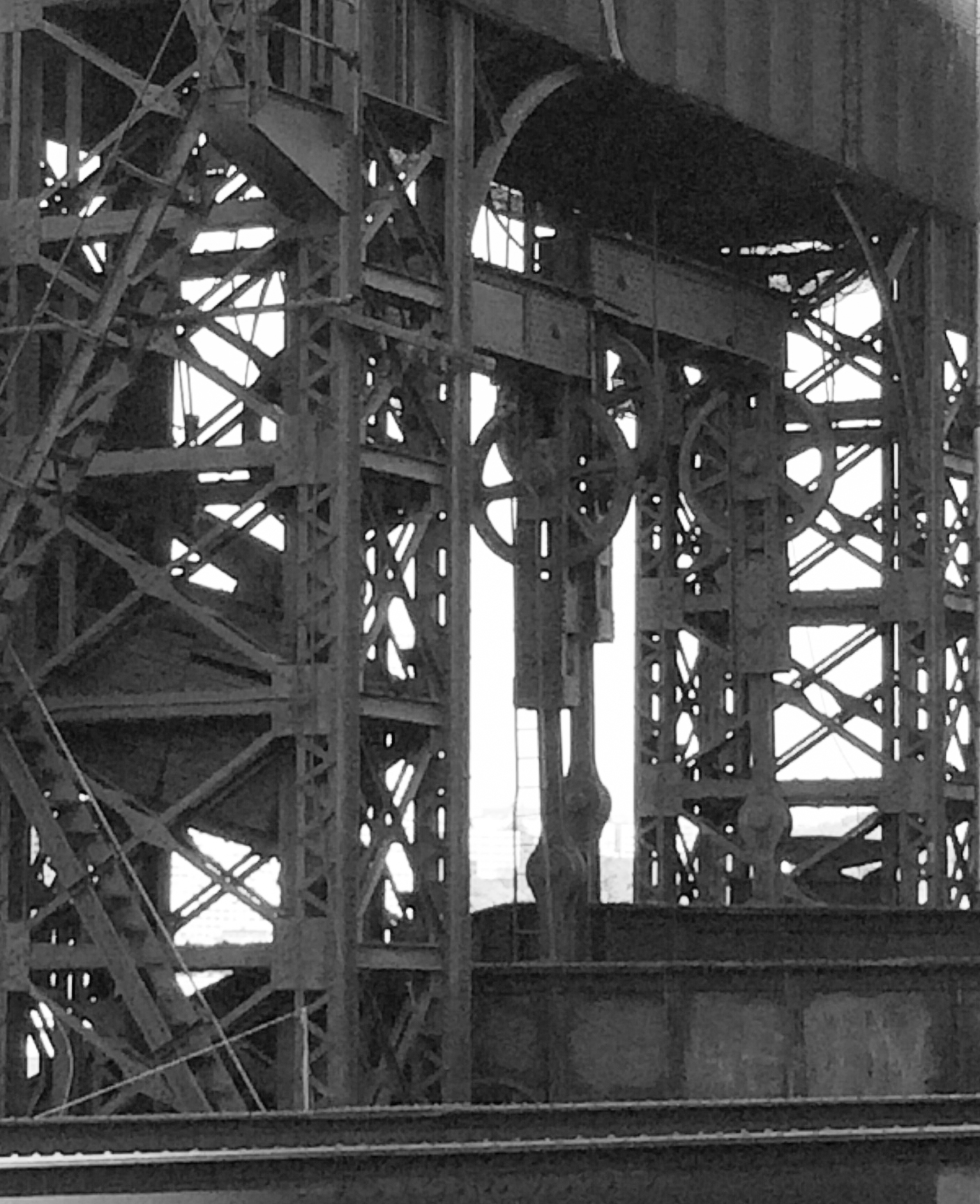
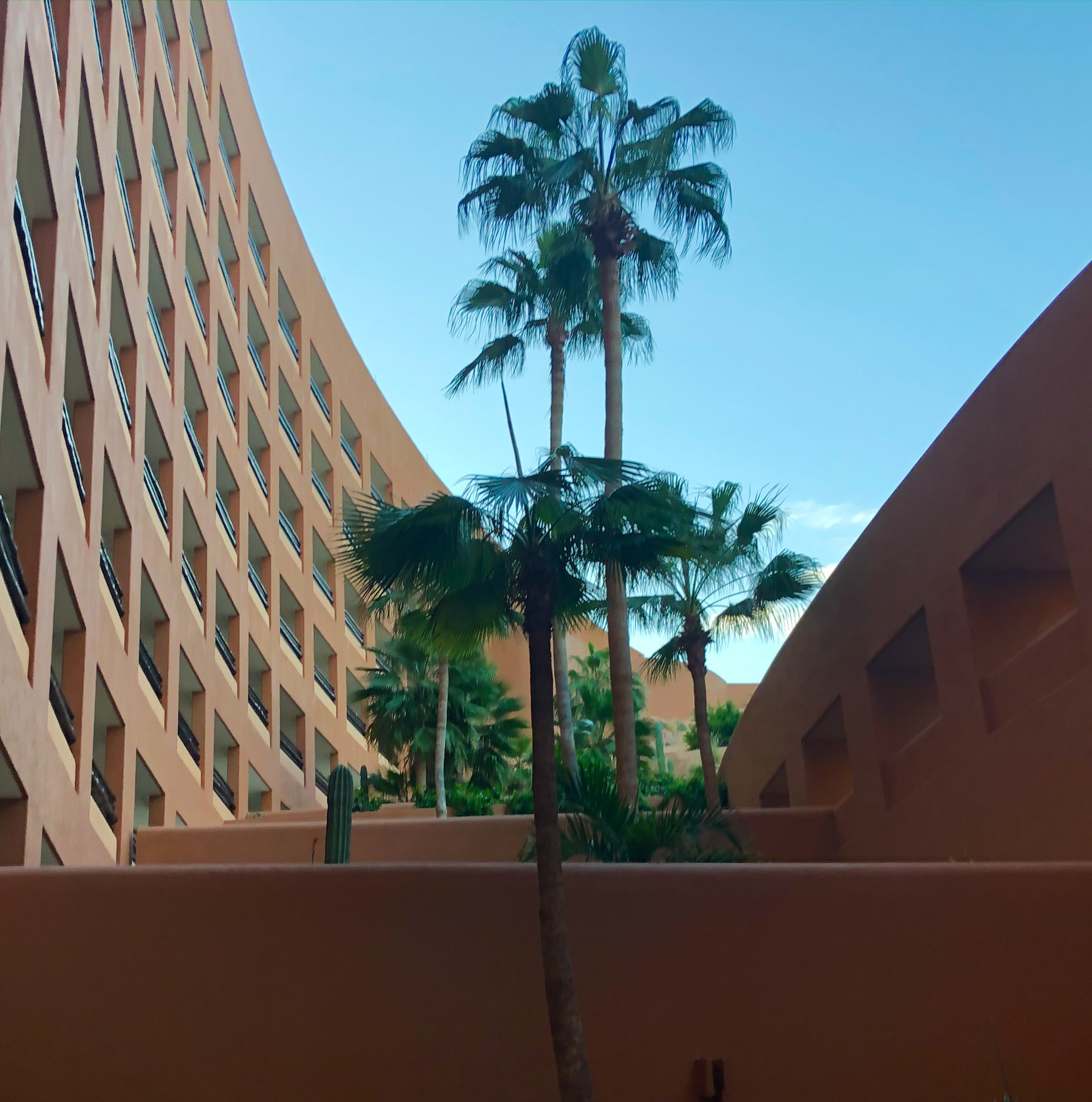
The lines and windows are interesting, and their colors and the overall composition of the window, very nice. I think I would have cropped out the black on the right and left sides, and I think the shot would have been improved with a zoom lens that could have gotten us a closer view of the windows. I can't really distinguish what the images are. Perhaps a horizontal shot, too, would have helped us get closer in by putting more photo rather than black in the available space. |
Apr 12th |
4 comments - 2 replies for Group 79
|
8 comments - 6 replies Total
|