|
| Group |
Round |
C/R |
Comment |
Date |
Image |
| 6 |
Mar 21 |
Comment |
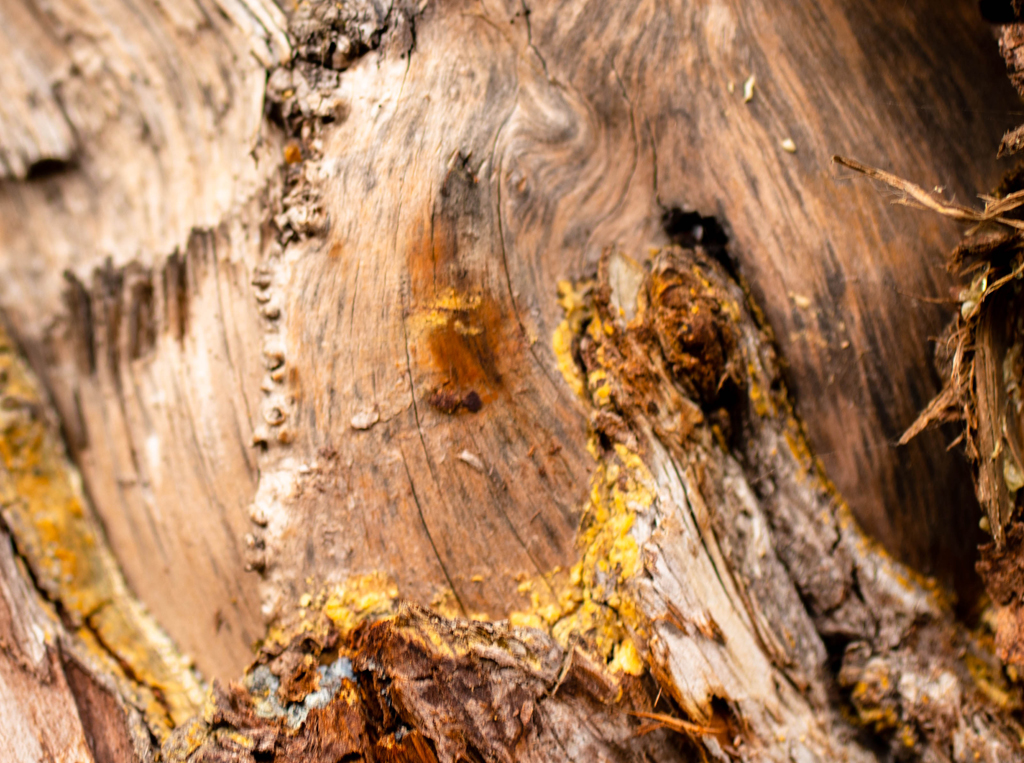
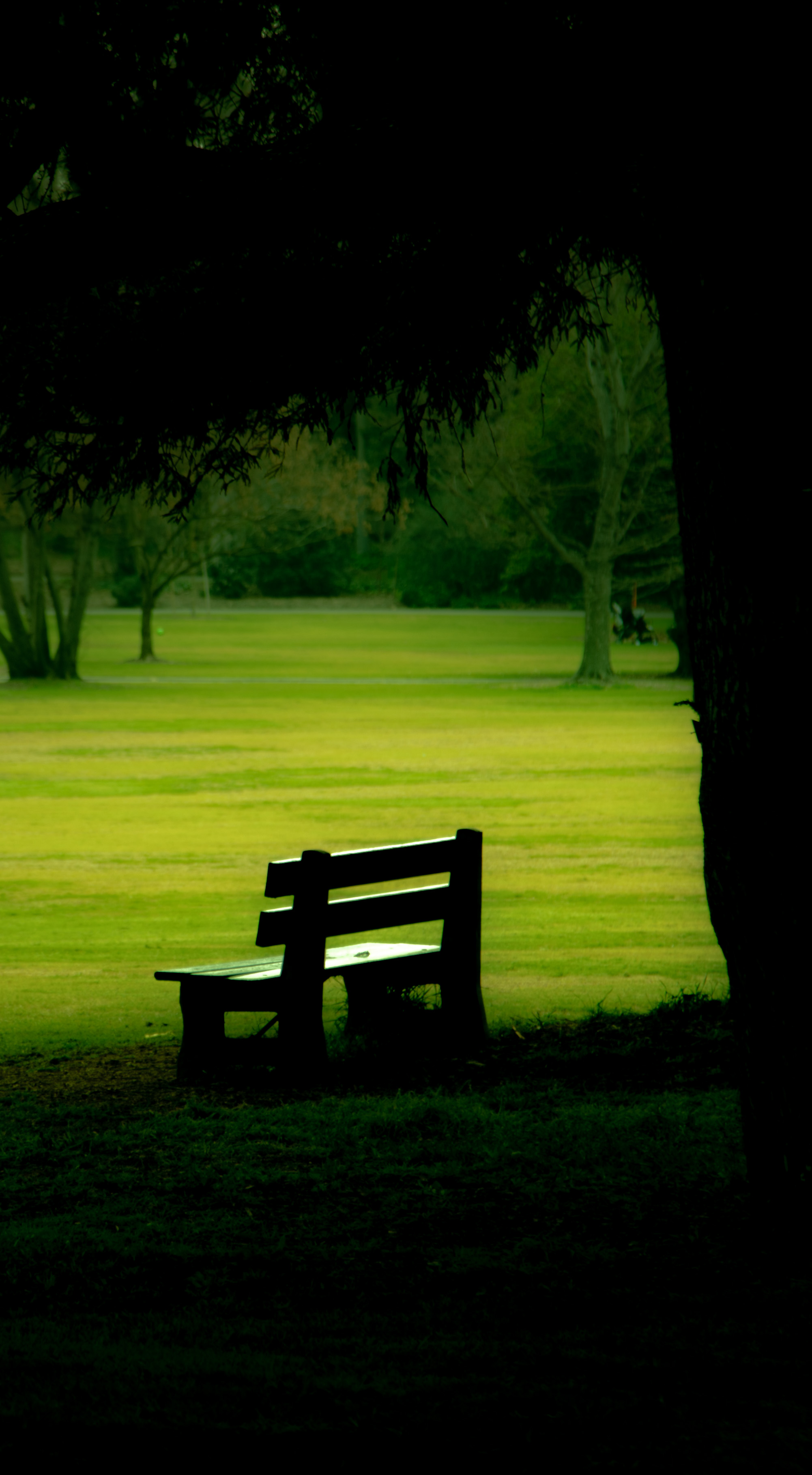
Fascinating and lovely! I love the texture and grain in the wood, and the variations in the colors. The lighting and shadow are fantastic. I think the opening between the planks and unevenness of the hasps all just add to the beauty and quality to the antique. |
Mar 21st |
| 6 |
Mar 21 |
Reply |
When you get right down to it, a lot of things we do in life are gambling like in a casino. So what matters is our values, our goals, and being true to what we believe and admire. I like photos that look like paintings or other forms of art! |
Mar 20th |
| 6 |
Mar 21 |
Comment |
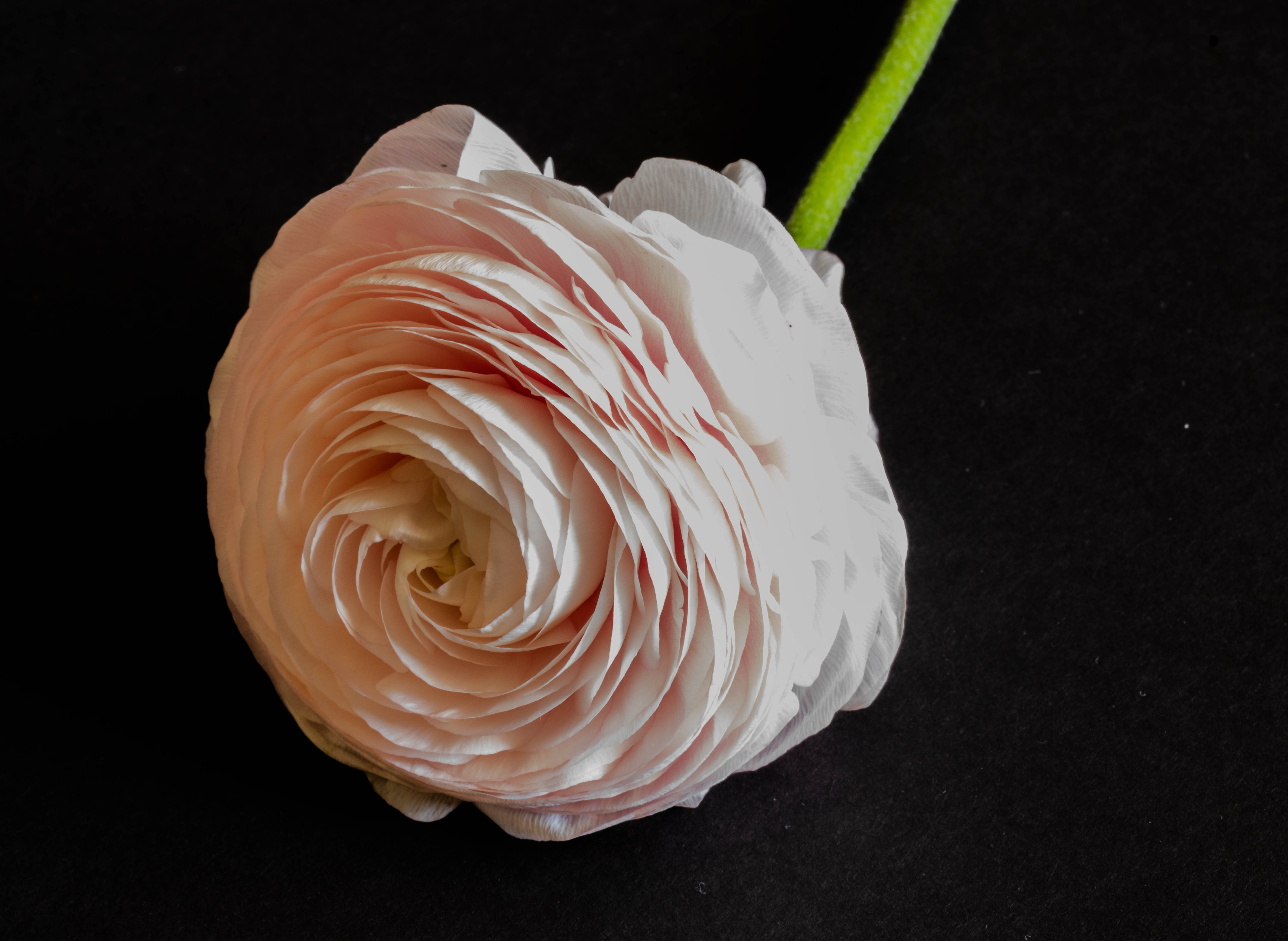
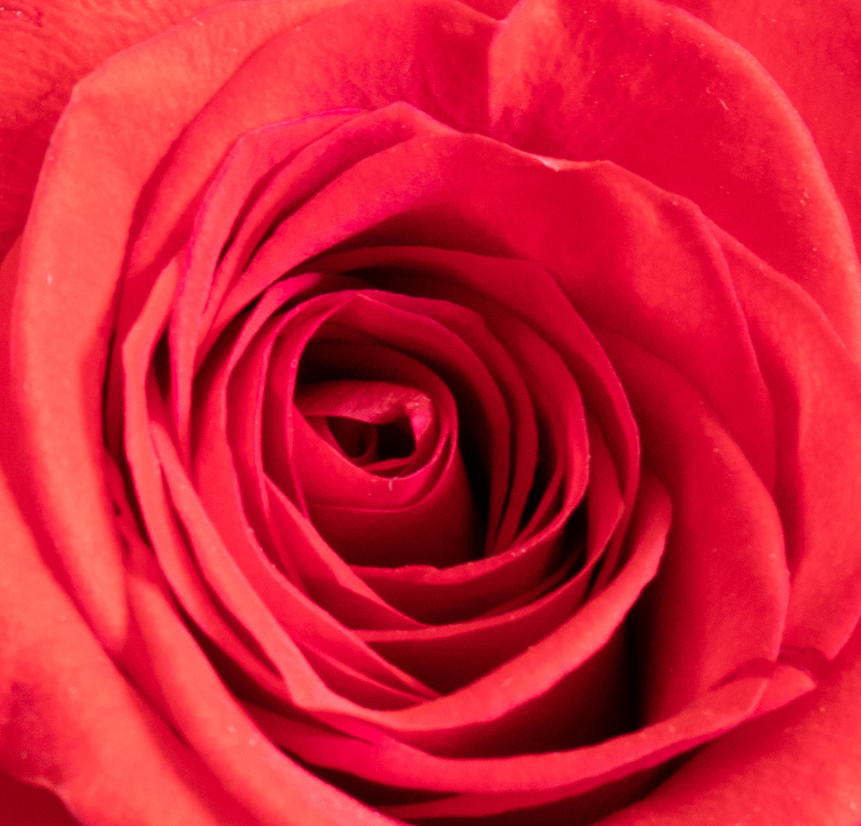
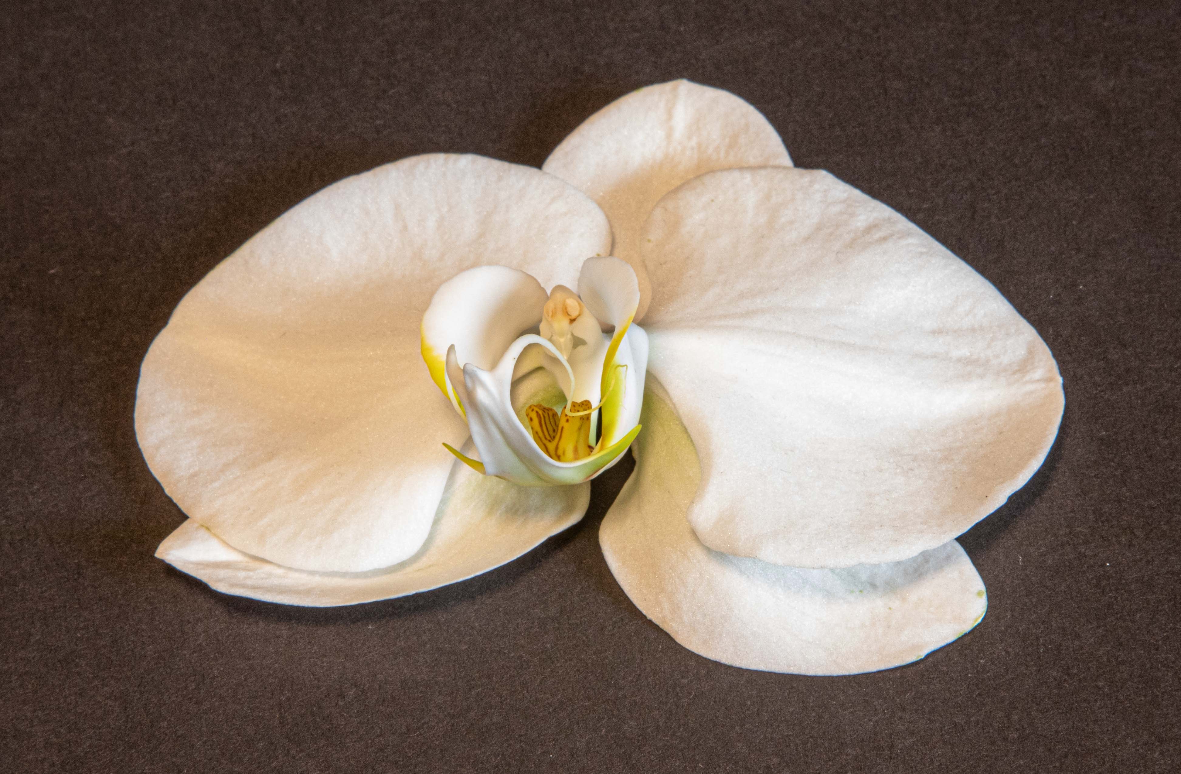
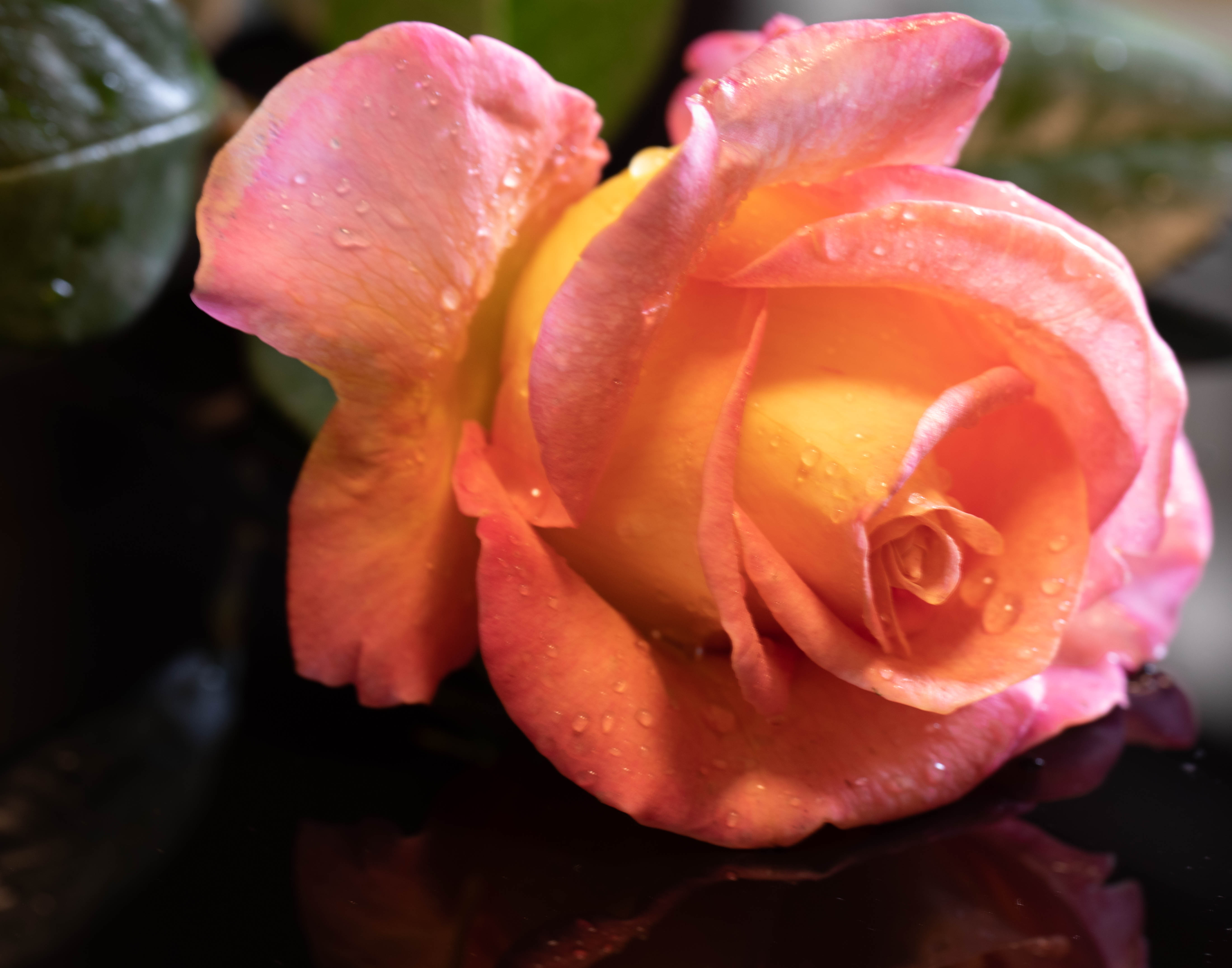
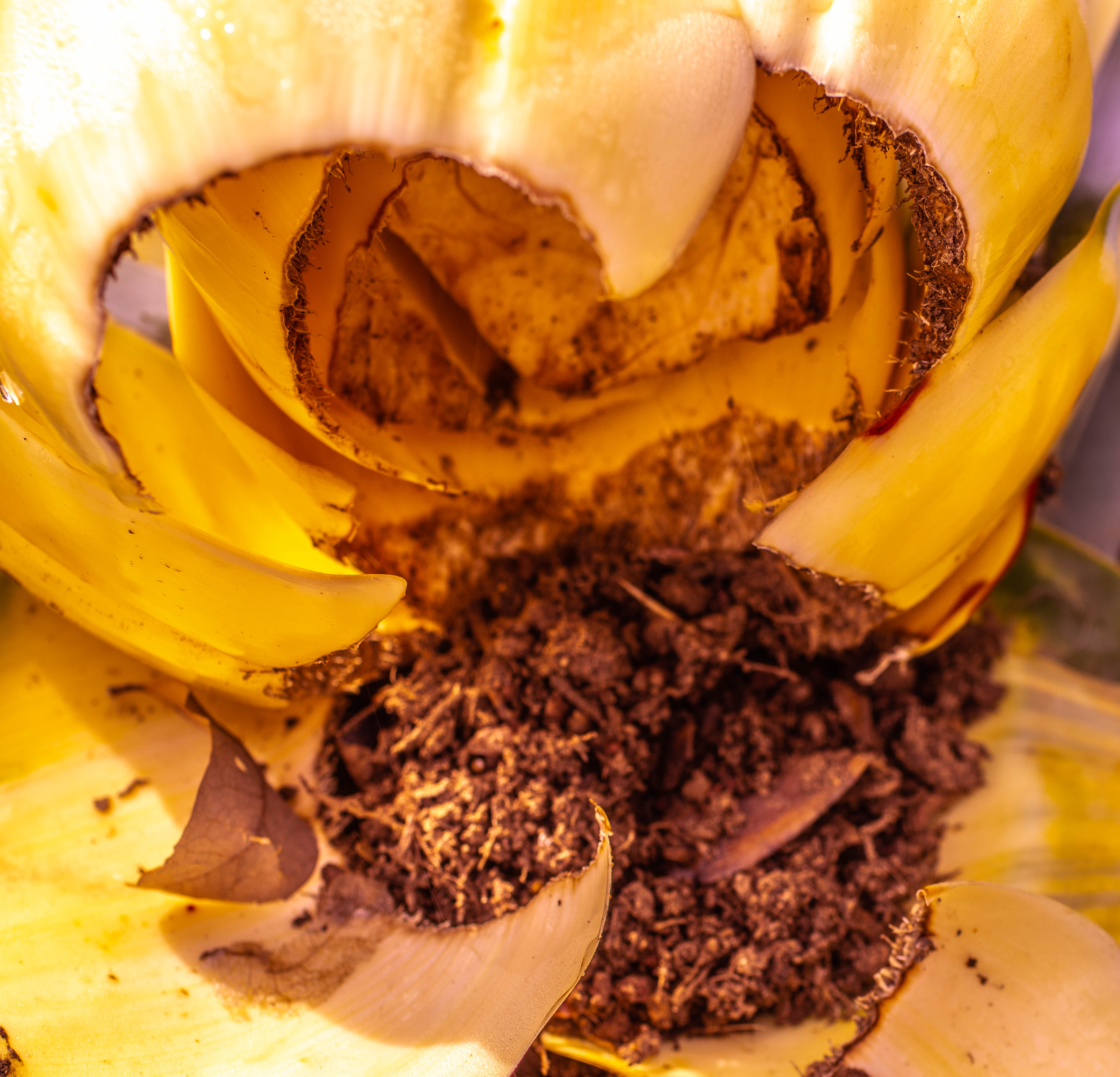
I agree this photo achieves the desired sense of calm. Good work there! I don't know much about the Lensbaby lens, so I can't comment on that, but I would say I would prefer the whole rose to be in much sharper focus. The cylindrical shape of the petals draws the eye naturally to the center of the flower, so I would say a vignette wouldn't be necessary. However, I think the composition would be better if the center of the rose weren't at the center of the photo. Have fun experimenting! |
Mar 20th |
| 6 |
Mar 21 |
Comment |
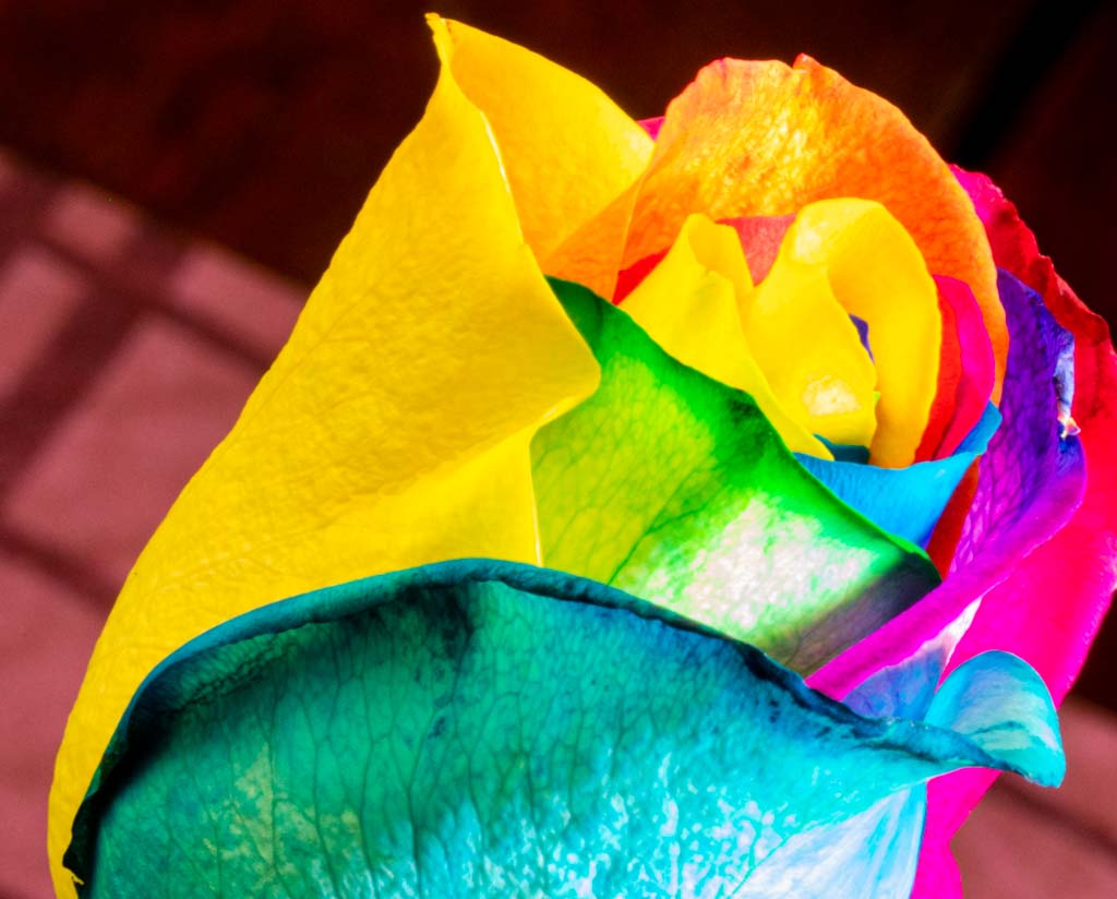
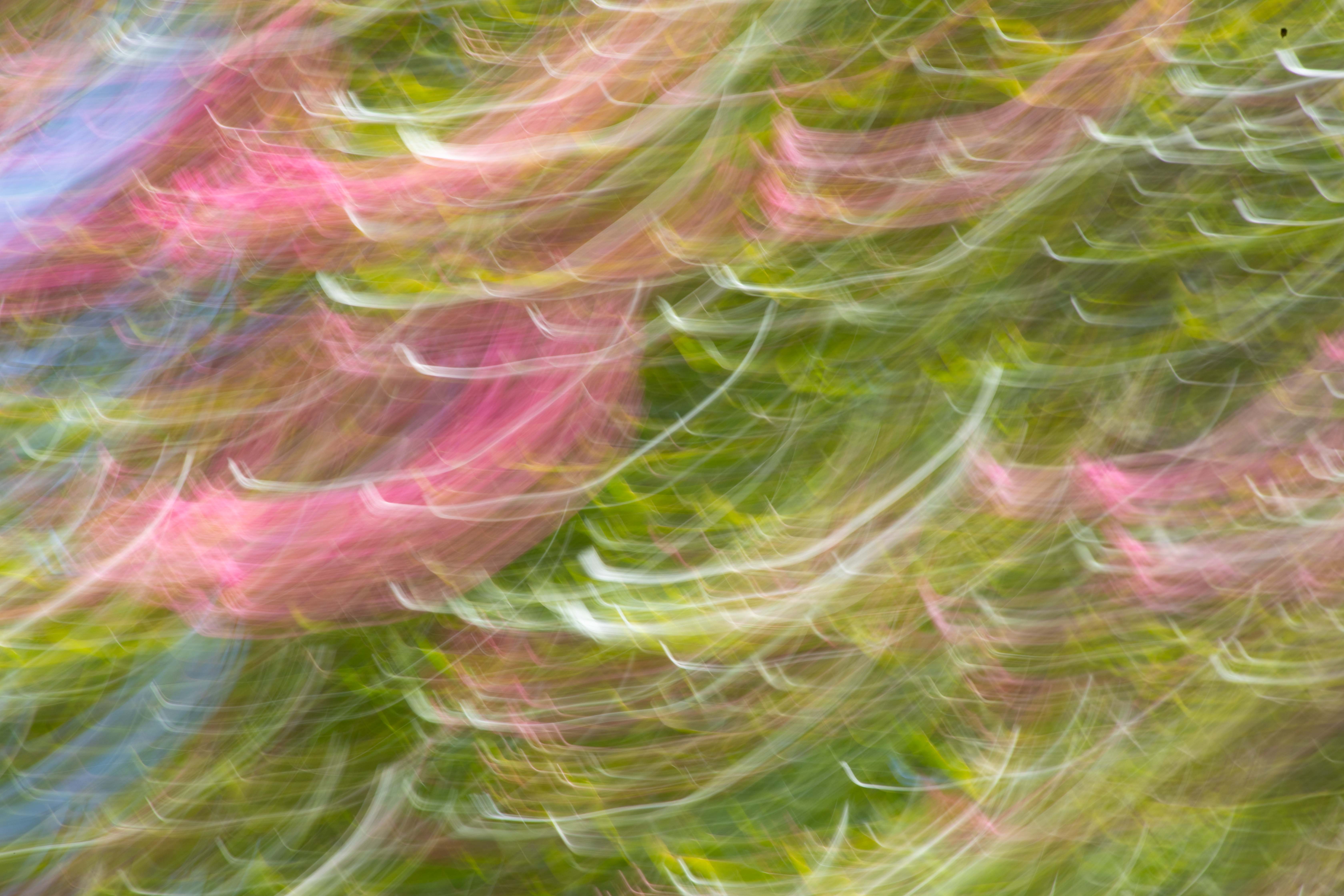
Well -- I am going differ from the rest and say that I loved the oil paint effects! But I am also a member of a Fine Arts group, so my "likings" may be a bit different from others. See Peter Newman's photo turned into a "painting" in group 79, my other group. I like taking close ups of something natural and then changing it into a "work of art," abstract or otherwise. However, I have found that people in this group seem to want a close-up to be only natural. I don't agree, but I go along. For this to have looked more like a painting, I would have continued the brush strokes into the green area, just enough, at least, to make the whole thing look like a painting. For me, it would still qualify as a macro! |
Mar 20th |
| 6 |
Mar 21 |
Comment |
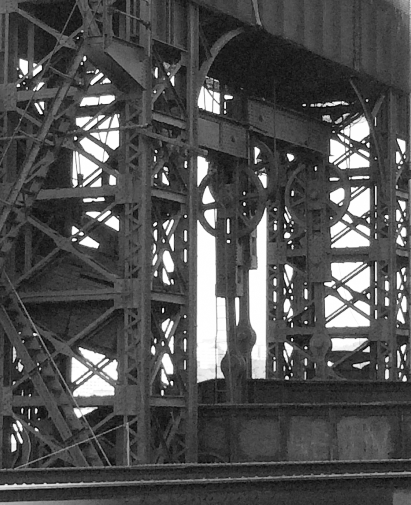
I found this really interesting and enjoyed exploring it with my eye! I like your version, without the flip. While I agree it would be better to have the clock right side up, I think the placement at the upper right rather than lower left is a better composition. I love the background - perfect color! And the lighting. I agree the two sleep pieces are distracting, but I would add the 2525 one as distracting. The clock seems to me to be the center piece, and the close focus and reading of the others are distracting. |
Mar 16th |
| 6 |
Mar 21 |
Comment |
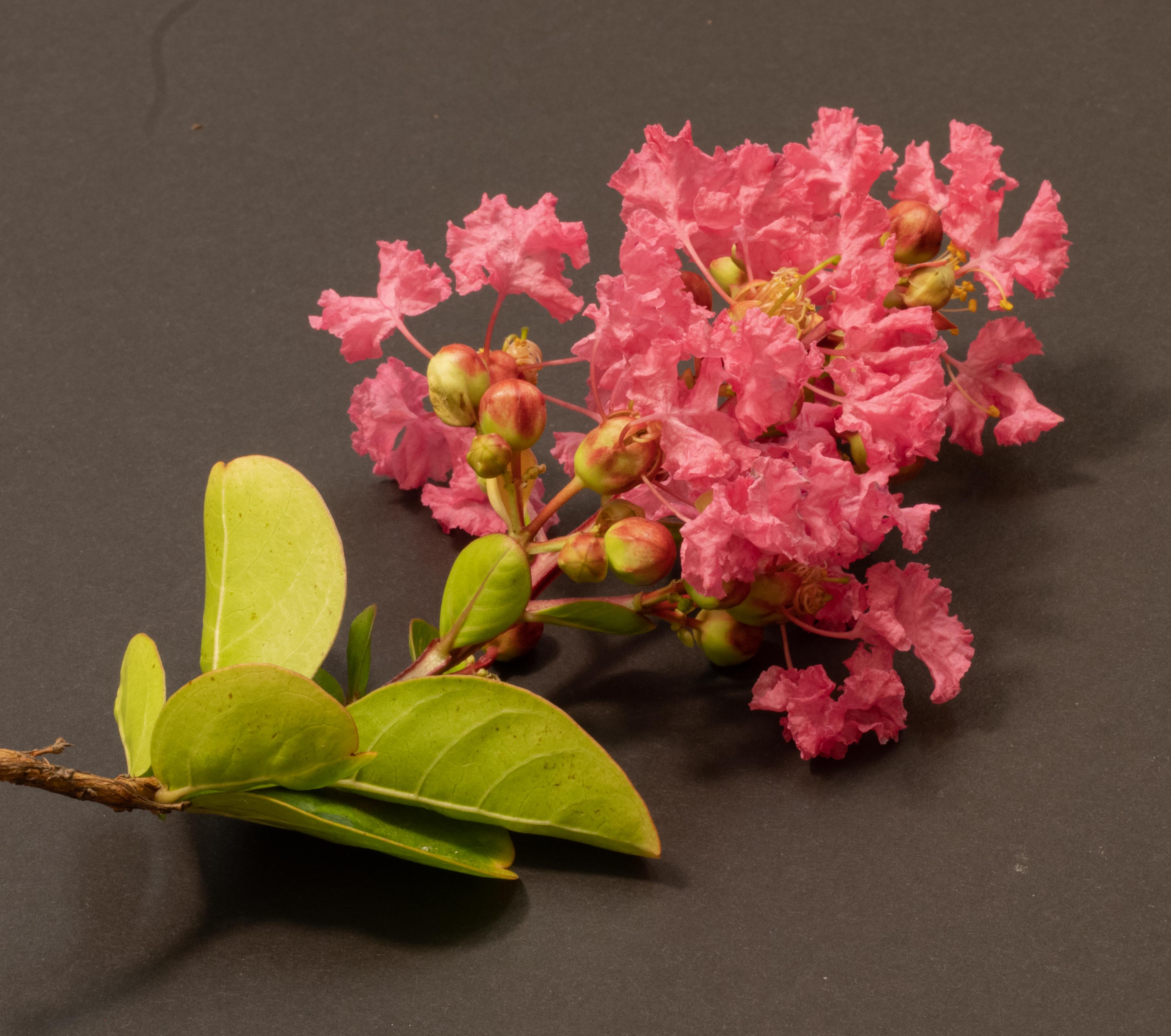
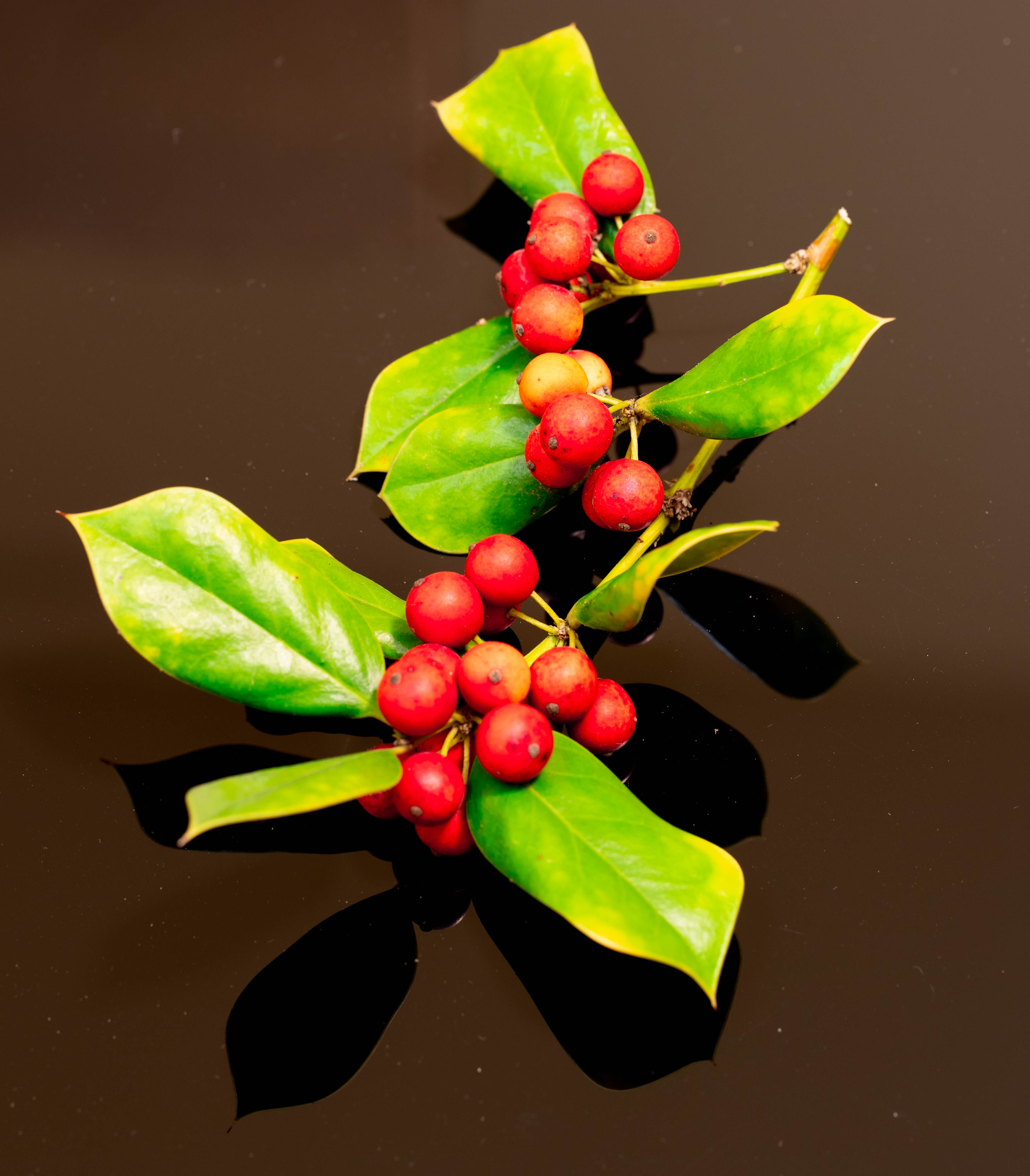
A lovely photo! However, I do like Janet's crop, and I guess I prefer the color image. Don't think I can articulate why-- maybe because the pollen dust doesn't show. Also, it's more cheerful. We all need that these days! |
Mar 16th |
5 comments - 1 reply for Group 6
|
| 79 |
Mar 21 |
Reply |
I tried that already and it didn't work. I don't know what the problem is. Perhaps I'll call when they're open. |
Mar 21st |
| 79 |
Mar 21 |
Reply |
Thanks - strangely, I can't sign in, and I also can't reset my password without my Membership #, which I didn't record. I'll have to wait until I get the next copy of the PSA magazine. Thanks again! |
Mar 21st |
| 79 |
Mar 21 |
Comment |
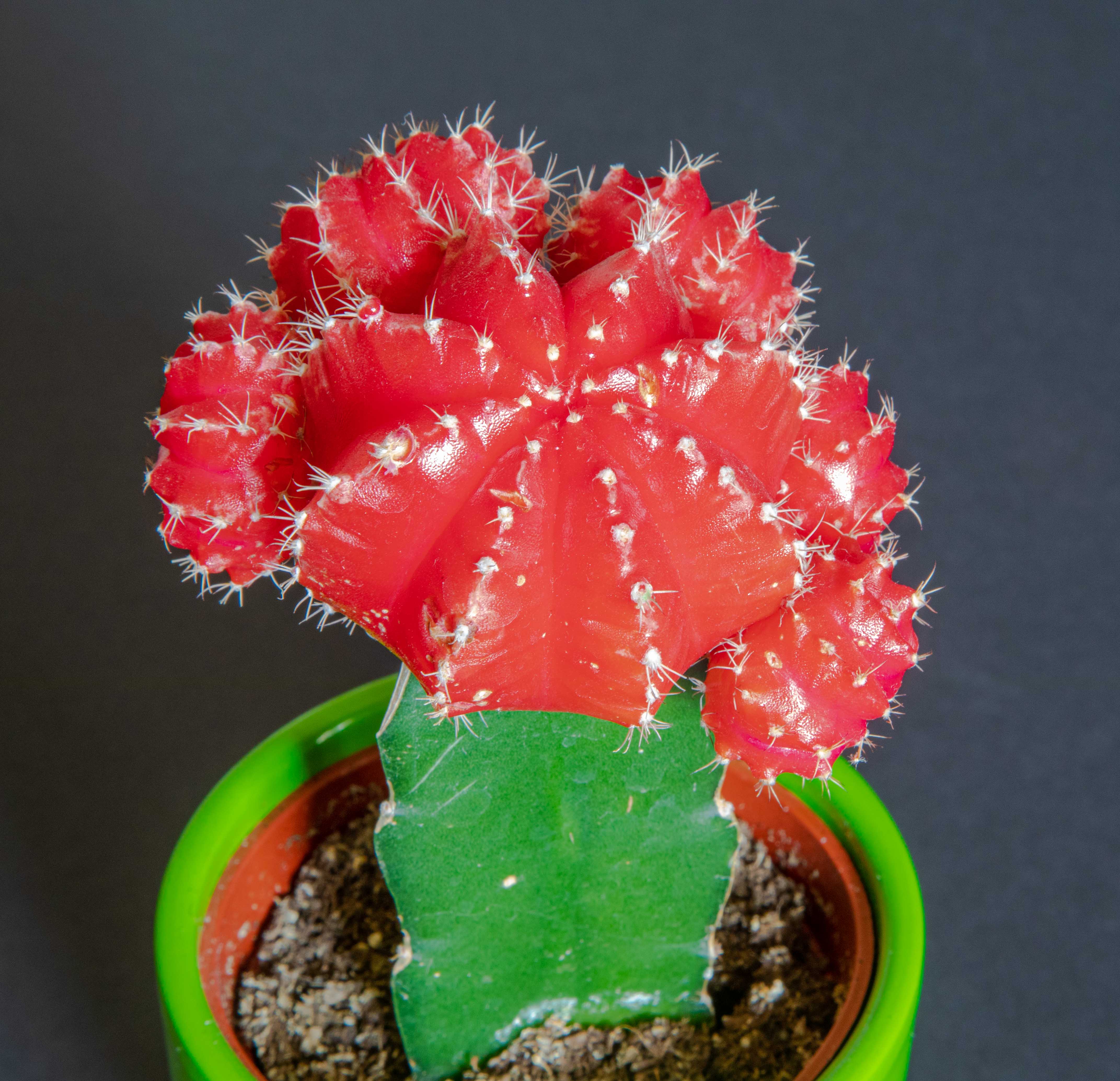
Great work! I love the sharpness of little "hairs" at the base of the flower and the "veins" in the upper portion. Amazing, considering the camera was hand-held. Excellent composition and choice of settings to reduce camera shake. Where can I get the PSA beginning photoshop class? |
Mar 21st |
| 79 |
Mar 21 |
Comment |
I can't believe how creative and innovative you are! I would never have dreamed of doing a shot like this, but you've given me some insights and now I'll try to think more creatively before I shoot. Great work! |
Mar 21st |
| 79 |
Mar 21 |
Comment |
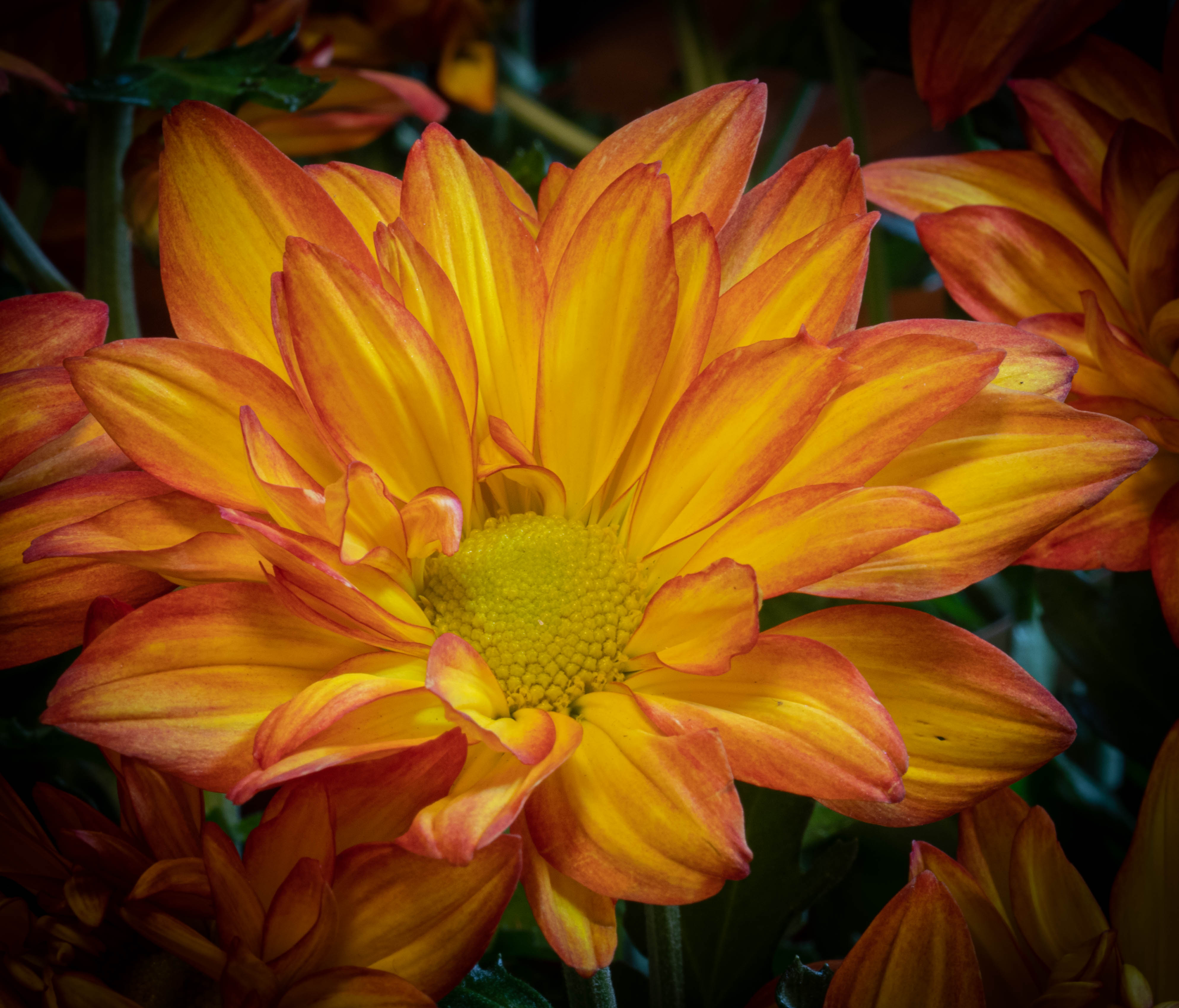
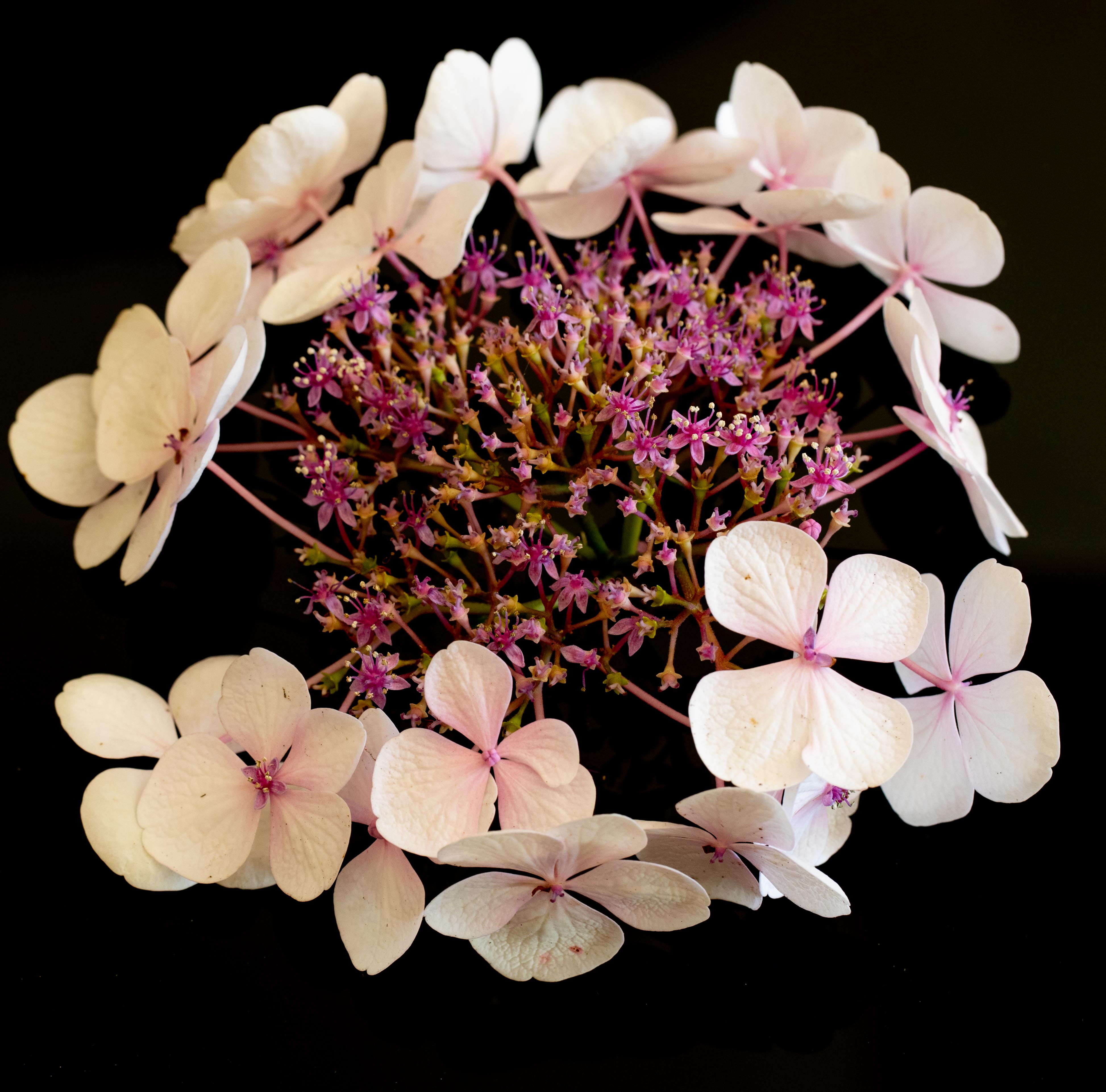
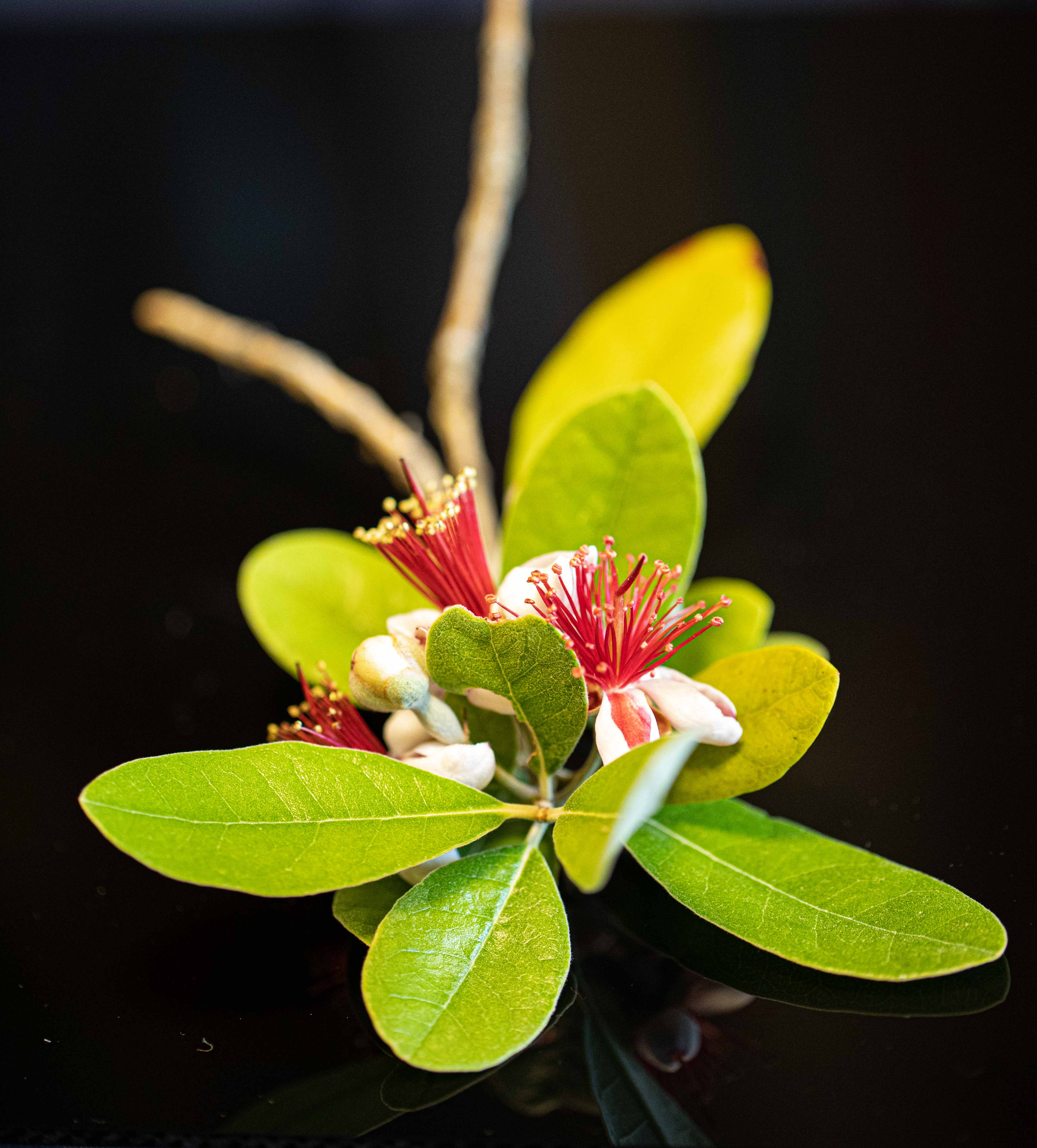
I love the lighting and clarity of this! A gorgeous flower with wonderful details and colors. I agree with Judith's comments about the background stems and leaf and the white flower. Also, I wonder if the composition would be improved by rotating it a bit so the white flower was in the upper right corner and the eye was drawn on a diagonal from lower left to upper right. |
Mar 20th |
| 79 |
Mar 21 |
Comment |
What a fantastic idea, and how talented you are! I love all the changes you made with your sketch - the perspective, the larger, clearer boat, the rendering of the marina to the left, the aging of the fencing, and the light in the lighthouse! Maybe the birds could have been clearer and better defined, and the blue in the sky a better reflection of the sea below, and more of a background-- unless it's meant to be some kind of smoke from the flame in the lighthouse--then gray. |
Mar 16th |
4 comments - 2 replies for Group 79
|
9 comments - 3 replies Total
|