|
| Group |
Round |
C/R |
Comment |
Date |
Image |
| 6 |
Feb 21 |
Reply |
Ok -- got it! Anyhow, great photo, as usual! |
Feb 26th |
| 6 |
Feb 21 |
Reply |
Ok -- got it! Anyhow, great photo, as usual! |
Feb 26th |
| 6 |
Feb 21 |
Reply |
Ok -- got it! Anyhow, great photo, as usual! |
Feb 26th |
| 6 |
Feb 21 |
Reply |
Ok -- got it! Anyhow, great photo, as usual! |
Feb 26th |
| 6 |
Feb 21 |
Reply |
Ok -- got it! Anyhow, great photo, as usual! |
Feb 26th |
| 6 |
Feb 21 |
Reply |
I like it - good work! |
Feb 26th |
| 6 |
Feb 21 |
Comment |
I think this is gorgeous! I love the swirls in the water and the clarity and color of the flowers. The only think I don't understand and am curious about is what all you did to transform the original to the final. I don't seem to see any water in the original. Can you detail your post-processing, please? |
Feb 25th |
| 6 |
Feb 21 |
Comment |
Interesting issues and great discussion! I agree the lighting was a bit harsh, but the detail on the wings looks pretty good to me. I think shooting from the front or side is a great idea, since the eyes and antennae are always of great interest -- but what a challenge! I also like the idea of changing out the lower bottom right, but my reason is it is out of focus, and looks like it was already "pasted" in. In particular, the dark edge at the bottom or back of the wings is very sharp, but the debris it is next to is very fuzzy. Cloning in the flowers from the top left to the bottom right gives more clarity. |
Feb 24th |
| 6 |
Feb 21 |
Comment |
Lovely portrait! However, I agree the vest is distracting and I prefer the cropped version. I think sometimes it's a struggle to decide whether to include the whole of the object or to cut part of it out. I've cut it out sometimes and then been criticized for removing context (but that was in my Fine Arts group). At any rate, cropping this down to just the head would remove the beauty of the tail pointing to the toes, which makes it such a lovely composition. |
Feb 21st |
| 6 |
Feb 21 |
Comment |
Lovely. Masterful. Lighting is great! |
Feb 19th |
| 6 |
Feb 21 |
Comment |
I think it's lovely and congratulate you for having the eye to see it and take it. Interesting. Good composition. Moves the eye around. I do like Dick's crop and flip, though. |
Feb 15th |
| 6 |
Feb 21 |
Reply |
I like it! |
Feb 15th |
| 6 |
Feb 21 |
Comment |
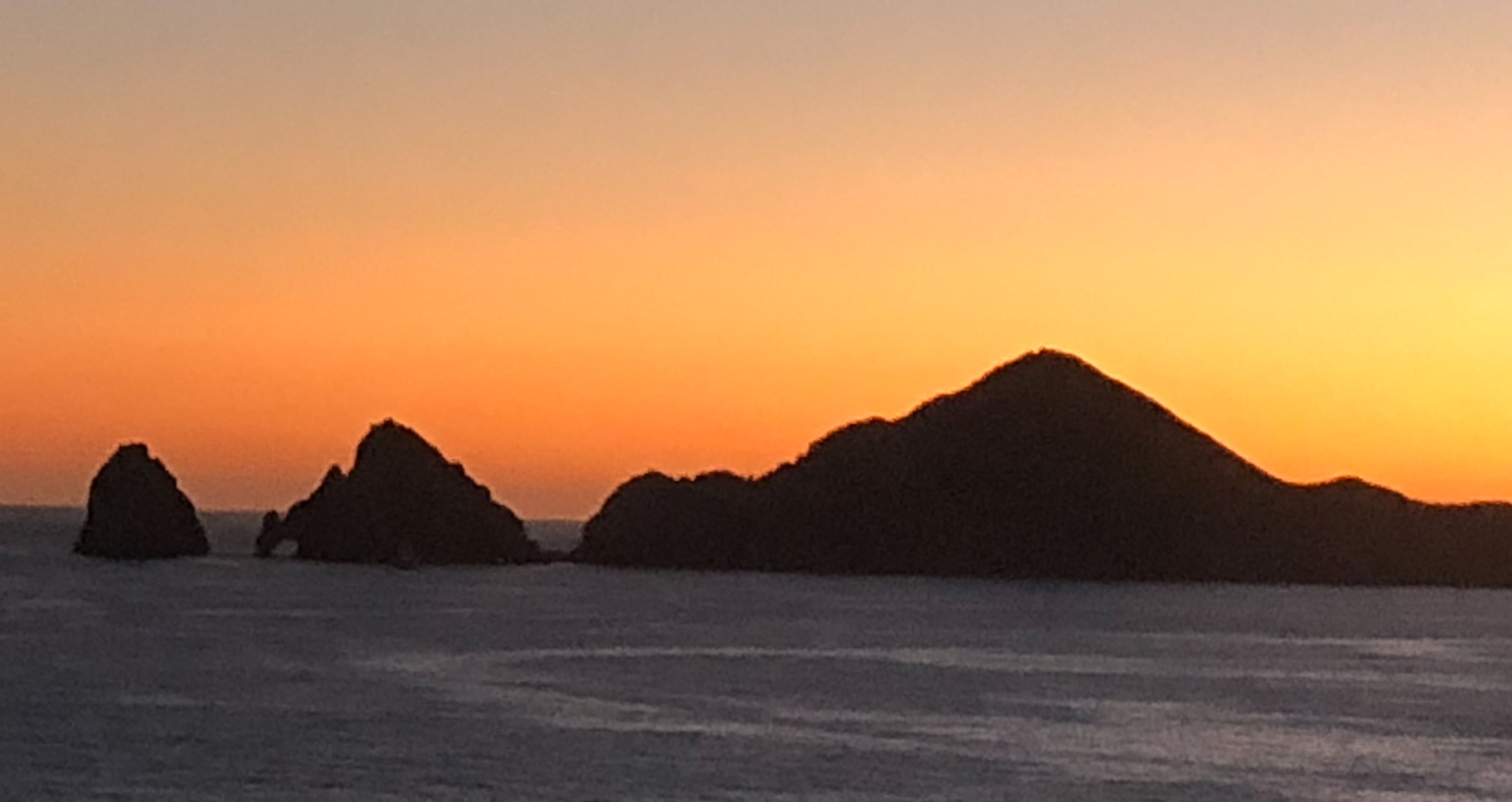
What a shot! I've never seen a butterfly that "up close." Love the weird eyes, and the hairy, spider-like legs. Good for you for knowing how to capture this. I might have liked to see the rest of the body, but that would probably have lost this beautiful focus on the eyes. |
Feb 10th |
6 comments - 7 replies for Group 6
|
| 79 |
Feb 21 |
Reply |
No, not focus stacked. I have a macro, but in my post-surgical daze, I grabbed my zoom of nearly identical size and shape. Didn't realize until I was writing it up in the end. |
Feb 26th |
| 79 |
Feb 21 |
Comment |
I love the rays and the fact it's monochrome. Good choice and good post-processing work. However, the sunlight is really, really bright and hard to look at. Do let us know if any of the suggestions given by others for recovery work for you-- we need to know these things! |
Feb 25th |
| 79 |
Feb 21 |
Reply |
I read the Langoliers -- a novella by Stephen King adapted for TV. Interesting comparison! |
Feb 21st |
| 79 |
Feb 21 |
Comment |
Very creative! Can't believe it's an airplane wing -- at first glance I thought it was a manta ray. Love the colors and the stars! Strange as it may seem, I think I'd like it better without the astronaut. |
Feb 21st |
| 79 |
Feb 21 |
Comment |
Lovely colors! Love the reflections in the water. I agree with others I would crop out the bird at the top entirely. |
Feb 21st |
| 79 |
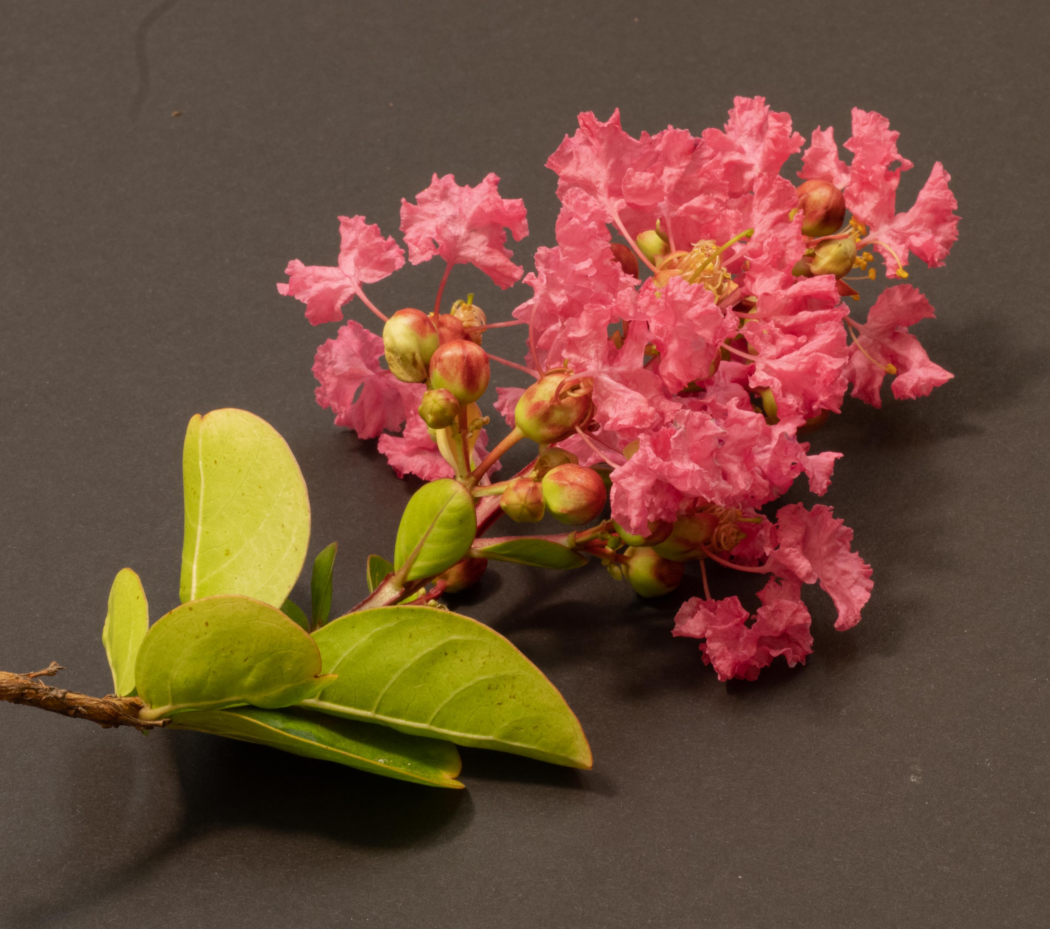
Feb 21 |
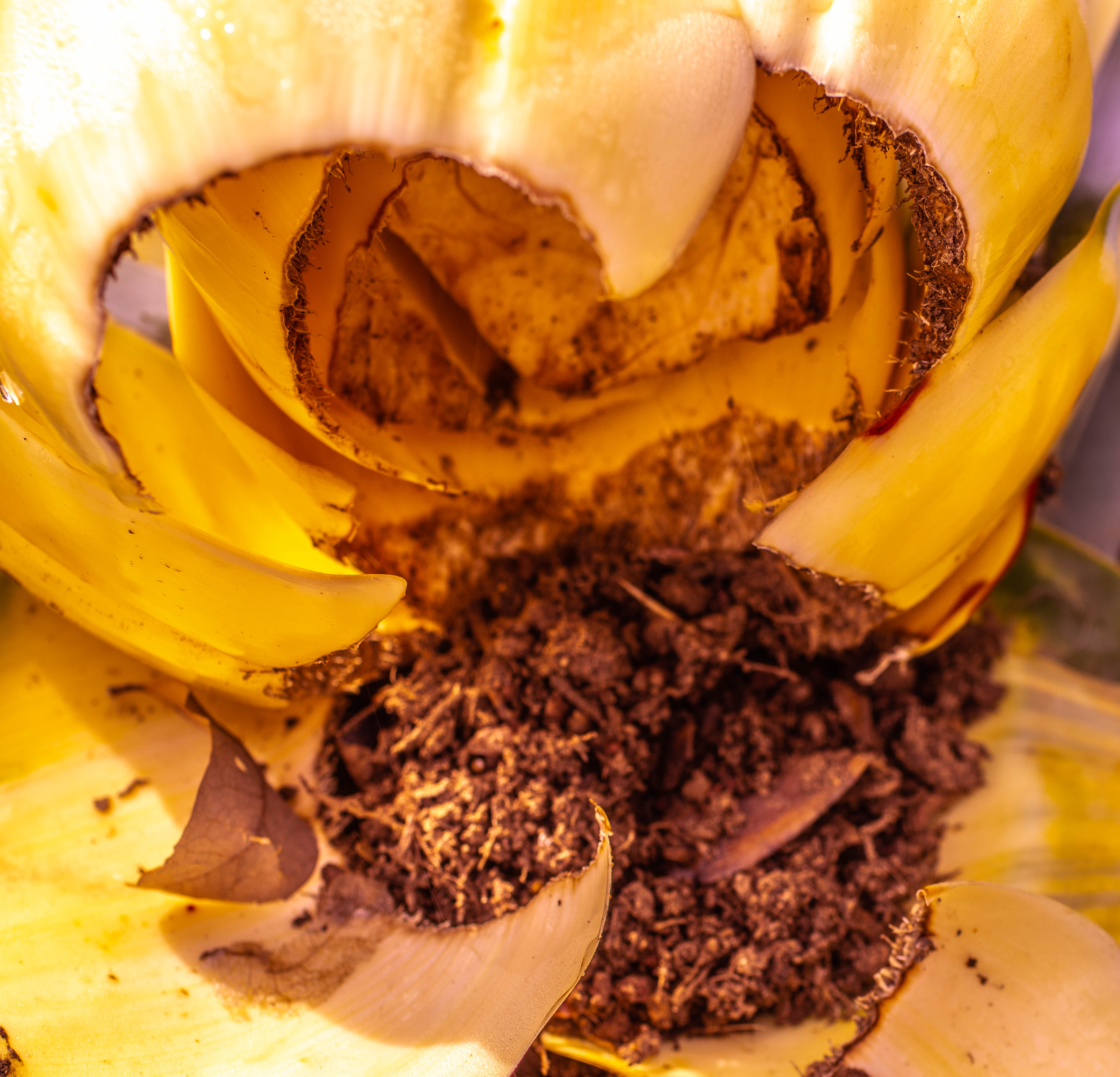
Reply |
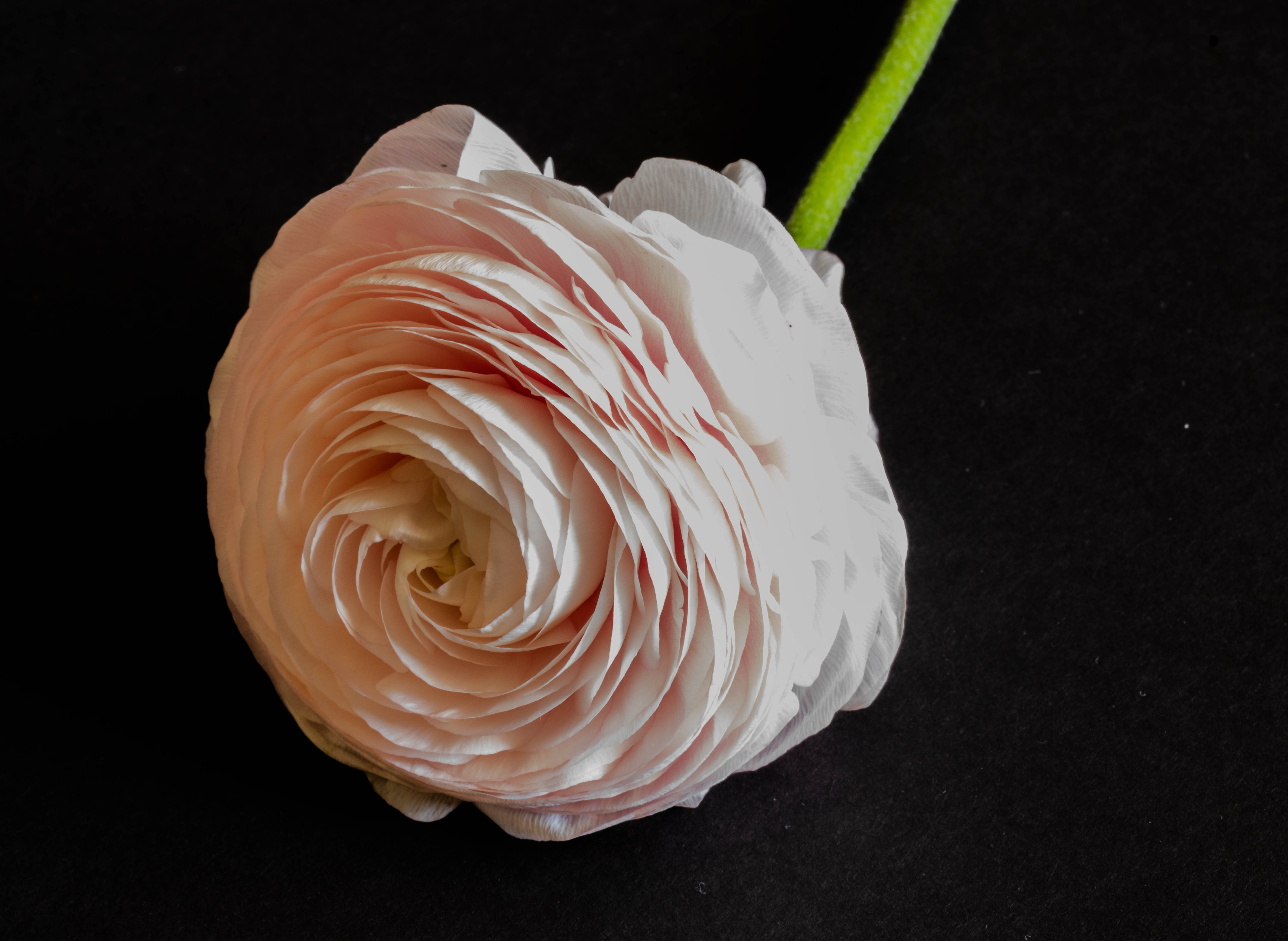
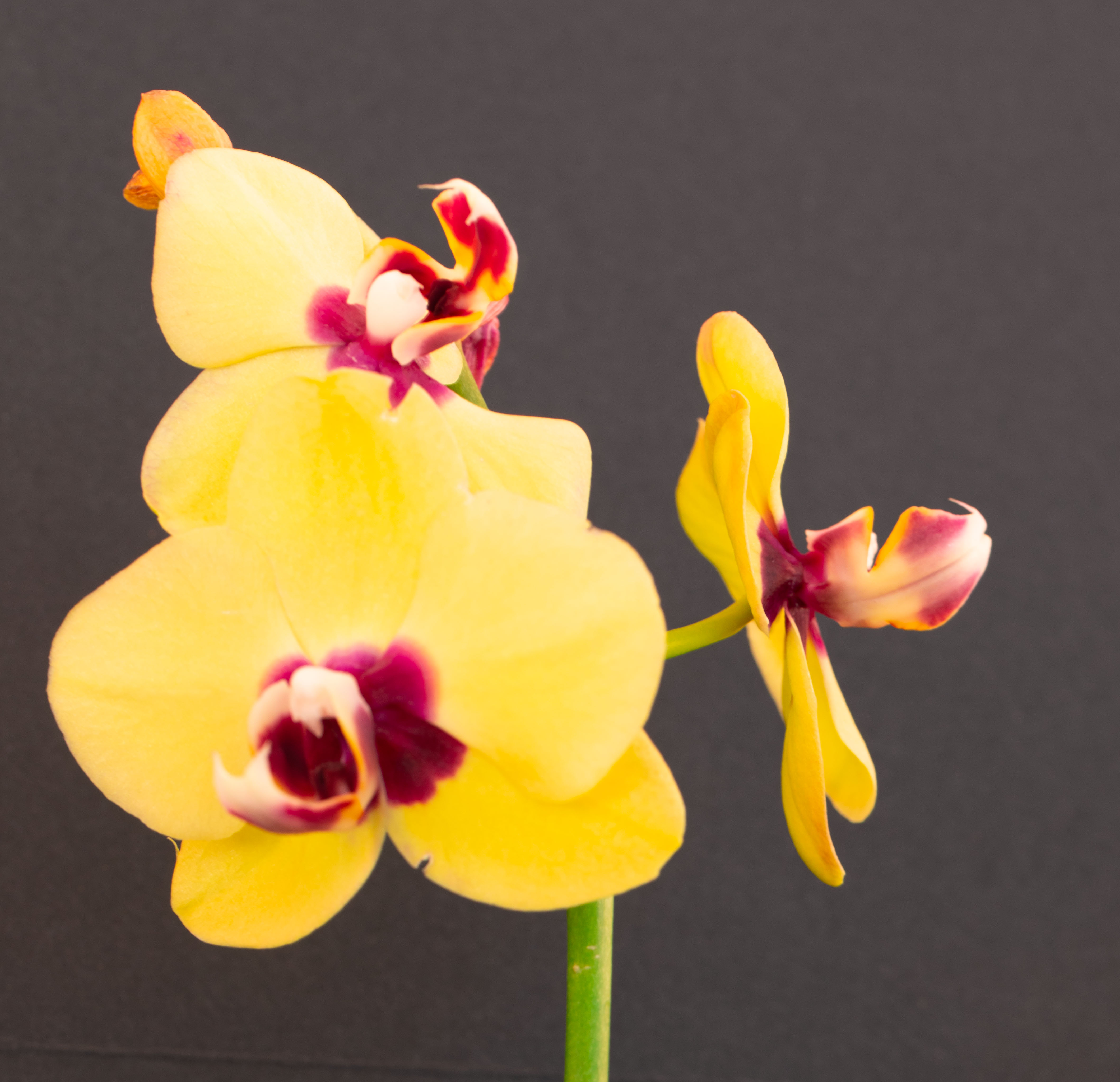
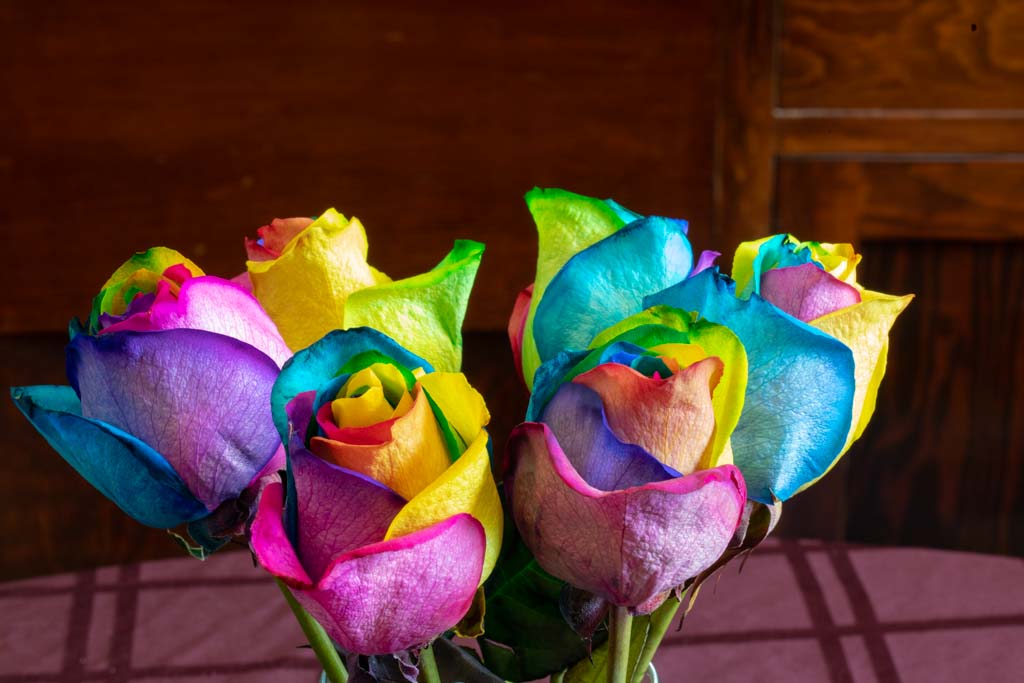
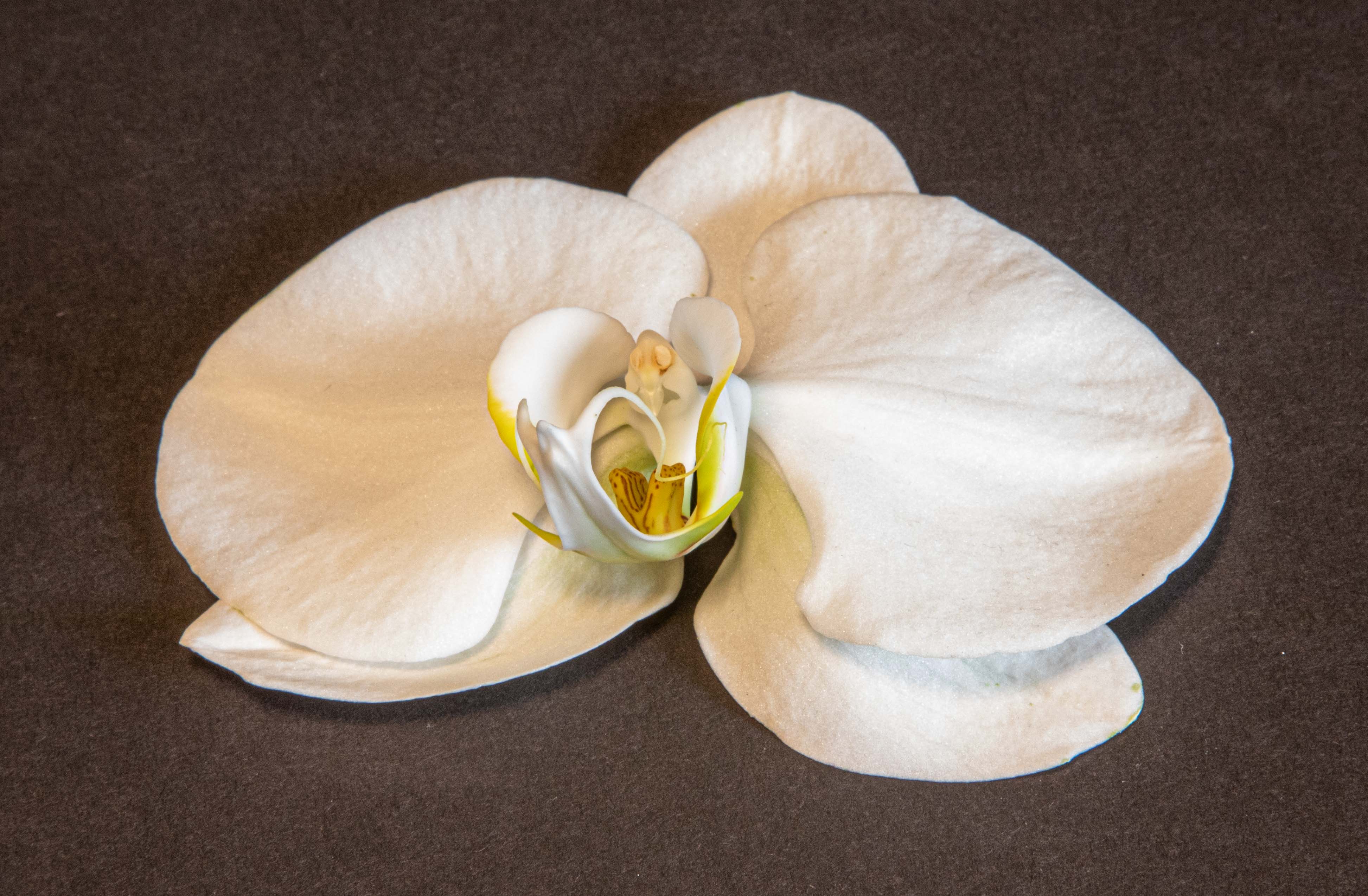
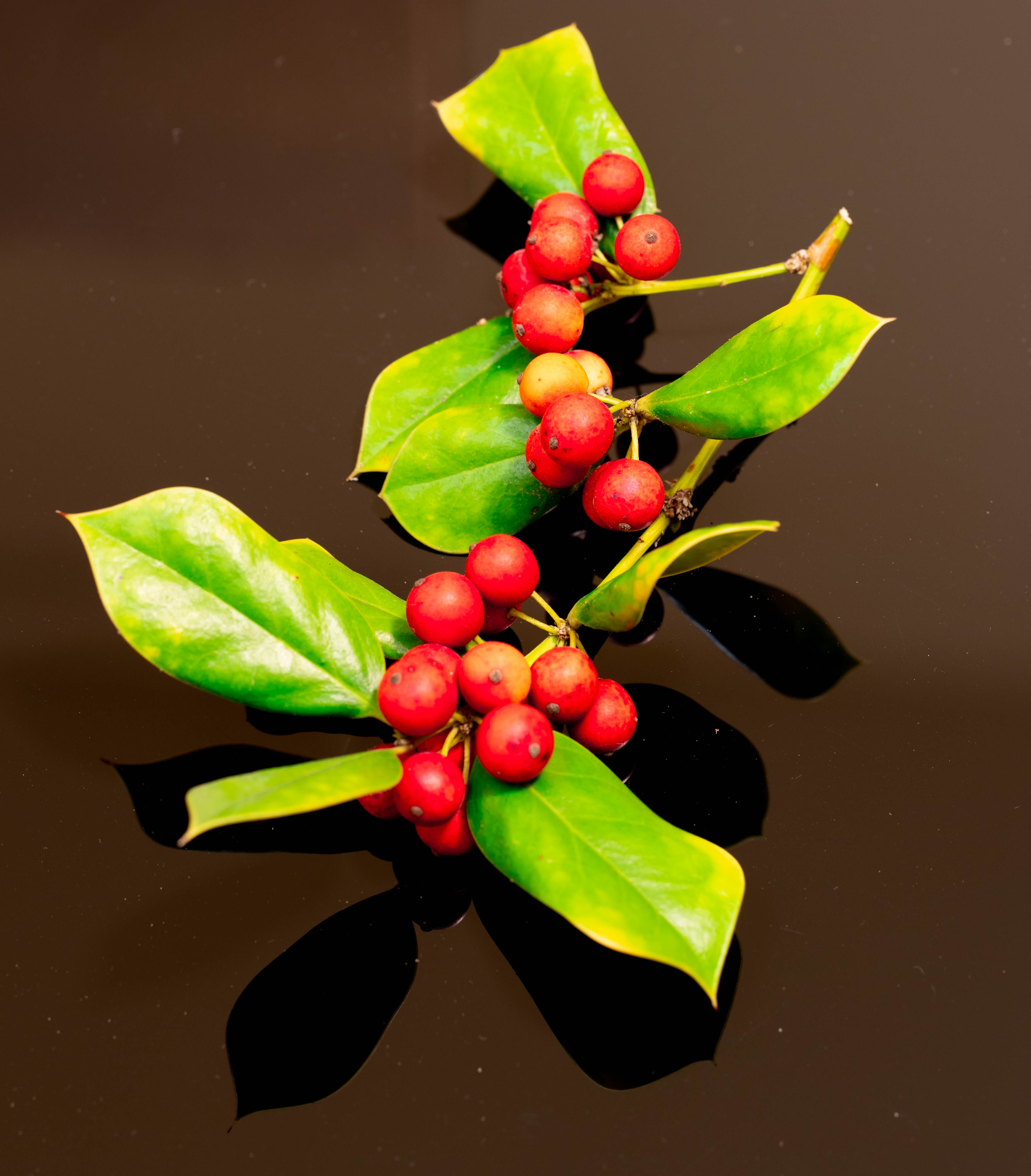
I cut the flower off the plant and put it on a "black" foam board. I didn't crop anything but the board. |
Feb 19th |
| 79 |
Feb 21 |
Comment |
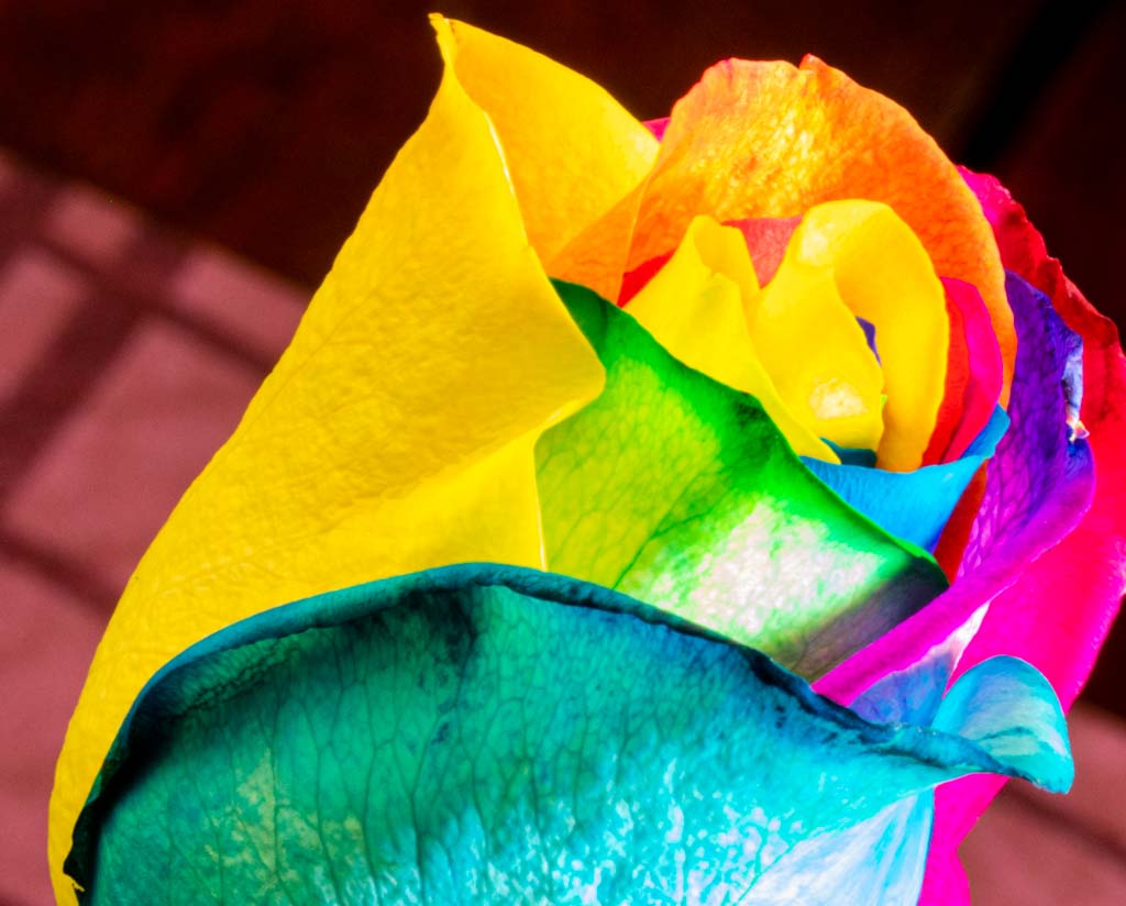
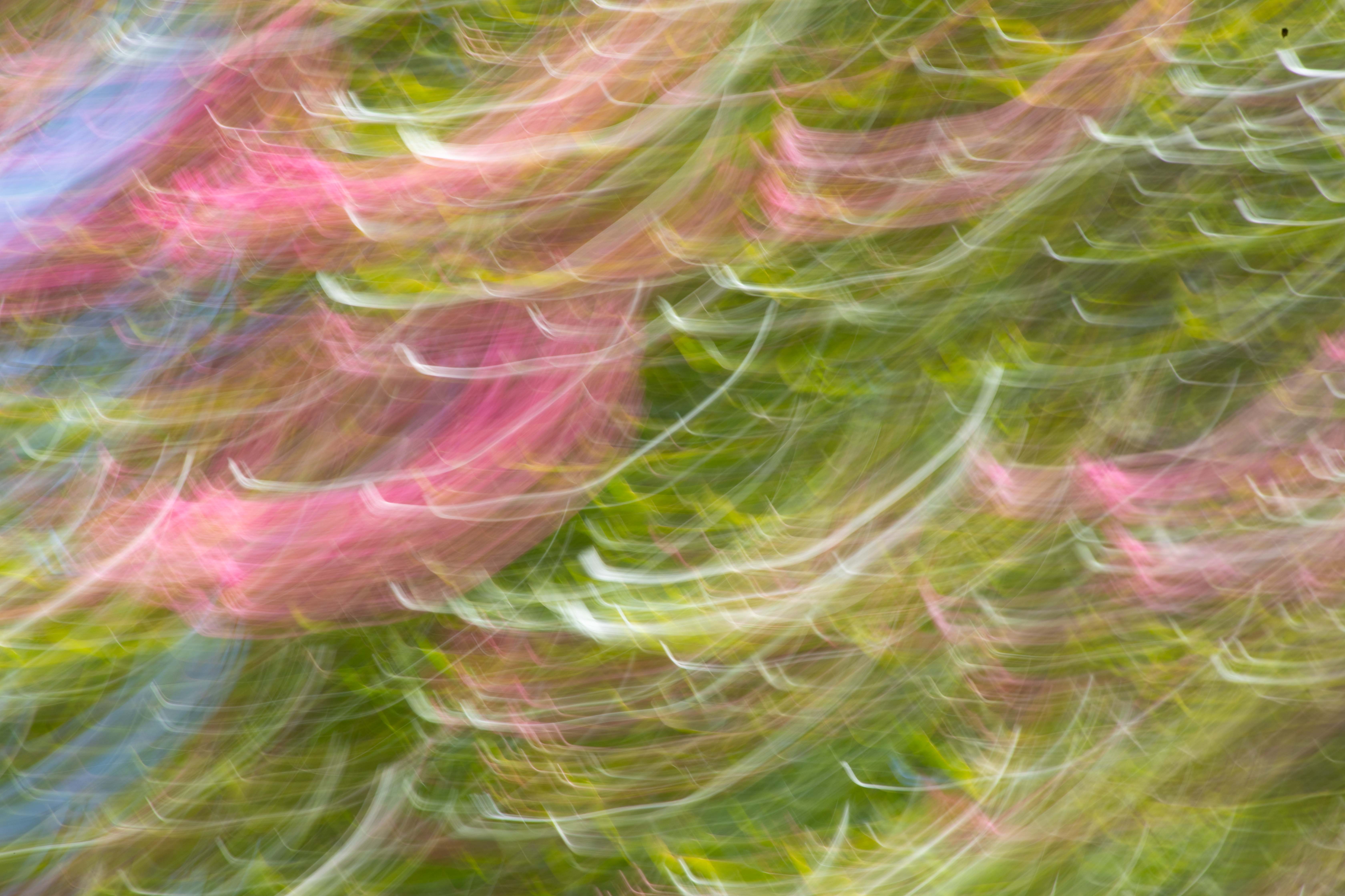
This is really pretty. I love the different shapes, the movement, the colors, the magic. I do find the blue stripe at the right a distraction. Congrats for doing it -- unfortunately, I'm too much of an amateur do understand the acronyms in the discussion. |
Feb 15th |
| 79 |
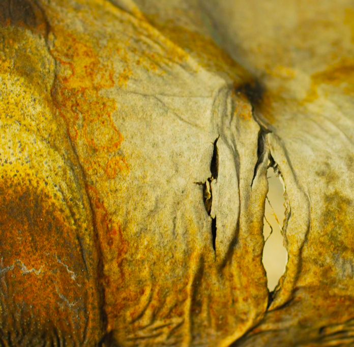
Feb 21 |
Comment |
A very interesting and intriguing work. I love the effect of the overlaid vase image. How did you get the tear in there? I agree with Karl that the pain clearly comes through, but nothing to link it to the military. Challenging idea for an exhibit. Do you intend to photograph victims? If so, would they tell what happened to them and would that somehow be linked to the photo? |
Feb 10th |
5 comments - 3 replies for Group 79
|
11 comments - 10 replies Total
|