|
| Group |
Round |
C/R |
Comment |
Date |
Image |
| 6 |
Aug 20 |
Reply |
Thank you -- I'll try it! |
Aug 22nd |
| 6 |
Aug 20 |
Reply |
Using a higher numbered f stop definitely helps increase your DOF. Dick is an expert on this. See his comments on my photos in the past. |
Aug 19th |
| 6 |
Aug 20 |
Comment |
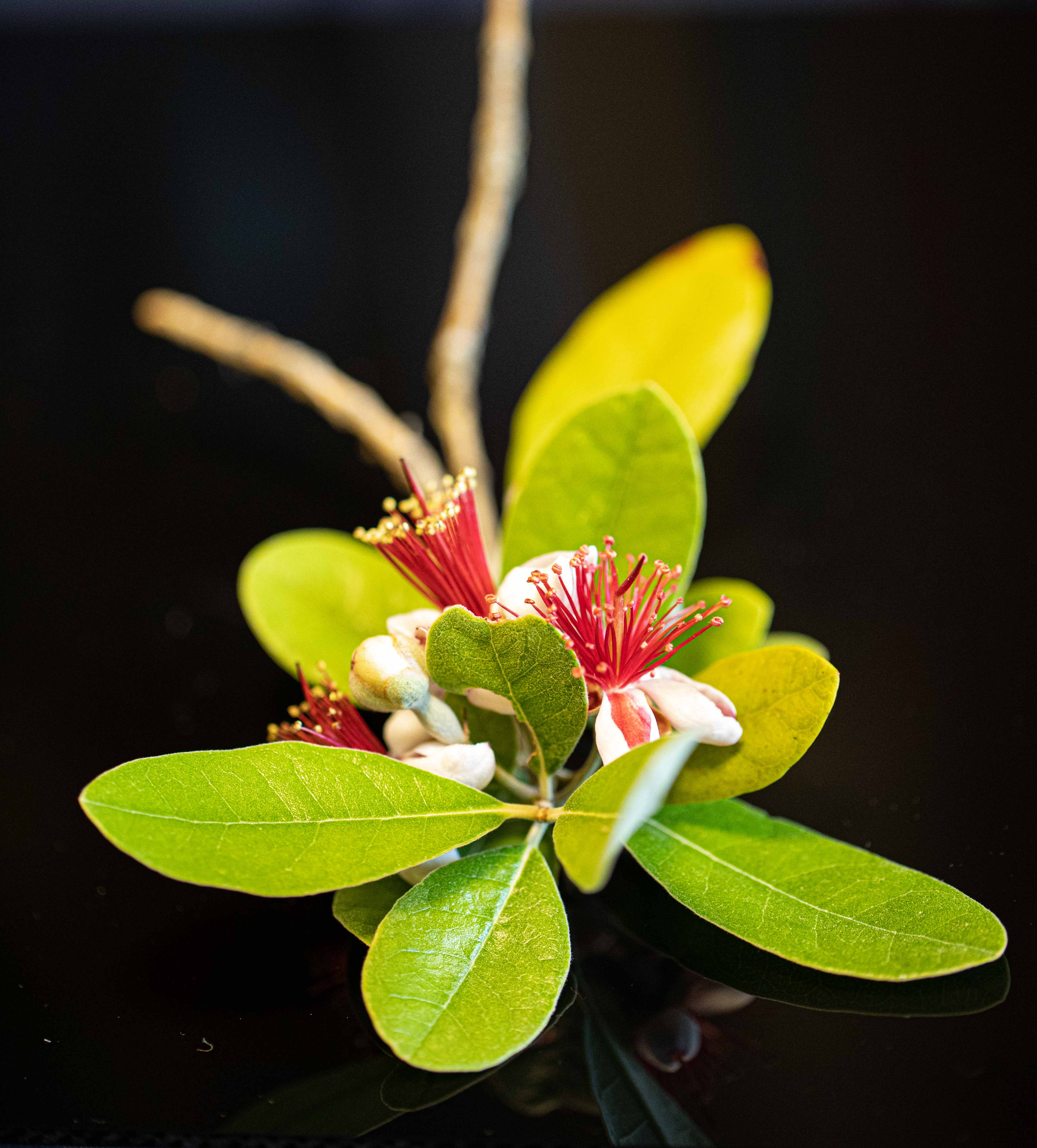
Gorgeous shot! Love the detail of the green and gold back, and all the eyes! Please see my comments under Salvador's photo. I am not one that believes everything needs to be in focus, but here I would have liked to have the wings, at least, in focus. Now, this was hand held, and that would probably be impossible. And to set up a tripod and cable release, and a chair, and sit and wait for the bee, would be ridiculous. I once sent back a macro lens and got one that had image stabilizing for just that reason. I guess our best bets with little beasties are with dead ones! Anyhow, absolutely terrific shot taken on the fly, as it had to be. Congrats! |
Aug 19th |
| 6 |
Aug 20 |
Comment |
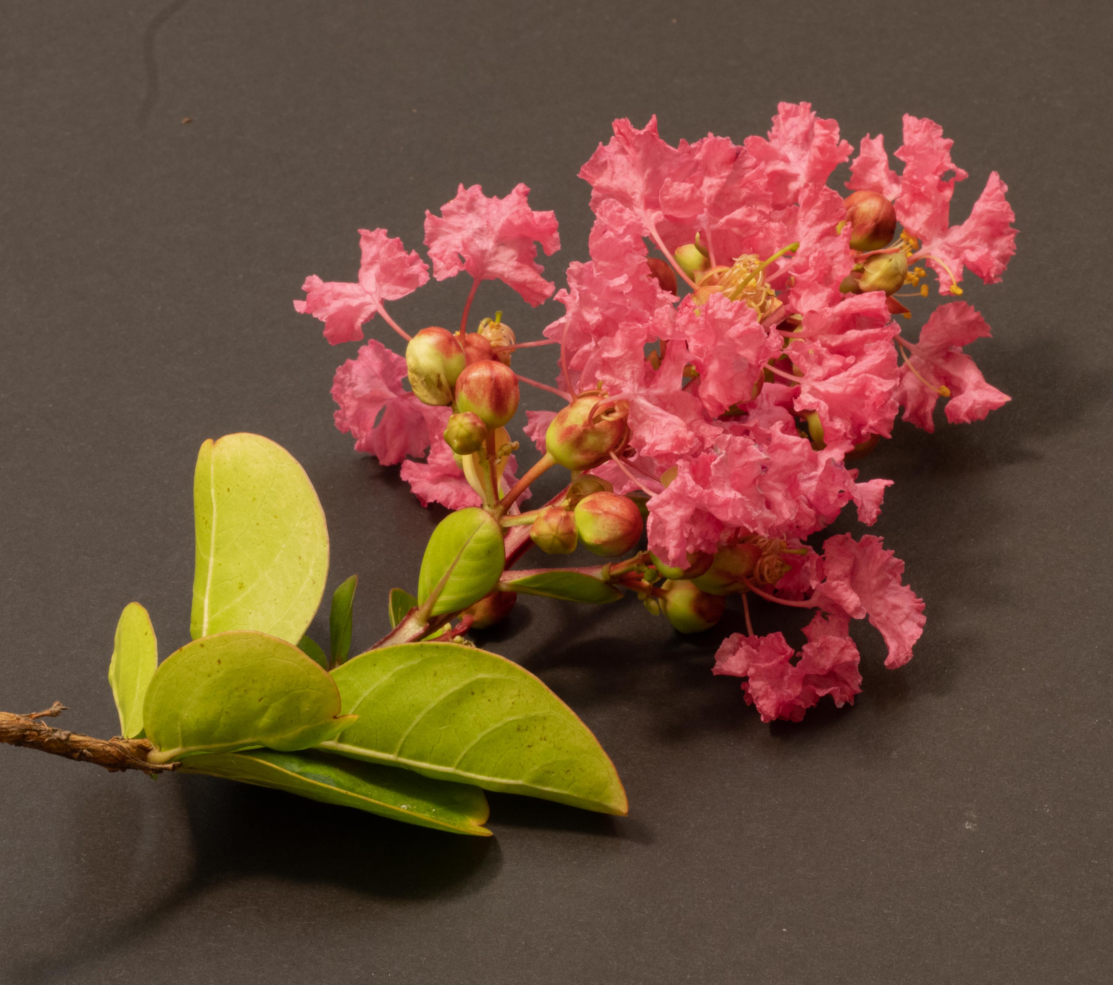
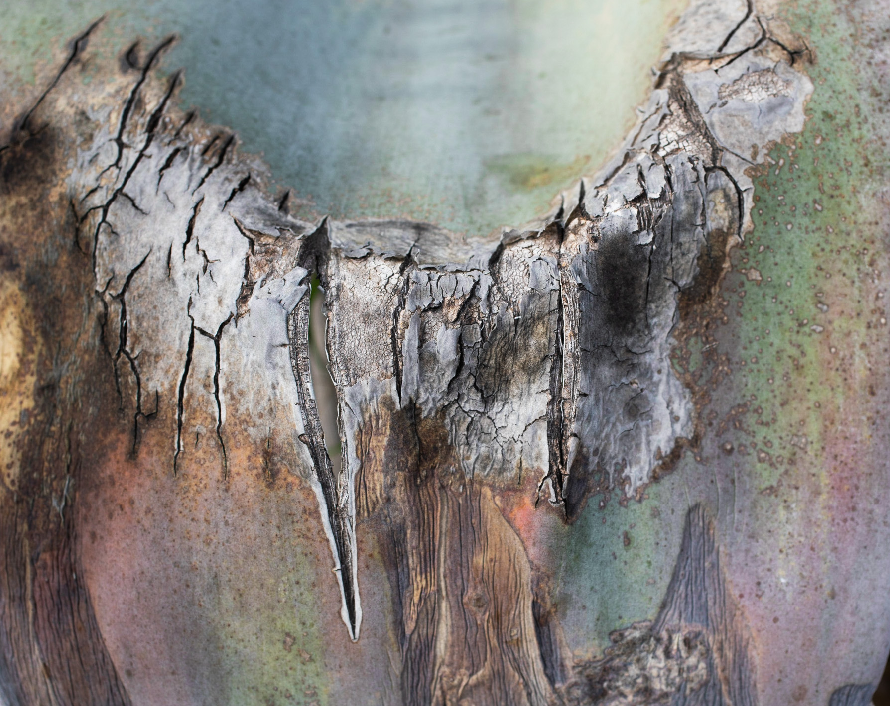
I, too, am interested in taking close up photos of tree trunks and plants, etc. I have done some so close the subject cannot be identified. Then I colored it nicely in LR, and what I had was an abstract work of art, in my view. Needless to say, this group called me out because they couldn't identify the subject. So I ask you all -- so long as it's a close up, why do you have to be able to identify it from looking at it? And why is that part of our criteria?
Also, I have noticed we all get criticized if some part of the photo is not in focus, especially if it's the subject. For example, a bug where part of the legs aren't in focus but are blurred. I have many books on macro photography (I'm sure you all do too), and there are many exemplary photos in there where part of the subject and/or photo is not in focus.
So I challenge you all -- what is our criteria here, and why?
As for this shot, the wound seems to me to be the main focus. That being so, I would crop it so that the wound was more central and located well, compositionally speaking, and so the wound took up at least 10-15% of the area of the photo.
How, by the way, do I import the photo from here to LR or PS so I can edit it and then repost it? |
Aug 15th |
| 6 |
Aug 20 |
Comment |
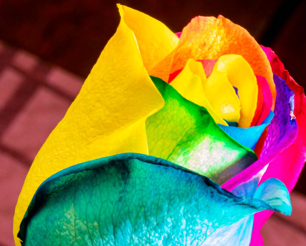
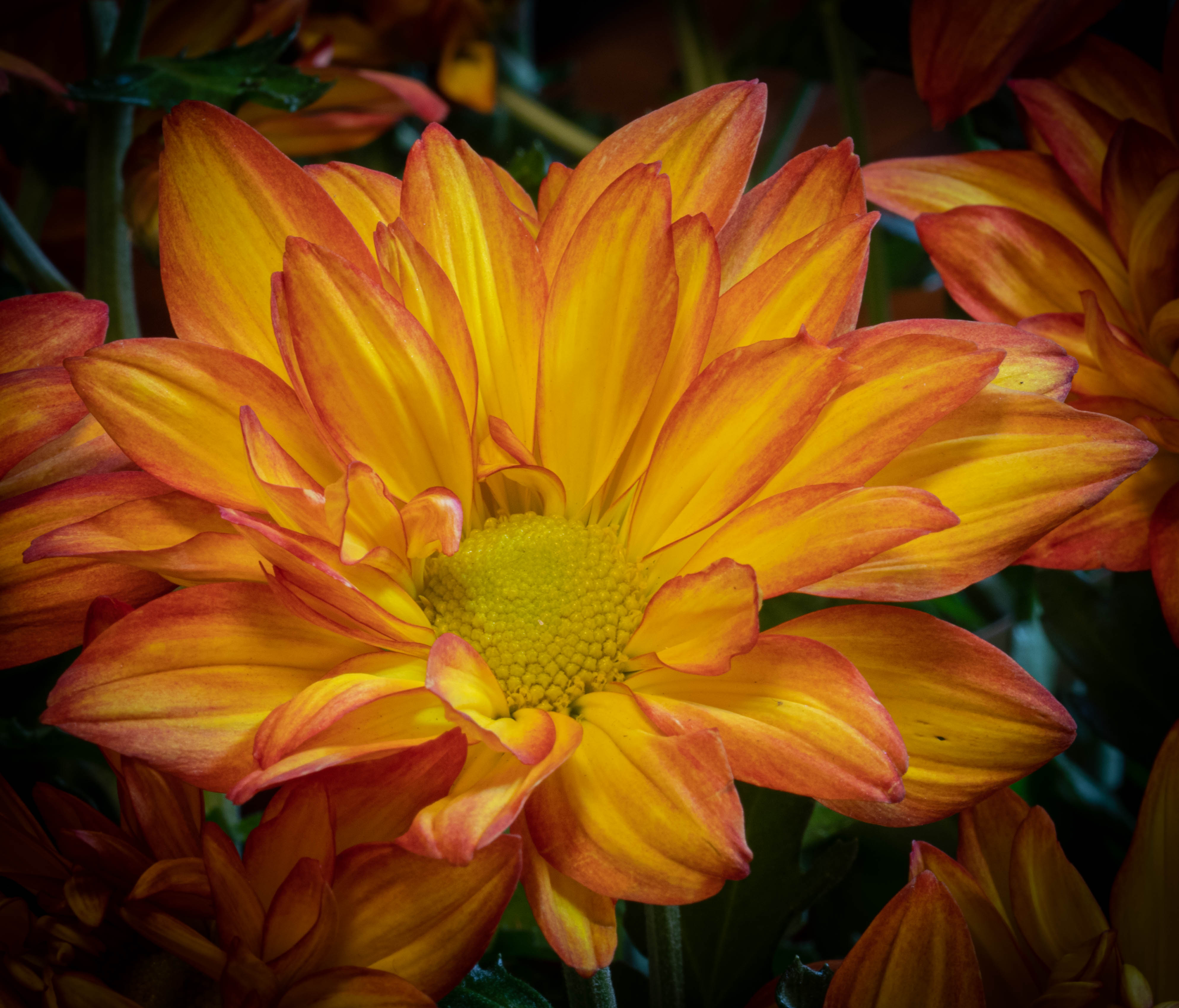
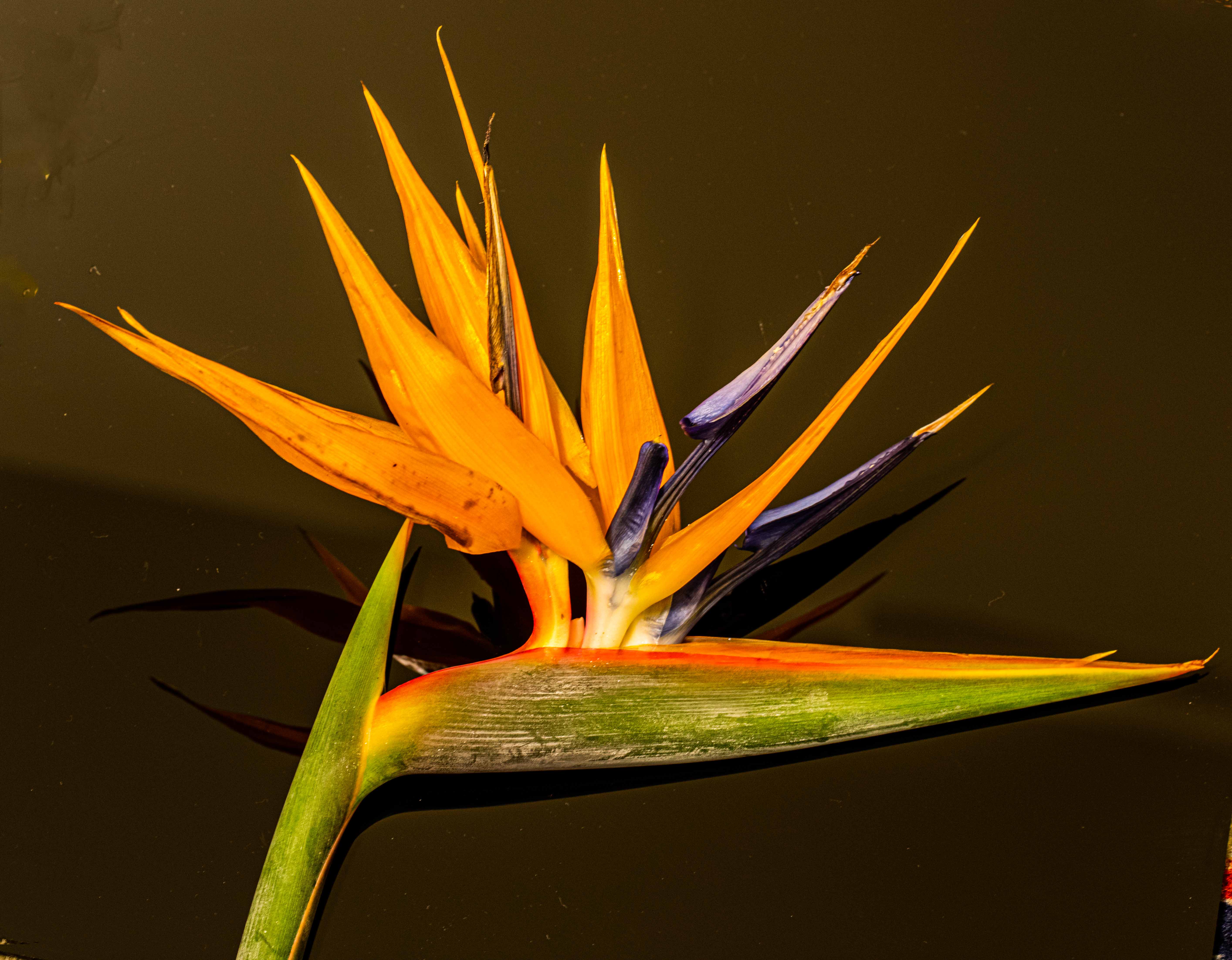
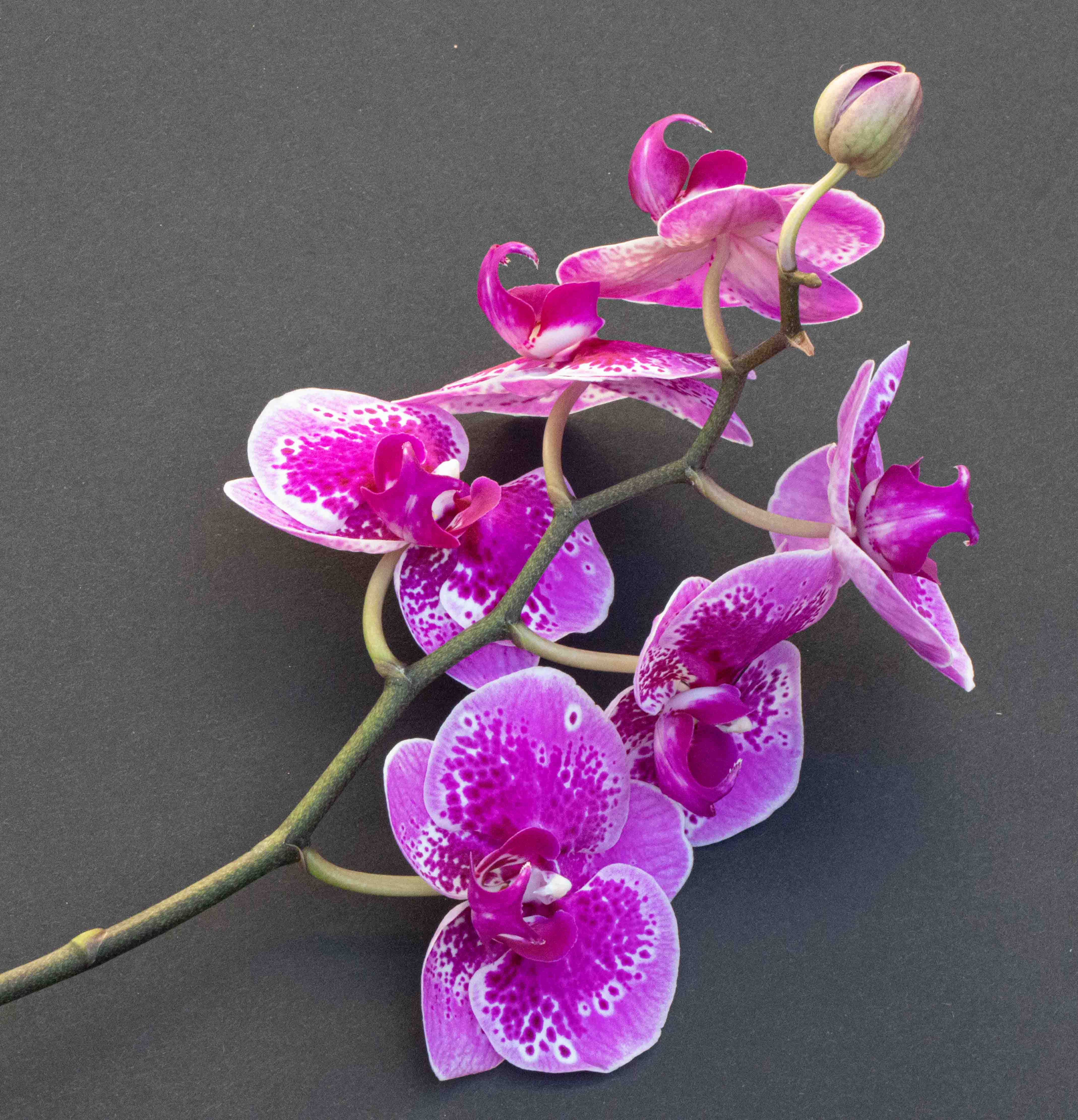
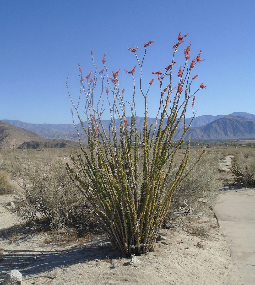
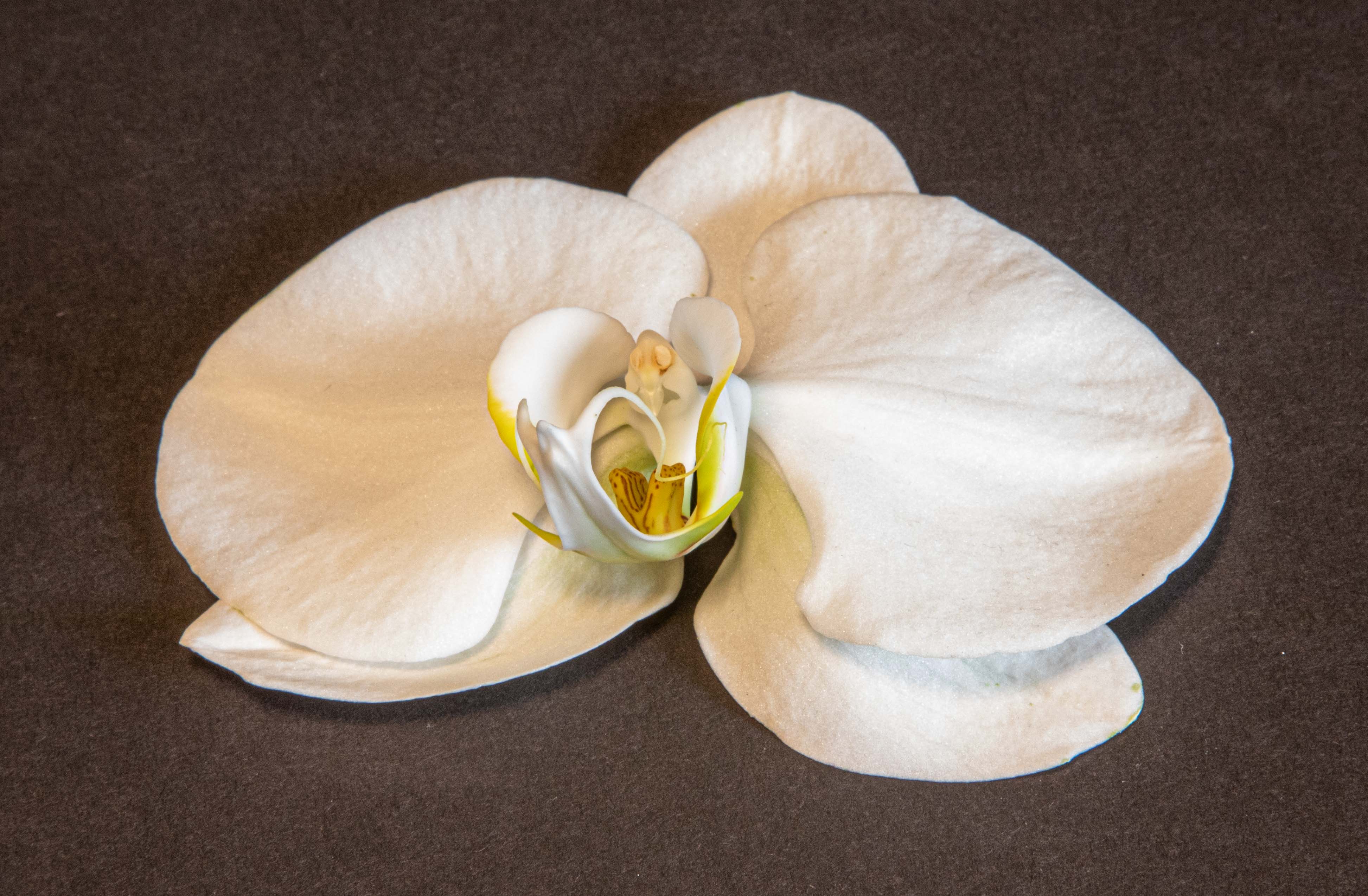
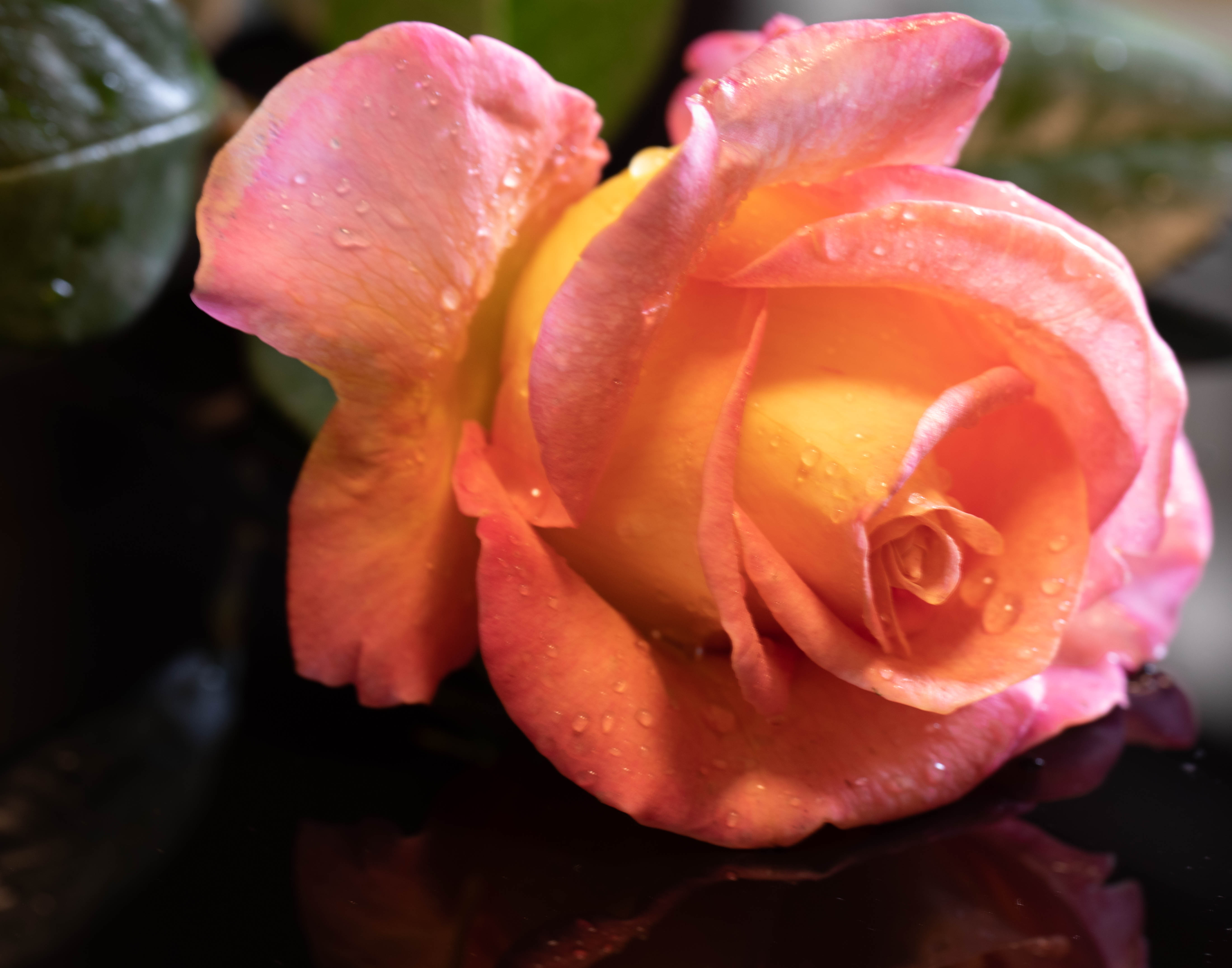
What a gorgeous shot! I love the colors you have, and I prefer them to the orange. Funny, I was going to suggest just the crop that Janet did--everyone's ahead of me! I do think it helps to get more flowers and fewer leaves in the frame, but I don't think the rotation is necessary. Great job! |
Aug 15th |
| 6 |
Aug 20 |
Reply |
Thank you! |
Aug 12th |
| 6 |
Aug 20 |
Comment |
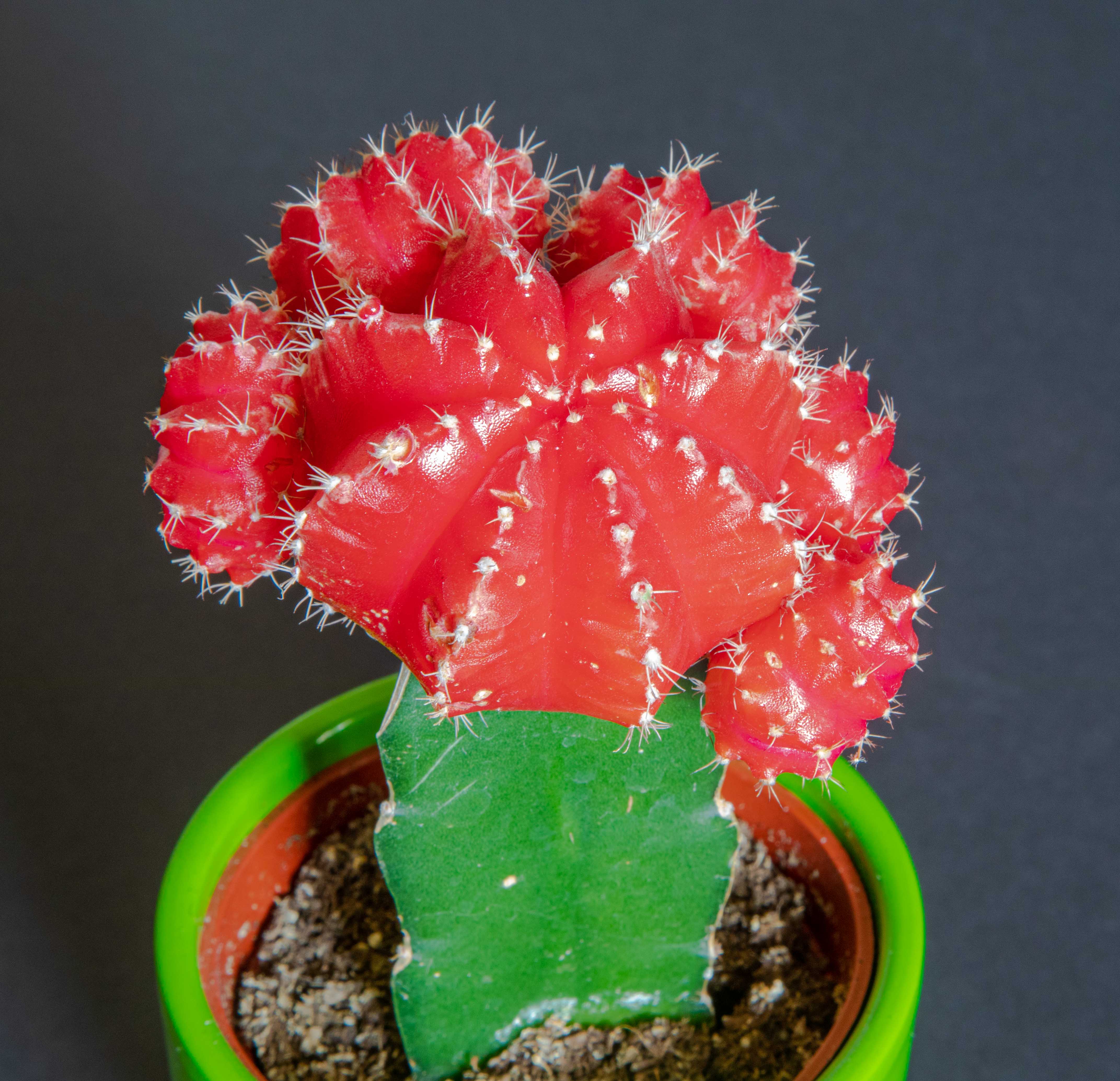
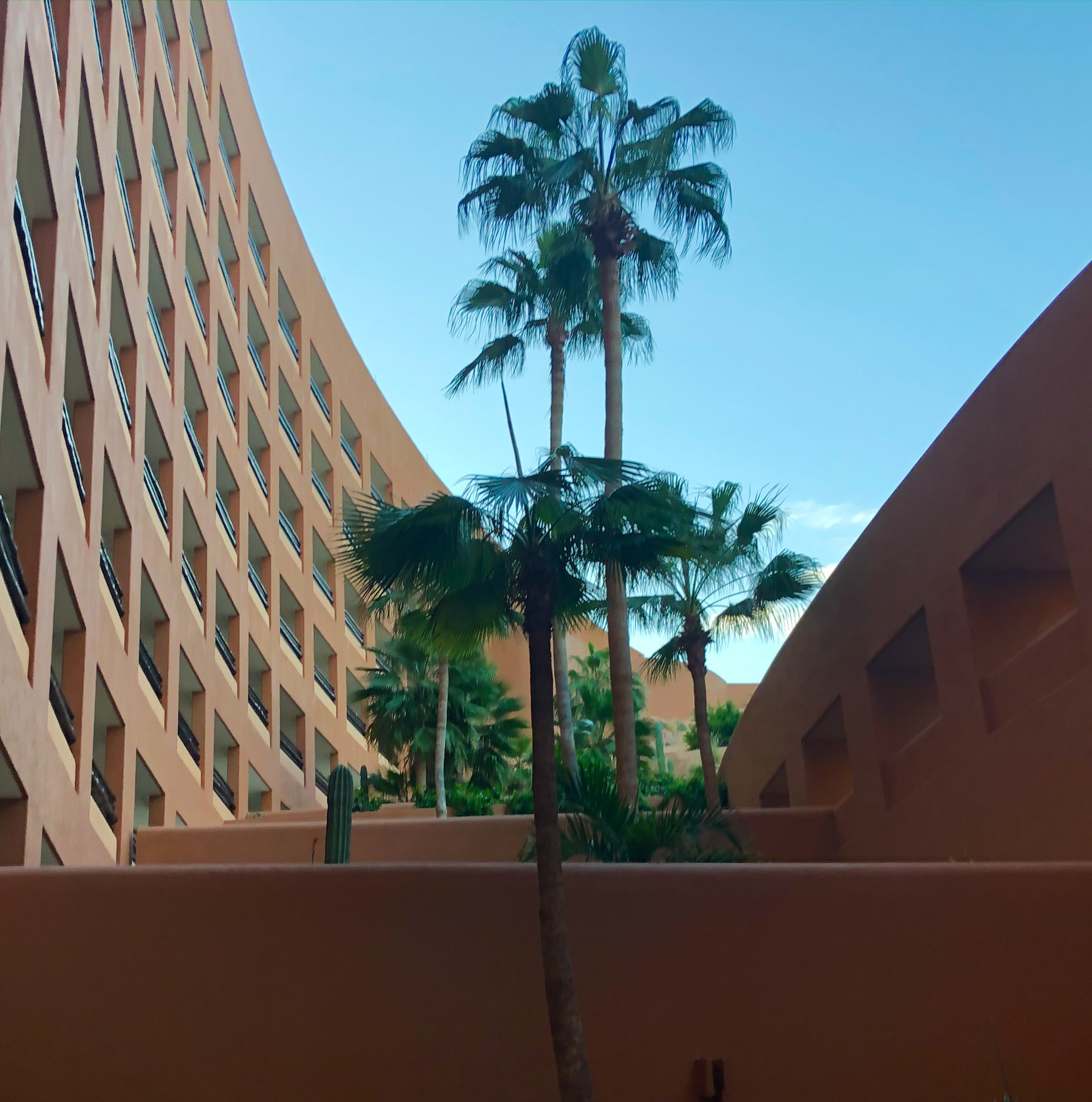
Lovely shot, and great for you to get it. I spot a bee, and it's gone long before I can even get in the house to get my equipment. Did you set yours up and then wait? I like what Dick did -- the yellow, the structure, and the border. |
Aug 6th |
| 6 |
Aug 20 |
Reply |
On the DOF issue, are you saying as I close down the aperture, I should refocus and I do it? |
Aug 2nd |
| 6 |
Aug 20 |
Comment |
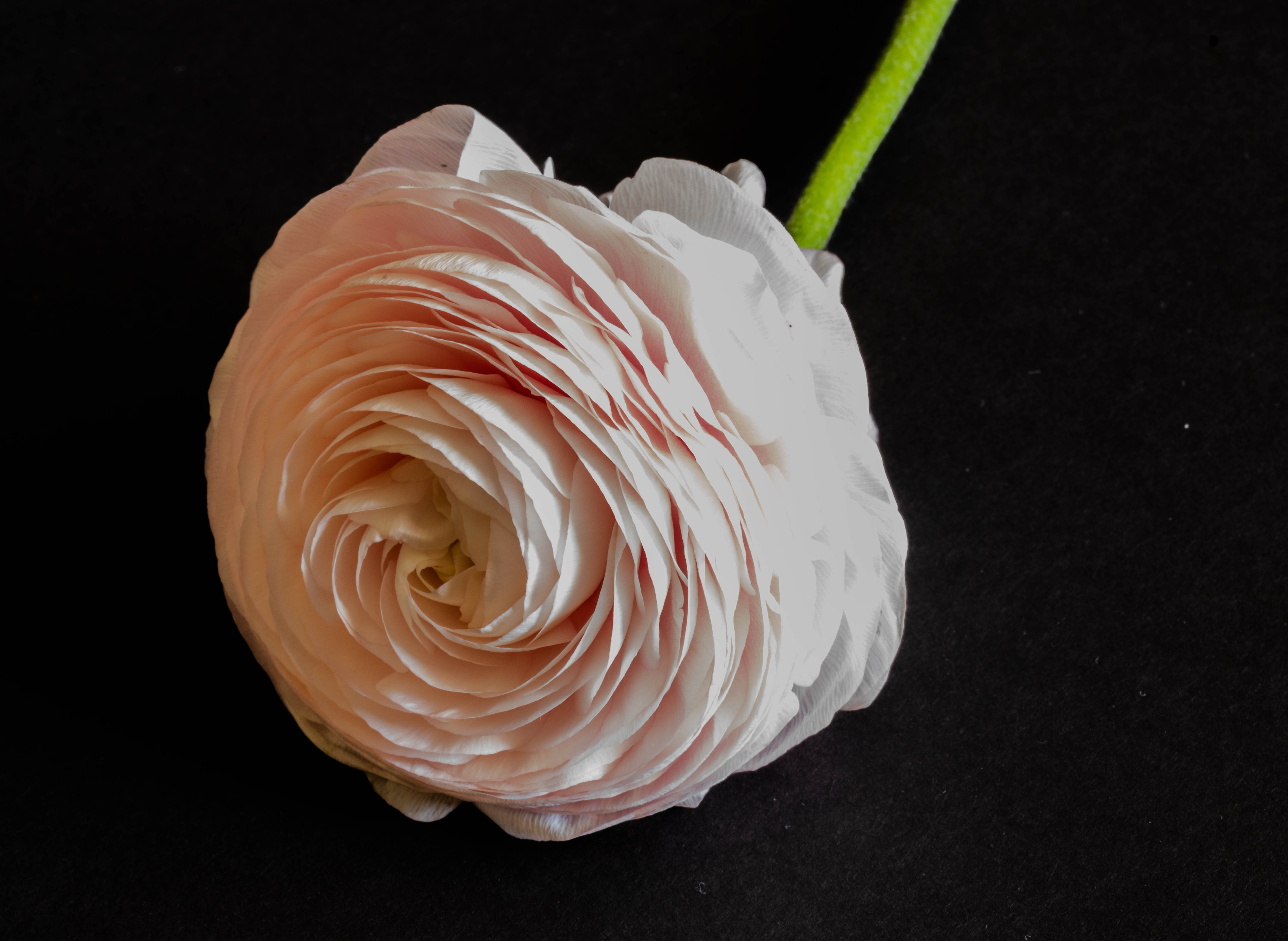
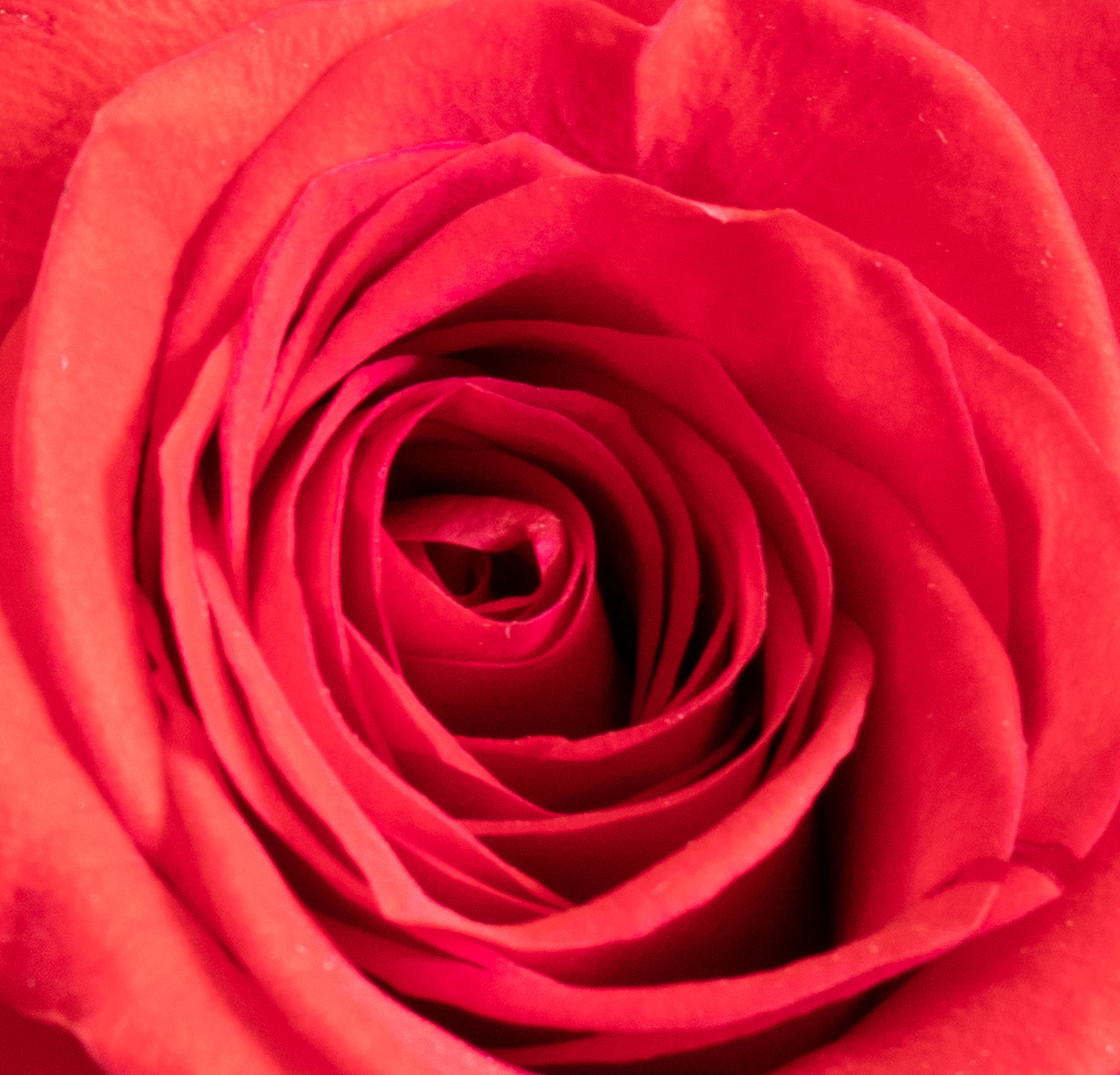
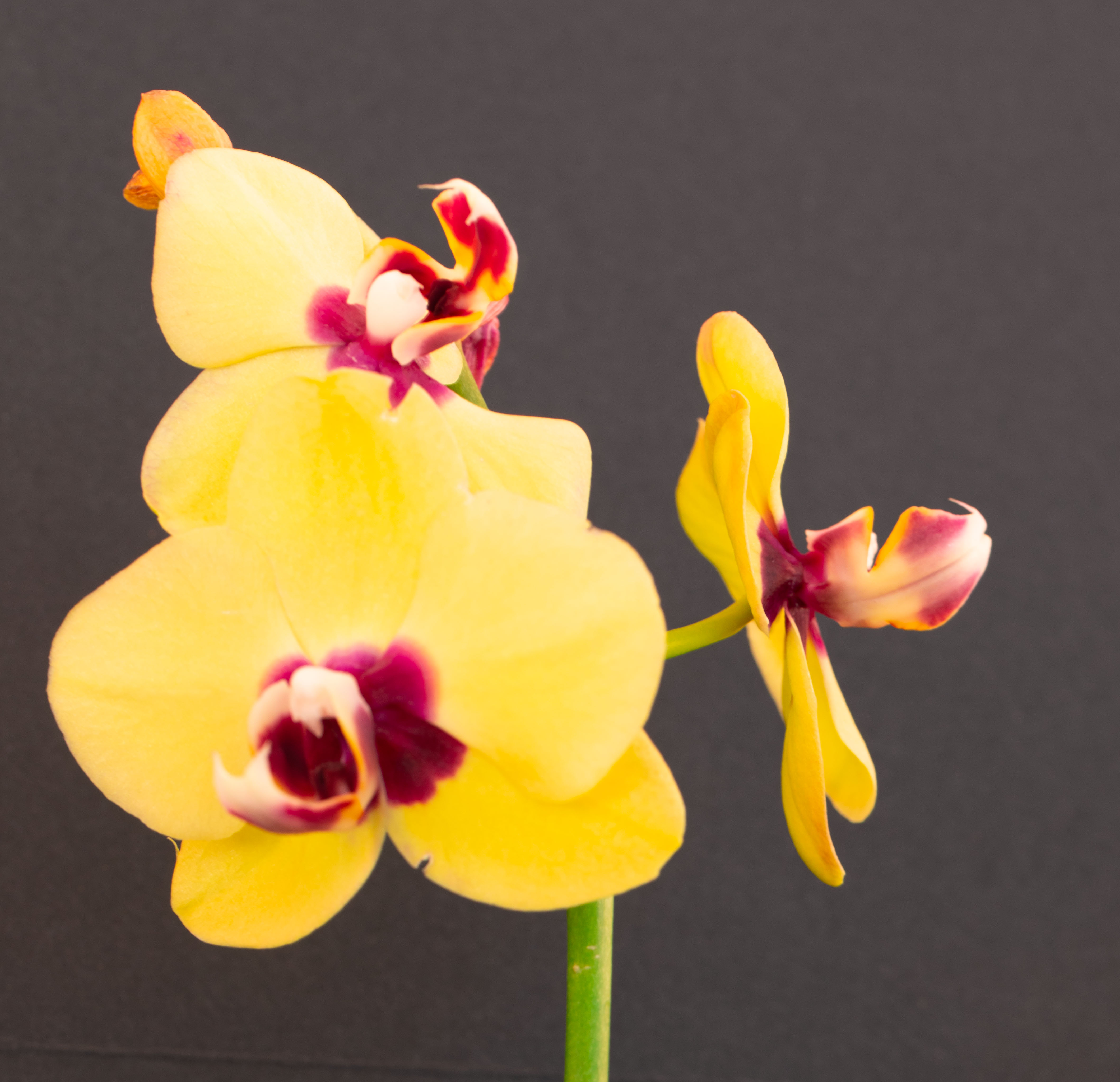
I like the 2nd one much, much more! I love seeing the "face" of the flower, and I really like seeing the lovely yellow bud making its debut. Are they the same flower that you cut, or is the second one a different flower from the same bush? |
Aug 2nd |
| 6 |
Aug 20 |
Reply |
Thanks for the tips on DOF-I'll work on that.
I love your crop, the darkened leaves, and the border. How did you do the "border"? |
Aug 2nd |
5 comments - 5 replies for Group 6
|
| 79 |
Aug 20 |
Reply |
I definitely agree the black spot should come out. I am just beginning with PS, and not exactly doing well, but I'm working on it! |
Aug 24th |
| 79 |
Aug 20 |
Comment |
I agree with everyone about the age and the energy and the romance! What did happen to the girl's legs? Also, out of curiosity, is that a yacht in the window? Whatever it is, it's distracting. |
Aug 20th |
| 79 |
Aug 20 |
Comment |
This is really interesting! I find I am most drawn to the figure and intrigued by her tattoos, that I'd like to see more clearly. I don't have a clue how you did this, but if I knew something and could do something, I would reduce the number of rings around the model by 1/2 to 2/3, and pull her further forward so she was larger in the photo. Very imaginative piece of work! |
Aug 20th |
| 79 |
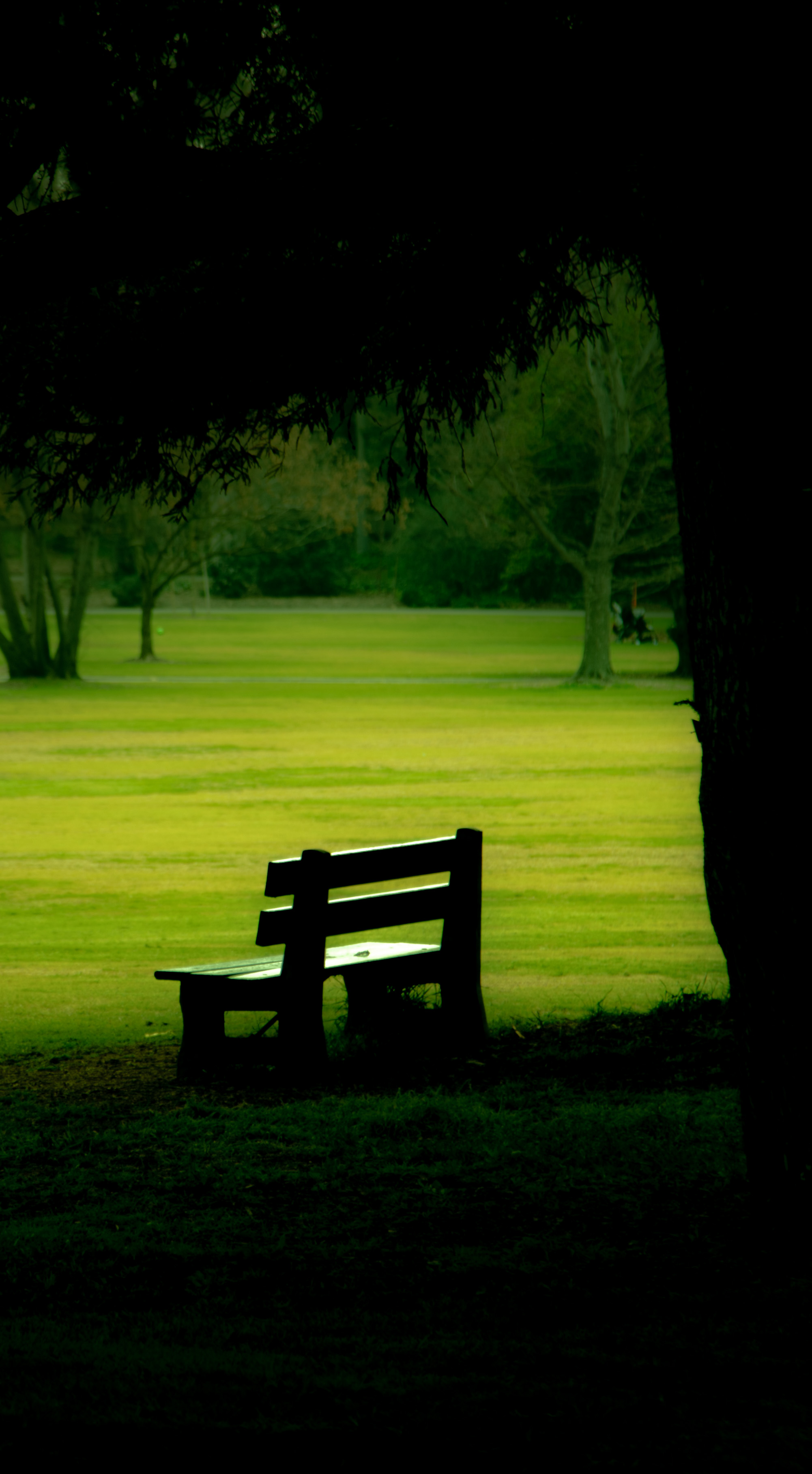
Aug 20 |
Comment |
I'm not versed very well in post-processing, so you are all speaking Greek to me. For what it's worth, I like the middle photo. The eye follows the poles nicely up and over. The fence gives size and a straight line to compare to poles going over the hill. I think it's by far the best composition of the three. |
Aug 20th |
| 79 |
Aug 20 |
Comment |
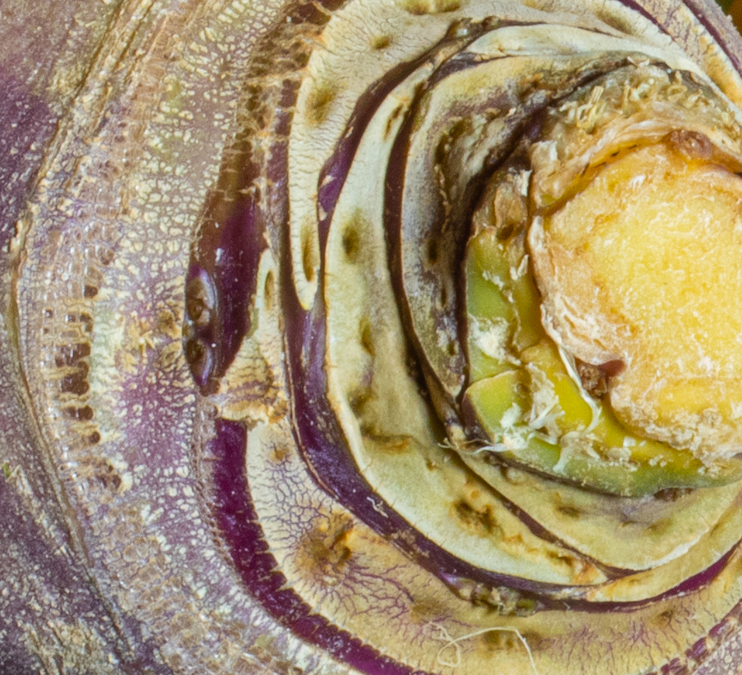
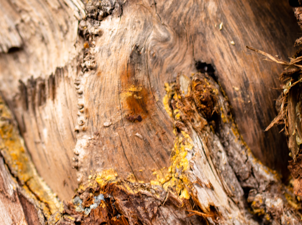
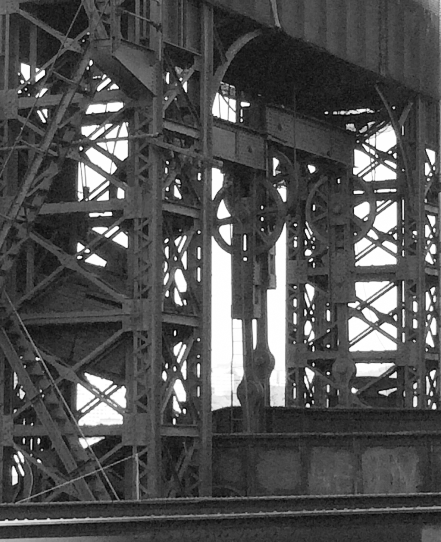
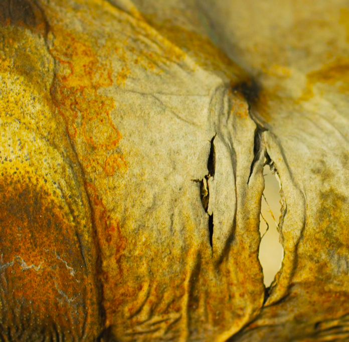
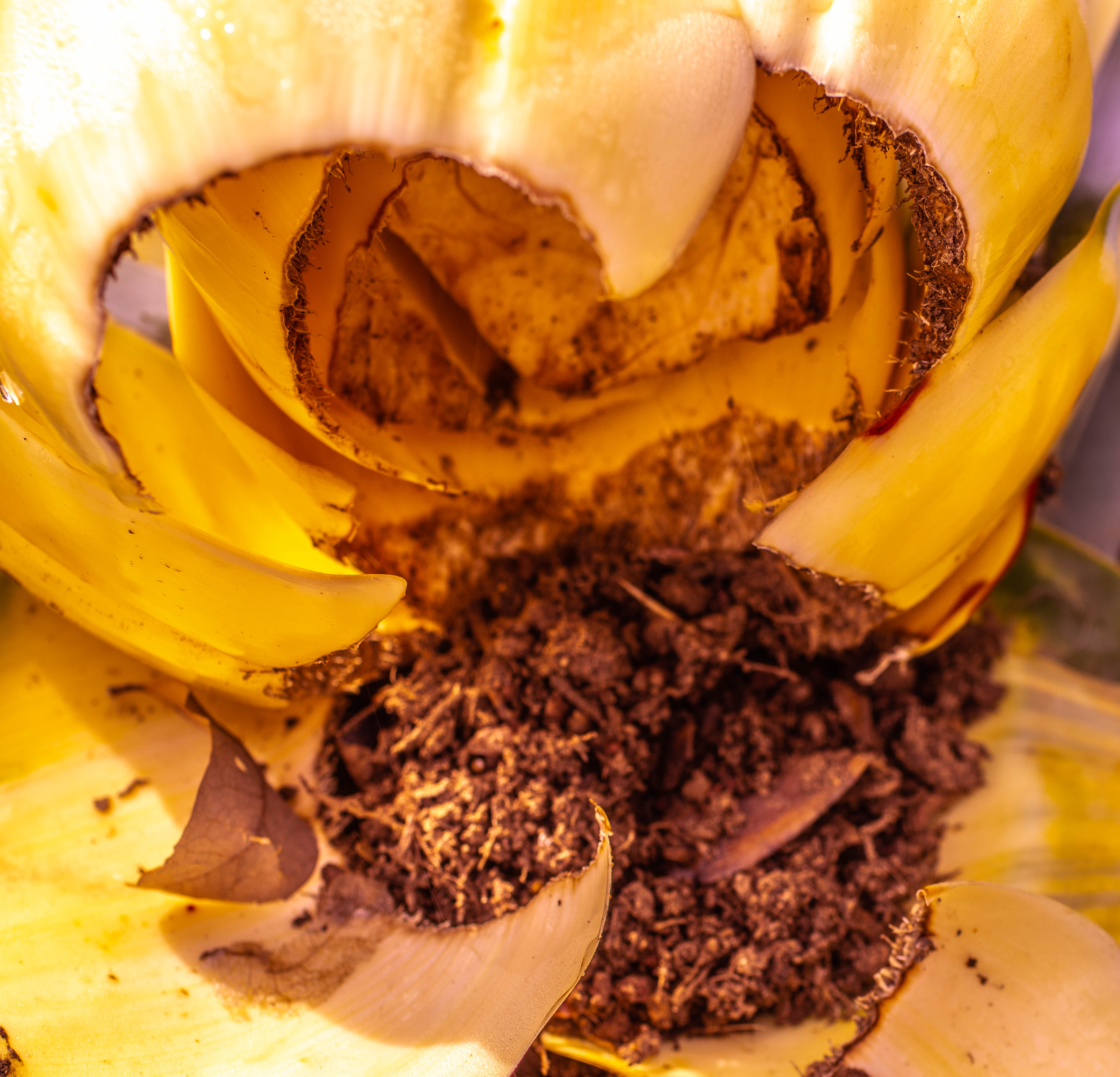
This is a very interesting photo. I love the textures and whorls in it, also the gradations of tone. I am, unfortunately, very familiar with rodents, although we are fortunately free of them right now. However, I have no idea what an insulation sprite is. Can you define it for us? I am sort of guessing it has something to do with the darker, round thing that is center right, which looks a bit like a film container. In any event, I applaud you for thinking "camera" when you're seeing "rodent damage"! |
Aug 15th |
| 79 |
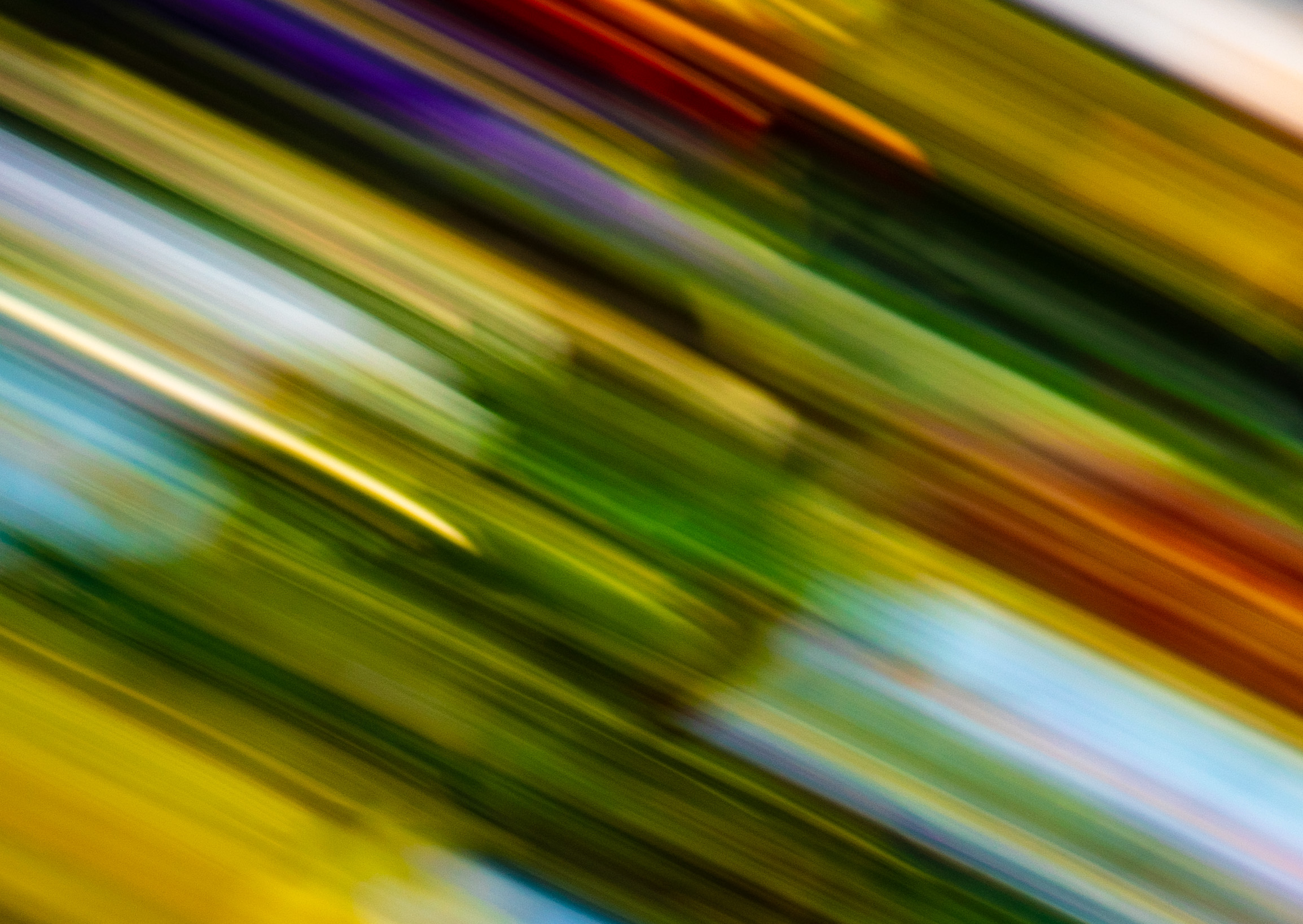
Aug 20 |
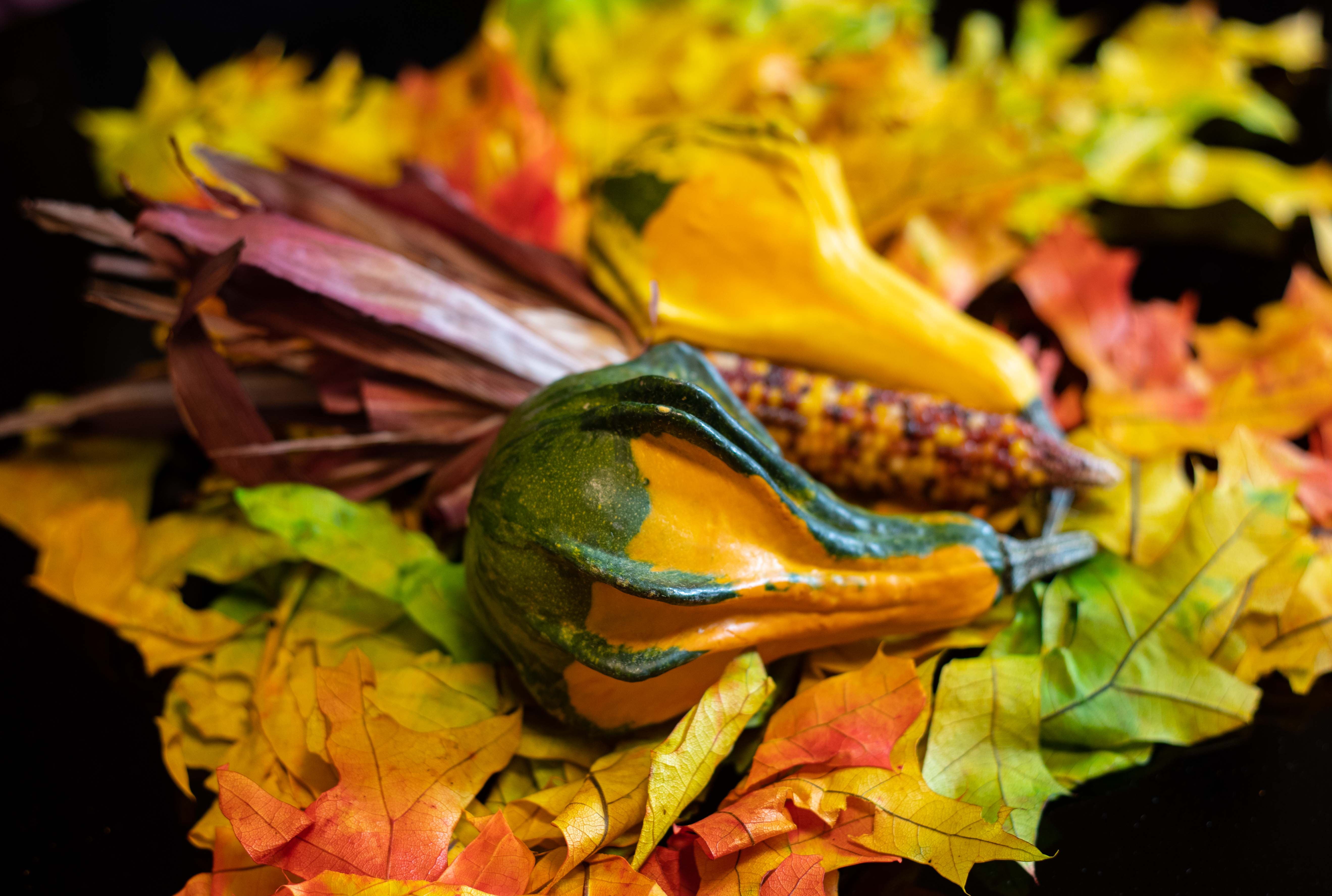
Comment |
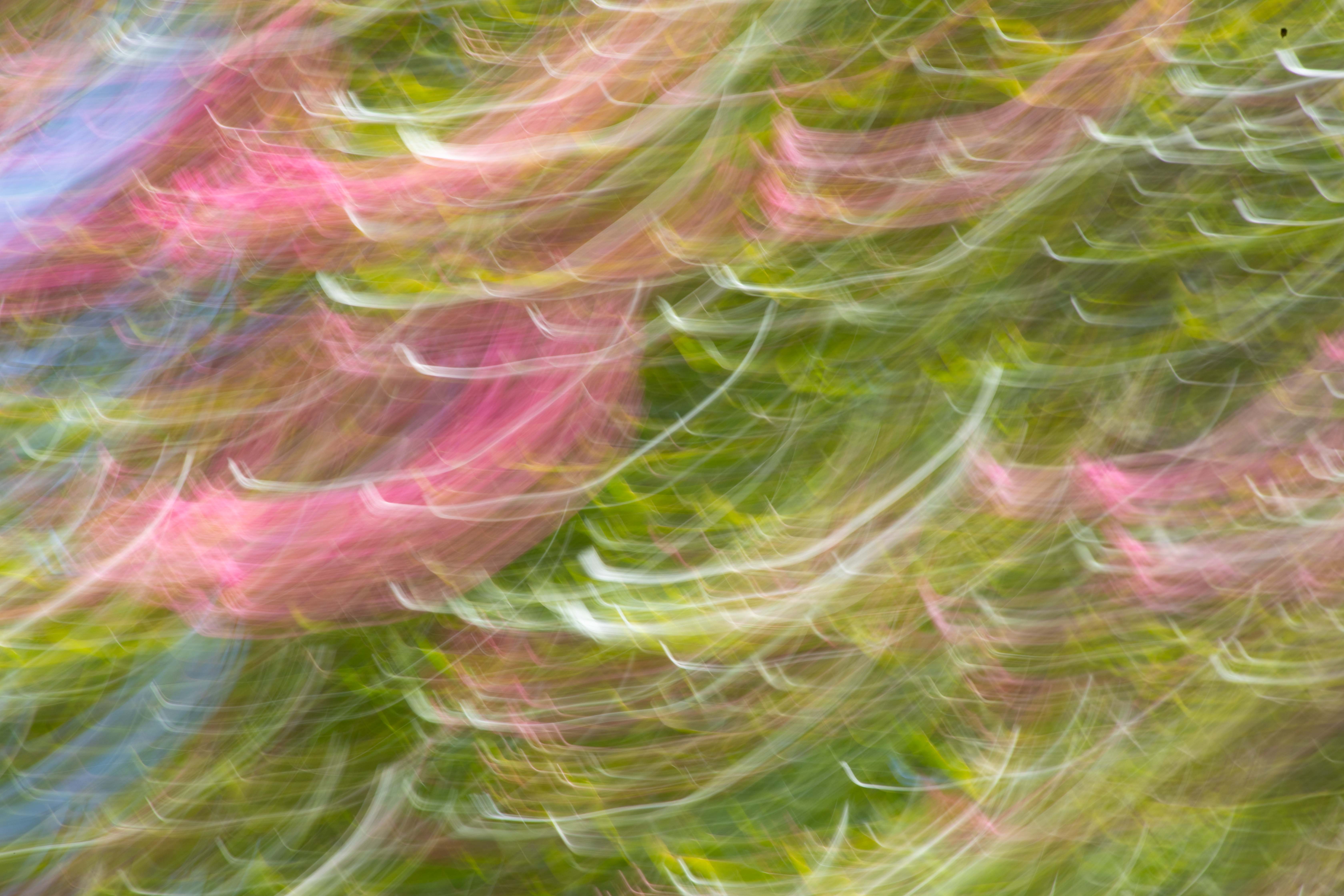
I love your choice of subject, and the fact you chose to shoot it in an unusual state (for a photo), the ing up and disappearance of various elements, the bokeh of the background, and the choice to use sepia tone. I have a preference (very individual, judging by the photos that appear in the books we all read) for completion of the main subject. Thus I would have liked to see the tops of the top parts that have been cropped out, and the bottoms of the leaves cropped out at the bottom. Still, as I've indicated, a creative and artistic approach -- and that I greatly appreciate and applaud! |
Aug 11th |
| 79 |
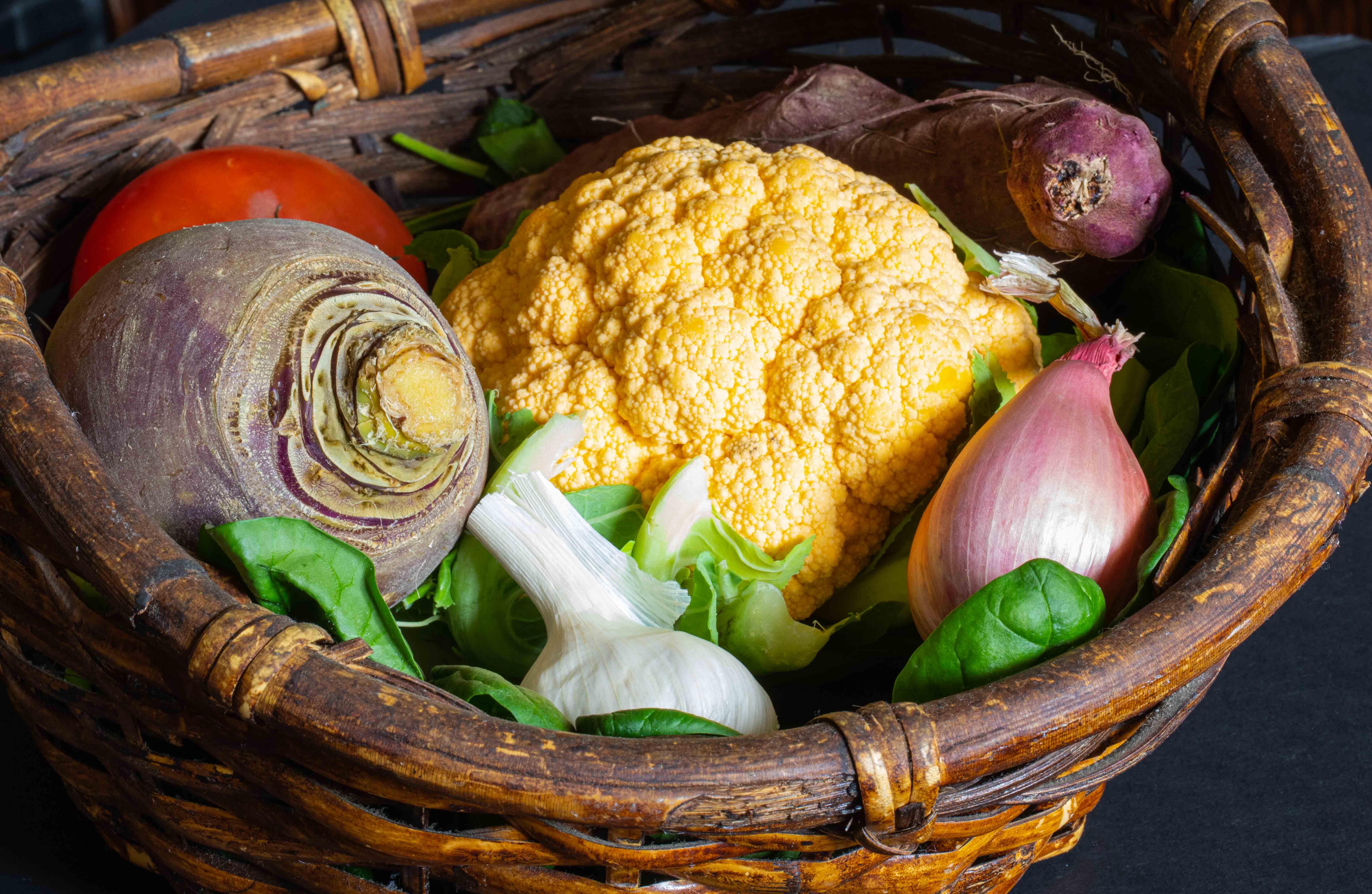
Aug 20 |
Comment |
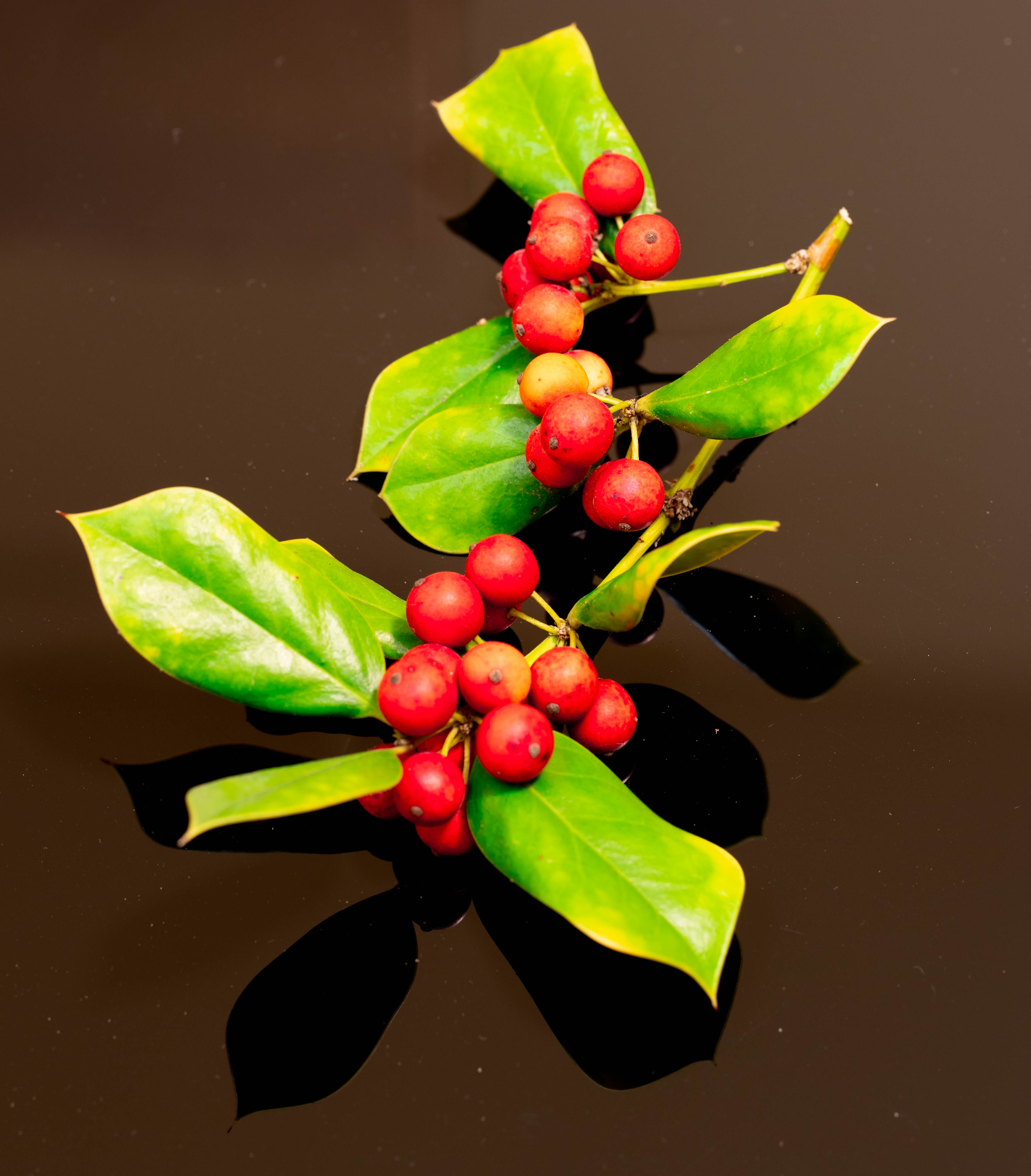
Gorgeous - love the color! I, too, have never seen an artichoke in bloom as this is. I also love the composition and the work you did in post-processing, especially the bokeh border. |
Aug 6th |
6 comments - 1 reply for Group 79
|
11 comments - 6 replies Total
|