|
| Group |
Round |
C/R |
Comment |
Date |
Image |
| 6 |
May 20 |
Comment |
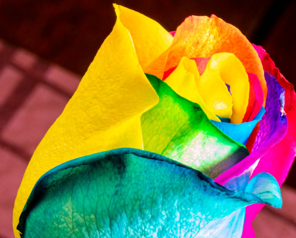
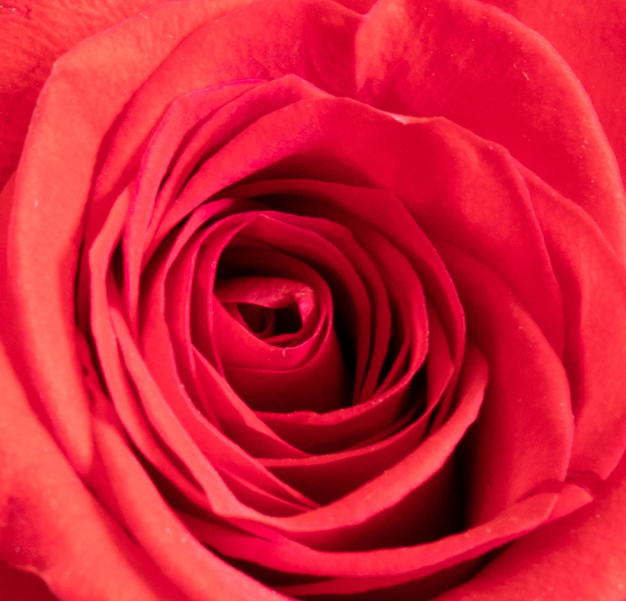
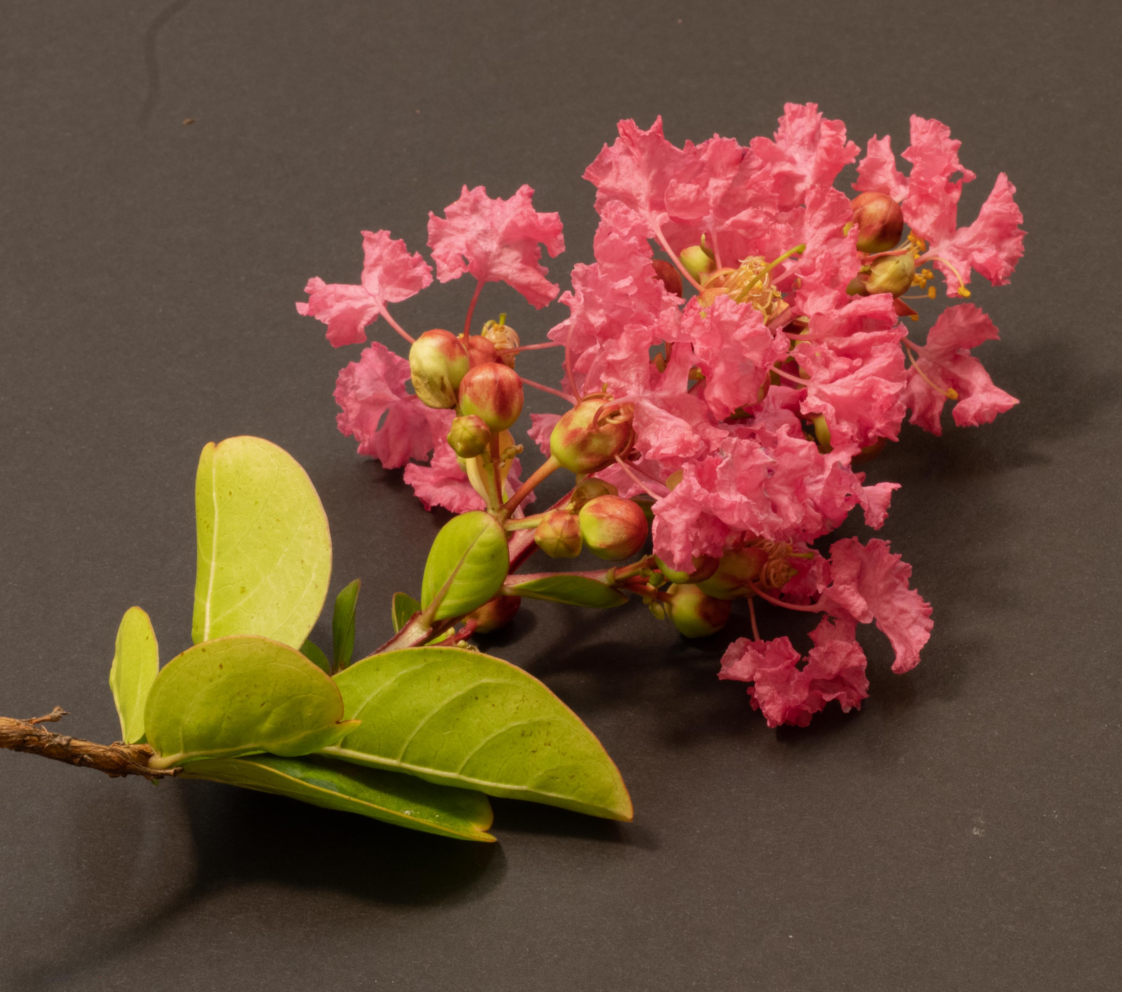
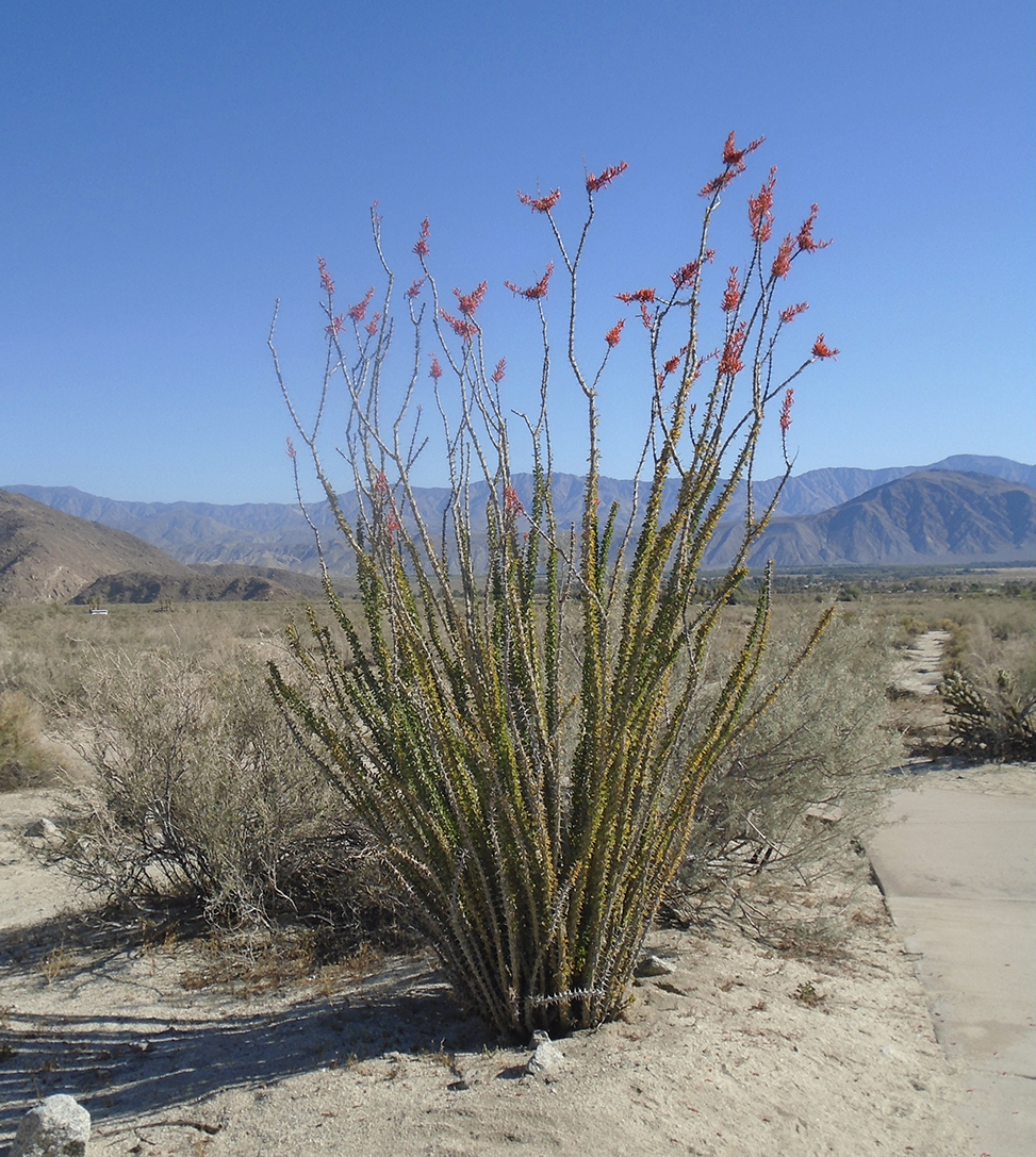
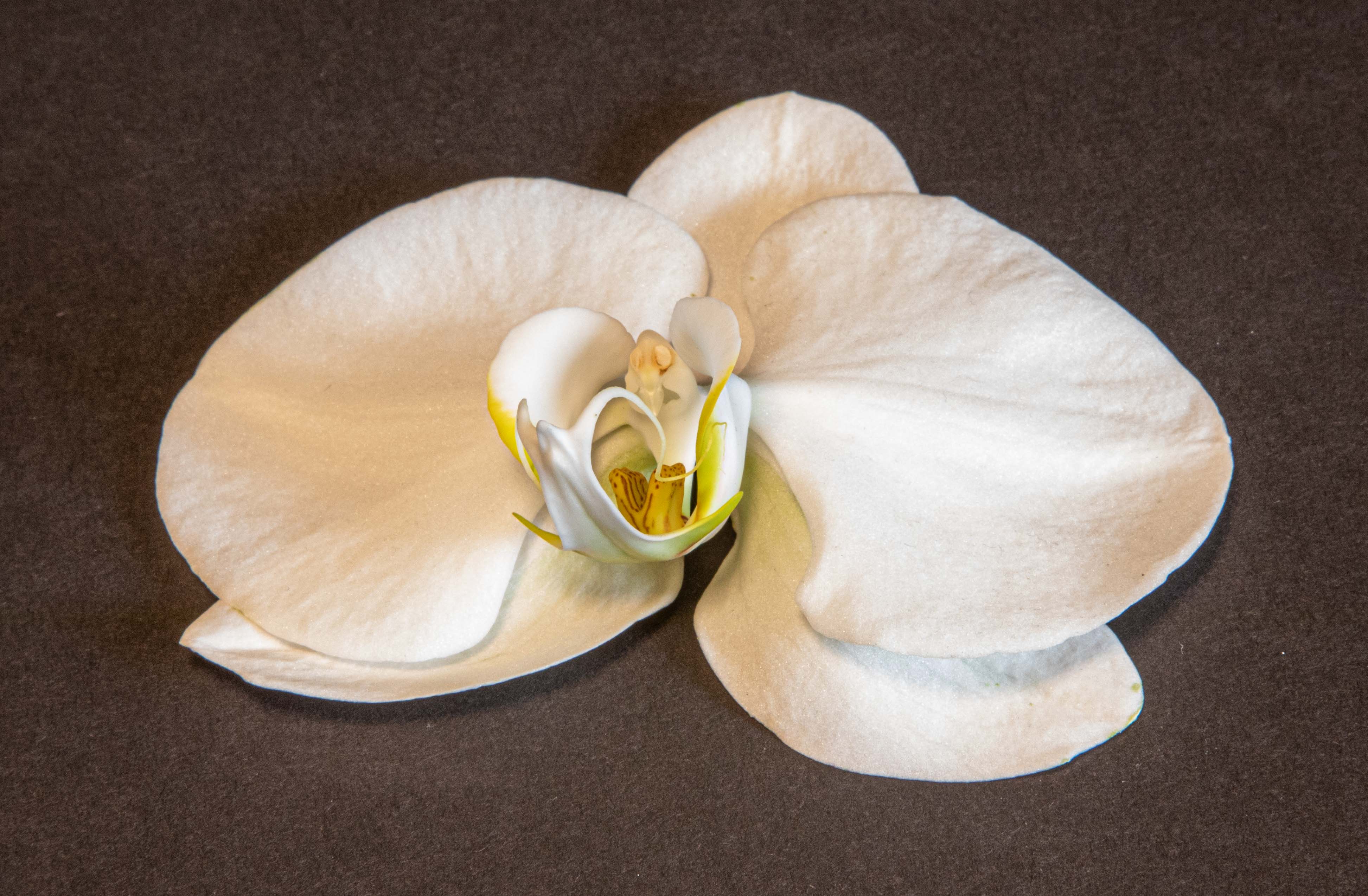
Gorgeous! It's all perfect, as usual, except I wish the flower's right upper side had been more perky-- or was it that it hadn't arisen yet! However, that's about the subject, not the photo. Love the clear and crisp view of all the little hairs. This is a great picture! Good for you! Do those flowers grow in a climate like L.A.? I'ld love some seeds, too, if they do!
|
May 23rd |
| 6 |
May 20 |
Comment |
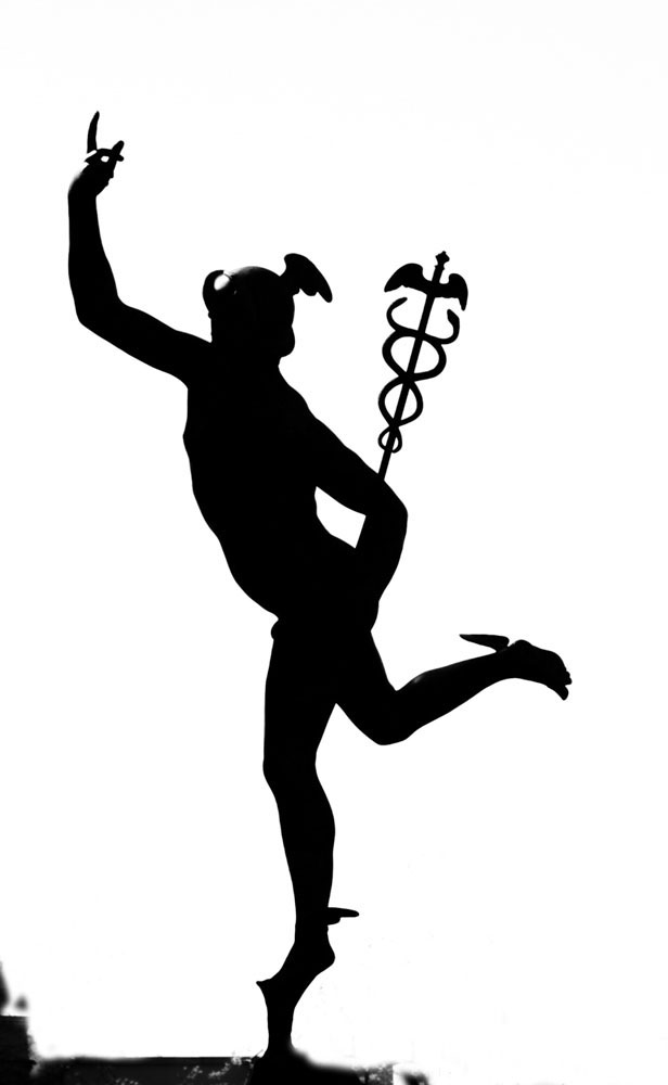
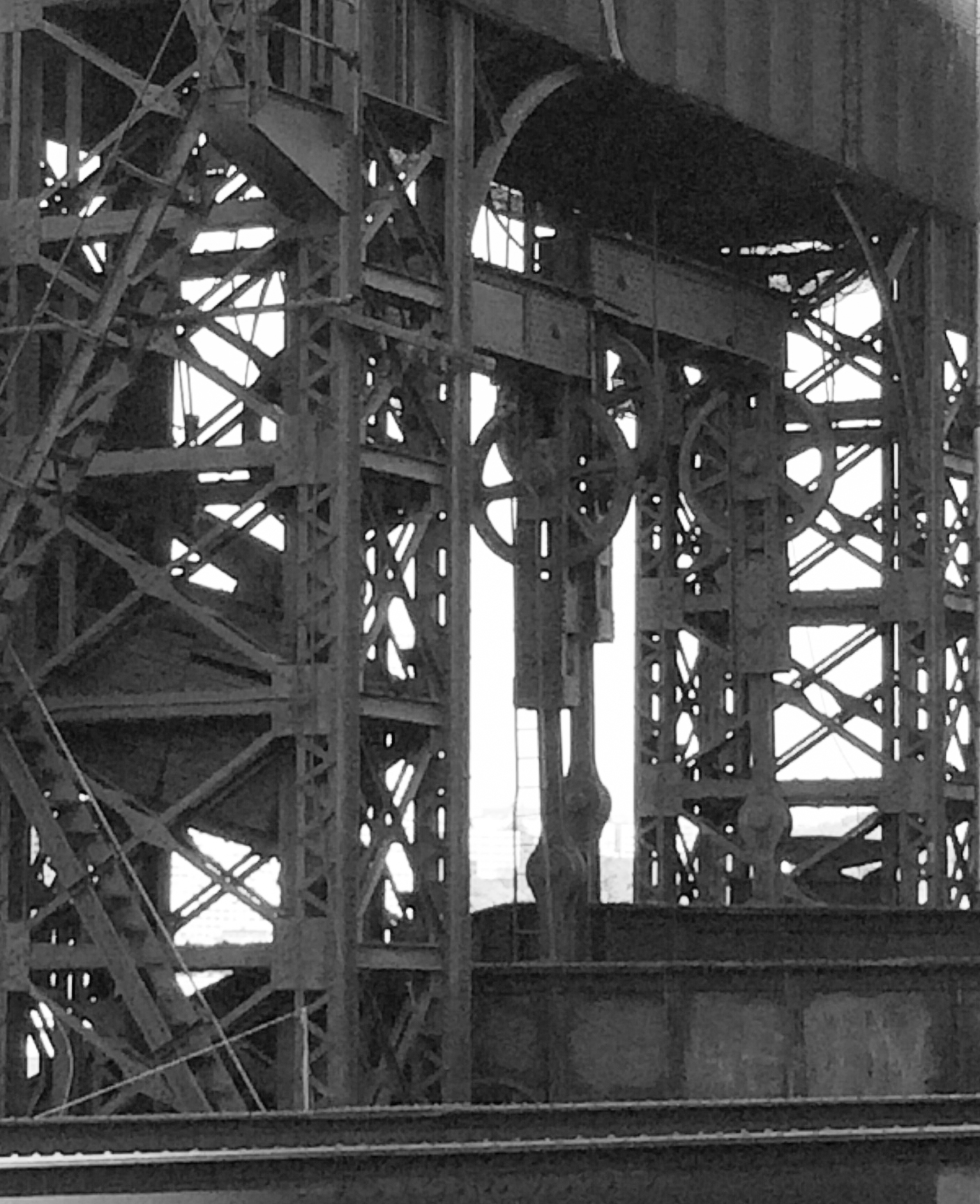
Very crisp and sharp! Wow, how sharp are those cutters! I like the fact it's in color, not monochrome, as I appreciate the shadings of grey, silver, and black. However, I find the strong light on the top and back of the tool on the right and the right side (facing it as we are) of the cutters to be too bright, and thus distracting. |
May 20th |
| 6 |
May 20 |
Comment |
I like Janet's crop. And I agree that the focus isn't sharp. I also agree that since you were relaxing and the bees were frequenting, it might have been possible to put your camera on a tripod and let the bees come into view. A glass of wine and a book would be good company! |
May 20th |
| 6 |
May 20 |
Reply |
Yes, thank you, I am pleased with my progress. But like all trips forward, I meet lots of frustration! |
May 14th |
| 6 |
May 20 |
Comment |
A beautiful subject and composition! I appreciate the fact that the colors of the cloth are the same as those in the sprouts. I don't find the cloth itself distracting, but the fact it seems wavy rather than flat. I do like Dick's crop, but then he increased the light falling on the falling out sprouts, but the light doesn't light up all of those fallen out, which I find problematic. I like the lighting on the sprouts in the original better -- it's more natural and even and less distracting. |
May 13th |
| 6 |
May 20 |
Comment |
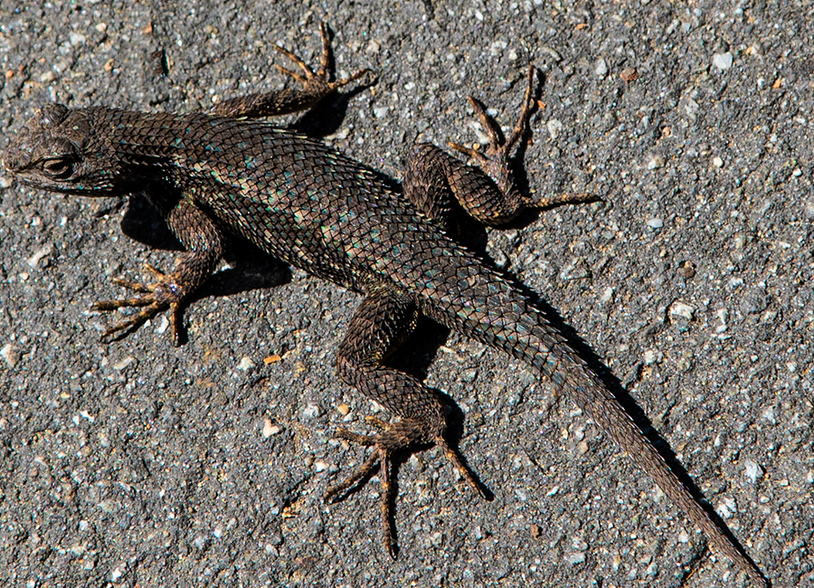
I liked what Dick did to it. The shine on the nose is distracting. What a cute little guy! He cheers me up! Good job getting close enough to get this without scaring him off! |
May 10th |
| 6 |
May 20 |
Reply |
Gorgeous! Thanks for your help. Will try all suggestions next time! |
May 10th |
| 6 |
May 20 |
Reply |
Thanks! |
May 7th |
| 6 |
May 20 |
Reply |
And how did you take out the specs? I tried and tried and just couldn't do it, tho I know it is really easy in Ps. |
May 6th |
| 6 |
May 20 |
Reply |
Thank you! I tried so hard on those specs, but whatever I connected with didn't do the job well. At least it got rid of the rug on the upper left and upper right!
Now, as for rotation, I would have moved it a bit more to the right so the lower part of the base of the flower pointed slightly upward on a diagonal to the left. How would I do that? And how are you doing it, anyway??? |
May 6th |
5 comments - 5 replies for Group 6
|
| 79 |
May 20 |
Reply |
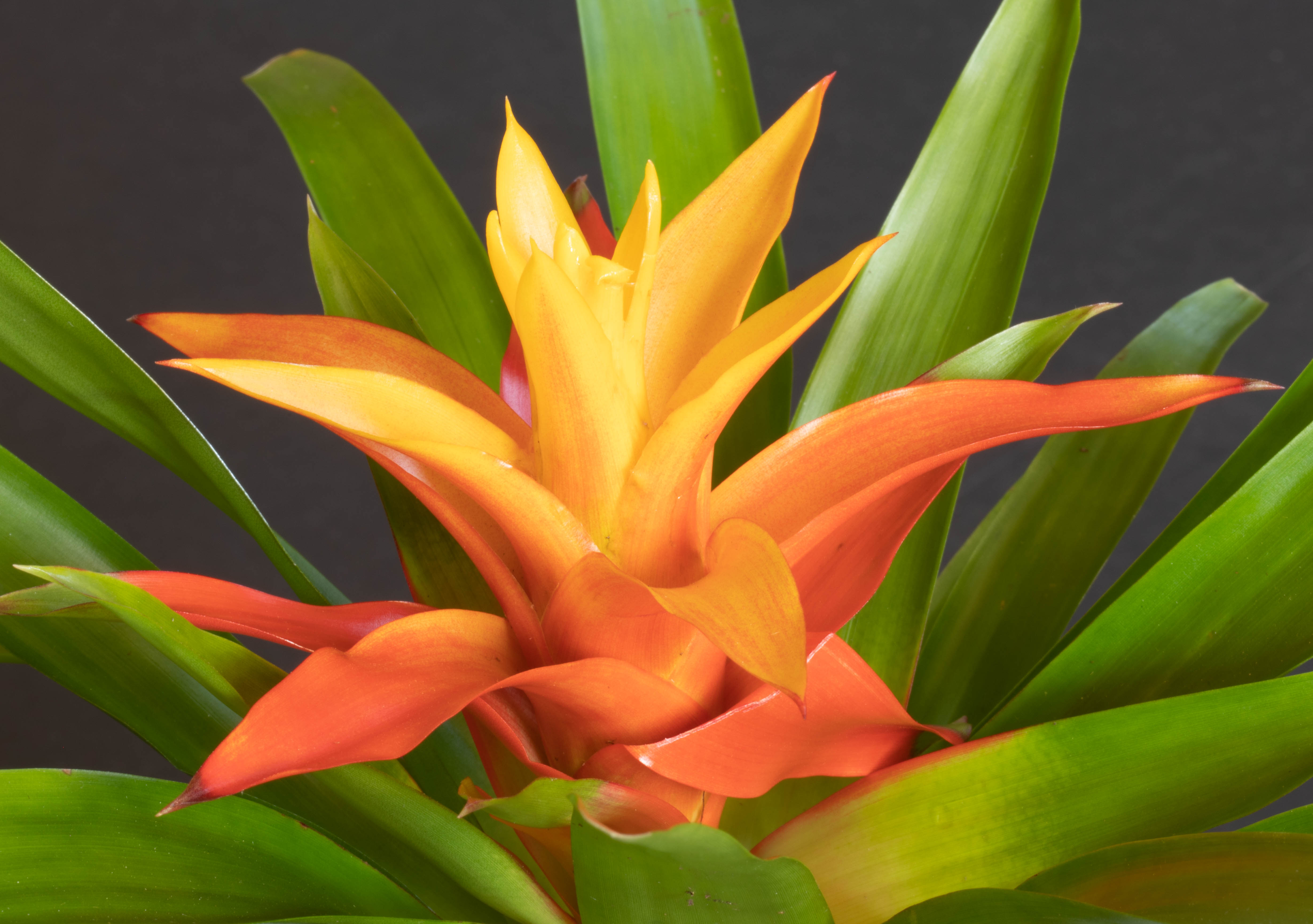
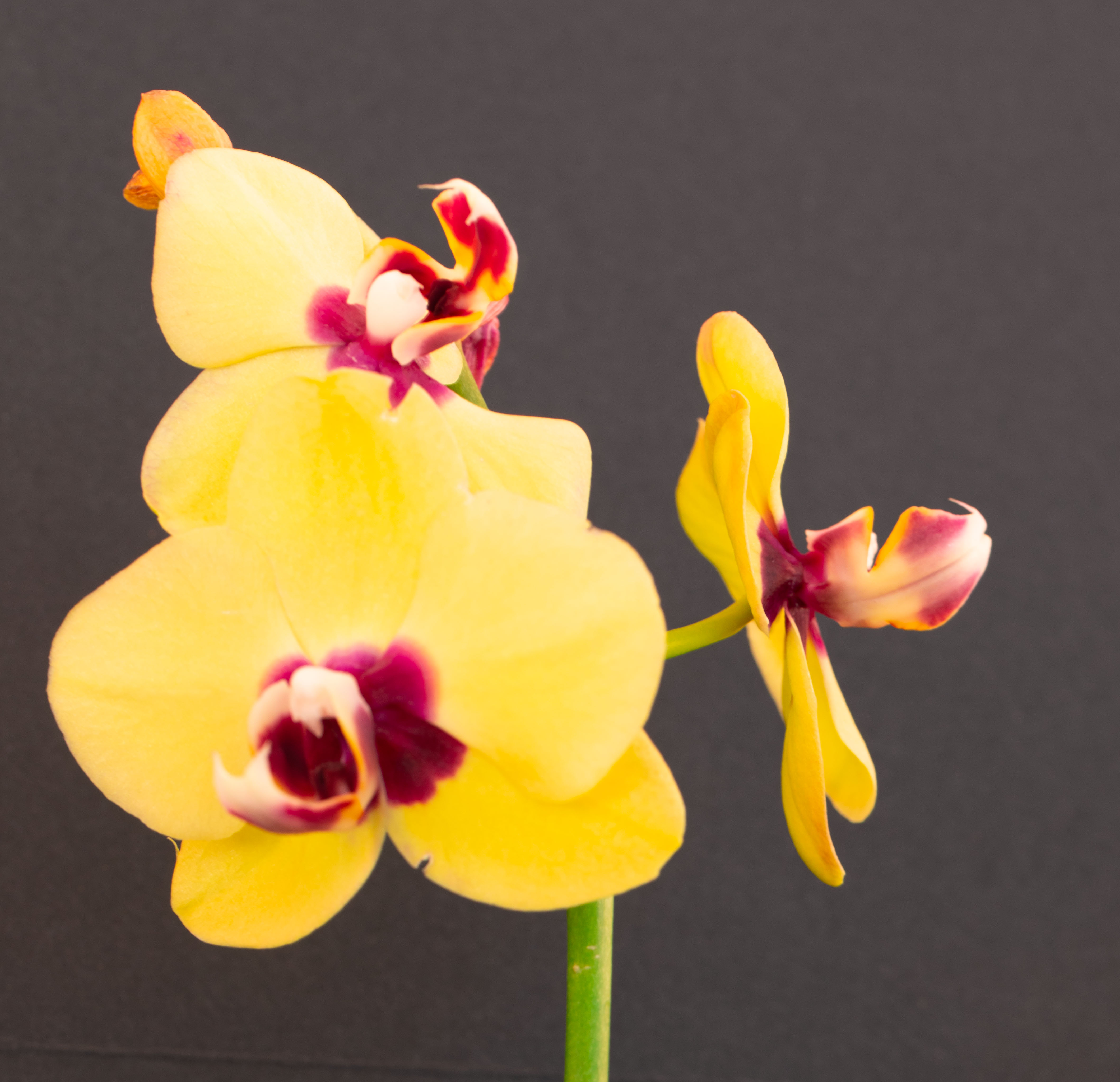
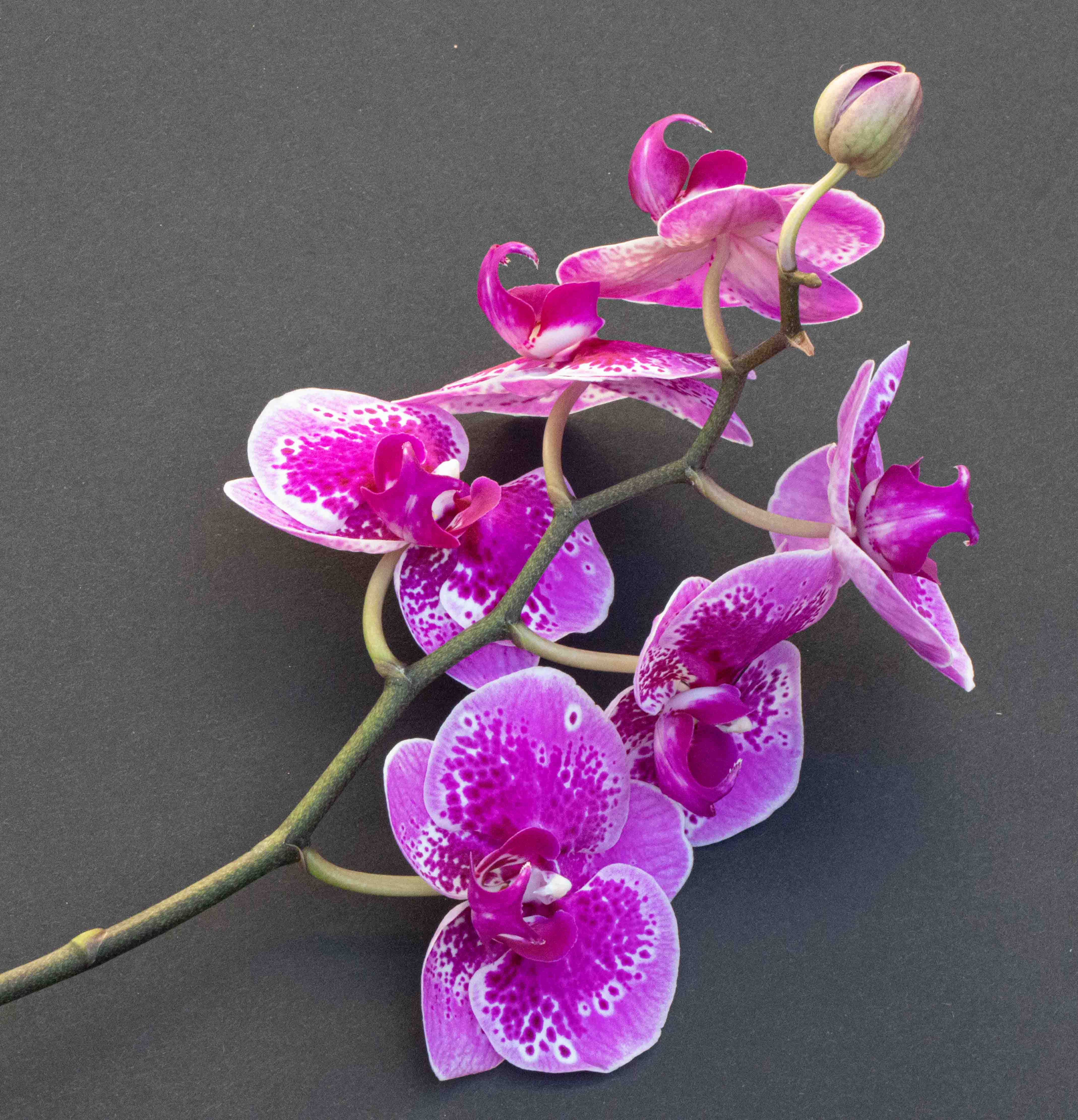
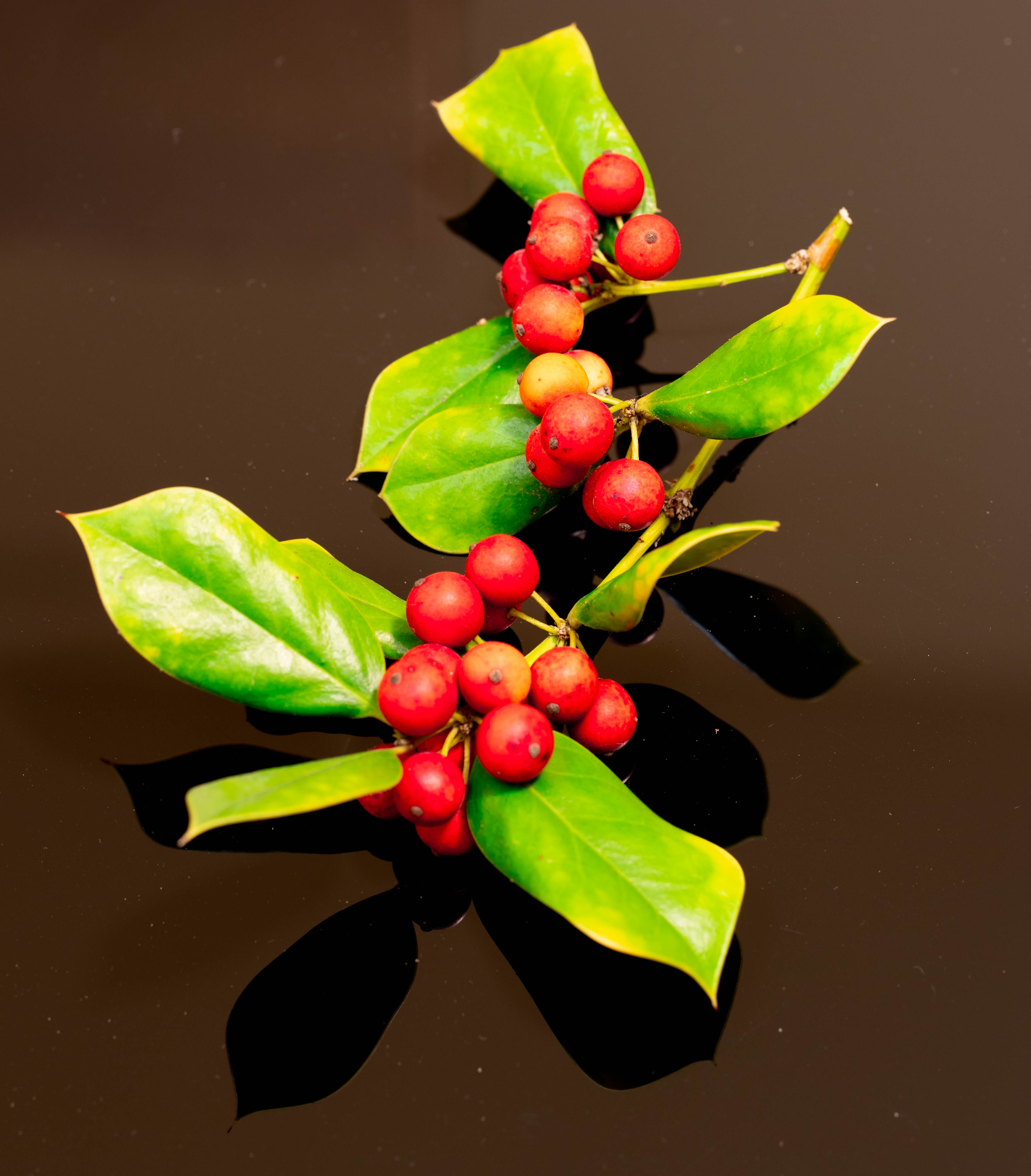
I don't know what the plant is called - although I found it in my garden. The background is Black Acrylic Sheet Lucite Plexiglass (via Amazon). |
May 28th |
| 79 |
May 20 |
Comment |
This is gorgeous and a lot of fun, and I can only stand in awe of the fact you know how to do it! |
May 20th |
| 79 |
May 20 |
Comment |
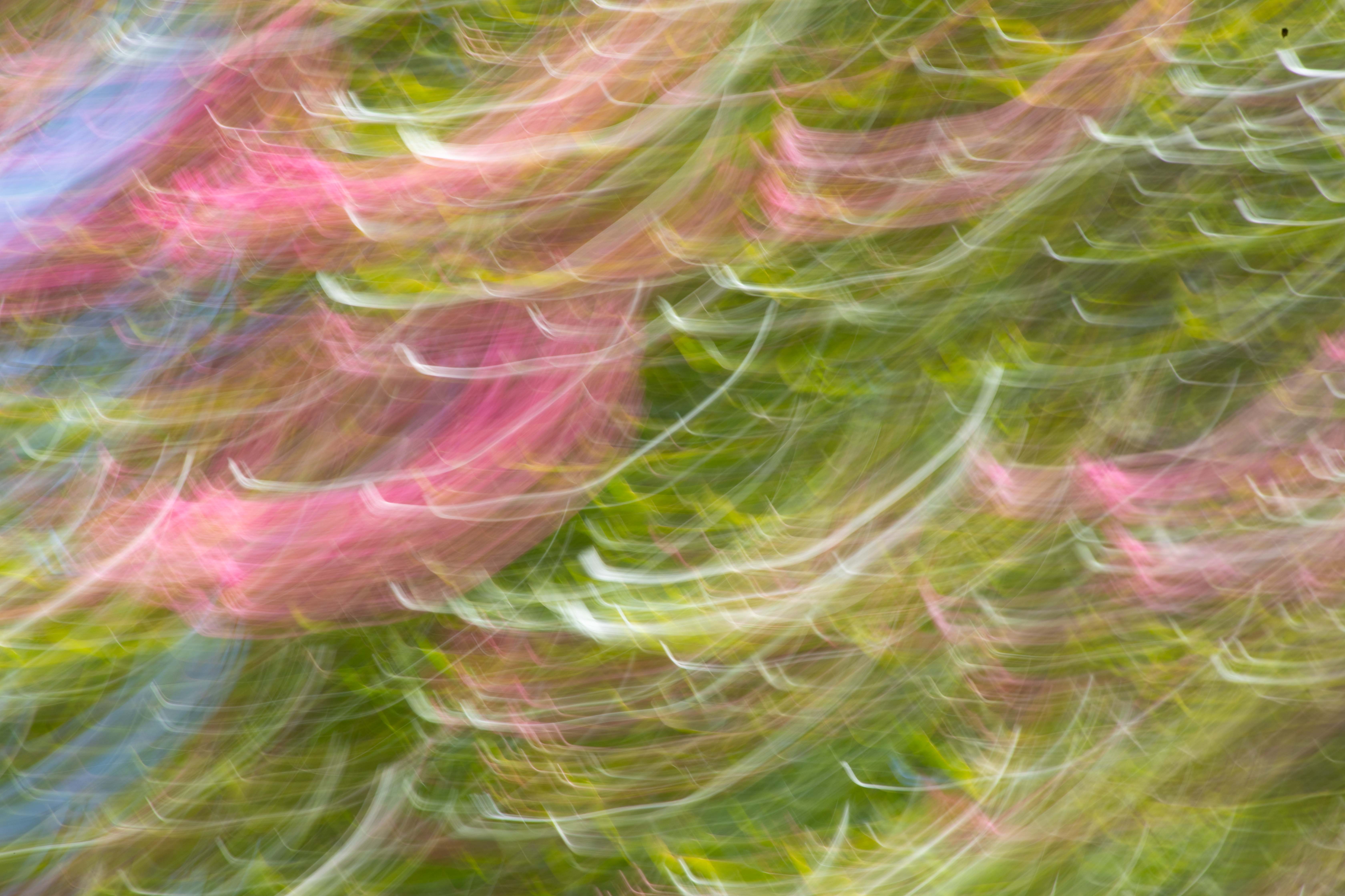
This works for me. I like the lines. I like the composition. I think it's very successful!
I don't see anything that looks like a California pomegranate, but maybe they are different in Japan. |
May 13th |
| 79 |
May 20 |
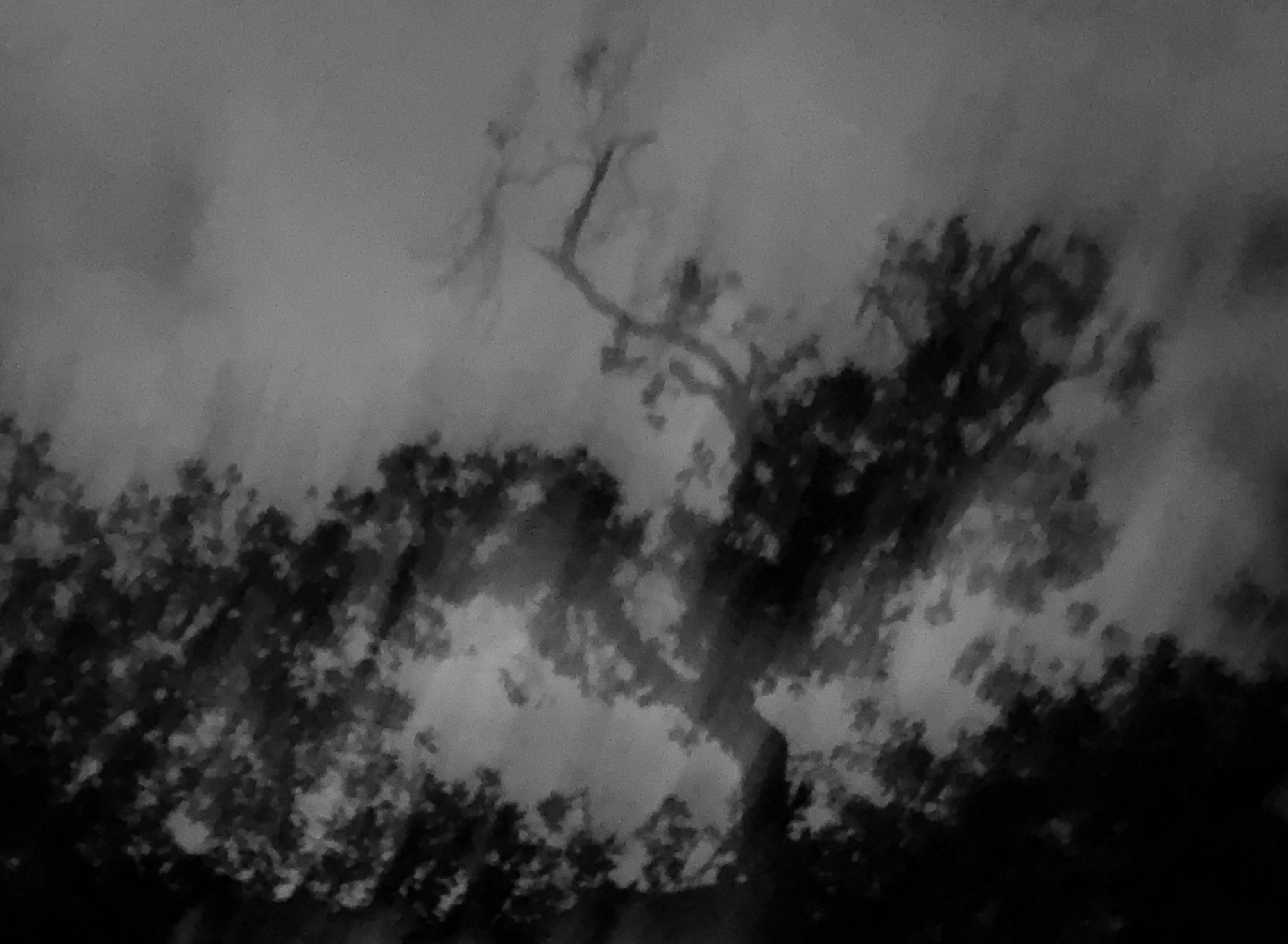
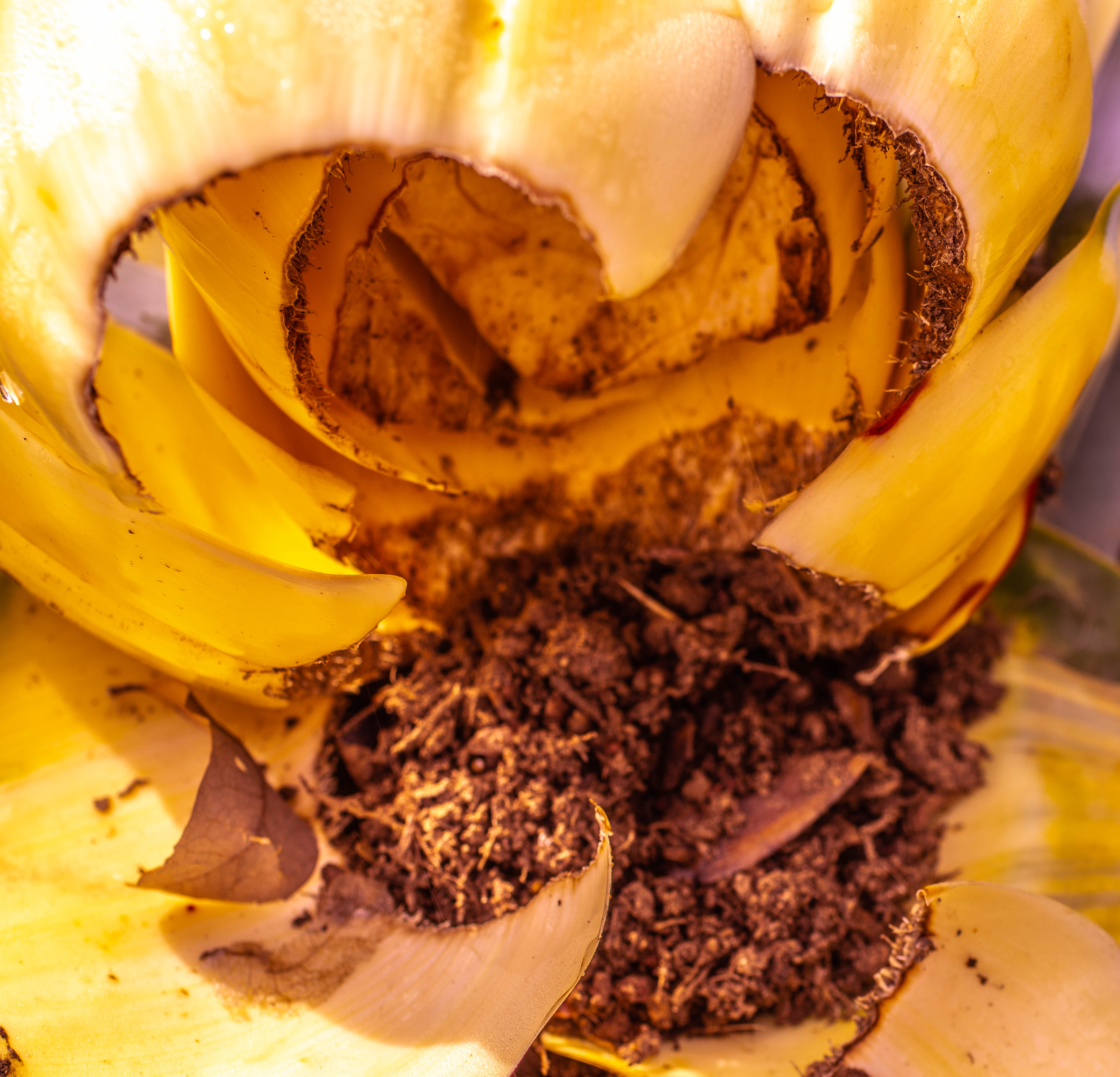
Comment |
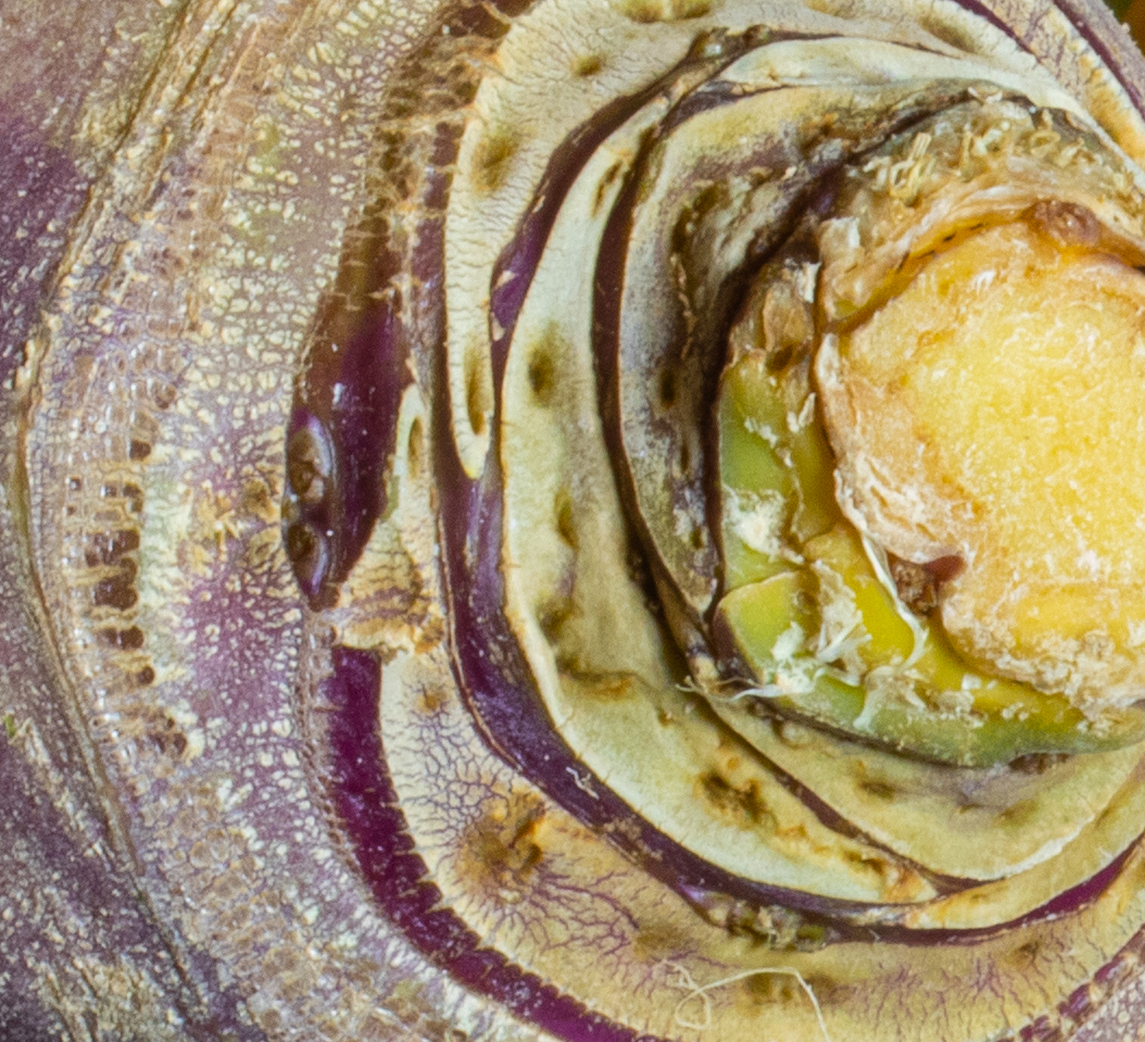
Hard to figure out where the hair is, exactly. The background is easy enough to make out to see it is something we should recognize. I sometimes like to take pictures that are so close up or so in motion that the subject matter is unrecognizable. In those cases I am going for some kind of abstract art approach. However here the viewer can distinguish quite a lot, and I felt left wondering what all the little holes and gunk were. I do think the monochrome is effective. Also the focus is good. |
May 10th |
3 comments - 1 reply for Group 79
|
8 comments - 6 replies Total
|