|
| Group |
Round |
C/R |
Comment |
Date |
Image |
| 6 |
Mar 20 |
Comment |
Well, I'm glad not to any longer be the newest one to the group! Welcome! I think this is a great choice of a subject. However, if it's the flower, I want all of it. If it's the bee, I'd like to see it closer up because I can't really make it out. I'd follow Dick's suggestion to get closer up and cut out much of the flower and focus on the bee. Again, welcome and enjoy!
Dick -- have Tom and Stuart left us? |
Mar 22nd |
| 6 |
Mar 20 |
Comment |
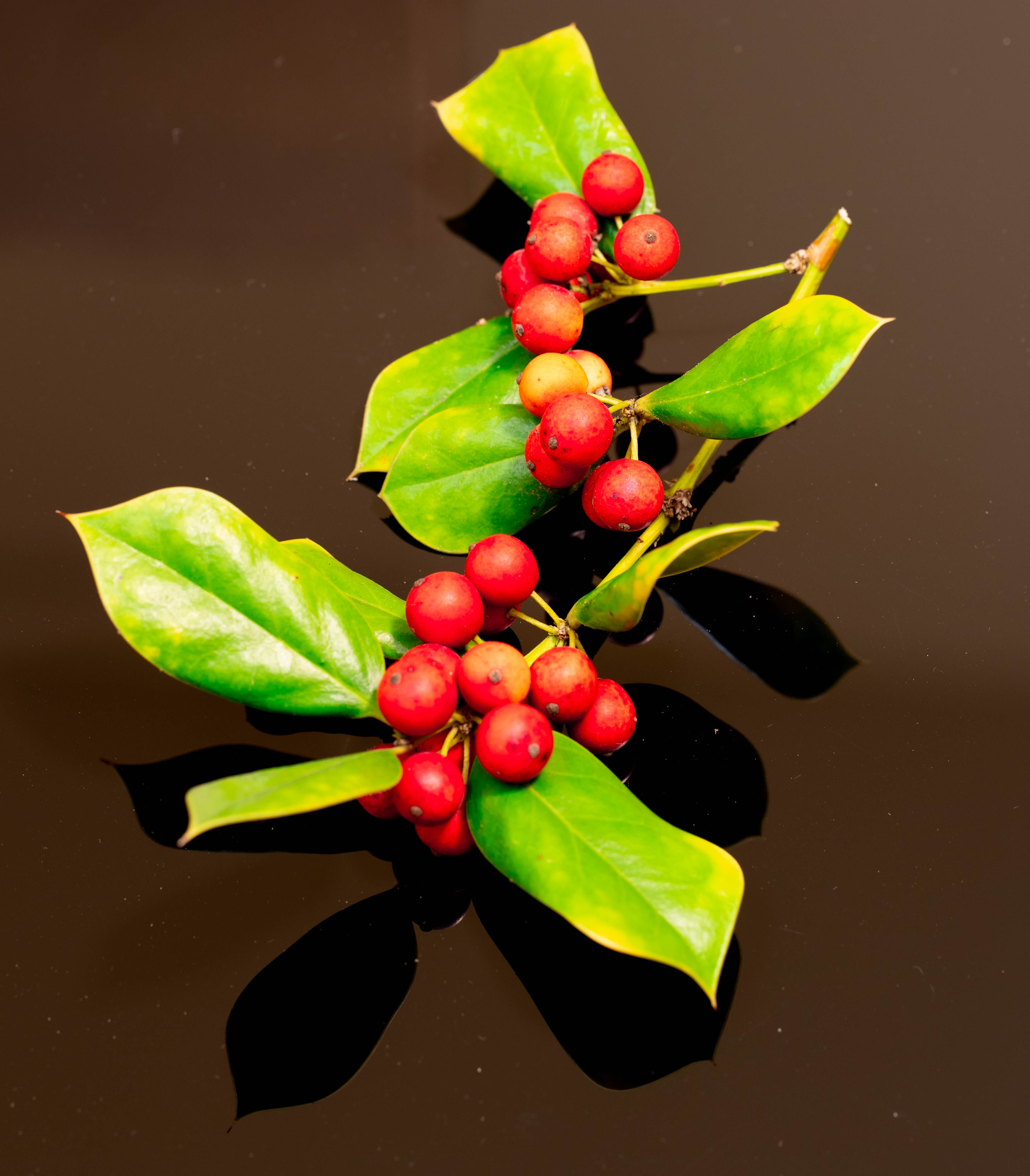
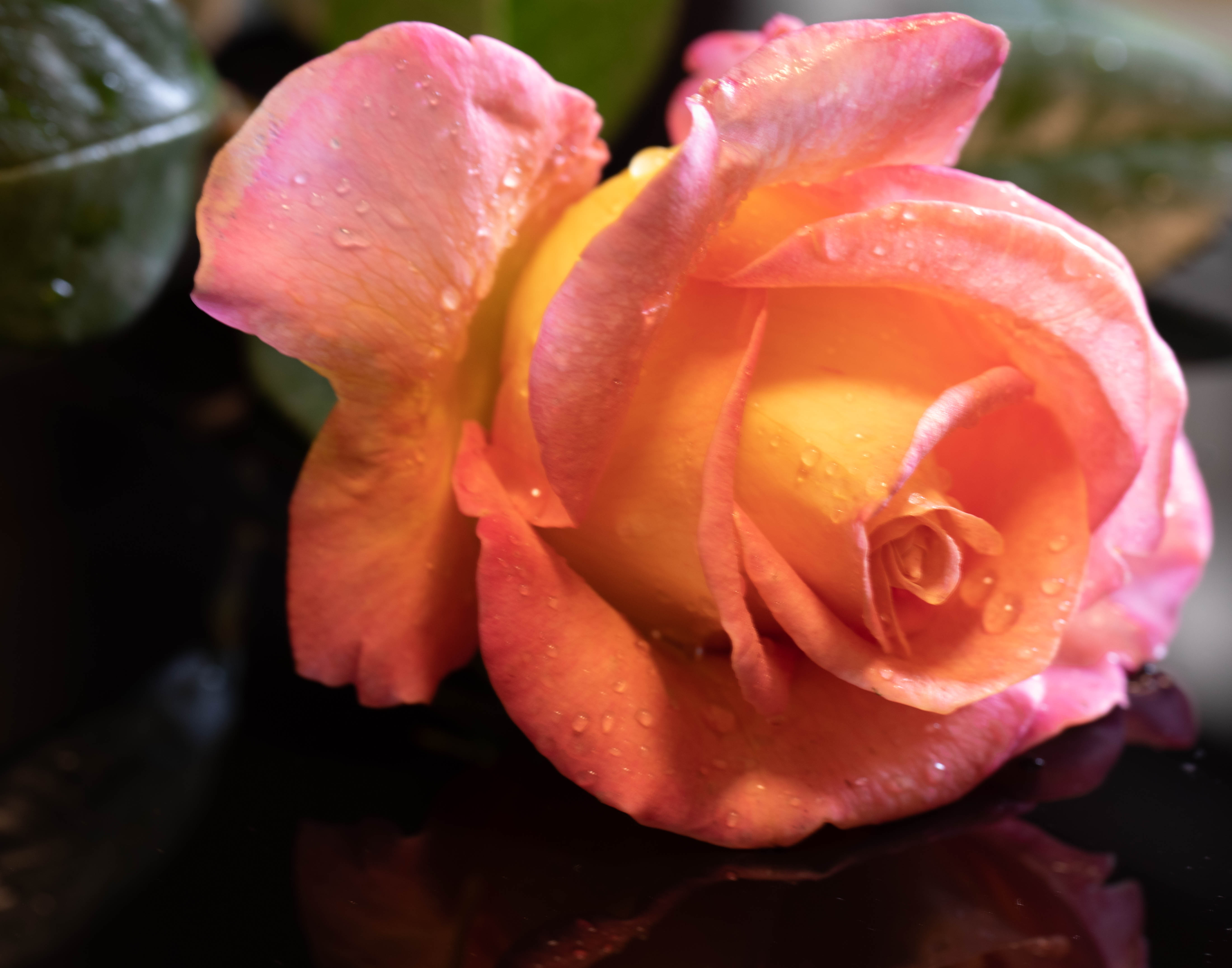
This is gorgeous! I love the twists and turns of the leave, and the composition, which is balanced out and made wonderful by the reflection. |
Mar 22nd |
| 6 |
Mar 20 |
Comment |
I find this photo very tender! I agree with the comments of the others, but would add that perhaps taking it while he was actually playing and doing it so there was a slight blur because of the motion might convey the motion. |
Mar 20th |
3 comments - 0 replies for Group 6
|
| 79 |
Mar 20 |
Comment |
Great image! Thanks for sharing it! And I agree with everything everyone else has said. |
Mar 25th |
| 79 |
Mar 20 |
Comment |
Absolutely lovely! Congrats on your awards! However, I, too, would have preferred the hands turned palm upwards (as May's), and I would have also liked a face, even if it were a blue mannequin type face. |
Mar 25th |
| 79 |
Mar 20 |
Comment |
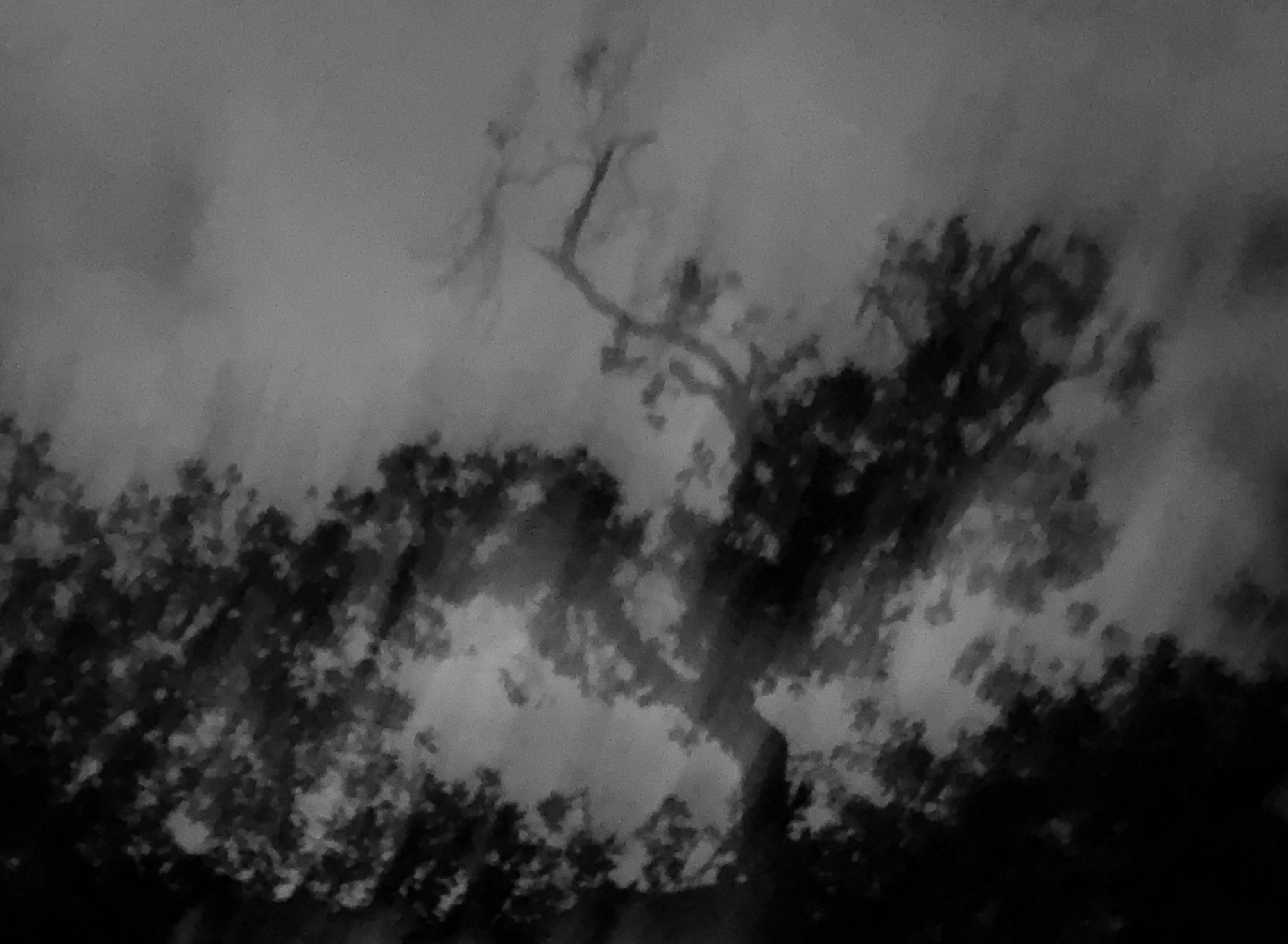
What a fascinating photo! You did a great job of capturing the old-world feel of all the details in the place, which tell so much about the Tea Maker and his world. I love the smoke, and the use of black and white. However, I agree with Karl that the photo would be improved by cropping the left side. I wouldn't crop out the window however, I would stop the left side crop where the painting covering part of the left side of the window starts. This would make clear where the light is coming from. It would also bring the Tea Maker a bit closer to the center rather having him way to the right. |
Mar 23rd |
| 79 |
Mar 20 |
Comment |
I think this is a lovely photo, and the sepia is a great choice for it. I do see that the apple and hands are not in focus. The center of the focus seems to be the chest. I think it would be better with more depth of field. Also, the lighting could have been improved. It is harsh, and blows out lots of places on the skin. In addition, it leaves a shadow on her neck. I also agree with others that the lines and texture in the background is distracting -- cloning the best part of it would have helped. |
Mar 23rd |
| 79 |
Mar 20 |
Comment |
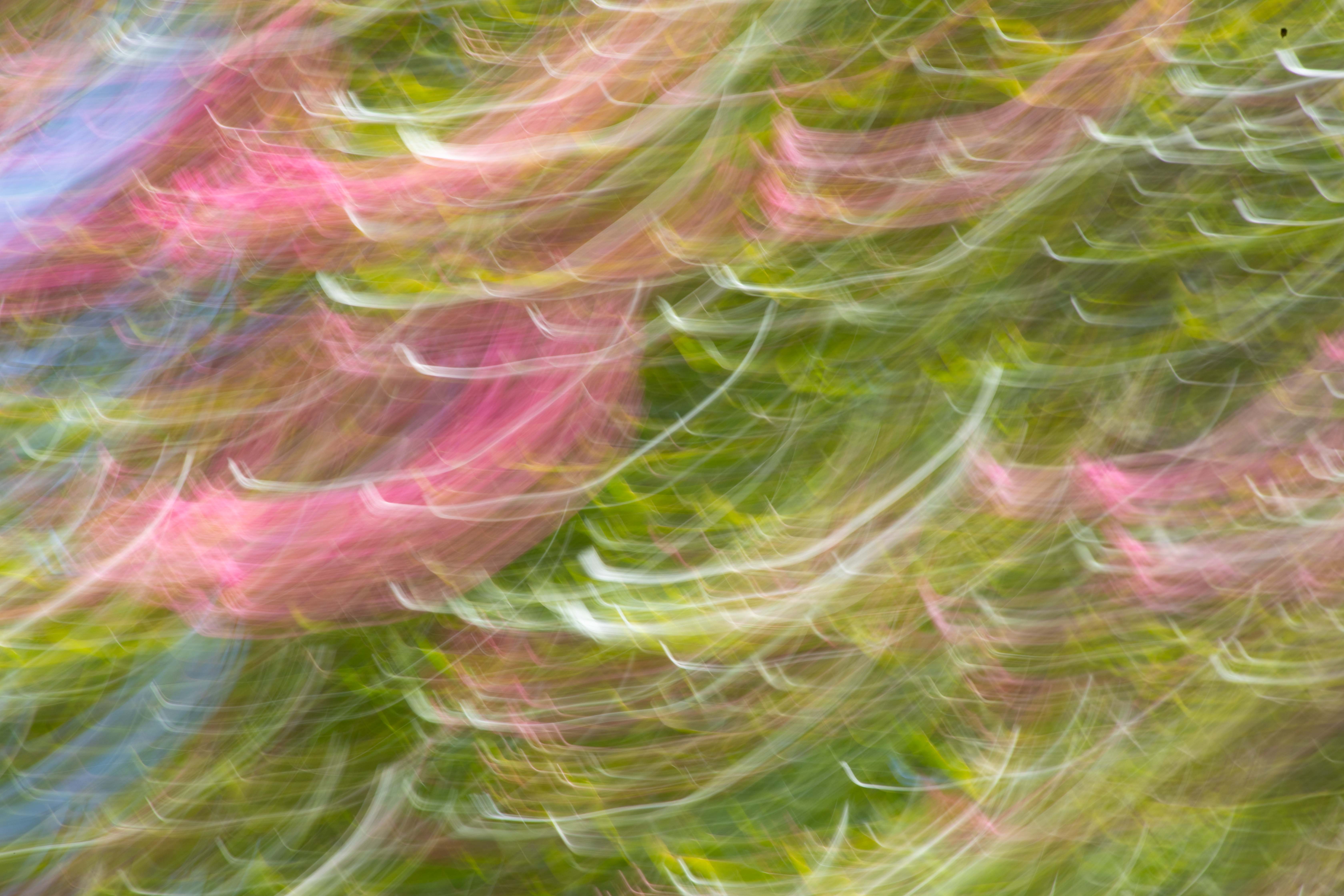
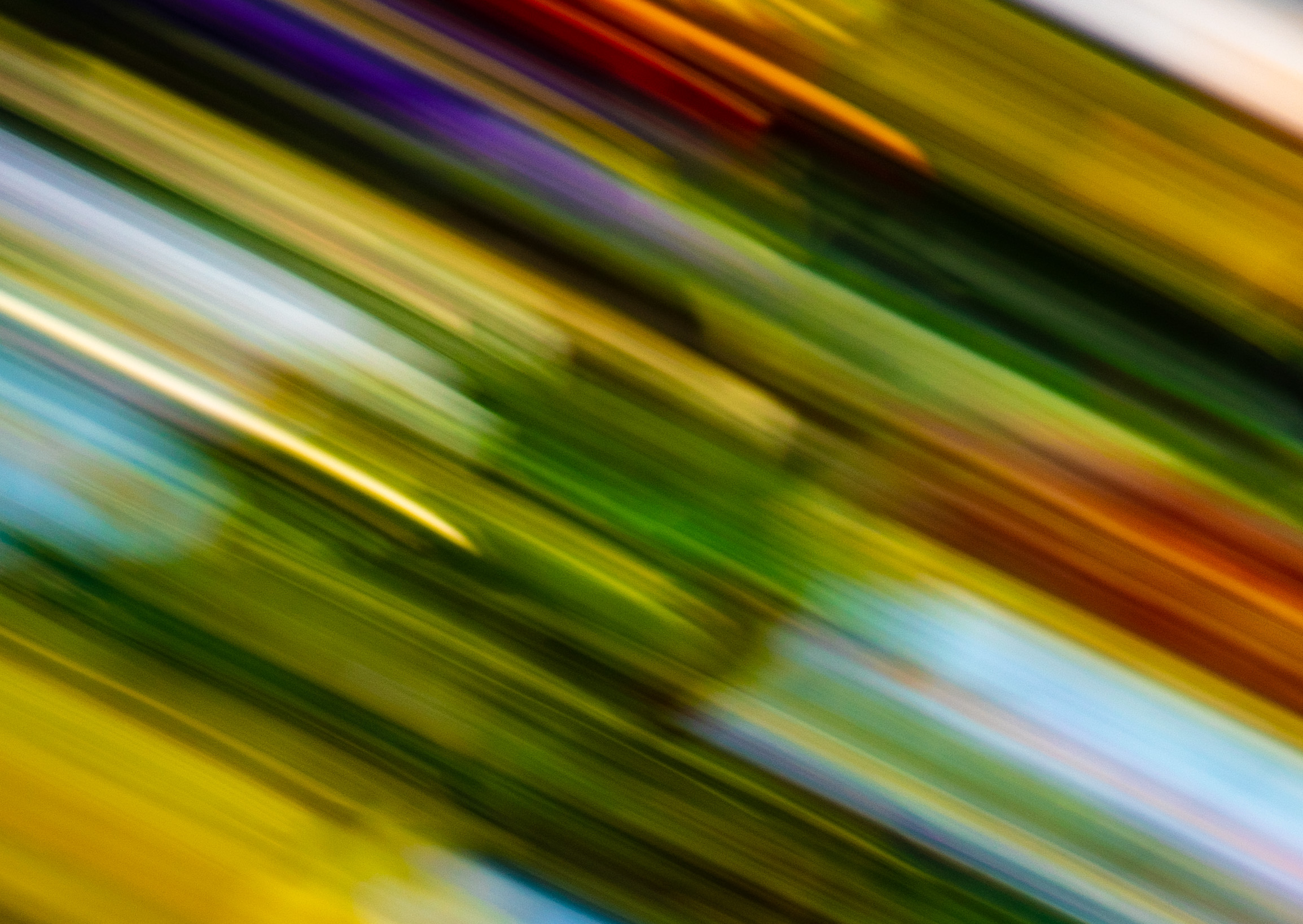
I agree with Karl's take on this. I'm open to interpreting it as abstract fine art, which is apparently what you were going for. I could see this hanging with other such fine art photos and then the viewer would have a different mind set in approaching it -- one not requiring or expecting to be able to identify the subject. I certainly could not figure out the subject, but once I understood what you were going for, I'm could accept it. For the abstract photo, I might have moved the lights around and experimented with finding the best composition for the streaks of light on a dark background. |
Mar 20th |
| 79 |
Mar 20 |
Comment |
Lovely idea -- charming photo. However I do agree with others that parts are blown out--hands, arms, face. Background is great, as is detail of the flowers! |
Mar 20th |
6 comments - 0 replies for Group 79
|
9 comments - 0 replies Total
|