|
| Group |
Round |
C/R |
Comment |
Date |
Image |
| 21 |
Aug 21 |
Reply |
Thank you. I appreciate your comments. |
Aug 14th |
| 21 |
Aug 21 |
Reply |
Yes, I did 2nd guess myself as I left our homes unprotected but I thought it was best for everyone and to get out before the roads were clogged. |
Aug 14th |
| 21 |
Aug 21 |
Reply |
Mine was a voluntary evac so we weren't one of the families with fire coming down our driveway. That said, it was the closest we have come. We could stand in our patio and see flames on the farthese ridge and watched the c130's drop fire retardant. Our neighborhood was just on standby, but I knew I wouldn't be able to sleep that night. We were lucky in that we had the opportunity to go thru the house and take the art off the walls and pack up all the cars with things we considered irreplaceable. I've decided not to return the art until we get a rain and the worst of fire season is past. We are very lucky that we have the cabin to go to. I know people who ended up in hotels down in Sacramento camping in other peoples yards. Thank you for your concern. It's become an unfortunate way of life. |
Aug 14th |
| 21 |
Aug 21 |
Comment |
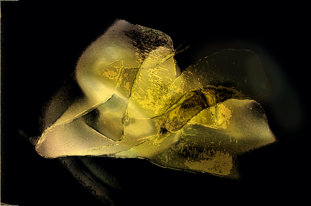
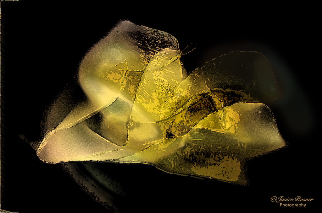
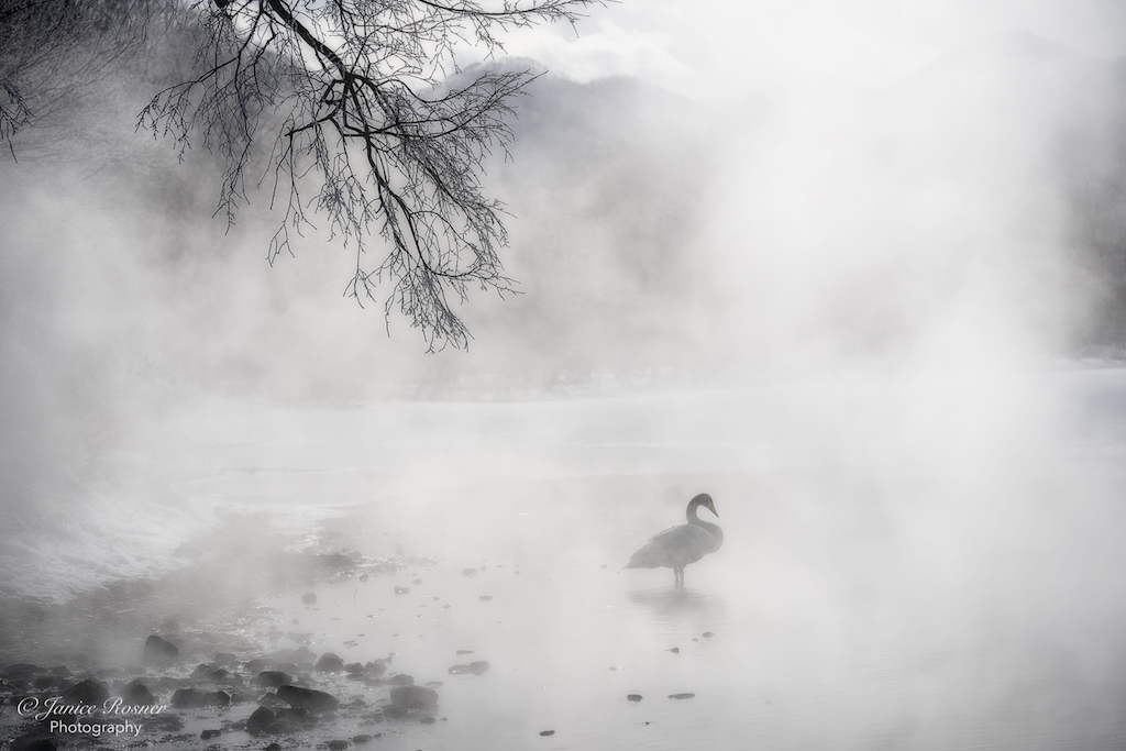
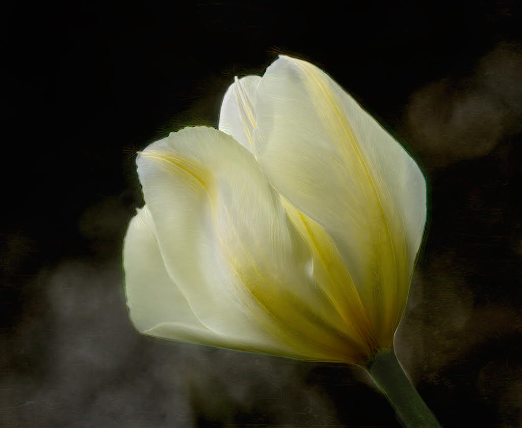
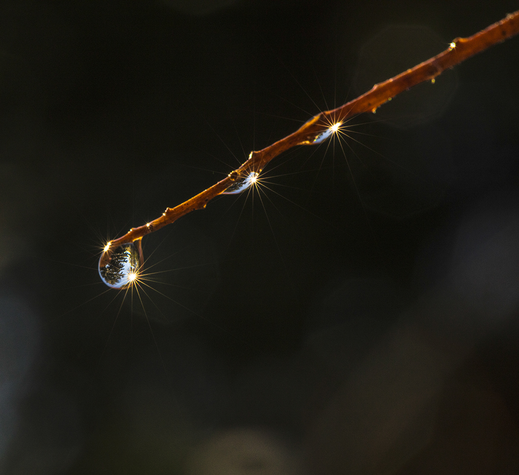
To me, this looks like rays emanating from the tulip with the flames on the ground in front of it. I was probably influenced by the fact that I live in NorCal and had to evacuate last week when the River fire started. I think that the smoke in Brian's 2nd image adds some dimension and depth to the story. |
Aug 13th |
| 21 |
Aug 21 |
Comment |
I agree with Joan about the saturation of the colors and straightening. Until I read your writeup, I didn't notice the carriage driver as he blends in with the carriage. I also think a little less saturation would add depth to the image. I'd like to know more about your thoughts in terms of applying a psychedelic look to this historical image. |
Aug 13th |
| 21 |
Aug 21 |
Comment |
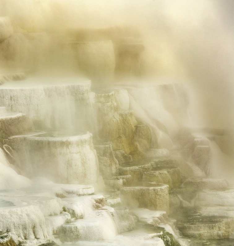
The curves over the lines make this an interesting image for contrasts. I think the subtle tone changes created by the dahlia add a lot of interest to the "basins". I also think your final choice of color is a good one. |
Aug 13th |
| 21 |
Aug 21 |
Reply |
Thank you so much for commenting on my image. I appreciate it. |
Aug 12th |
| 21 |
Aug 21 |
Reply |
Thank you so much for your comments. I appreciate it. |
Aug 12th |
| 21 |
Aug 21 |
Comment |
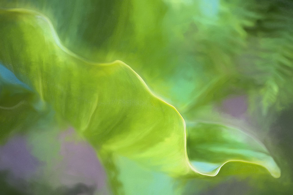
The gradations of the colors are very appealing to me, and I like the shapes as they are, I don't have to know that they are tulips. To me this image is about the shapes, how they overlap and the various colors created by the overlap and blur. |
Aug 11th |
| 21 |
Aug 21 |
Comment |
The way that the balloon is lit is very appealing. I just love those colors. Can you tell me what the story is here? Because of the way it is lit, It seems like this image is all about the balloon and I think the gorilla is watching the giraffe and the people are watching them? But, I don't know what the significance is of the gorilla on the balloon? He is holding it down for some reason? I'd love to hear your story. |
Aug 11th |
| 21 |
Aug 21 |
Reply |
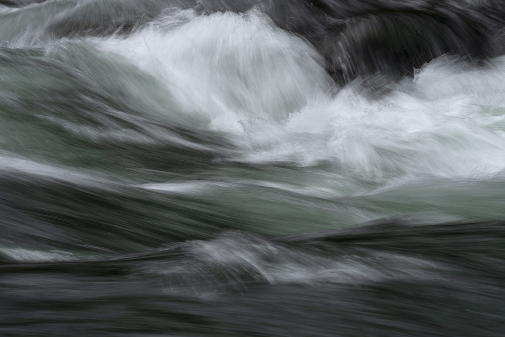
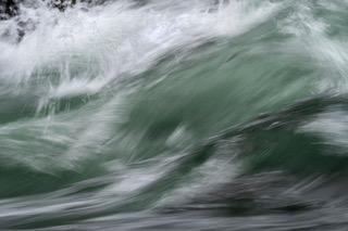
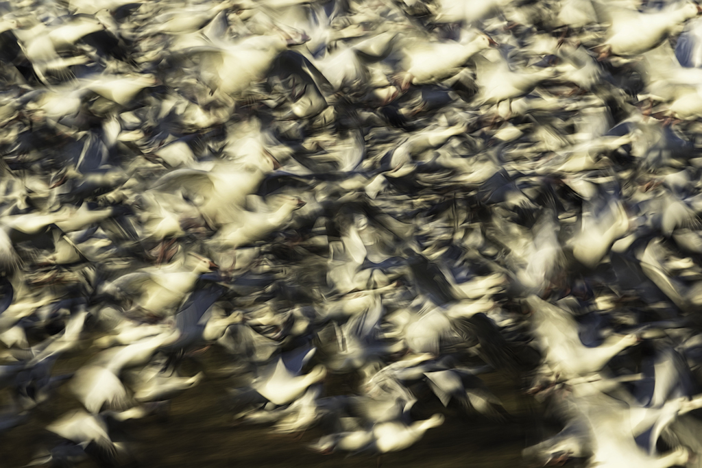
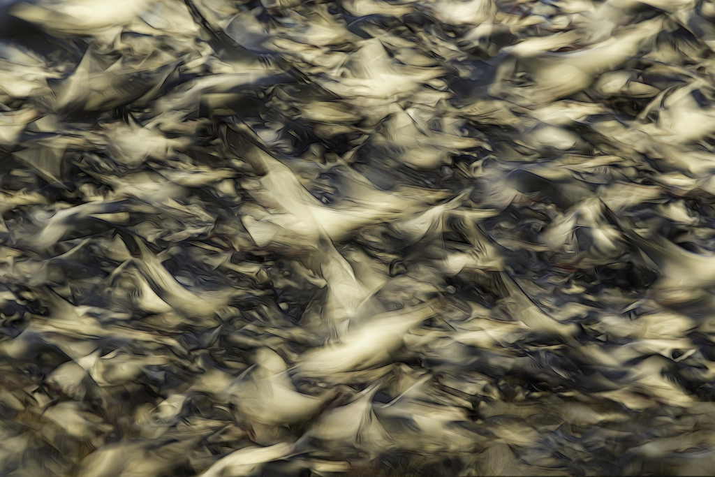
Thank you for your comments. For me, the creativity was more in capturing the image as opposed to the post processing. This image was made during my 2nd visit to the rapids. During my 1st session, I didn't get anything I really liked. After studying what the problems were, I realized that I really had to study the swift moving water and the light and just anticipate what I might get. With a 10s exposure, I was always behind the flow of the water. During the 2nd session, I had several more successful images as I was more in sync with what the camera would see as the water rushed by. |
Aug 11th |
5 comments - 6 replies for Group 21
|
| 75 |
Aug 21 |
Reply |
Thank you. I'll check this out. |
Aug 23rd |
| 75 |
Aug 21 |
Reply |
What are the parameters for images posted here? I was thinking they needed to be small. |
Aug 22nd |
| 75 |
Aug 21 |
Reply |
Than you, Pauline. |
Aug 16th |
| 75 |
Aug 21 |
Reply |
Thank you. |
Aug 11th |
| 75 |
Aug 21 |
Comment |
I love watching the otters in Monterey as well. I'm wondering if this one has a headache. For comedy, you could composite in a bottle of aspirin. |
Aug 9th |
| 75 |
Aug 21 |
Comment |
I actually love the bright flower and don't mind that it's super saturated. In looking at the 3 images, I think I like your original best though I would remove the shadow cutting thru the flower on the left. I think you selection is an interesting idea though I wouldn't have known your intent unless I had your written description. I wonder if it would convey a similar message if the flower on the left was just as bright as the flower on the right? |
Aug 9th |
| 75 |
Aug 21 |
Comment |
Gorgeous butterfly. I agree with Nicole that the lower is a bit overexposed, otherwise, I love the colors in this image. Compositionally, I'd remove the tips of the 4 petals that look like they are growing out of the top of the butterfly's wing. In my opinion they detract from the butterfly. I would also take down the brightness of the petals and flower on the right. |
Aug 9th |
| 75 |
Aug 21 |
Comment |
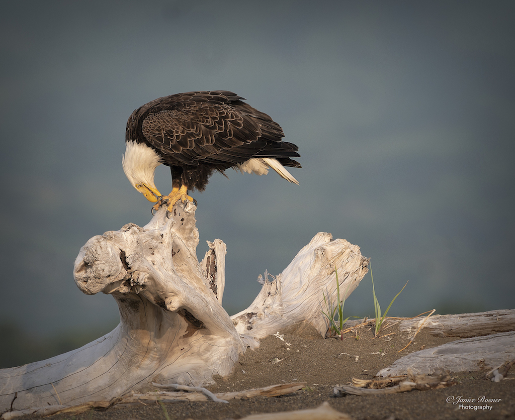
When I first saw this, I thought it was some kind of sand crab. I like the contrasts between the texture of the sand and the texture of the wood. Also, I think the POV works with all of the branches in good placement. I do wish the upper left branch was a bit sharper. It looks like the head of the creature and needs to make a statement. |
Aug 9th |
| 75 |
Aug 21 |
Reply |
Thank you. I was pleasantly surprised that a long shutter speed could capture the feeling of that fast moving water. |
Aug 9th |
4 comments - 5 replies for Group 75
|
9 comments - 11 replies Total
|