|
| Group |
Round |
C/R |
Comment |
Date |
Image |
| 21 |
Jun 21 |
Reply |
Thank you for that. A couple of friends saw that image this weekend and they both liked the way I had it originally as well. So, I think I'll just sit with it and not make any changes yet. Thank you for your comments as well. |
Jun 14th |
| 21 |
Jun 21 |
Reply |
Both Brian and I noticed it. It looks like a selection by the rectangular marquee tool. |
Jun 14th |
| 21 |
Jun 21 |
Comment |
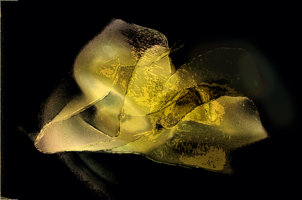
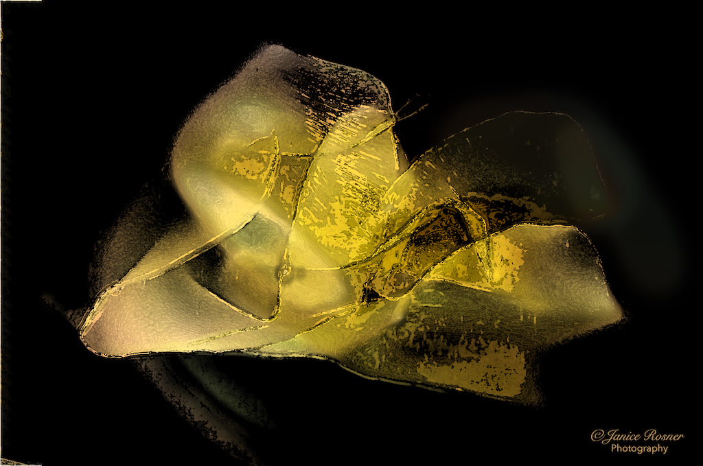
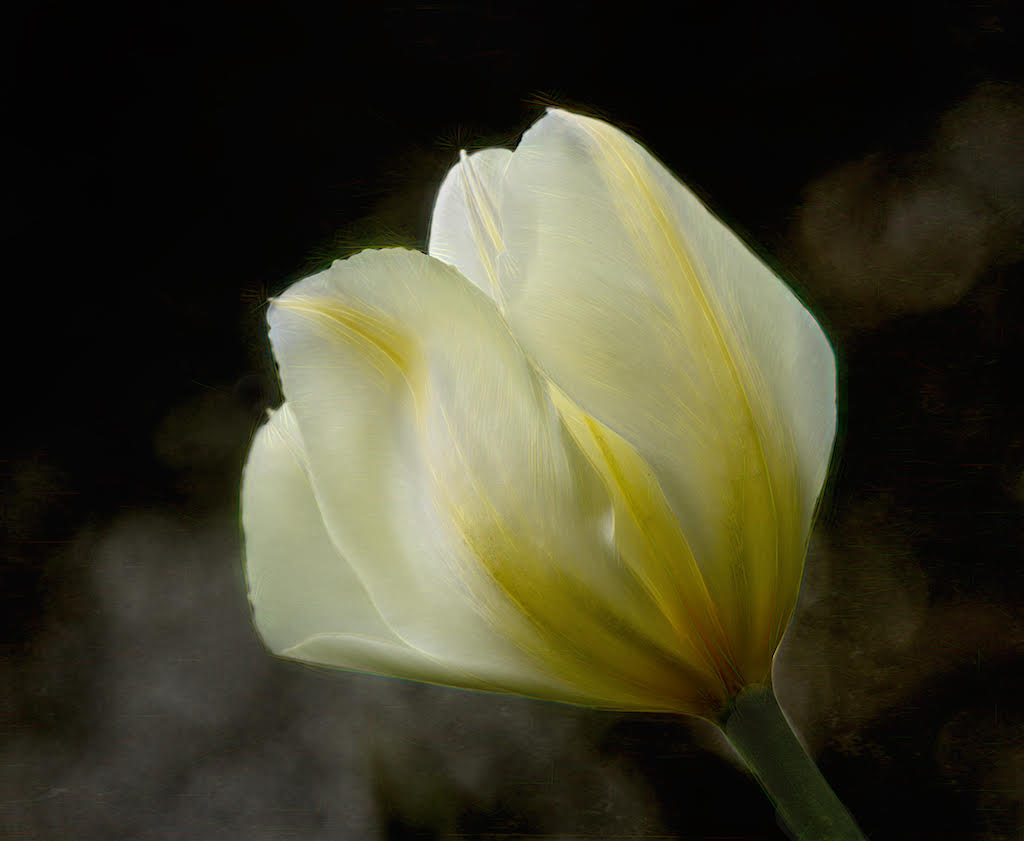
I think is a beautiful and well composed image. On my monitor, your color management looks very well done. My eye goes right to the top curves in the petals and then down to the bottom petal and back again. I also like how the flower fades in and out of sharpness, your chosen aperture seems to have been just right. I also like the texture your chose with colors that compliment but don't complete with the flower. Nicely planned and executed. |
Jun 12th |
| 21 |
Jun 21 |
Comment |
My first response to this was, "cool". Im my opinion, the hypersaturation works well, as doesn't your composition with the space and light leading to the mannequins. This seems to be well thought out and executed. My only questions, is what was the GoPro mounted on to give you this POV? |
Jun 12th |
| 21 |
Jun 21 |
Comment |
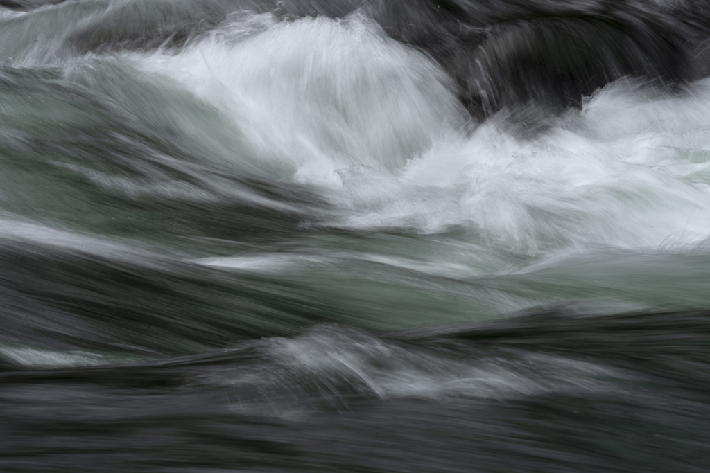
I like the texture created by the waves and ripples, though I'm wanting the flag on the left to be more visible like the flags on the right. To me, this difference between the flags creates an imbalance in the composition. I also didn't understand how the image with the planes fit in till I read your comments above. I'm looking forward to seeing your new version. |
Jun 12th |
| 21 |
Jun 21 |
Comment |
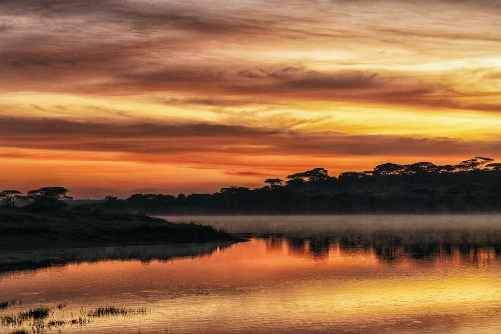
Your image is successful in creating a mood. I like your placement of the elements and how your lightening pierces the light beam which, in my opinion, creates a lot of energy and tension. On my monitor, the light beam is very opaque, especially towards the left end which doesn't seem to fit with the rest of the light beam. There is also a rectangular shape in the bottom left that almost looks like a selection. Compositionally, I don't understand it. |
Jun 12th |
| 21 |
Jun 21 |
Comment |
Your final product is very appealing and quite an interesting image. While reading how you made this image, I was wishing there were more images from the steps in the process. I see the influence of the fern image in the rocks and water but not in the sky. I'm wondering if your purpose in adding the the fern image was to add texture? I think your color palette works well and am impressed with the various tones you have in this image. They all work well together. Anyway, I'd love to learn more about your process with this image. |
Jun 12th |
| 21 |
Jun 21 |
Comment |
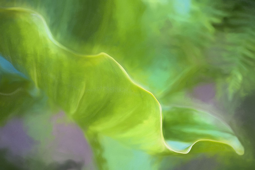
Thank you. I'm going to play with the leaf position and crop. I appreciate all your comments. |
Jun 11th |
| 21 |
Jun 21 |
Comment |
I just love your rain-stained wall, it makes both an interesting image on it's own and a useful layer. I also love the colors in original 1, especially the reflections on the water. I am a fan of in-camera intentional motion blur and I think your did a nice job with the circular movement. I think combining the vertical lines of original 2 with the circular lines of #1 was an interesting idea that worked well. |
Jun 9th |
| 21 |
Jun 21 |
Reply |
I think the square works better with it flipped and the tip of the leaf in the upper corner. I'm going to experiment with this. Thank you so much for your time and thoughts on this image. |
Jun 9th |
| 21 |
Jun 21 |
Reply |
Yes, the square puts more emphasis on the tip and curve though I'm not sure yet about losing the rest of the leaf. I like the stretch of it. I just haven't decided yet. |
Jun 9th |
| 21 |
Jun 21 |
Reply |
Interesting about the flip. I think I like it. I think that smaller leaf tip works nicely in the bottom left. Thank you. |
Jun 9th |
7 comments - 5 replies for Group 21
|
| 75 |
Jun 21 |
Reply |
Thank you for your comments about the crop. I'm going to work on that today. I've never done storm chasing but I'd like to do it once. |
Jun 13th |
| 75 |
Jun 21 |
Reply |
Thanks for weighing in on the color vs B&W. The color image for me was more like the feeling I had that day. The wind was blowing so hard that I had to put my weight against the door to open it. It was quite tricky, parking on the side of the highway, forcing the truck door open and getting out with my camera under my jacket, running down the highway and onto the prarie to check for good POV's, whip the camera out from under the jacket, make images, then run back into the truck and blow the camera off with the rocket blaster. It was blustery cold and the blue tint of the color version just conveys that feeling I had. I'm going to do the crop this am. T |
Jun 13th |
| 75 |
Jun 21 |
Reply |
Hi Walter, thanks for your crop. I think I may try that. I actually did convert this image to B&W so I have both. I'm actually not sure which one appeals to me more. Both have merit. I think I chose the color as it is more reminiscent of my experience there. |
Jun 12th |
| 75 |
Jun 21 |
Reply |
OH, I hadn't thought of cropping. I'll play with that. Thank you. |
Jun 10th |
| 75 |
Jun 21 |
Comment |
I think the high key effect works well in this image. I'm just wishing that the hippo was a little closer to the boat as you have the area between the hippo and the boat with not much going on. I think the branches sticking up out of the water add a nice sculptural element but I'm wondering if you could have changed your position so that the branch didn't appear to be poking thru the man's chest? I like the texture on the boat which makes it clear it's a hand-hewn boat. On my monitor the man and his clothes are quite dark. I'd love to better be able to see the expression on his face. |
Jun 9th |
| 75 |
Jun 21 |
Comment |
Brave woman to lay down in front of 200 cattle! This event certainly has interesting compositional possibilities. In terms of composition, I'm wondering what it would be like if that big, white cow in the front was more prominent in the image? When I first looked at this my eye wanted to follow the power lines down the road and it was only later that I came back to the white cow in front. Also, not sure what happened but the color balance seems better in the original. On my monitor the final looks a bit over exposed. I think this is exciting subject matter. You could just focus on the dust and all the legs as well as all the faces. I really like cows. Fun image. |
Jun 9th |
| 75 |
Jun 21 |
Comment |
This is an interesting concept although without your explanation I wouldn't have related the men walking to a near death experience. I actually like your original without the crop and with all of those roots and branches on the left edge. Without the crop the men seem farther away down the tunnel which, in my opinion adds mystery. Also, your original WB is warmer and I think that works with this image. |
Jun 9th |
| 75 |
Jun 21 |
Comment |
How exciting to get to experience the cicadas though living with them may be another story. This is a nice composition and your macro lens has done a good job of blurring the background. My only criticism is that I wish the cicada was sharp. Macro photography is difficult and I'm assuming you had to use manual focus. I see that parts of the wing are sharper but given that this is a portrait of the bug, in my opinion the head needs to be sharp. |
Jun 9th |
| 75 |
Jun 21 |
Comment |
I think you accomplished your goal. This is a peaceful scene with a magical quality. I also think you did a good job with that difficult time of day. You've avoided harsh shadows and blown highlights. On my monitor, the rocks and moss in the left foreground don't seem to be sharp which surprises me given that you were at f9 with 38mm. I love the little island on the right and the orange toned rocks in the foreground. This is a successful composition. |
Jun 9th |
5 comments - 4 replies for Group 75
|
12 comments - 9 replies Total
|