|
| Group |
Round |
C/R |
Comment |
Date |
Image |
| 21 |
May 21 |
Reply |
Thank you so much. I appreciate your comments. It does look spring-like and actually it was October. |
May 31st |
| 21 |
May 21 |
Reply |
Thank you for the suggestion. I'm traveling now but I'll play around with that when I get again |
May 22nd |
| 21 |
May 21 |
Comment |
I agree with the comments above that the sunflowers in the shack image should also be in color. To me, this would help to integrate the shack into the field of sunflowers. I also think Brian had an interesting idea to have all of the sunflowers more blurred. At the moment, there is a huge, blurred sunflower that is close to the size of the smaller part of the shack right next to the sharp shack. That incongruence doesn't work for me. I think this is an interesting concept with some really interesting possibilities. |
May 16th |
| 21 |
May 21 |
Reply |
Thank you for your comment. After your first comments I had studied the image and wondered about placing something in the left corner but there was that dense area so I hadn't come up with anything yet. Good to know, though, that at your first viewing of the image that corner didn't stand out to you. Thank you. |
May 16th |
| 21 |
May 21 |
Reply |
Thank you for sending the link. |
May 16th |
| 21 |
May 21 |
Comment |
Hi, welcome to the group. I just love the light in this image. You really did a nice job capturing the warm, diffuse light of the forest. I agree with Brian about the trunk on the right being a bit heavy and distracting and would agree with a crop similar to Brians. I think you achieved a nice balance in combining the images and that softening the blur works well. |
May 12th |
| 21 |
May 21 |
Comment |
I absolutely love your original 1. I love the repeating swirling lines and the barely distinguishable human forms. It's quite an interesting image. Original 2 repeats some of these swirls and I like the colors and tones of your composite. What I'm not feeling is the relationship between the tranquil appearing woman and the spinning crowd. I don't know the soundtrack "Widow Woman" so perhaps with the music this question is answered. |
May 12th |
| 21 |
May 21 |
Comment |
I like the effect of your ICB and agree with Hazel that it looks a bit like rain (except for the blue sky). Your effect is reminds me of impressionism and I think it's quite well done. I also like Brian's crop. My eye followed the green path down the bright side, but didn't notice the darker sider as much. I think Brian's crop makes the green grass look less like a "dividing line" in the image. |
May 12th |
4 comments - 4 replies for Group 21
|
| 75 |
May 21 |
Reply |
Thank you, Kerry. |
May 17th |
| 75 |
May 21 |
Reply |
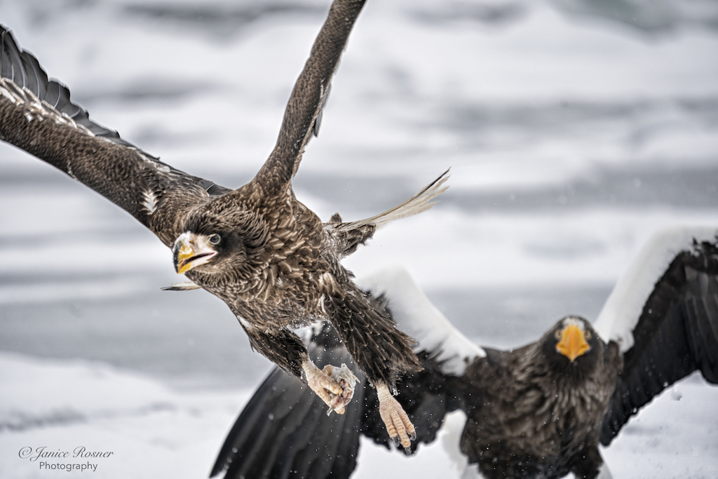
I like your crop as well. With that look on the white cubs face, he commands the attention and the other lions just give him context. |
May 17th |
| 75 |
May 21 |
Reply |
It was fun. And you're very welcome. |
May 17th |
| 75 |
May 21 |
Reply |
Here ya go with the sign removal. I don't have time right now to make one with the foreground put back in. I'm running around as I fly out tomorrow am for my high school reunion. I'll try to do it when I return.
|
May 17th |
 |
| 75 |
May 21 |
Reply |
Thank you. I just removed the sign from my original and I agree with you and Nicole after sitting with it for awhile. I also agree about the gravel. I wasn't driving so didn't have a choice in my placement. |
May 16th |
| 75 |
May 21 |
Reply |
This was done quickly. One could certainly fine tune the mask. |
May 12th |
| 75 |
May 21 |
Comment |
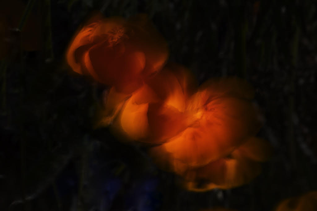
Cute kitty! Very nice capture of the expression on the cubs face. For my taste, the blur and vignette is a bit heavy. I did a different crop on your original and applied a light blur. |
May 12th |
 |
| 75 |
May 21 |
Comment |
|
May 12th |
| 75 |
May 21 |
Comment |
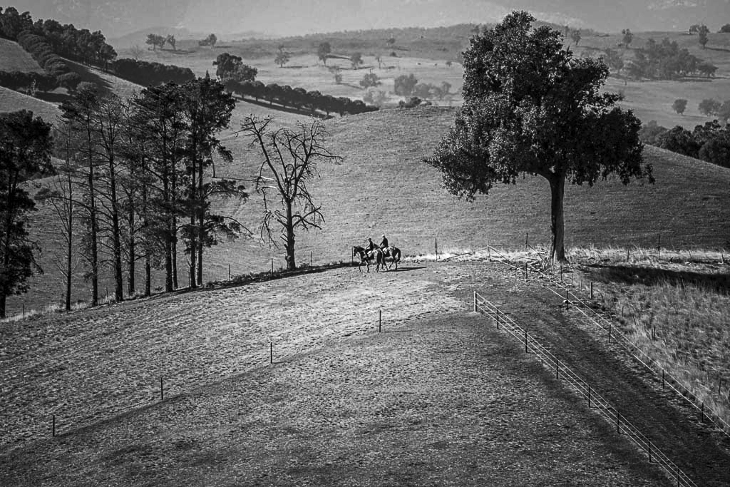
I just love this! It is one of the few "bullseye" images I've seen that really works. You have the diagonal lines of fences and trees to mitigate the "bullseye". I like your choice of the b&w but did think it looked a little flat. I took it into PS and applied a little dehaze and then a curves layer that brightened the center and highlighted the riders to illustrate increasing the contrast. |
May 12th |
 |
| 75 |
May 21 |
Comment |
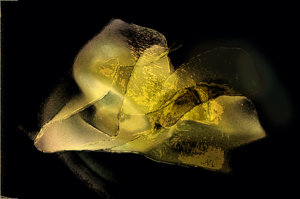
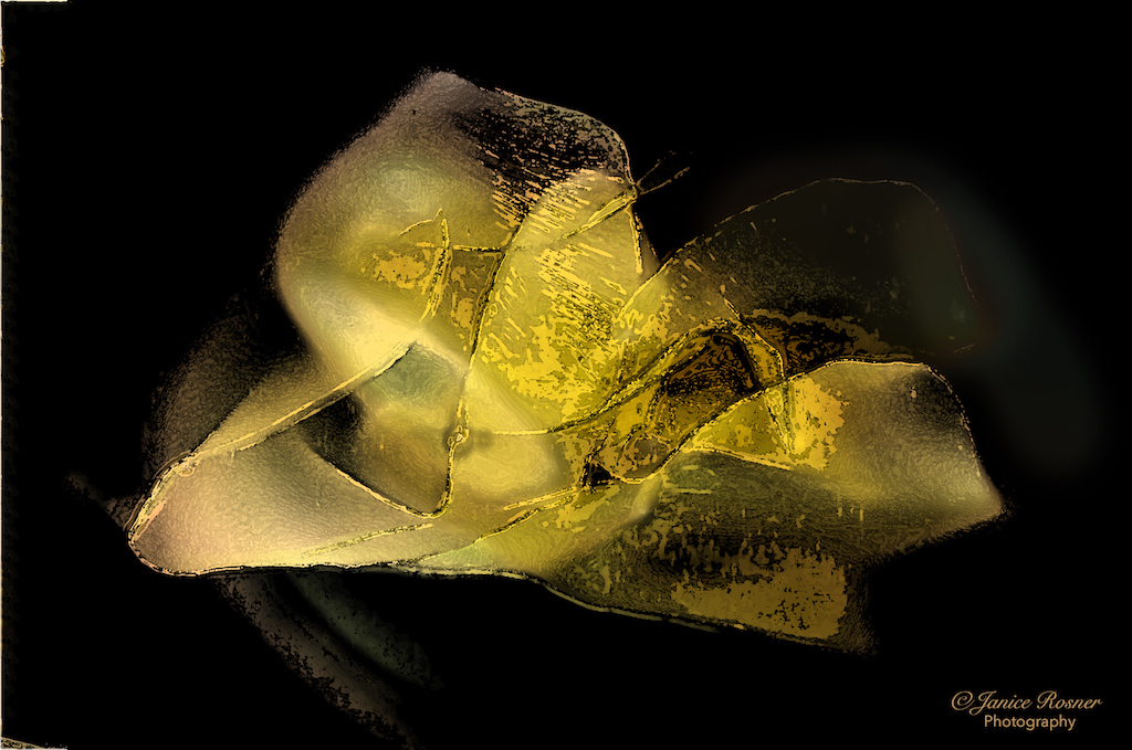
What an interesting plant. There is so much detail that I'm really wanting to study it and do find myself wanting it to be in focus. I love the beautiful bokeh in the upper part of the frame as well which is not so bright at to overtake the image but colorful and adds interest. Because they are the brightest elements in the image, my eye is drawn from the subject to the orange on the left and the green on the right so they compete with the subject. I would consider burning them a bit. |
May 12th |
| 75 |
May 21 |
Comment |
this is an image about contrasts, the delicate flower petals next to the dense rock and the bright yellow color next to the neutrals of the rock. I like this theme but because the rock in the foreground is part of the subject, I'd reshoot this with that rock being sharper as well as the front of the daffodil. The back petals of the daffodil are nice and sharp and really bring out their delicate detail. I'd like to see that on the front of the flower as well. |
May 12th |
| 75 |
May 21 |
Comment |
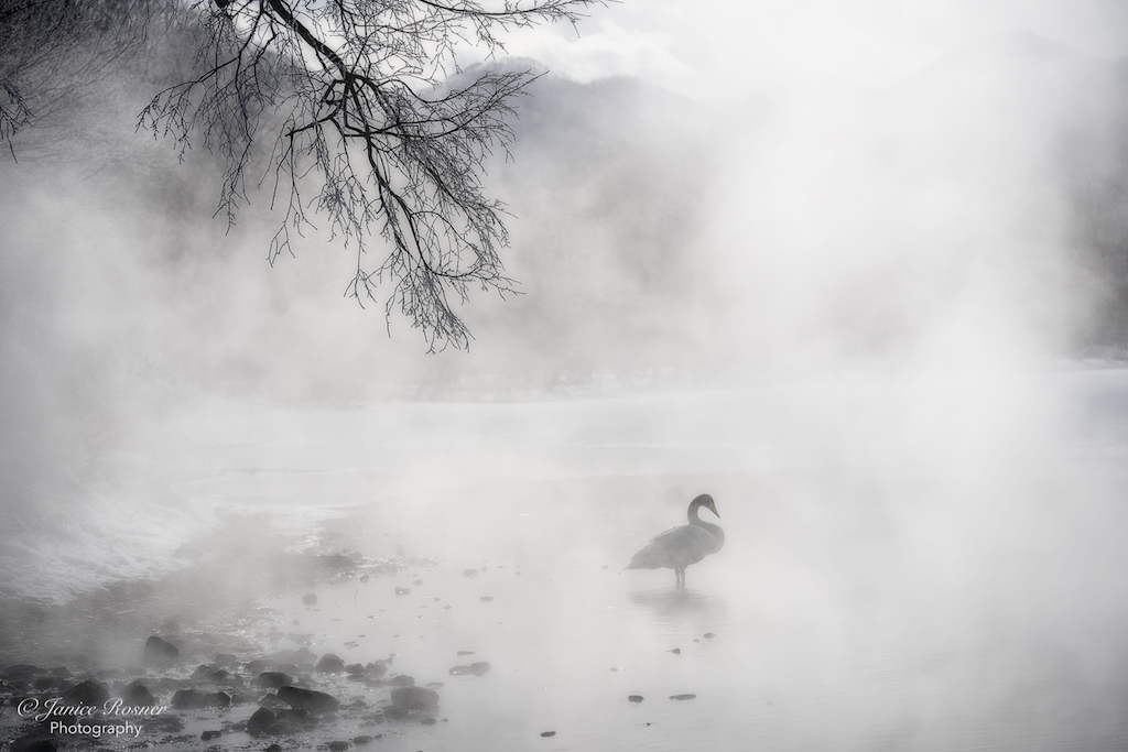
This is an inviting scene for a warm summer day. I can just feel me walking over the cobble in the foreground to take a dip in the pool under that waterfall. I like how the tree branches frame the waterfall and I like how you decreased the shadow across the waterfall. I agree with Nicole about removing the branch as I don't think it adds anything in this case. Another thought would be to come back and photograph this when the light wasn't so harsh on the water highlights. |
May 12th |
| 75 |
May 21 |
Reply |
Thank you for your comments, Nicole. I was wondering about the cropping. I did the crop because the foreground was shaded by the vehicle and I was't sure if there was enough going on in the foreground to keep it. I appreciate your comments about the leading lines. I also wondered about the sign. I often would remove something like that, but I wondered, because of it darkness, if it provided some balance to the dark bushes on the right. I'd like to hear what other people think. Again, thank you for your comments. |
May 11th |
6 comments - 7 replies for Group 75
|
10 comments - 11 replies Total
|