|
| Group |
Round |
C/R |
Comment |
Date |
Image |
| 75 |
Aug 20 |
Reply |
Thank you, Kerry. They actually aren't texture layers. They are all effects in PS. |
Aug 23rd |
| 75 |
Aug 20 |
Reply |
I"m glad it was helpful, Kerry. I also like the image with the pelican taken back to the warmer tones that David did. |
Aug 23rd |
| 75 |
Aug 20 |
Reply |
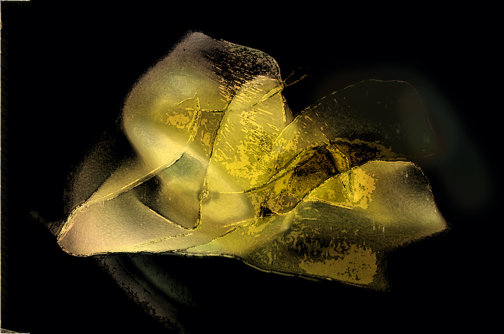
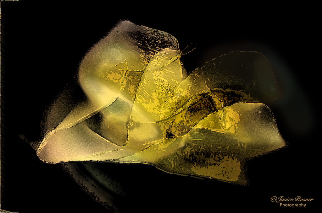
I appreciate that observation. The ghosting is actually a petal of the flower that was darker. I'll have to work on that. |
Aug 22nd |
| 75 |
Aug 20 |
Reply |
Thank you, Pauline. I appreciate your input. J |
Aug 12th |
| 75 |
Aug 20 |
Reply |
I"ll be looking forward to your next version. Glad my comments could spark some experimentation. Again, welcome. |
Aug 12th |
| 75 |
Aug 20 |
Reply |
I'm actually not sure how many versions there were. It was up on my desktop for the better part of a week. I just kept puttering, "to see what would happen". During 1 putter I got something I thought was "cool" so I kept on with it. It's a happy accident really. |
Aug 12th |
| 75 |
Aug 20 |
Comment |
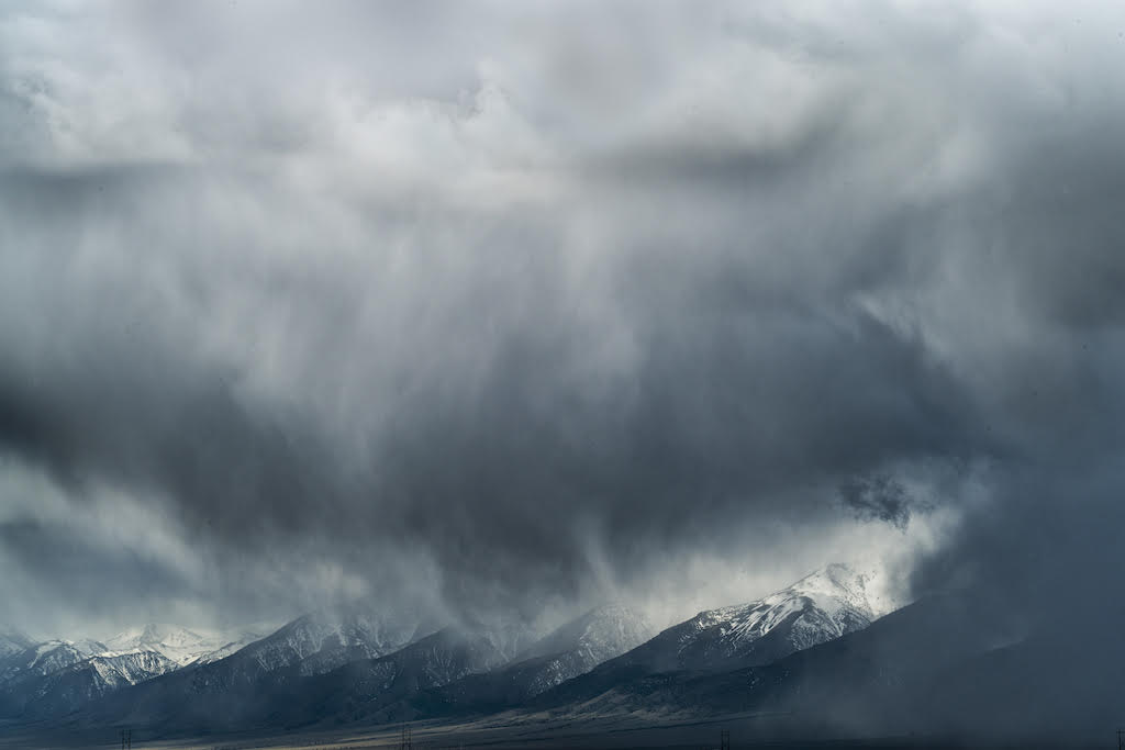
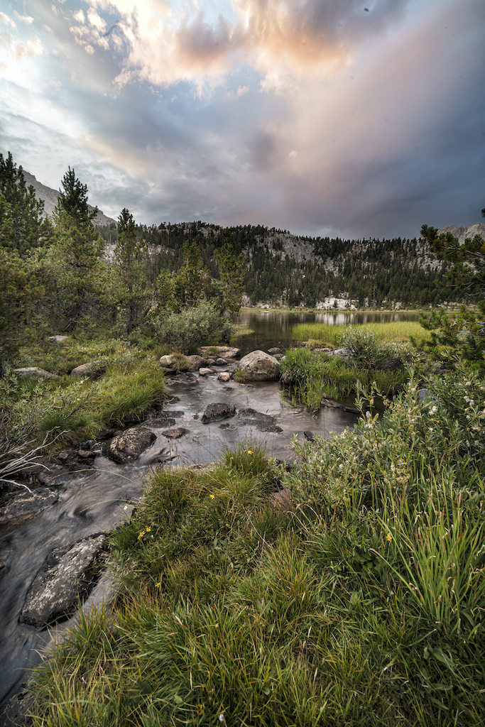
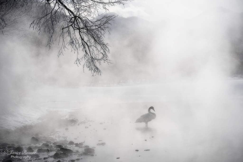
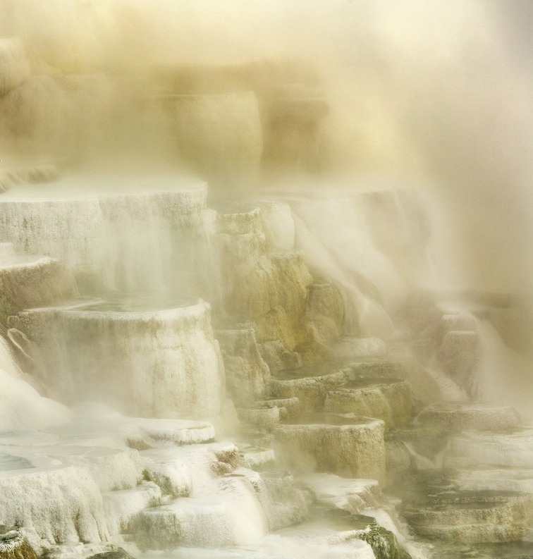
I have shot Mammoth Hot Springs a couple times and know that it's always a dance between clear air and mist. On my monitor, this image is a little flat and seems to need contrast. I did put this image into ACR and see from the histogram that you have a good range of midtones but not much in the darks and highlights. I enjoyed the colors in your original 2 and know that the colors of the bacteria in these pools are a big part of the story at Mammoth. I'm also not sure what the subject is in this image. Is it the snag, the flat terrance in the left foreground, the water tumbling over the stone? The water in the mid right is the brightest area of the image but I'm not sure it's a strongest enough focal point. |
Aug 11th |
| 75 |
Aug 20 |
Comment |
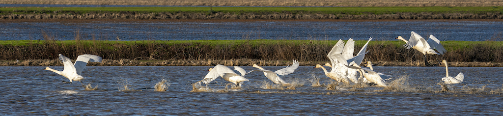
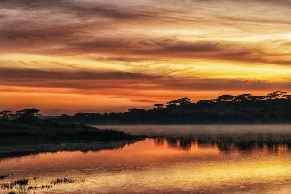
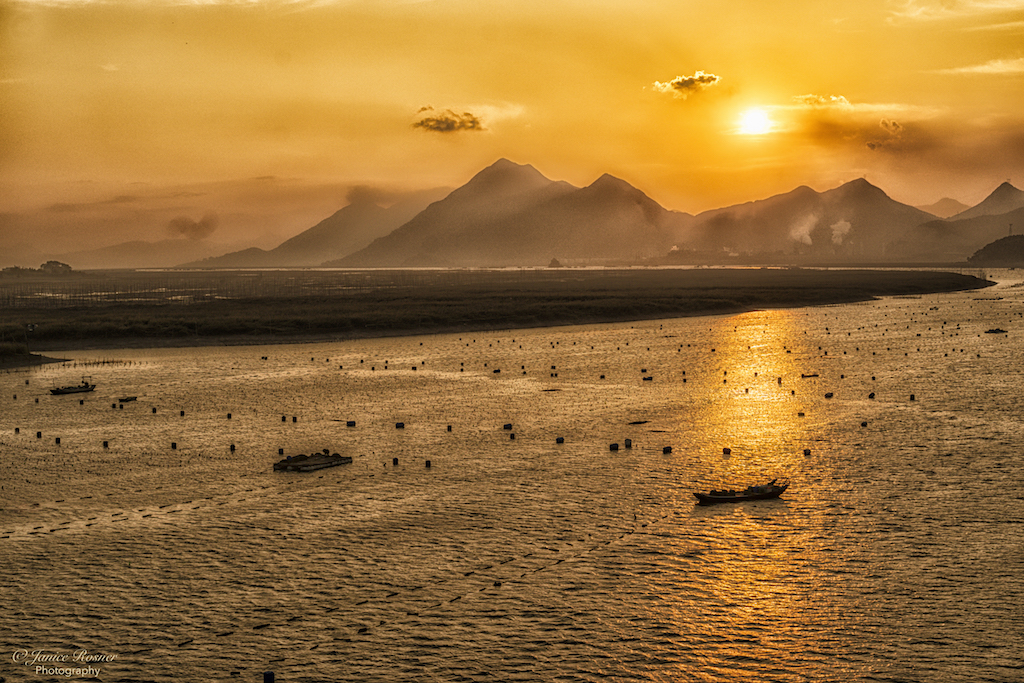
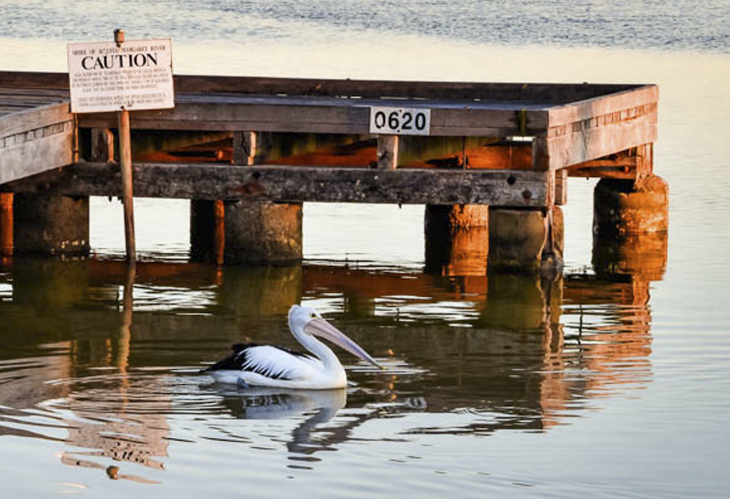
I just love the tones in this image. What a beautiful sunset! In my opinion, the most beautiful part of the image is around the pelican and the right end of the pier. If the pelican is the subject, I think it should be bigger in the frame. I have attached a crop to illustrate what I'm talking about. The two signs and the bird make a triangle of lines which I think makes the subject stronger and the reflection of the sign frames the bird. |
Aug 11th |
 |
| 75 |
Aug 20 |
Comment |
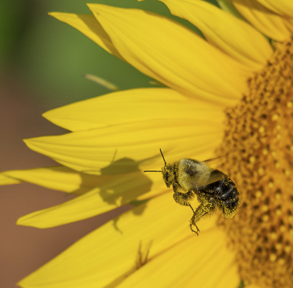
I 2nd that welcome to the group. I hope you enjoy it. On my monitor, the color balance seems good and your shutter speed was adequate to keep the bee sharp. When I brought the image up on my large screen, my eye immediately went to the center of the flower which is big and bright. I wandered around the flower and then came to the bee. In my opinion, the bee (the subject) is overpowered by the giant flower so I experimented with a crop with the goal of making the bee more prominent in the frame. I've attached a copy of my crop example. I also agree with Walter about the shadow and wonder if it could be lightened to be less prominent. |
Aug 11th |
 |
| 75 |
Aug 20 |
Comment |
It doesn't get much better than sunflowers against a bright blue sky! I also love the angle of your shot though I think a bit more DoF would have given the petals in the background sharper focus. I agree with Walter about the petals in the foreground being distracting, especially the one that cuts through the flower in the lower right. I think you could have gently put that leaf behind the flower and moved your POV which would de-emphasize that flower (like Walter's crop). That said, I love the boldness of this image which, in my opinion, captures the essence of sunflowers. |
Aug 11th |
| 75 |
Aug 20 |
Comment |
With this image of the Swallowtail, I think you have achieved your goal of recording it's characteristics. Photographically, I would like to have seen a bit more room on the sides of the butterfly as to me it seems a bit crowded in the frame. Also, the leaf in the bottom foreground almost looks like part of it's tail you might want to consider decreasing the brightness so it's not so prominent. |
Aug 10th |
5 comments - 6 replies for Group 75
|
5 comments - 6 replies Total
|