|
| Group |
Round |
C/R |
Comment |
Date |
Image |
| 75 |
Jul 20 |
Reply |
I appreciate your comments, Pauline. So much to consider as I work with this image. |
Jul 20th |
| 75 |
Jul 20 |
Comment |
Thank you for your comments , Kerry. I appreciate what you said about the brightness at the top of the image. I agree with you. Time to get cropping! |
Jul 19th |
| 75 |
Jul 20 |
Reply |
I agree. Thank you so much. |
Jul 17th |
| 75 |
Jul 20 |
Comment |
Yes, I agree with Larry that this works much better in terms of highlighting the bird and eliminating the bright spots. Nice. |
Jul 17th |
| 75 |
Jul 20 |
Reply |
Hi Walter,
I appreciate you and Larry taking the time to work with this image. I do like your crop and see that you have also cropped out that darker spot on the right. I agree with you two that that has to go. Thanks again very much. |
Jul 17th |
| 75 |
Jul 20 |
Reply |
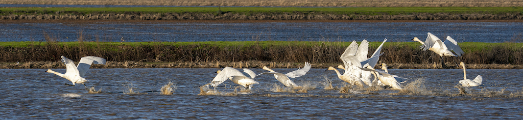
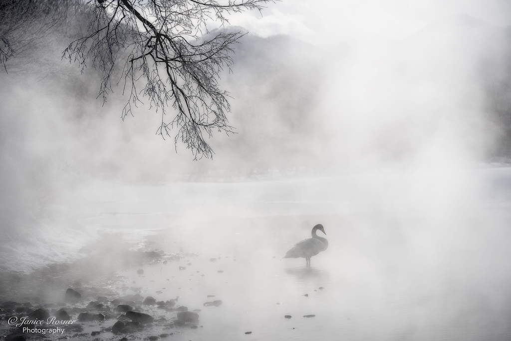
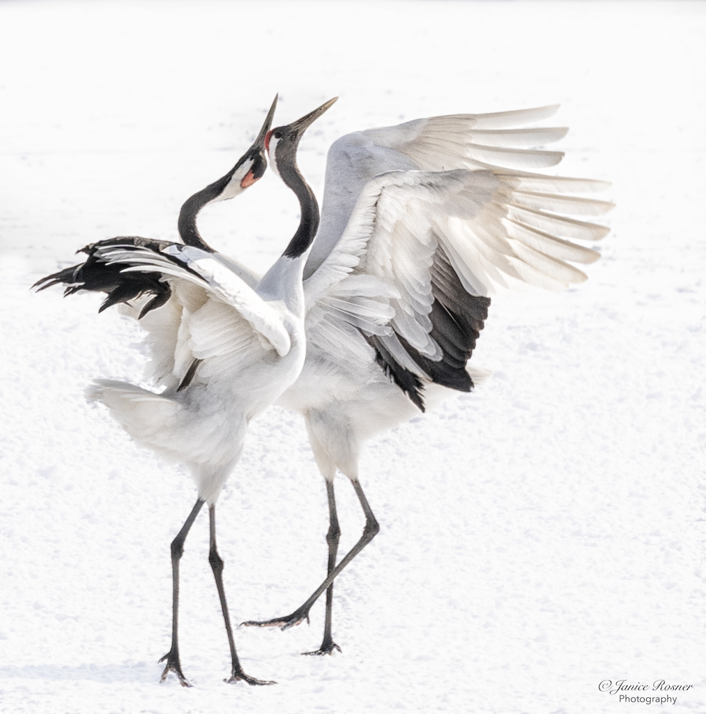
You know, I wasn't even thinking about the Ro3rds and the way you have it is low in the image so it's not a bullseye. I do appreciate your suggestions and I am going to play with the crop. I think that lack of color issue is interesting. I have a couple images from Yellowstone I took in the winter and they also look like B&W although they aren't converted. Processing these winter images has taught me some things about the colors (or lack there of) of winter. Even scenes I see as having more color, the camera seems not to see it that way (and I'm not talking about a color issue with the camera). It's just another example of the difference between what the brain sees and what the processor sees. |
Jul 10th |
| 75 |
Jul 20 |
Reply |
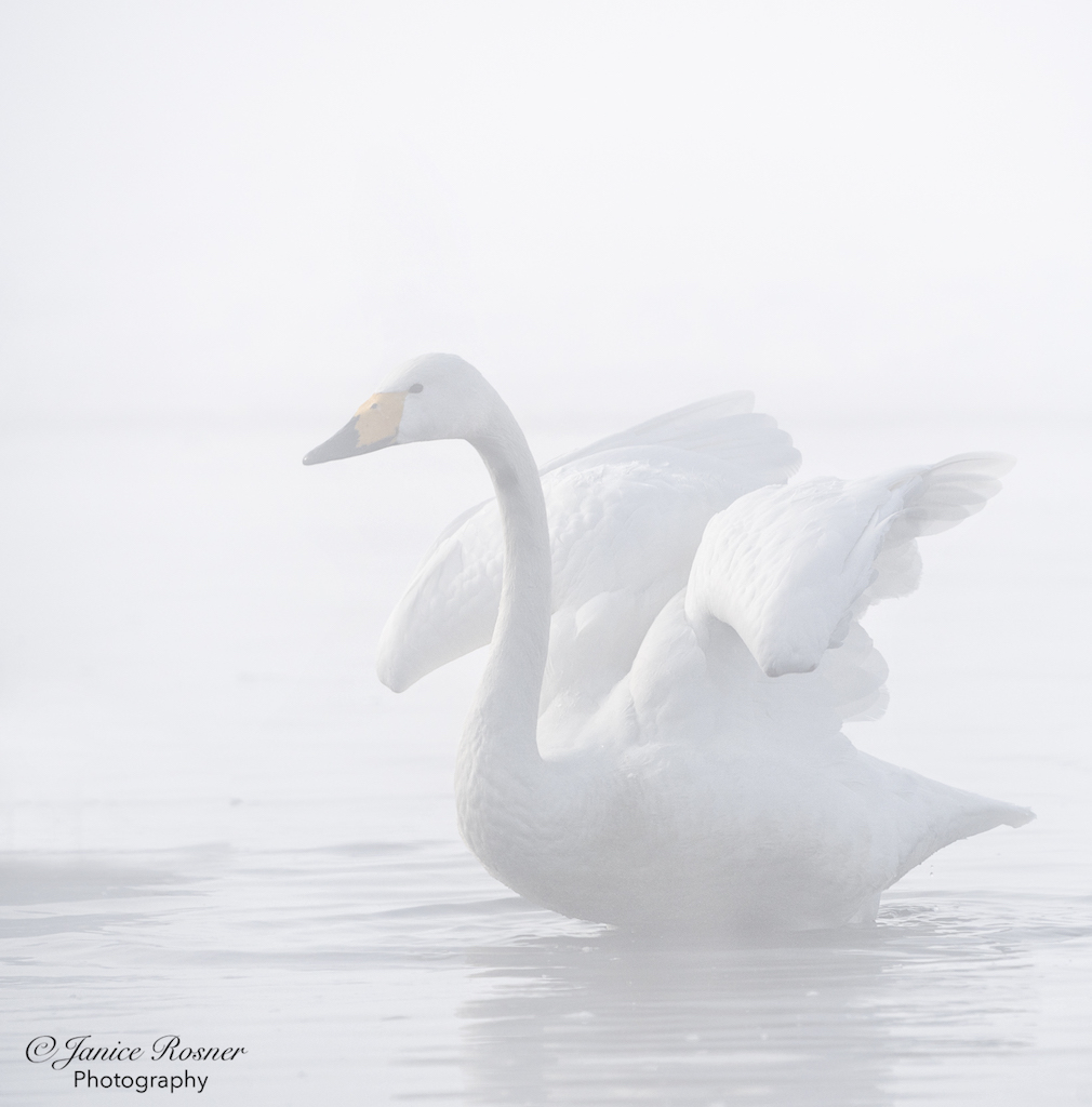
This is an interesting crop. I do like loosing the shadow on the right and I like the rocks and tree limb pointing toward the swan. That said, I'm not sure I like the more center placement of the swan that these crops force. I should give you more background about this image. We arrived here at sunrise, before the swans flew in from the night roost spot. This swan and a couple others were the the first arrivals, ahead of the majority of the flock. This swan stopped in this spot while his flock mates were upriver just lightly. I was struck by the vastness of the valley and this lone swan in this place. So, the swan is only part of the subject but is needed to contrast with the enormity of his world. I appreciate your comments and I'm going to experiment around with some crops and see what I come up with. Btw, this isn't a B&W conversion. It was just a "shades of grey" morning and too cloudy for color in the sky. |
Jul 10th |
| 75 |
Jul 20 |
Comment |
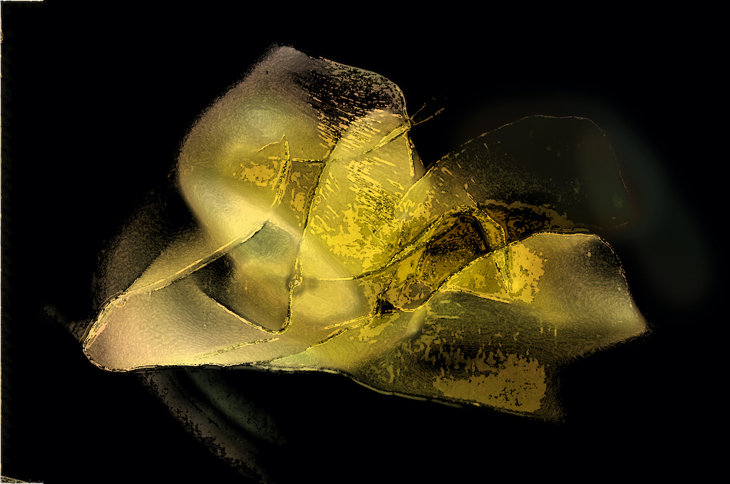
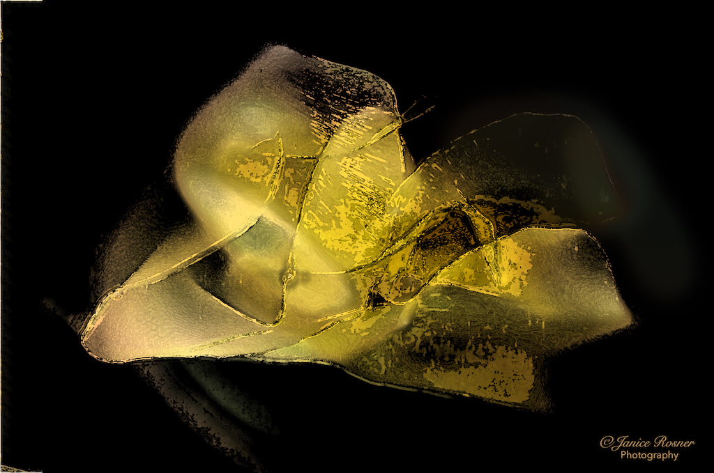
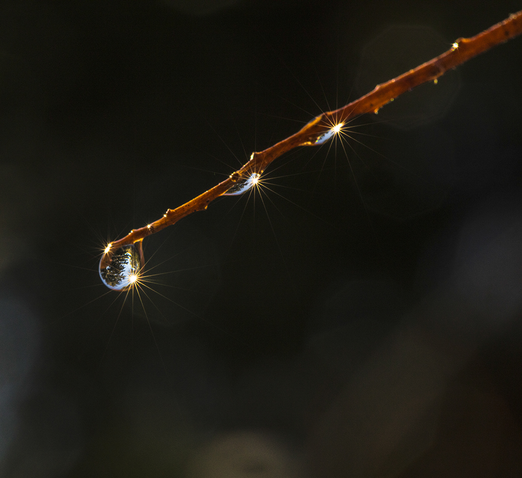
I like the simplicity of this composition and the lines created by the tail and the stem. All lines lead to the wings and head. Unfortunately, when I get there, the head and wings aren't sharp which is a disappointment. These dragonflies can make such good subjects and I think there's a story in the frayed edges of the wing, I just would like it to be sharper. |
Jul 10th |
| 75 |
Jul 20 |
Comment |
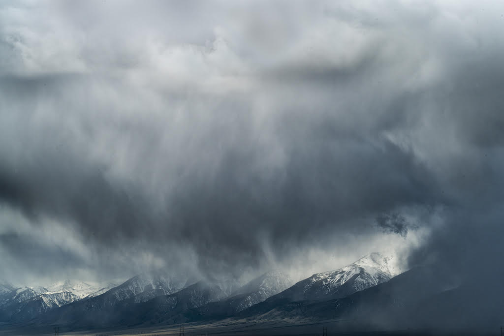
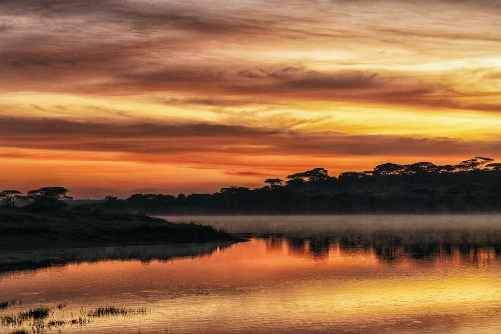
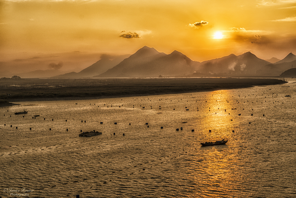
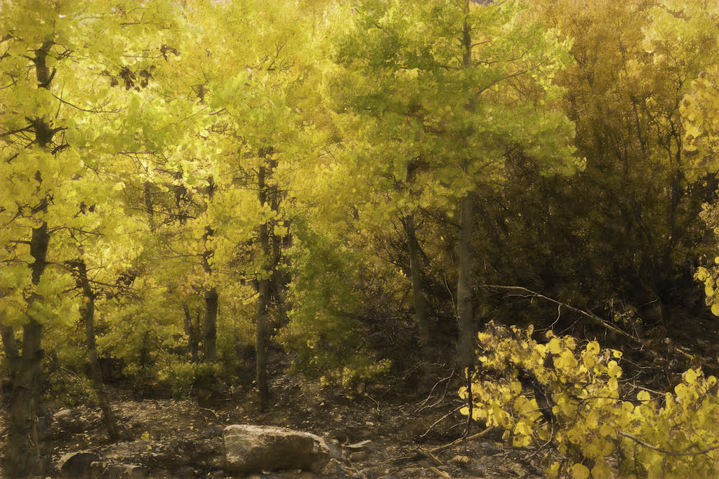
I love, love, love this composition and your description of the lake makes me want to visit! I just have a couple of suggestions in terms of processing. I love how the wood of the tree stands out on the right. It is light and contrasts nicely with the darker bushes. I'd like to see this carried out on the left side of the tree to emphasize the structural impact of the tree. My other idea, because I was reading about gradients this am, would be to apply a gradient to the image to really bring out those fabulous colors in the sky. |
Jul 10th |
| 75 |
Jul 20 |
Comment |
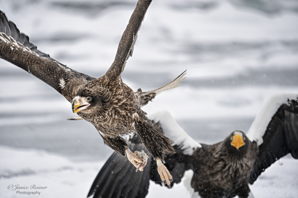
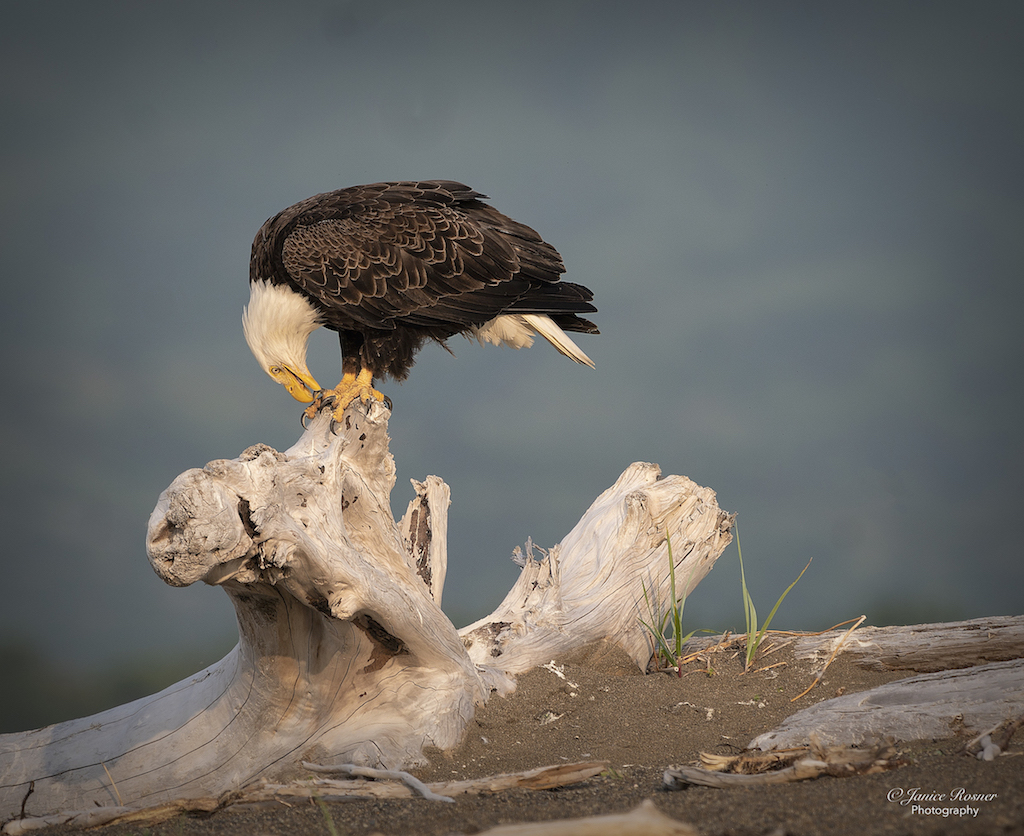
This guy is gorgeous. I like the detail in his feathers and that you got the whole bird from top of his head to tip of his tail. In terms of processing, I see that you removed a lot of the bright light in the upper right though I still find the remaining light distracting as it competes for attention away from the bird. I'm also wondering if you had decreased the DoF just a little if the background would have been more blurred. I think that the textures of all that plant material would is also distracting. Finally, I love that he seems to be looking at the camera, and I'm thinking that dodging his face and eye would make the image more powerful. |
Jul 10th |
5 comments - 5 replies for Group 75
|
5 comments - 5 replies Total
|