|
| Group |
Round |
C/R |
Comment |
Date |
Image |
| 75 |
Feb 19 |
Comment |
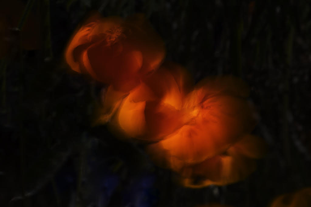
I agree with Walter's crop suggestion. Good call. |
Feb 21st |
| 75 |
Feb 19 |
Comment |
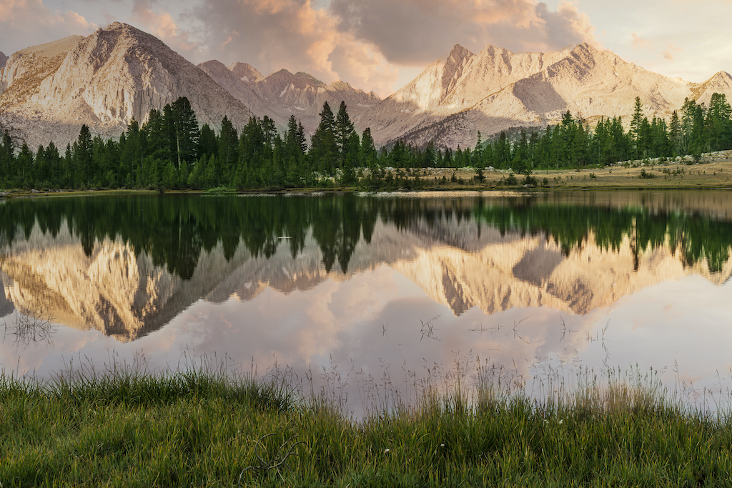
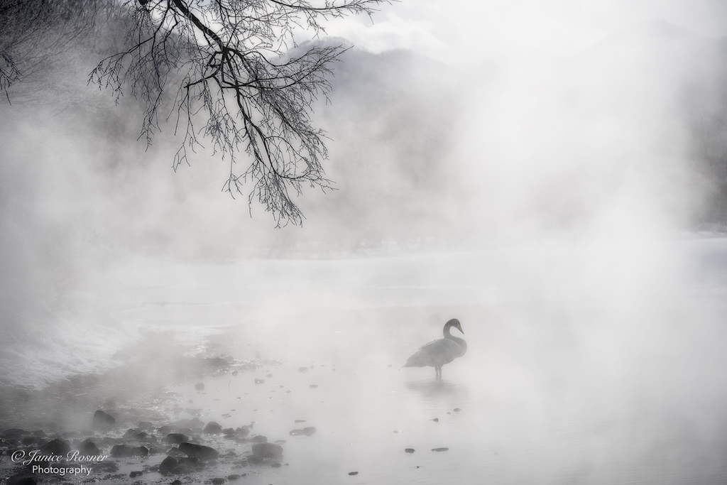
Your 2nd set of adjustments are quite lovely. I especially like the detail it brought out in the tree which I had no idea was there. On my monitor, the tones in this image are looking quite balanced. The mountains are also looking softer and more pleasing. |
Feb 21st |
| 75 |
Feb 19 |
Comment |
This is a good suggestion. I appreciate you noticing those limbs. Sometimes when you look at an image for awhile, you don't notice things like a pair of fresh eyes would. |
Feb 19th |
| 75 |
Feb 19 |
Reply |
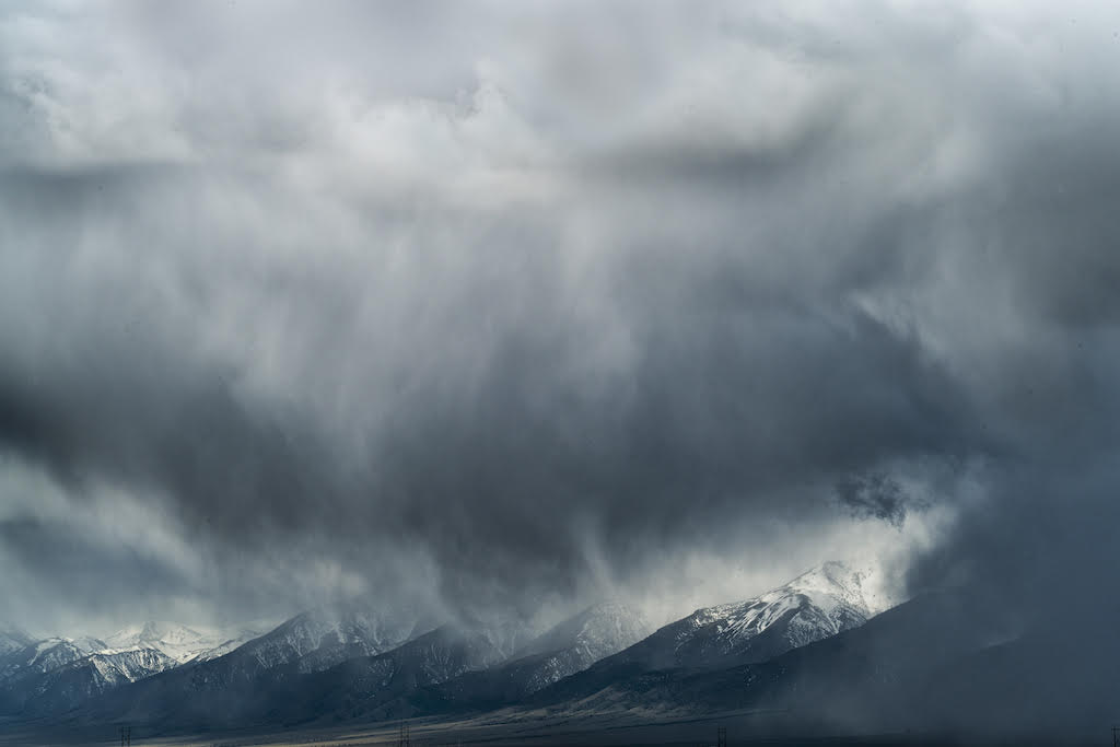
Yes, I think that helped tone down the blue in the mountains immensely and now they look more natural. The trees are also opened up more which, to me, is more pleasing. I don't know if you did anything to the gold grass, but maybe just by toning down the blue in the hills, the gold in the grass doesn't seem so saturated. It also seems like by toning down the hills, the clouds stand out more. Nice job. |
Feb 17th |
| 75 |
Feb 19 |
Comment |
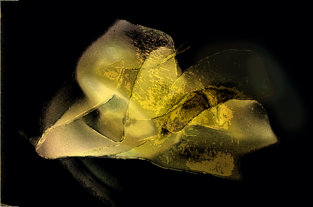
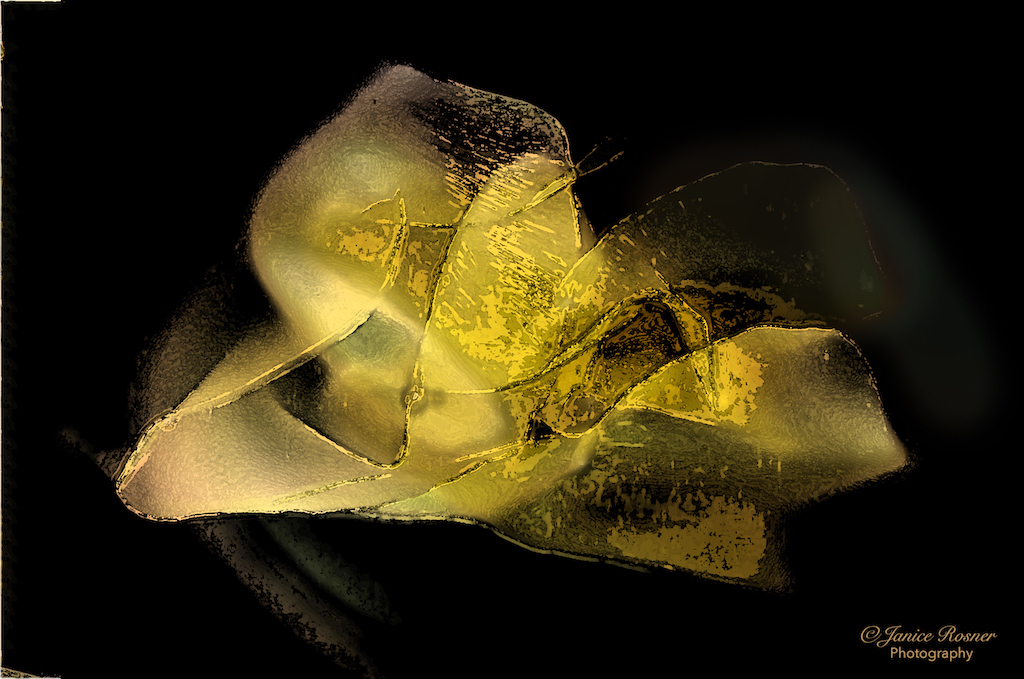
Oh, I see where that was confusing. I should have said that by simplifying the detail in the image, it emphasized the colors more. Thank you for taking the time to comment. I'll have to make a practice print of the image to see how the current adjustments need to be modified. |
Feb 16th |
| 75 |
Feb 19 |
Reply |
Interesting. There's no glow filter on this although I did adjust the brightness and contrast. Perhaps that's it? |
Feb 16th |
| 75 |
Feb 19 |
Reply |
Interesting. There's no glow filter on this although I did adjust the brightness and contrast. Perhaps that's it? |
Feb 16th |
| 75 |
Feb 19 |
Comment |
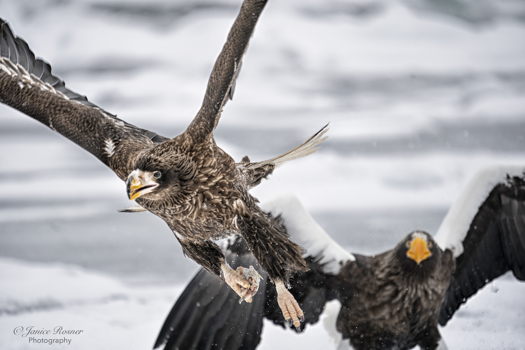
Woodpeckers are one of my favorite birds. Yours is nice and sharp with good feather detail. It makes me wonder what's in that branch he's peering into. This was a difficult image in that the bird is backlit. Compared with the raw file, you brought up the color of the bird but, at least on my monitor, he's still a bit muddy and there is no detail in his eye. It looks like this is one of those images where you would have to overexpose the background in order to properly expose the bird. |
Feb 14th |
| 75 |
Feb 19 |
Comment |
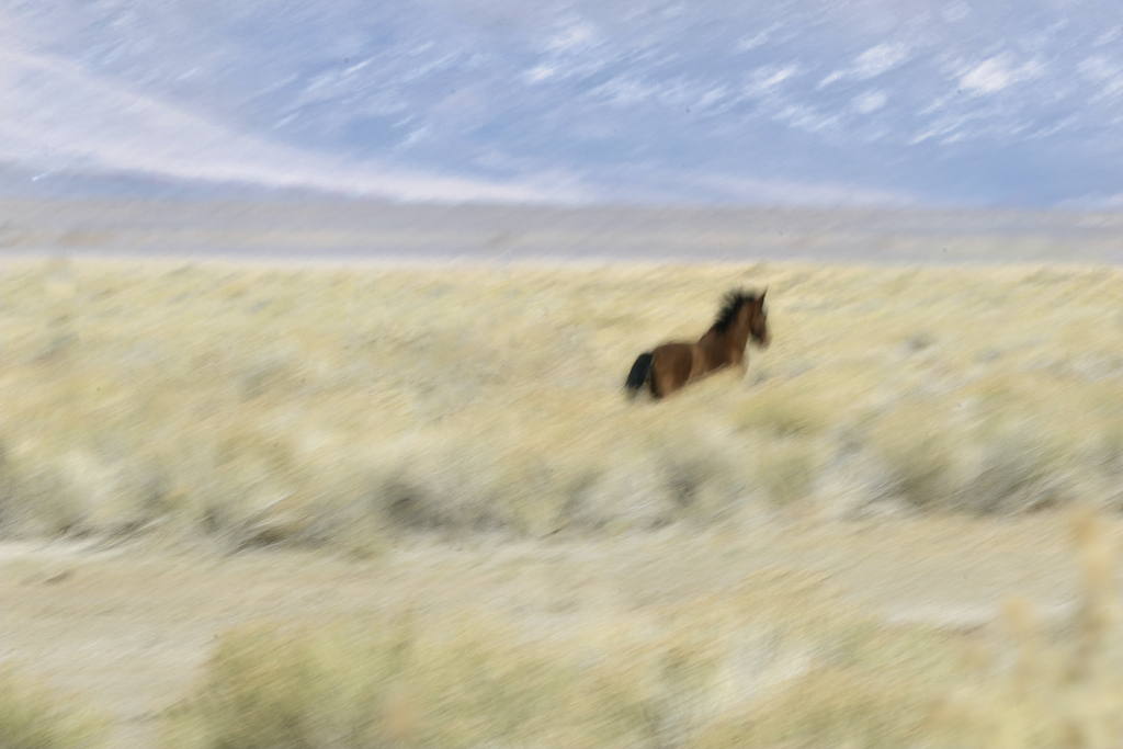
I like the back light on the horses mane, that is the most striking part of the image. Focus on the horse is good as is the dof which blurred out the foreground and background. As compared to the raw file, you did a nice job with taking down the highlights on the mane and bringing up the shadows on the horse. I would have liked to see the eyes open. I'm not sure what the story is in this image. l |
Feb 13th |
| 75 |
Feb 19 |
Comment |
Wow, I love, love, love, the light in this image. I also love the view of the cattle through the dust and how the whole image is framed by those interesting, huge, curving trees. The crop you did of the foreground was effective as were your post processing adjustments. The only thing I'd change would be your perspective so we could see the faces of the cattle and the drover. As it is, it still tells an interesting story. |
Feb 13th |
| 75 |
Feb 19 |
Comment |
This is a well exposed, sharp, environmental portrait of a squirrel. The squirrel looks like it could be shivering as it's not really holding anything. This is a "bullseye" image with the squirrel placed in the center. Next time, I would play with the composition and maybe throw some food out to see if you can photograph the squirrel while it's engaged in some activity. |
Feb 13th |
| 75 |
Feb 19 |
Comment |
This is an interesting, wonderful old tree. I can see why you shot it. The cottage peeking out from under the tree was a very good way of giving the tree some scale. I would have enjoyed a perspective a bit farther back so that the sides and top of the limbs aren't cut off which, I think, interferes with the shape of the tree and makes it look boxy. I suspect it has a much more graceful overall shape. This is a massive tree and it just seems to need a bit more space. Also, on my monitor, the snow lacks detail and looks blown out. If this is the case I would do an adjustment on the whites to bring out some detail and texture. |
Feb 13th |
| 75 |
Feb 19 |
Comment |
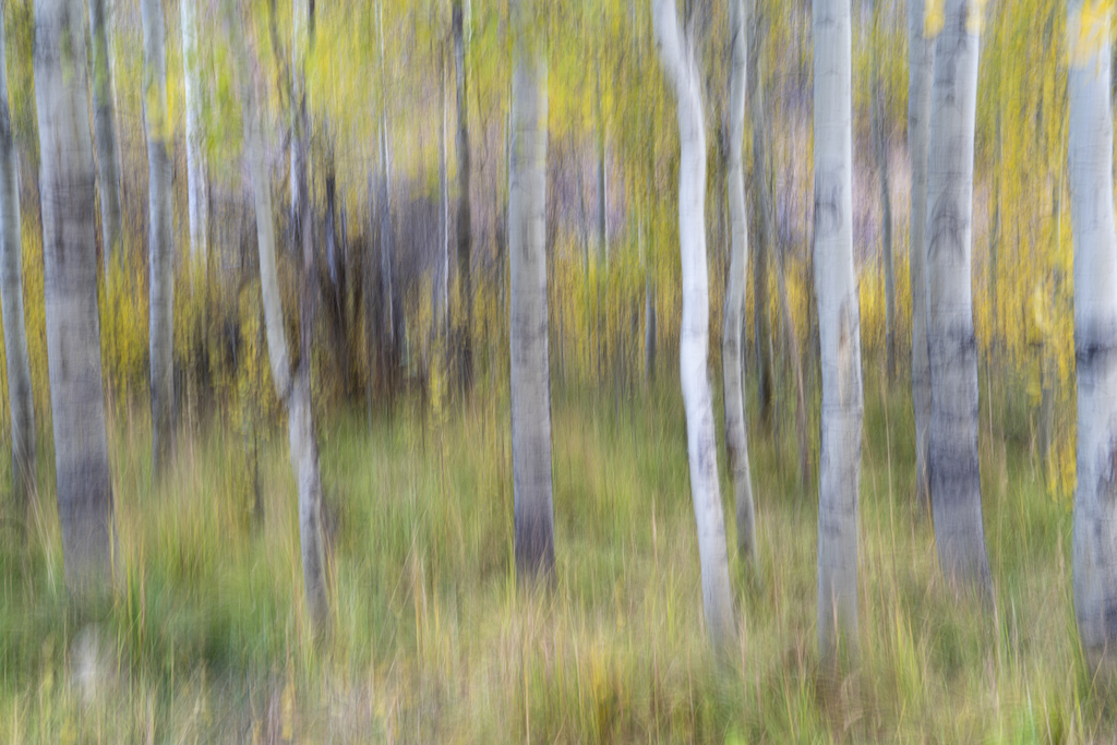
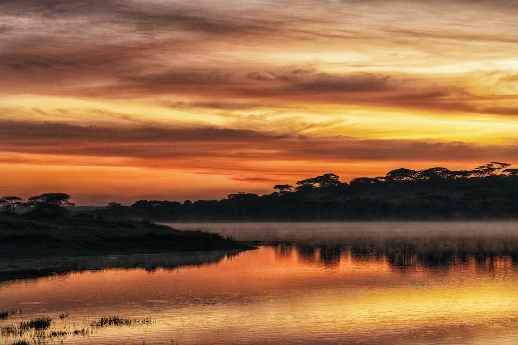
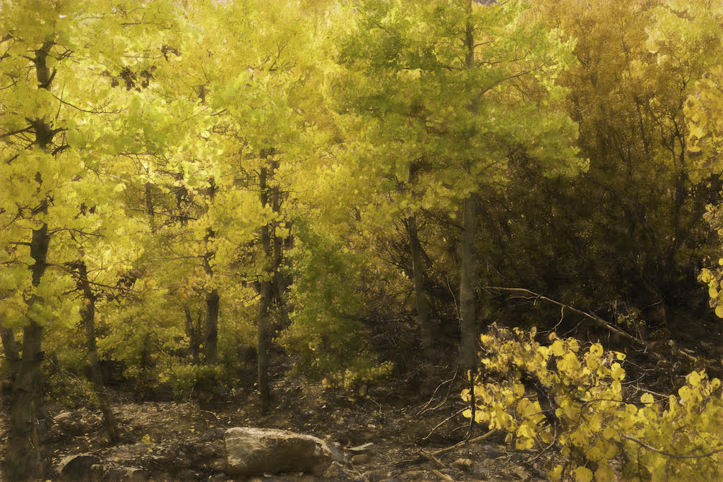
The composition of this image works with the tree on right 3rd gridline and the repeating diagonal lines of the grasses and background trees. It's a relaxing scene and makes me curious to visit that meadow. I like that you made the clouds pop a little more than in the raw file. I also like the blues and golds which are such a pleasing color combination. That said, on my monitor at least, the image seems very over saturated and the mountains have a deep blue color cast which is almost as strong as the sky and the foreground grass is quite orange. I see that you brought the shadows up quite a bit but I would have enjoyed a bit more opening of the shadows in the trees on the left. |
Feb 13th |
10 comments - 3 replies for Group 75
|
10 comments - 3 replies Total
|