|
| Group |
Round |
C/R |
Comment |
Date |
Image |
| 7 |
Aug 22 |
Reply |
Thanks, Rich. That is quite an improvement. |
Aug 23rd |
| 7 |
Aug 22 |
Comment |
I never would have realized it was a composite image...Great job. Outside of the hot spot that Barbara mentioned I would not touch a thing. |
Aug 17th |
| 7 |
Aug 22 |
Comment |
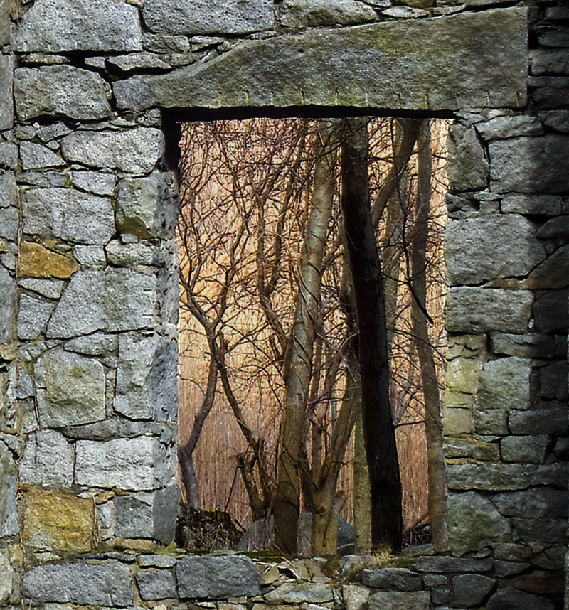
I really like the image. I agree with Tom regarding the removal of the bare branches. I think the framing and the woman provide wonderful perspective. The tilt of the large building does not trouble me, but I do find the branch distracting. |
Aug 17th |
| 7 |
Aug 22 |
Comment |
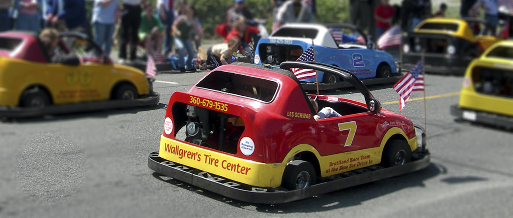
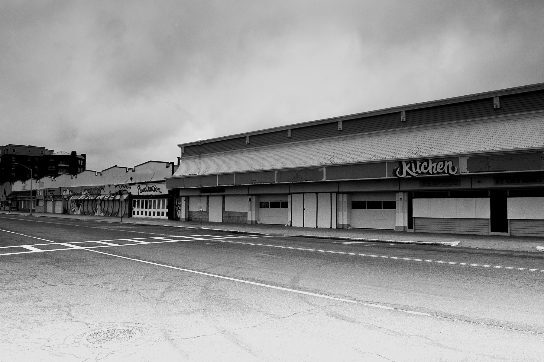
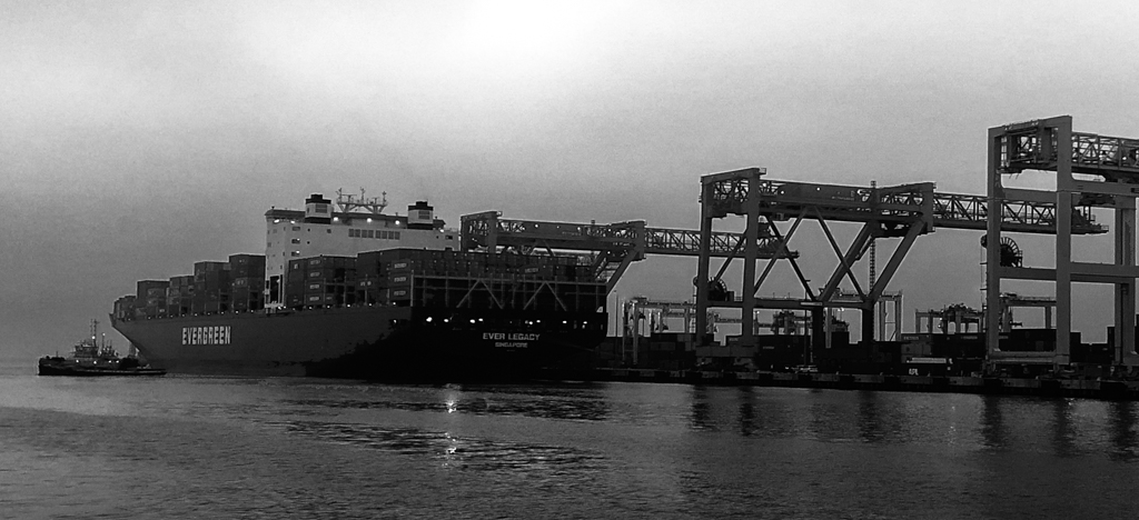
I agree. B&W was the way to go on this image. I love the collection of shapes, mostly rectangles, and the lines created by the bodies of the cars. The shapes, lines, and sky blend together nicely to create a strong image, |
Aug 17th |
| 7 |
Aug 22 |
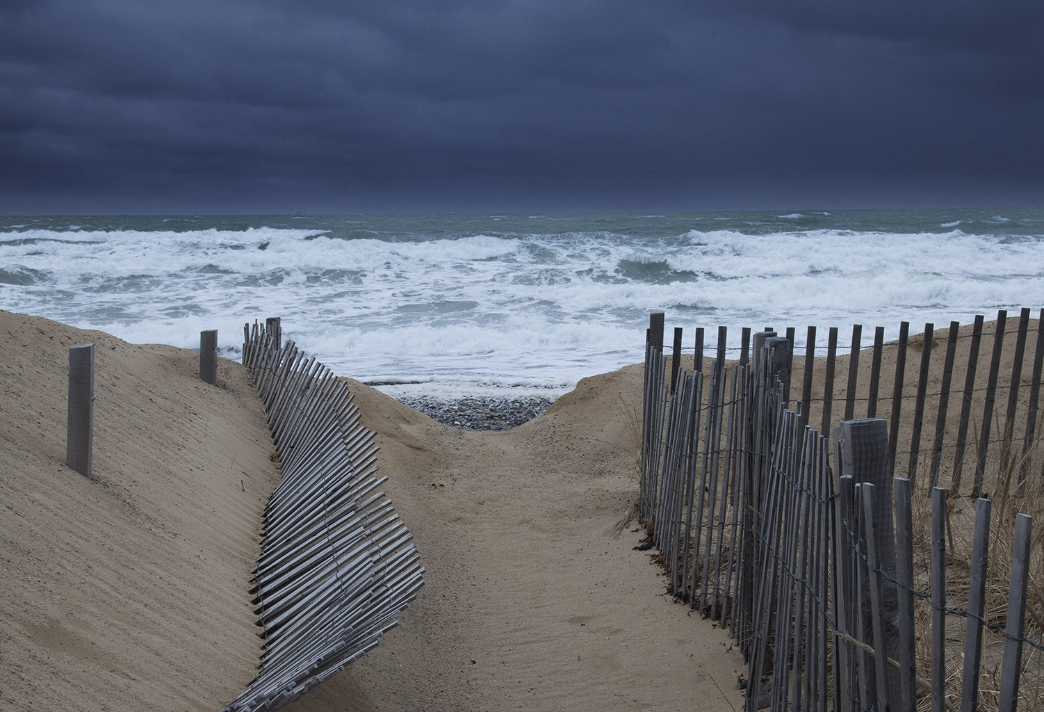
Comment |
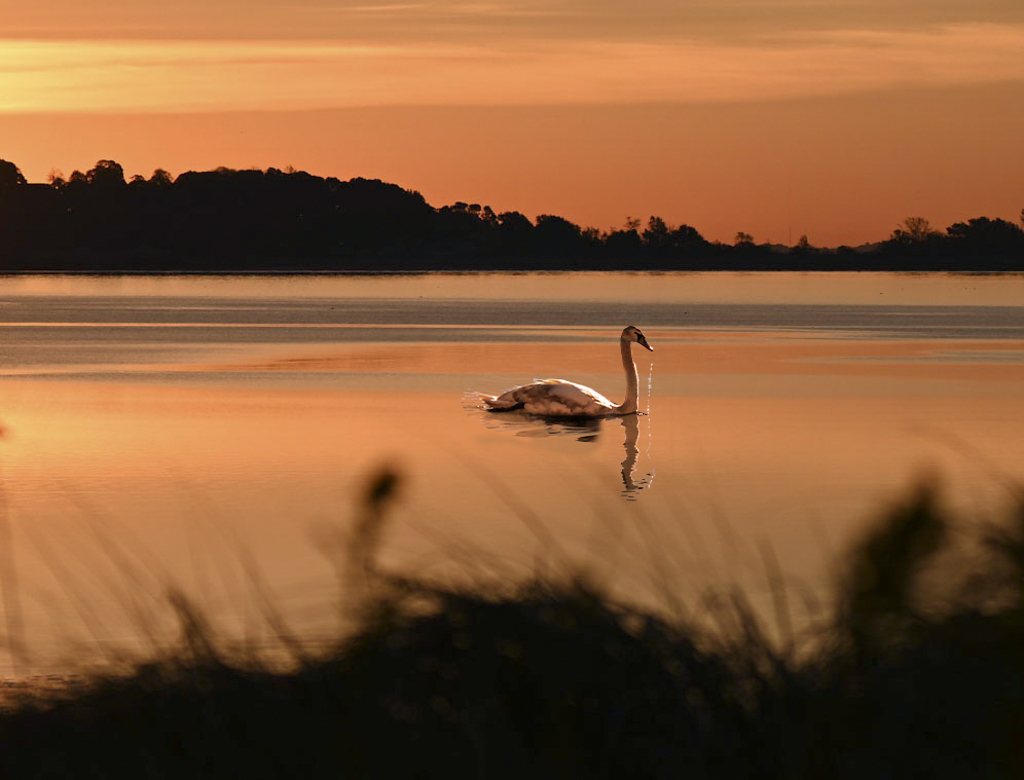
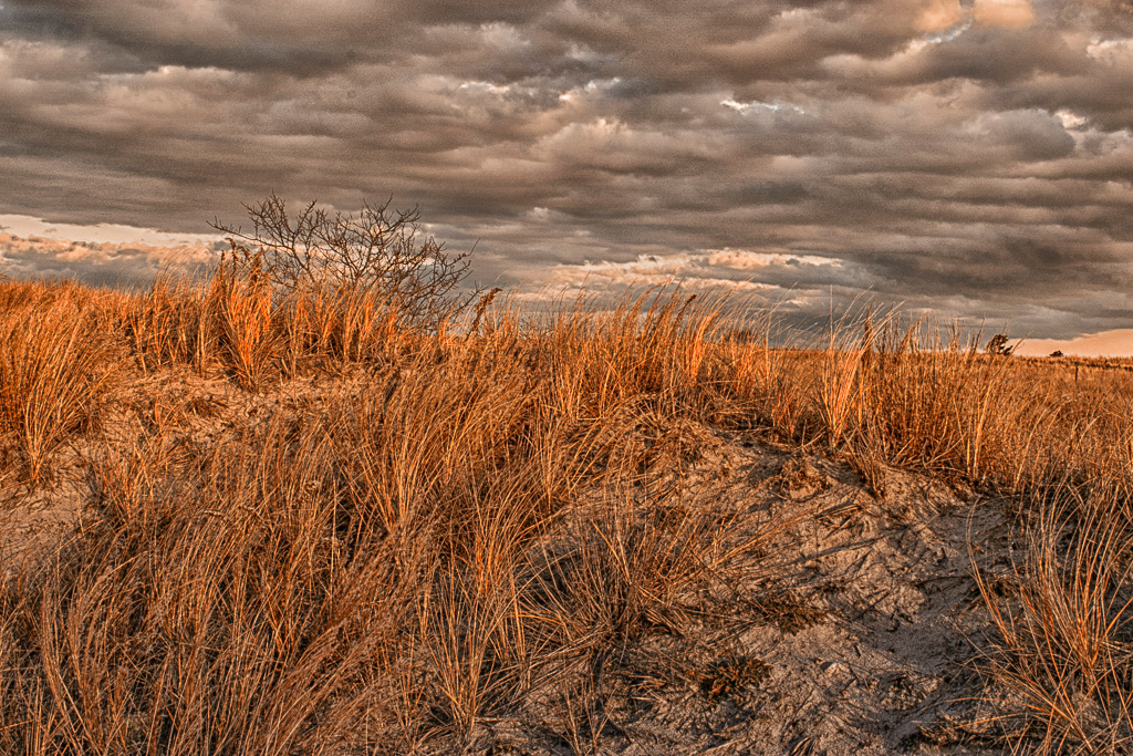
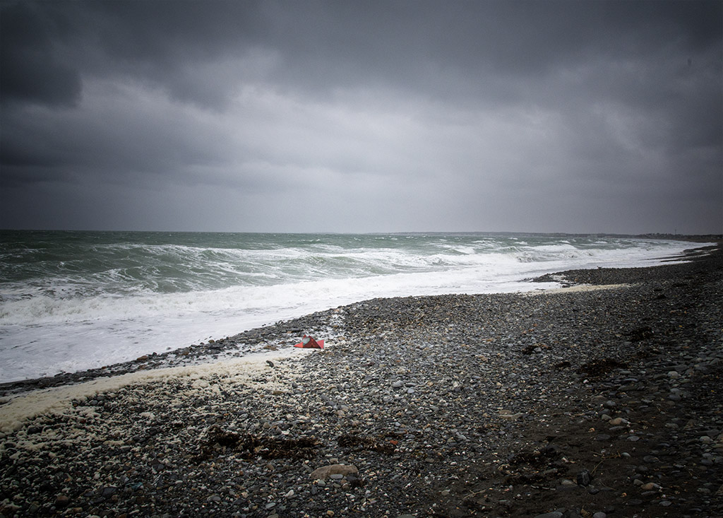
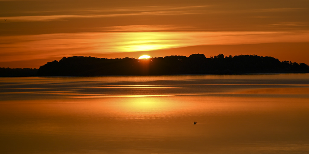
What a dramatic sunset. It is bold enough to warrant the low horizon. My only comment is that the bottom third appears to be a little noisy. I have started to use DeNoise with good results. |
Aug 2nd |
| 7 |
Aug 22 |
Comment |
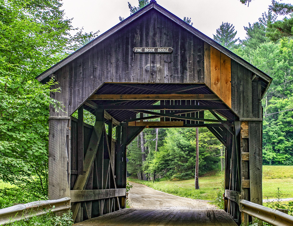
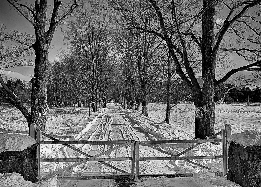
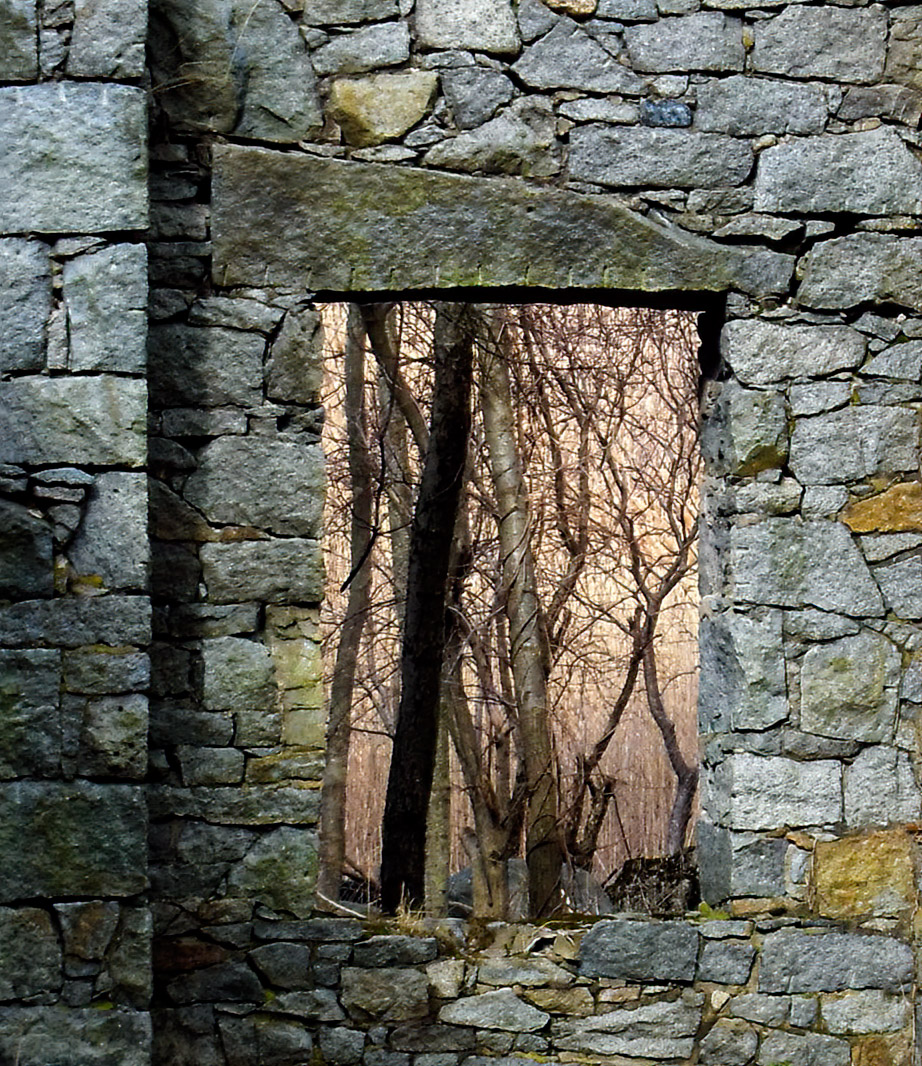
I like the way that the road and walls lead you inside. The detail on the inside of the bridge really makes the picture. It may be my imagination, but it actually looks cooler and inviting on the other side!
At first, I thought I would like it head on, but as I looked at the picture, the sense of turning onto the bridge grew on me. |
Aug 2nd |
5 comments - 1 reply for Group 7
|
| 71 |
Aug 22 |
Comment |
Add me to the group!!! |
Aug 9th |
| 71 |
Aug 22 |
Comment |
I like the way that everything... the branches, arms, the motion of the young girl moving forward, and line of the mother's and older girl's backs leaning in ...pull your eye to the two hands touching. The colors are wonderful as well.
|
Aug 9th |
| 71 |
Aug 22 |
Comment |
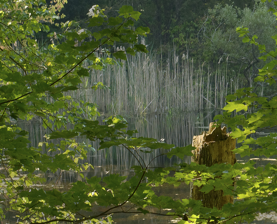
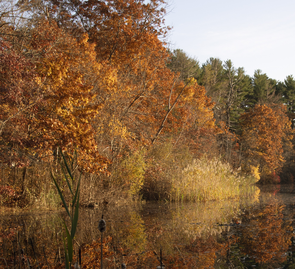
I, too, have never attempted an Astro-image. I liked the overall image and I like the scale and the contrast provided by the large tree on the left side. The foreground disturbs my enjoyment of the image. It pulls at my eye and I think anything you could do to reduce its impact would strengthen the photograph.
I like John's cropping. |
Aug 9th |
| 71 |
Aug 22 |
Comment |
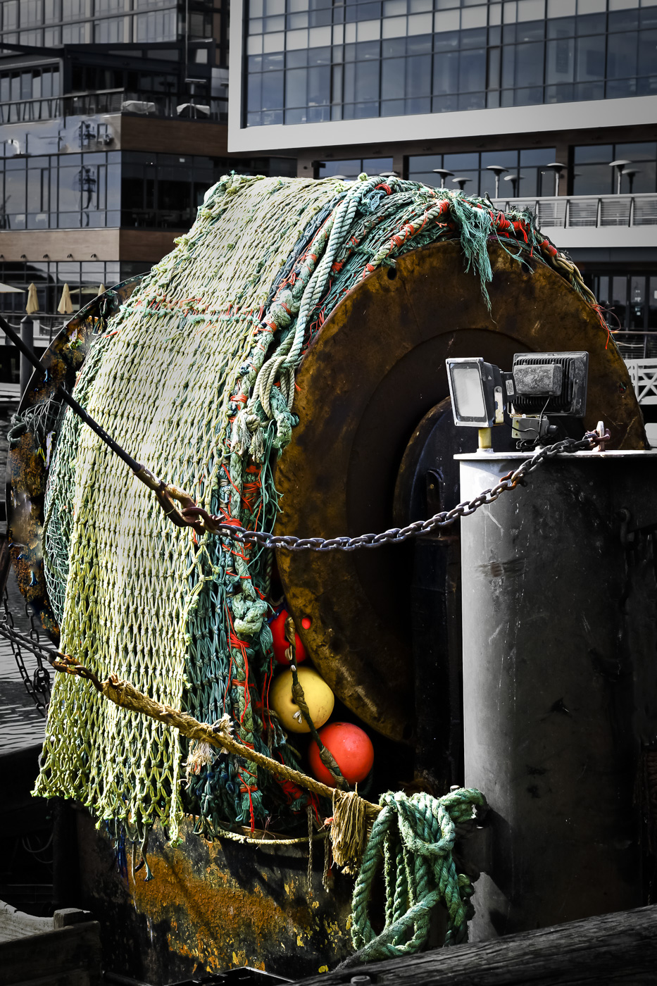
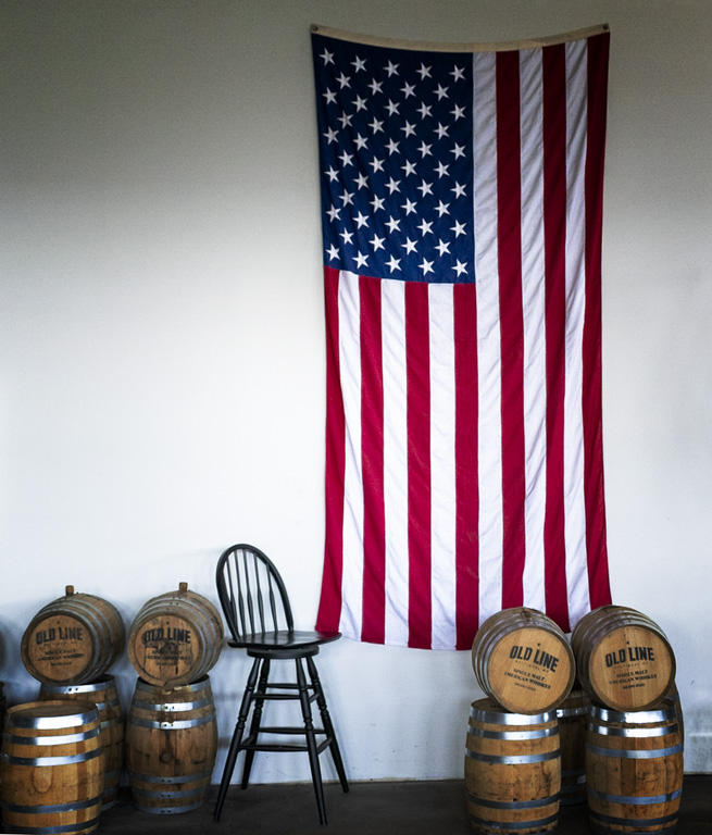
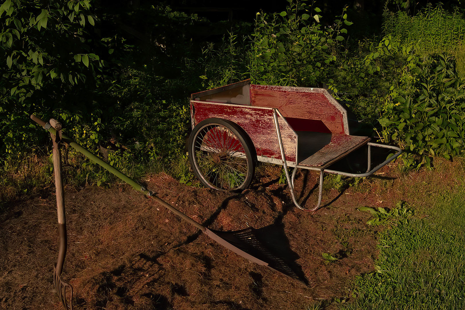
Great picture. I really like the composition and colors. However, it the textures which truly grabbed my attention. I don't think there is a single millimeter in the frame without a dramatic texture and you have caught the subtle differences in them all. The shadows of the chair and tumbleweed are also fascinating. |
Aug 9th |
4 comments - 0 replies for Group 71
|
9 comments - 1 reply Total
|