|
| Group |
Round |
C/R |
Comment |
Date |
Image |
| 7 |
Jul 22 |
Reply |
Thank you, Tony. I like the suggestions. |
Jul 14th |
| 7 |
Jul 22 |
Reply |
Thank you Tom. |
Jul 14th |
| 7 |
Jul 22 |
Reply |
Thanks, Tom. |
Jul 10th |
| 7 |
Jul 22 |
Reply |
In the second shot I think you lose the impression of rhythmic swaying evident in the first, The brightness is also an issue. |
Jul 10th |
| 7 |
Jul 22 |
Comment |
I think that the blur accentuates the speed of the two objects and the force that is being transferred. I like it. I would think about cropping a tiny bit from the top just to concentrate the focus on the batter and the swing. |
Jul 10th |
| 7 |
Jul 22 |
Comment |
I like the difference in altitude between the roofs on the left and the red and white flags on the right. It pulls me right in. I hadn't focused on the green sign as an issue, but after seeing Barbara's comment, I agree. The saturation level of the sign and the reflection do not add to the image.
The architecture is striking. I would actually crop to the first black support wire. The canopy effect to the architecture is so good it should really be highlighted. |
Jul 10th |
| 7 |
Jul 22 |
Reply |
Thank you to both you and Barbara. I believe that your suggestions and crops make it a better image. |
Jul 10th |
| 7 |
Jul 22 |
Comment |
I don't think the greenish tint was the result of any of the Topaz products. |
Jul 10th |
| 7 |
Jul 22 |
Comment |
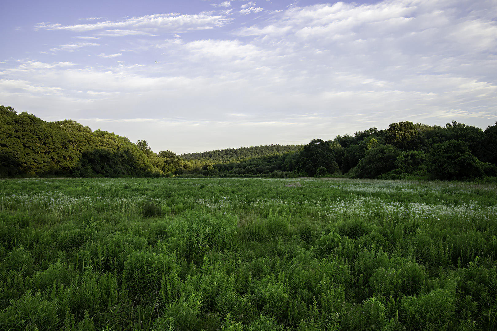
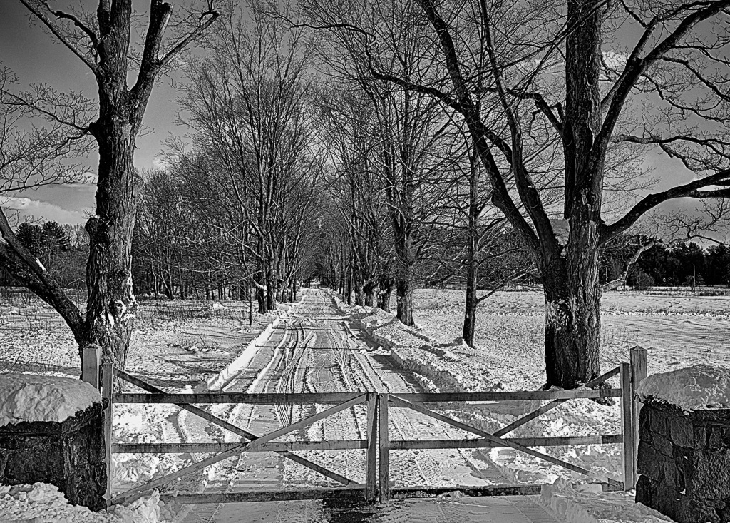
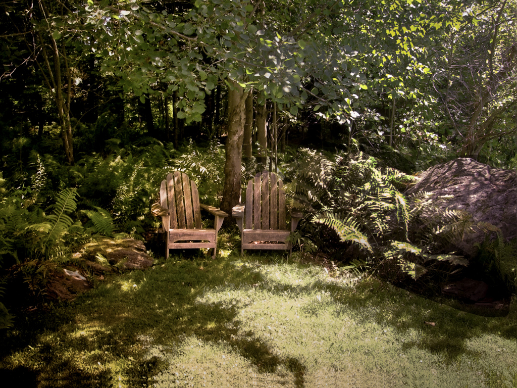
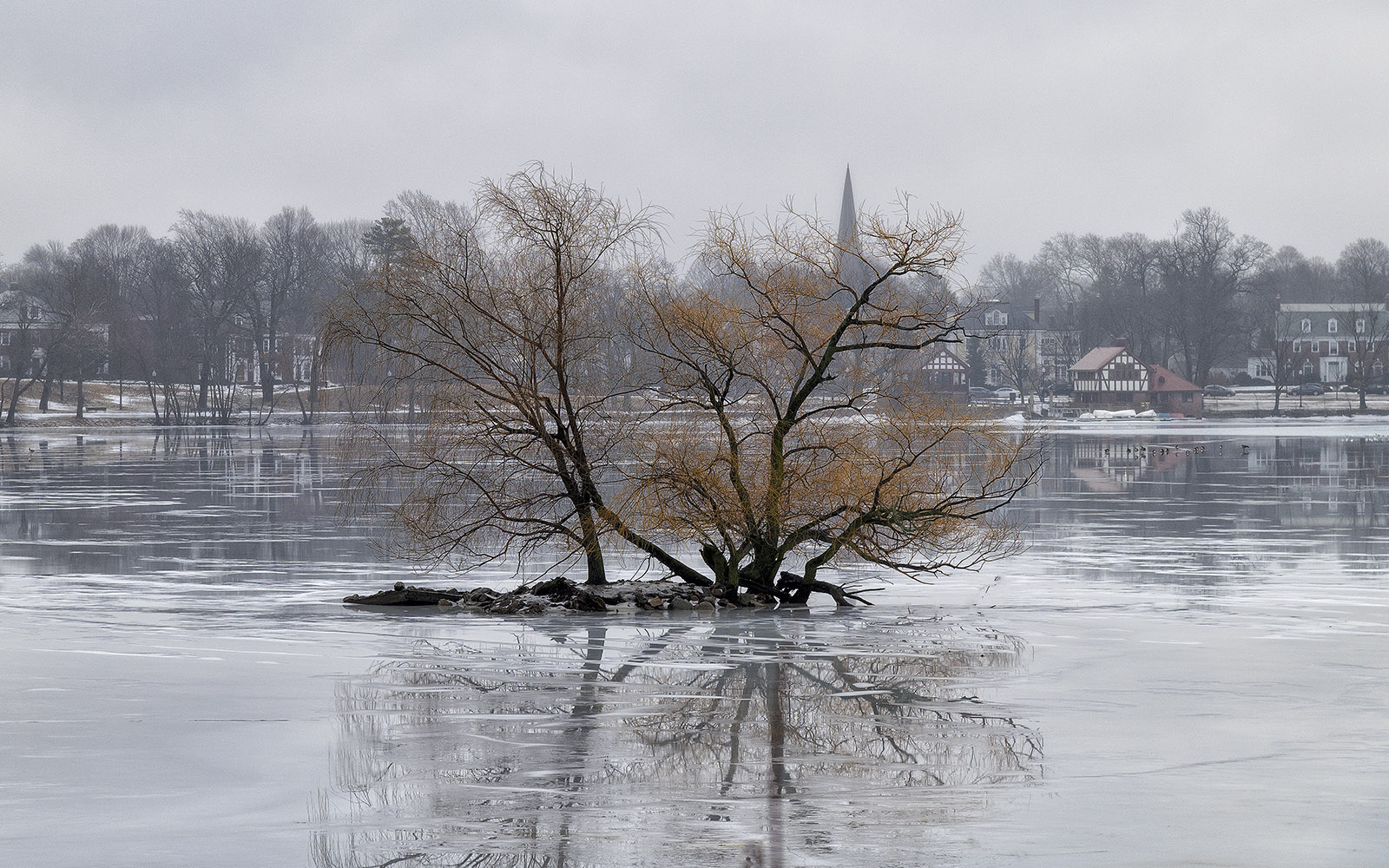
I really like the image. I particularly like the conversion to sepia. The tree is magnificent. My only suggestion is that I would like to see the tree a bit off center, perhaps to the left. Perhaps crop it into the pole on the left. |
Jul 7th |
| 7 |
Jul 22 |
Comment |
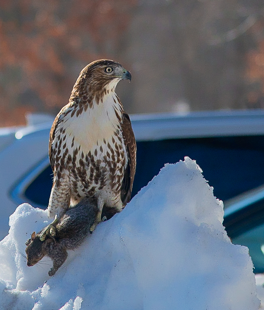
I love the way the dog is leaning against the angle of the grass. I think that it really makes him pop. You captured the sense that the dog was singing and keeping in rhythm with the orchestra. My only suggestion would be to get rid of the brown spot in the lower left. |
Jul 7th |
| 7 |
Jul 22 |
Comment |
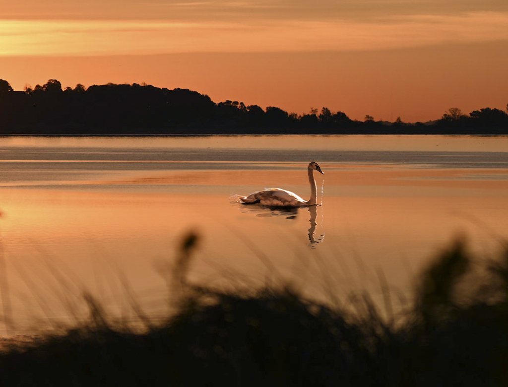
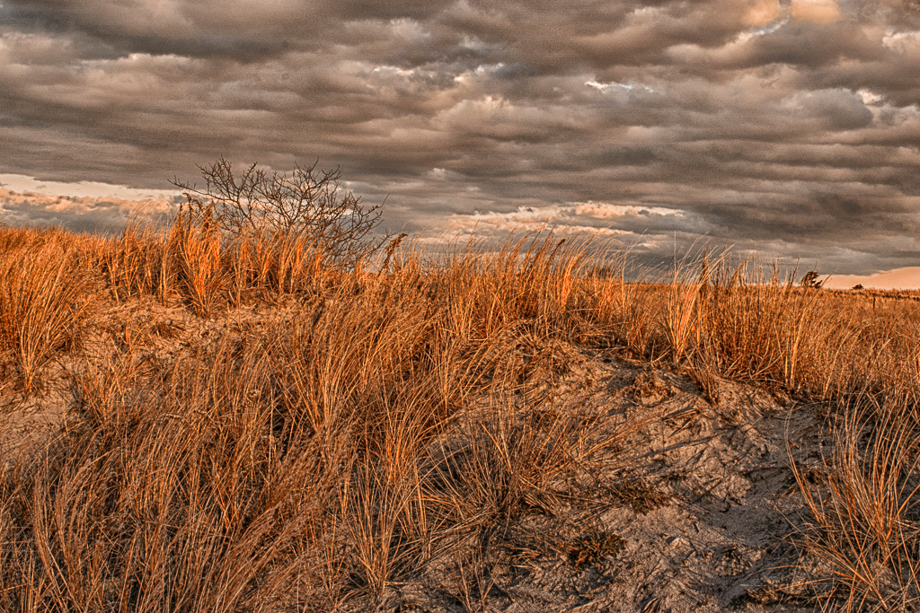
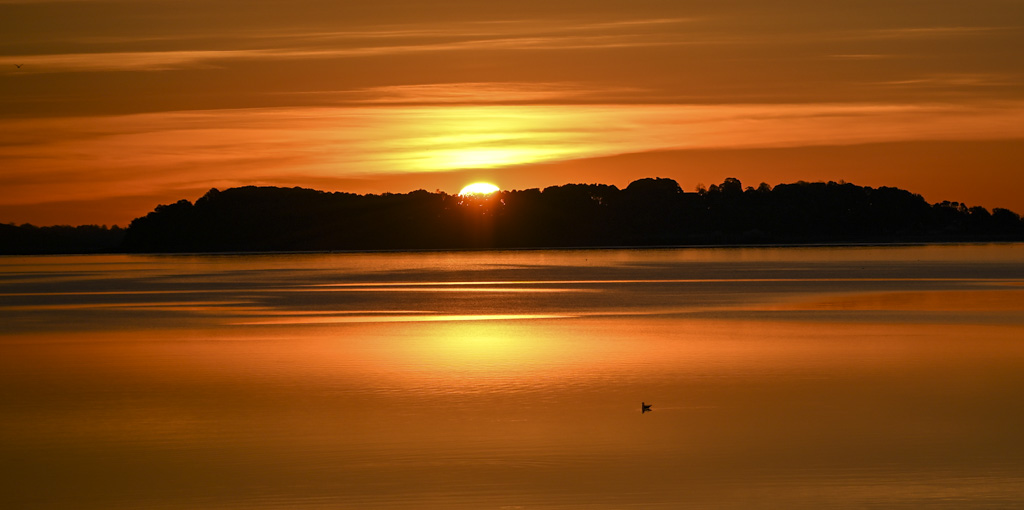
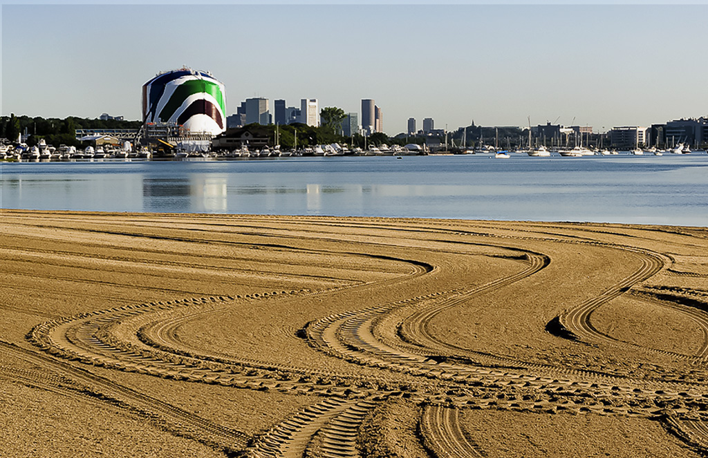
The sunset is spectacular!
I think the width of the image contributes to establishing the grandeur of the sunset. A little less grain would suit my tase, but that is my taste. |
Jul 7th |
| 7 |
Jul 22 |
Comment |
What a great image. The detail in the sunflower is remarkable and you did a fantastic job on the background. I am curious, what did you use to create the blue background. I have starting to play with Photoshop but nothing I have done rivals the crisp, clean look you achieved.
I don't see how you can improve on this image. |
Jul 7th |
7 comments - 5 replies for Group 7
|
| 71 |
Jul 22 |
Comment |
I like the image. The two colors are so complimentary, and the overall softness provides a nice comfortable visual experience. |
Jul 20th |
| 71 |
Jul 22 |
Comment |
Wonderful image. I think it is amazing that you were able to catch the four primary displays at virtually the same point in their arc. The tiny size of the boats in the harbor gives a great sense of the enormity of the area. The combined clarity of the fore ground, the fireworks and the distant shore is quite amazing.
I agree with Beth.... a beautiful result. |
Jul 10th |
| 71 |
Jul 22 |
Comment |
There is really a lot to see in this image. I like the lines leading your eye to the mountain, but I particularly like the sense of scale provided by the triangular structure in the lower right. I am particularly drawn to triangles and find the comparison between the mountain, the building, and the mountain tops in the distance provide a perfect little valley for the town to be nestled.
Great image. |
Jul 10th |
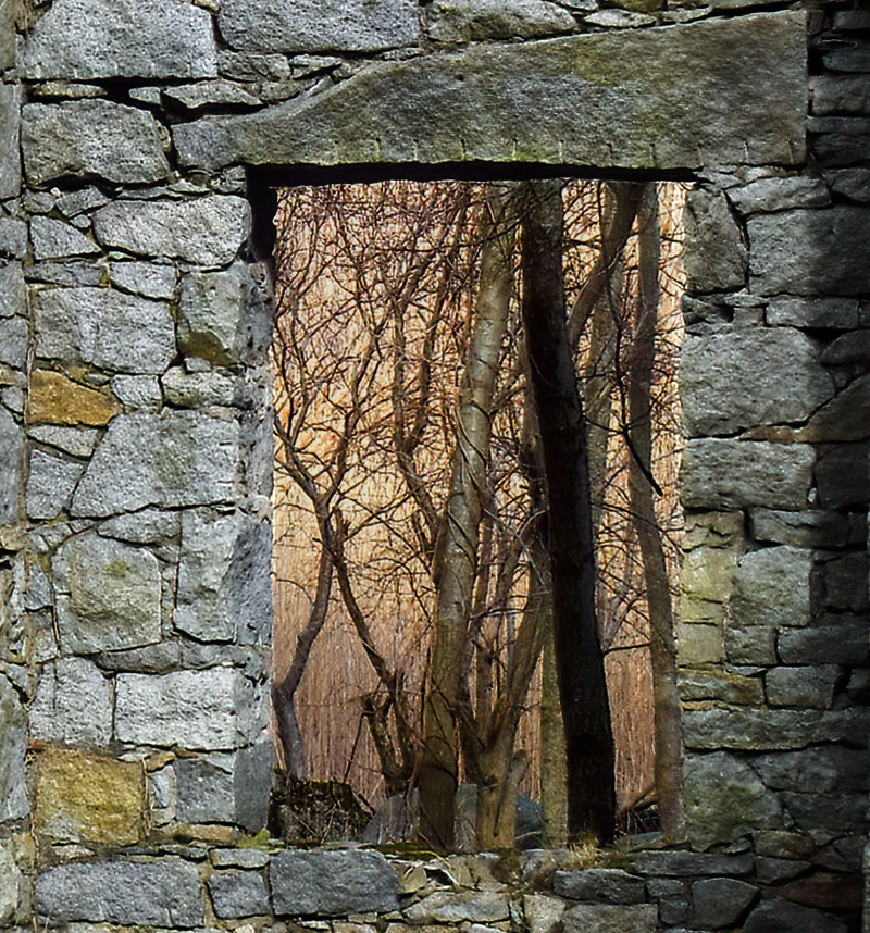
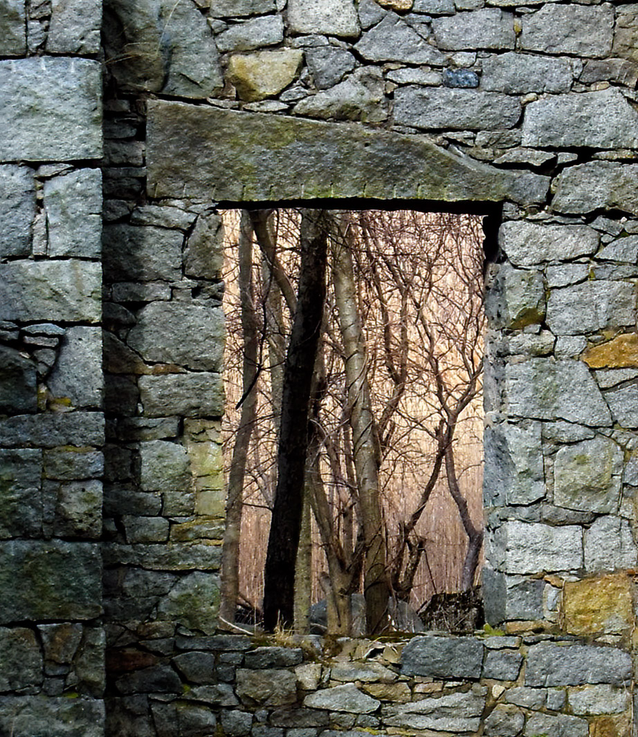
| 71 |
Jul 22 |
Comment |
I loved the image and like the through the window coincidence.
I am a bit torn. Like Nigel my first instinct was to remove the triangle of open sky from the top left. When I do that, however, I lose the sense of enormity and infinity of the universe that the image gives me. |
Jul 10th |
| 71 |
Jul 22 |
Reply |
I did play a little bit with the tone inside of the window. |
Jul 10th |
4 comments - 1 reply for Group 71
|
11 comments - 6 replies Total
|