|
| Group |
Round |
C/R |
Comment |
Date |
Image |
| 7 |
Nov 21 |
Comment |
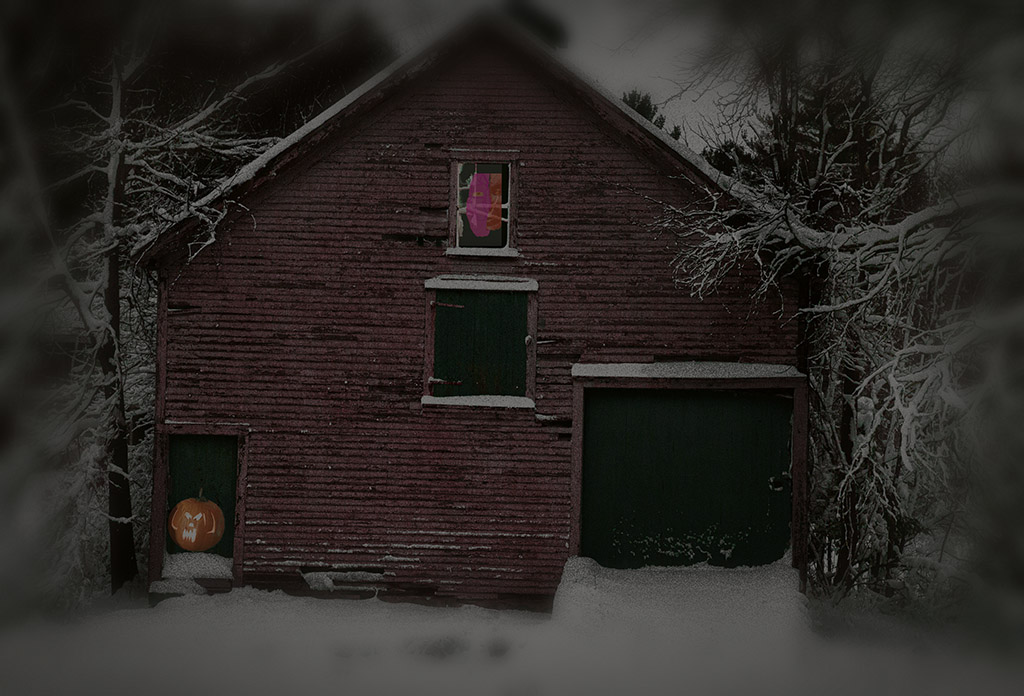
I enjoyed the image as originally presented, but agree that the reversed image resonates more. Both tell a story, I can feel the heat as I look at the image. The house did not bother me, but I do like the image more with it removed. |
Nov 24th |
| 7 |
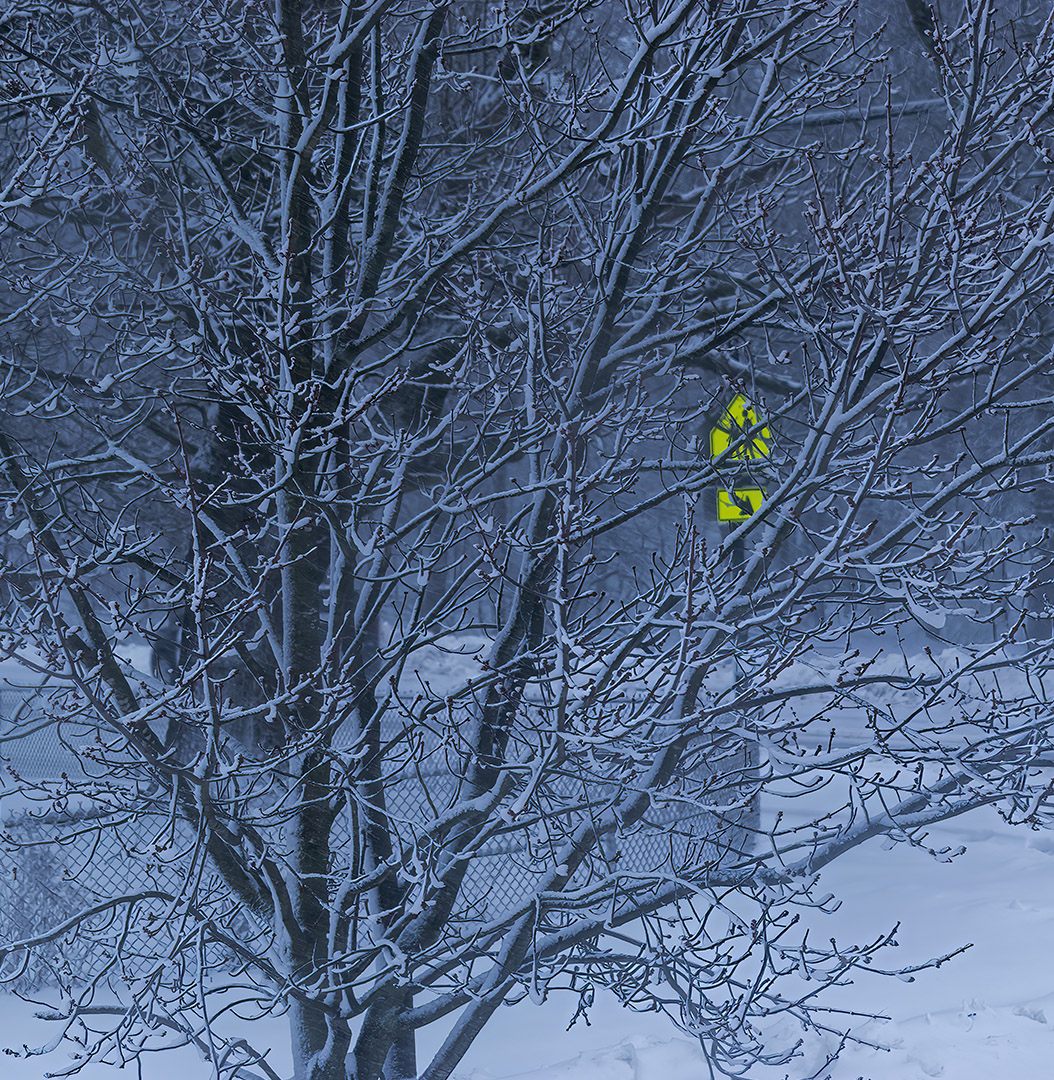
Nov 21 |
Comment |
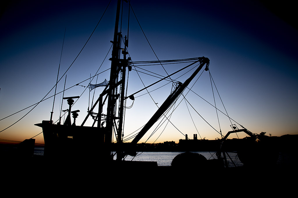
Beautiful image. Everything about it from the tone, the lines, the angle of the branch, and the background is first rate. |
Nov 24th |
| 7 |
Nov 21 |
Comment |
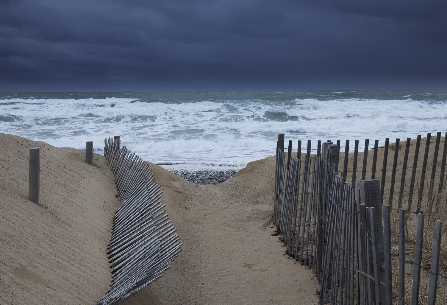
Very nice Tony. I am captivated by the lines of the bridge, the contrails, and the implied lines of fright. In addition the image is remarkably sharp and crisp. I agree that a bit more room on the right side would add to the image. |
Nov 24th |
| 7 |
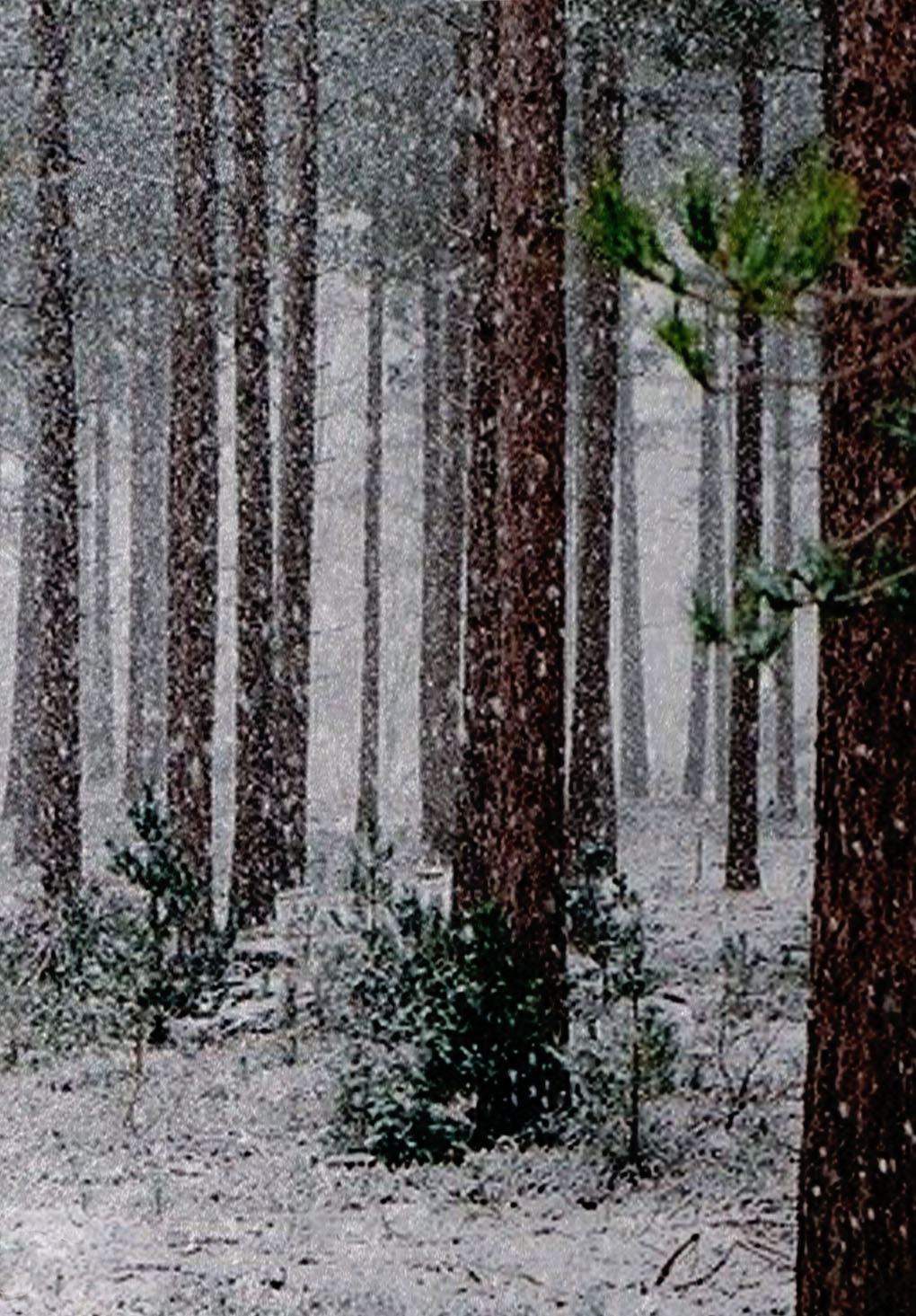
Nov 21 |
Comment |
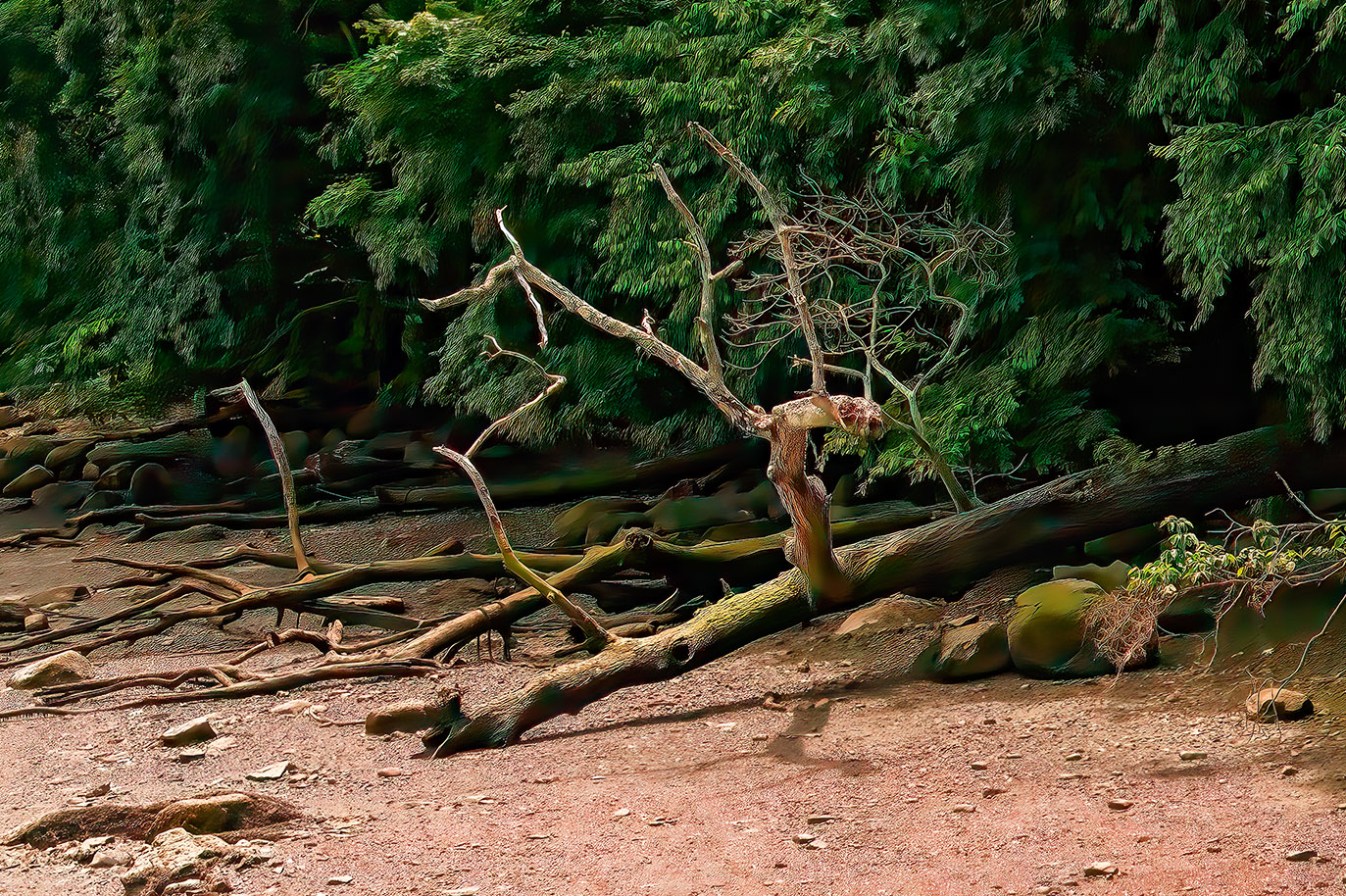
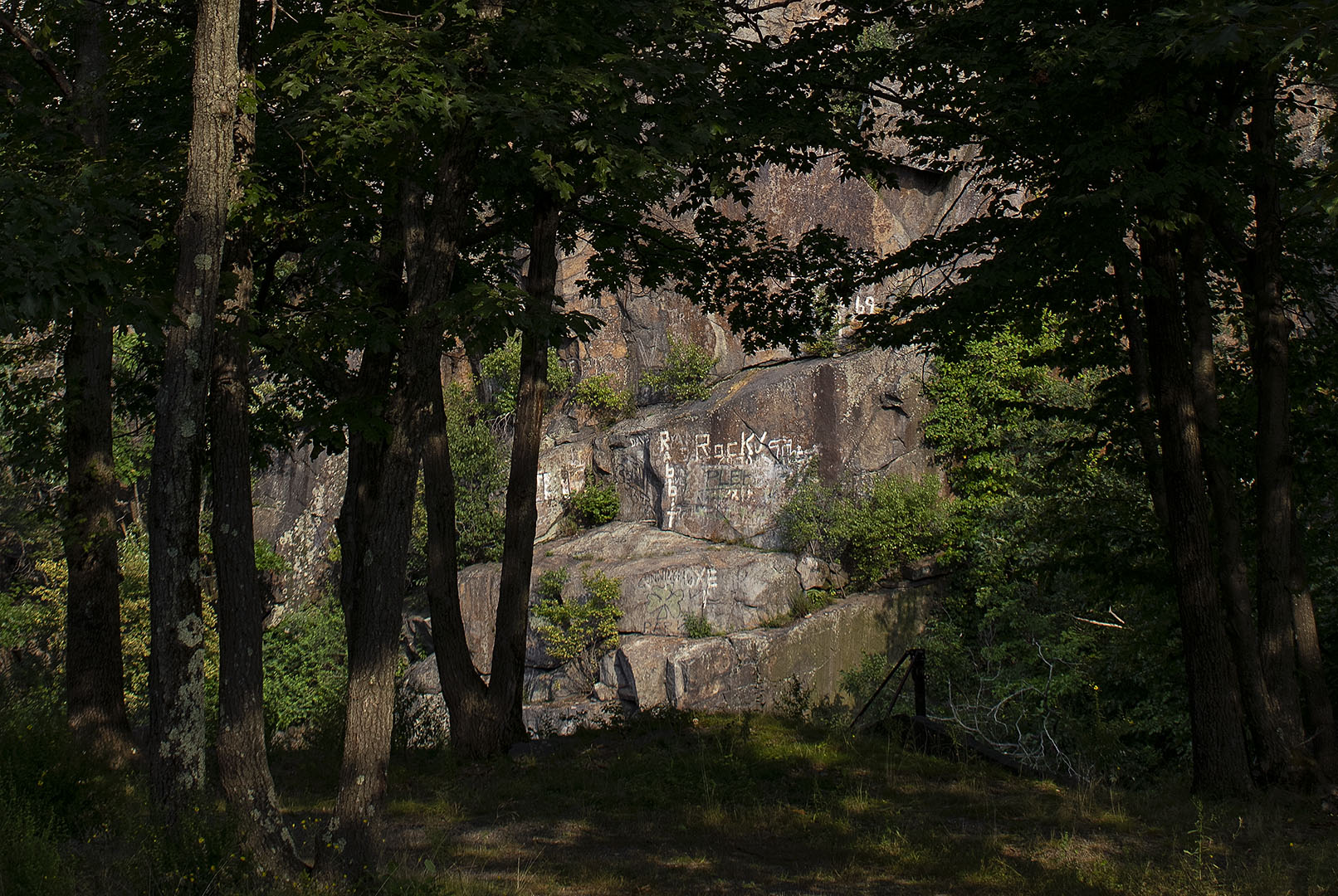
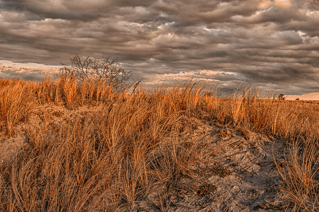
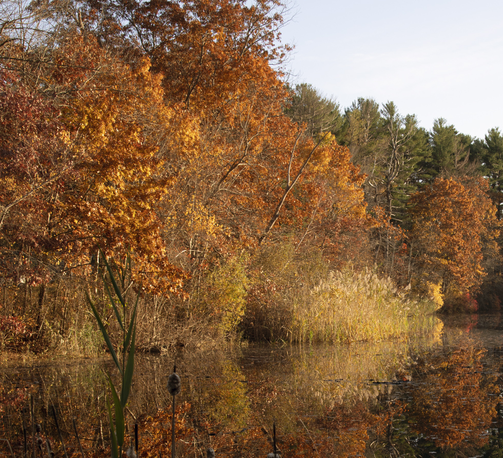
I really enjoyed this picture. The scene was captured perfectly and the tree trunks are exquisite. I cannot recall another image where tree trunks were so dramatic. Perhaps it is the apparent violent destruction of the trees by some force of nature offset by the beauty of the the background. |
Nov 24th |
| 7 |
Nov 21 |
Comment |
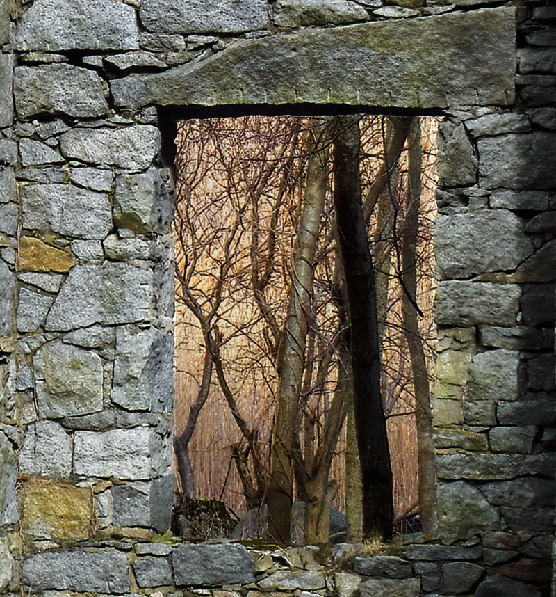
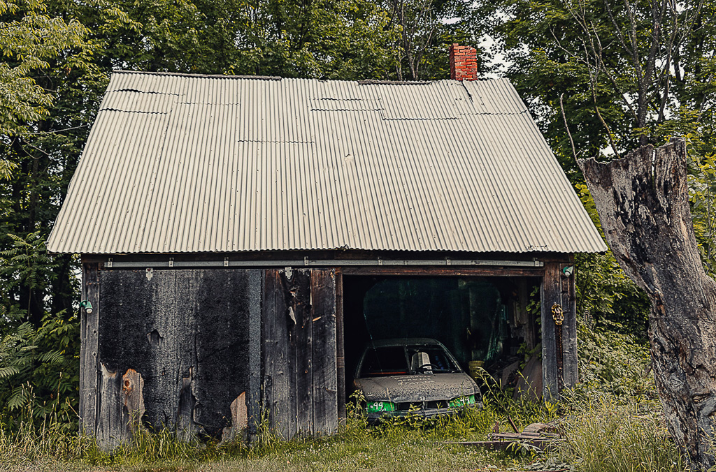
I like the color version, although there is a lot to be said for the monochrome. I think that the color brings my eye deeper into the building. I love the vines and I really like the manner in which the vines and the overgrown weeds frame the image. I like the mystery of it. |
Nov 24th |
5 comments - 0 replies for Group 7
|
| 71 |
Nov 21 |
Comment |
Thank you all for your thoughts and suggestions, all of them were very helpful. I went bck and implemented virtually all of them and the image is much better as a result. I tried to post the amended version but for some reason it kept reverting to the original.
Thank you again for your keen insights. |
Nov 24th |
| 71 |
Nov 21 |
Comment |
I agree with the earlier comments. I really liked the original image but found that the removal of the sky really strengthened the picture. |
Nov 24th |
| 71 |
Nov 21 |
Comment |
Very nice composition. I like how the stairs carry the eyes up to the lighthouse and how the foreground adds emphasis to the height of the hill. I agree that a slightly darker sky adds to the picture. |
Nov 24th |
| 71 |
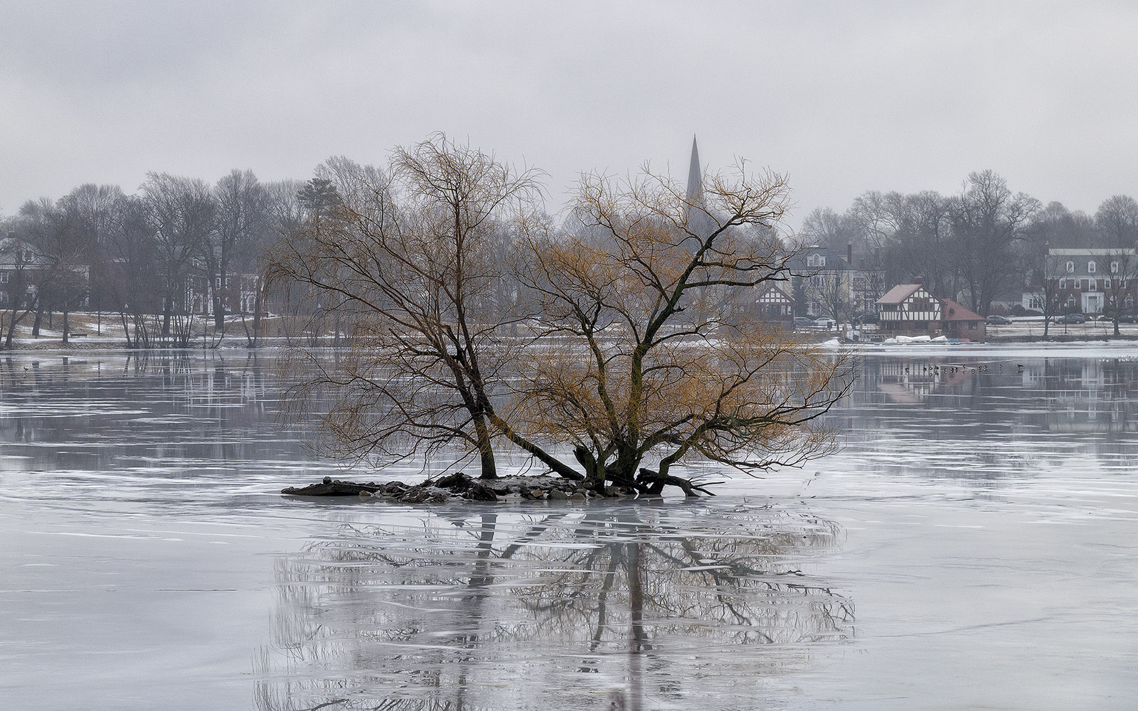
Nov 21 |
Comment |
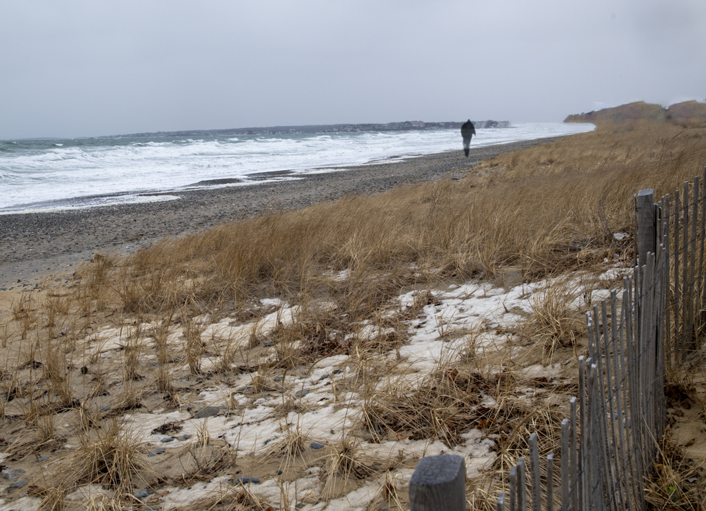
I like the sense of weather and winter moving in. I like the presence of the trees, foliage still in place, while the snow blows in from the mountains. If it were up to me I would take Barbara's suggestion and darken the foreground. |
Nov 24th |
| 71 |
Nov 21 |
Comment |
Sorry for the late comments.
Nice image. I too, noticed the bright spot. It really pulled my eye from the rest of the image. The left tilt is a bit of a distraction as well. I leke the sky and feel as though cropping an inch from the bottom would reduce the weight of bottom half while maintaining the character of the sky. |
Nov 24th |
| 71 |
Nov 21 |
Comment |
Thanks Nigel. That is very helpful. |
Nov 4th |
6 comments - 0 replies for Group 71
|
11 comments - 0 replies Total
|