|
| Group |
Round |
C/R |
Comment |
Date |
Image |
| 7 |
Oct 21 |
Comment |
Great image. My only suggestion is to crop it a small bit from the right increasing the focus on the lion's face. |
Oct 11th |
| 7 |
Oct 21 |
Comment |
I agree the darker shade of blue is very water like and is a distraction. There is something about the area between the cliffs that makes me think there is a third image in the mix.
Great creativity. I like the man and bike attempting the leap. I thik with a bit of blending to address the lower 70& of the image you would have an extremely interesting image. |
Oct 11th |
| 7 |
Oct 21 |
Comment |
Wonderful picture and thank you for the background information. The clarity of the image given its size is remarkable. I think you did a masterful job with the reference points, they really enhance the sense of distance. |
Oct 11th |
| 7 |
Oct 21 |
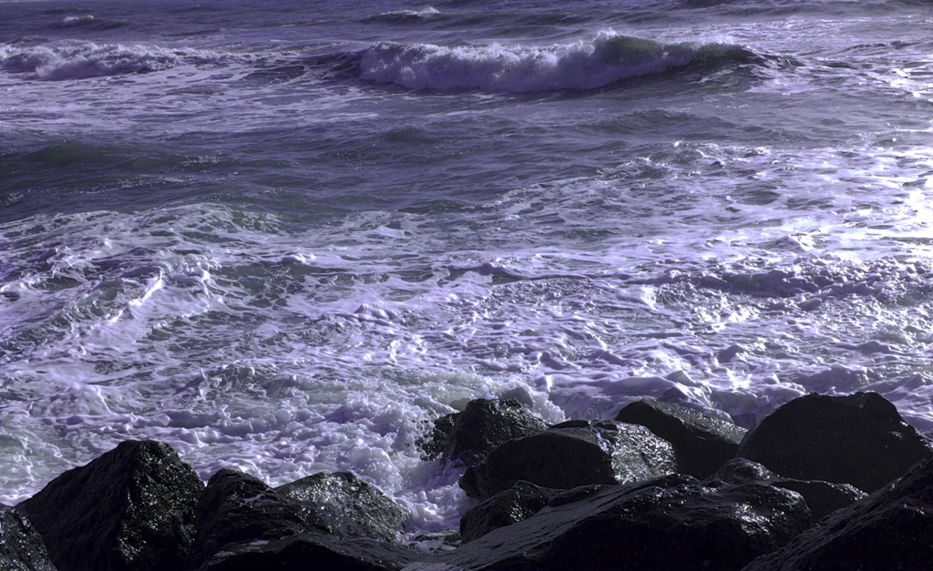
Comment |
I won't pretend to understand the technical aspect of what you did. I do like the highlighted section of roiling water offset by the shadowy areas. I also like the sense of rapid, violent movement and the feeling of falling and being hurled back up. |
Oct 11th |
| 7 |
Oct 21 |
Comment |
I enjoy triangles within an image as the capture my attention and force me to focus on different aspects of the picture. I count at least five and the all point towards heaven....quite appropriate given the main focus is a church. I did find the tilt a bit distracting but did not mind the square profile. |
Oct 11th |
5 comments - 0 replies for Group 7
|
| 71 |
Oct 21 |
Comment |
When I look at this image I am captivated by the violent strength of the wave and the surfer climbing up to the top of it. My only suggestion would be to crop a bit from the bottom to enhance both. |
Oct 11th |
| 71 |
Oct 21 |
Comment |
It is a busy image, but busy in a nice way. There is a lot to see and that is the nature of street displays. My only suggestion would be to eliminate the lamp and individual in the upper right quadrant, I find them a distraction. |
Oct 11th |
| 71 |
Oct 21 |
Comment |
Mike, I like the image very much. I think a bit of a crop from the right sight would enhance the mother's eyes and I think they are what makes this image so nice. |
Oct 11th |
| 71 |
Oct 21 |
Comment |
Great image. I agree with Bev's suggestion and like the edited version. |
Oct 11th |
| 71 |
Oct 21 |
Comment |
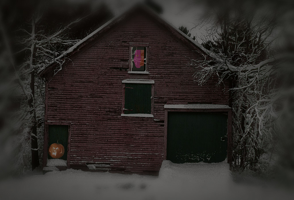
I don't think you need a ghostly figure, the image on its own is great! I would not change a thing. I would love to know the technique you used to create the moonlight and the light in the windows.
|
Oct 11th |
5 comments - 0 replies for Group 71
|
10 comments - 0 replies Total
|