|
| Group |
Round |
C/R |
Comment |
Date |
Image |
| 3 |
Apr 25 |
Comment |
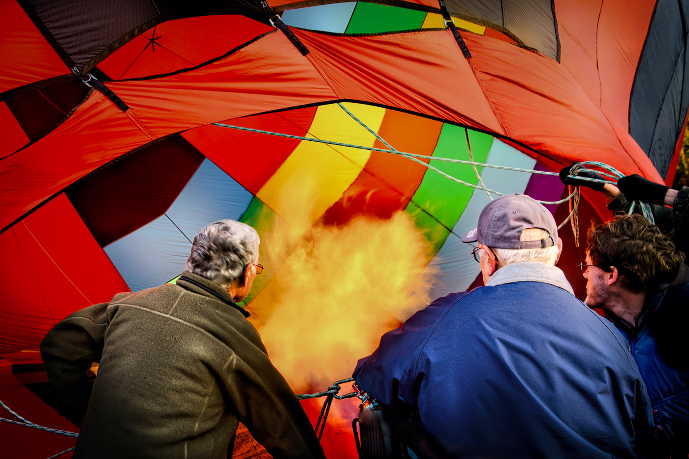
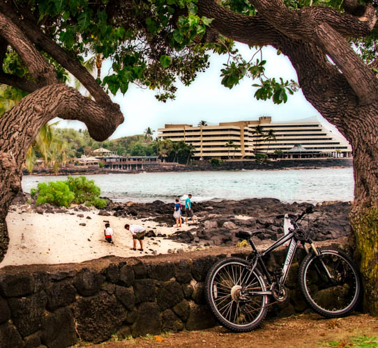
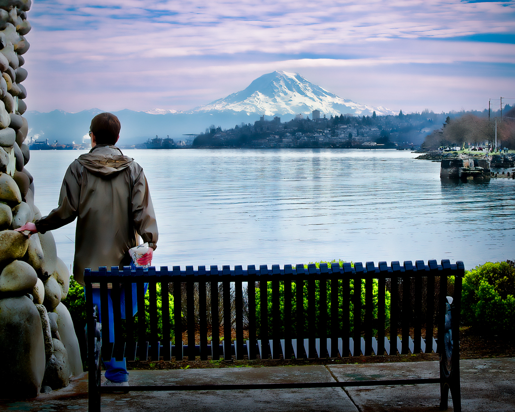
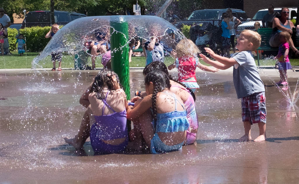
Joan, I don't know if you were on the post-conference tour or not? The first stop was to the balloon festival. It was a fascinating experience to walk around and photograph the balloons in various stages of inflation, flight, etc. Very nice shot. I enjoy the silhouettes against the balloons. |
Apr 12th |
1 comment - 0 replies for Group 3
|
| 6 |
Apr 25 |
Comment |
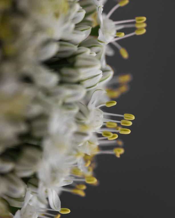
Just visiting from group 30. Ruth, I enjoy the soft light on the sand dollars. It feels like you have sharper focus on the rear sand dollar. Perhaps you could retake it, placing more focus on the foreground SD's. I agree, some sand would be helpful, or maybe just for fun, a colorful background. I would experiment. Keep at it!
|
Apr 12th |
1 comment - 0 replies for Group 6
|
| 30 |
Apr 25 |
Reply |
Thank you for your suggestions. I put a blue filter on it in LR. I like it better. Any thoughts? |
Apr 19th |
 |
| 30 |
Apr 25 |
Reply |
Pho, I don't know either. I will check with our webmaster for an answer. |
Apr 11th |
| 30 |
Apr 25 |
Reply |
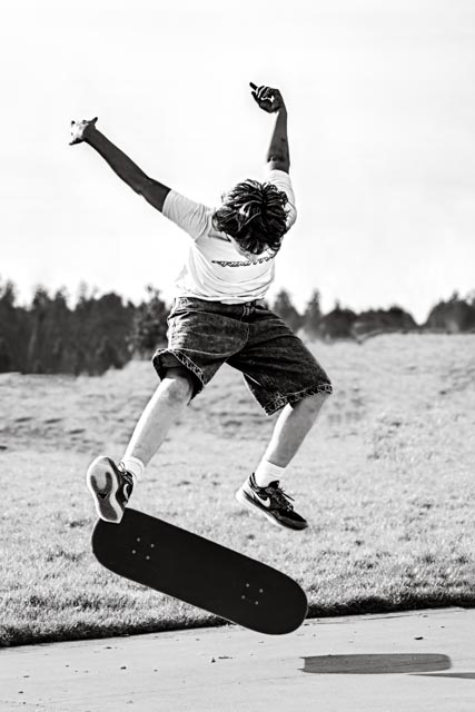
Thank you for your suggestions Walter. I agree the boy probably needs more contrast, but I prefer a wider crop, especially on the bottom as I like the shadow of the board included. |
Apr 7th |
| 30 |
Apr 25 |
Reply |
Yes. That was the reason fir her trip. |
Apr 3rd |
| 30 |
Apr 25 |
Comment |
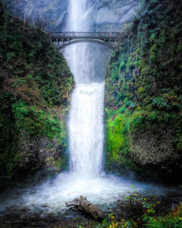
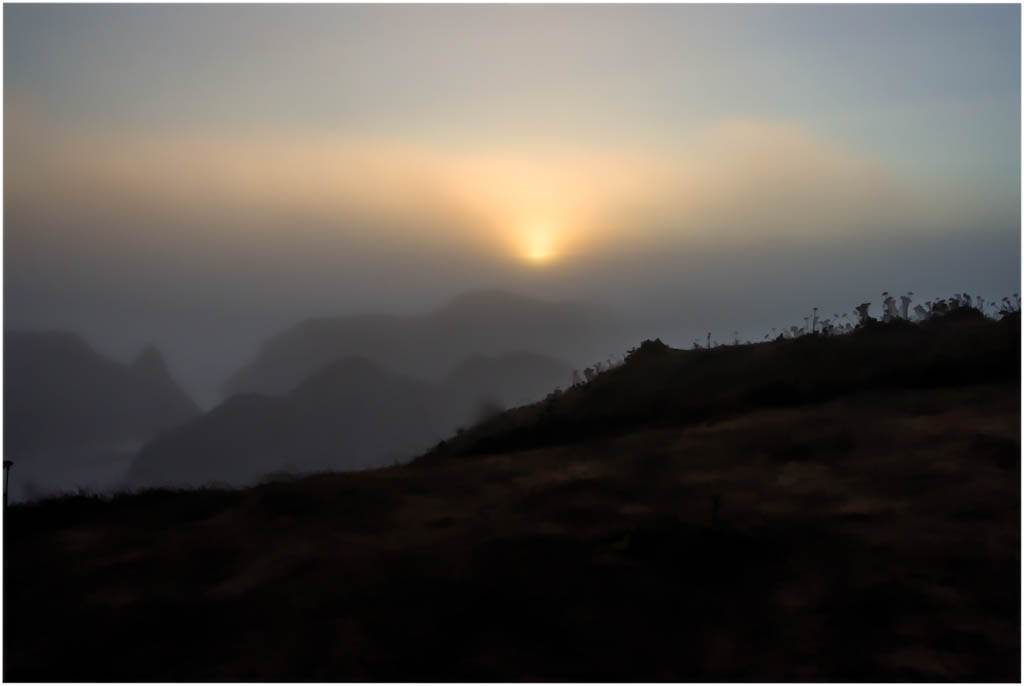
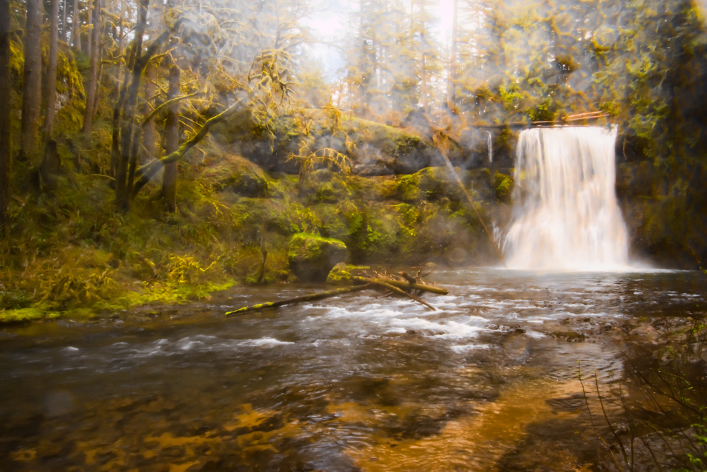
Sometimes there is so much to see and we want to get it all in one shot. I think this is one of those settings. I took this into LR and cropped some of the right off. I think your subject is the mountain and waterfalls, so we don't really need everything on the right. Then using masks in LR, I selected the sky and increased the contrast. I selected the mountain and its immediate surrounds, increased the exposure and blacks. Finally I used a radial gradient over the waterfalls ti increase the exposure and whites. Each of these adjustments were just made "slightly", enough to hopefully draw the viewers eye into and through the image. |
Apr 3rd |
 |
| 30 |
Apr 25 |
Reply |
I thought that might be the case. Coincidentally I had a friend who was there just a couple of days ago as well. |
Apr 3rd |
| 30 |
Apr 25 |
Comment |
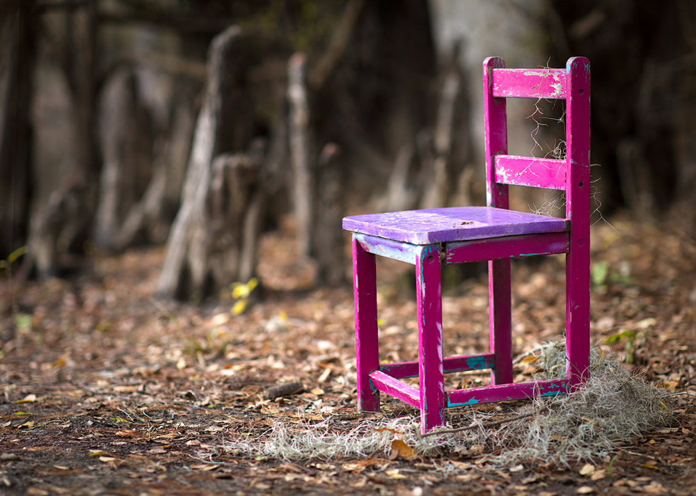
I enjoy seeing another version of your "swamp chair". I think I prefer the color version. In LR I increased the contrast a little as well as the blacks. Also straightened the chair. |
Apr 3rd |
 |
| 30 |
Apr 25 |
Comment |
Great capture of this dramatic moment. Thank you for including the two original images for us to see. I feel like the lava flow at the bottom is a little pixelated but that could just be because I'm looking at a jpg file.
|
Apr 3rd |
| 30 |
Apr 25 |
Comment |
My first thought when I saw this was "wowza"! Wonderful job capturing these at just the right moment. I agree, slightly over-sharpened. I'm wondering what lens you used? |
Apr 3rd |
| 30 |
Apr 25 |
Comment |
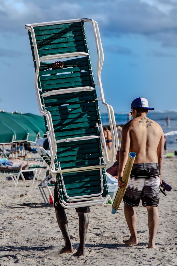
The image does need a little straightening. I like the blurred background. I don't think the dead branch adds anything to the image, so would definitely remove it and just let it be what it is.... an excellent portrait at the beach. |
Apr 3rd |
| 30 |
Apr 25 |
Comment |
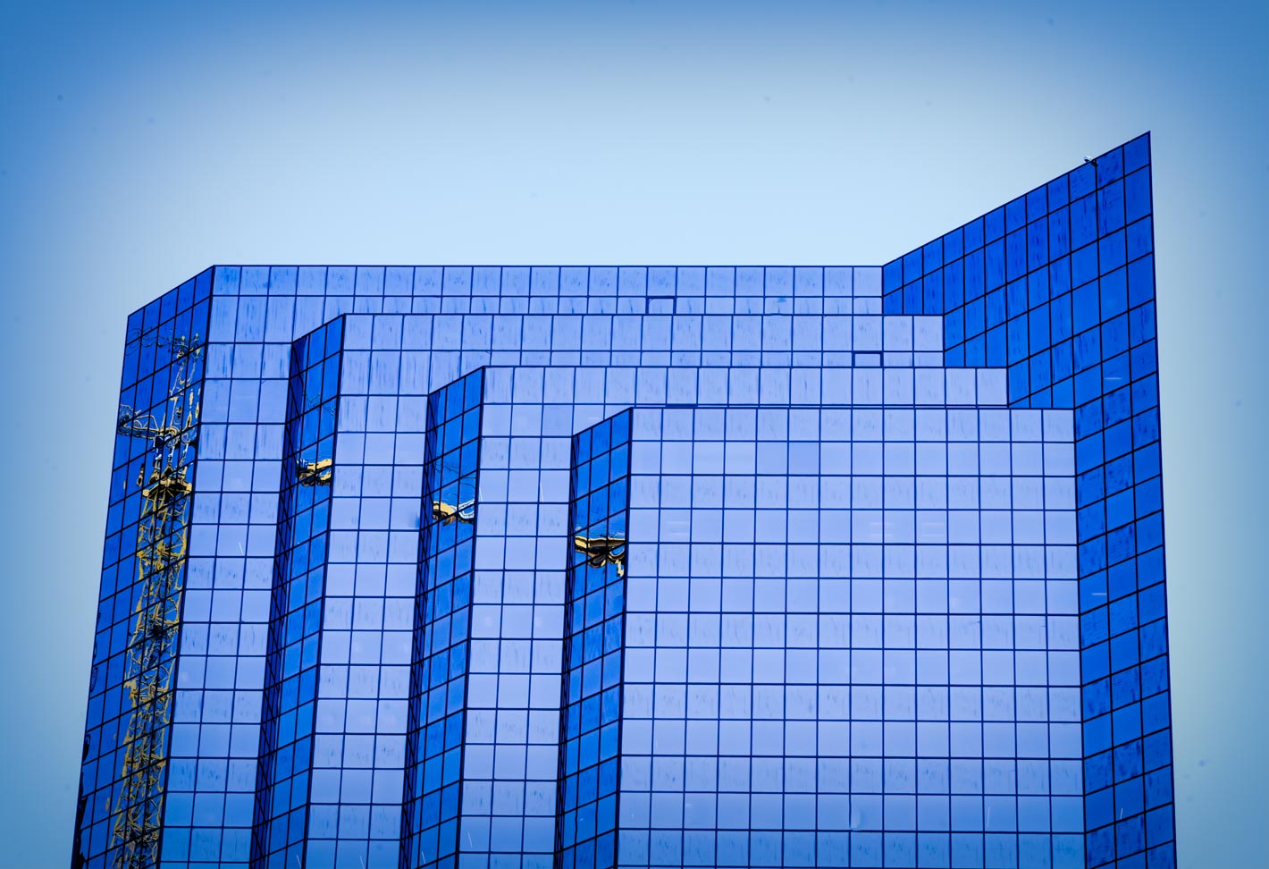
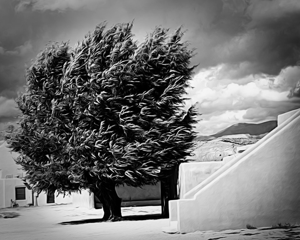
I agree with the others, the contrast between the old building with its multiple ac units and the newer buildings in the background, is quite jarring. I also agree with Patrick about cropping out some of the sky. Thanks for sharing this interesting image! |
Apr 3rd |
6 comments - 5 replies for Group 30
|
8 comments - 5 replies Total
|