|
| Group |
Round |
C/R |
Comment |
Date |
Image |
| 25 |
Feb 22 |
Comment |
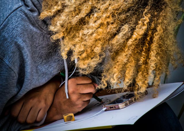
Just visiting from group 30. What a great subject, and you have told the story well. I appreciate that you included the original. Your crop changes the story, but I think in a very good way. I like the way you have partially cropped the artist out an included the painting supplies. It's about what she is doing and how she is doing it; not who she is. Well done!
|
Feb 11th |
1 comment - 0 replies for Group 25
|
| 30 |
Feb 22 |
Reply |
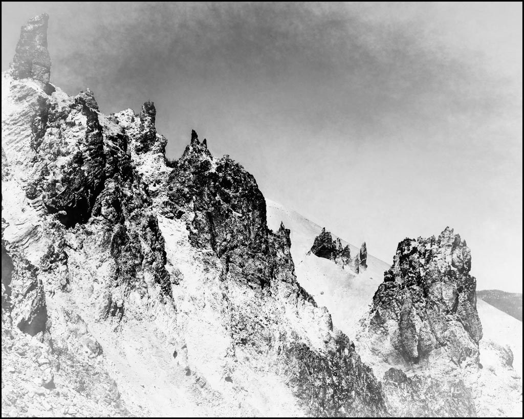
Thanks, Jessica. It was a lackluster image to start with and so I just started experimenting. Yes, I did use Topaz as part of the process. More contrast might help. To me it looks like an old old bw image. I appreciate everyone's comments on this. |
Feb 20th |
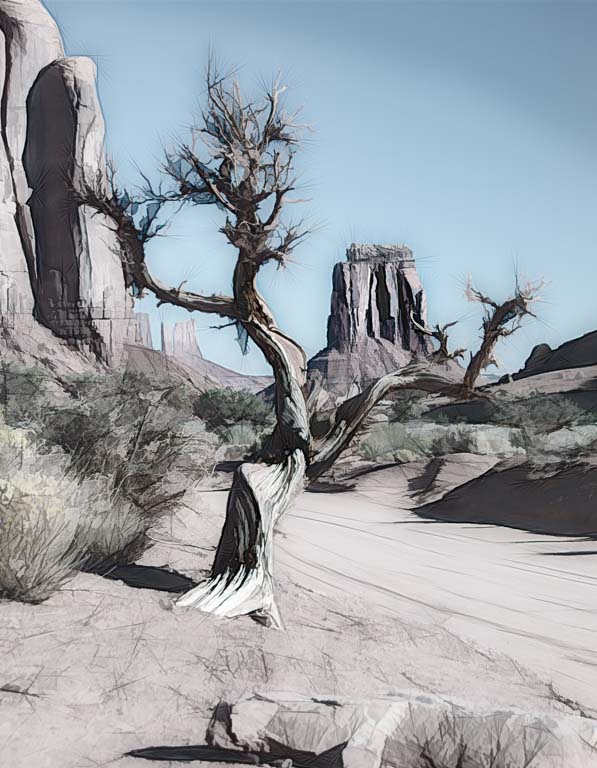
| 30 |
Feb 22 |
Comment |
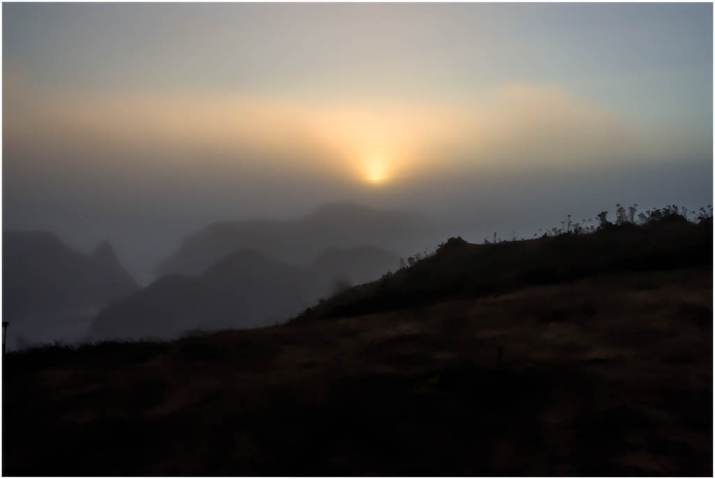
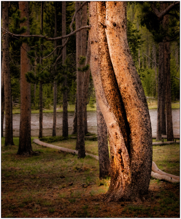
I just recently found out these outcroppings are referred to as the "devil's spine".
|
Feb 19th |
| 30 |
Feb 22 |
Comment |
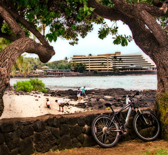
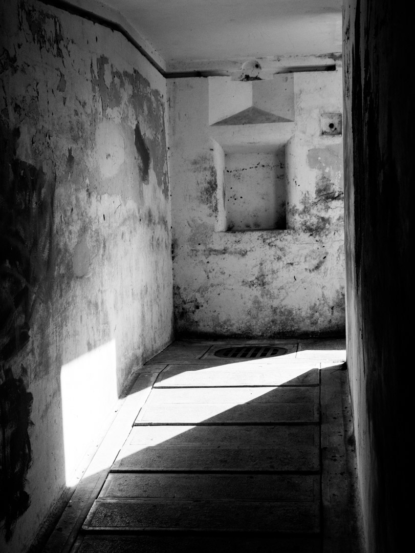
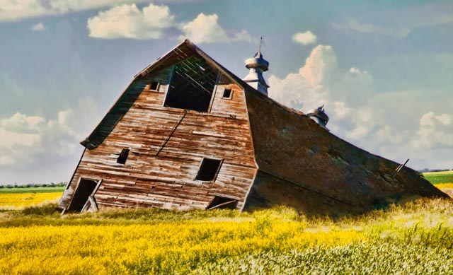
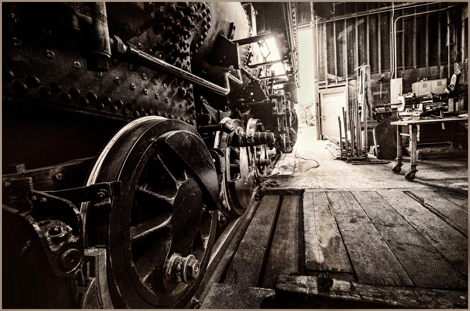
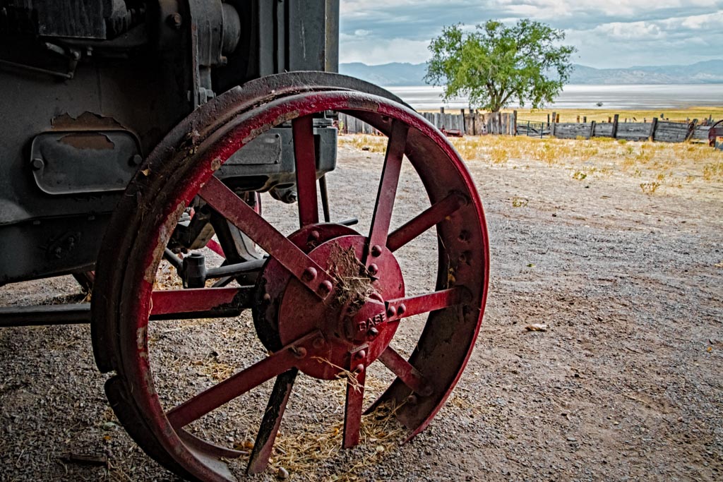
I truly enjoy the in-your-face view of this poor old wreck. Near the top there is a window view that is quite bright. Selectively drop the lighting on that. Possibly the yellow car also, although that doesn't actually bother me too much. When I see these images I think how proud the original owner was as they drove it off the show room floor. And now....
|
Feb 11th |
| 30 |
Feb 22 |
Comment |
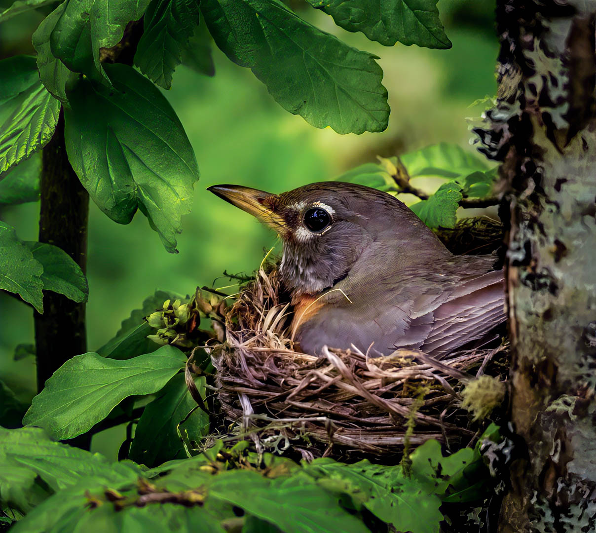
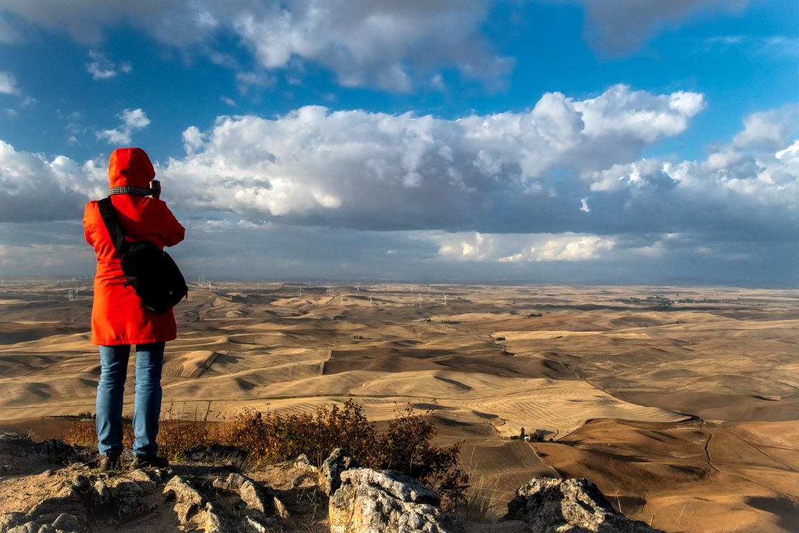
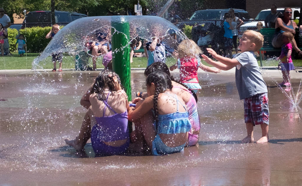
They say that the best wildlife/ bird images are those that show the animal in a normal activity or position. This certainly meets that mark as the bird is doing as it's name describes "skimming" along the water while feeding (I assume).
I, too, would like for the bird to be a little sharper, while recognizing how difficult that is. Have you considered playing with the lighting? As presented it feels a little flat. |
Feb 11th |
| 30 |
Feb 22 |
Reply |
Thank you Tom. When I presented it, I was hoping others would do just what they have.... see what they could do with it. It's interesting to see the various interpretations. I believe they all have merit.
|
Feb 5th |
| 30 |
Feb 22 |
Comment |
To clarify my above comment. I was referring to the white edge around the spider, not the white string attached to it.
|
Feb 5th |
| 30 |
Feb 22 |
Comment |
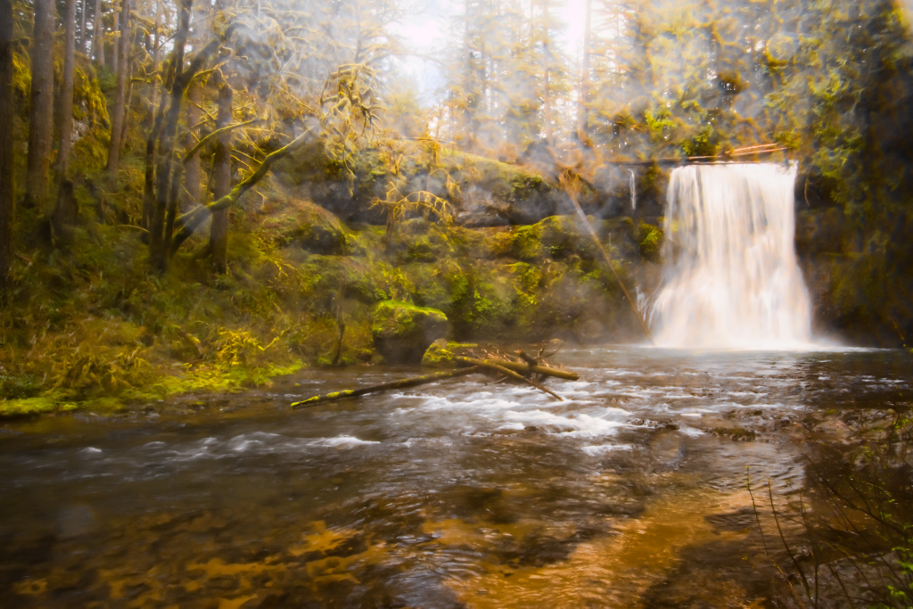
Leonid, when I first opened this image, I think I stopped breathing for a minute. Absolutely beautiful! Of all your images I think this is definitely my favorite! Of course the buildings are exquisite, but the effects you used on this push it way to the top! I don't know what else to say except thank you for sharing it with the grouop. |
Feb 4th |
| 30 |
Feb 22 |
Comment |
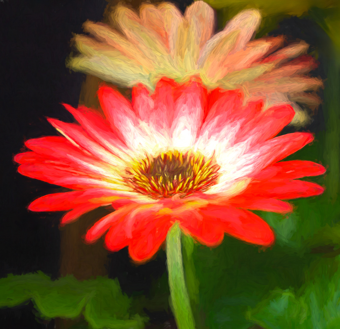
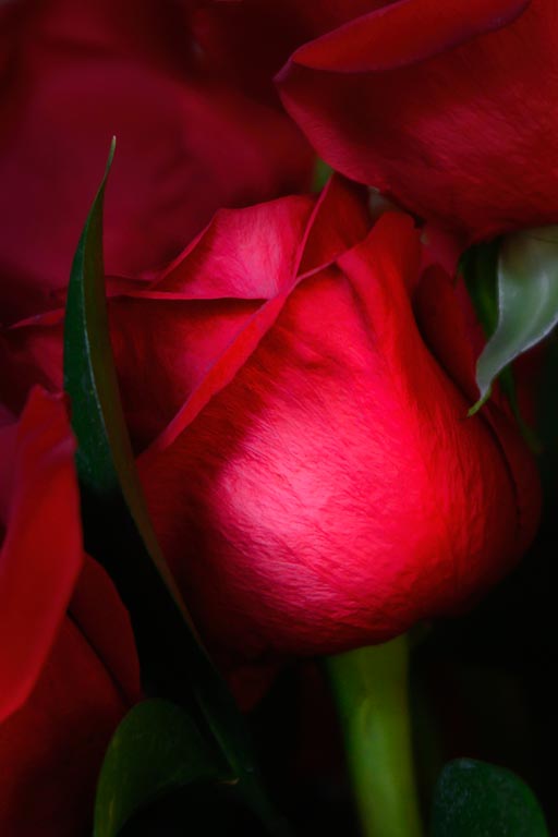
Beautiful colors in the rose and background. I enjoy the droplets on the rose. Some people over sharpen them and for me it ruins the image. You have it just right. Could the rose itself be a little sharper? Yes. Does it bother me a lot for this particular image? No.
|
Feb 4th |
| 30 |
Feb 22 |
Comment |
I'm not familiar with these spiders? We may not have them here in the PNW, although we certainly have our share of others! I agree with Leonid about the white line. I think the spider is over sharpened? I know there is a way to remove that but unfortunately I don't remember how. Perhaps someone in the group knows? It's a beautiful web but I think the image has too much of the web. I cropped to reduce the web and the white area Leonid referred to. Then I reduced the hilites to darken the green and create more contrast. Added very slight vignette. |
Feb 4th |
 |
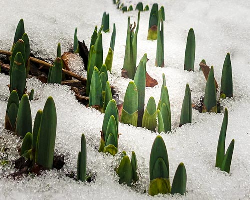
| 30 |
Feb 22 |
Comment |
So many people probably don't notice these early signs of spring, I'm glad you did and that you shared them with us. I like that there is a little piece of wood or some other thing that intersects with the daffodils. I also agree the the need to change the white balance. Just trying some small changes that I like for this image: cloned out a few "stray" daffodil leaves that I thought distracted us from the main group, also cloned a little from left, bottom, right. Finally, I used a brush to increase the saturation on the central plants and added a little more light to the center using a radial light. Tiny changes. |
Feb 4th |
 |
8 comments - 2 replies for Group 30
|
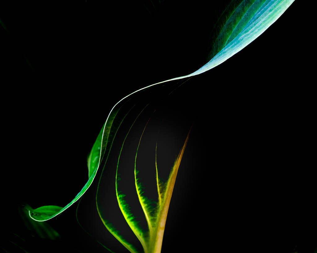
| 42 |
Feb 22 |
Comment |
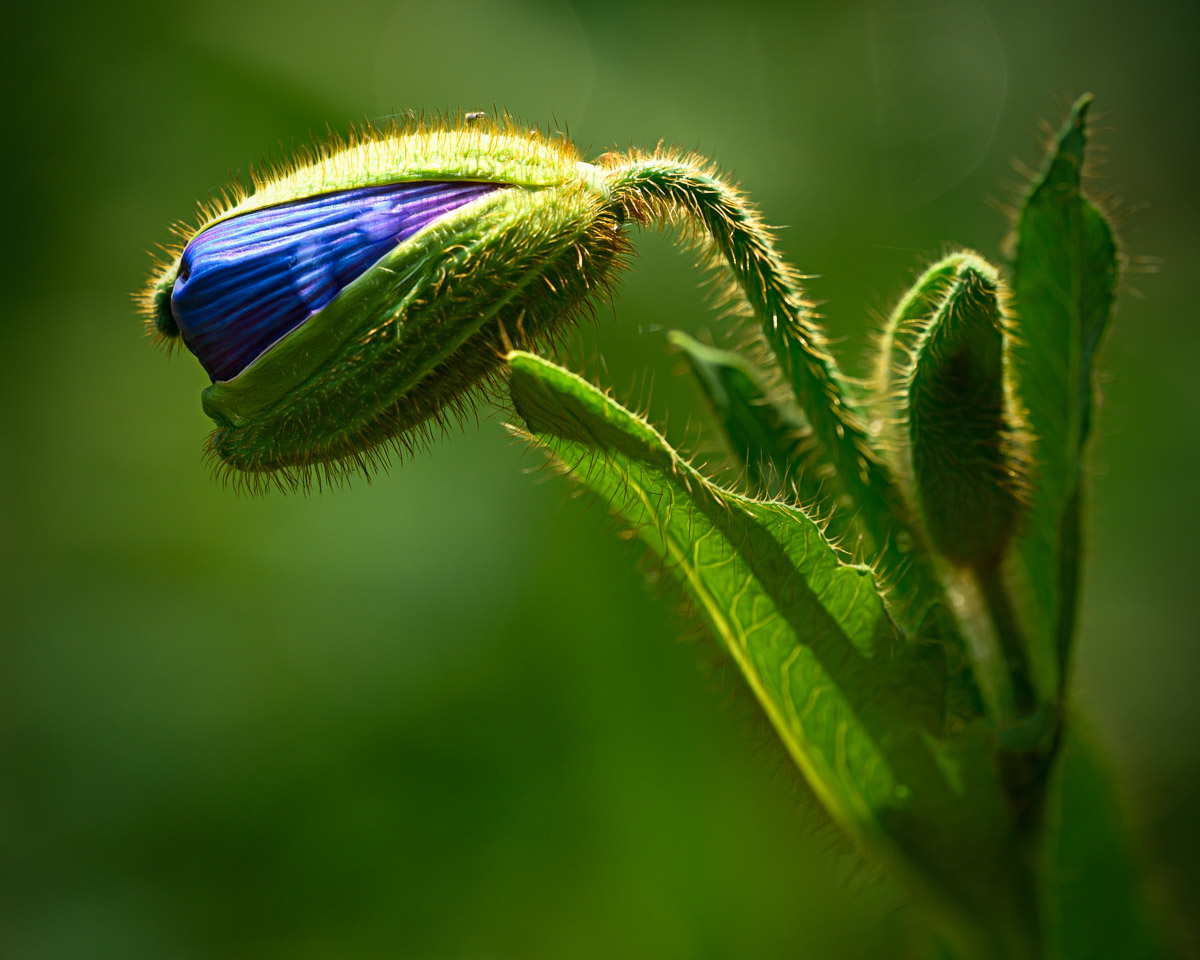
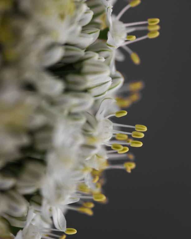
Robert, I find this to be a very interesting subject. I appreciate the fact that the stem is at a slight angle, the leaves create a sort of umbrella-like effect. You did quite well with the focus stacking. The colors are rich and inviting, the lighting is soft and nothing is blown out. The large white spot at the left/ base of the stem distracts me. I would recommend removing it as well. The rest of the white areas are fine, environmental.
|
Feb 11th |
1 comment - 0 replies for Group 42
|
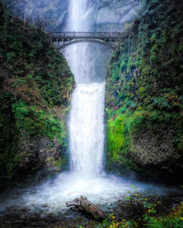
| 96 |
Feb 22 |
Reply |
Robert, I have told Bob this is one of my favorites. After reading your comments, I looked again and now I "see" that the right hand rock is actually a dog/ wolf howling at the moon. Can you see it? :-)
|
Feb 8th |
0 comments - 1 reply for Group 96
|
10 comments - 3 replies Total
|