|
| Group |
Round |
C/R |
Comment |
Date |
Image |
| 30 |
Jan 22 |
Comment |
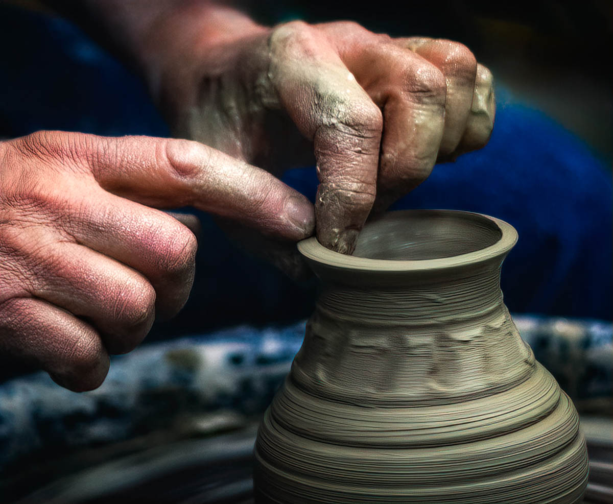
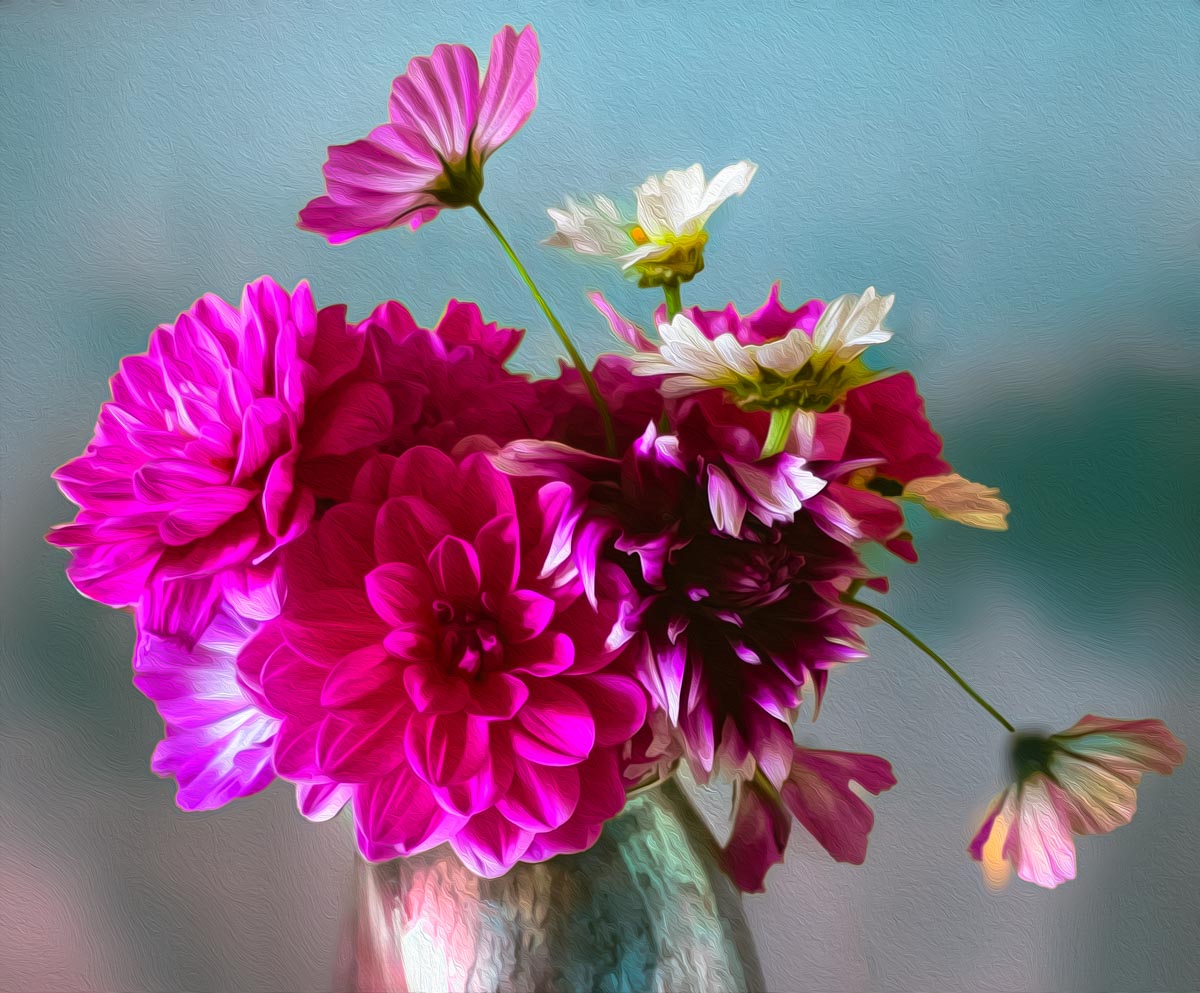
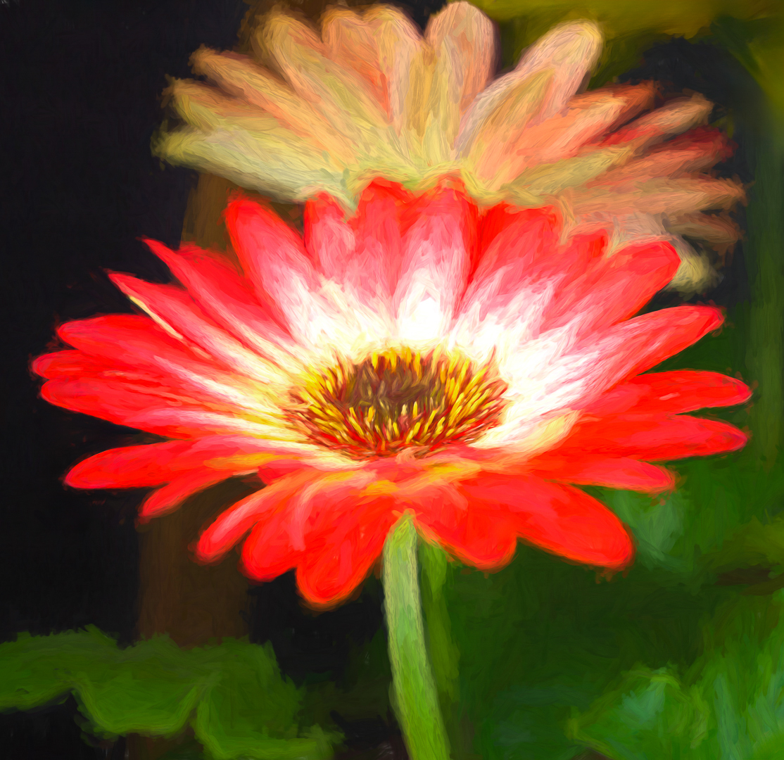
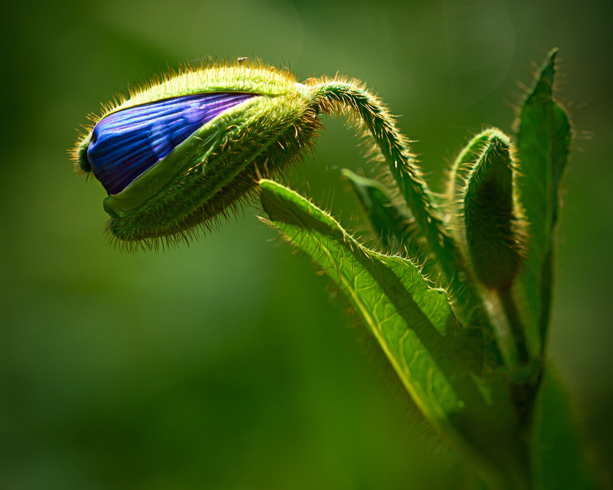
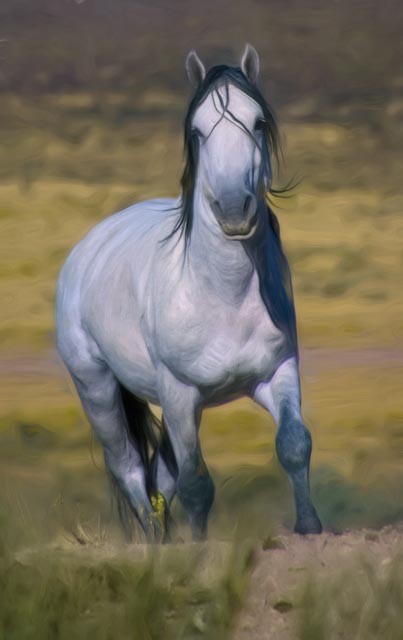
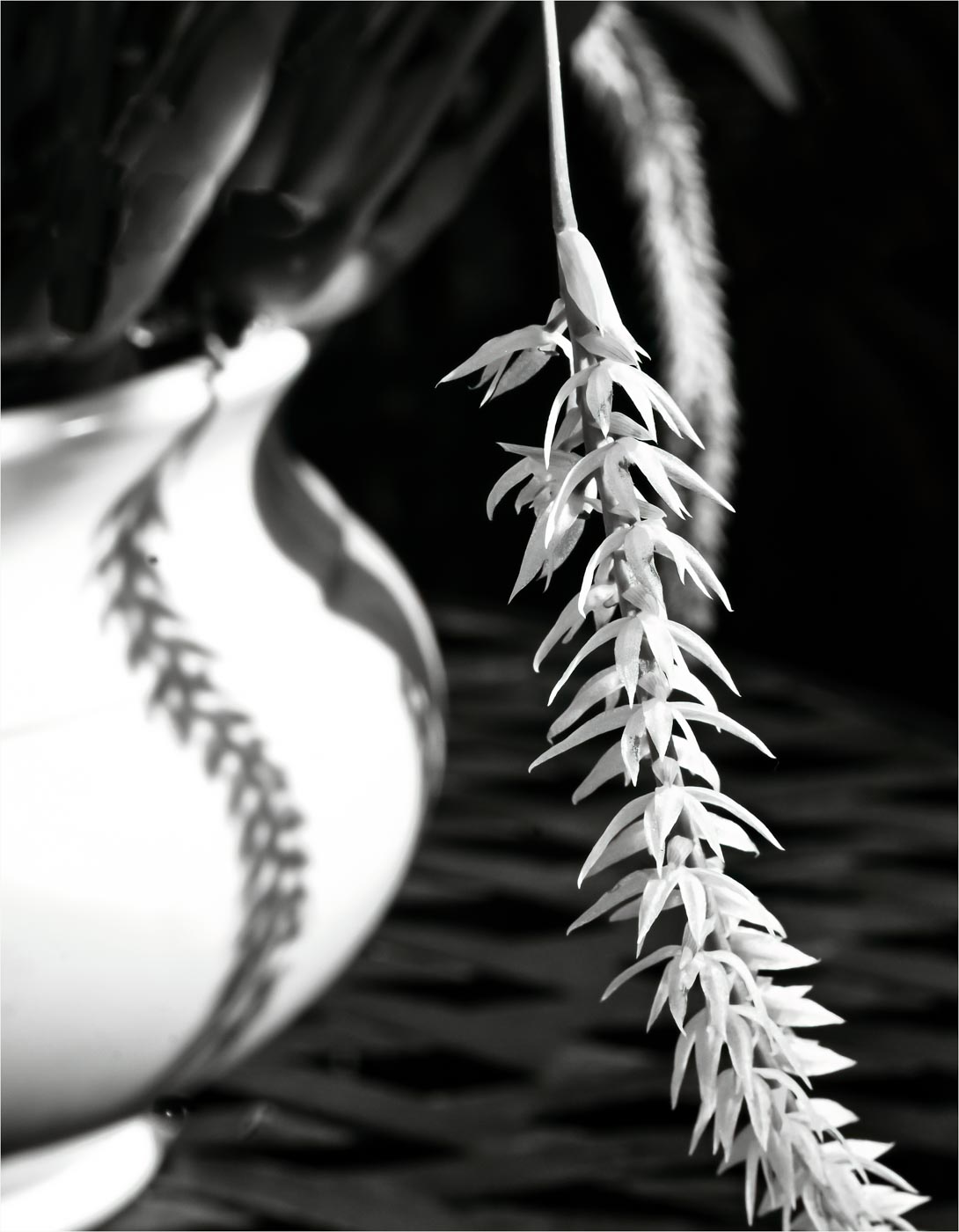
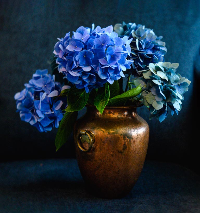
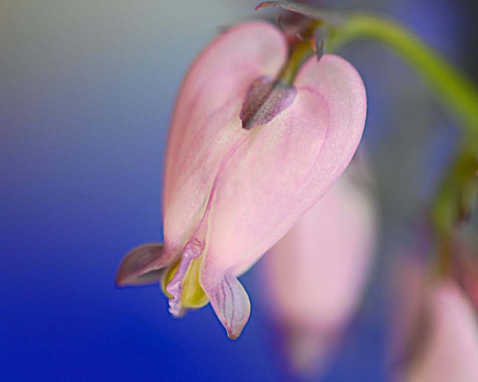
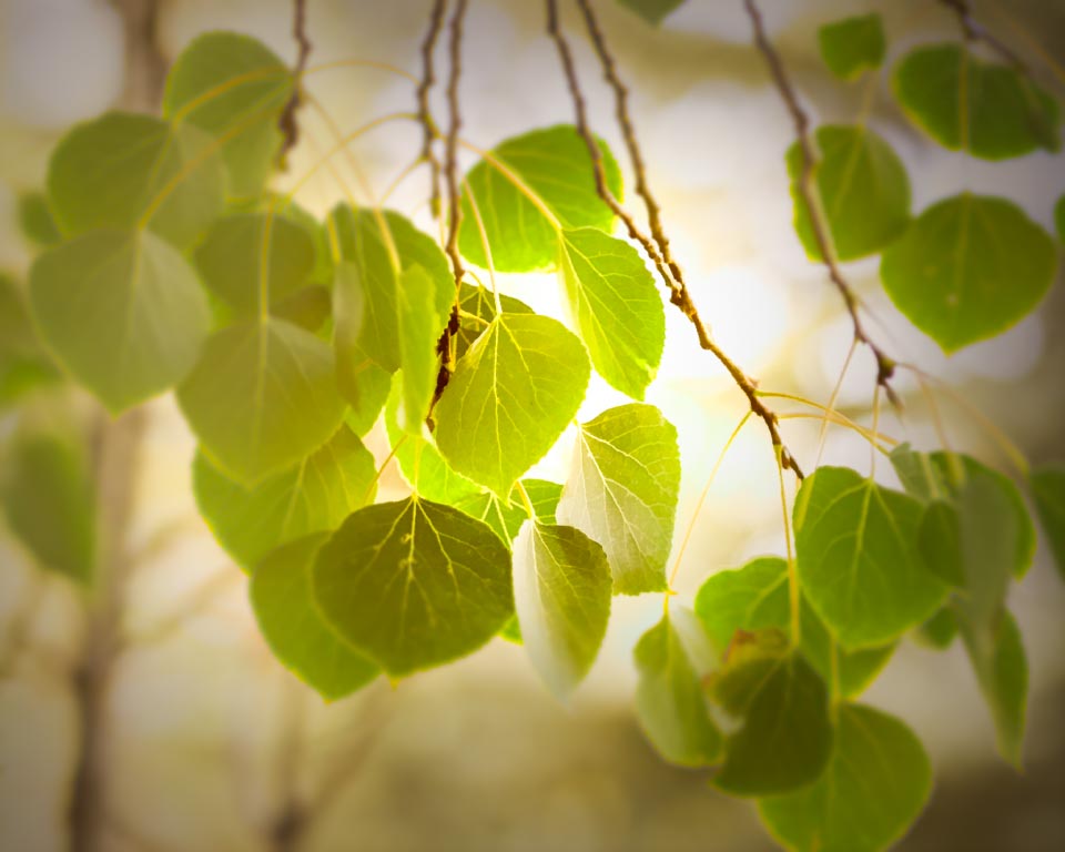
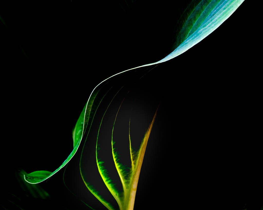
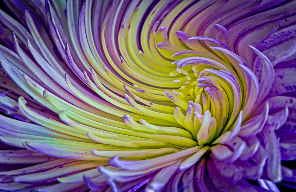
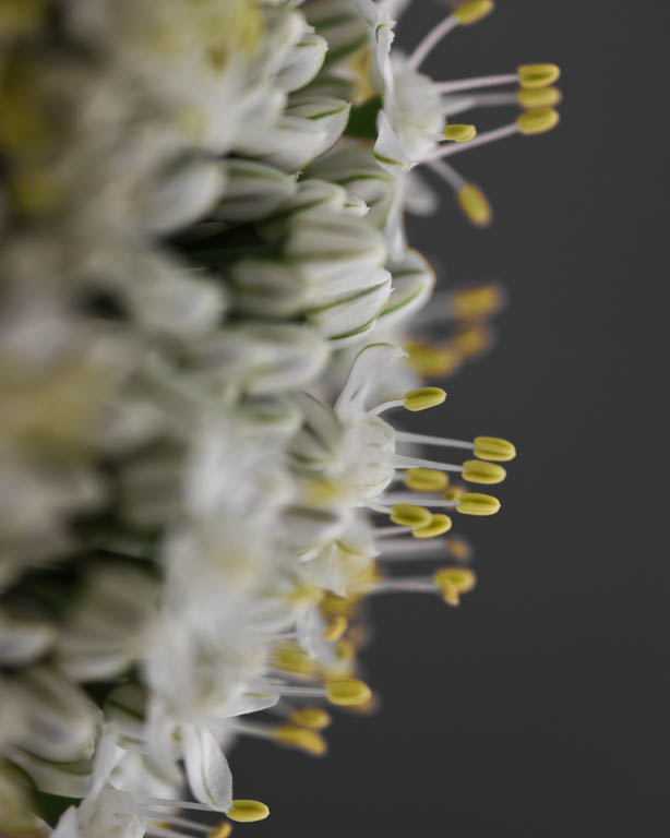
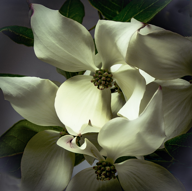
Very nicely done. I especially like the angle of the main stem. While I like Jessica's crop as an alternative, I enjoy the original as well. The blurred background is perfect. If keeping the original, I might consider cloning out the spent flower lower right. |
Jan 18th |
| 30 |
Jan 22 |
Comment |
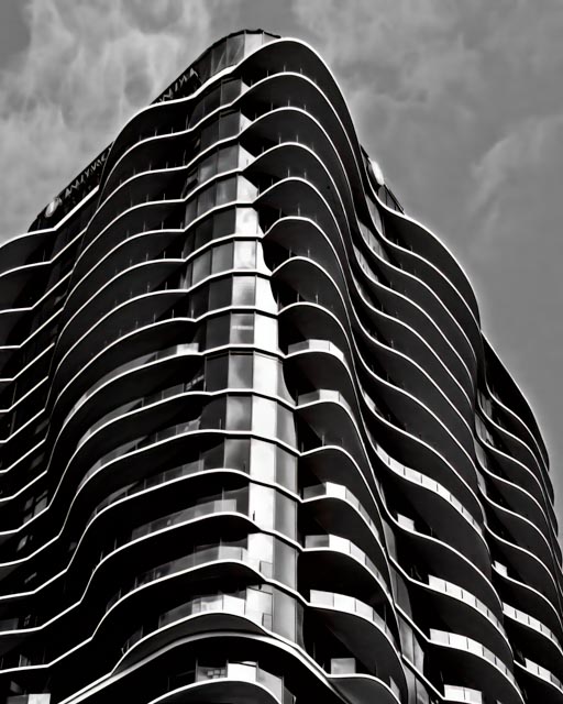
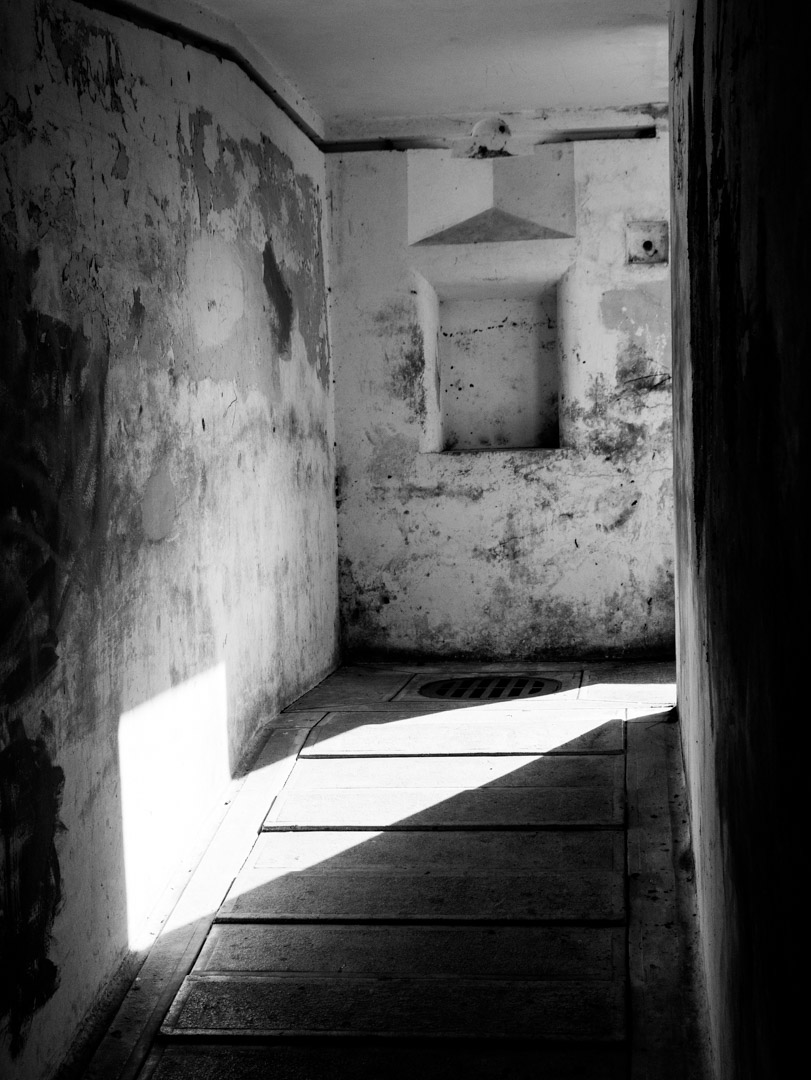
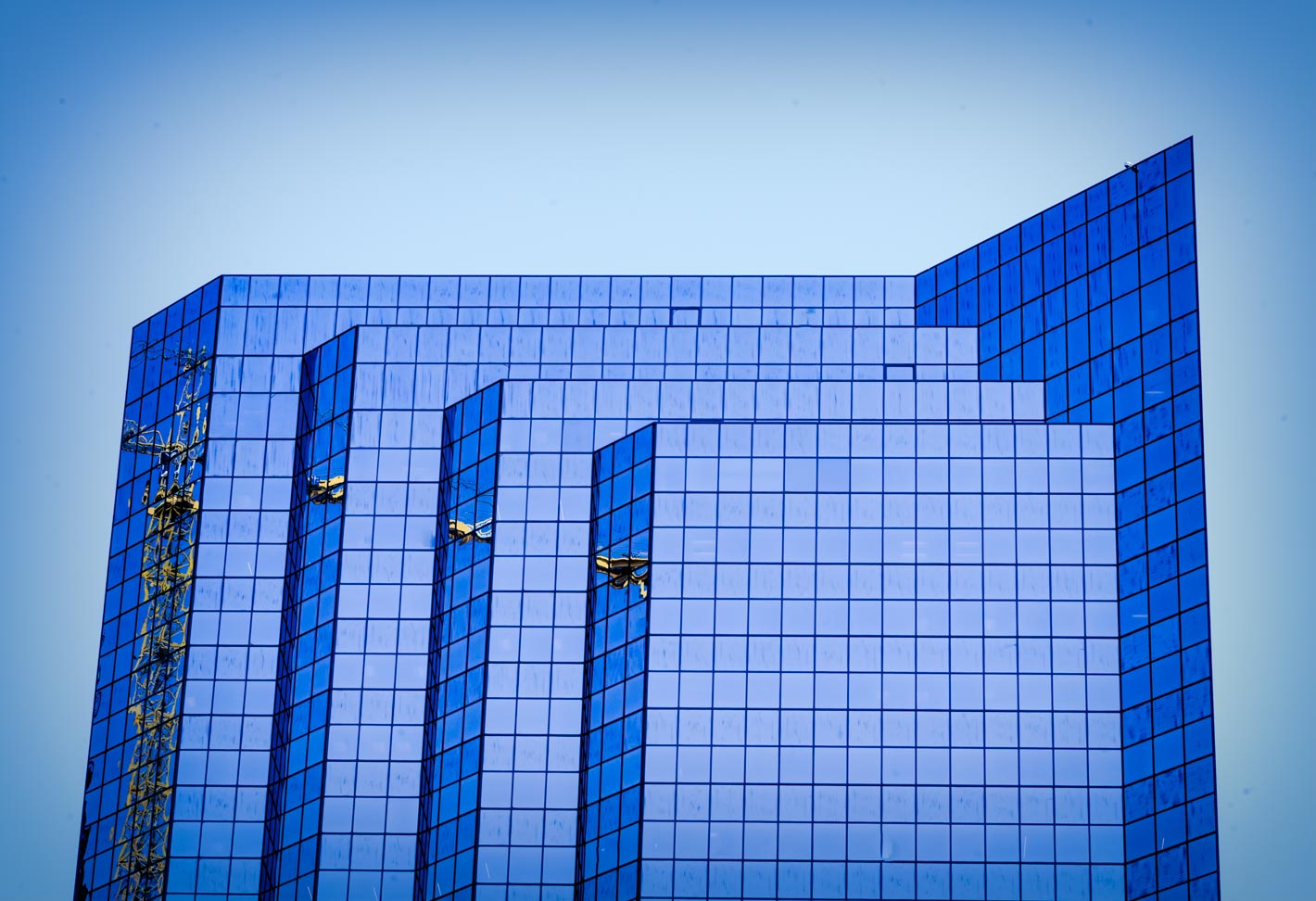
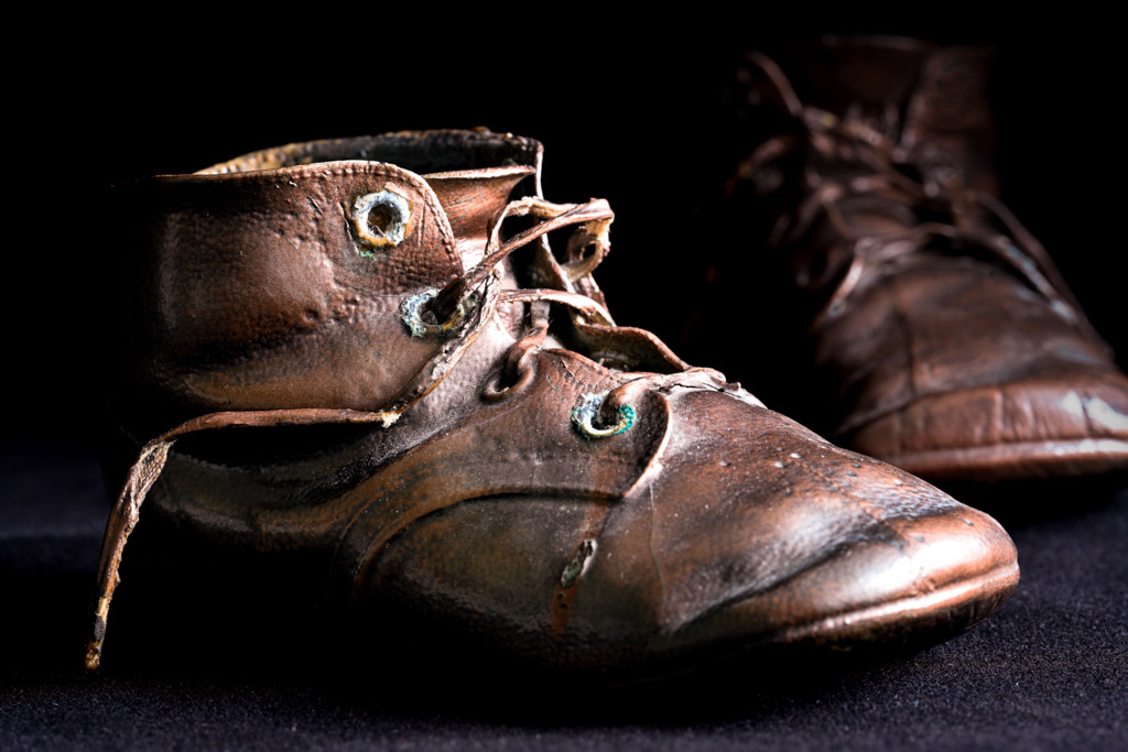
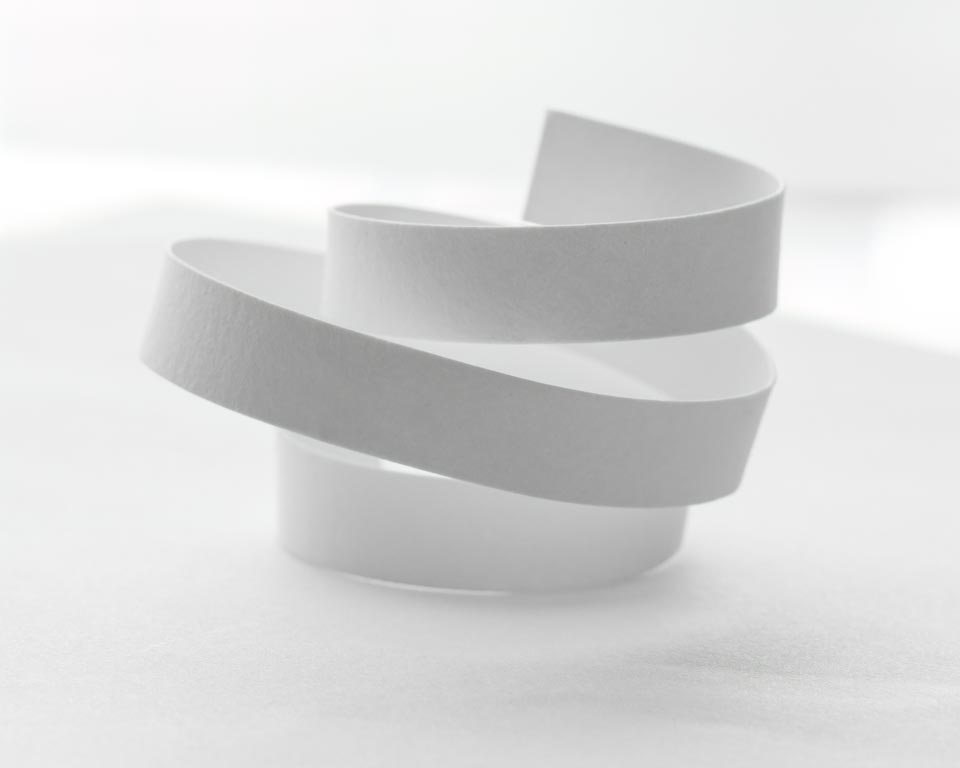
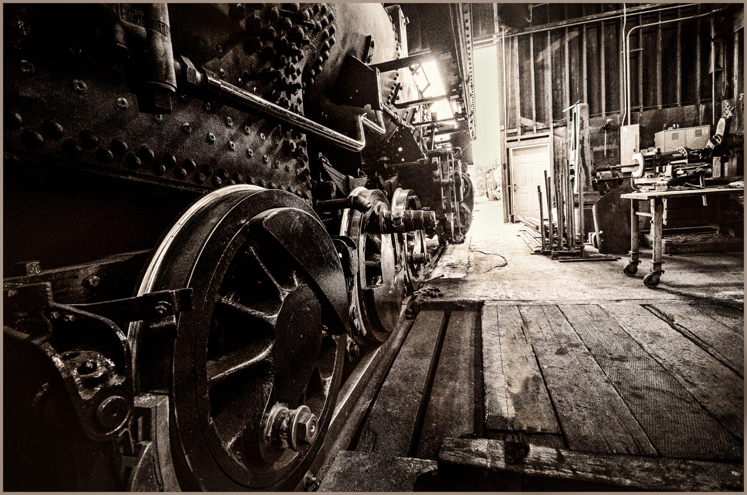
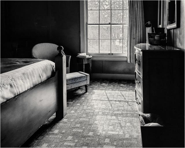
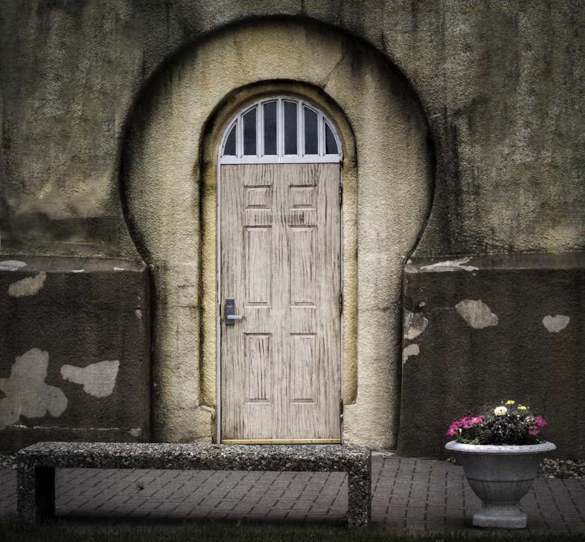
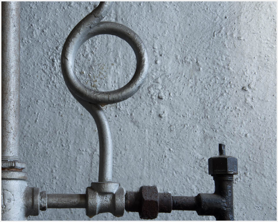
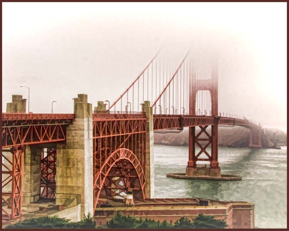
This is an interesting image. I agree with Jody, that I would like to see the rivets the same on both sides. While I like the blue tones, I also tried it in bw. Also, I cropped some off the top and bottom, using a brush in LR, adjusted some of the light/ dark areas inside the window. Finally I reduced the exposure on the outside portion. Reducing the exposure brought out some texture as well which you may or may not like. Just a different take on a very interesting subject. |
Jan 18th |
 |
| 30 |
Jan 22 |
Comment |
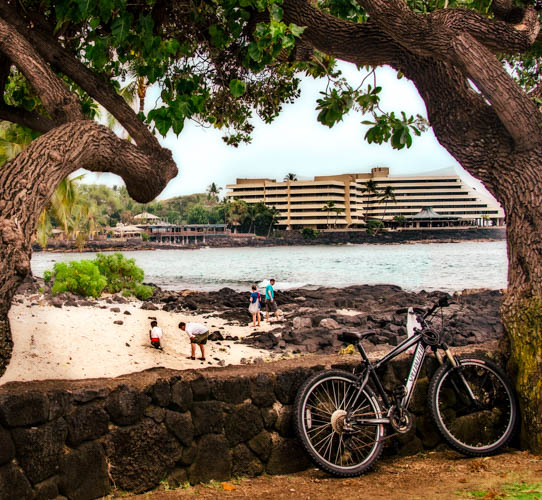
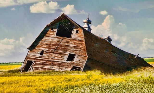
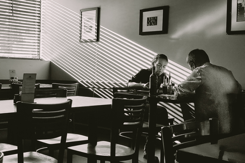
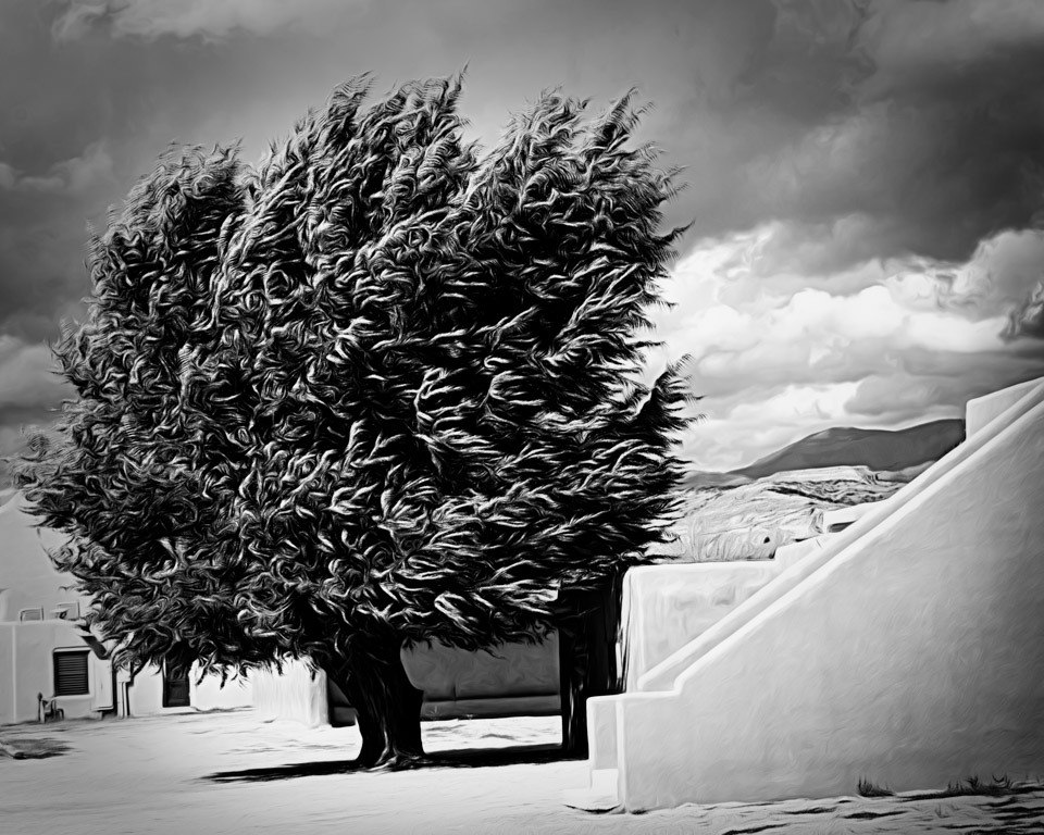
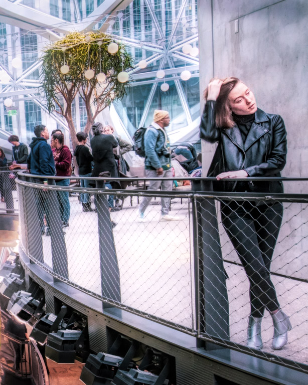
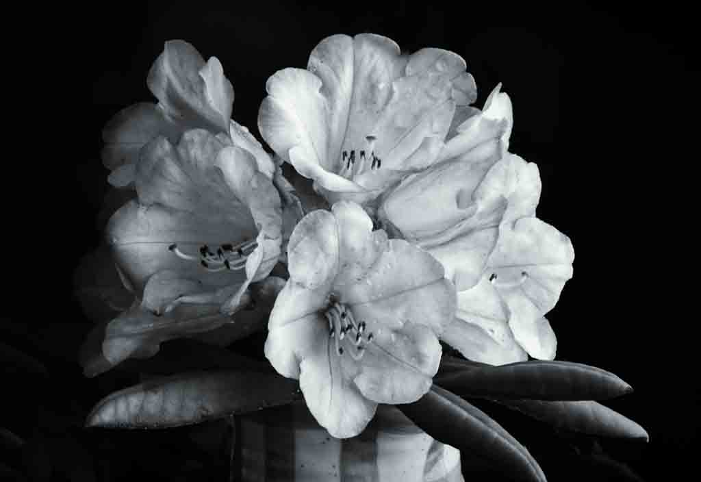
Thank you all for the comments. Truly not a great image to start with. I was just interested in whether or not it could be salvaged. I will try mono. The "house" is actually a historic inn and restaurant and well associated with the area, but unless you were local, would not know that.
|
Jan 16th |
| 30 |
Jan 22 |
Comment |
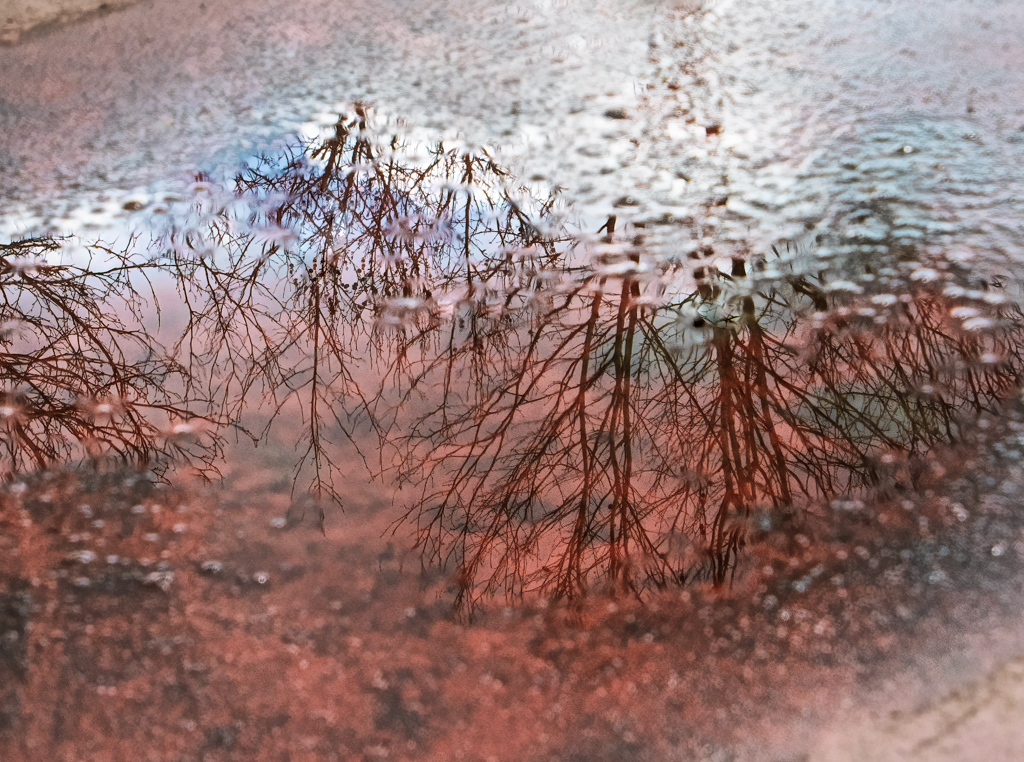
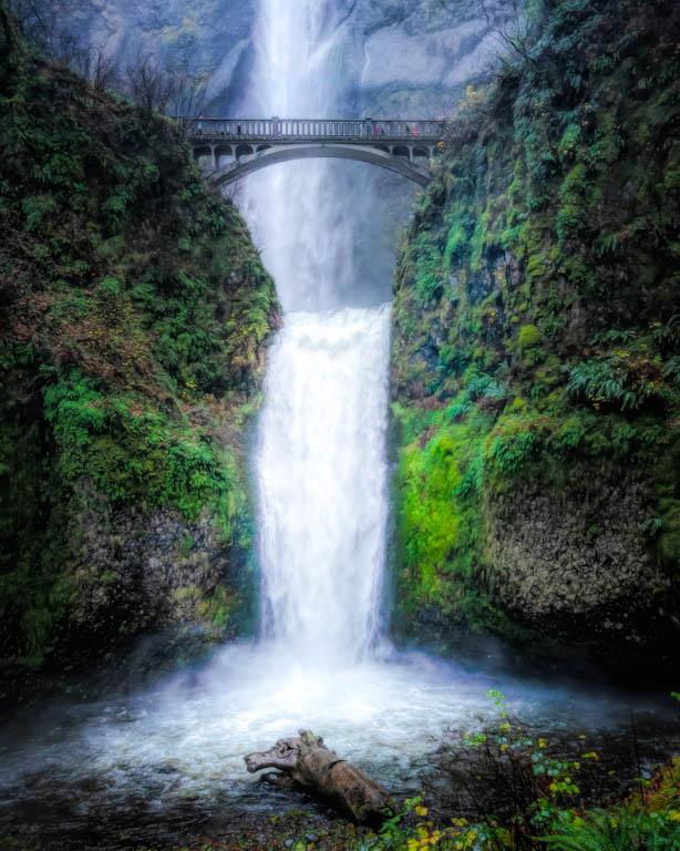
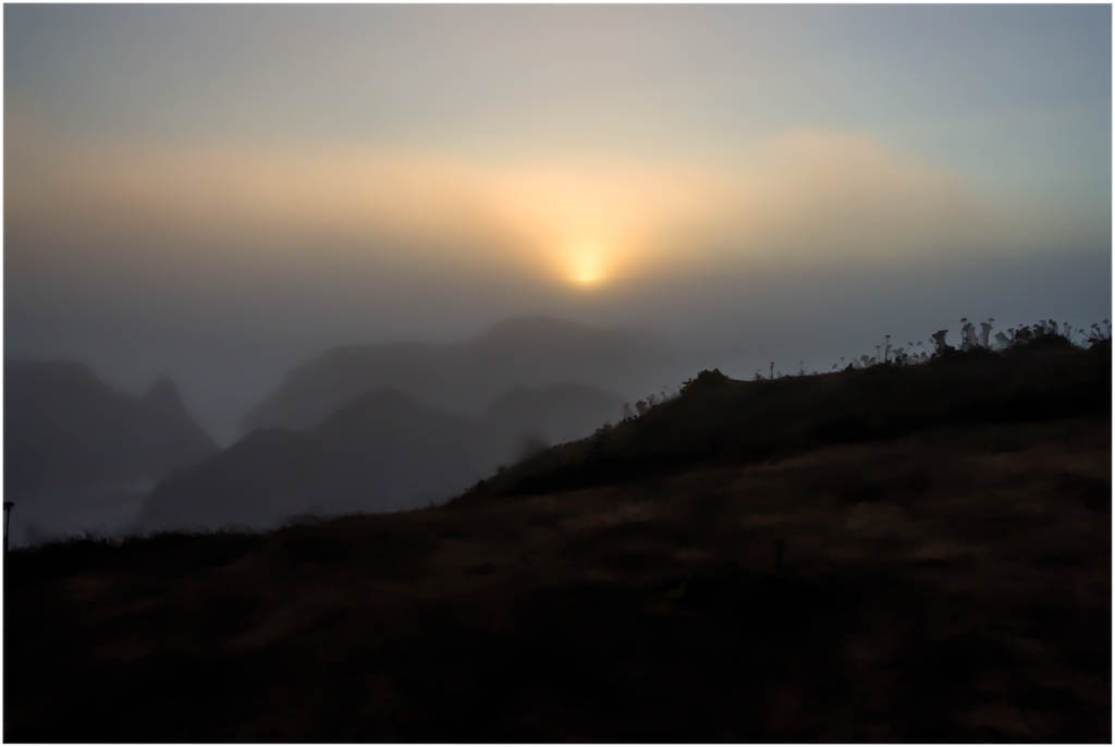
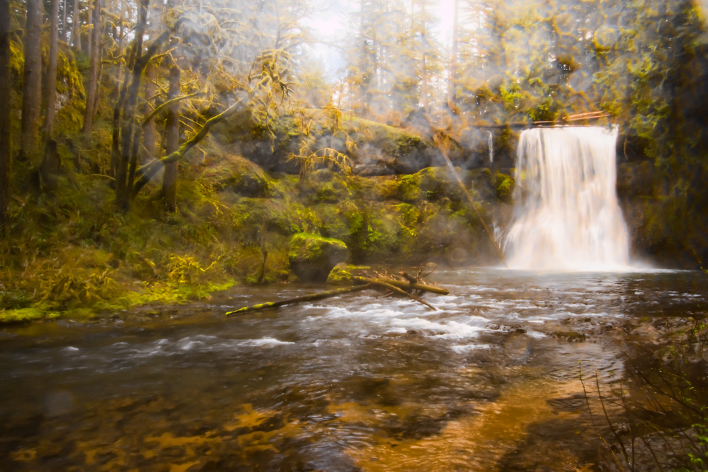
I didn't actually add the mist. The mist was everywhere plus it was raining. I tried to reduce it as much as I could. I just need to go back when it's not raining and not windy.
|
Jan 3rd |
| 30 |
Jan 22 |
Comment |
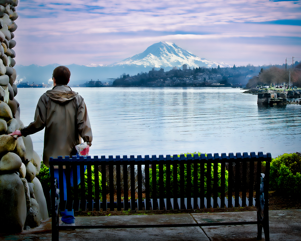
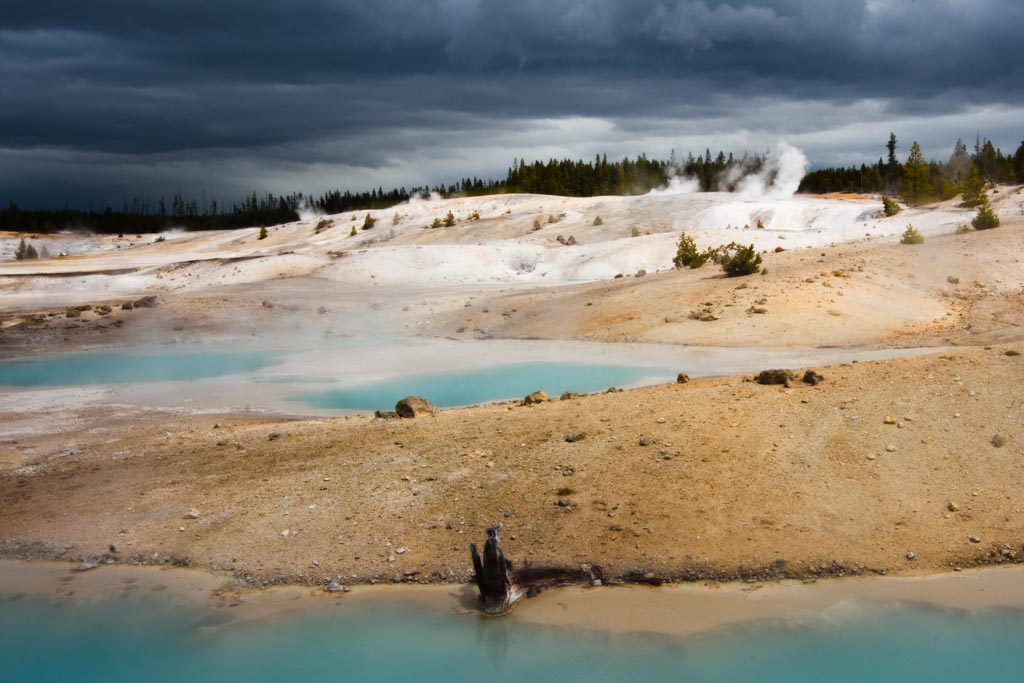
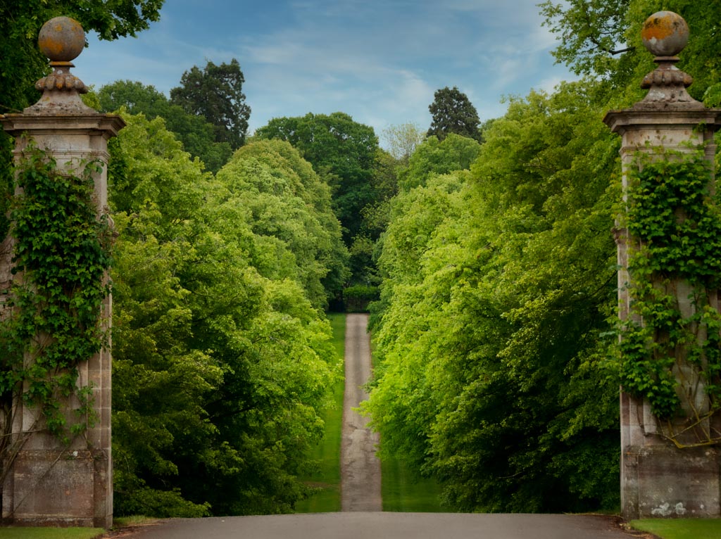
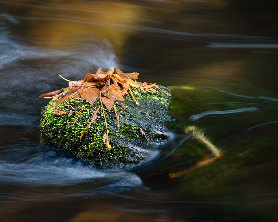
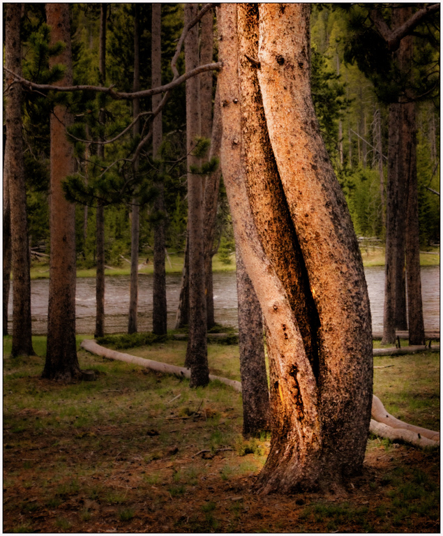
Lovely view and composition. It is a little dark for me so I lighten/brightened it globally. Then lightened the log by masking it. Also a small crop to bring us closer to the log. |
Jan 3rd |
 |
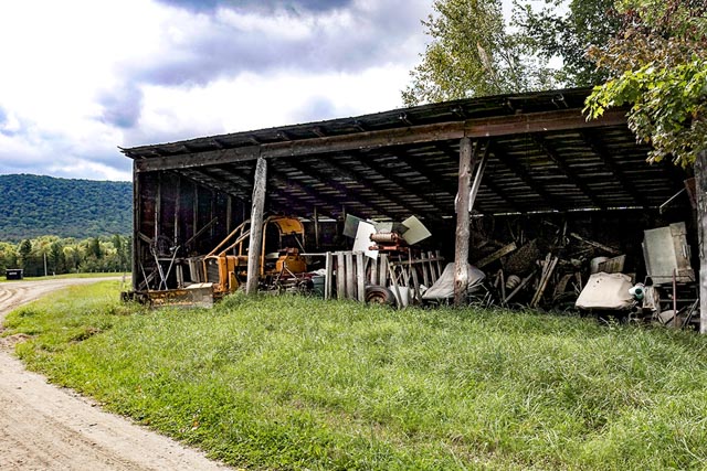
| 30 |
Jan 22 |
Comment |
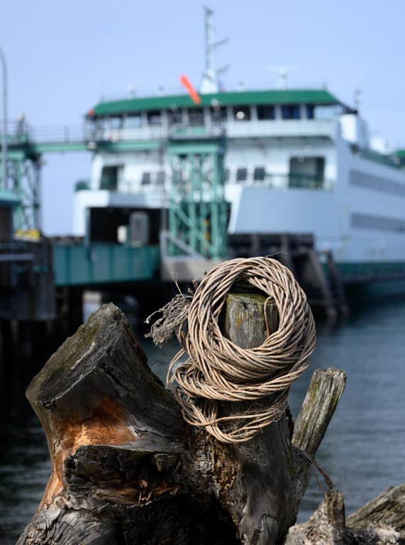
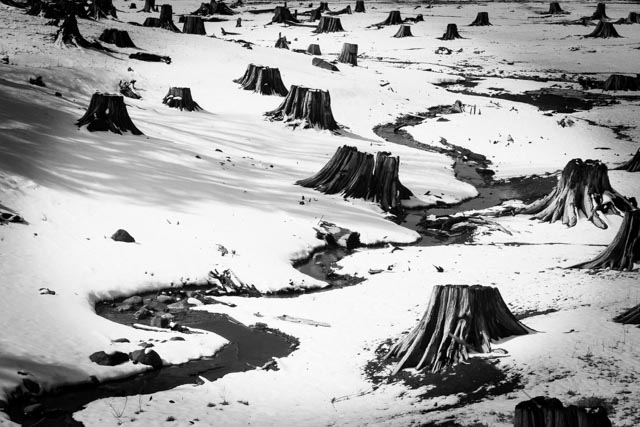
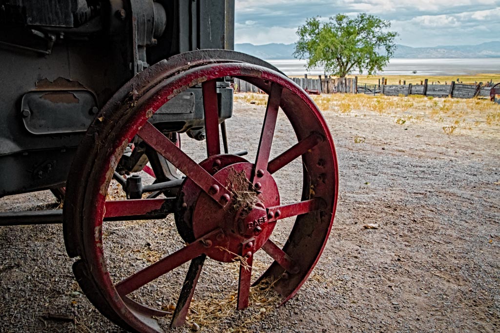
One man's junk is another man's treasure, to paraphrase. Interesting subject. Did you try some close ups of the junk as well? Since the subject is the junk as well as the shed, I would like to see the shadows opened up so we could see in side the shed better. I also would crop a little to bring us closer to the items in the shed. My example is included. |
Jan 3rd |
 |
| 30 |
Jan 22 |
Comment |
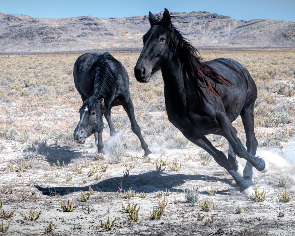
I don't have much experience photographing the moon. I did go back and look at mine and yours is much superior. It is sharp enough that we can see many details. I think I would prefer it just a "tad" brighter, not much. You have inspired me to try again, myself. Thanks! Very well done!
|
Jan 3rd |
| 30 |
Jan 22 |
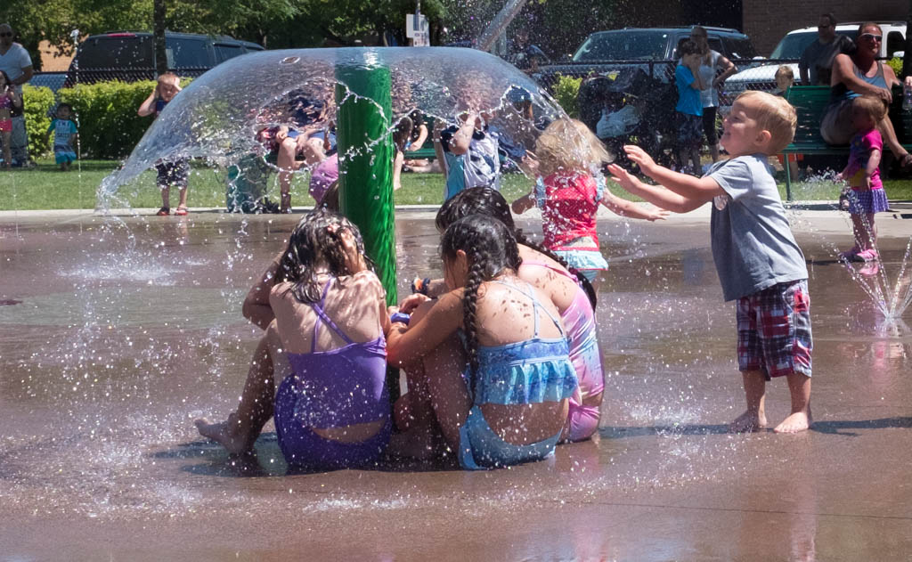
Comment |
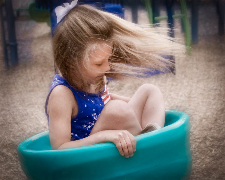
Great job catching your moving target, aka Maxon! I love the pose. It was especially nice that the golf course had a flag to match his red white blue outfit! The yellow golf ball in his hand is the frosting on the cake! Your image is fine as you processed it, but I decided to try some subtle changes. In LR I put a mask on the subject and then inverted it. I softened and darkened the background a little to create more separation between Maxon and the background. I also brightened his eyes slightly. Finally I added a subtle vignette. |
Jan 3rd |
 |
8 comments - 0 replies for Group 30
|
| 42 |
Jan 22 |
Comment |
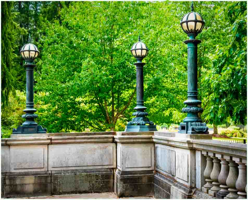
Robert, I agree about trying different angles with this image. The second try is my favorite. The subject is sharp, you have a little bit of grass in the background. In the third image, the subject is sharp, with great detail. However, in that image, the grass in the back merges too much with the lantern for my taste. A great opportunity to experiment. |
Jan 16th |
1 comment - 0 replies for Group 42
|
9 comments - 0 replies Total
|