|
| Group |
Round |
C/R |
Comment |
Date |
Image |
| 29 |
Aug 20 |
Comment |
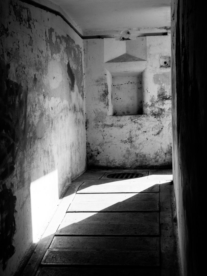
Hello Judy, Bannack is one of our favorite places to stop on the way to Yellowstone. The first time we were there, they had re-enactors which made it even more interesting. I don't know if you took the liberty to move the bottle around, but I like your composition very much. The one issue I have is that the lighting is all the same, which makes it a little flat. I think you could adjust that with your software so that the bottles stand out a little more as your subject. Glad you enjoyed your visit to Bannack. |
Aug 8th |
1 comment - 0 replies for Group 29
|
| 30 |
Aug 20 |
Comment |
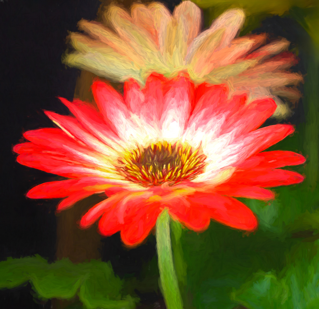
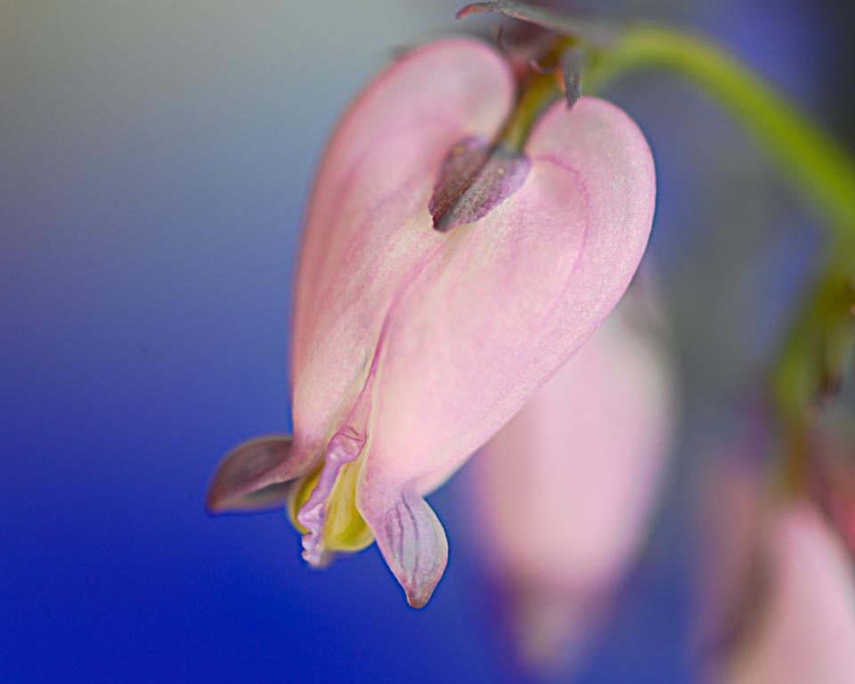
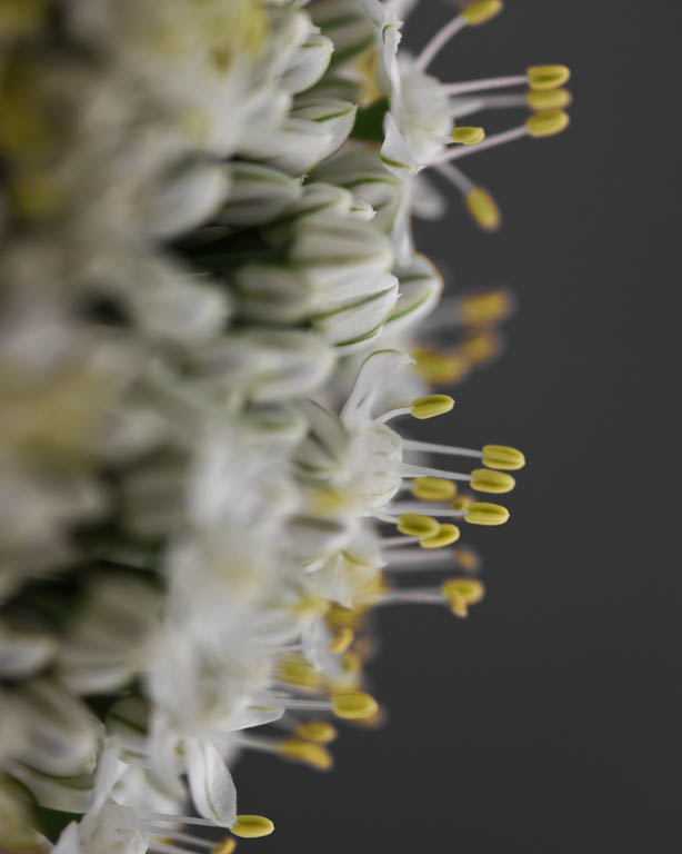
My image is not the greatest, but I'm glad it has generated this discussion. In particular, I appreciate the conversation about composing a close up of a flower like this. On reflection, I think if the close up is in fact close-up or macro, it can generate a lot of interest. But it needs to be sharp in the center, which mine fails to do. The negative side of this is that it creates a very static image. We can see from Robert's effort, that the image is more dynamic due to the diagonal lines. Thank you all for your comments and suggestions! |
Aug 20th |
| 30 |
Aug 20 |
Reply |
We need those days now. Glad you had a good time!
|
Aug 8th |
| 30 |
Aug 20 |
Comment |
I've been watching this interesting dialogue unfold. My take on this: Leonid, you had a creative vision that you wanted to accomplish using compositing techniques. You are happy with your artistic results.Therefore, it is a success, because it is artist's choice. When I first saw this image, I thought "wow"! The lighting and colors are lovely and I liked the concept of the splashing water on what I perceive as a hard surface. So for me, the lighting and colors, the reflection on the surface, are all great. However, on looking again, the water drop and splash do not fit right with the apples, for me. Since the apples and background appear realistic to me and the water does not. I agree on removing the drop. I might try softening the water splash so it does not look so frozen in time. Just my thoughts. |
Aug 8th |
| 30 |
Aug 20 |
Comment |
Your subject is nicely placed in the image. The legs are very sharp, but I wish the head/torso were sharper. The wing positions are great. It must take a lot of patience to photograph these. |
Aug 8th |
| 30 |
Aug 20 |
Comment |
I agree with Judy. As a fine art image, we need to separate the heron from the busy background. I do like the detail you got in the bird wings and the reflection. Very nice. A 600mm lens is a great lens for bird photography, but more than I could probably manage!
|
Aug 8th |
| 30 |
Aug 20 |
Comment |
For me, the carp as presented, leaves me wondering what I am looking at and why? If he was heading towards an object or location such as some grasses, it would work better for me. |
Aug 8th |
| 30 |
Aug 20 |
Reply |
Leonid, I see what you mean. Thank you. |
Aug 5th |
| 30 |
Aug 20 |
Comment |
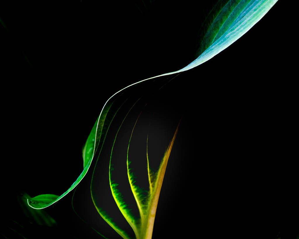
I think you made a good choice converting this to bw. It adds interest. The lighting is perfect on the coiled part of the fiddlehead. The only suggestion would be to consider cropping from the top to just above the second leaf from the top. But, if you want to keep this in a standard ratio, then it is fine as is. |
Aug 4th |
| 30 |
Aug 20 |
Comment |
It's been a couple of years since I tried photographing fireworks. I remember it was great fun. I like this image. Your timing was perfect. I might clone out a couple of the brighter lights lower right and the large white one on the left. Otherwise, very nice.
|
Aug 4th |
| 30 |
Aug 20 |
Reply |
Thank you for the comment, Robert. I can't disagree with you. I think I did over process this, now that I look at it again. |
Aug 4th |
7 comments - 3 replies for Group 30
|
8 comments - 3 replies Total
|