|
| Group |
Round |
C/R |
Comment |
Date |
Image |
| 30 |
Jun 20 |
Comment |
I just noticed a small thing while re-looking at your image. I think the horizon line needs to be straightened a trifle.
|
Jun 11th |
| 30 |
Jun 20 |
Reply |
Thanks for including your description. ..... just be careful on that ladder!!!!!
|
Jun 11th |
| 30 |
Jun 20 |
Reply |
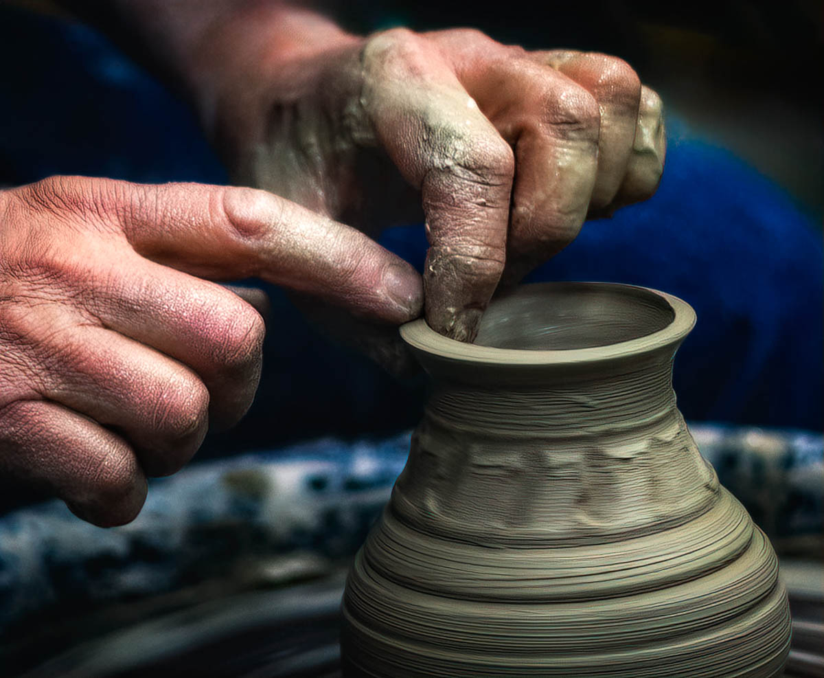
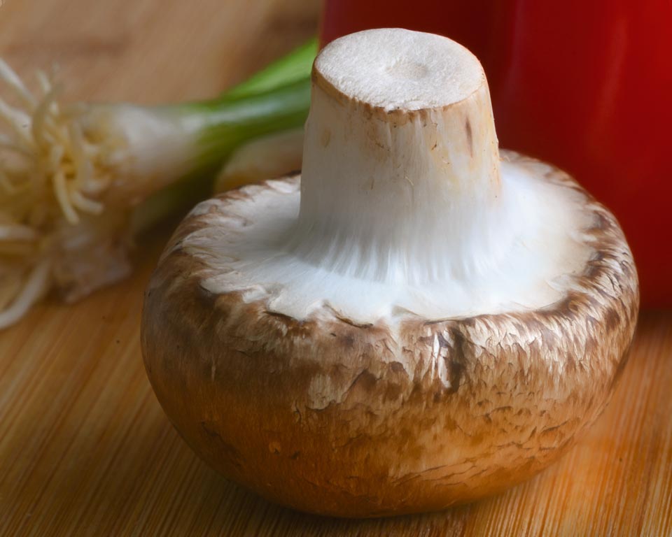
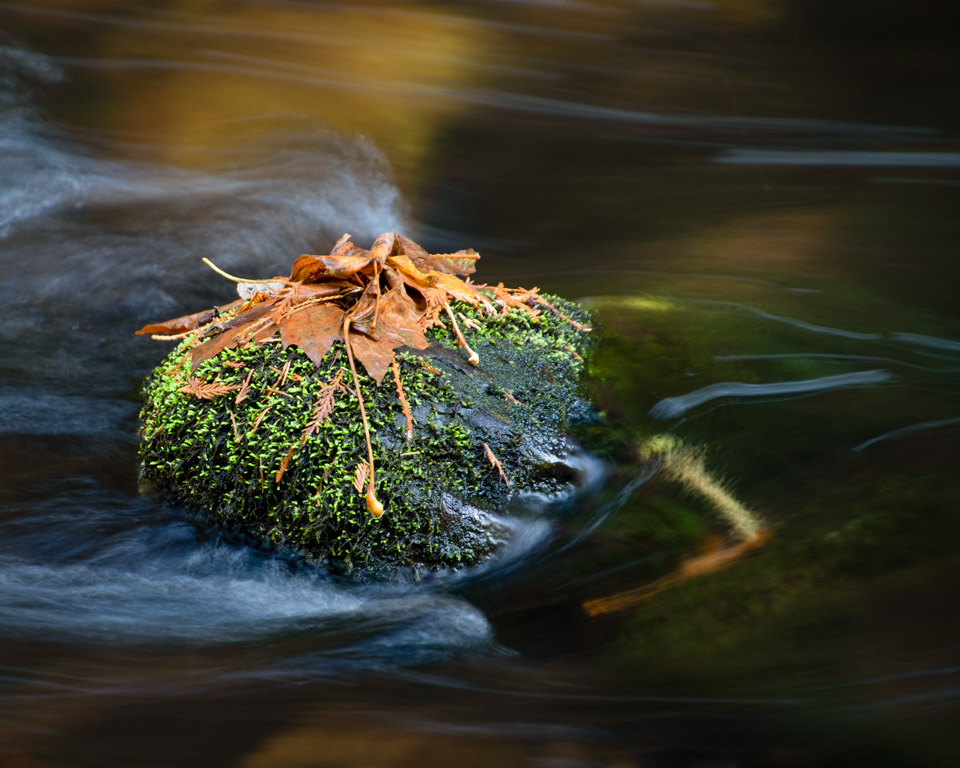
Thank you Tom. I took this indoors using window light, but I think I also added a little bit of light from a small Lume cube. |
Jun 11th |
| 30 |
Jun 20 |
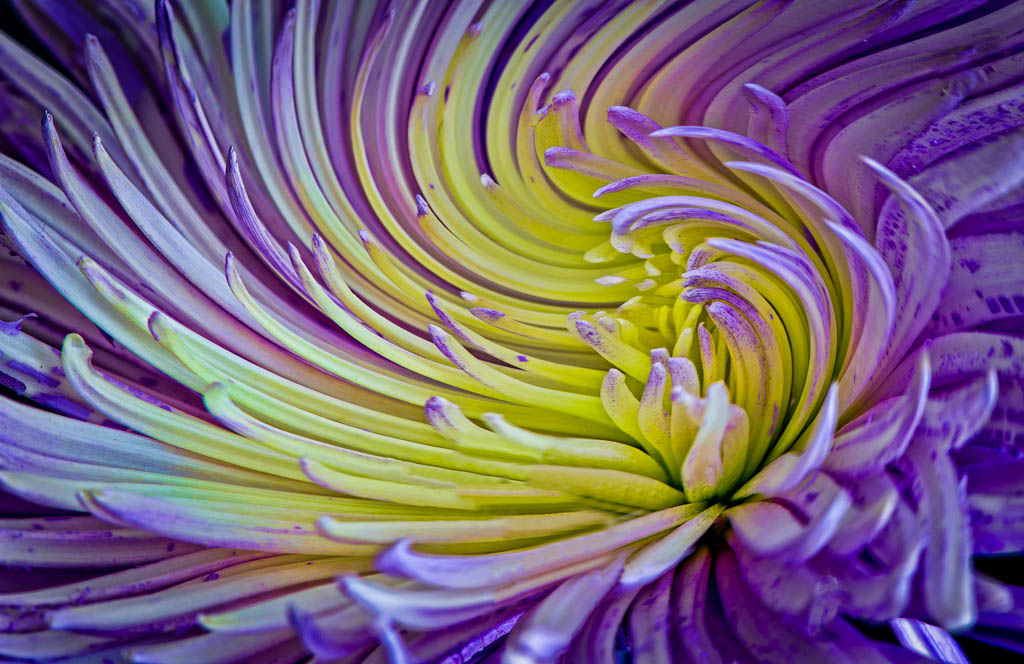
Reply |
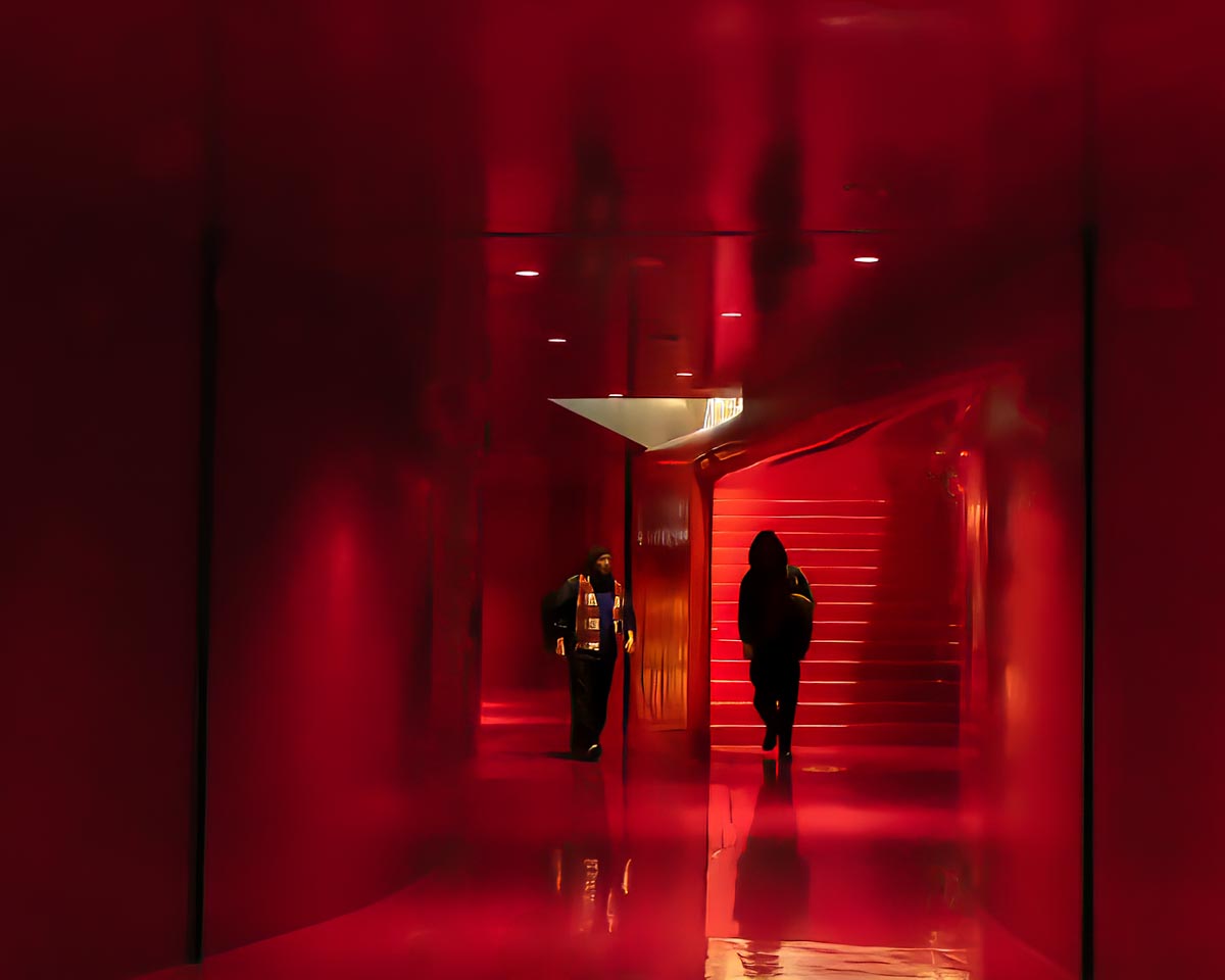
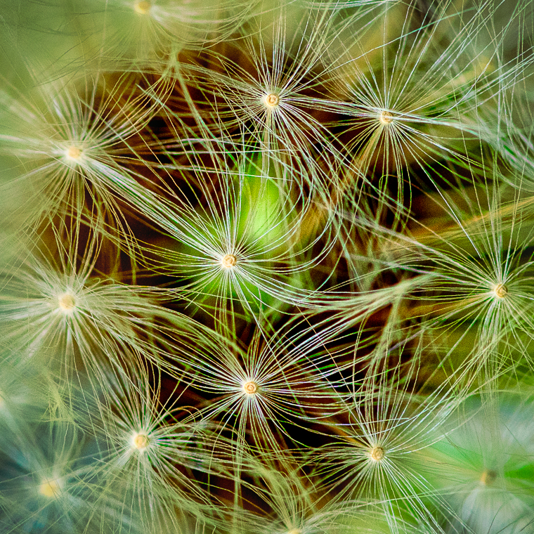
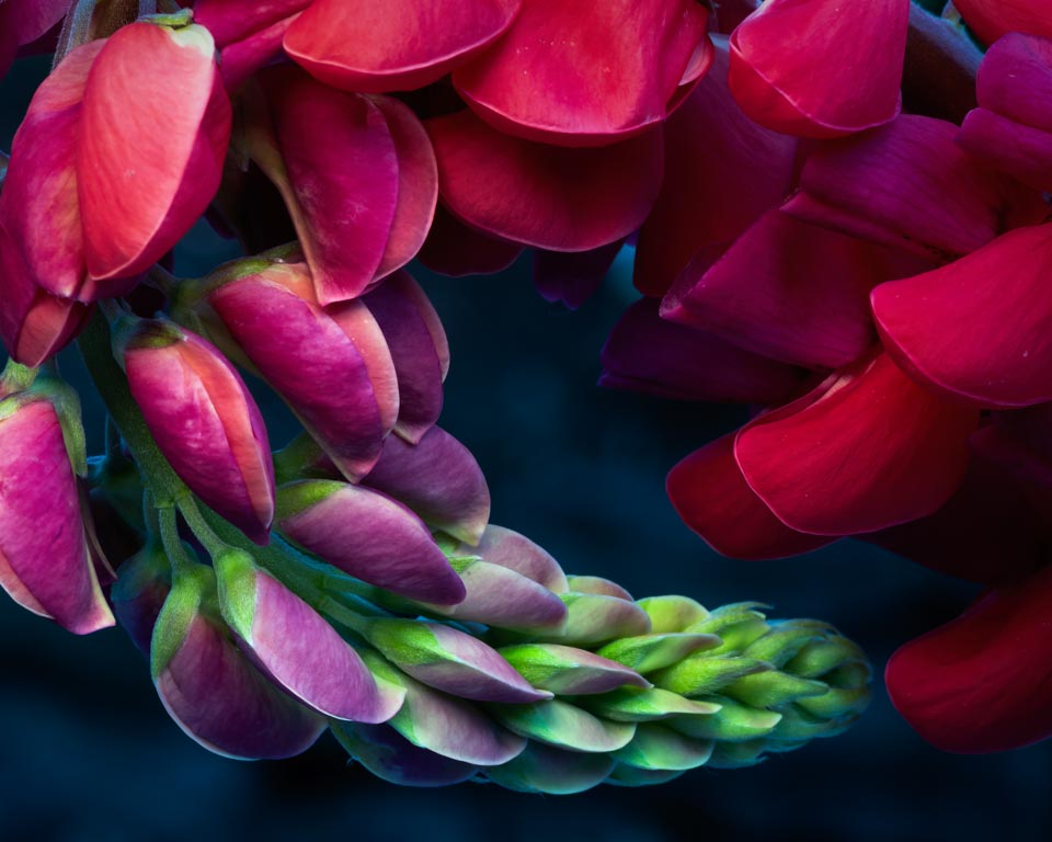
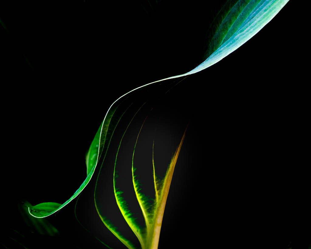
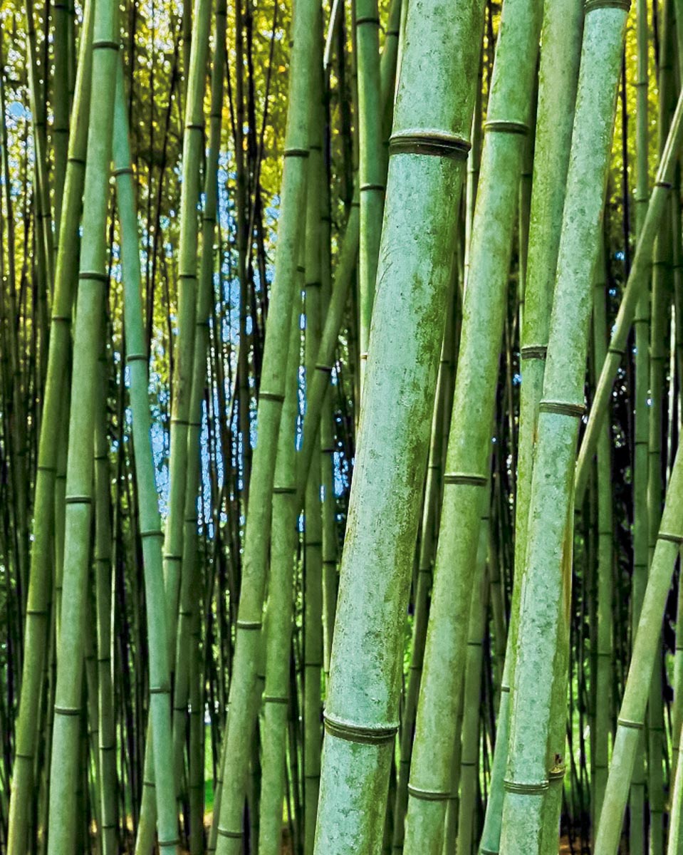
The intent was to photograph the patterns and colors rather than an identifiable subject. We've watched various photography instructors and I think Blake is the most knowledgeable and has the best instructional technique of any for photoprocessing.
|
Jun 5th |
| 30 |
Jun 20 |
Comment |
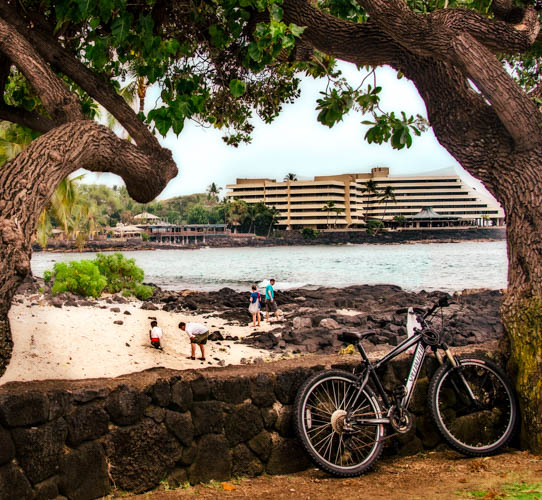
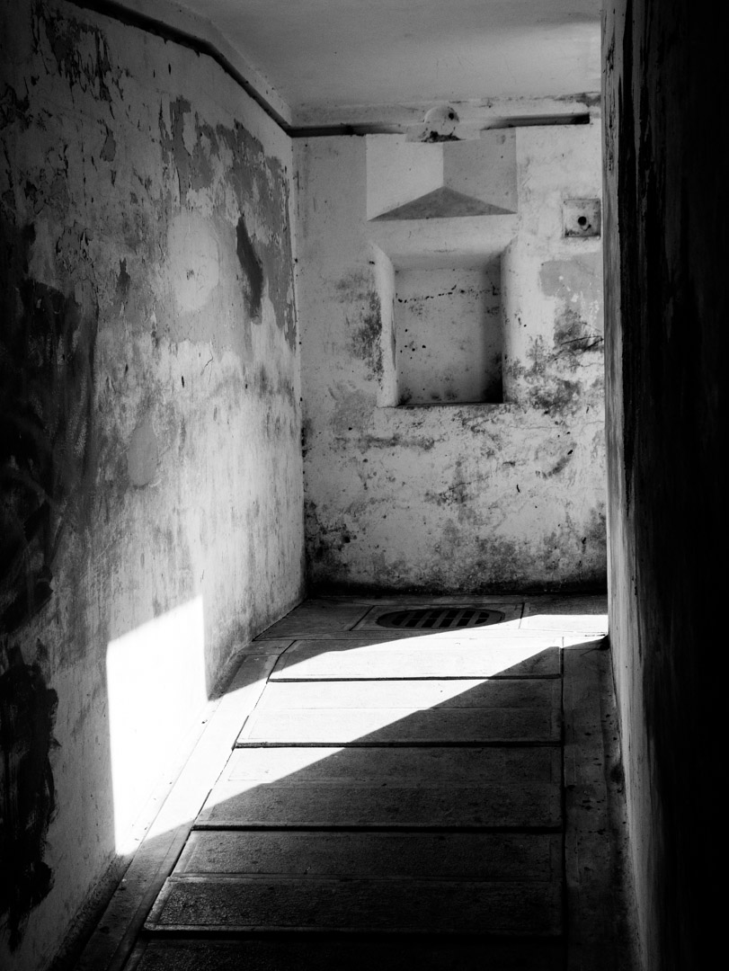
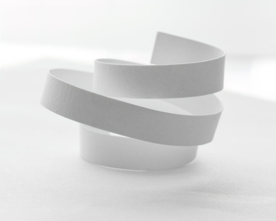
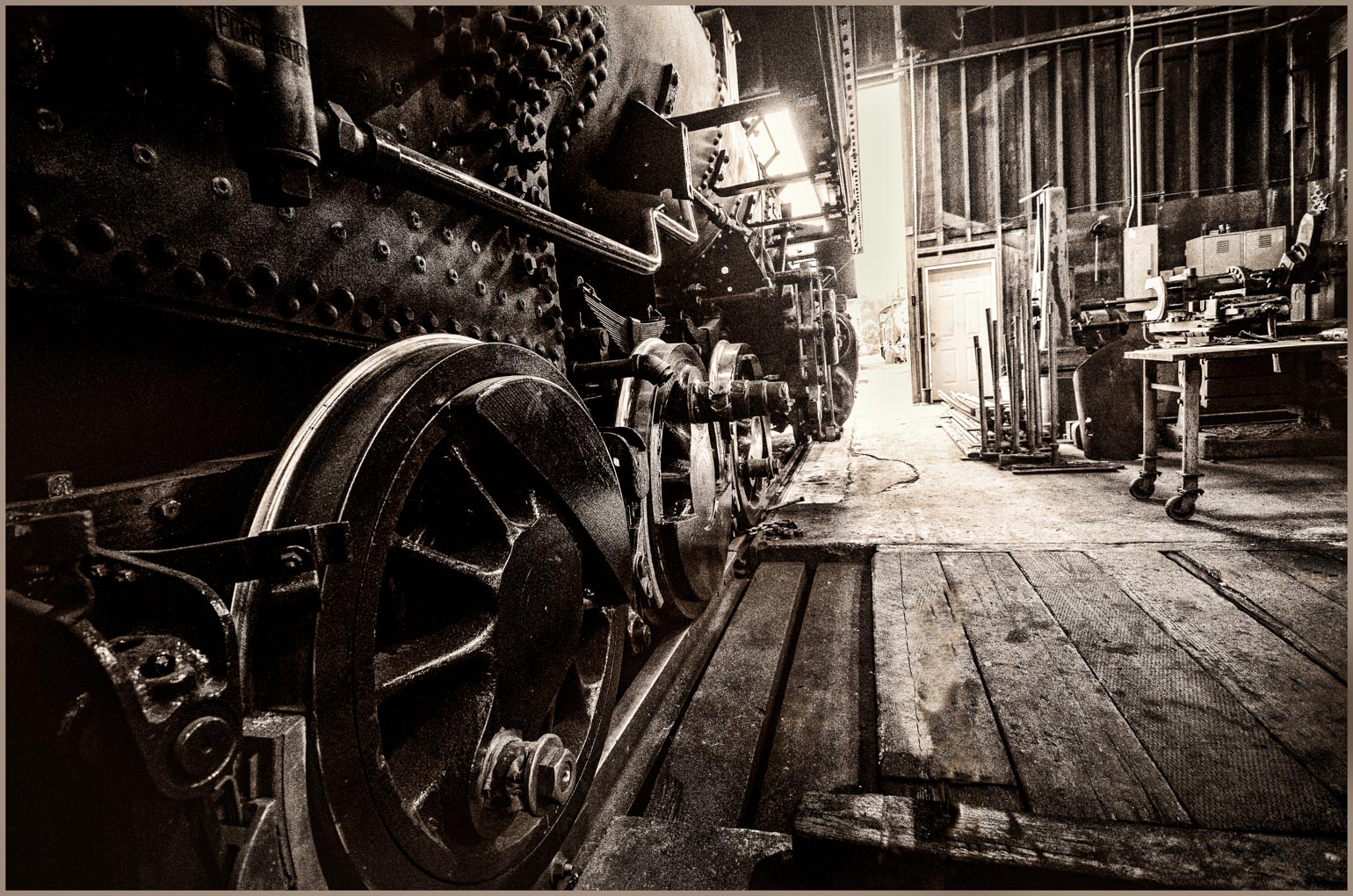
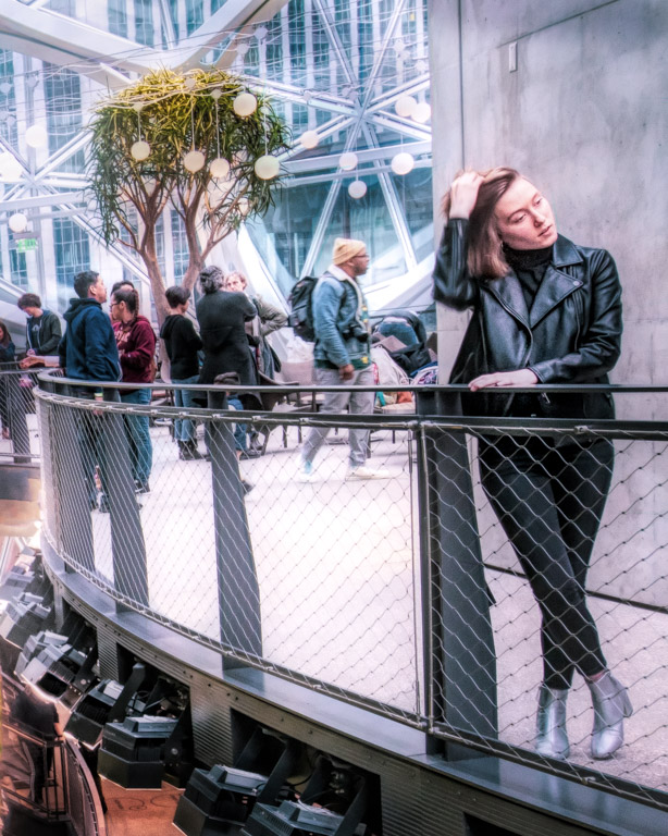
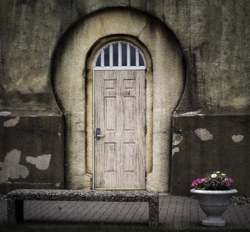
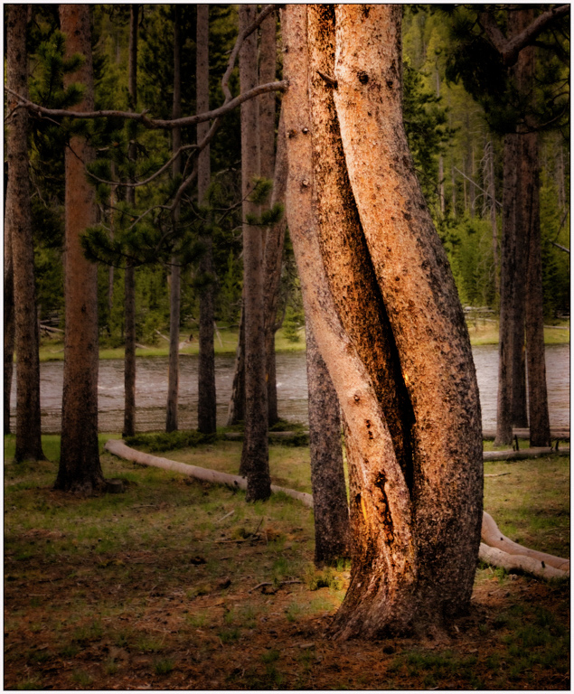
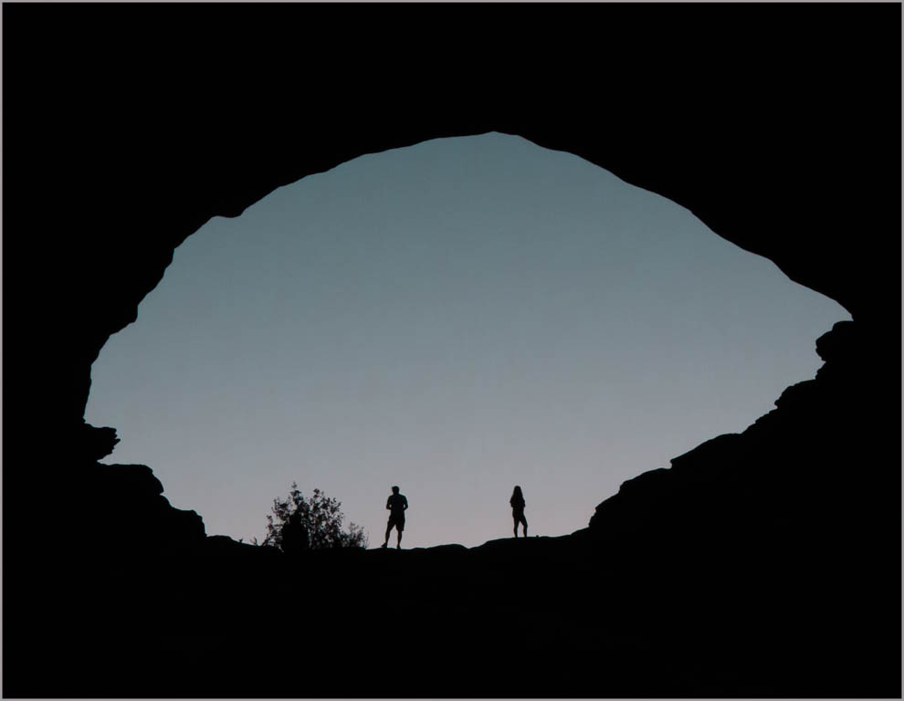
The "rule" as I understand it: don't take photos of other peoples artwork and call it yours. UNLESS you take it from a unique perspective, show only a portion, have a person walking in front of it, that sort of thing. Something that you add or detract from the original work to make it your own. I think you are fine here, especially since from your viewpoint we can peak through and see the other sculpture at the far end. Very nicely done. Love the texture.
|
Jun 4th |
| 30 |
Jun 20 |
Comment |
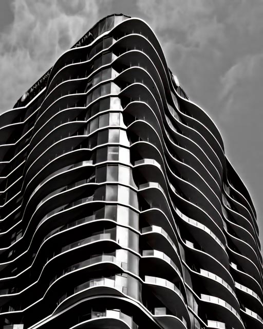
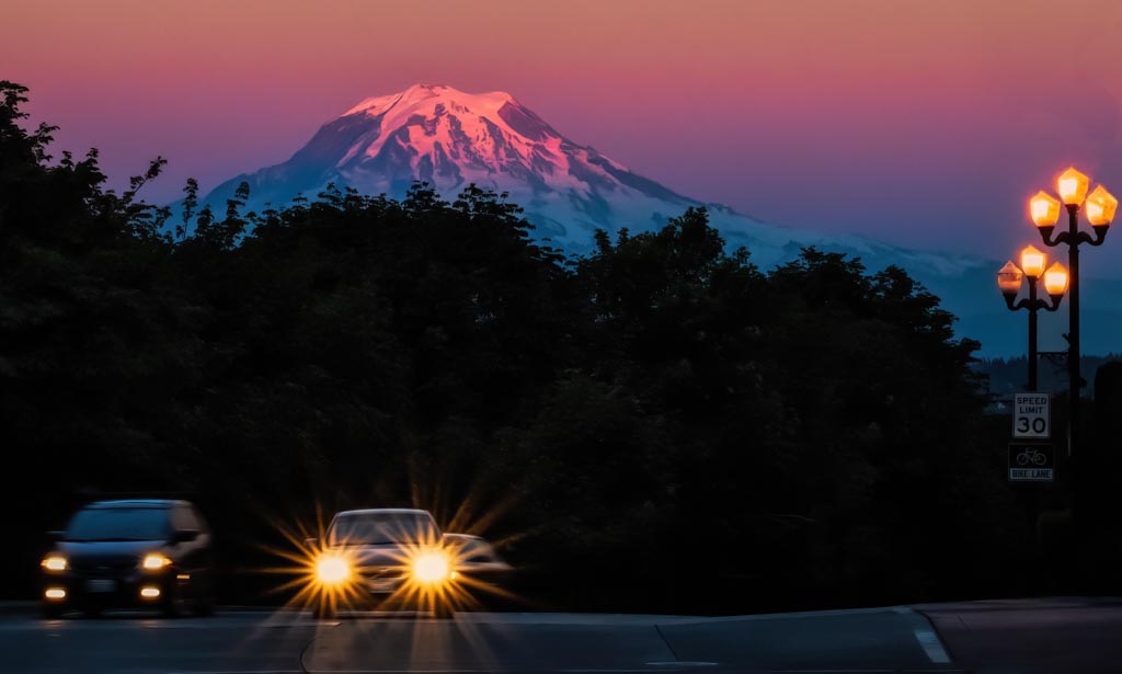
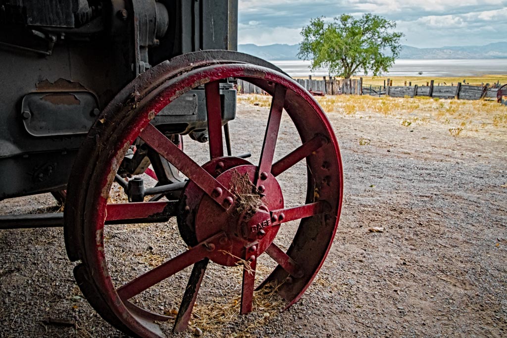
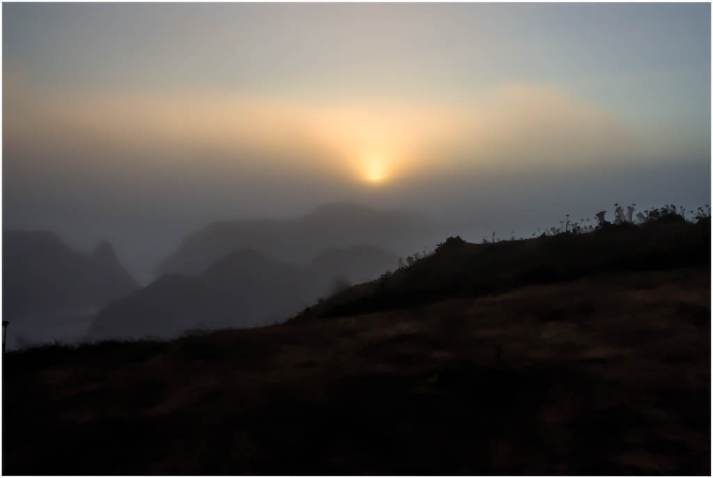
I would crop but without the sunburst. Sometimes less is just better and I think that is the case here. |
Jun 4th |
 |
| 30 |
Jun 20 |
Comment |
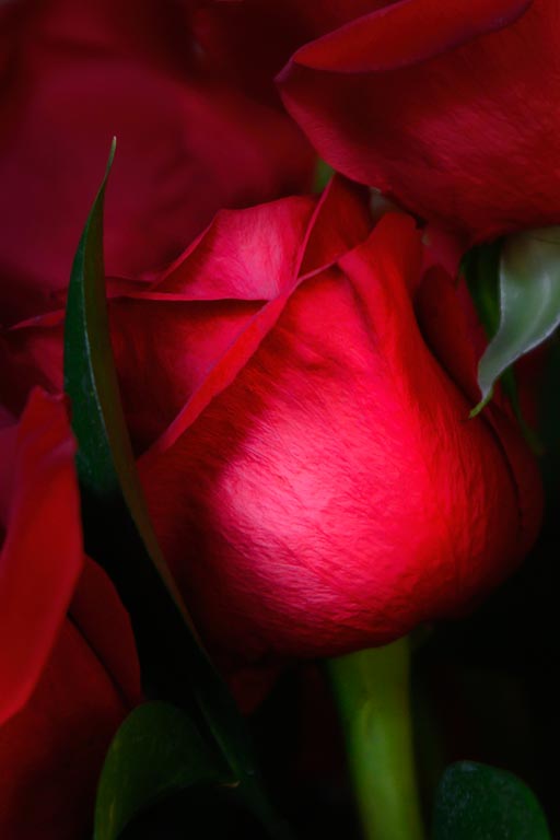
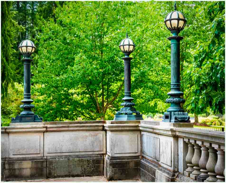
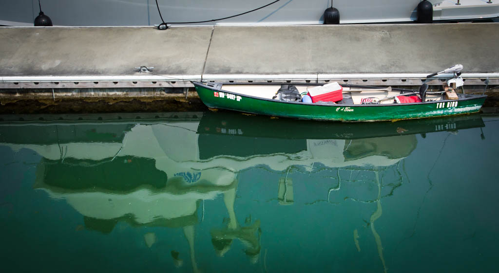
Very nicely done. You have enough reflection without any annoyances. My only nitpick would be to have included just a hair more at the base where the ornament joins the car. Definitely print it! |
Jun 4th |
| 30 |
Jun 20 |
Comment |
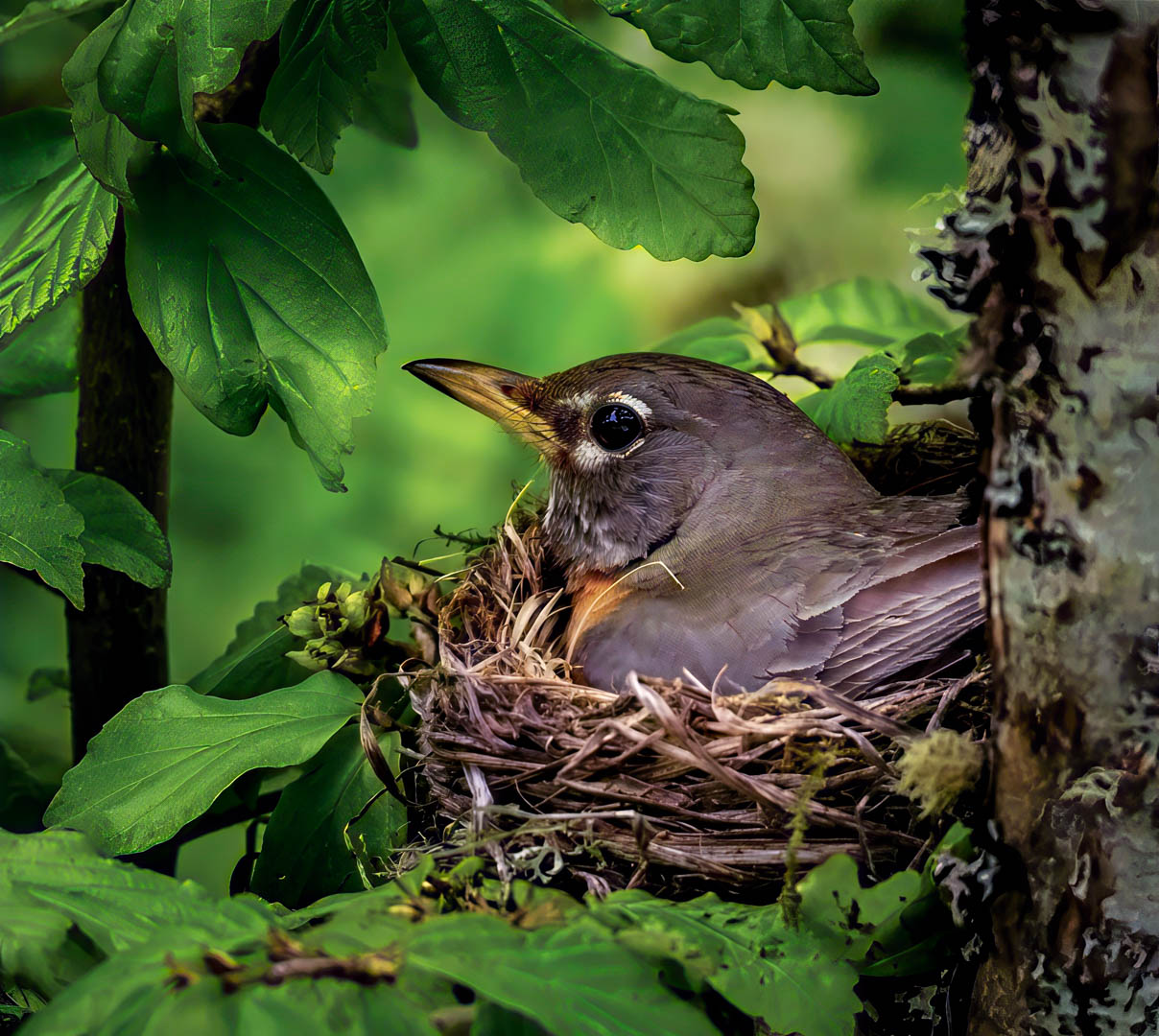
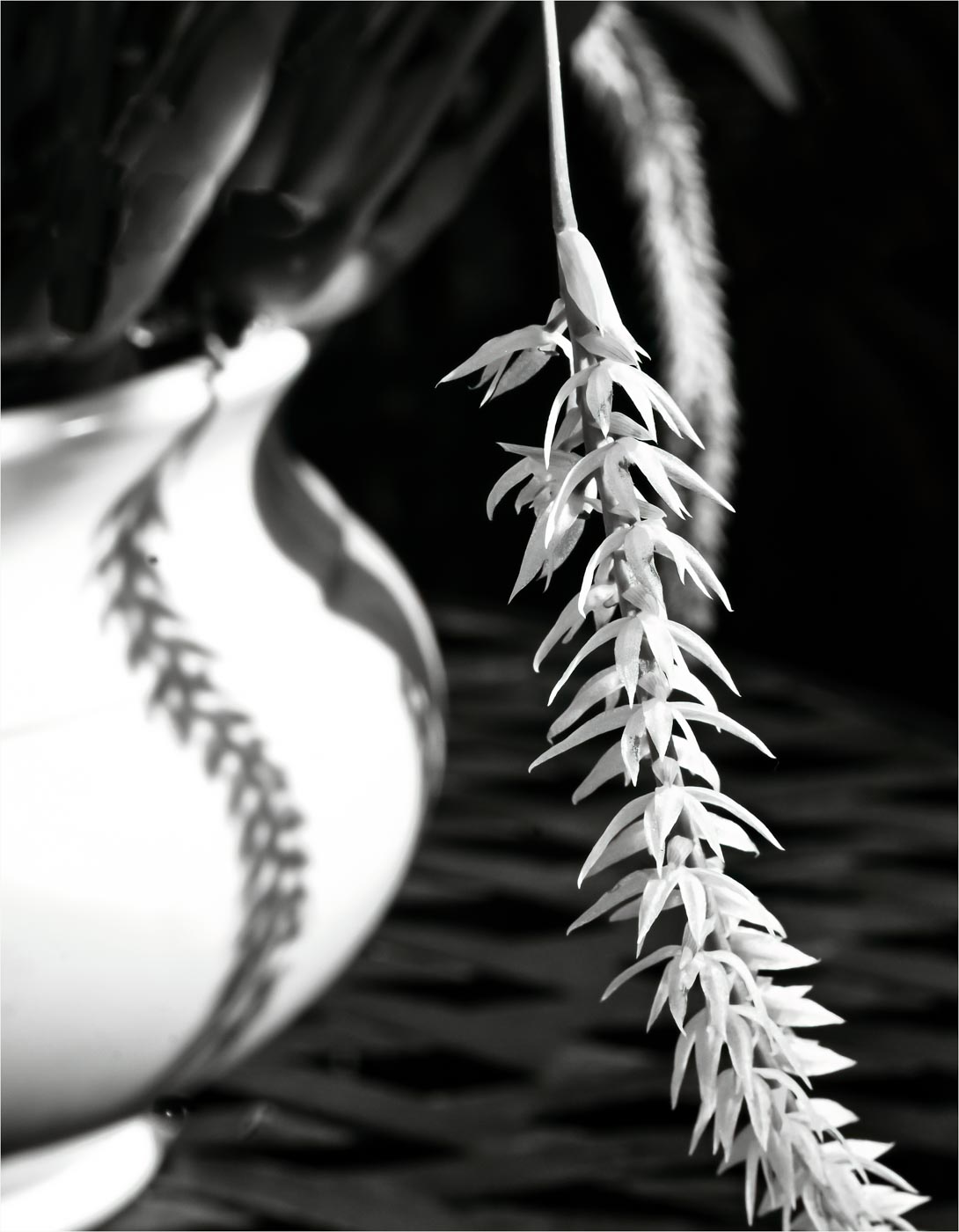
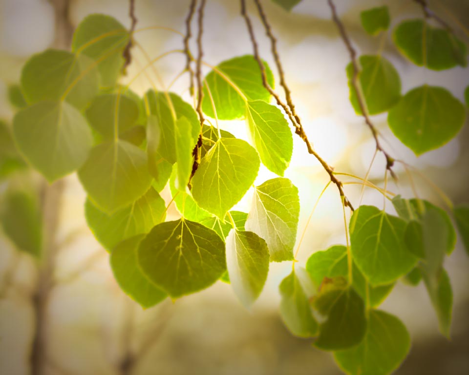
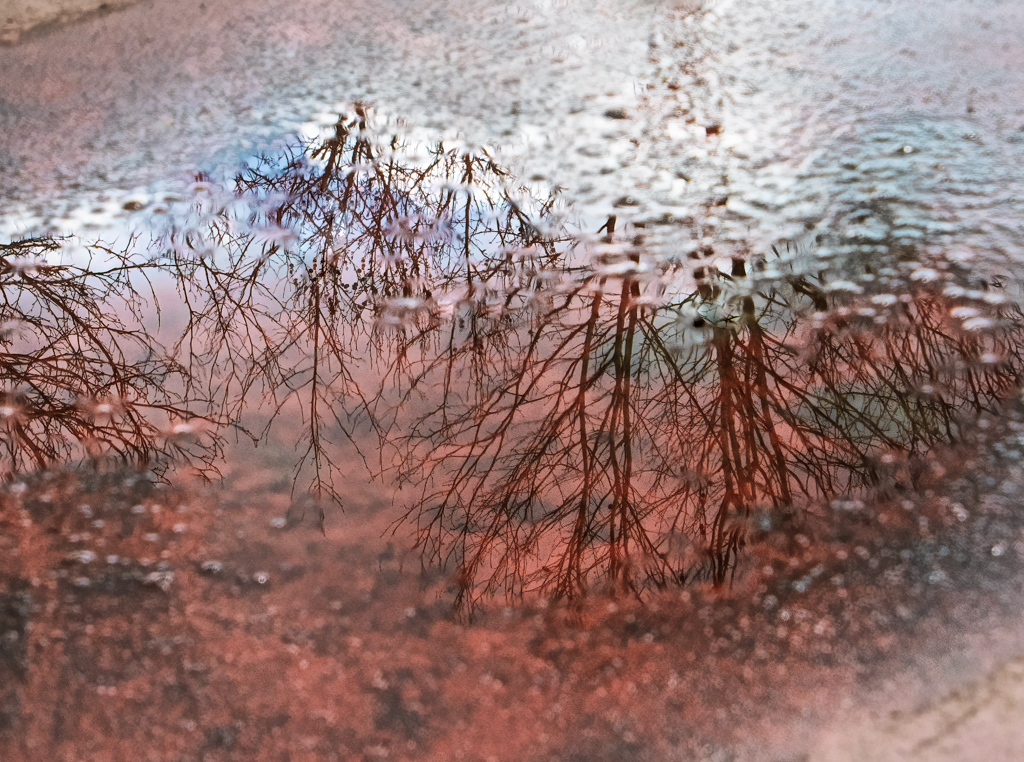
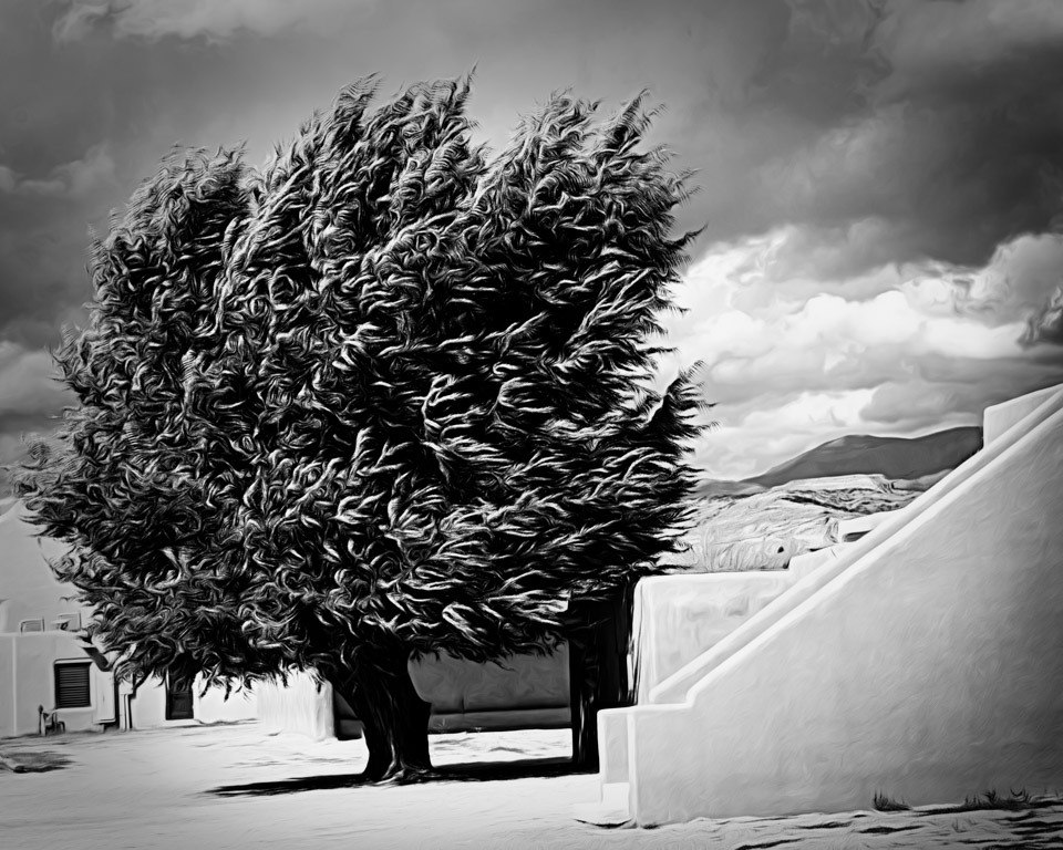
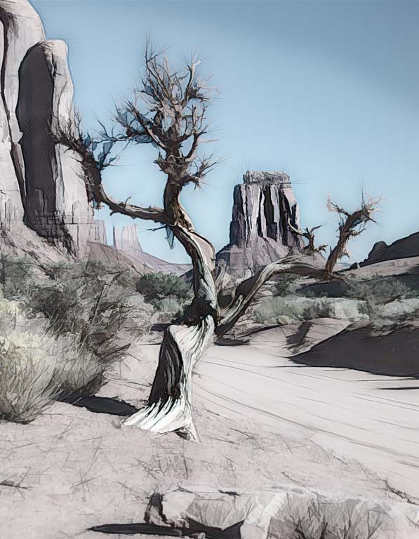
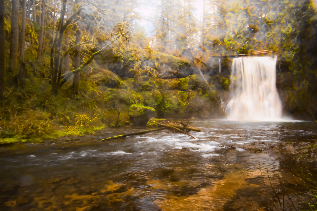
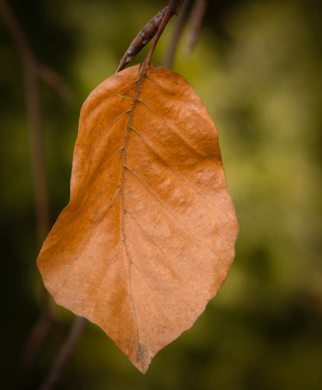
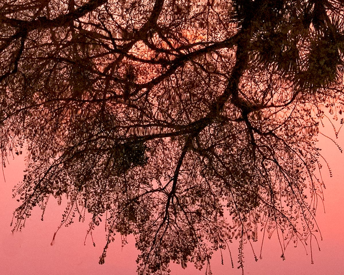
I like this very much. Since it doesn't have the original tree to reflect, why not crop it closer and make it more of an abstract filigree pattern? In my example I also removed part of a blurry branch bottom left. |
Jun 4th |
 |
| 30 |
Jun 20 |
Comment |
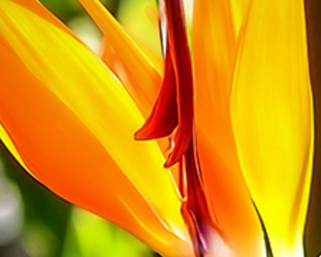
Second version |
Jun 4th |
 |
| 30 |
Jun 20 |
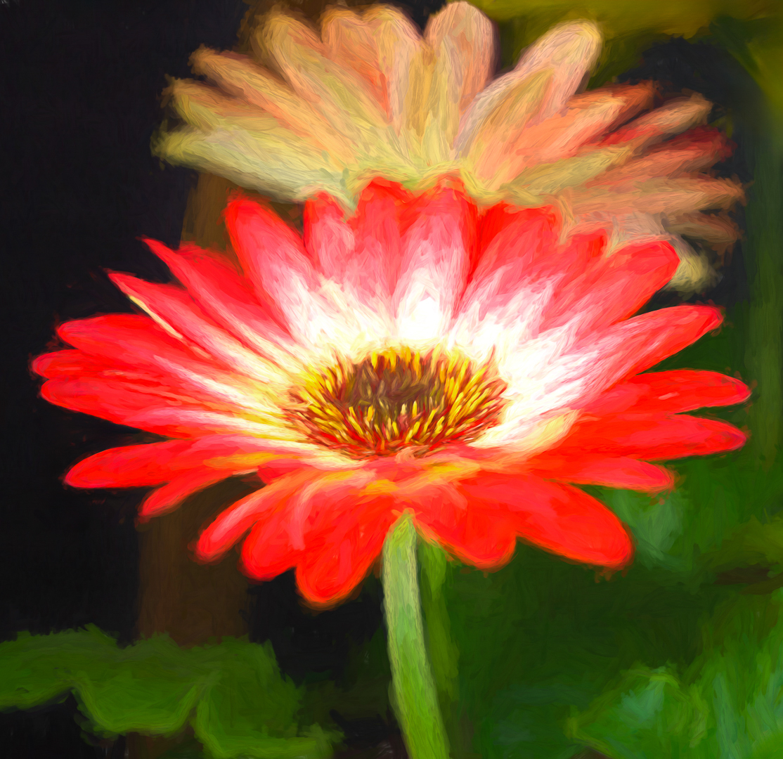
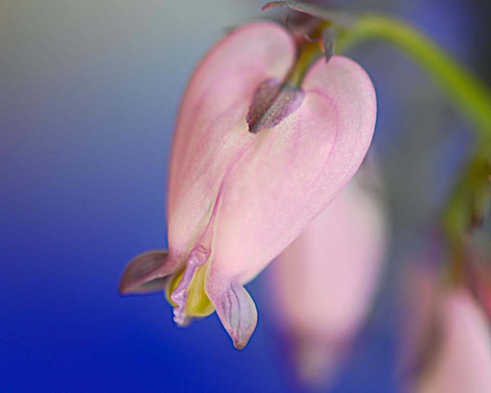
Comment |
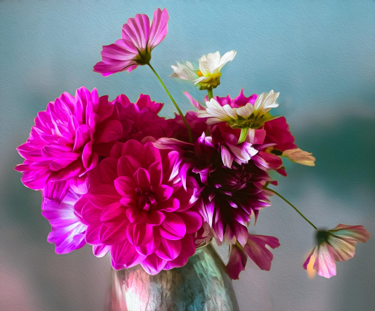
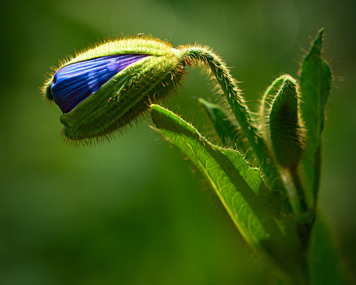
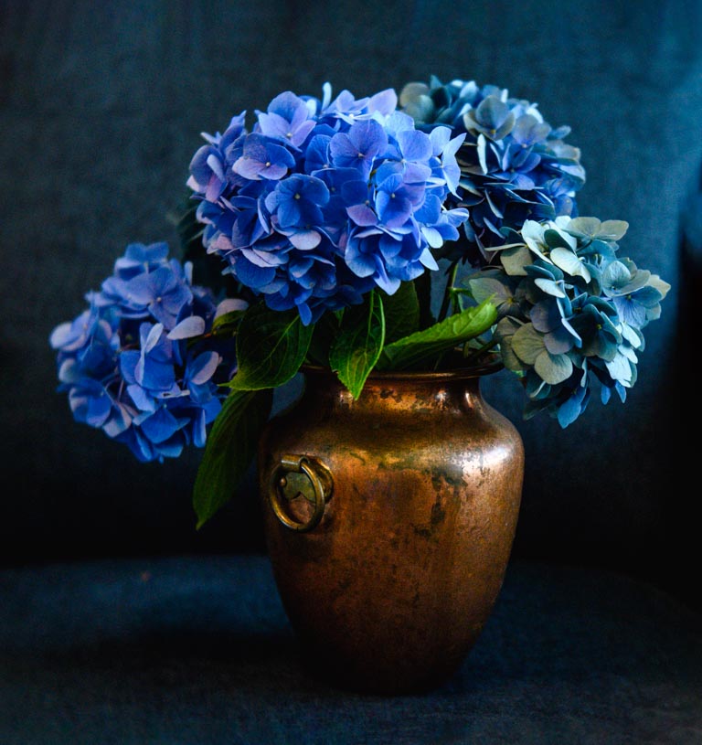
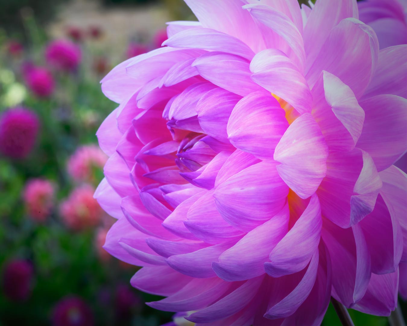
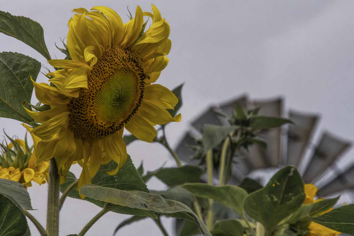
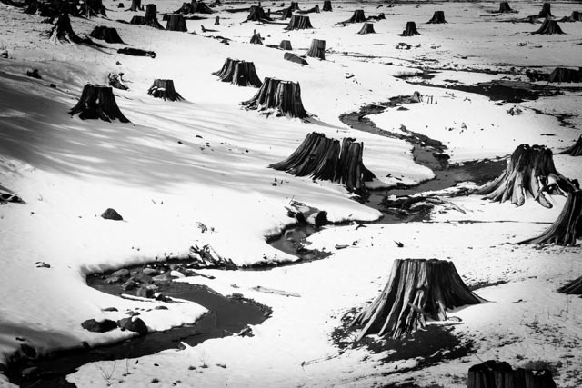
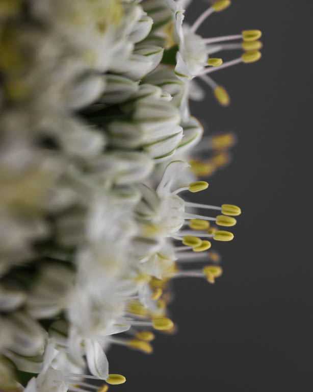
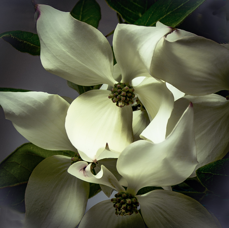
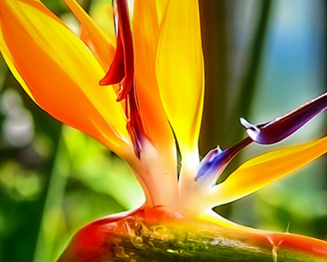
I agree the background needs to be de emphasized by reducing the saturation and/or blurring. I wonder if it might have been better to take a portion of the flower rather than the entire flower for a more abstract look. Just a couple of suggestions. My versions are pixelated because of the size of the original, but you should get the idea.
|
Jun 4th |
 |
| 30 |
Jun 20 |
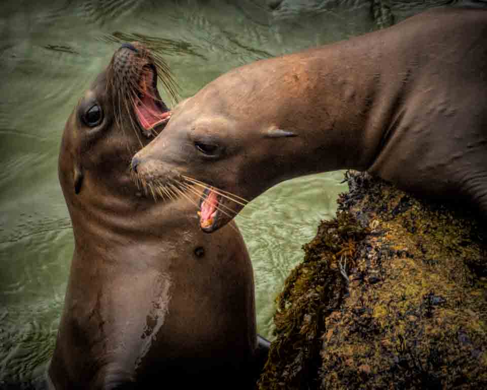
Comment |
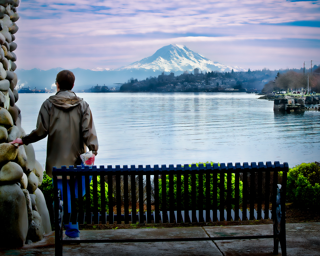
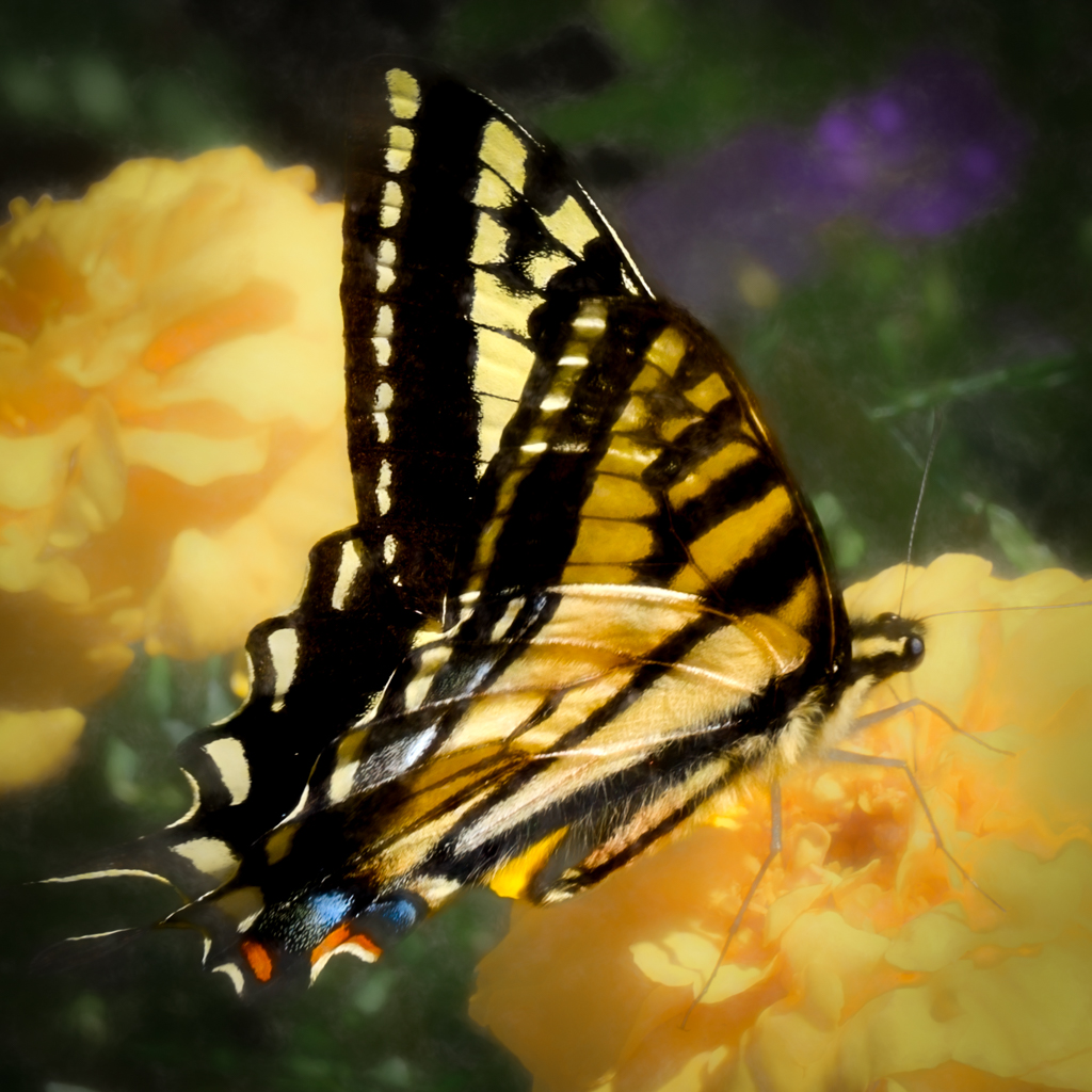
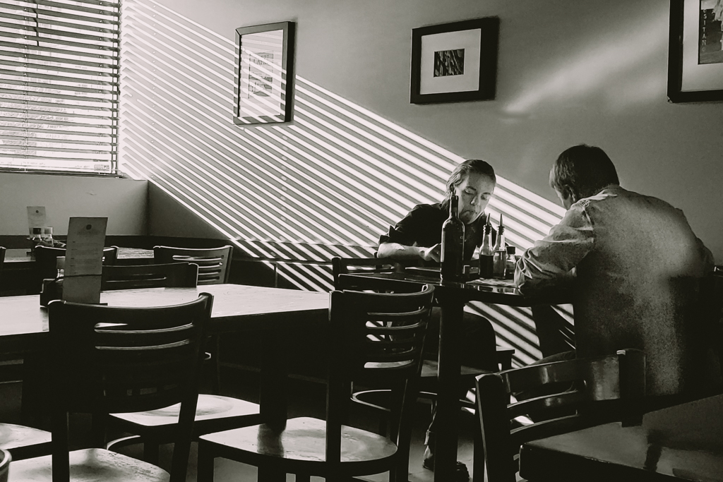
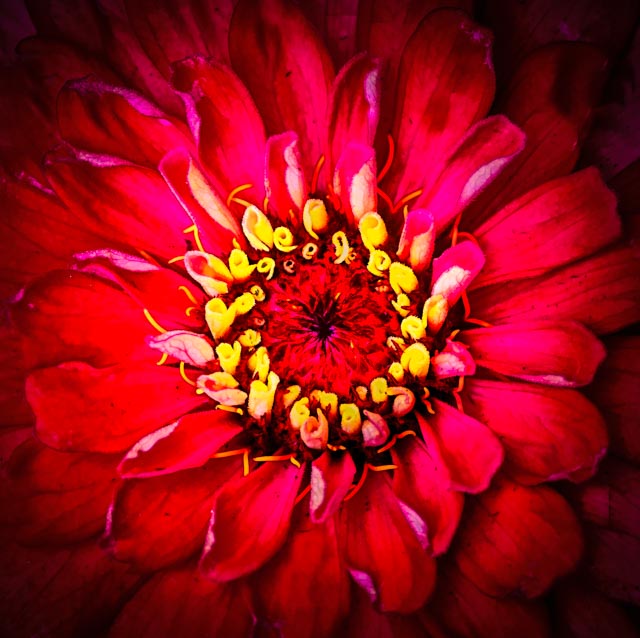
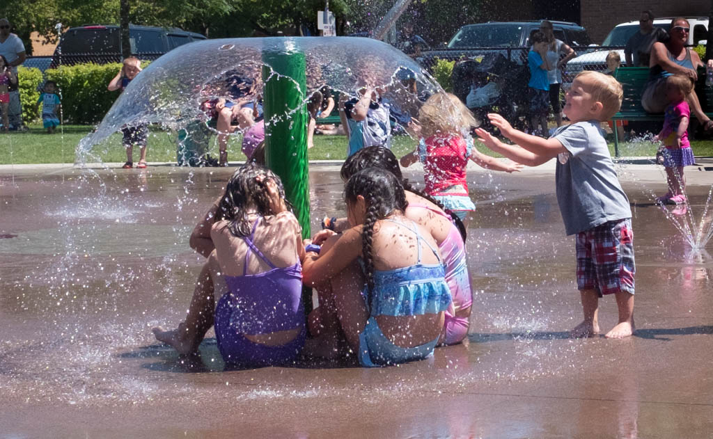
The bee definitely adds interest to this image. The lighting is good. I agree, the image is soft. Did you use a tripod? For an image such as this, I think it is about the only way to get it really sharp. |
Jun 3rd |
| 30 |
Jun 20 |
Reply |
Thank you Judy. I'm with you. I learn a lot of things from photography that have nothing to do with photograph!
|
Jun 3rd |
| 30 |
Jun 20 |
Reply |
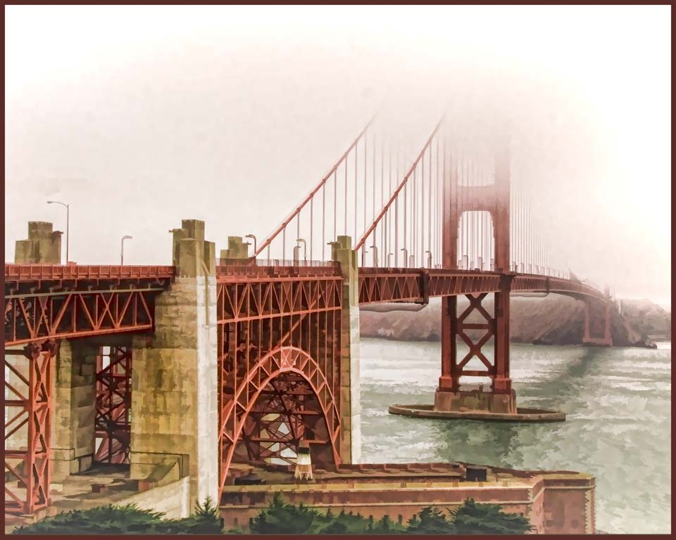
Robert thank you for your comment. As far as Luminar, yes, the substitutions look very good at high resolution. We have some camera club friends who have been using it very successfully. The reason I made adjustments in Luminar (but no substitutions) was because I wanted to experiment with the program, plus it's pretty quick. Just as an aside, my husband, Bob, has a subscription to Blake Rudis' f64. Blake is an outstanding instructor. We've been takinig his PS 30 Day Mastery course together. If anyone is interested in learning PS, I highly recommend this. He starts with total basics and builds from there. |
Jun 3rd |
8 comments - 5 replies for Group 30
|
8 comments - 5 replies Total
|