|
| Group |
Round |
C/R |
Comment |
Date |
Image |
| 15 |
Mar 20 |
Comment |
I did not realize he was swimming until I read your description. I agree, you caught him at a very good moment. The intensity in his eyes, the shadow across his face, make this a very compelling image. You could try to tone down the brightness of the hand, but I'm not sure if that is necessary? Very well done. |
Mar 30th |
1 comment - 0 replies for Group 15
|
| 29 |
Mar 20 |
Comment |
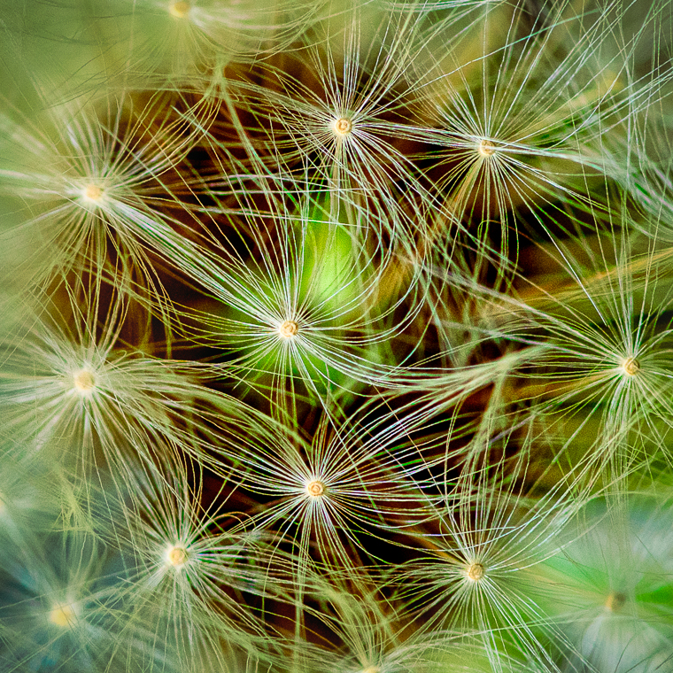
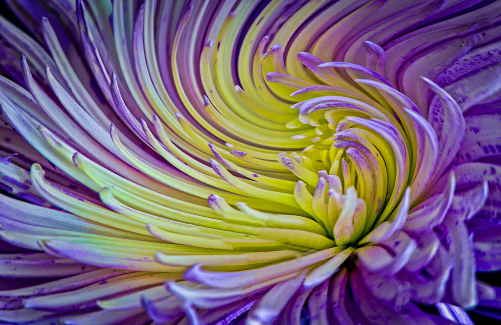
Judy this is an amazing! It reminds me of a kaleidoscope. Very creative on your part. I do like Bob's enhancements as they increase the drama.
|
Mar 16th |
1 comment - 0 replies for Group 29
|
| 30 |
Mar 20 |
Comment |
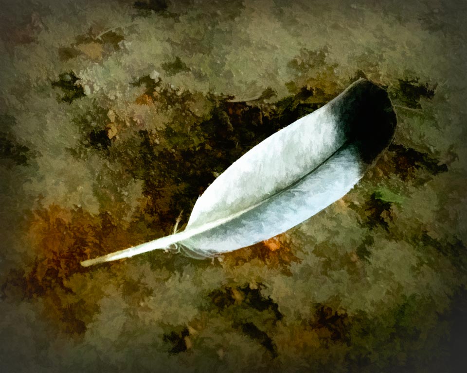
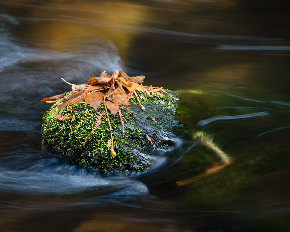
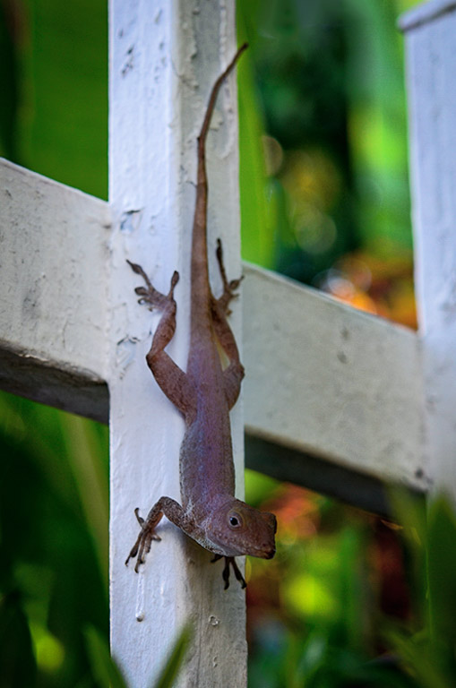
Since you have not processed this, I played with it a bit. Not sure I came up with anything special with my processing, but am including it anyway. He is a cute little guy. Wonder what he is thinking? Your subject gecko is darker than the background which for me is a little problematic. I tried to lighten him but was not totally successful. I think part of it is because he is slightly blurred. And, yes.... I would like to see him in sharper focus. I also cropped a little, removed the light boca near the top, added a very subtle vignette. |
Mar 12th |
 |
| 30 |
Mar 20 |
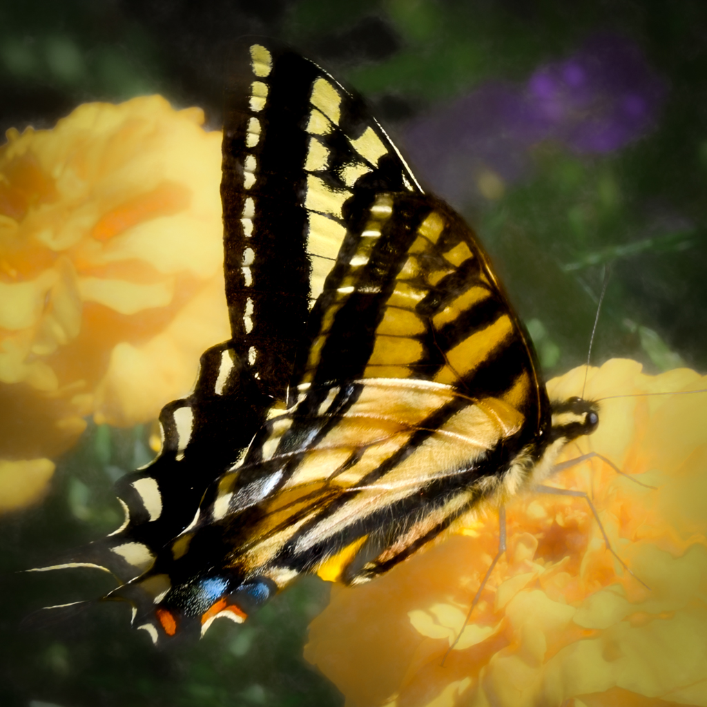
Comment |
Your subject is nicely framed and as mentioned above, the red adds needed color to the composition. I do prefer it with the background blurred. I find it interesting that with this butterfly, it is the background that supplies the color. :-)
|
Mar 12th |
| 30 |
Mar 20 |
Comment |
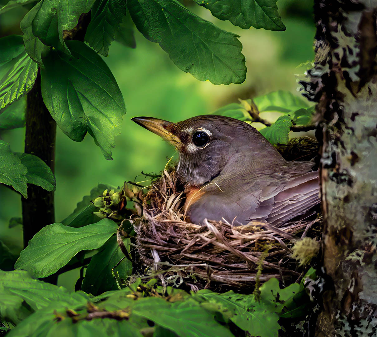
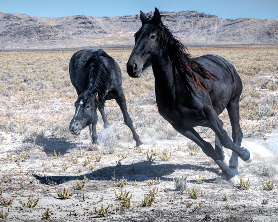
These are such beautiful birds. I love the position of the bird, his tail feathers, etc. in the bush. I agree it is a little lost in the background so I would prefer a closer crop. Also, I wish there was more detail in the feathers. Still, a very good image. |
Mar 11th |
| 30 |
Mar 20 |
Reply |
Thank you Jon. I was especially happy I caught him looking at his target as well.
|
Mar 11th |
| 30 |
Mar 20 |
Comment |
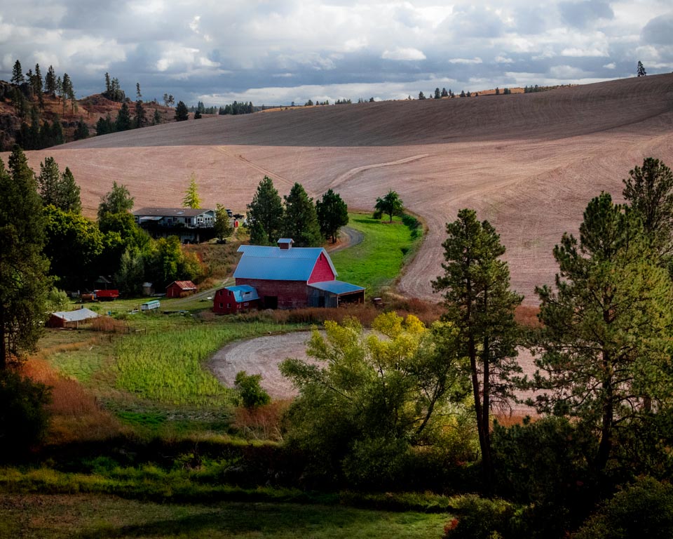
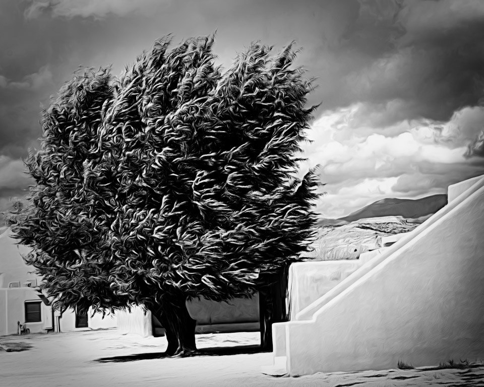
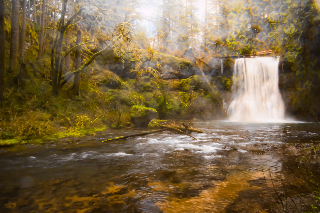
I can see why you wanted to come back. It is a lovely, peaceful scene. I agree with Robert's crop. I believe the image does need a little more "pop" but not quite as much as Robert has presented. But, I usually seem to favor less rather than more when it comes to saturation. There is a stick in front of the bush (lower left) that needs to be cloned out. I don't think it is part of the tree and even if it is, I think it would be better without. |
Mar 6th |
| 30 |
Mar 20 |
Reply |
Thanks. I will fill you in.... it was a fast ball.
|
Mar 2nd |
| 30 |
Mar 20 |
Reply |
The vignette I added was quite minimal....
|
Mar 2nd |
| 30 |
Mar 20 |
Comment |
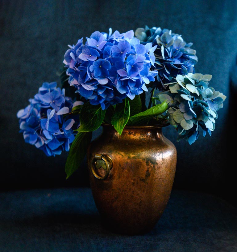
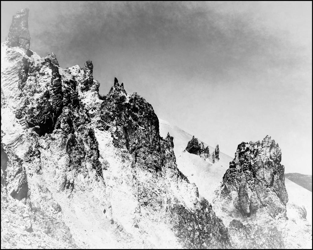
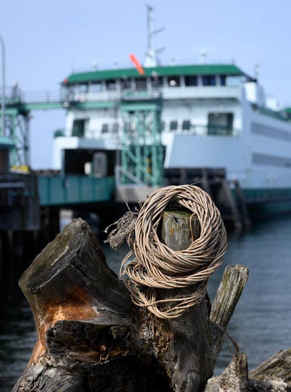
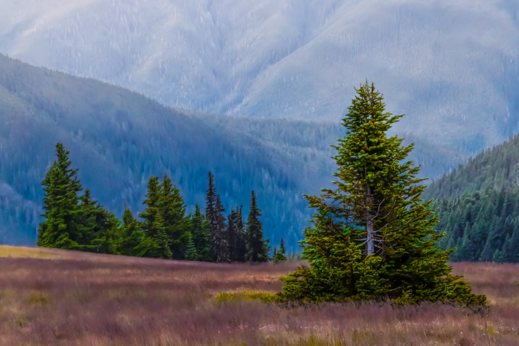
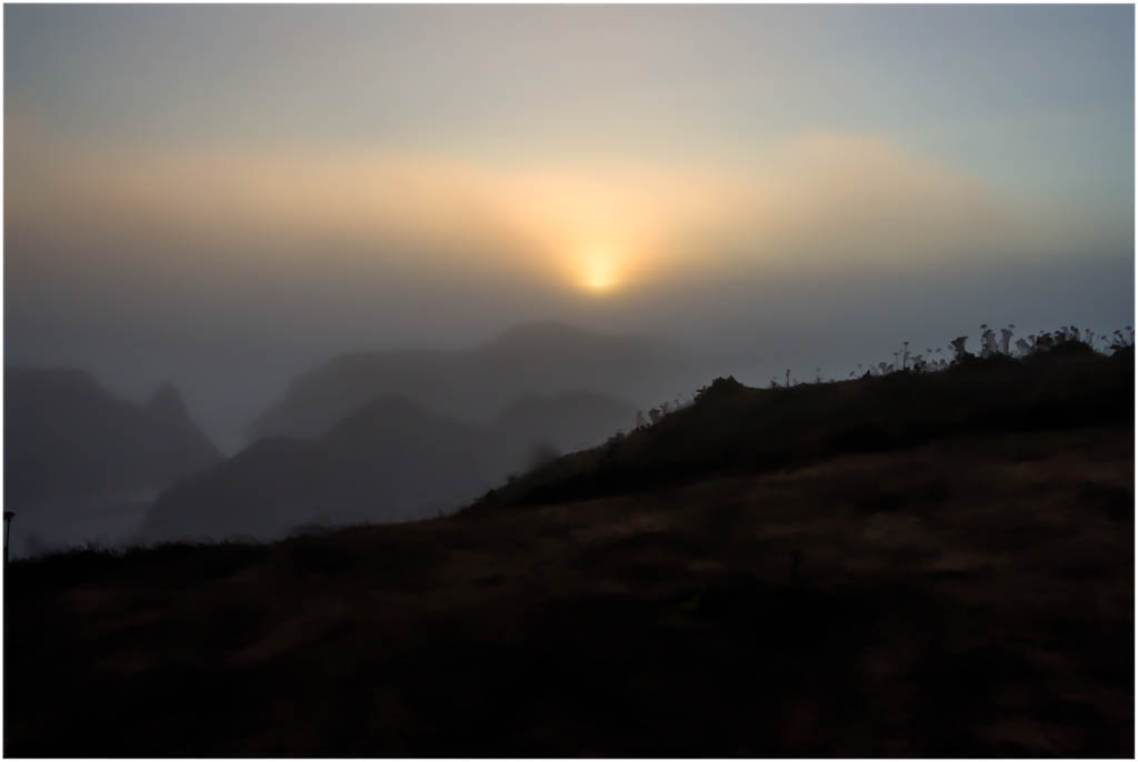
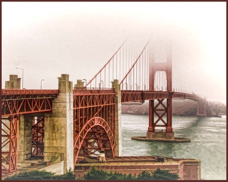
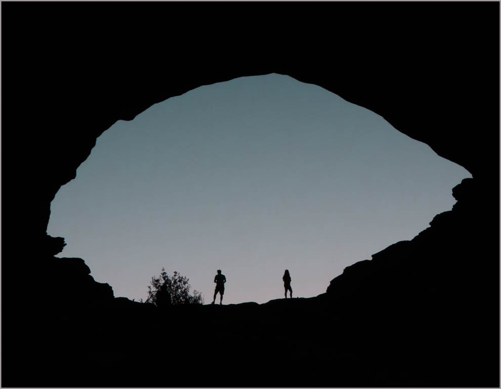
Beautiful scene that I think provides a lot of options. First, I would suggest removing the small wispy clouds on the right edge either by cloning or cropping them out. If you make a large crop, removing the right side of the image just to the right of the foreground tree, you have an image that emphasizes the ski lifts with the sun in the right hand corner. Similarly if you crop from the left, leaving the sun in the left hand corner, you have an images that emphasizes nature. I'm not sure I really like the sky color in the original, so I tried a variety of color tones, including bw. I would recommend exploring that possibility. |
Mar 2nd |
| 30 |
Mar 20 |
Comment |
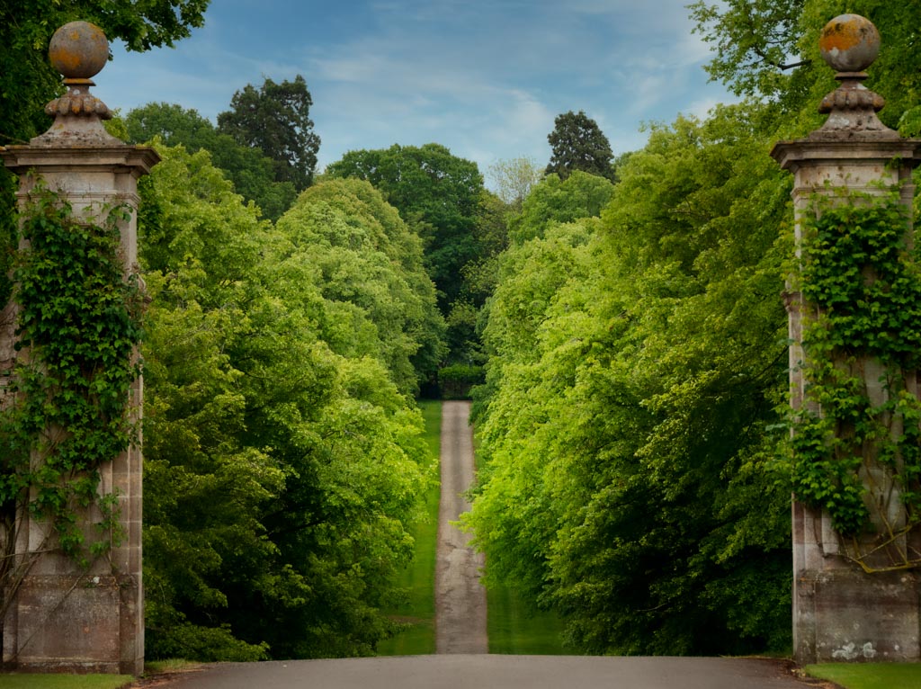
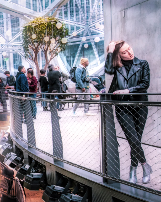
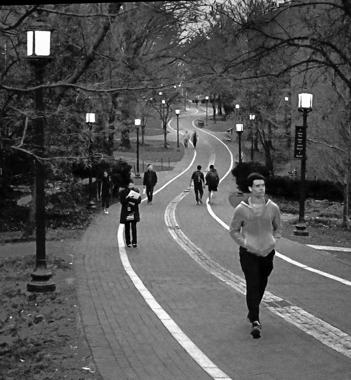
You have a real winner with this one. It's obvious from your description and from the image itself that you did a lot of preliminary planning. The curving path, accentuated by the painted stripes is pleasing to the eye. Yes, having the lights on is another bonus. I don't think I would like it nearly as well without them. The student groupings ... perfection! As is, it is a wonderful image and tells a story. I have a couple suggestions, just from my perspective. I would recommend darkening the sky slightly by lowering the exposure there. As is, it competes with the destination, the far end of the pathway. I used a radial blur to ever so slightly lighten the distant end of the path to draw our attention there. I changed the bw to a warmer tone (just my personal preference) and added a vignette (-9 on the LR slider). Just ideas. |
Mar 2nd |
 |
6 comments - 3 replies for Group 30
|
| 84 |
Mar 20 |
Comment |
Peter, this is a lovely, creative video. I especially liked the dissolves between scenes. The music sets the perfect mood. Well done!
|
Mar 18th |
1 comment - 0 replies for Group 84
|
9 comments - 3 replies Total
|