|
| Group |
Round |
C/R |
Comment |
Date |
Image |
| 2 |
Jul 19 |
Comment |
Visiting from group 30. Hung, you have definitely captured and relayed the emotions you felt when you heard this lady play. Beautifully done. Thank you for sharing it. |
Jul 7th |
1 comment - 0 replies for Group 2
|
| 30 |
Jul 19 |
Comment |
Beautiful background blur. The colors are very warm and appealing. I would crop half the distance between the dragonfly and the top of the image. This will eliminate the light area at the top and bring our attention closer to the subject. |
Jul 13th |
| 30 |
Jul 19 |
Comment |
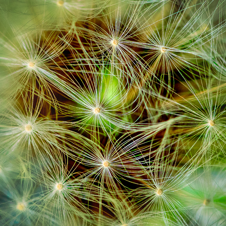
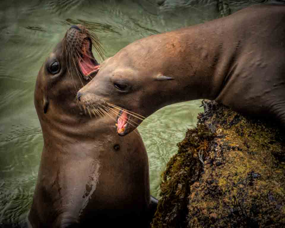
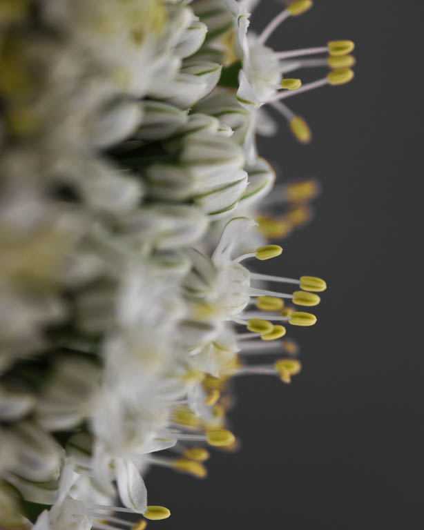
This group has such a richness of information that I always enjoy. I enjoyed reading your description of how this flower and the bees work together in pollen collection. I understand why you wanted to include both bees to tell this story. Unfortunately for me, both bees are too dark and out of focus from a visual stand point. But sometimes we get what we get, especially in the world of nature. My suggestions for this image would be to patrol the image for light spots and remove those. Then I would remove some of the brown spots on the flower.... not all, maybe the 2 spots in the upper left, some of the center spots.
|
Jul 13th |
| 30 |
Jul 19 |
Reply |
Robert your image as presented is very nice. I also appreciate your explanation of why you prefer that. It's interesting, because I was just re-reviewing Judy's image. IN her case I prefer the background story, in yours I prefer less background. No hard and fast rules here and the photographer always has the final say.
|
Jul 13th |
| 30 |
Jul 19 |
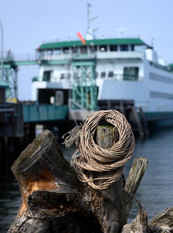
Comment |
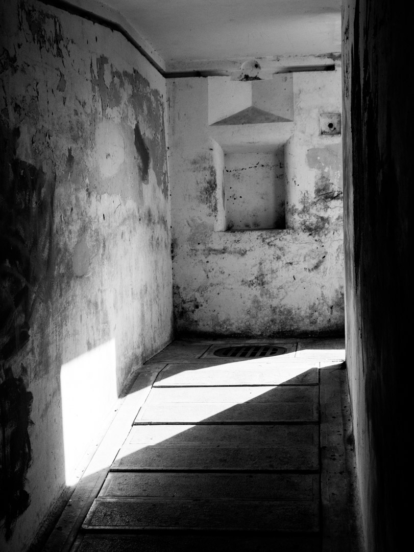
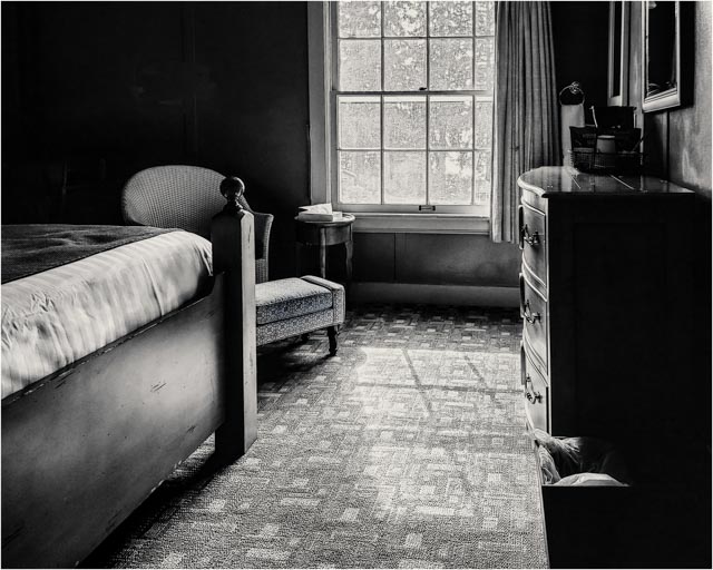
Looking at this (and other comments) again: I still think the background is an important part of this image. Here's a suggestion: crop the top to just below the shelf of cans. Then SLIGHTLY desaturate and/or darken the background. I would not eliminate it as Leonid has done, just lessen the impact. I believe that having some background in this instance, enhances the image. |
Jul 13th |
| 30 |
Jul 19 |
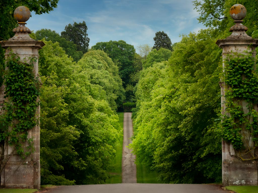
Comment |
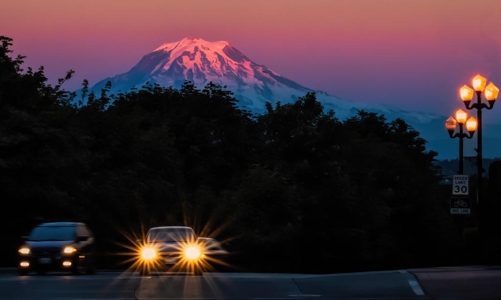
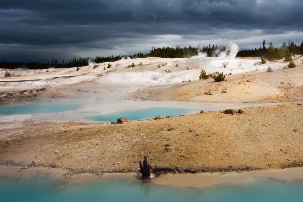
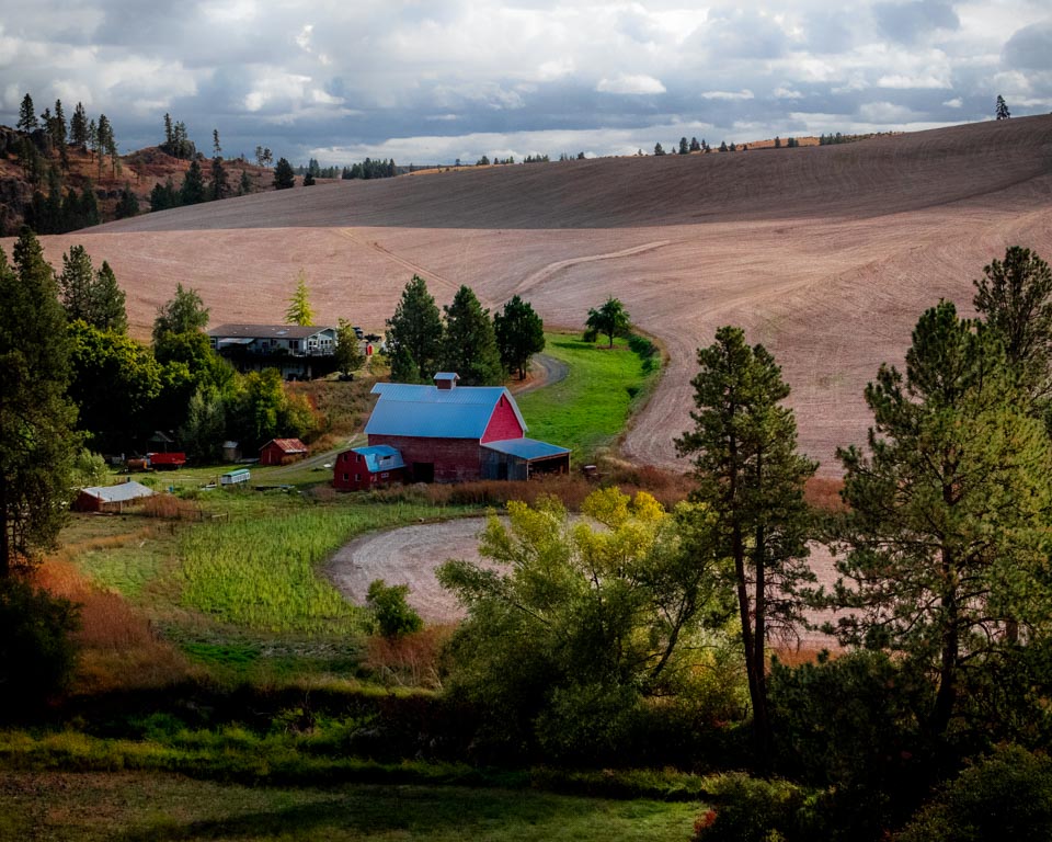
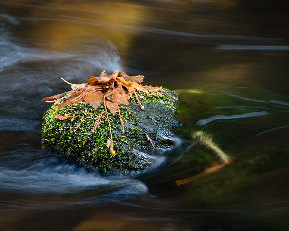
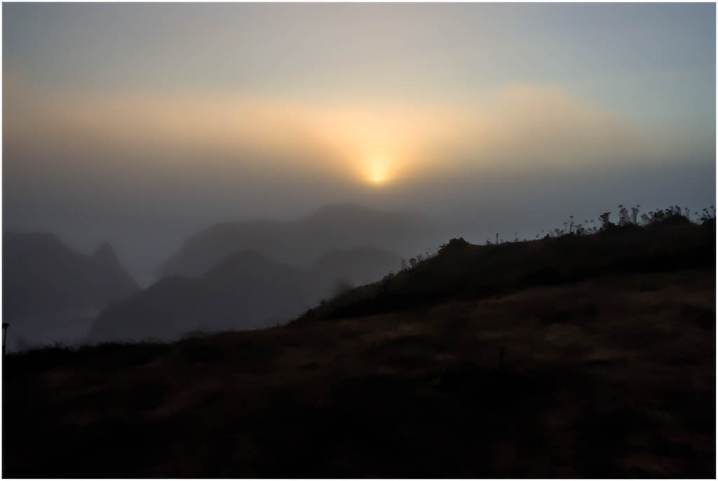
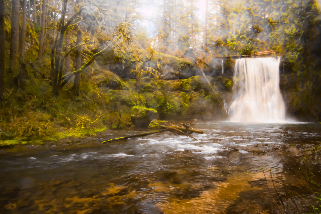
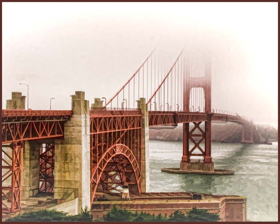
It looks like a beautiful drive. I'm glad you took the opportunity to stop and photograph it. The sun rays of course add to the view. Keeping the same crop ratio, I did crop in to eliminate the bright upper left corner and the haze on the right upper corner. |
Jul 1st |
 |
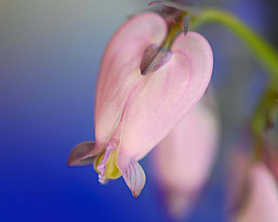
| 30 |
Jul 19 |
Comment |
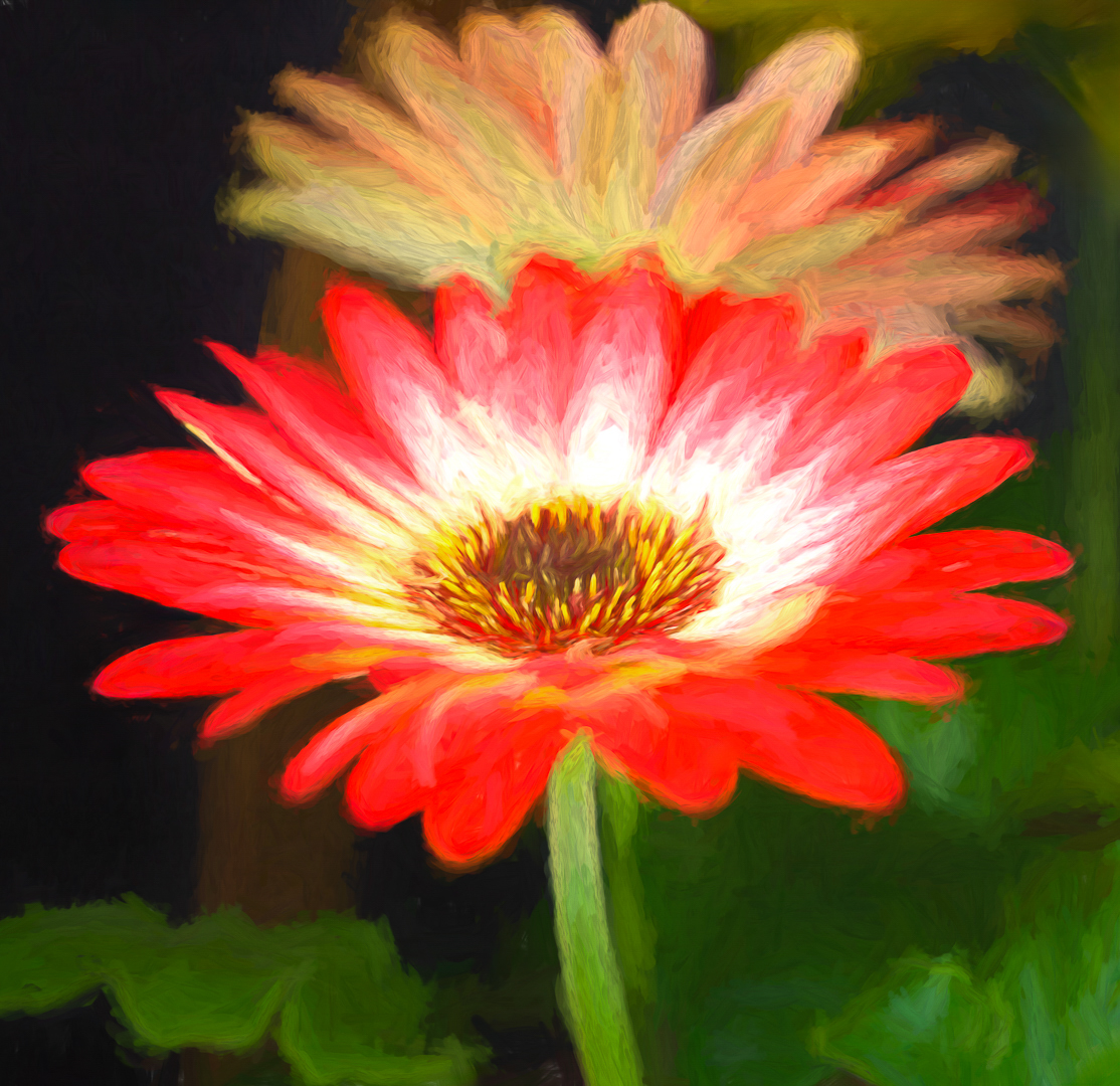
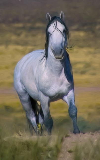
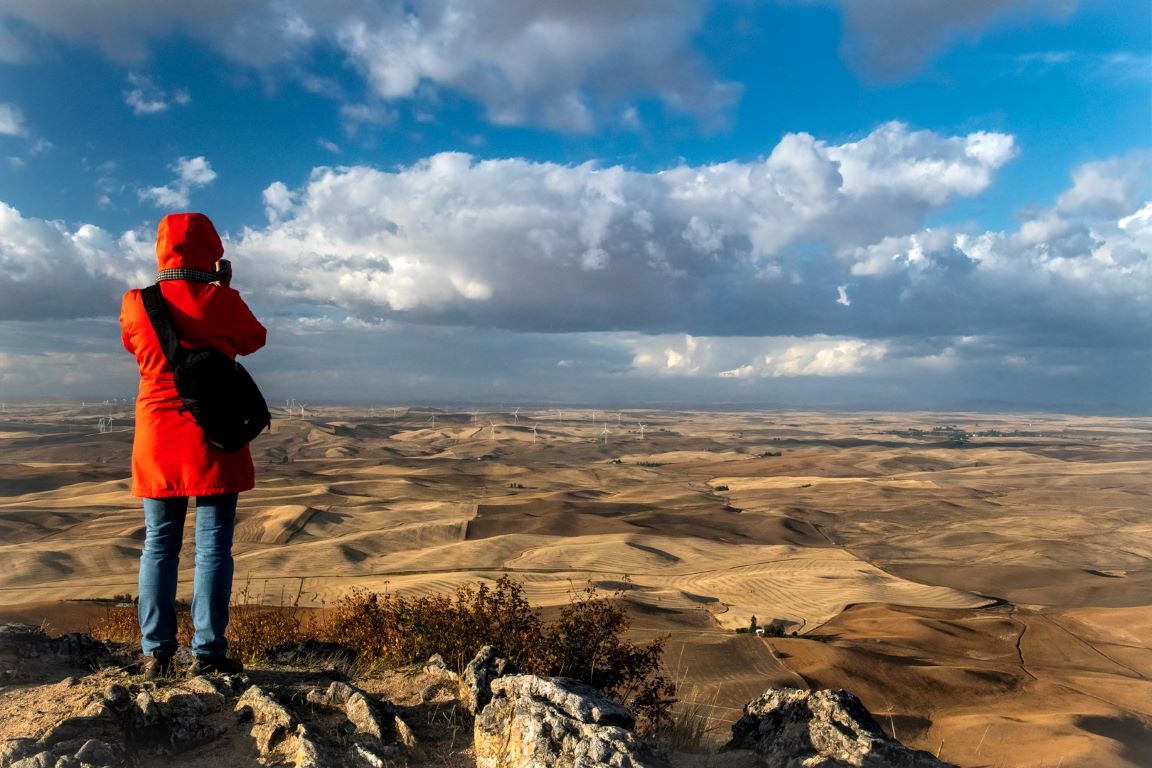
Robert, I think you did a very good job of creating depth with this image. Did you use curves to accomplish this? I do find the background a little distracting. I tried to darken/blur the background a little and like Judy, lighten the center slightly. Just an idea. |
Jul 1st |
 |
| 30 |
Jul 19 |
Comment |
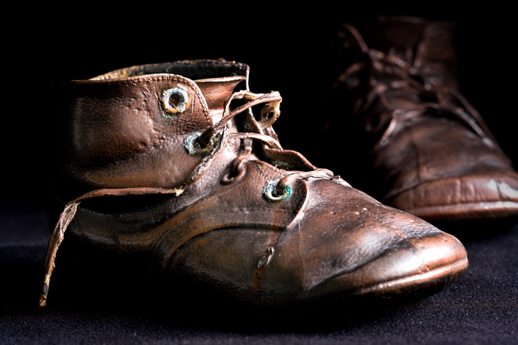
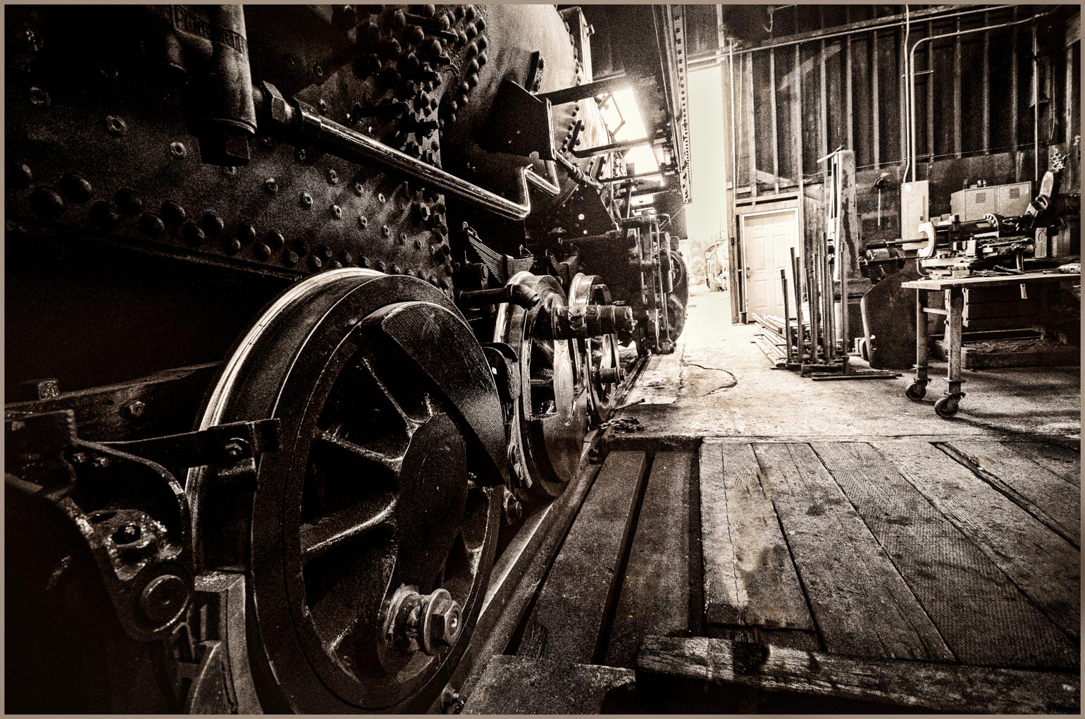
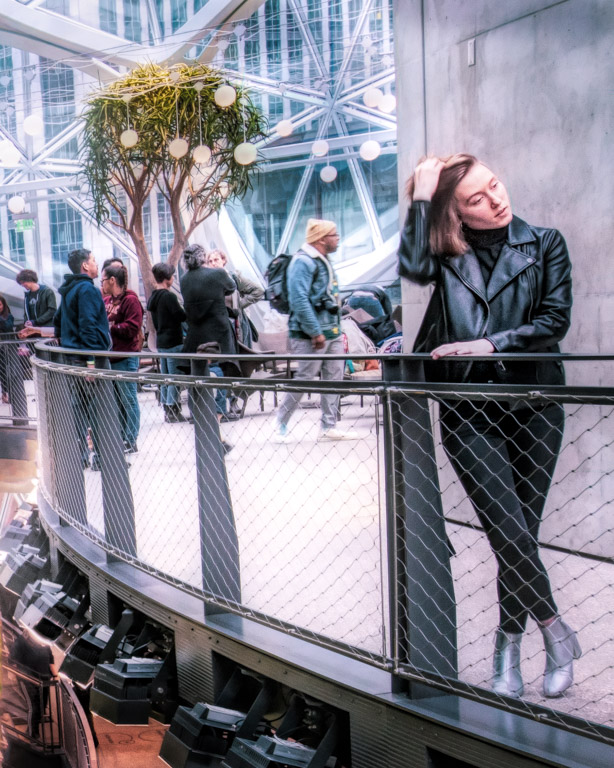
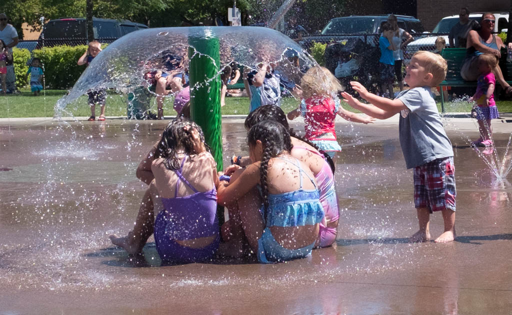
Beautiful job with this beautiful old car. You are fortunate that the museum presented a good backdrop. We have two large car museums/ collections near us but in one, the lighting is terrible and the cars are crowded close together. Takes a lot of imagination to get a good image. A couple of suggestions for your image. I love the little starbursts on the front bumper, but wonder if you should remove the specular hilites on the front fender? Also, if I remember, you are good at adding "canvas' to your images. Can you add a slight more to the left side of the image? The front of the car is touching the edge and I think would be better if there was a little space there. Great job.
|
Jul 1st |
| 30 |
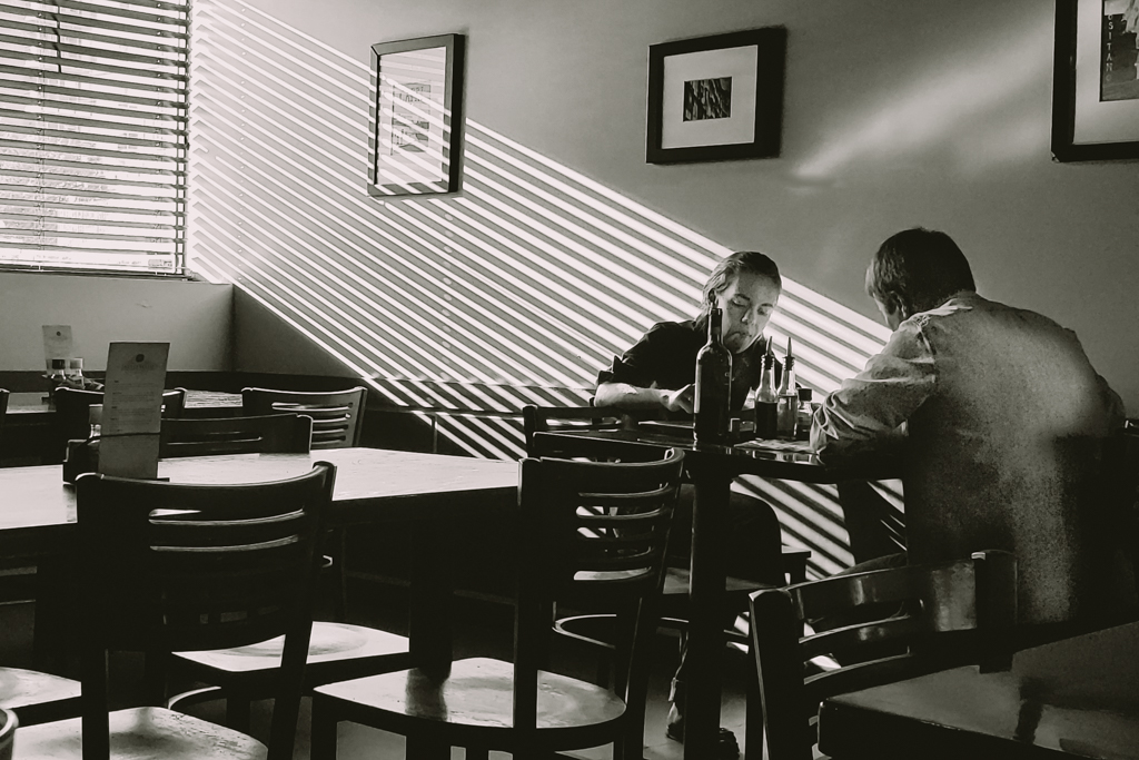
Jul 19 |
Comment |
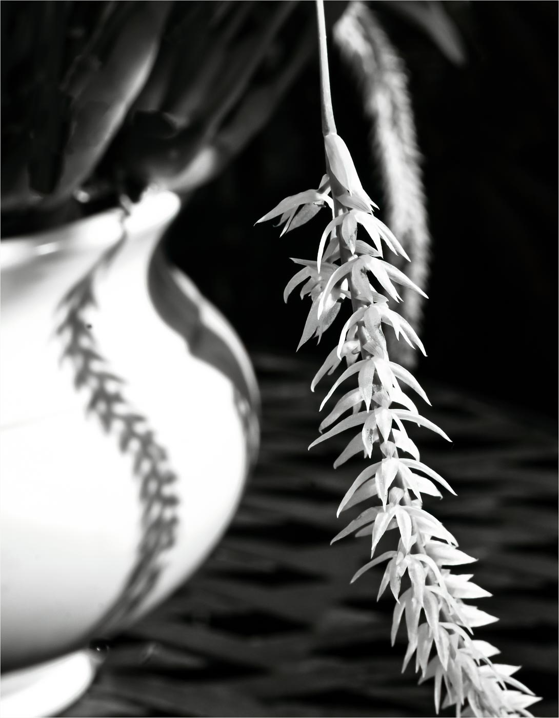
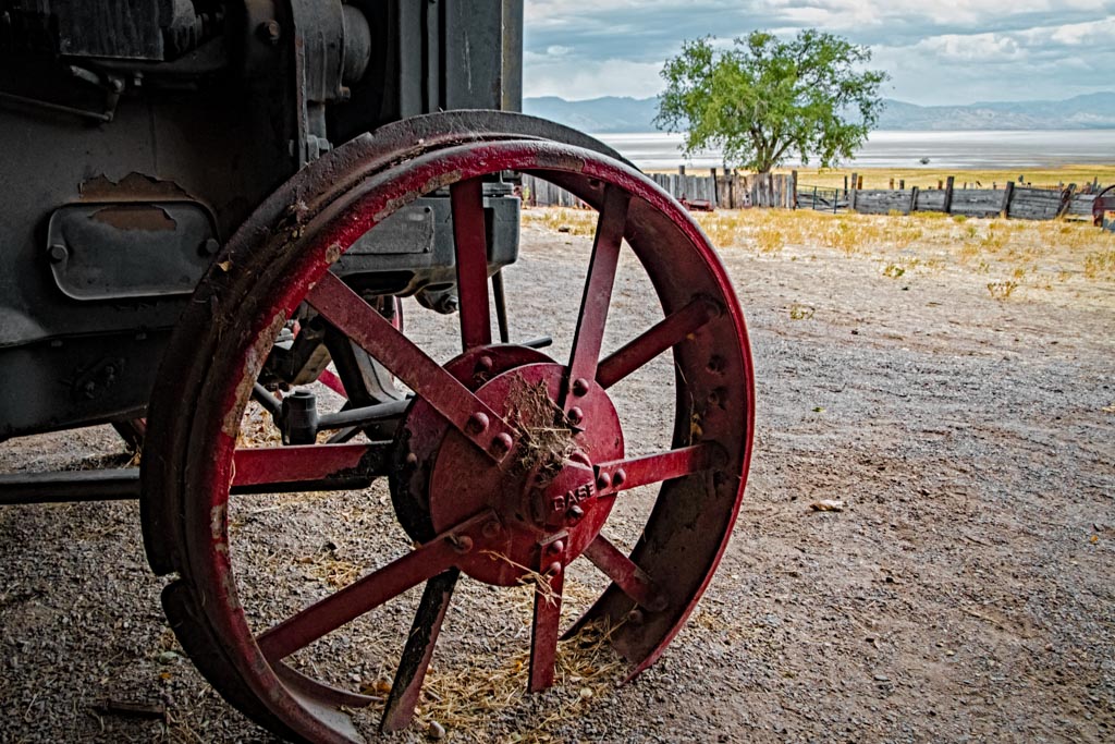
Love the title! Gave me a good chuckle. I think bw was a good choice for this image. For me, the chain is too dark, I want to see more details. Also, I changed it to a 6 x 9 format, cropping some from the top and right. |
Jul 1st |
 |
7 comments - 1 reply for Group 30
|
8 comments - 1 reply Total
|