|
| Group |
Round |
C/R |
Comment |
Date |
Image |
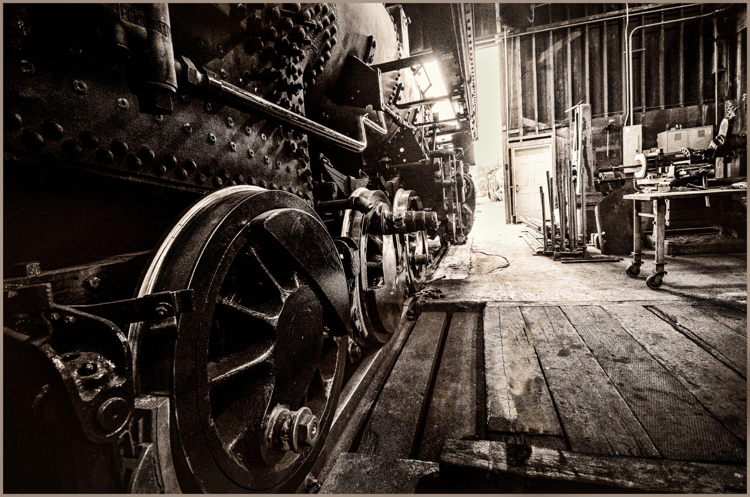
| 14 |
Sep 18 |
Comment |
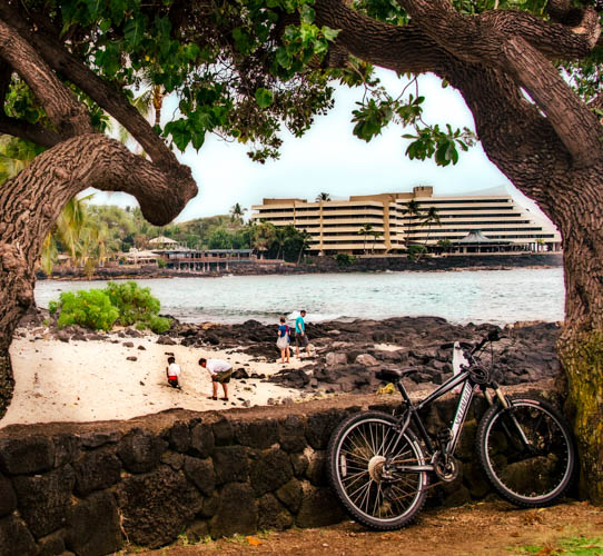
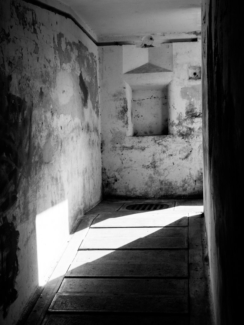
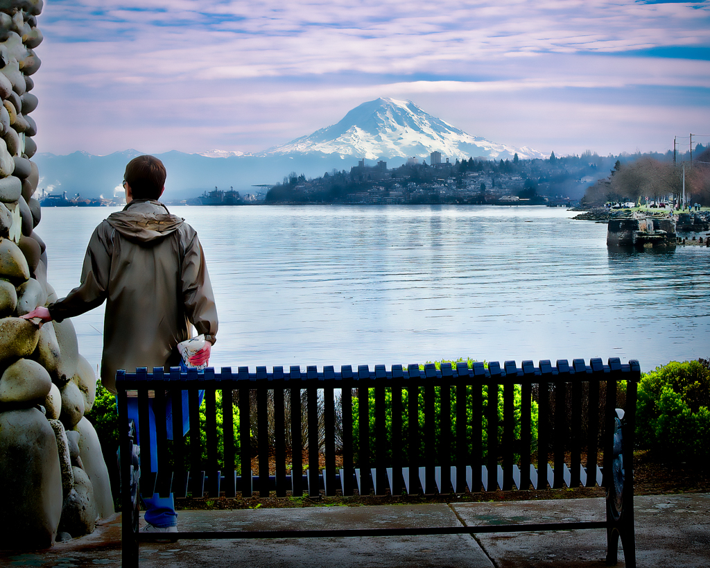
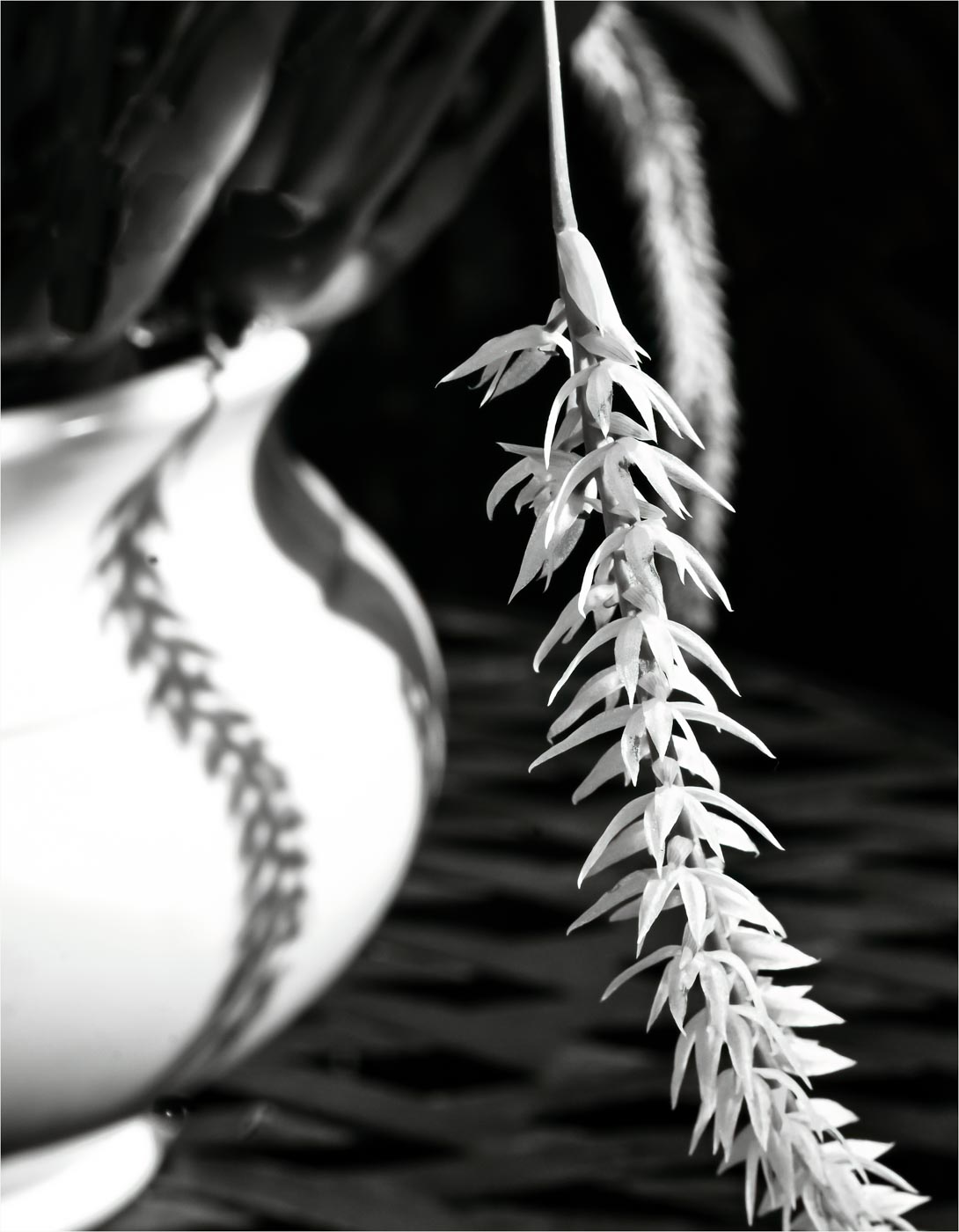
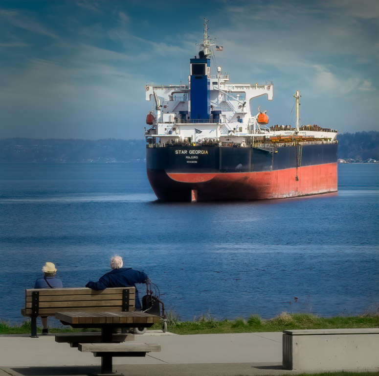
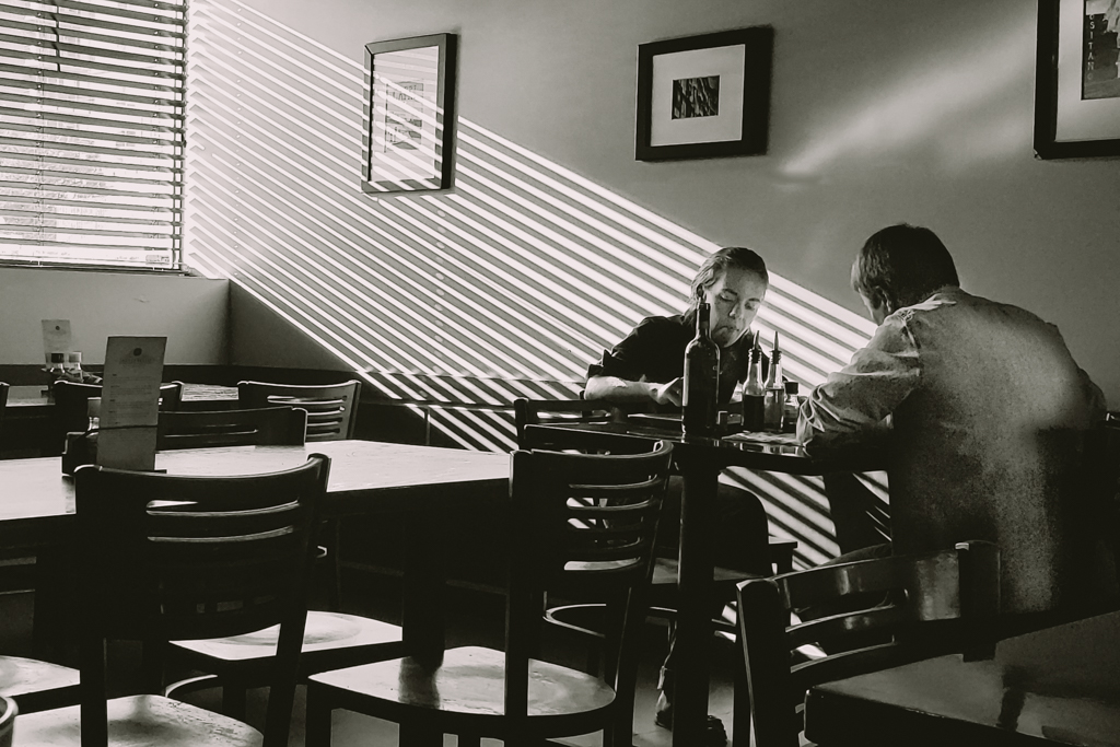
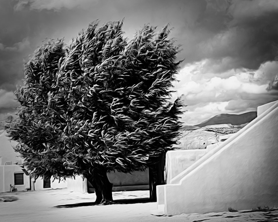
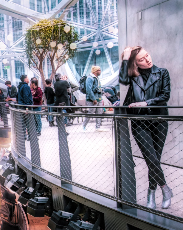
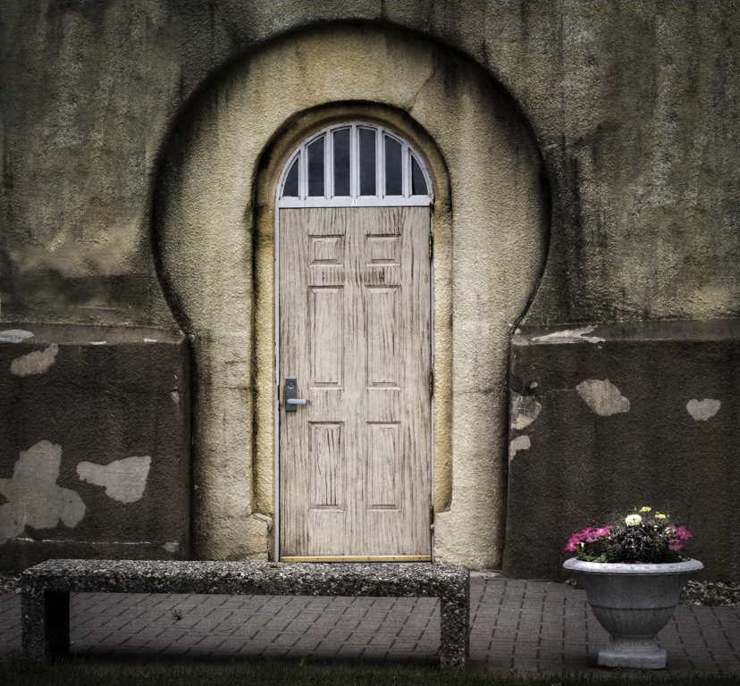
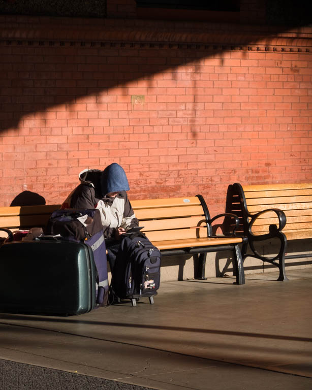
Wow! Talk about impact! I love the lines, the shadows, even the colors within this image. I think you have a couple more images here. You could remove the left side of the image to create a portrait image with the large (bench?) in the left foreground. You could also crop from the left again, but this time also crop up, to remove the first bench. Just some ideas. Great image! |
Sep 25th |
| 14 |
Sep 18 |
Comment |
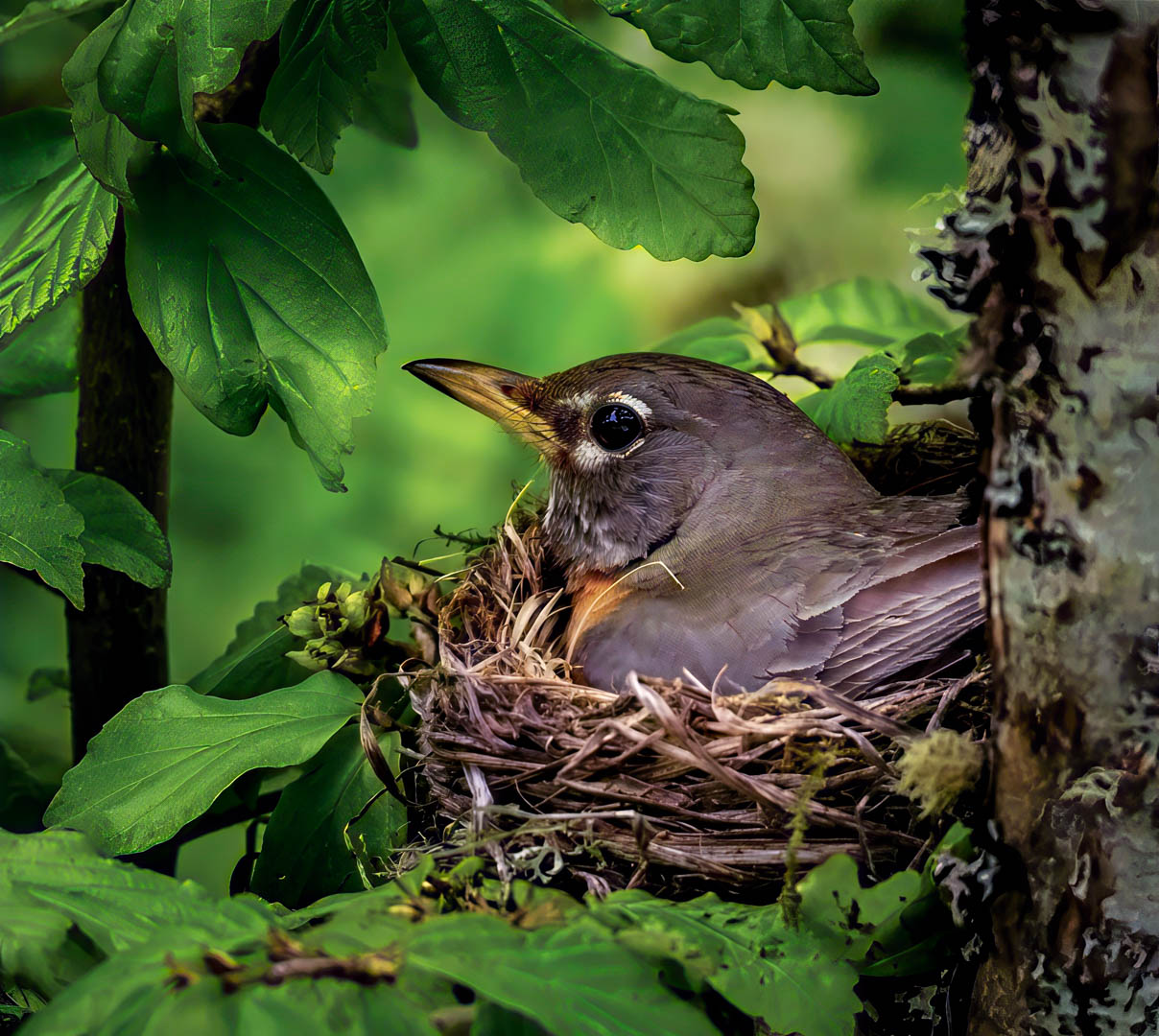
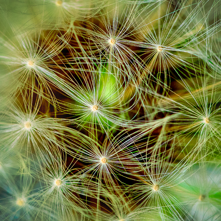
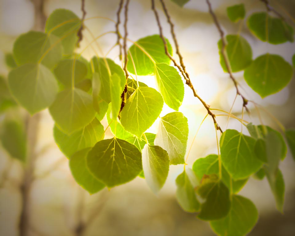
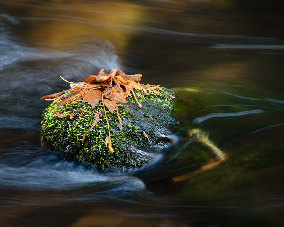
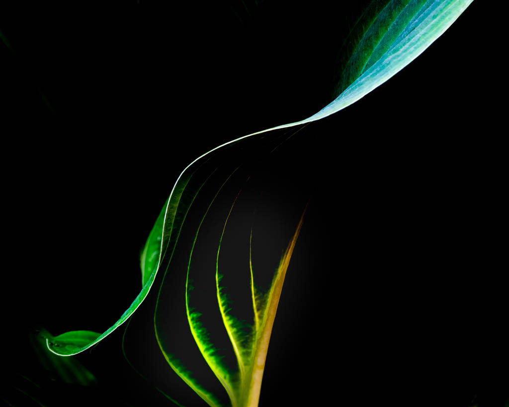
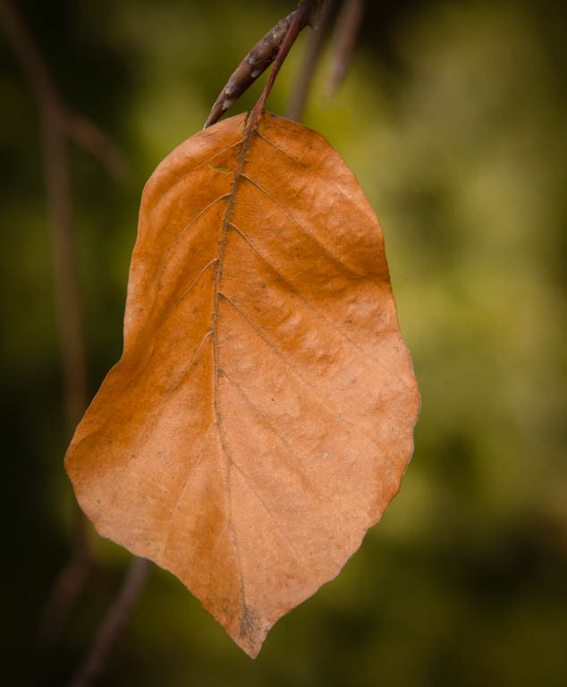
Eleanor, Your lovely image caught my attention. I especially like the fact that the brightest/ lightest feature leaf is in the back. The layering of leaves is quite appealing. I might suggest cropping from the bottom, just enough to eliminate the leaf in the lower left corner. |
Sep 25th |
2 comments - 0 replies for Group 14
|
| 30 |
Sep 18 |
Reply |
Judy, I thought about removing the cars also, and still might try it. I know what you mean about getting a smeary result. Not sure how to avoid that sometimes?? As for the warm color, I'm not precisely sure what I did this time but my usual workflow is to start in LR, using the profile presets (4 little boxes). Then I crop, perhaps make a couple basic adjustments. Next I go into PS for clean up (cloning or otherwise removing things I don't want). Then I go into Topaz Studio. Recently I have started just using the Adjustments on the right side of the screen. In the past and occasionally now, I use the presets on the left, making final adjustments with the sliders. I hope this helps. |
Sep 13th |
| 30 |
Sep 18 |
Reply |
Thanks Dave. This is a great group. All skill levels. I can't do what Leonid and Judy did but we allearn from one another. |
Sep 12th |
| 30 |
Sep 18 |
Reply |
Tom,
I just checked out the edit-perspective-warp feature in PS. Thanks for suggesting it. |
Sep 10th |
| 30 |
Sep 18 |
Reply |
Thank you for adding to the discussion, Stephen. I found your explanation of "lean-back" perspective to be interesting. |
Sep 10th |
| 30 |
Sep 18 |
Comment |
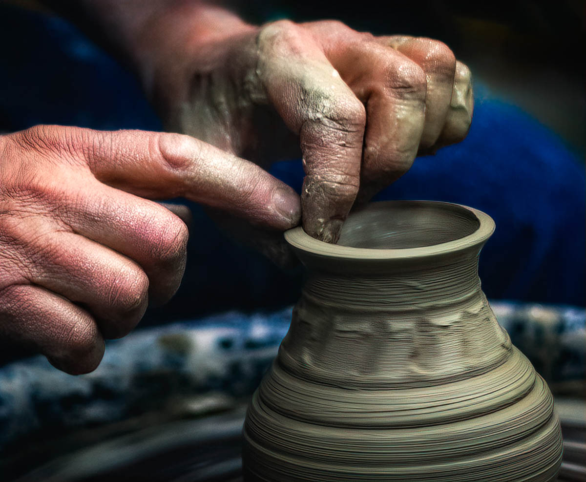
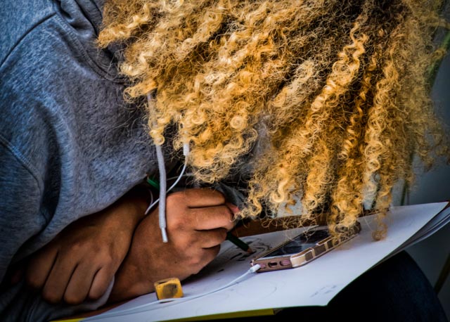
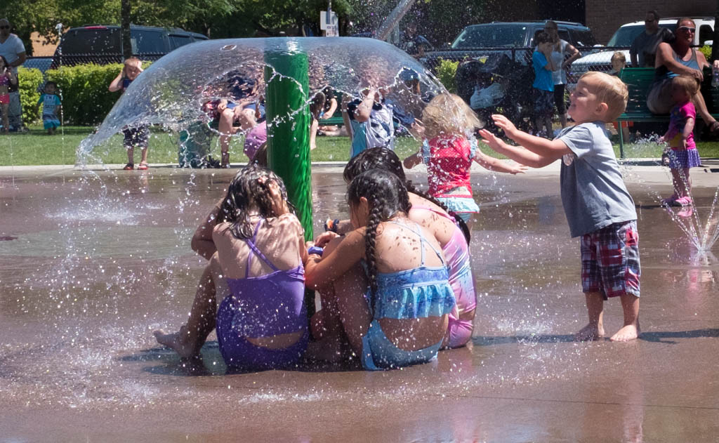
I like Judy's placement of the artist's hand, but would like a little more on the left since it appears the lady is looking at something there. |
Sep 9th |
| 30 |
Sep 18 |
Comment |
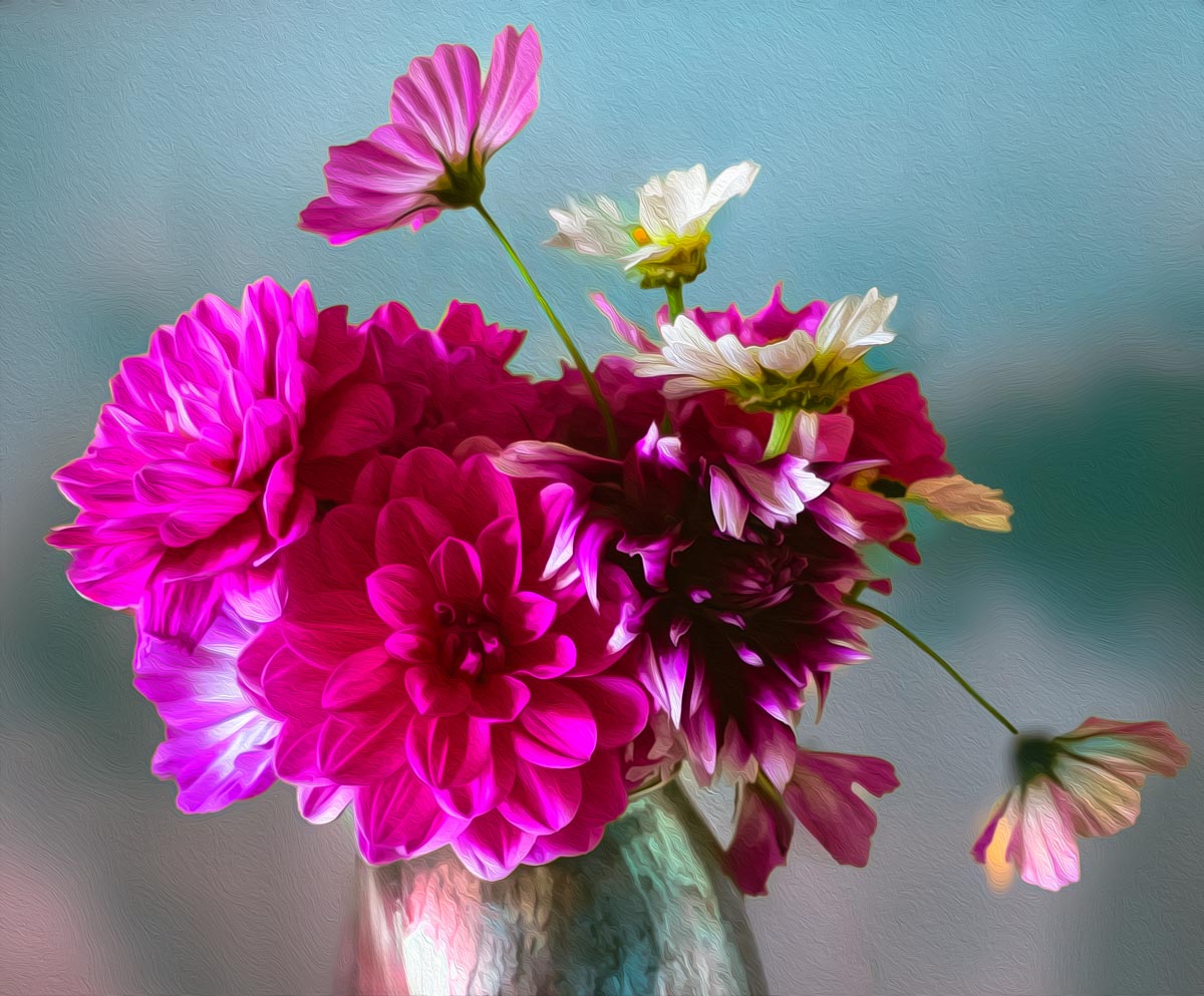
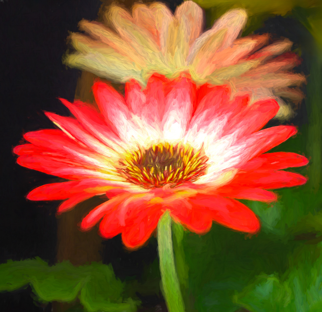
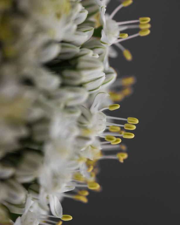
I'm afraid my eyes bounce around on this one: from the red dots (cactus spines?) to the lovely flowers to the bright green in the background. I would suggest eliminating the brought green in the back and cropping 2/3 off the bottom. This would draw the viewer to the flowers. Perhaps reduce the hilites on the flower on the right as well. |
Sep 9th |
| 30 |
Sep 18 |
Reply |
Robert,
That is why this groups are so helpful!
|
Sep 7th |
| 30 |
Sep 18 |
Reply |
Yes. That's it!
|
Sep 7th |
| 30 |
Sep 18 |
Reply |
Thank you Tom. I will look at it.
|
Sep 7th |
| 30 |
Sep 18 |
Reply |
I would reduce the light on the apple, not remove it all together. Leave the grapes alone. |
Sep 2nd |
| 30 |
Sep 18 |
Reply |
I, too, like the bw. |
Sep 2nd |
| 30 |
Sep 18 |
Comment |
All I can say is wow! I do not have the skill to do this but you did its very well! I wish the arm of the painter was not quite so straight up and down, perhaps at more of an angle. But as I said before, "wow"! |
Sep 2nd |
| 30 |
Sep 18 |
Comment |
Excellent job with the focus stacking. I think you did well to put a limit on it. I do agree, however, that I would like it better with some of the right side cropped out. Because it is so bright and blurry it distracts from the beauty of the raindrops. |
Sep 2nd |
| 30 |
Sep 18 |
Comment |
Beautiful image. I agree that you need to reduce the hilight on the apple. Your composition is excellent both design-wise and color-wise. I very much like the stroke around the border. I was talking to one of the judges at the NWIEP Salon here in Puyallup, yesterday. One of the things he emphasized was how you present your image whether it is by leaving a stroke around it, or the paper choice that you print on, etc. Well done, Judy. |
Sep 2nd |
| 30 |
Sep 18 |
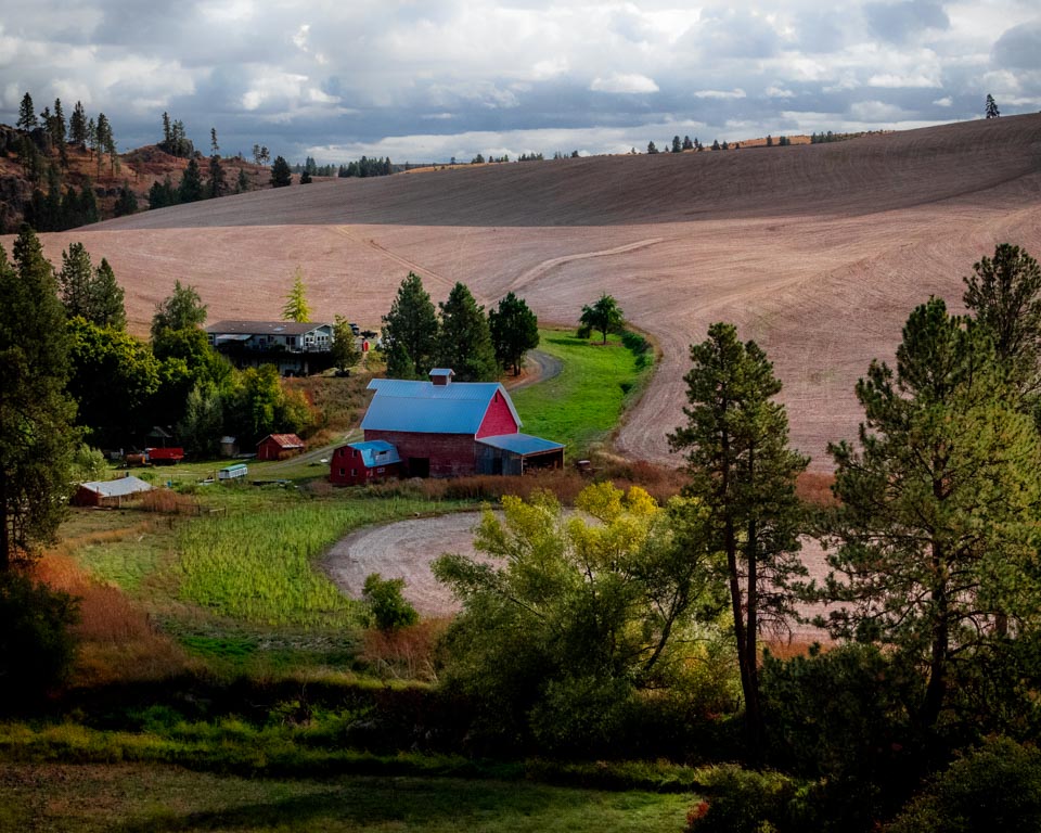
Comment |
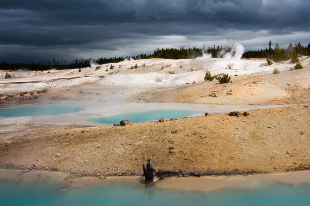
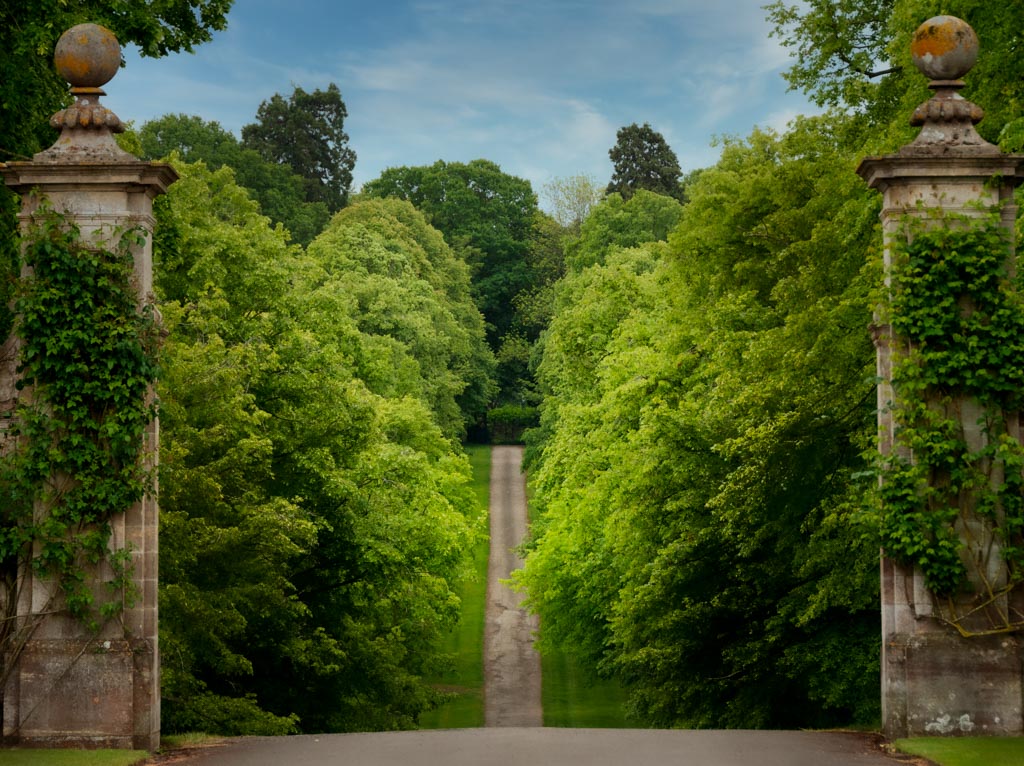
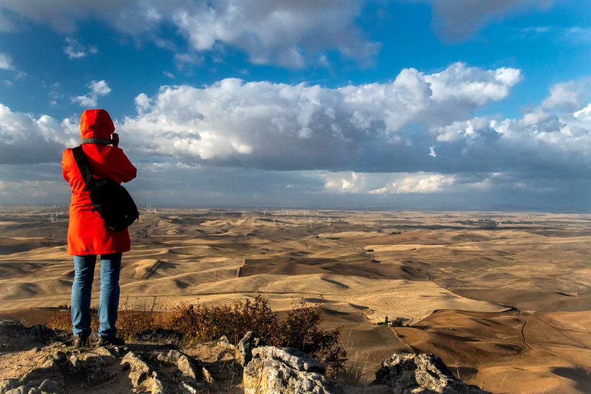
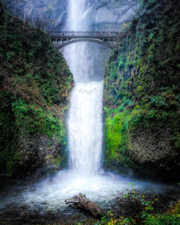
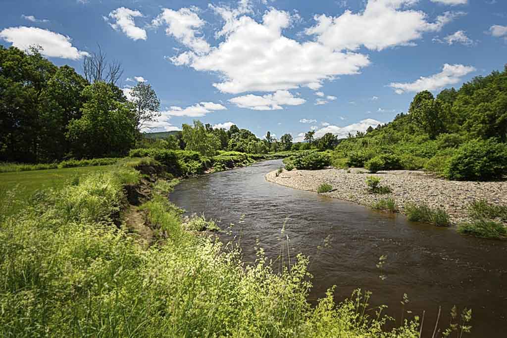
This looks like a lovely place to explore and spend the day. The clouds are a little blown out. In LR I reduced the hilights a little. Then I used the radial filter to lighten both the river curve and a little of the weeds in the foreground. I added a very slight vignette to the edges.Subtle changes. See what you think. |
Sep 2nd |
 |
| 30 |
Sep 18 |
Comment |
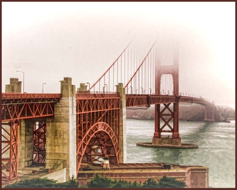
I had to look up Skyway Bridge as I was not familiar with it. It's a beautiful bridge and I can see why you wanted to photograph it with the moonrise. Sometimes the weather just does not cooperate. The bridge is too dark for me. I can barely see the outline. I am also wondering about the colors. Why is the sky green and the water so bright blue when it is so dark we can barely see the bridge? I'm not sure those issues can be effectively corrected. I would definitely encourage you to return next time conditions are right. |
Sep 2nd |
| 30 |
Sep 18 |
Reply |
Robert, Now that I see your version, I am coming around. I think I like it better. And, yes, I was happy with the clouds and sky. It had been an overcast day and the sky was just starting to open up. |
Sep 2nd |
| 30 |
Sep 18 |
Reply |
I did play with the perspective. I liked this best but was not sure how others would see it. |
Sep 1st |
7 comments - 11 replies for Group 30
|
| 33 |
Sep 18 |
Comment |
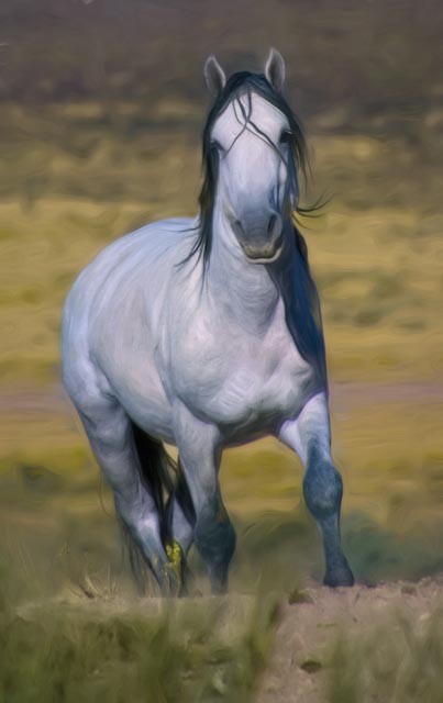
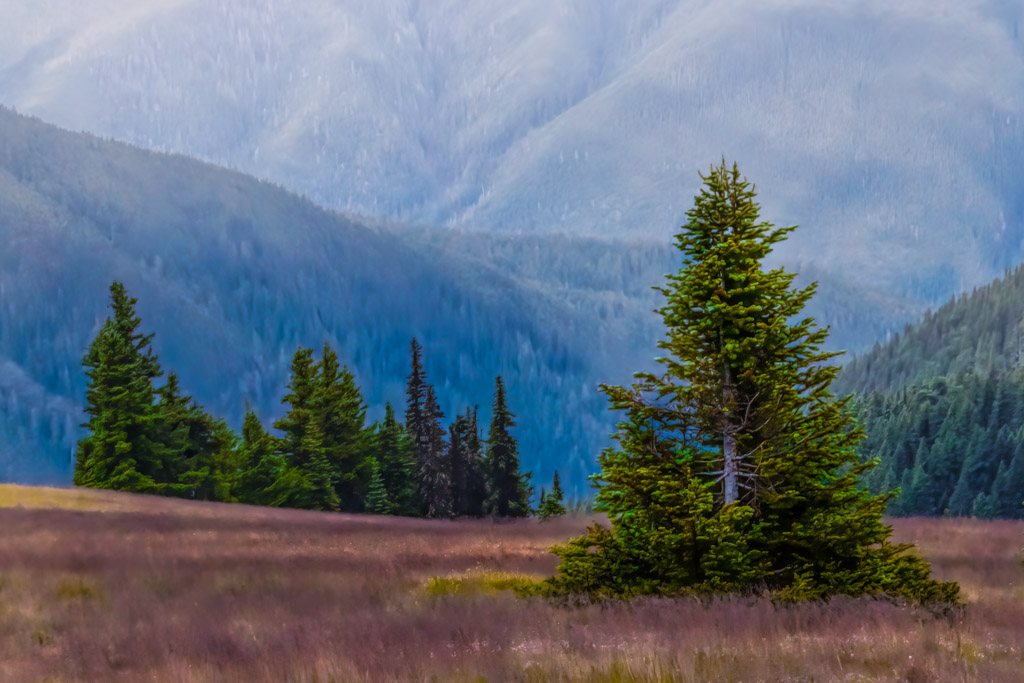
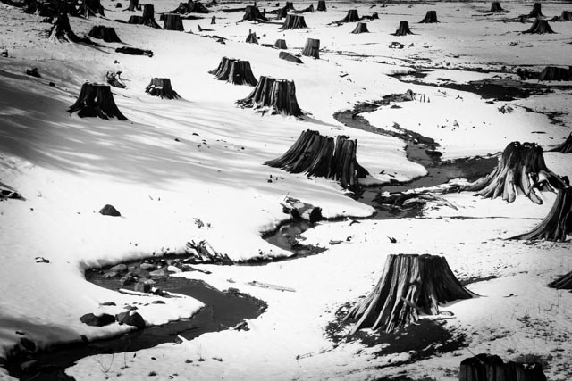
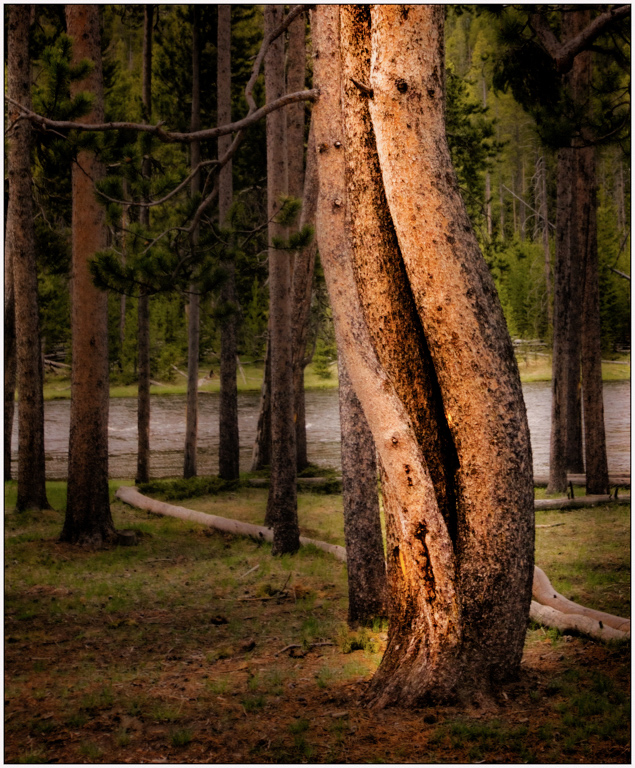
Harsh light or not, I find this image very pleasing. My only suggestion would be to remove the tall grasses on the right edge as well as a couple of tree trunks in the background that are collecting light. |
Sep 25th |
| 33 |
Sep 18 |
Comment |
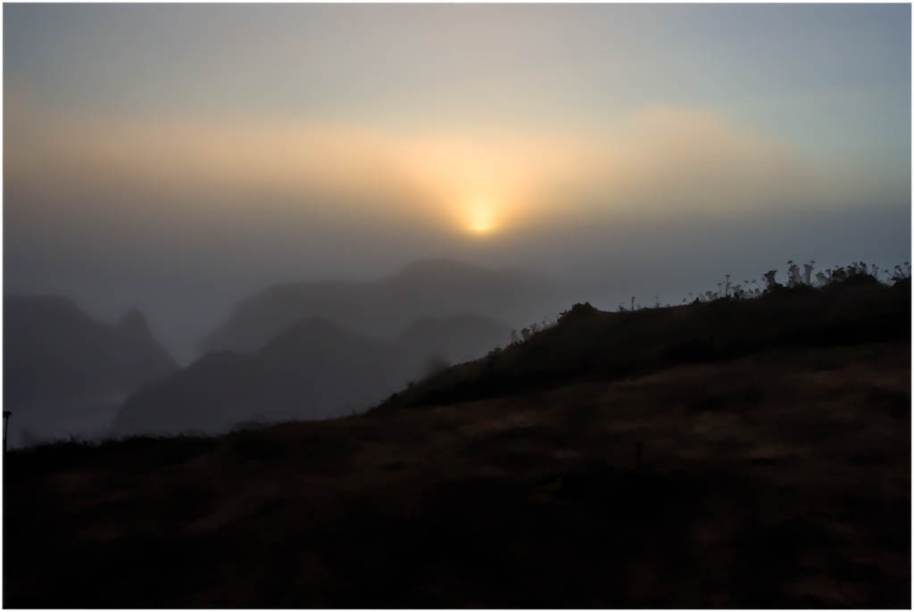
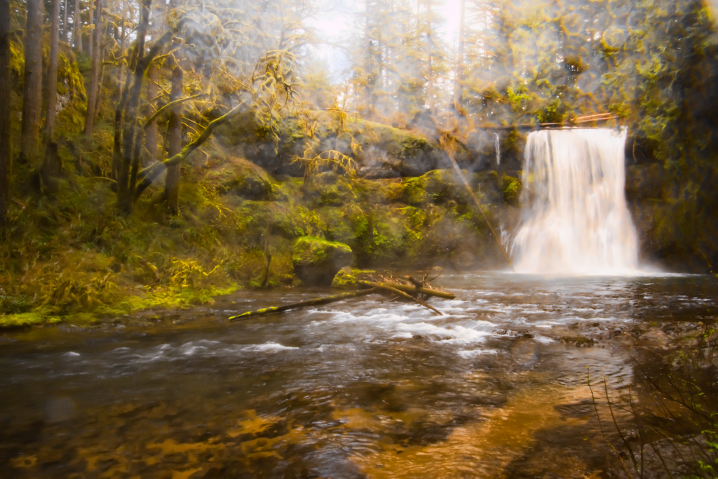
Ken, I like your overall concept. The wild rose (?) is sharp and the colors rich, contrasting with the fog. The image feels a little unbalanced to me. Perhaps, remove a little off the right, perhaps as far as the right edge of the large rock. At the least, I would suggest removing the white rock in the lower right hand corner. |
Sep 25th |
2 comments - 0 replies for Group 33
|
11 comments - 11 replies Total
|