|
| Group |
Round |
C/R |
Comment |
Date |
Image |
| 29 |
Jun 18 |
Comment |
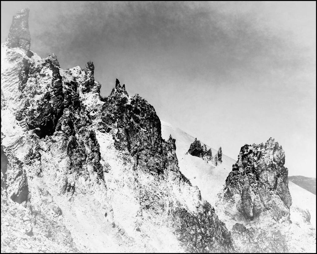
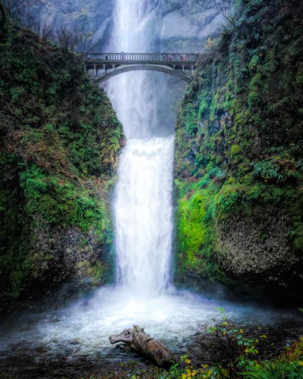
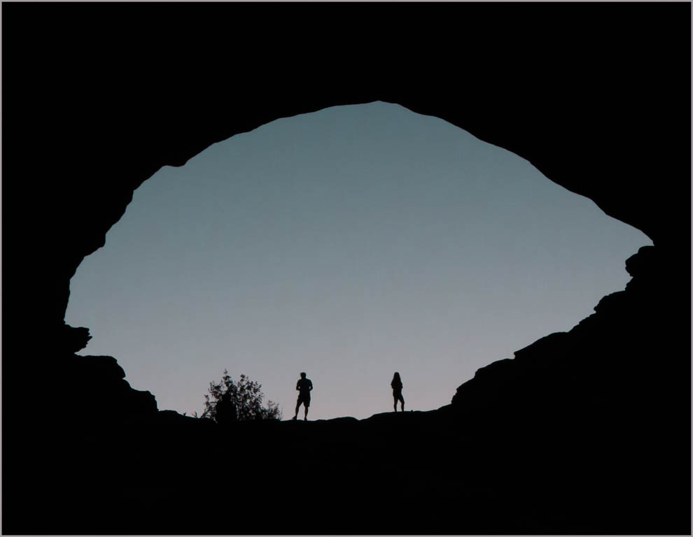
Hello Tam, As beautiful as they are, I often get bored with Slot Canyon images, because they all seem the same. Your image is definitely the exception! Absolutely exquisite! Well done! |
Jun 21st |
1 comment - 0 replies for Group 29
|
| 30 |
Jun 18 |
Reply |
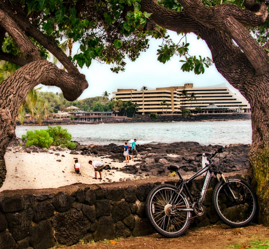
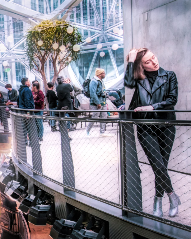
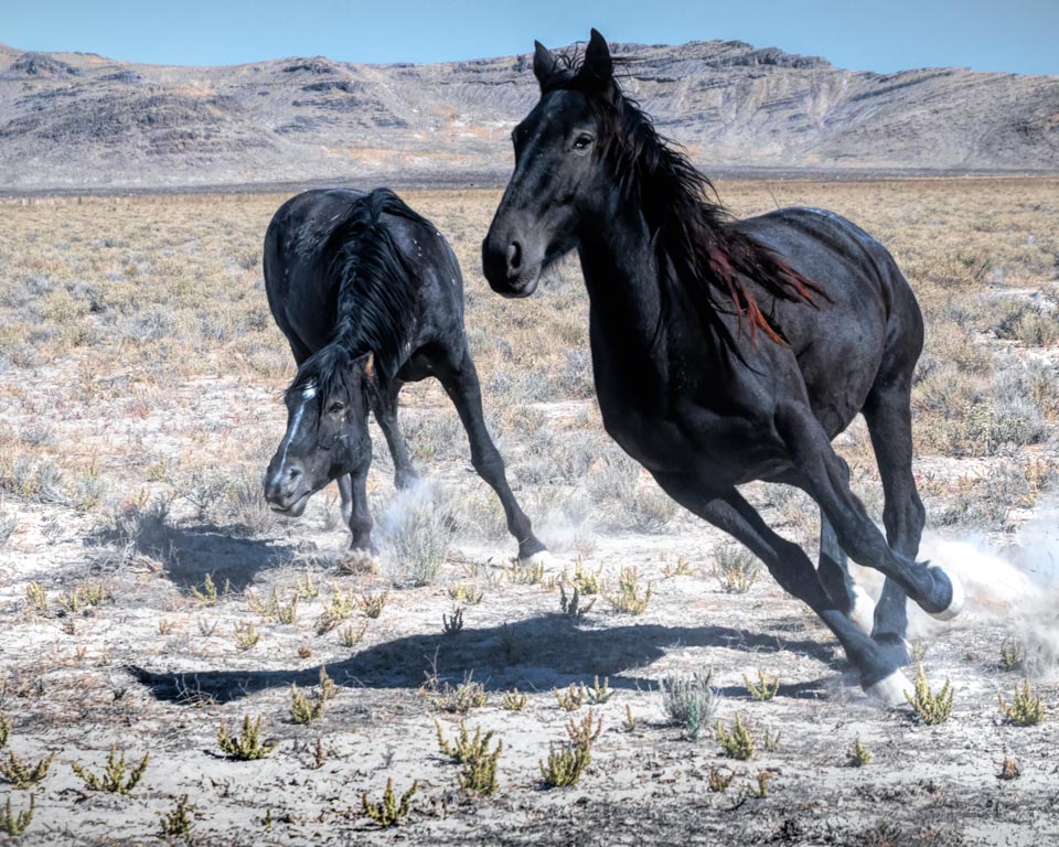
Jessica, you do have to keep your distance but I was above them on a walkway with a high fence. I shot between the fencing for many of the shots. |
Jun 21st |
| 30 |
Jun 18 |
Comment |
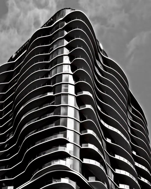
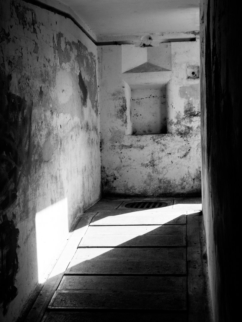
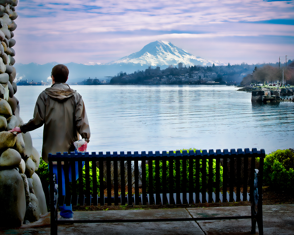
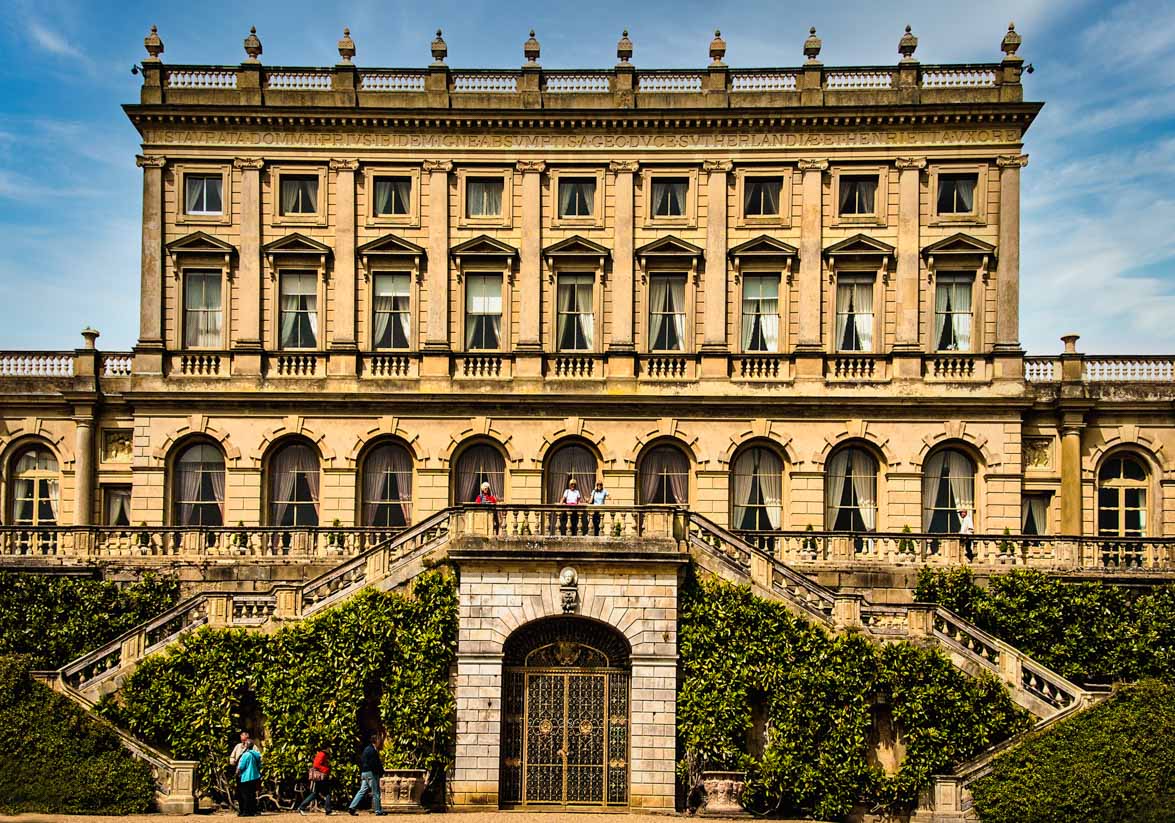
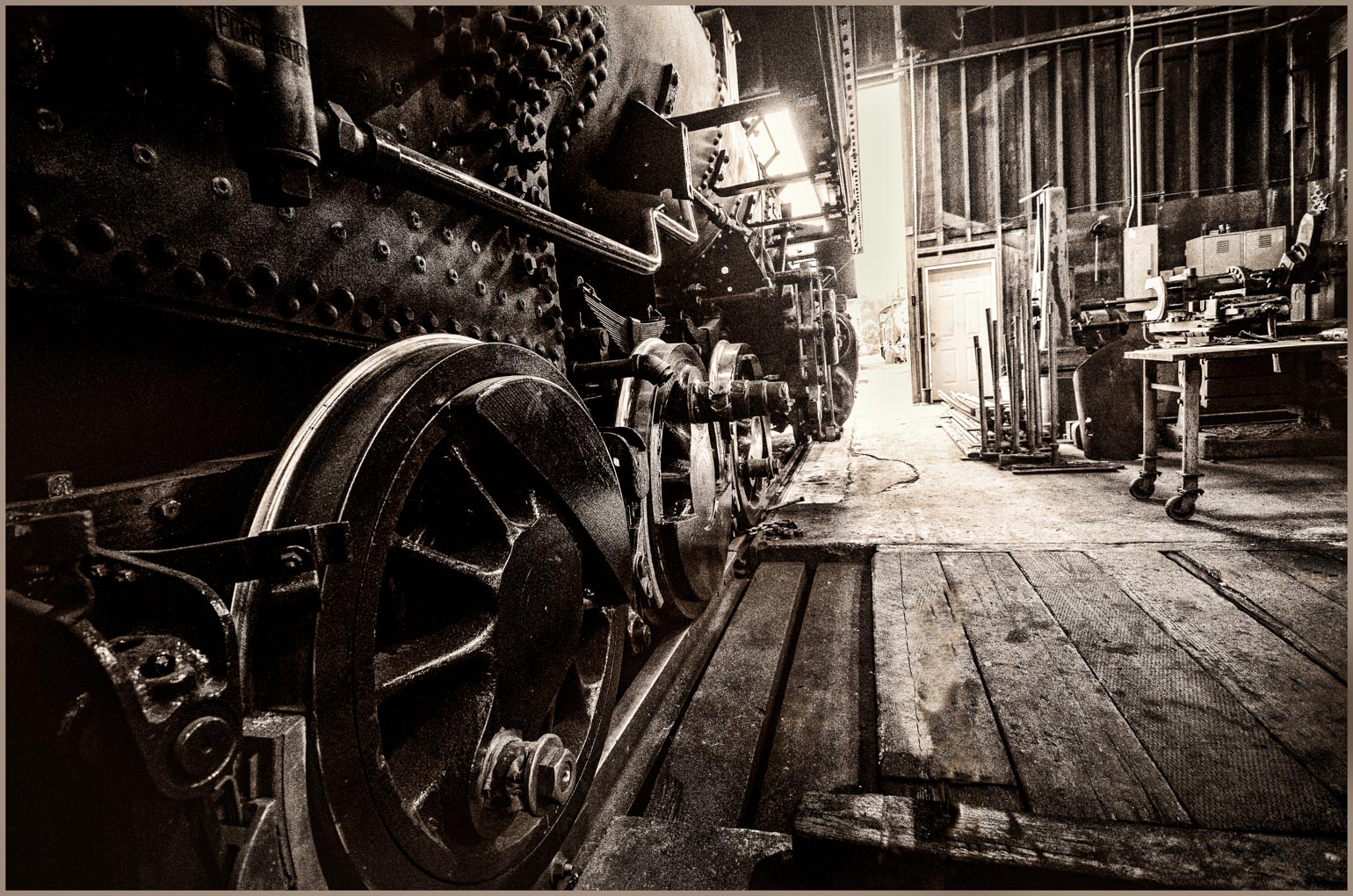
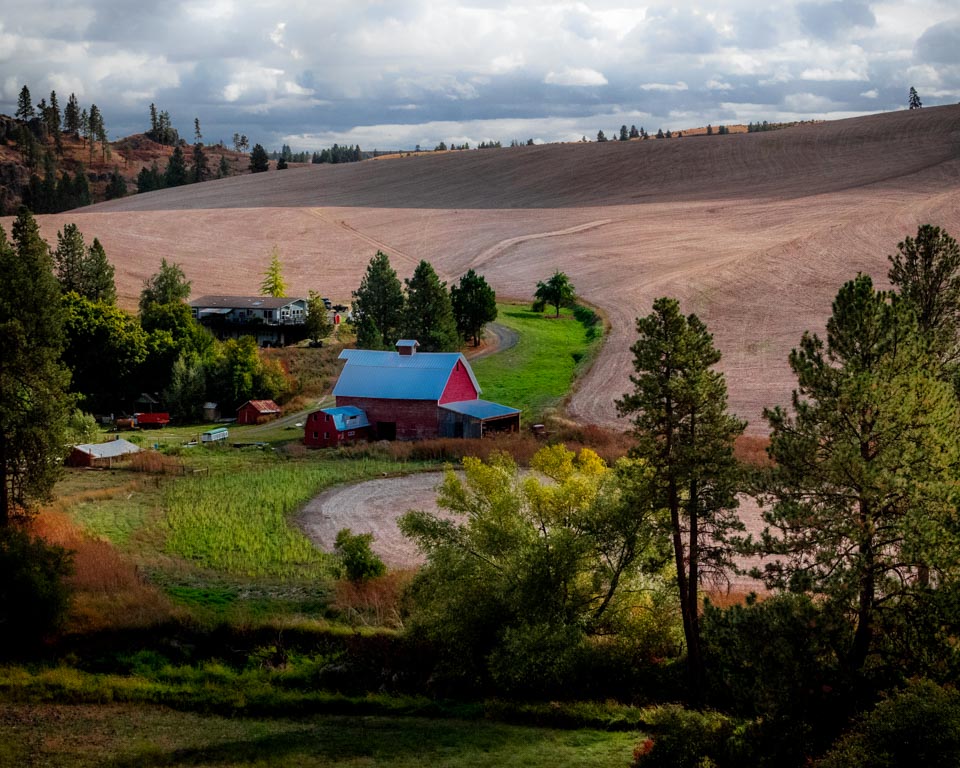
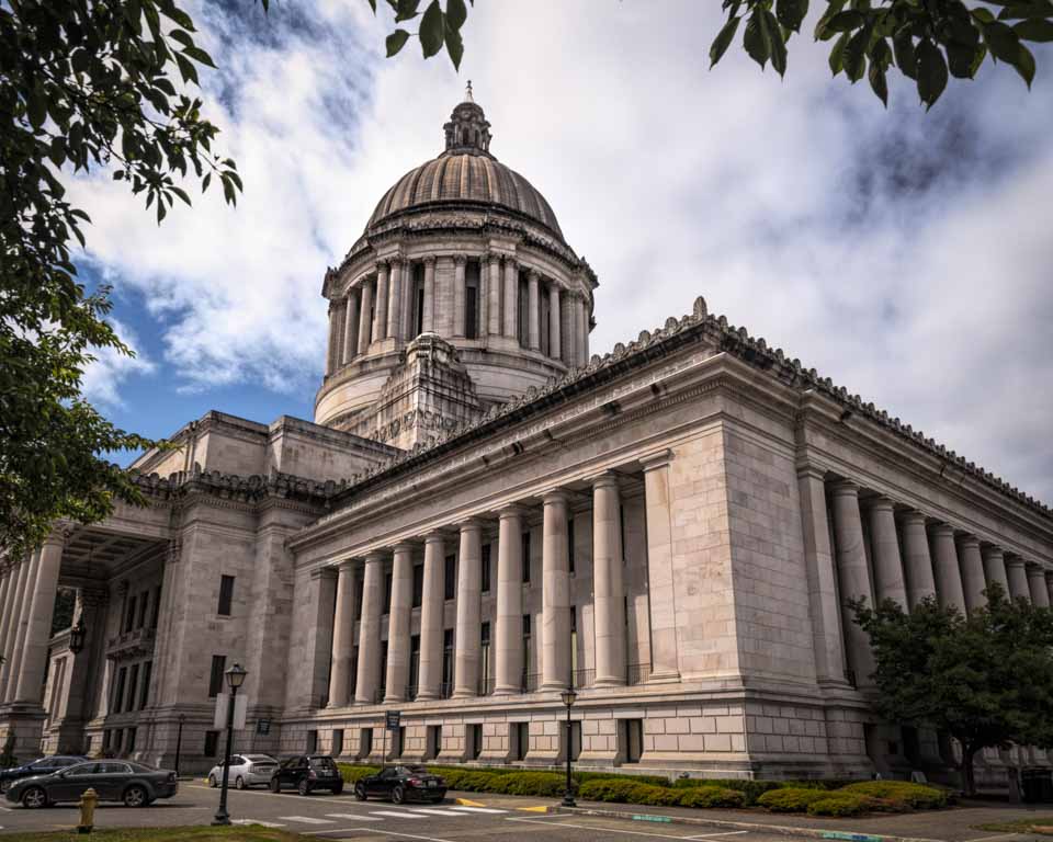
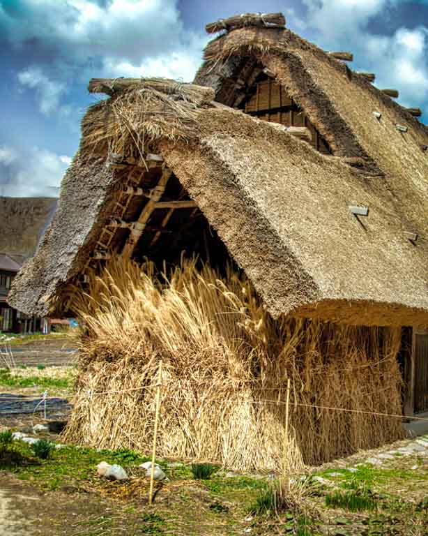
This is an interesting building, and good to know that it's being preserved as a part of history. Your image is fine as it stands, in my opinion. It shows the building in it's entirety and some of the environment. For a more artistic version, however, I would suggest a dramatic crop, focussing on the unique aspect of the structure. While blurring the background is an option, I don't think it works in this situation. Also, I'm not sure what is on the side of the building (signs??) but I find them distracting. Anyway, here is an other option. |
Jun 16th |
 |
| 30 |
Jun 18 |
Comment |
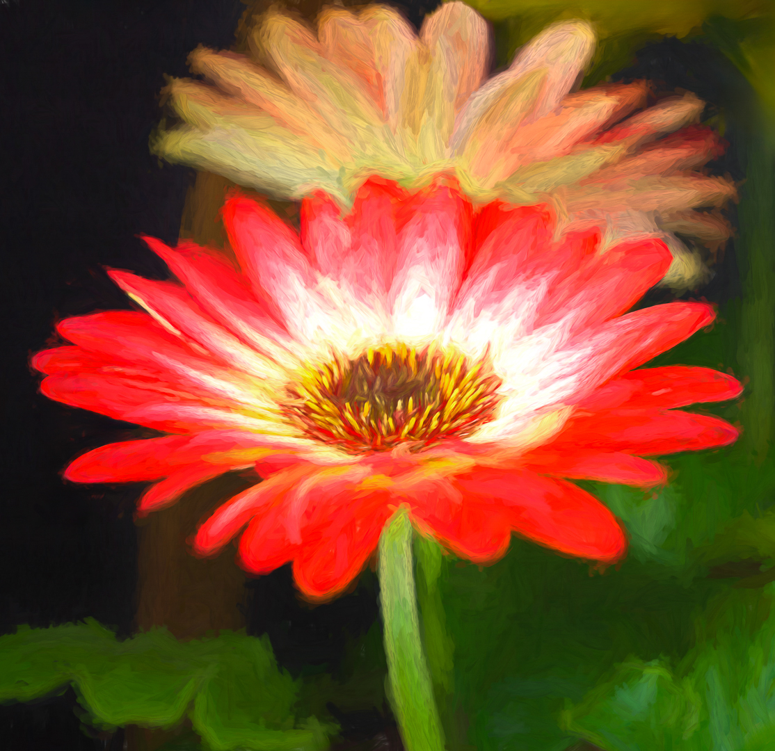
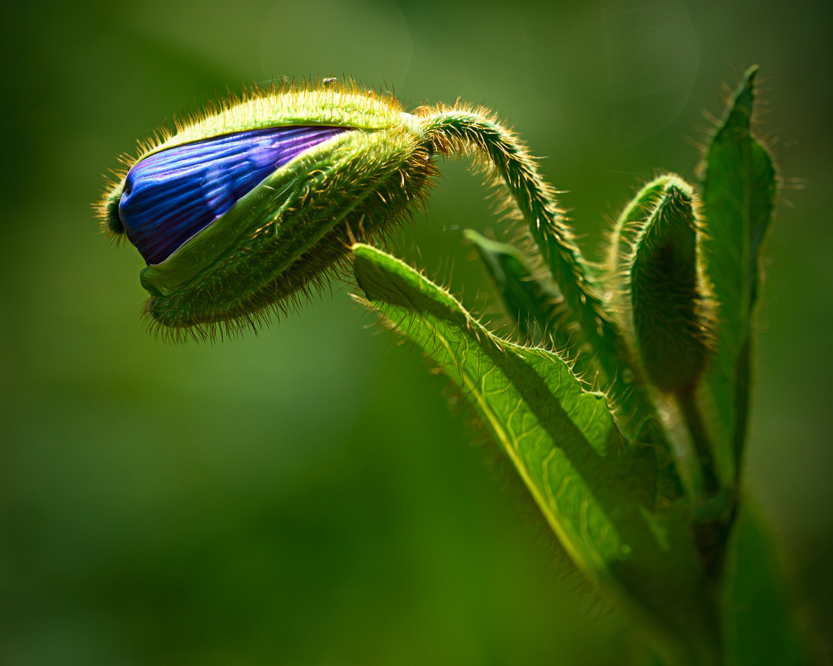
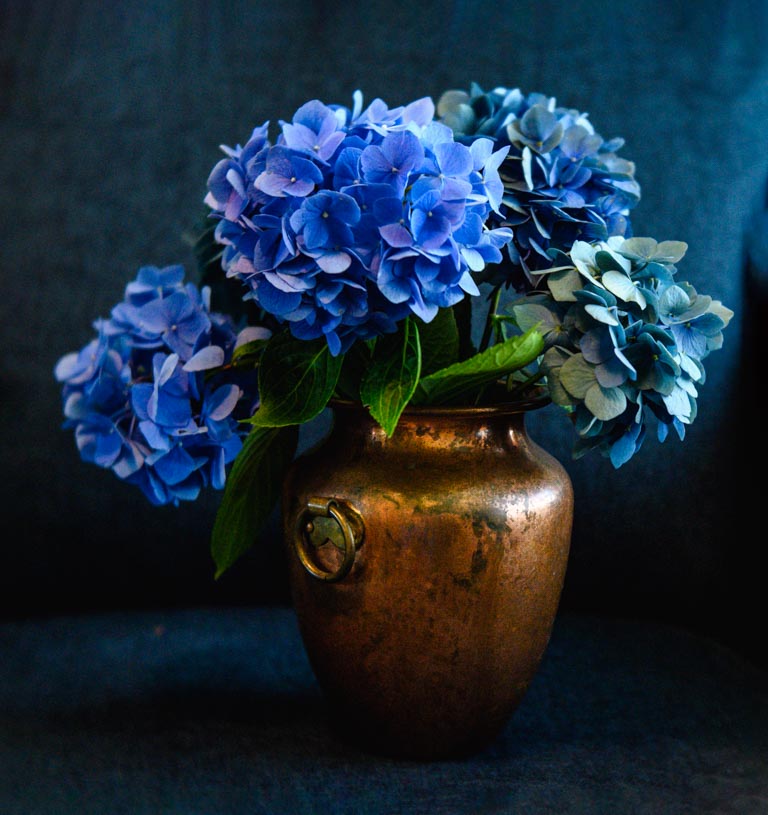
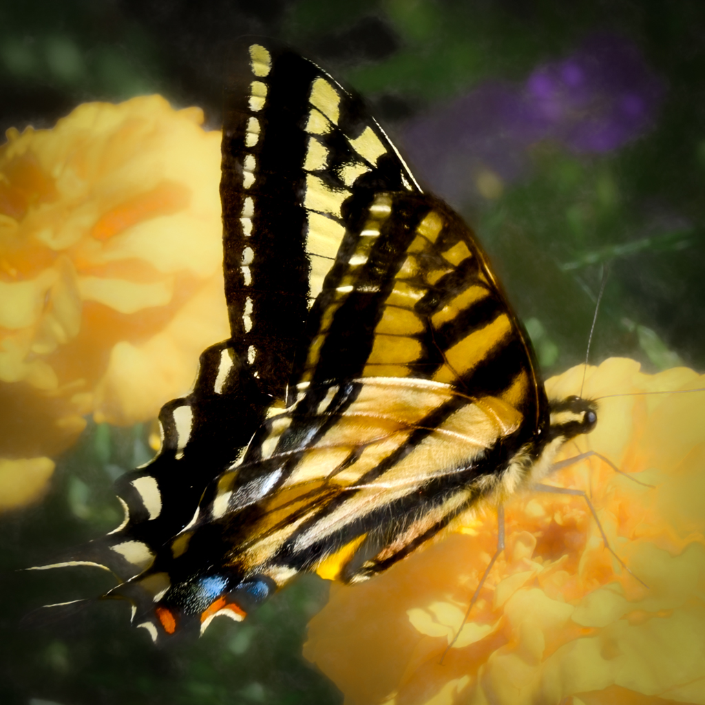
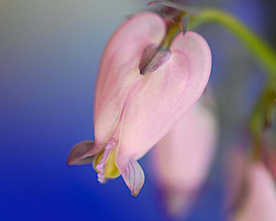
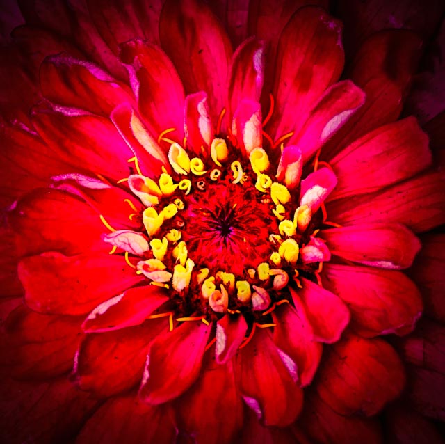
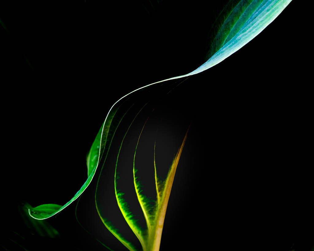
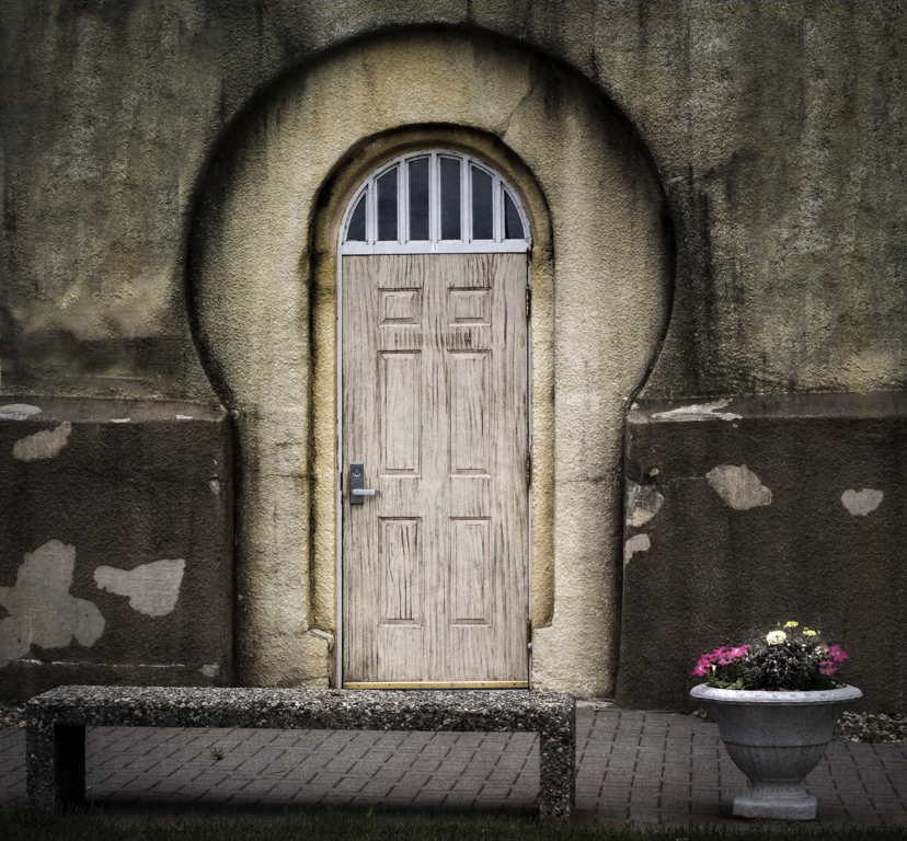
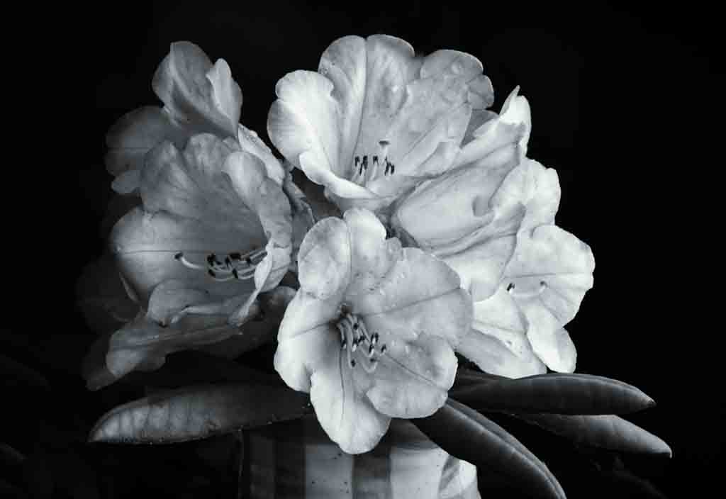
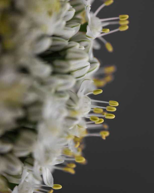
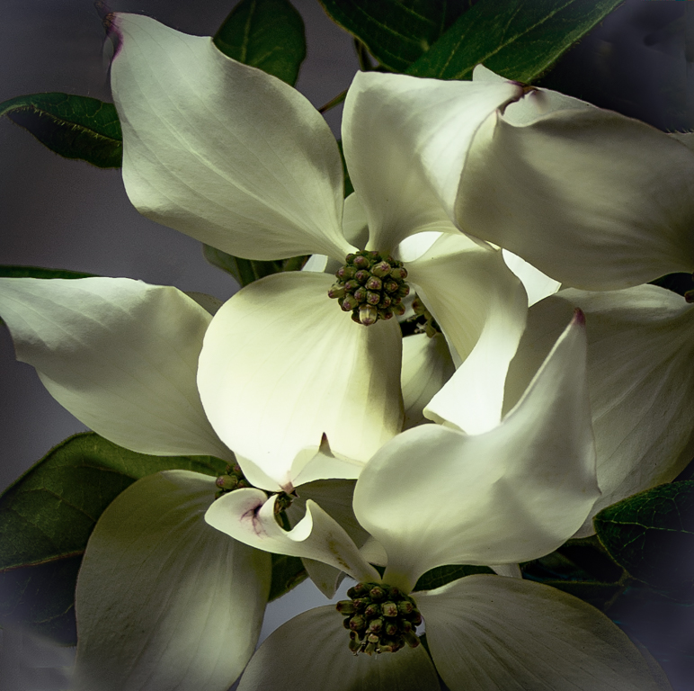
I like the subject and the composition. I do think the flowers need to be hilited more. |
Jun 16th |
| 30 |
Jun 18 |
Comment |
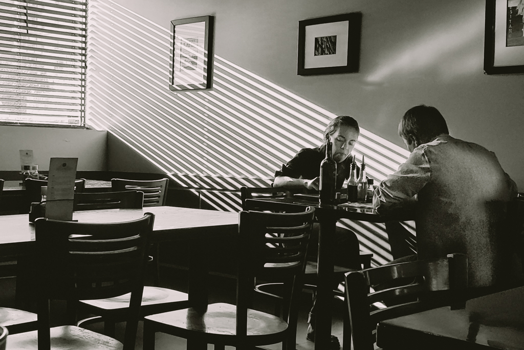
Jon, you should not be embarrassed. The point of these study groups is to share images that we like, but that we want input regarding. If we do not want the opinion of others, or if it has already proven itself to be a "winner" then this is not the right place to display it. I love the colors and the tattered walls. having said that, I do like Judy's crop. |
Jun 16th |
| 30 |
Jun 18 |
Comment |
I got a little lost in the original. I like Leonid's crop which includes one ceiling light. For me, the window lighting works very well to hilight the subject area. |
Jun 16th |
| 30 |
Jun 18 |
Comment |
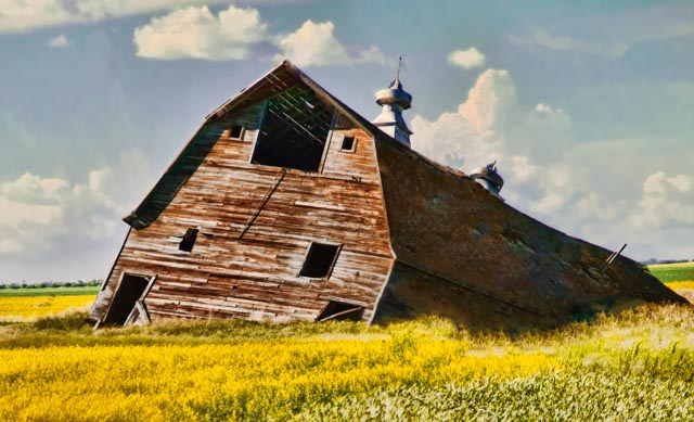
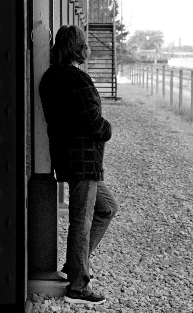
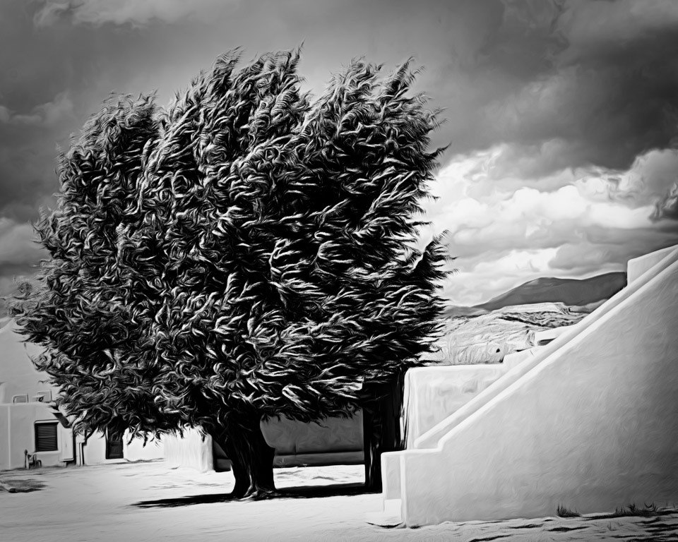
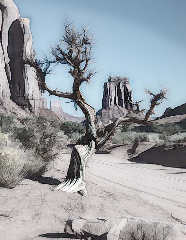
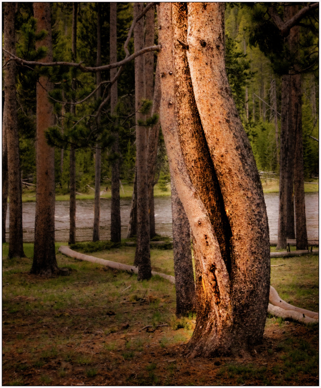
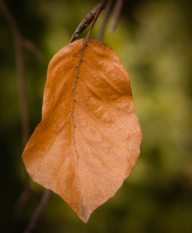
I've just been reading through the other comments. It is interesting to note the various reactions this type of image elicits. First, Jon, I do see the human figure you mentioned. Good eye! I probably would have missed it. I like the placement of the tree, although it feels to me as if it needs to be straightened. I am in Leonid's corner and believe some should be cropped off the bottom. I, too, wonder what is the subject? The flowers or the tree? I cropped about 1/3 off the bottom and then sat back and just studied the image. My final thought is that perhaps Use some vignetting to focus the viewer's eye on your subject area? As it is now, I get a little dizzy. I like the image, just think it needs more work. |
Jun 16th |
| 30 |
Jun 18 |
Comment |
We have a lot of bird photographers in our local camera group and so I have seen quite a few images of Egrets. What I especially like about your image is the lighting on the birds against the darkened background. I'm not sure I like the stroke on the left. I find it distracting rather than helpful. |
Jun 7th |
| 30 |
Jun 18 |
Reply |
Thank you Jon. I appreciate your statement. I think the last couple of years especially, this group and participating in the PSA 365 Day Gallery have caused me to practice my photography in different ways. Also, I have been working harder on my post processing (mostly with the help of my husband, Bob, who is much more technically adept than I am). |
Jun 7th |
6 comments - 2 replies for Group 30
|
7 comments - 2 replies Total
|