|
| Group |
Round |
C/R |
Comment |
Date |
Image |
| 40 |
Jan 22 |
Reply |
I really love the changes on this one, Don. This is worthy of a print/poster treatment. |
Jan 27th |
| 40 |
Jan 22 |
Reply |
I think this is much better. The tiny extra bit of breathing space enables us to see he was looking up, that is, that his head was in motion, so the image looks more alive. Great improvement! |
Jan 21st |
| 40 |
Jan 22 |
Comment |
IMHO if you crop out the sun you will also lose a lot of that blue sky, which would take away from the power of the image. |
Jan 17th |
| 40 |
Jan 22 |
Comment |
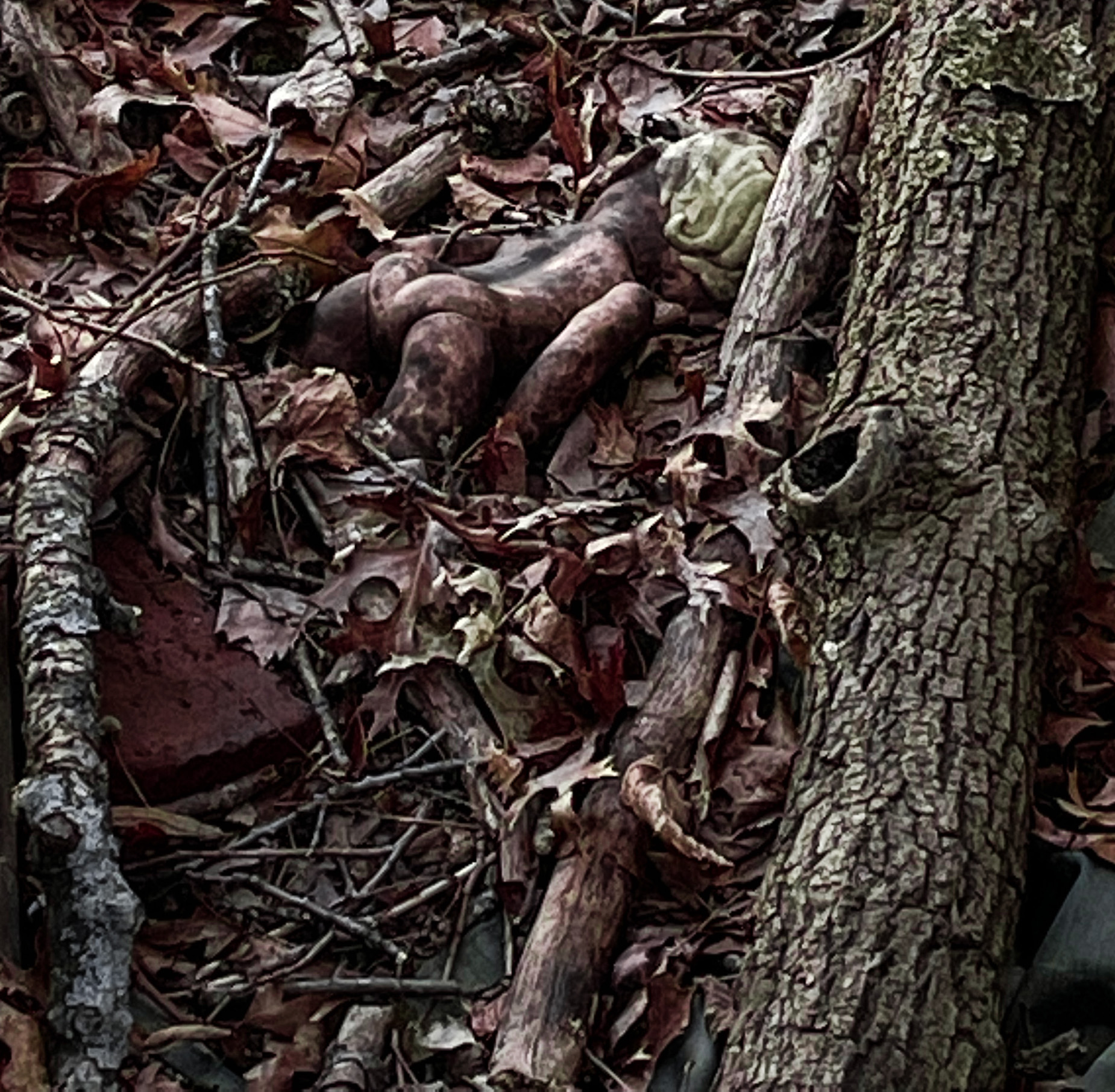
I'm late to the discussion so many of my thoughts were covered by others. I like the idea, the close up that is so expressive of his character, and the black and white treatment.
I think it is a little too tightly cropped. I would like to see his full tuft on the top of his head and a little more room below his chin. You could try making the crop a little wider, and then using some processing to bring a bokeh effect to the background so that it is not so distracting. I don't know exactly how to do that but I know it can be done. Great image: the kind that I would put in an article arguing for the personhood of animals. |
Jan 17th |
| 40 |
Jan 22 |
Reply |
Yes, I was thinking about whether I liked the other man or not, I think it's better without him. This round is a great round for reflections-Catherine's picture also has some great reflections. I love the reflection on this one.
But the main story is the conductor's face. There is a tension in that we fear he will drop the schedule, and given his pose we assume the train is moving. The schedule is very white and bright and draws the eye, if you wanted to play with it further, maybe a little masking just on the schedule to lower it's brightness just a bit (which means you would have to do similar work on the reflection of the schedule, might be more trouble than it is worth). Great catch of a great character! |
Jan 17th |
| 40 |
Jan 22 |
Comment |
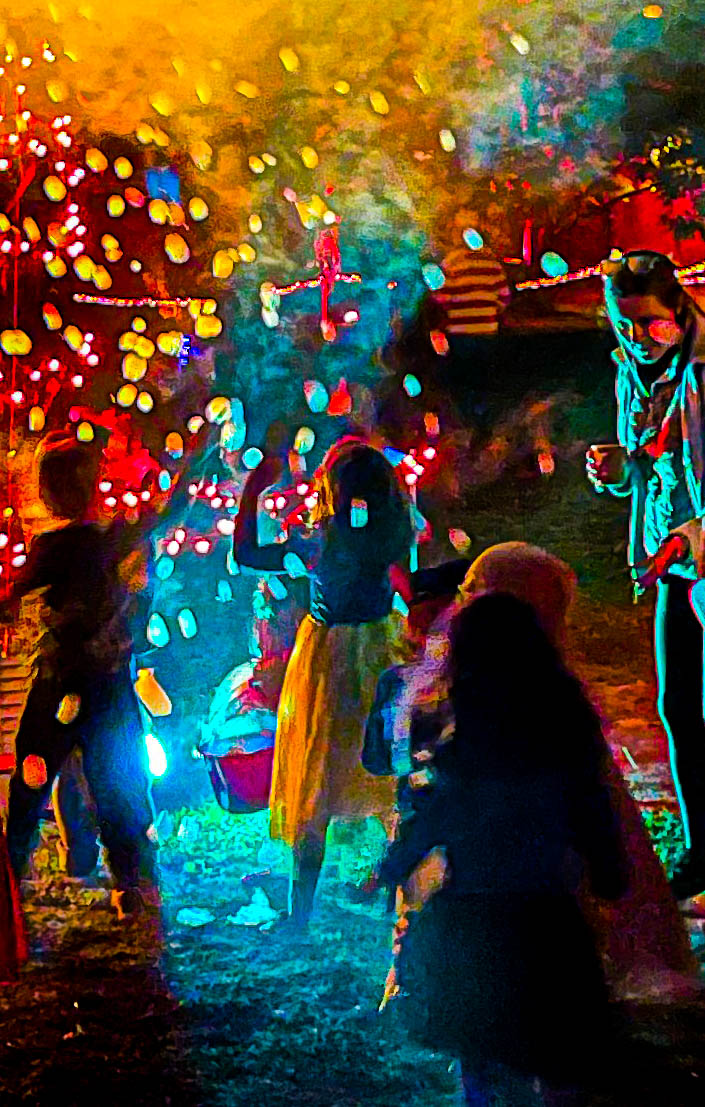
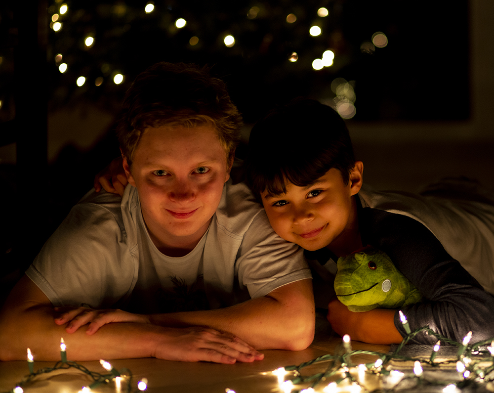
This is fantastic. Lovely Bokeh of Christmas lights in the background. A great image for texture. I'm particularly fascinated by the reflection of the rooms in the pink and white lower globes. It reminds me of that painting, The Arnolfini portrait, where the reflection of the painter is in a mirror. https://en.wikipedia.org/wiki/Arnolfini_Portrait
If you were going to do more slider work I would bring up the contrast or shadows or whatever it takes to make that reflection of the room in the lower balls a little more visible to the kind of observer who just glances at an image quickly. Also, if you p rint this for a card, having it a little more contrasty would print better. Have you tried printing it?
Did you take a picture of your photographic setup, by any chance? I would love to see it.
|
Jan 17th |
| 40 |
Jan 22 |
Comment |
Yes, I agree about the match, I didn't even notice that .... |
Jan 17th |
| 40 |
Jan 22 |
Reply |
Most of the pictures that didn't come out were out of focus, it was simply too dark in there.
Since the place was pretty empty I was sometimes able to rest the camera on something and get a steadier image, but that usually did not lead to interesting framing.
We spent a lot of time standing by a burning fireplace with two people who are re-enactors and spend their yearly vacation dressed up and living their whole vacation as colonialists would have, including cooking on a hearth. The conversation was really interesting, but I'm asthmatic, and after inhaling the smoke for a while I started to suffer, my mind became very fuzzy. It was hard to take pictures after that.
They have a re-enactment event every spring where they re-create a revolutionary war skirmish at the fort. That would be a great event to photograph, I hope to make it this year.Definitely a place I would revisit. But it's only open seasonally, so I have to wait until Spring. |
Jan 17th |
| 40 |
Jan 22 |
Comment |
I like your version very much, Don! Especially the warmer temperature! |
Jan 13th |
| 40 |
Jan 22 |
Comment |
Here is a horizontal crop, without the Topaz AI |
Jan 12th |
 |
| 40 |
Jan 22 |
Comment |
I played with it a little bit. Some photoshop, some topaz AI, which I think I overdid, and then made it B&W in photoshop. Just to try things. |
Jan 10th |
 |
| 40 |
Jan 22 |
Comment |
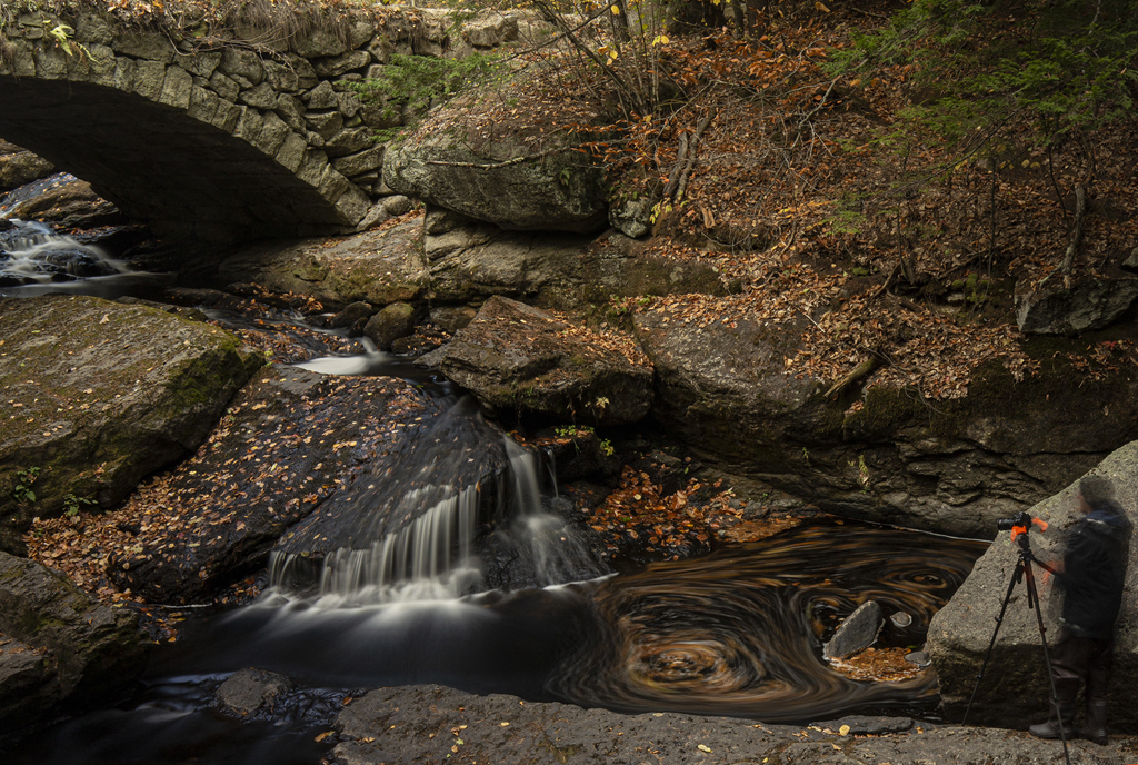
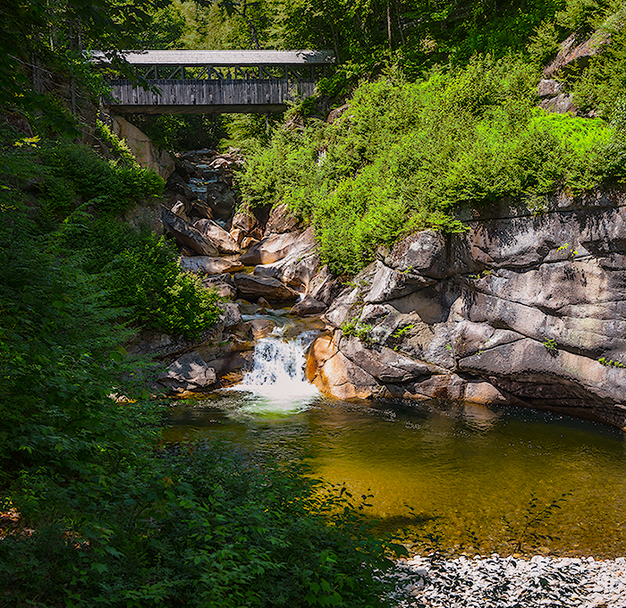
I cannot believe you got this with your iphone!!!!! this is just amazing! What a capture of the water movement! We have to work so hard to get this effect with a DSLR!
Did you do any post processing?
Yes, I agree a few feet back might have been interesing. But this shot say "lacy falls." It's all falls.I could argue for going tighter. I'm also wondering what it would look like if you played with the sliders a little.
|
Jan 10th |
| 40 |
Jan 22 |
Comment |
This image is great! Most pleasing to my eye is the way the sea mist is echoed by the clouds overhead.
The crop is perfect, the foreground elements also perfect. I love the deep blue of the sky and how it compares to the metallic blue of the water. I can't suggest anything to improve. Wow, Henry!
If I remember correctly you've taken pictures at other times from this spot. It would be great to see them all in a series. |
Jan 7th |
| 40 |
Jan 22 |
Comment |
I like the color work you did. It brings out the textures. There really is a tactility to film, isn't there? The pattern was mesmerizing and drew me to study the image. Though I couldn't be sure if they were bullet holes or something made by animals.I wish it was clearer that we are looking at a truck door.
I didn't notice the title right away, but once I read it, though I still wasn't sure if it was a truck or the door of a warehouse or something, I was at least sure they were bullet holes.
So as an abstract this image really works for me. As an image with a story, it doesn't work until I read the title.
do you have other images, maybe one that is a bit wider? It would be interesting to compare. |
Jan 7th |
10 comments - 4 replies for Group 40
|
10 comments - 4 replies Total
|