|
| Group |
Round |
C/R |
Comment |
Date |
Image |
| 40 |
Dec 21 |
Comment |
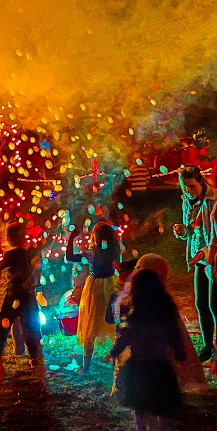
And here is the edited version passed through Denoise.
I know most of you won't see this before the comments close, but thought I'd do it anyway. It does seem better, but putting it through denoise makes the work I did on the mother's face more visible, I think. So moral, do cloning and erasing and such after denoise? |
Dec 31st |
 |
| 40 |
Dec 21 |
Comment |
I noticed just today Topaz Denoise was on sale, so I made an investment. I don't know how to use it, really. I just tried it. |
Dec 31st |
 |
| 40 |
Dec 21 |
Reply |
What a great set of fotos on Kottke.org! The one with the sign Hope 1/2 mile was used on a recent cover of the Poets and Writers Magazine! |
Dec 29th |
| 40 |
Dec 21 |
Reply |
Hi Julie,
I don't have Topaz denoise, does anyone in this group have it? |
Dec 26th |
| 40 |
Dec 21 |
Reply |
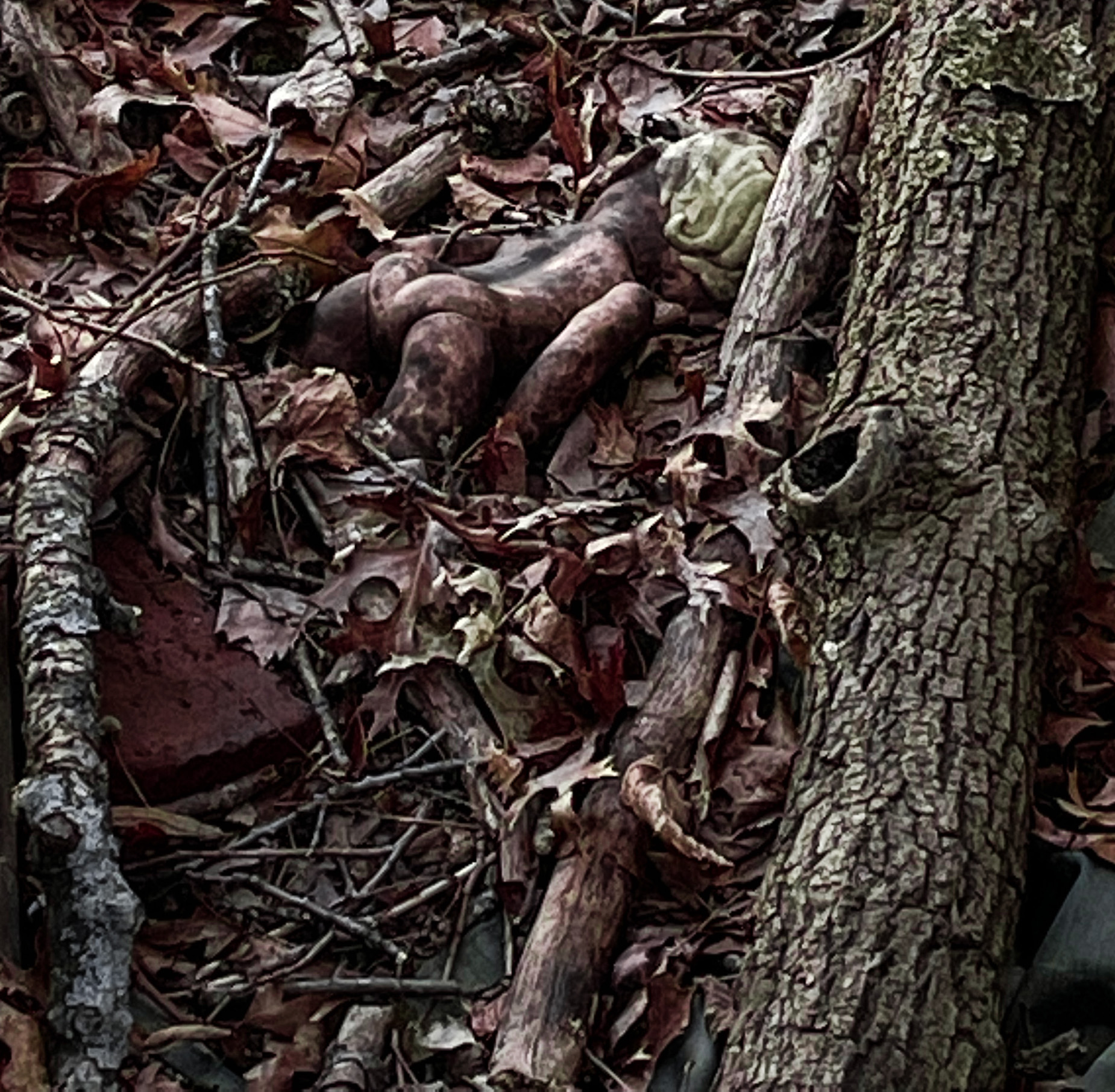
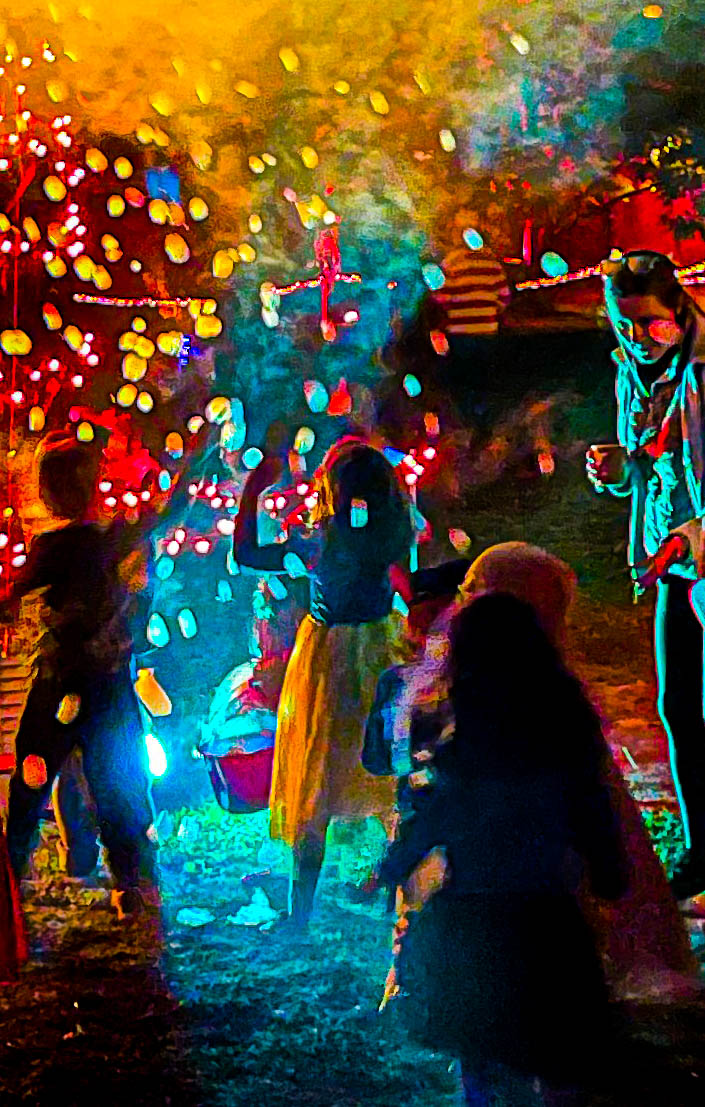
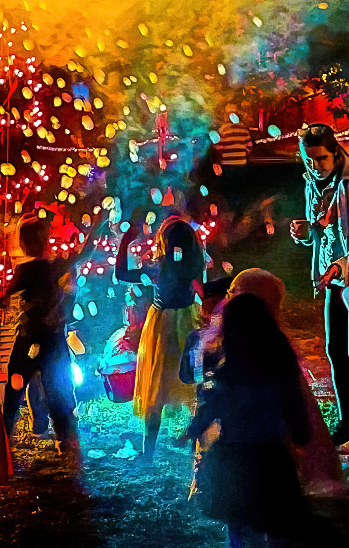
Here it is with bubble removed from woman's face (hard to do in an image like this) and more fog on top |
Dec 26th |
 |
| 40 |
Dec 21 |
Reply |
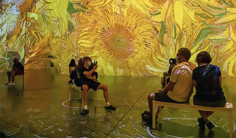
Ah, I saw this after I posted my quick edit. As you can see I cropped top, took out mirror on right, edited out bench, and brightened colors. See what you think. |
Dec 26th |
| 40 |
Dec 21 |
Reply |
My shot at making some of the changes I suggested. |
Dec 26th |
 |
| 40 |
Dec 21 |
Comment |
The square crop and what you did to brighten the colors work perfectly.
I agree with Stephen about maybe moving the spoon away a little.
I find myself staring at the two cookies perched on thebutter and I wonder if they are going to slip off. I find that thought distracting. So maybe, if you do another one, pose the gingerbreak men a little less precariously. I like the one leaning on the egg.
I agree with everyone else. How could anyone NOT eat those cookies?
This is great fun! Keep doing these! |
Dec 22nd |
| 40 |
Dec 21 |
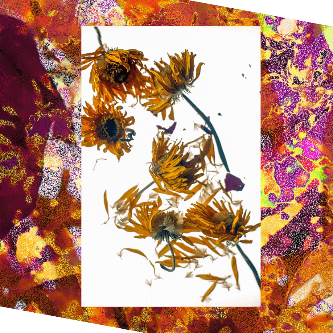
Comment |
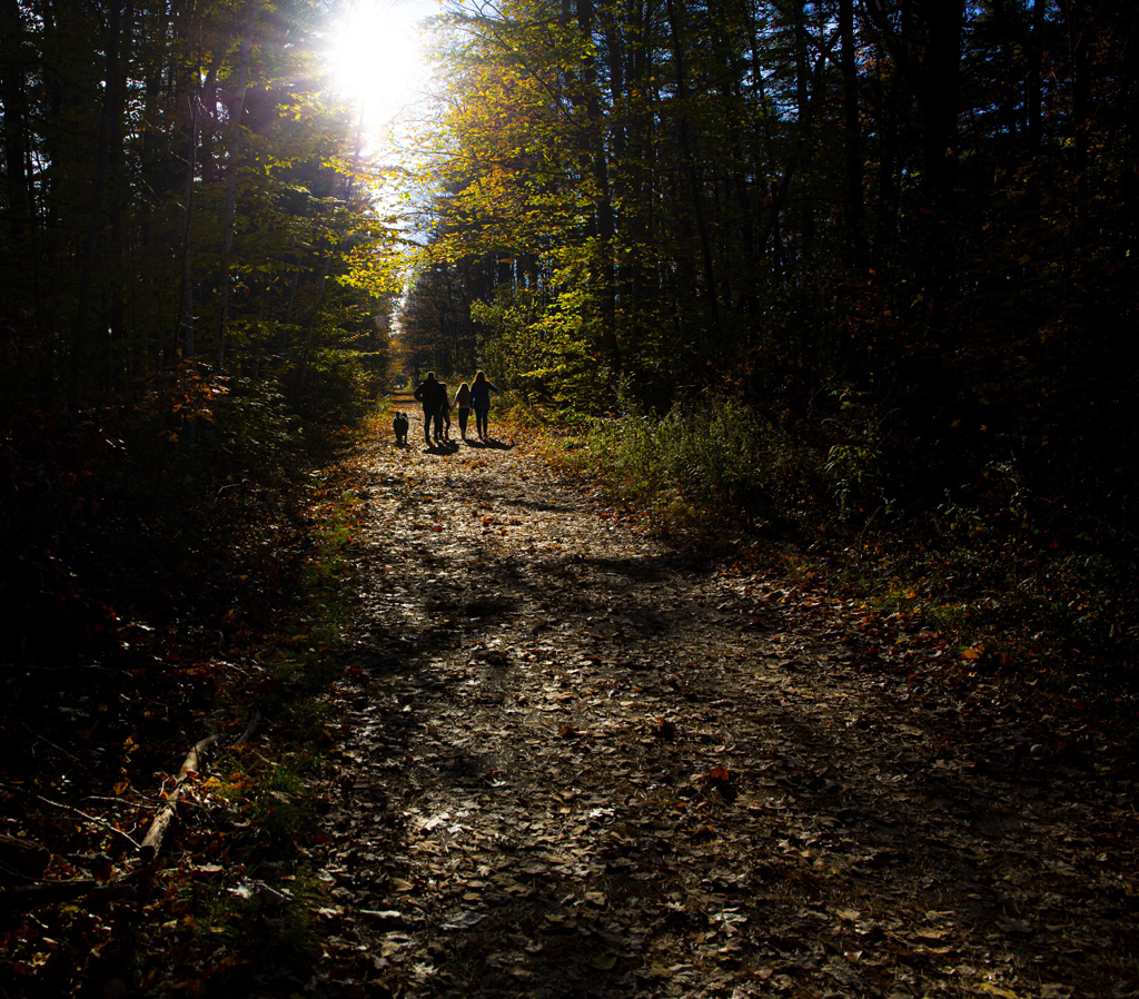
Definitely evokes Monet's water lilies. I love it. I'd like to see you do more like this.
I agree about cropping the lower part, because I agree with Andrew that the main event is the branch of yellow leaves.
However it looks to me that when you took it, you saw the main event as the triangular pattern of silver light in the middle of the image, which is echoed by the triangular shapes of the branches.
The thing is, the triangle of silver light in the middle draws the eye away from everything else. So if you wanted to keep that, maybe some slide work to lower the brightness just of that triangle and increase brightness of yellow and orange (as Andrew did in his version). Then you can keep the repeating pattern of triangles, though Andrew managed to keep those in his version as well.
You got a good shot so now you have options. Which will you take?
Make more of these! |
Dec 22nd |
| 40 |
Dec 21 |
Comment |
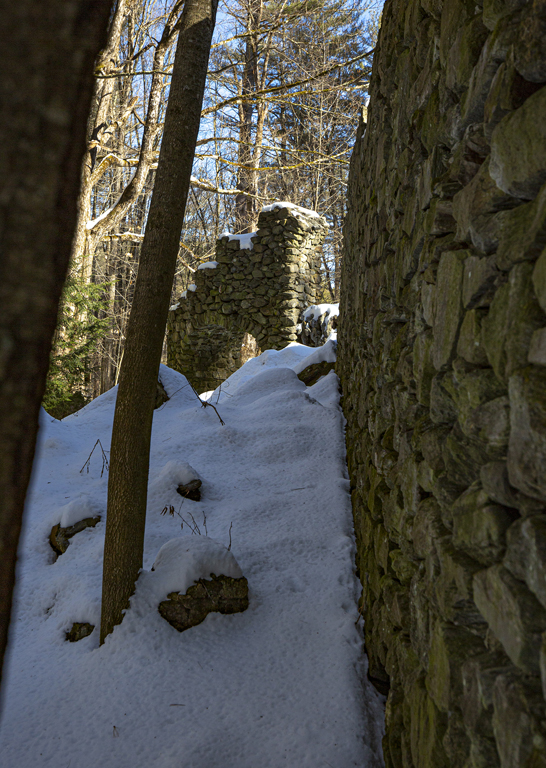
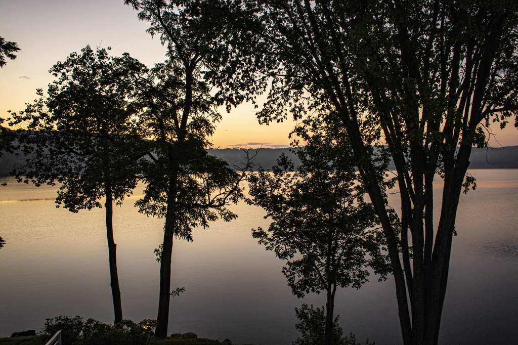
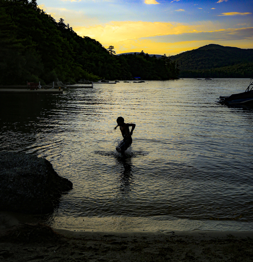
When I first saw the image, it made me think of a guillotine. A guillotine that's been decomissioned, that's maybe considering swimming out and putting an end to it's endless of cycle of guilt. Or maybe contemplating the horizon and hoping for healing and forgiveness. We can all relate.
It wasn't until Catherine pointed out that the top of the structure I'd anthropomorphized lined up with the horizon that I saw it. It didn't bother me the first six times I looked at it. If you could go back and photograph it from higher up, so the top of the structure doesn't fall right on the horizon, that would be good, but I also like it just as it is. It spoke to me.
I think the slider work you did was spot on. |
Dec 22nd |
| 40 |
Dec 21 |
Comment |
Wow, everyone is so very kind! I really appreciate it. I almost didn't submit an image this month because I felt too mentally drained from my studies, felt like I'd lost my "eye." Decided at the last minute to try to make something out of a series of images I took at this event, none of which I felt were successful. But editing can get you there in the end!
I iwll try to take the bubble off the mom's face, but I did try leaving in more fog and felt it took away from the grouping of the kids. |
Dec 22nd |
| 40 |
Dec 21 |
Comment |
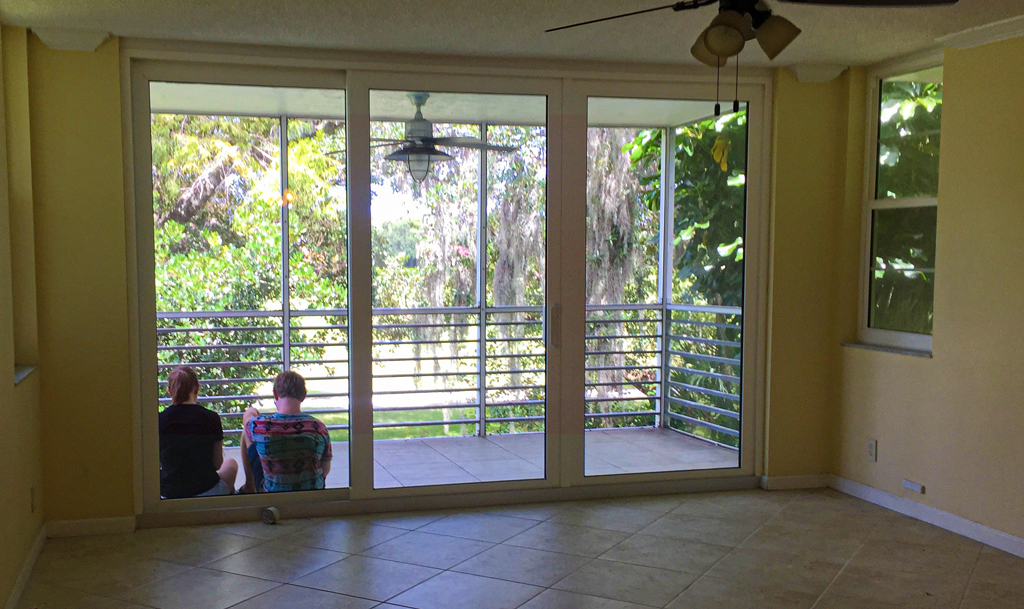
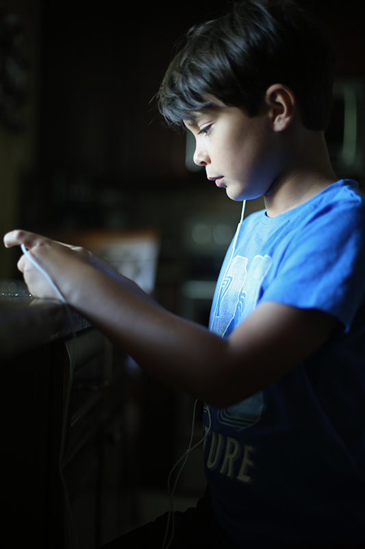
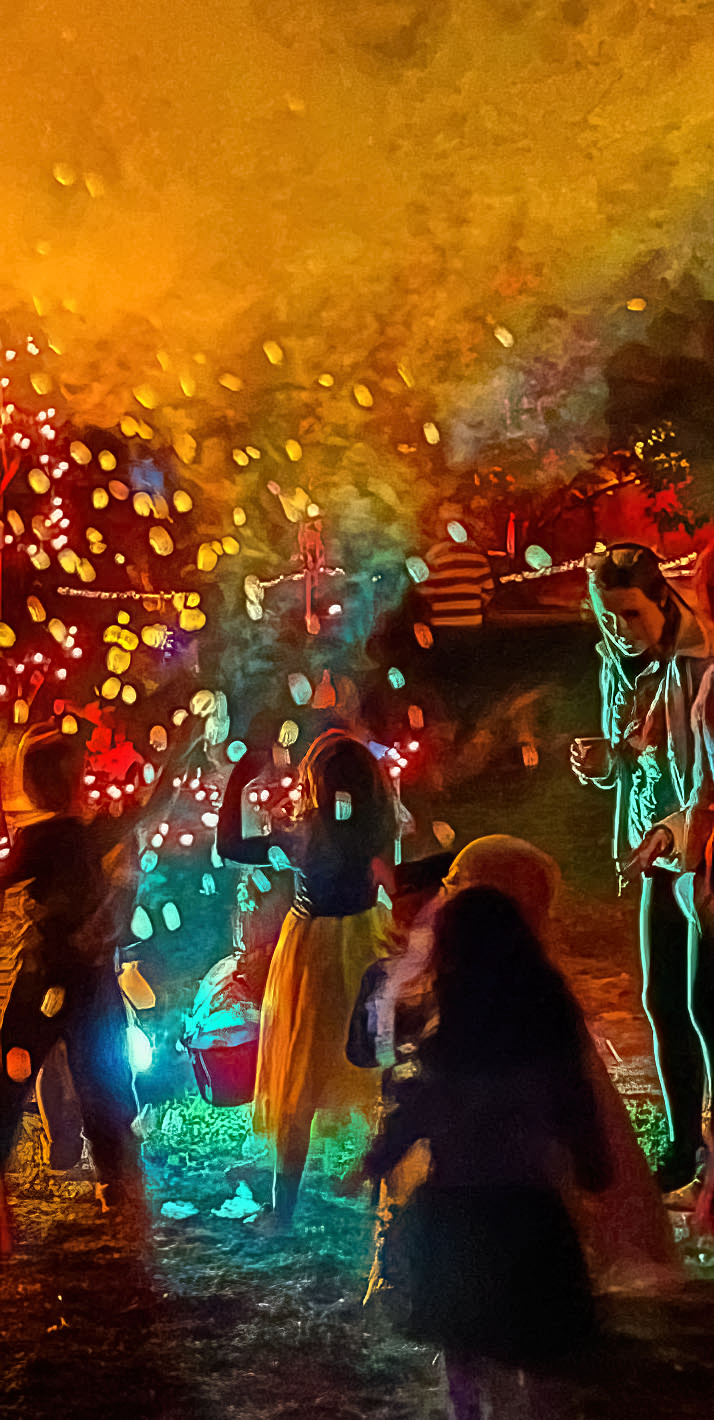
to me this image makes a complicated statement about visuals, screens and lenses that are windows or mirrors or in this case, given the sense of immersiveness, doors.
IMHO the boy taking the picture is the most important figure.
I suggest cropping a bit off the top, to take out the black square. Crop to the right to take out bench and mirror to the right.
Clone out people right behind couple and behind boy taking picture, but keep the figure to the left behind mirror.
Then you have the elements that tell the story you want to tell without distraction.
Maybe a little color correction to brighten the yellows and oranges and enhance the feeling of being inside a painting.
That's a lot of editing to suggest, but the image concept is important so I think it's worth doing.
I haven't been to one of these yet-I think there is one in Boston-is it worth going? |
Dec 22nd |
| 40 |
Dec 21 |
Comment |
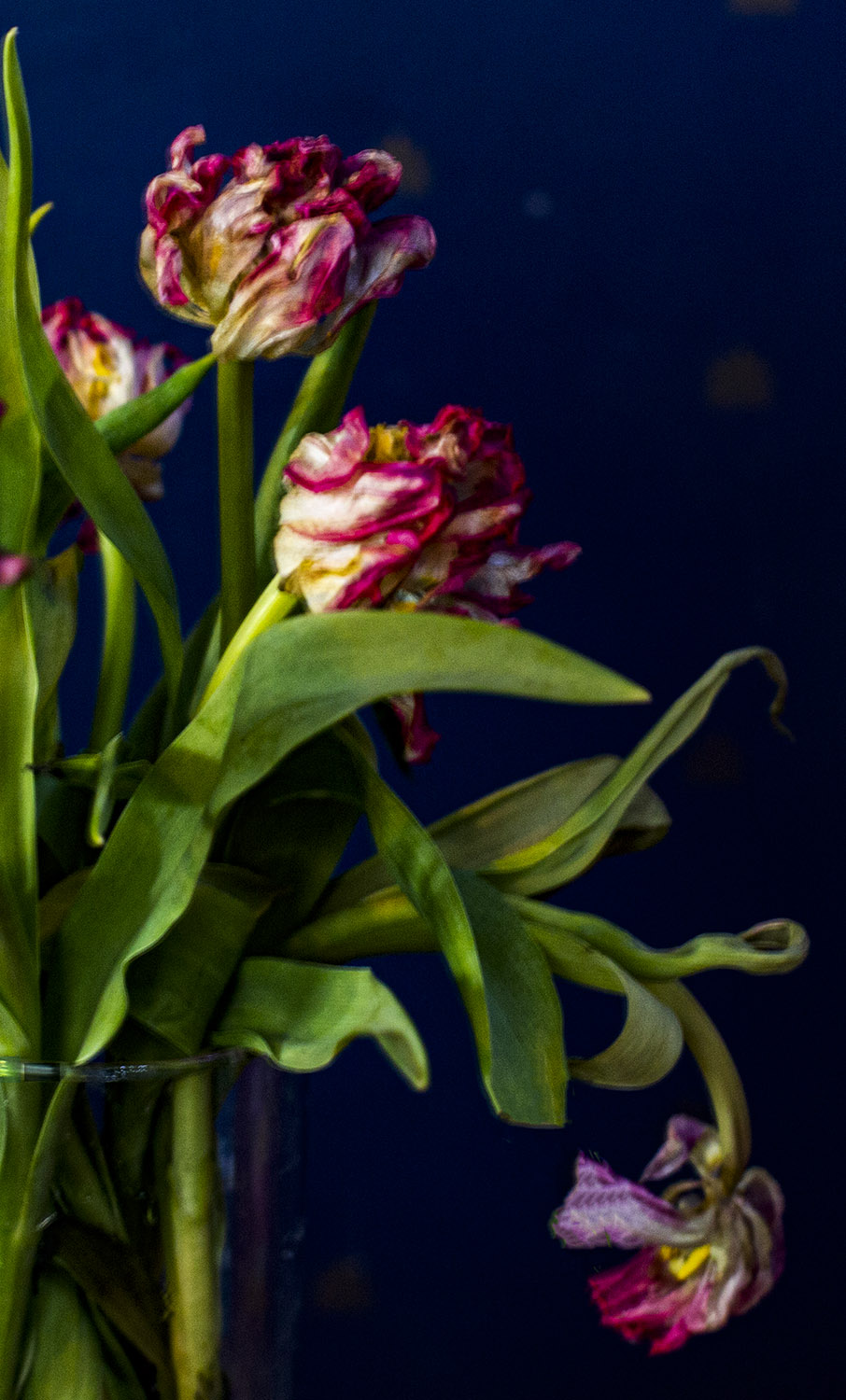
I'm pretty much in agreement with previous commenters. Love the subject, love the texture of the wave. Feel that it was cropped too tight at the top. Some work in PS to eliminate the white lines would be good. I like the texture as you have it. Once those white lines are out, it should feel like "water."
Good eye, good catch, needs a little work. Not sure what you mean by a "holiday feel" for this image. To me it's an abstraction of water. |
Dec 22nd |
8 comments - 5 replies for Group 40
|
8 comments - 5 replies Total
|