|
| Group |
Round |
C/R |
Comment |
Date |
Image |
| 40 |
Apr 21 |
Comment |
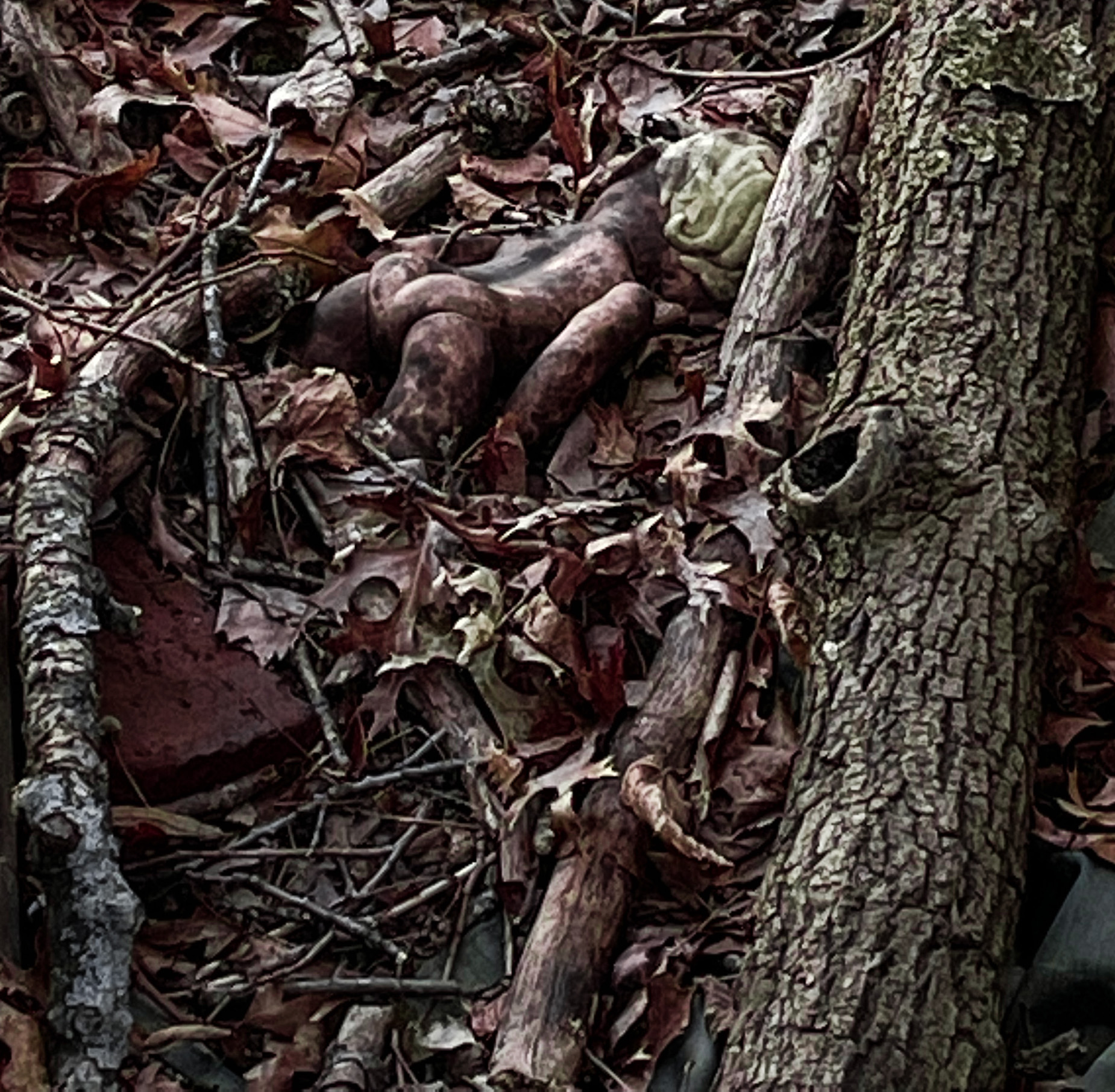
I don't feel this works as architecture, and your image reflects that: there is a disturbing lack of flow between one porch and the next, one overhang and its neighbor. Picasso's cubism, which deconstructs and re-arranges to add meaning, this is not.
Your black and white work is stellar. It makes the textures more accessible to my fingertips.
If you live near this, I would suggest finding other ways to photograph it, other angles, with angular rays of light on it and on overcast days.
I agree on the comments others have made on the shadows.
|
Apr 24th |
| 40 |
Apr 21 |
Reply |
I've filtered the bluish tint out and cropped a bit. Howsit look now? |
Apr 24th |
 |
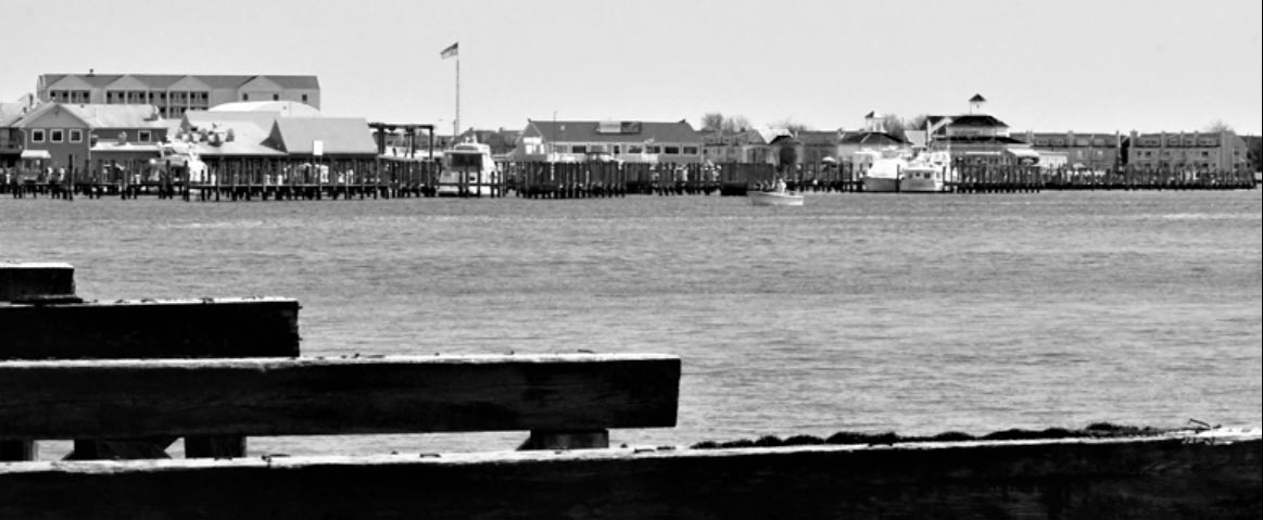
| 40 |
Apr 21 |
Comment |
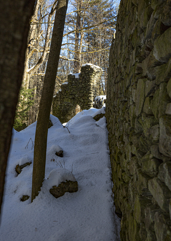
I wrote a long note on this and seem to have lost it. My comment was that I think I see what you wanted. What's important are the converging diagonal lines.
The reason we can't appreciate them is the difference in scale between the old wharf and the newer buildings on the horizon line. A different lens and a different angle are worth trying.
Still I felt this image had more going for it than we see at first glance. I tried cropping to a letterbox shape and changing to b&w. See what you think. |
Apr 24th |
 |
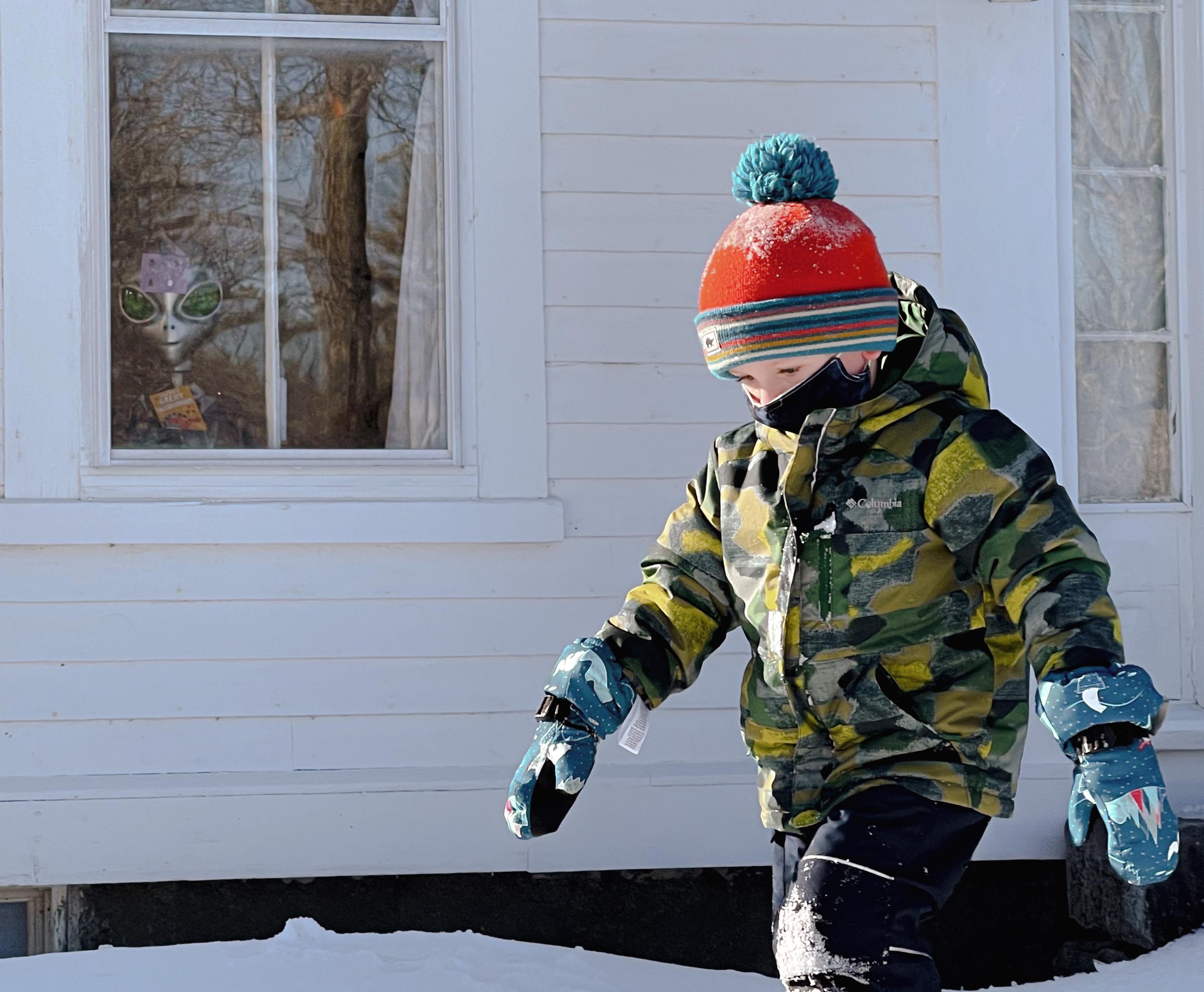
| 40 |
Apr 21 |
Comment |
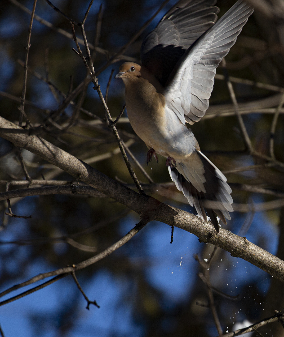
I love this little bird! The black background is a little disturbing to me emotionally, makes me feel he's in a studio. However, I agree it is better than leaving the original background. I agree excellent eye catchlight and the texture of the snow is also amazing. I suggest you keep taking more of these! Now that it is warming up you could open the window....
My husband just put bird feeders in our back yard. The window in this old house we rent is scratched beyond repair *the previous renters had a dog) but we lift it and watch the birds through the storm window. I haven't tried to take pictures yet, but you have inspired me. |
Apr 24th |
| 40 |
Apr 21 |
Reply |
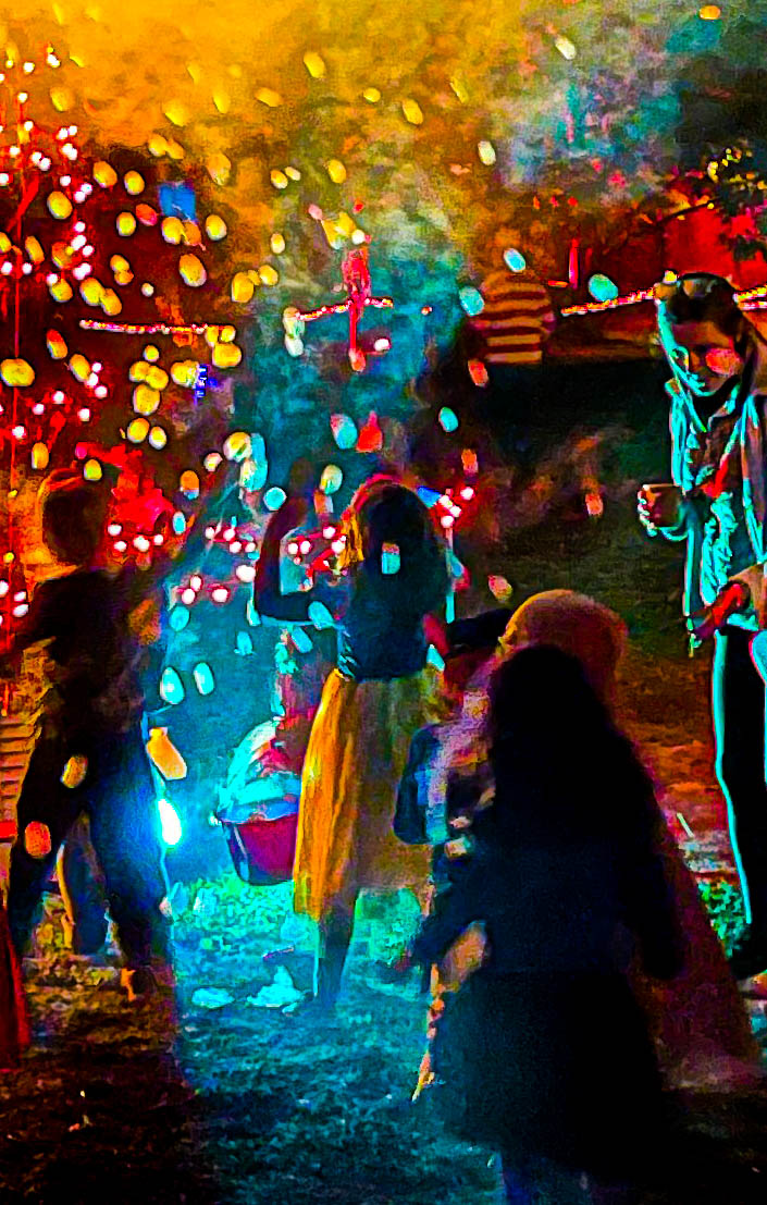
Wow Anne your picture in the showcase is powerful and moving! Such good texture, motion, and metaphor all rolled into one! Congratulations on getting picked! Your image stands out in a collection of fabulous images. |
Apr 24th |
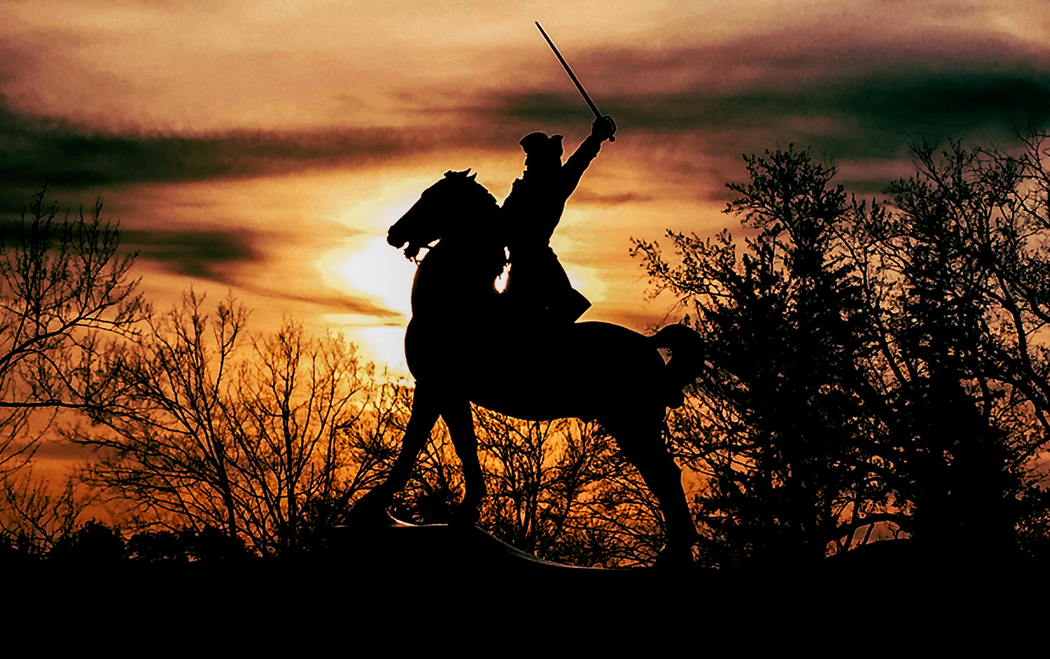
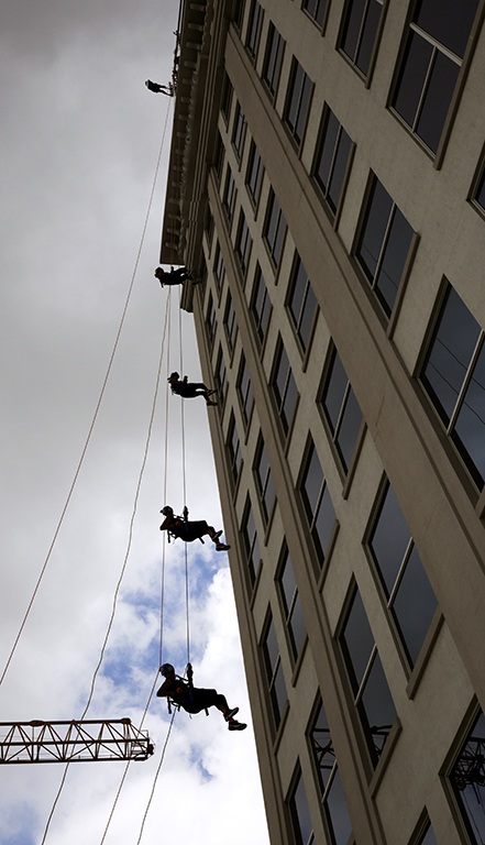
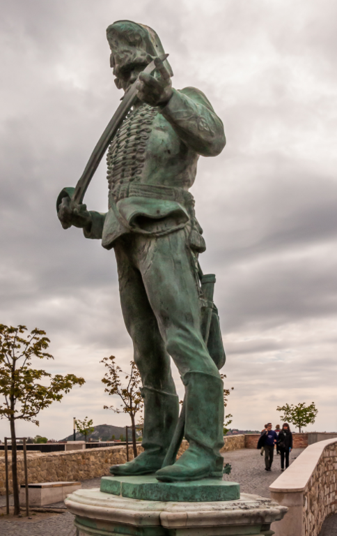
| 40 |
Apr 21 |
Comment |
This image is foreboding: the sky is foreboding, his action of testing his blade is foreboding, the sheer difference in scale between him and the people, and the fact that they are on a bridge adds to the viewer's malaise. The picture would not be as powerful as it is without the people.
I find those red and white poles (radio towers?) in the bkgrd on either side disturbing. Try erasing them in photoshop, or crop them out.I tried the crop: |
Apr 24th |
 |
| 40 |
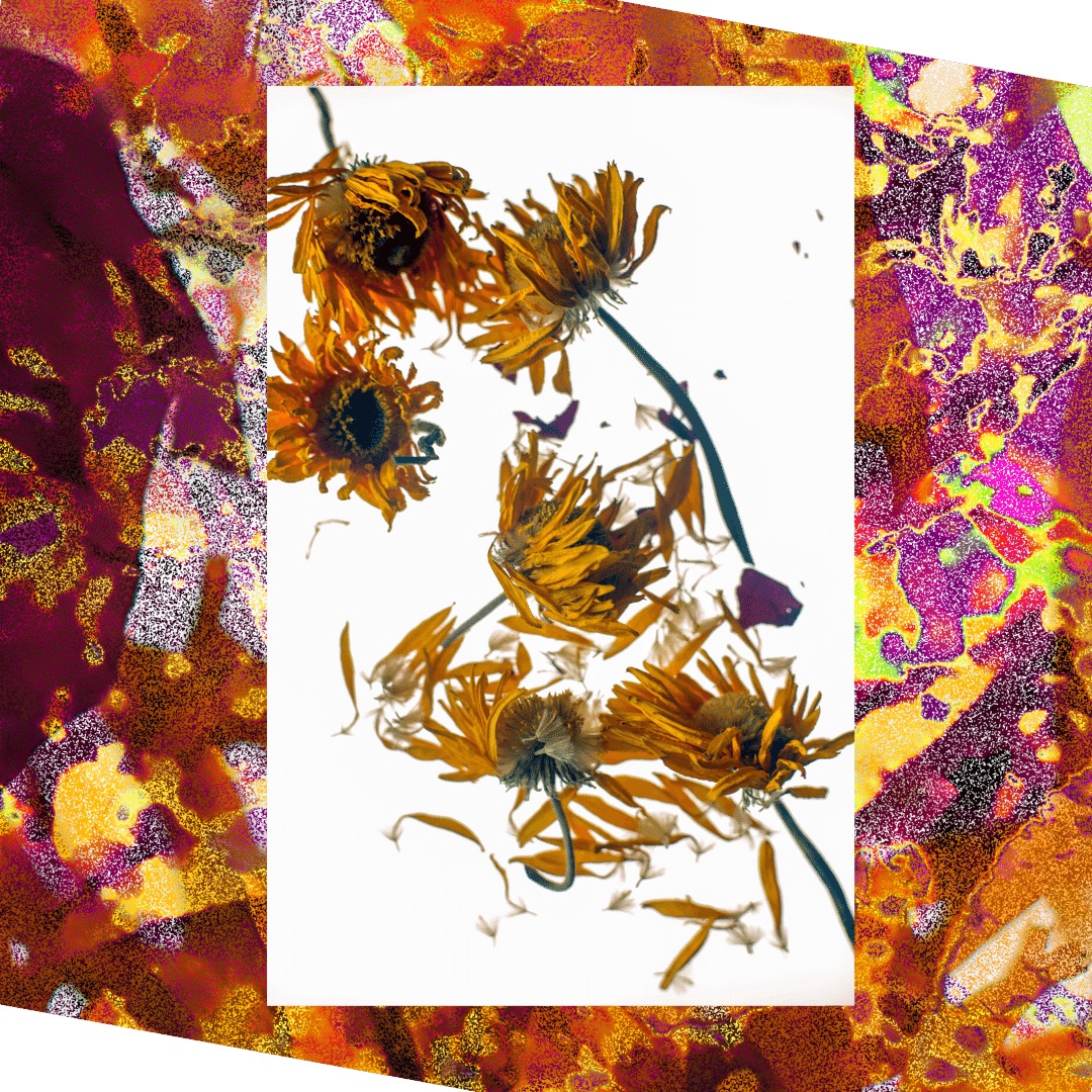
Apr 21 |
Comment |
Photos like these remind us to pause and appreciate how amazing nature is. I especially admire the beads of dew or raindrops that almost evenly line the unfurling petals. Just amazing.
It is sad that the middle is soft. Some people have had luck with some softwares that restore a measure of focus, though sometimes at a cost to the overall image. Topaz is one, if I remember correctly.
Or take more pictures like this until you get the full effect you are after! |
Apr 24th |
| 40 |
Apr 21 |
Comment |
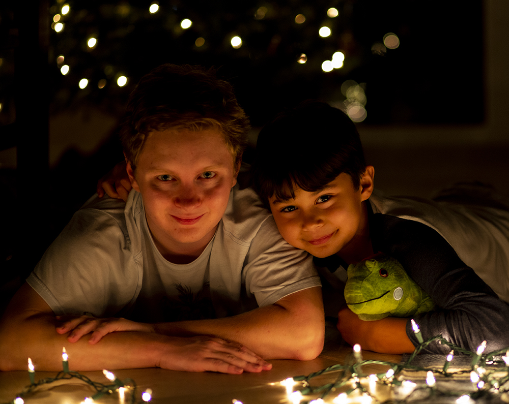
Thank you for all the kind feedback!
I thought of cutting off more to bring more focus to the faces. My crop was minimal, just a bit at the bottom. But when I tried cropping further it meant cutting off Cooper's hands, which bothered me. |
Apr 24th |
6 comments - 2 replies for Group 40
|
6 comments - 2 replies Total
|