|
| Group |
Round |
C/R |
Comment |
Date |
Image |
| 40 |
Nov 20 |
Reply |
Thank you for the kind words, Beverly! Nice to see people here from other groups!
Just to be clear, I took the picture with my phone, but then I took it home, downloaded it, and edited on photoshop on my laptop computer. I do have a few photo-related apps on my phone, but they are for taking pictures, not editing them. That I do on my laptop! |
Nov 27th |
| 40 |
Nov 20 |
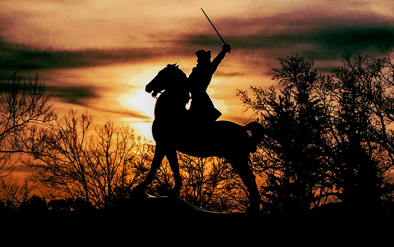
Reply |
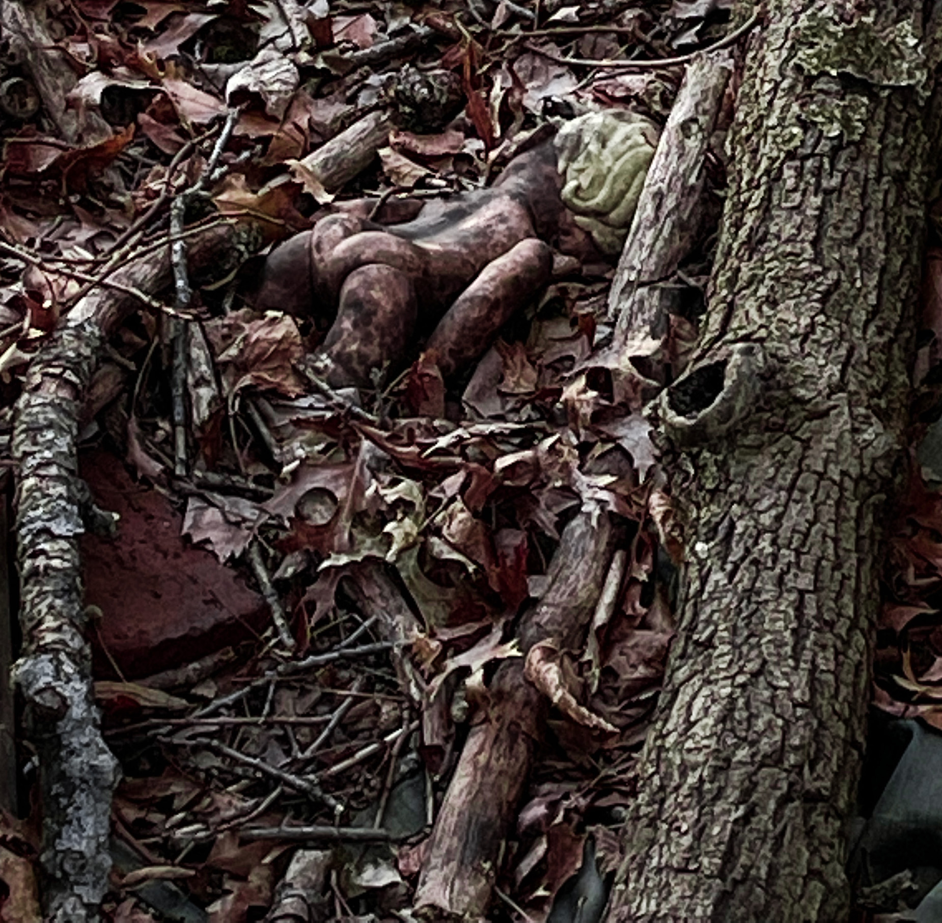
You know, Julie, you are right, this statue is very close to me, I could go back with a plan and attention to time and maybe an ND filter and shoot it properly. After all, it's a statue, it's not going anywhere... for some reason it hadn't occurred to me to go back and try again. But I will! |
Nov 25th |
| 40 |
Nov 20 |
Comment |
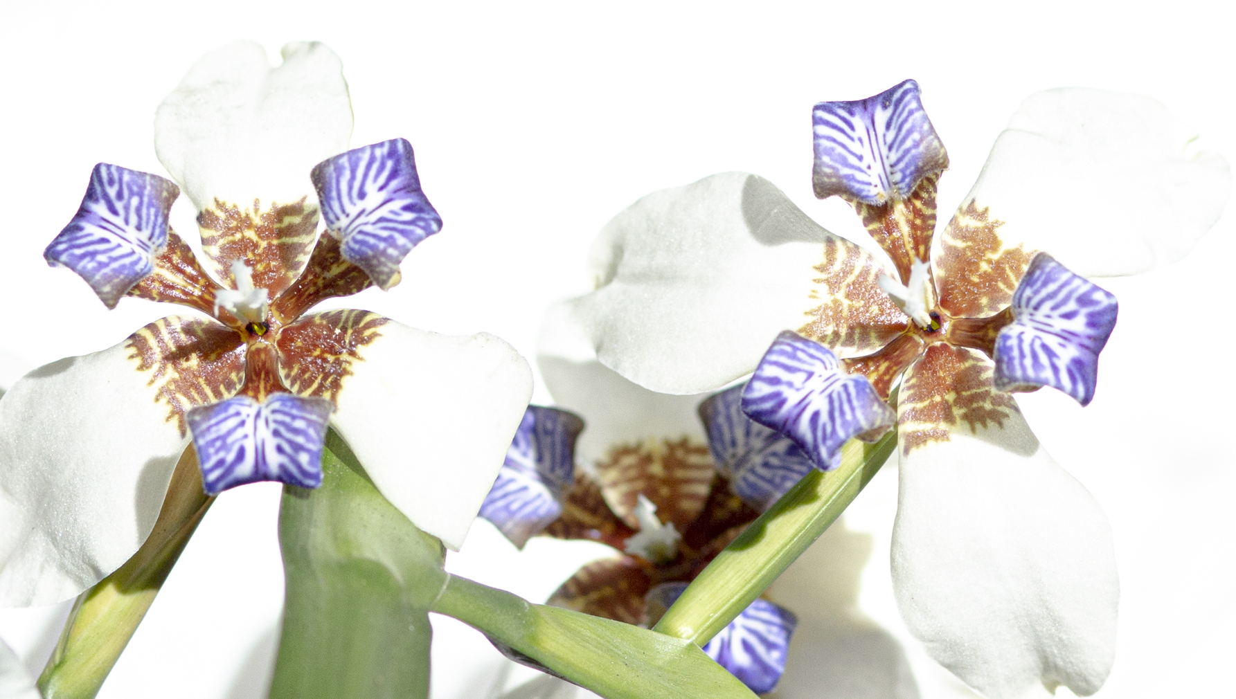
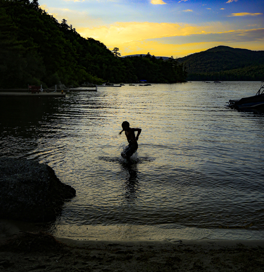
"Pelouse" means "lawn" in French so as soon as I read the name and the place and saw that beautiful emerald-green grass or whatever it is, I had to smile. What a beautiful place! and a beautiful moment that you caught.
When I was in theater I witnessed some interesting effects work. People would project images onto a scrim that wasn't visible in normal lighting conditions, and it would suddenly reveal something. I also saw an experiment where a column of smoke (actually dry ice vapor) was emitted by something on the scene and then images were projected onto that. I've seen the same done with foam.
The wave of crop-dust in this image has the same effect on me here. There is one reality, of the placid, almost ocean-like surface of emerald green, and then there is the explosion of dust, which enables us to see that the sun is moving across the landscape, reminding us that even a landscape this calm is ever changing.
If you bring up the exposure as others have suggested you definitely want to make sure to adjust the blacks and shadows accordingly so you don't lose the range of contrast. I agree with Andrew that the wave of dust to the far right is a distraction. That could simply be cropped out. I wouldn't touch the rest of the dust.The background is hazy, so cloning any more out would just lead so a blotchiness you don't need.
Great catch. Like the others, I'd like to see this place some day.... |
Nov 25th |
| 40 |
Nov 20 |
Comment |
I've been thinking about this image for a while. I find photos that tell stories or work on visual puns very difficult to construct, so my first reaction is hats off, you did it!
I agree it feels like it's cropped too tight and the red valve is distracting. I would clone out the red valve and the human to the far left.
But more important than that, the eye doesn't naturally travel to the "one horse power" sign which is key to the viewer "getting" the story (we assume that such a complicated machine would end up being more powerful than that). So first off I would try to make that sign brighter, redder, so that it stands out. The other thing I might do is clone out the lettering along the side of the wagon, (the name of the company and the address). The reason I suggest that is that my eye starts with horse's white ankles (and that distracting red valve) then travels to the right, which means I focus on reading the address. I then start wondering who these people are, where is this set, and why are this horse and wagon important? By the time I get to the "one horse power" sign I'm "out" of the narrative and miss the joke.
So to sum up my suggestions: loosen the crop if possible. Clone out red valve. Clone out address. Brighten "one horse power" sign. If you are not hung up verisimilitude, I would even enlarge the one-horse power sign and composite it back in over the original, to make it just a little bit larger. I would also give the image the title "One Horse Power," for the distracted viewer who might miss it.
I've watched you created these images that tell stories over the couple of years I've been in this group. You are getting better and better at it, so I hope you keep making these. |
Nov 25th |
| 40 |
Nov 20 |
Comment |
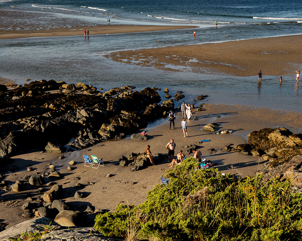
The thing about the uncropped composition is that the little green leaves of that bush make a nice diagonal behind the bird. I'd like to see the diagonal retained even if you crops some. I like what Henry did, taking out the distracting white branches.
The birds seem brighter in the original, would like to see them brighter.
Really an amazing image. I've only seen roseate spoonbills (in captivity) as well. As far as I know all spoonbills are endangered so this is a precious image. Thank you for sharing it! |
Nov 18th |
| 40 |
Nov 20 |
Comment |
I love this picture. The cropping works for me. I would blur the background even further, or darken as someone suggested.I agree about the leaf. Also there is a hair on the lens that you could content aware out (in the one o'clock position just above where the two flower petals overlap). That hair really bugs me.
Beautiful capture. Makes me miss FL! |
Nov 18th |
| 40 |
Nov 20 |
Comment |
This image is very strong. I wonder if the B&W was over-brightened a little too much.
Unlike the others, the centering of the tall trees doesn't bother me, because as a viewer I'm aware of the flatter extension (bushes on an island?). Taken together, trees and island are not centered.
Still, taking the advice of the others on cropping will not hurt.
I do find myself going back to the color image; in some ways I think it has a greater sense of depth that the B&W lost. Both images are quite strong. Hard to choose.
Was it vignetted? It doesn't look vignetted to me. |
Nov 18th |
| 40 |
Nov 20 |
Comment |
For me, the biggest advantage of the moving pictures like these, is you get a feeling of texture. The emphasis moves away from "where is the light coming from" to "what feeling do these colors and shapes evoke."
A few months back I tried a collage where I kept adding layers of different parts of the same image over each other (I think it was June or something). I never really got what I wanted, but I did feel that what I ended up made a good background for something else. My point is, this image isn't the end of it: you will probably use it in a new composition with other elements. Or anyway, you could. |
Nov 18th |
6 comments - 2 replies for Group 40
|
6 comments - 2 replies Total
|