|
| Group |
Round |
C/R |
Comment |
Date |
Image |
| 40 |
May 20 |
Reply |
I haven't been able to do any photography work this month. We had to rent a place up north sight unseen (we did have relatives go look at it). We are putting our place up for sale. The kids are finishing school, one kids graduated. I have about 5,000 books and I've been packing them for the move. The next picture I will probably take will be of my apartment, to help sell it. So don't expect too much from me... I'll try to do somethng. But once we are settled I'll be able to experiment more.
I'm trying to get the models I photographed in February to give me permission to submit the pictures to the PSA for critique or whatever it is they do, but they are balking on signing a model release. |
May 28th |
| 40 |
May 20 |
Comment |
This kind of effect is so far out of my experience that I can't think of much to say about it. I studied it a good long time- your original vision of the street was a good one. I agree about taking out tree on the left. I also agree that it would be worth making the people stand out in someway, either by whiting them out so they are just white figure, putting back the photo-realistic version of them, or removing them completely.
I could really see just the street, without people, as the backdrop for a comic book scene, something like that. I think you should keep taking these kinds of pictures. You see something the rest of us don't, and this effect adds to what you see. Don't be dispirited because the jduges didn't like this one. Keep refining the expression of your vision. Eventually they will catch up to you. |
May 28th |
| 40 |
May 20 |
Comment |
Your instinct to take this image to B&W is great. It is absolutely a perfect image for B&W, with the cloud texture and high contrast.
I think it is perfectly cropped. If you crop further you will lose the black corner of sky which gives the image it's power.
I love the way the grass on the ridge is foregrounded by your cropping. Great work!
I've been looking for an article I saw recently that I thought you would enjoy. It was about how Ansel Adams dodged and burned "Moonrise over Hernandez." The sky in that image is black. The original sky is gray. Adams brought it down to black. When someone asked he said "of course the sky isn't black, have you ever seen a black sky like that?" He dodged and burned the hard way, with a wall of light bulbs at different settings that ran with a series of switches.
I think this is the first article I read: https://petapixel.com/2018/11/07/the-story-behind-ansel-adams-iconic-moonrise-hernandez/
Here is another one that shows his dodging and burning setup:https://photofocus.com/photography/a-look-inside-ansel-adams-darkroom-magic/
|
May 28th |
| 40 |
May 20 |
Comment |
Yep, I think the band of blue sky at the right has to go. However if you crop it you lose the feeling of looking at a corner angle of the building. Without that bit of sky for frame of reference that get lost.
An alternative is to play around with it in PHotoshop and darken the bits of sky that can be seen through the wooden beams.
|
May 28th |
| 40 |
May 20 |
Comment |
I'm a fan of B&W but in this case the color worked better for me. Because the curtains are really well designed for these windows.
I liked Andrew's crop.
It's true the image is soft. If this is a location you can re-photograph, I encourage you to do so. If you do that I also suggest using HDR, because the outer scructure, the curtains, and the reflections of other building in the glass each have ideal settings but none of them are the same. Can't wait to see what you do next.
|
May 28th |
| 40 |
May 20 |
Comment |
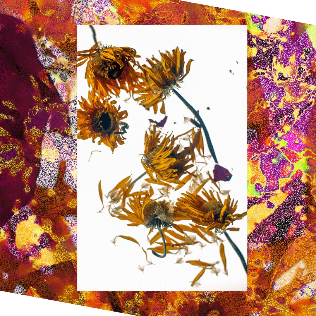
Henry, I like the vertical format. This flower says "vertical" to me. I also agree that the strength of the image is how the flower contrasts to the background, so enlarging it and cropping out more background would make you lose something.
I agree with Andrew that having a blurrier background would help, but I wouldn't want you to take that to extremes. it's good to know what the background actually is.
Your processed photograph is so much better than the original it's amazing. A real lesson in what a little post-processing can do. Can't wait to see your round 2!
I've heard that you can take a lens and turn it around and hold it up and get a macro picture that way. I've never tried it, but you might want to look into it, just to get a bigger variety of macro effects, since these flowers don't bloom for that long. |
May 28th |
| 40 |
May 20 |
Comment |
Hi Catherine,
Sorry I'm late to the party, it's been an unusually busy month for me as we move in a few weeks.
I wish you had the original of this image to also show us!
I agree with everyone, the boat is a jewel of a find! So kudos for that: your eye for what makes a good image is excellent.
If I were to guess at what changes you made I would say you added a vignette and then dodged and burned some areas, especially the trees, to bring them back up. It looks like you used sliders to bring the blacks down, but I agree with others who said it would have been nice to have whites punched up a little. It looks like you added haze or similar effect to make it smooth; this is what makes the image seem soft. It's an artistic effect, some will like it, some won't. I'm OK with it. The boat itself makes me think "skeletal," my emotional reaction is that some hapless sailor is desintegrating under the water. Great image!
|
May 28th |
6 comments - 1 reply for Group 40
|
6 comments - 1 reply Total
|