|
| Group |
Round |
C/R |
Comment |
Date |
Image |
| 40 |
Feb 20 |
Reply |
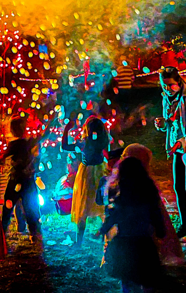
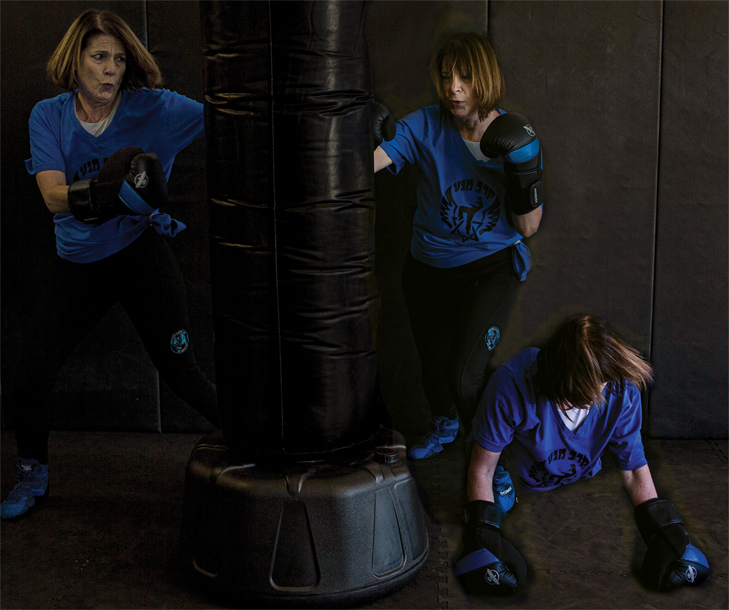
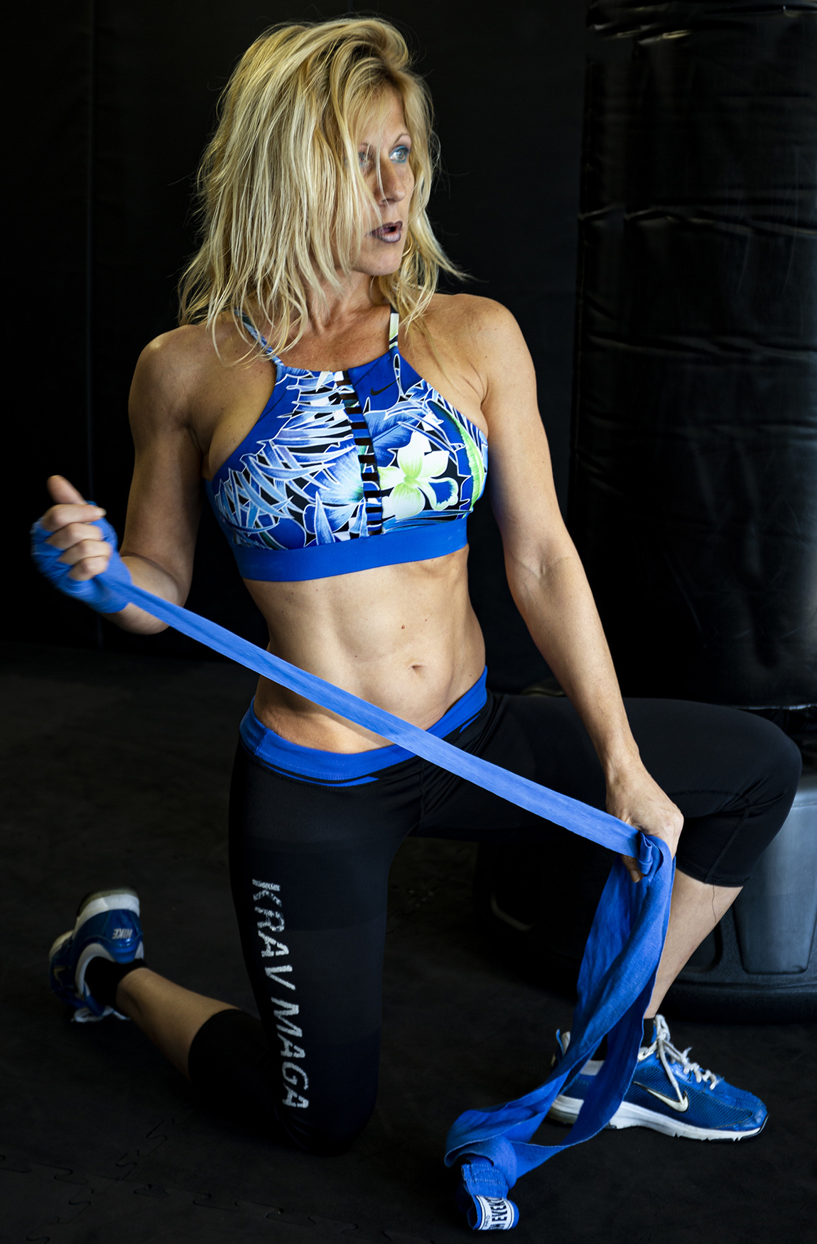
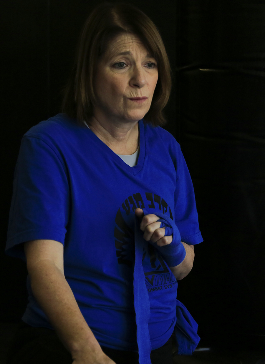
I would have cropped the bag out completely but then I would have cropped out her knee, which I didn't want to do. Moira's solution is much better. I managed to replicate it on another image from the same shoot. The bag was in the background too, but I cloned it out. Easier since this kickboxer isn't wearing black clothes. |
Feb 17th |
 |
| 40 |
Feb 20 |
Reply |
Ah yes, thank you.
|
Feb 17th |
| 40 |
Feb 20 |
Reply |
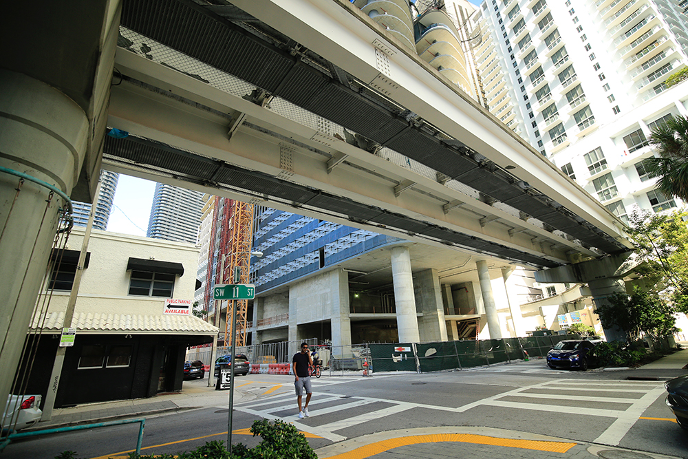
Andrew, what does it mean, "the figures don't cross"?
Also, I could see the left crop working, but only if the right was also cropped, just to the right of the rightmost foreground figure. However this takes away the darker "frame" which gives the space it's protective feel. But those crops would emphasize the diagonal movement of the strolling people. |
Feb 16th |
| 40 |
Feb 20 |
Reply |
Moira, thanks so much for the retouch. It looks so much better!
It was a long shoot so I have a lot of pictures like these. My goal was to make a sequence image, but I also want to give the ladies who patiently posed for me some nice pictures in return, so I will apply your advice to other pictures as well!
I tried to download this one but the software doesn't let me.... |
Feb 16th |
| 40 |
Feb 20 |
Comment |
Dear Andrew,
Wow, great job of making the most of a difficult situation. This gate and its towers definitely have a unique personality which you captures brilliantly. I would never have known it was stitched.
It's possible some other softwares might help you "straighten" the image a bit more, though I don't know what they are. Maybe one of the plug-ins for Topaz, which I do not own.
Even without further straightening the image tells a story. There is a power in the gate's bulk and it's rich, warm, textures and the roughness of the buttress in the foreground where the wall was hacked away.
I wonder what the image would look like if you cropped the left so that the housing behind the gate was no longer visible. That would bring our focus to what we see through the arch.
I think the rod on top was a lightning rod, not a flagpole. Either way it was a modern addition so I think losing it was an improvement.
An image that was well worth all the effort you put into it.
|
Feb 11th |
| 40 |
Feb 20 |
Comment |
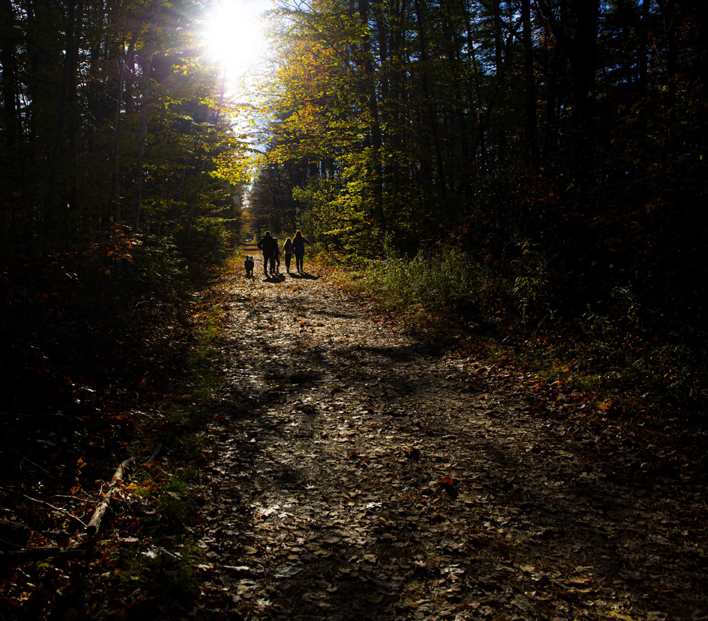
Dear Jamie,
This image also inspired me to go back and look at some of your other work of the past months. I compared this to your recent mailbox image and also your July image, with mountains and yellow flowers. Prakan had some comments on that image, about focus stacking, that could be applied to this image as well. That is, since you are clearly committed to photographing the park again and again, to use your tripod (I know, carrying the tripod for a mile is a drag!), take multiple pictures for one image, with different depths of field, and combine the pictures later in Photoshop.
Looking over your pictures of the last few months, I would call you the poet of the middle ground. Most of us focus on the background of the foreground of their landscapes, and the middle ground is just something that has to be there but is overlooked. In your mailbox picture and this picture it's all about the middle ground, as the lines of the ridges the trees are growing out of echo the s-curve of the stream.
I wish you'd posted the original, which I assume was in color, just to see what the B&W added, though I'm sure the B&W is the best choice, as it emphasizes the lines you want to emphasize. Good job of seen an op and walking the mile to catch it! Can't wait to see your next landscape! |
Feb 11th |
| 40 |
Feb 20 |
Comment |
I too thought this was frosted glass. I would not have known without being told what it was. Not knowing does not detract from the quality of the image at all.
I am impressed by your ability to see the possibilities for abstraction in the world around you. I was looking back over your images of the last few months and the really abstract images are your best. This one is a really good example. I can't think of any suggestions for improvement. It would work really well quite large, like, say, covering a whole wall. |
Feb 11th |
| 40 |
Feb 20 |
Comment |
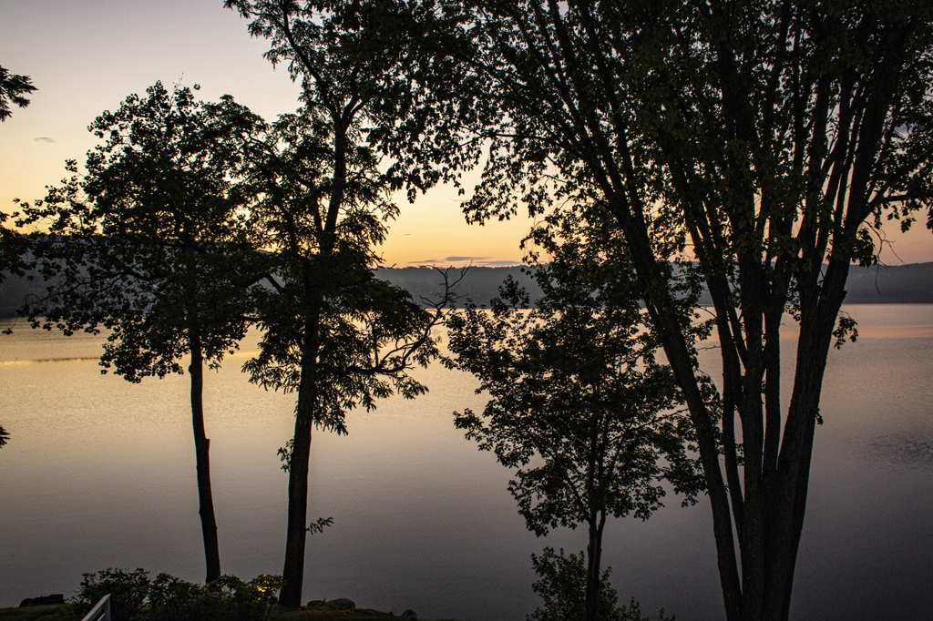
Dear Henry,
Wow, with the composition of this picture I feel that I can see the improvement in your eye! You had a photographic goal, you went after it, and in terms of composition, you got it! Congratulations!
I agree with the others that the blue is too intense, but not for the same reasons they give.The original has different light in the sky, on the water, and in the snow on the ground.The final loses some of that: we still see sky, water, and ground in the lines, but the differences in lighting tone have been lost.
I personally prefer the neutral whites, greens and grays of the original, but I can see a colorized version, including a blue version, working equally well. Just not quite so blue. The more even bluer patch in the right of the sky is distracting to my eye.
Also there seems to be a graininess in the final that isn't in the original, you might want to see where that came in and take it out again.
I love that you set out with a goal and captured it! Now it's just about tweaking the color. |
Feb 11th |
| 40 |
Feb 20 |
Comment |
A very powerful image. I do like the sepia toning, it makes me think of engravings from the newspapers of the time, the kind you often see illustrating Mark Twain stories.
I do wish we had a slightly larger version of the original, what we have here is very small and my eyesight isn't that good. The sepia is lovely but I suspect that the monochromatic nature of the original also has its charms; this might be the kind of original that yields two equally attractive possibilities.
I do agree with Moira that more room on the right would be better. Although technically we know from the water on the paddle wheel that it must be moving to the left, the way the boat is angled in the frame and the fact that the back end looks larger than the front end makes it feel like the boat is coming towards us.
Congratulates on recognizing the good photo op and catching it! Always the photographers first challenge! |
Feb 11th |
| 40 |
Feb 20 |
Comment |
I love this picture. I would love to know where in Spain this is! (I grew up in Catalonia).
For me this picture is about the yellows.The first yellow that pops out at me is that large architectural curved piece on the left. That yellow is echoed by the yellow squares on the roof of the building behind it and the horizontal yellow line in the red building in the center background.The same yellow is picked up by the bottom of the balconies on the right, along with some store signs at street level.It's interesting to me that my eye keeps going back to that large yellow architectural piece on the left. Then my eye circles around to the other yellows, which seem to encircle the peaceful space of this plaza, with the tiny creature in the center of it.
You mention the cold but I don't get "cold" from the image. Rather I get an impression of a protected public space where people can stroll in a relaxed manner. The dog looks a little nervous, so my eye keeps traveling to see what threatens it, only to end up comforted by the protective curve of the buildings and the yellow highlights in it.
I do agree that the right side is a little hot. I would suggest not juts making one side less hot, though, I would lower the overal brightness so that the change in lighting remains the same.
I've only seen a few of your pictures but I can tell already you have a special eye for light. |
Feb 11th |
6 comments - 4 replies for Group 40
|
6 comments - 4 replies Total
|