|
| Group |
Round |
C/R |
Comment |
Date |
Image |
| 40 |
Jan 20 |
Comment |
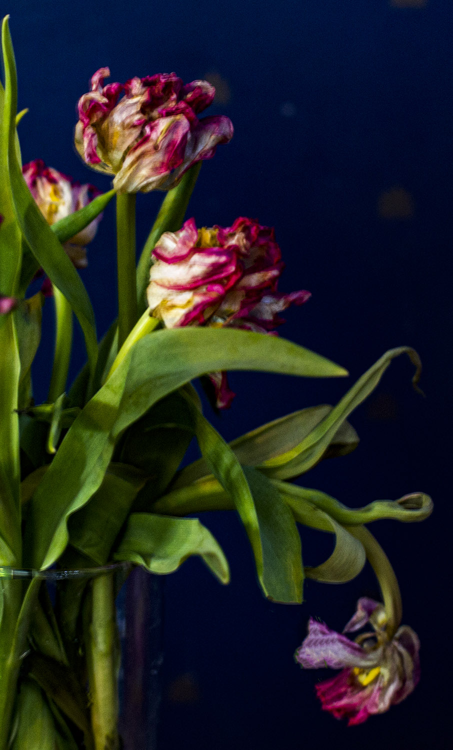
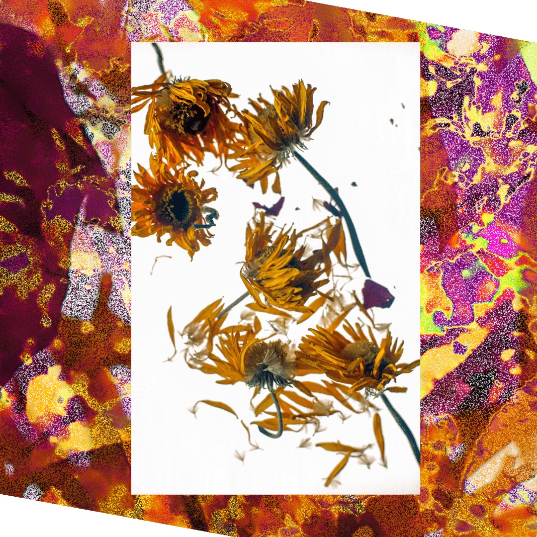
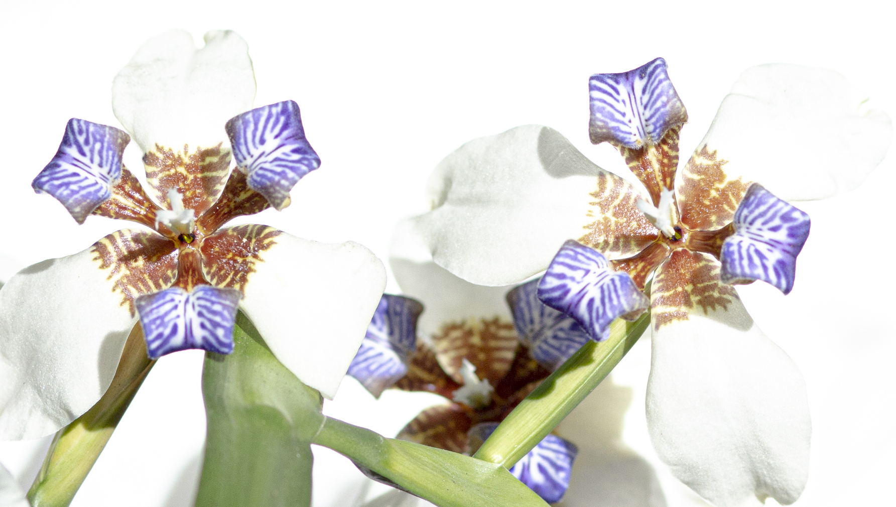
The filtering you used definitely brought a flaming, passionate color to the flower, which made all the difference.
I think what you did to the background was a huge improvement. But I agree the cropping doesn't quite work.
One thing to try is to crop most of the top half out and work with the big flower on the bottom. (You might also want to play with cropping the bottom half out and work only with the top). With the effect you added the big flower looks so painterly. I also recommend that you look at Georgia O'Keefe paintings of flowers, you might find inspiration there.
I'd love to know which effect this was, i fyou figure it out let us know. |
Jan 11th |
| 40 |
Jan 20 |
Comment |
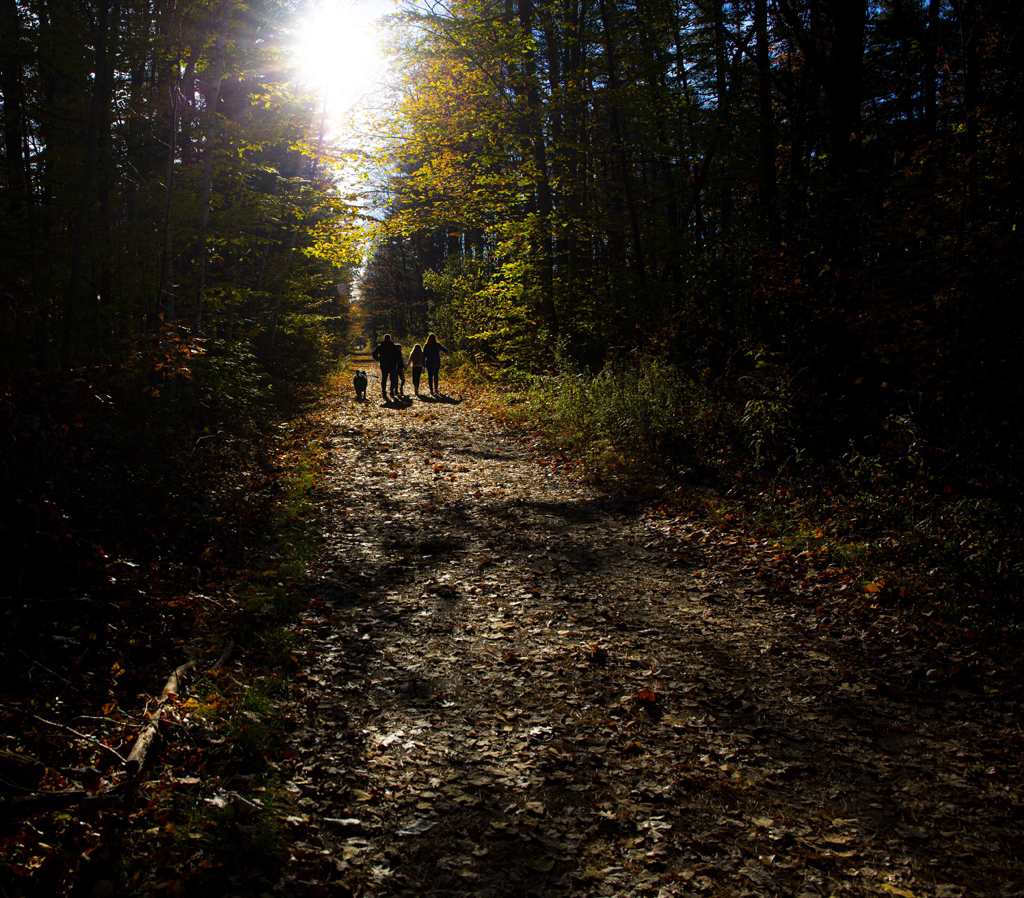
I like this very much. The curve of the shell brings to mind the mollusk that once inhabited it.
I like what you are going after, but I'm not sure you have found yet what you were aiming for. I would like to see you keep following this train of thought until you do find it.
It might help you to look at Georgia O'Keefe paintings of flowers and shelves for inspiration.
It might also work better to put the shell on a less perfectly reflective surface, such as the smooth black top of a piano lid, something that reflects somewhat but not perfectly. I know satiny black grand pianos are not that easy to find, so maybe a black lacquer serving tray, or a dull silver tray that has not been polished in a while. Experiment. You are on to something-I see the beauty of the idea. It's worth chasing it down. |
Jan 11th |
| 40 |
Jan 20 |
Comment |
Wow, Jamie, you definitely have an eye, especially for what I would call abstract art. I don't really read the bumps as Mickey ears, but the round images are definitely sensuous, with the sharp icicles(?) a contrast to that.
The image seems a little blurry to me. I wonder if you could sharpen it by playing with sliders in Photoshop like dehaze or clarify.
I'm also wondering what it would look like with a blue tone. The black and white works well. These are just thoughts.
A really interesting image!
|
Jan 11th |
| 40 |
Jan 20 |
Comment |
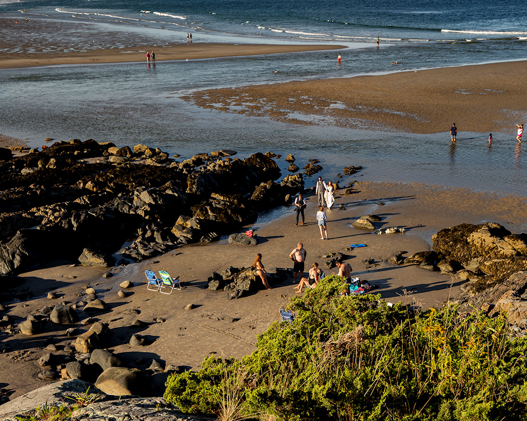
I like this image a lot. I'm envious of the bokeh-I didn't achieve it so well with my own image, and it was one of my goals.
I agree with Andrew about cropping left.
I really like the reflection of the room and the photographer clearly visible in the ornament! But if you want to use it for a Xmas editorial or something you might want to use some effect on it to make it less visible.
I'm curious to see what the starburst effect looks like, so if you make changes, please post so we can see it! An inspiring picture!
|
Jan 11th |
| 40 |
Jan 20 |
Comment |
I actually find this to be a fascinating picture.
And I didn't know you could do things like extend a picture and fill in the rotor blades! That's wonderful!
Your cloning looks pretty good-there does seem to be a smudge on the rotor blade that was filled in. But the sky behind it looks great.
Personally, I think it was worth the effort. An image filled with action and suspense. |
Jan 11th |
| 40 |
Jan 20 |
Comment |
Those are good tips, Andrew, I will try them. |
Jan 11th |
6 comments - 0 replies for Group 40
|
6 comments - 0 replies Total
|