|
| Group |
Round |
C/R |
Comment |
Date |
Image |
| 40 |
Sep 19 |
Comment |
Now that I see the original, I think everything you did was great. I think you were right to crop his hand, as the gesture feels too "modern" for the Victorian garb. And I see they are wearing the contact lenses. So their aim is to look otherworldly. You captured that feeling in your image. |
Sep 11th |
| 40 |
Sep 19 |
Comment |
Dear Catherine,
Just out of curiosity, I would like to know if you selected and arranged the objects or if you found them that way.
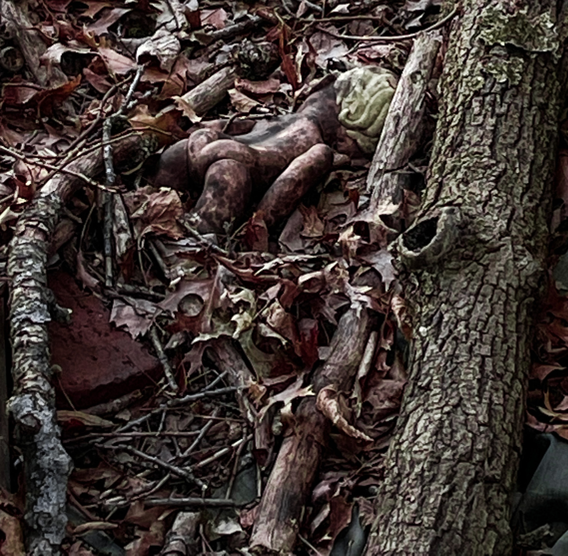
For me this still life works really well. The objects shown tell a story about grappling hooks and going out at night. I'm not sure what a waterman is, but the choice of objects give me some sense, with the duck decoy adding a note of humor. The array of textures works really well. If you were free to arrange the objects, I would have liked to have seen the hook on the front a little more clearly, that is arranged in such a way that it echoes the bigger hook. I would like to see the rope in the foreground, as it is the most different texture, and the duck in the back, beak pointed to the left, so that the eye is more likely to travel around. The light and angle are perfect for the subject. Good work!
|
Sep 10th |
| 40 |
Sep 19 |
Comment |
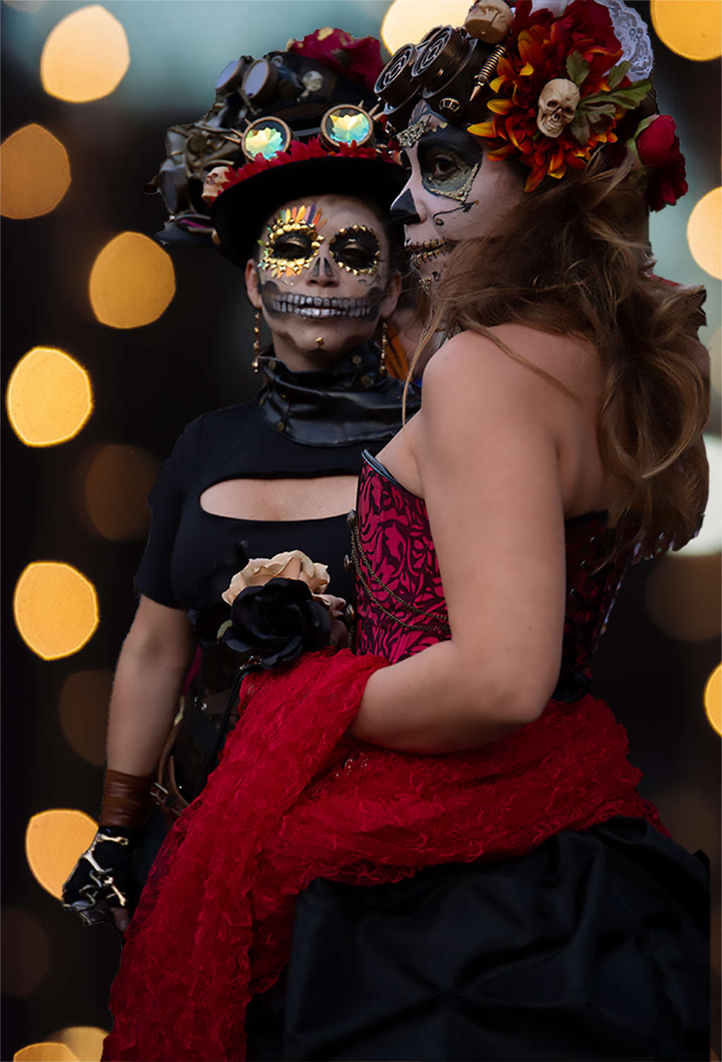
Dear Andrew,
I absolutely love this image. I would like to see his hand on her shoulder and see how that looks, would you mind showing us the original?
All your color work has paid off handsomely for me. I do feel their eyes have been lightened a bit too much, they look almost feral. I don't know if that's the result of your lightening or are they both wearing contact lenses to make their eyes look like that? I would like to see how the image looks if the brillian blue of their eyes is darkened just a bit. A great picture of an exotic world. |
Sep 10th |
| 40 |
Sep 19 |
Comment |
Dear Moira,
Welcome to the group!
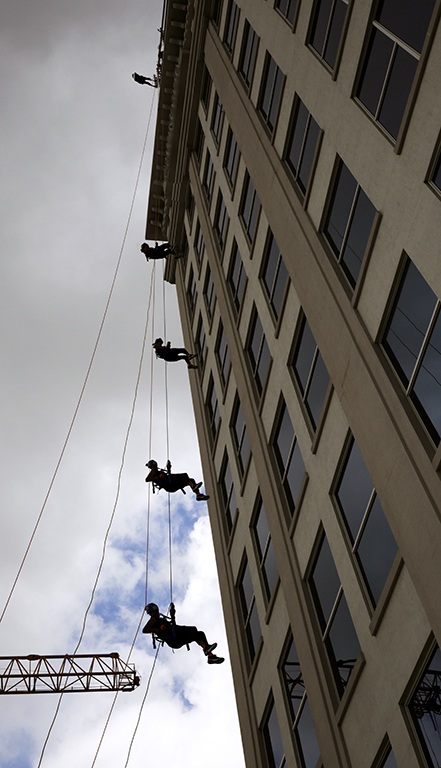
I love this image! There is a certain humor to it-he's garbed like a first responder, since 9-11 I, like most New Yorkers, see first responders with a whole new respect, so my first reaction to him was warmth and admiration. Then I realize he's a window washer, and right away I learned something about how tough their job is, too, since it requires very similar safety gear.
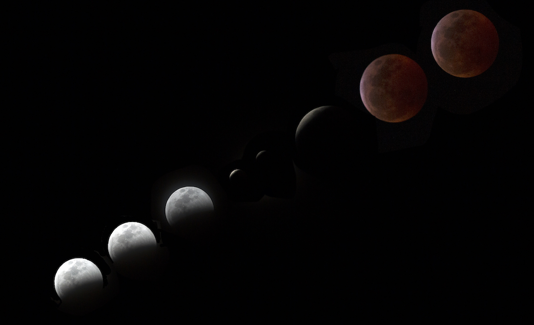
I loved that you clarified the light over his face so it is no longer in shadow. I do wonder if some changes to the crop would tell your story better. I feel that the crop on the left should either go further, to crop out his reflection in the window completely, or keep all of his reflection and make that part of the story. I feel that the space above his head in the original works better at conveying how high up he is. You have a good eye and the framing of your original works better for me. |
Sep 10th |
| 40 |
Sep 19 |
Comment |
Dear Henry,
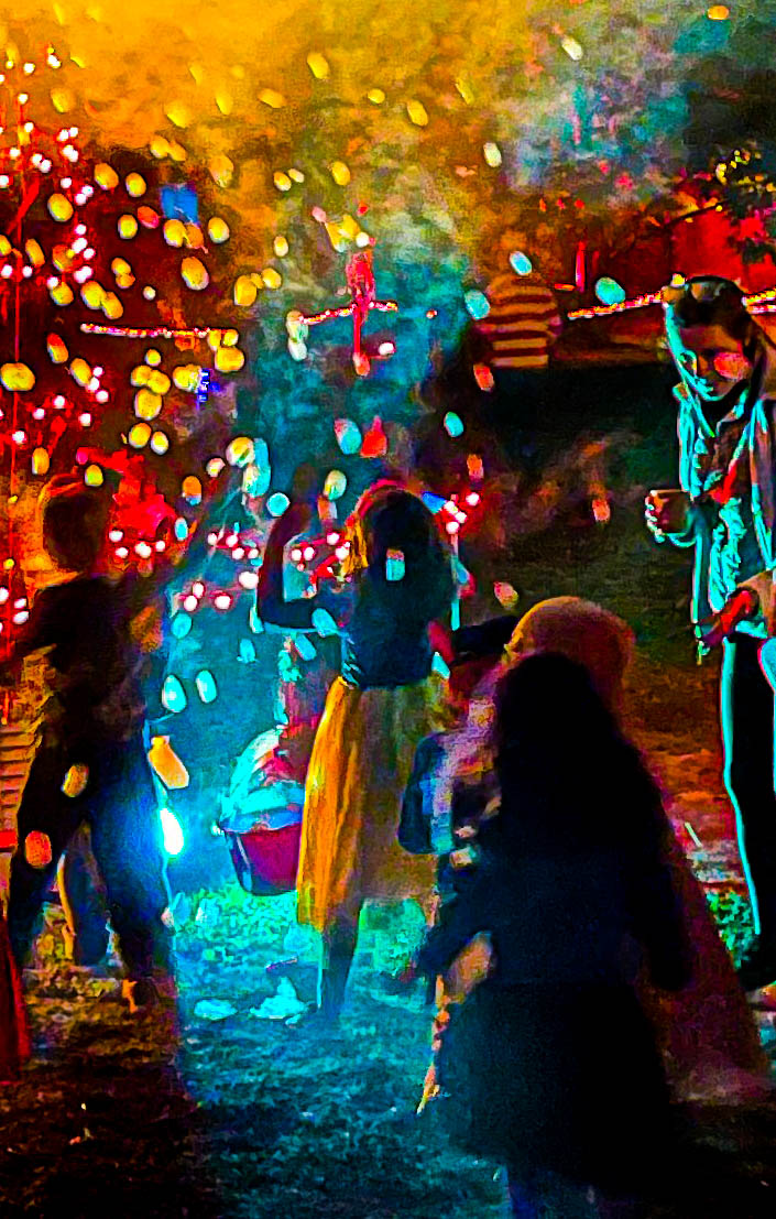
I immediately noticed the "theme" of the image, the cell phone obsession, and at first I felt it was humorous, but then I noticed the woman on the right looks quite upset-clearly she thinks her companion should be paying more attention to her than he is, and him showing her what's on his phone doesn't count.
Technically the image is well done, with a nice glowing light on the people in the foreground, I love the vivid red and the shadows of the empty inside behind them, your straightening and slider work all paid off. I do feel the left side of the image is cropped a little tight. I would prefer to be able to see the girl's hand and the bread basket. On the right side too, I would prefer to see the woman's entire hand. By keeping more you might have to clone out some distractions like knee in jeans on the left or the bit of writing on the glass on the right, but it would be worth it. I do understand that for competition purposes the cloning out isn't considered appropriate, so it depends on the audience for your image. Love this image, you have an eye for this, would love to see more work like this from you. |
Sep 10th |
5 comments - 0 replies for Group 40
|
5 comments - 0 replies Total
|