|
| Group |
Round |
C/R |
Comment |
Date |
Image |
| 4 |
Aug 19 |
Reply |
Hi Erik,
I work with a Mac Book Pro so your steps didn't work for me. However the directions in this article did work for me. https://digital-photography-school.com/how-to-straighten-a-crooked-image-in-photoshop/
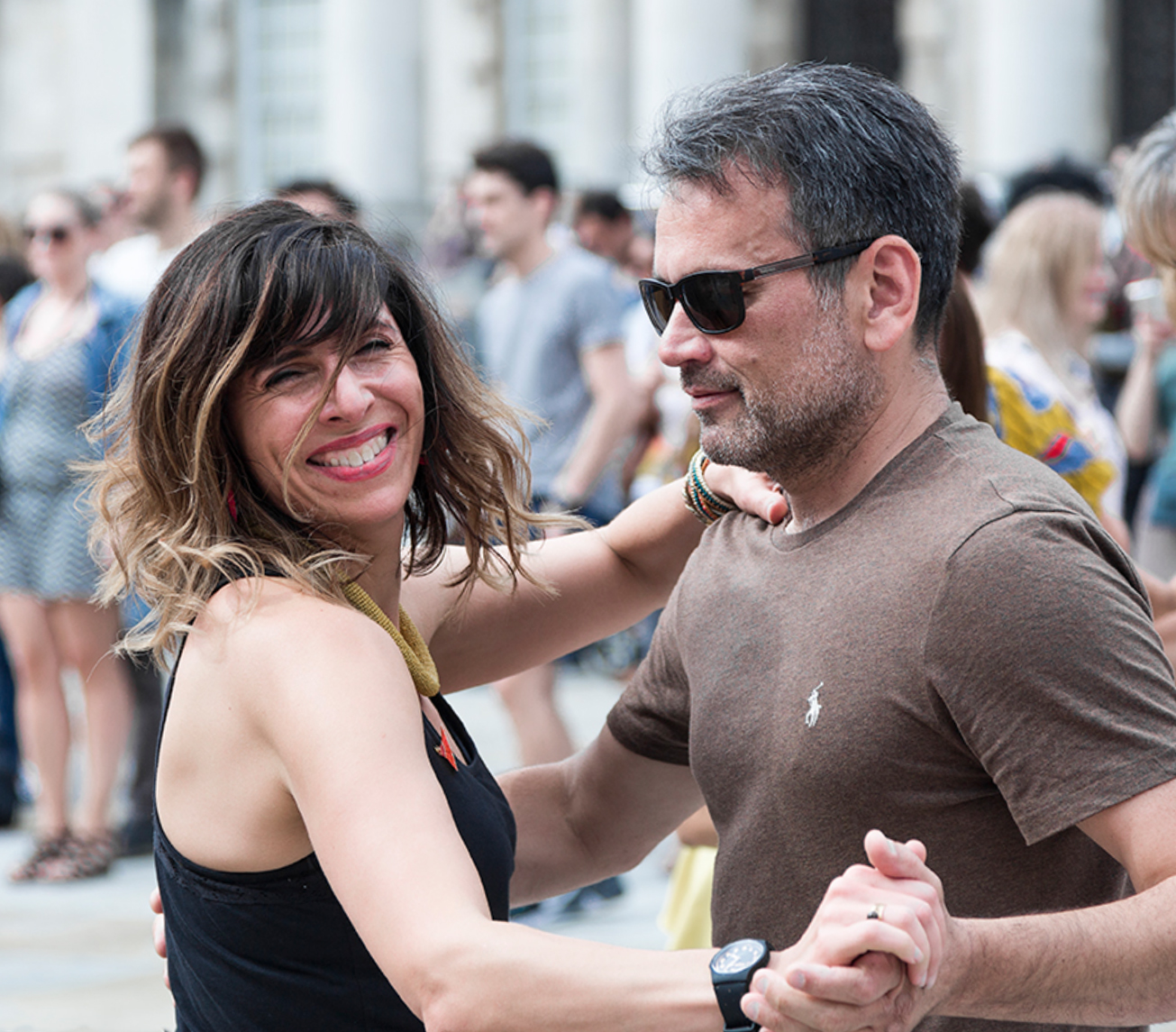
When I straightened the white building in the original, I found I had to crop some off the bottom in order to now have the "blank screen" effect on one side. I ended up cropping out people on both sides because they were distracting. I don't know how Bill managed to keep so much of her lower arm and their clasped hand. I like his better. This is what I got as I am trying to learn the technique. |
Aug 17th |
 |
| 4 |
Aug 19 |
Reply |
Thank you Ian, I am grateful! I look forward to his answer.
|
Aug 11th |
| 4 |
Aug 19 |
Reply |
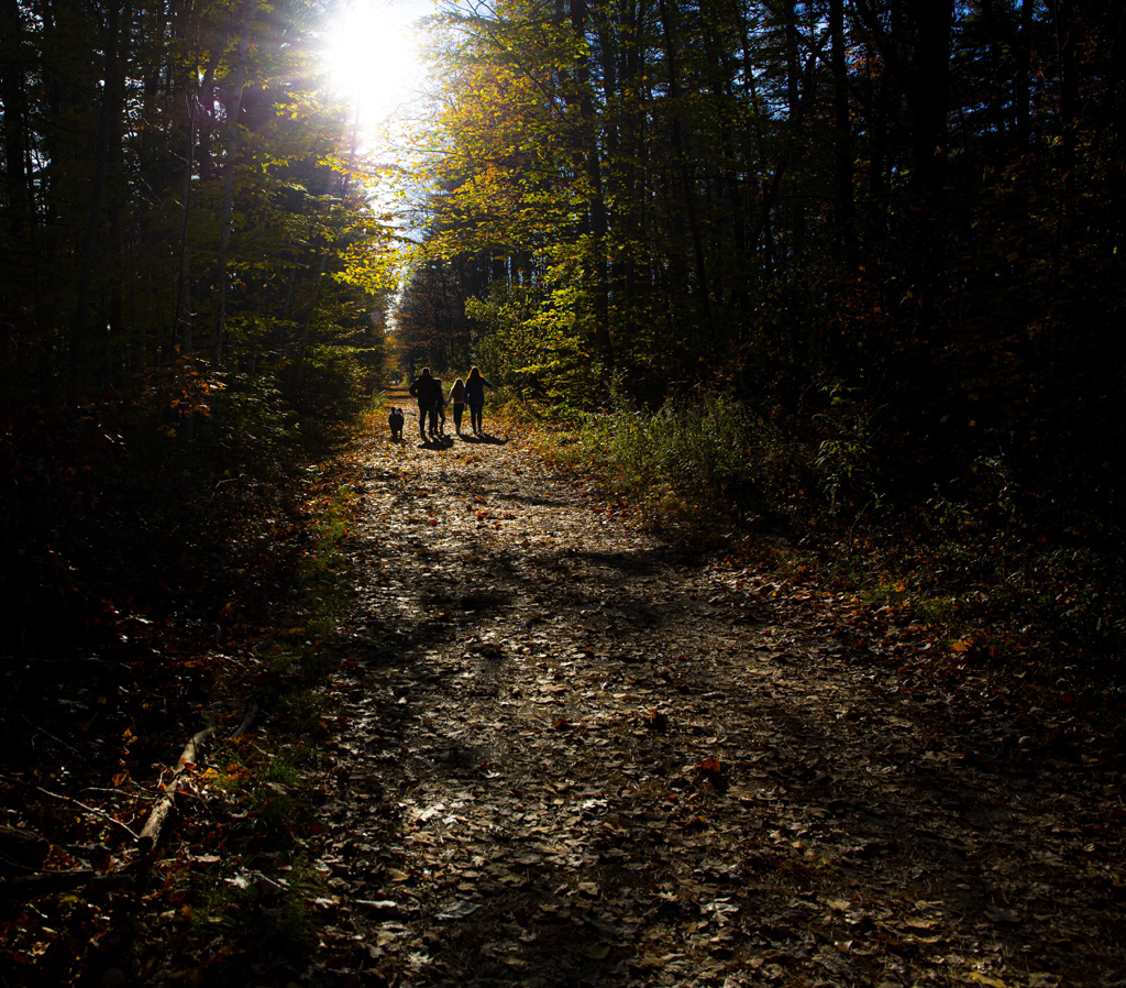
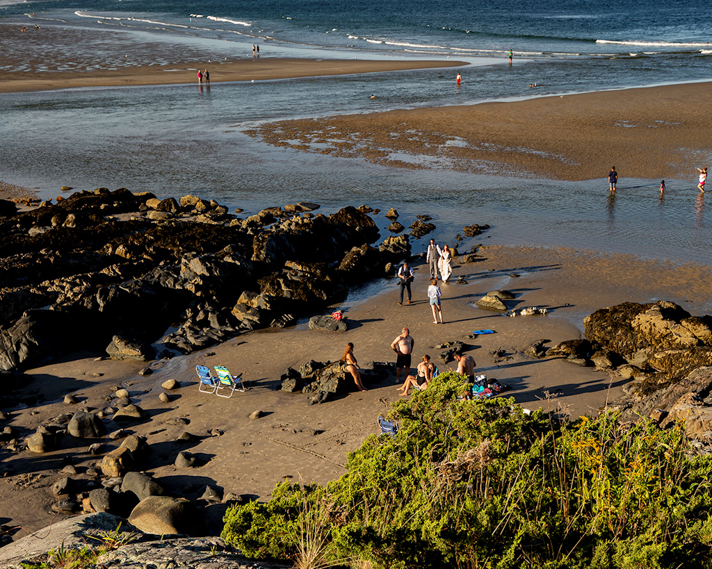
I think it's important to keep the ocean in so that we know where they are. It feels obvious to us that it's a beach because we've seen the original.I also agree it's important to keep the family members. I would rather see the three camera screen right cloned out than cropped out. Just my feeling.
But I also feel that the picture takers add to the story. So honestly I don't think the picture can be improved. |
Aug 11th |
| 4 |
Aug 19 |
Comment |
I'm visiting from Group 40.
A beautiful image that jumped out at me as I was scrolling through other groups. It conveyed a feeling of peace and calm to me. Each group of people tells their own story.
At the same time it is whimsical in its abstraction-the people are almost like musical notes and the bridges like several musical lines.Great use of rule of thirds, I love the minimalism and the creative use of silhouette.
An image that rewards repeated viewing, so many layers of meaning. |
Aug 11th |
| 4 |
Aug 19 |
Comment |
Hi Erik Rosengren, I was about to comment on the canted buildings and I see you fixed it. Can you go into a little more detail about how you achieved that? I work on a Mac. Thanks in advance. |
Aug 11th |
| 4 |
Aug 19 |
Comment |
I'm visiting from group 40. Really great picture-I knew he was playing Taps before I even scrolled down and saw the title.
Great composition with the line of people and focal point with the Taps player. Great depth, color range, and range of texture. You were right not to crop.
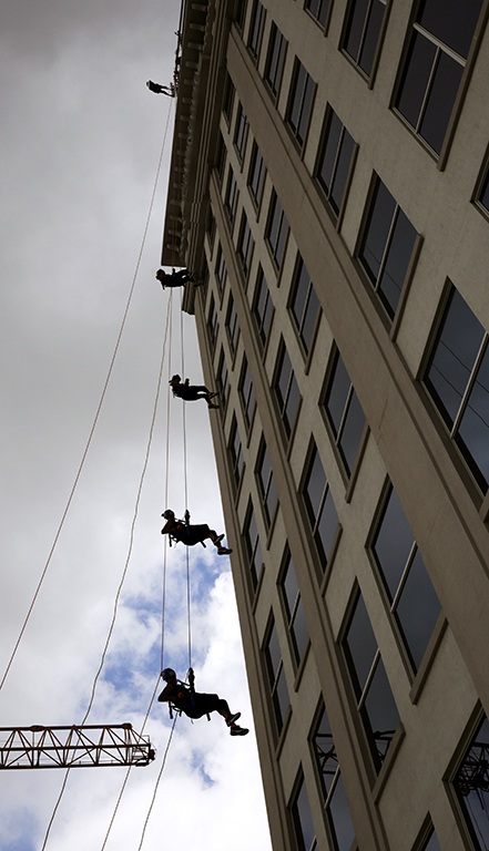
I am wondering if the horizon is horizontal. At first glance it looks like it is but I feel it is slightly off; I can't see the horizon to the left because of buildings, but you might want to consider a slight adjustment. |
Aug 11th |
3 comments - 3 replies for Group 4
|
| 18 |
Aug 19 |
Reply |
You picked the right one. I love it. Your image evokes an emotional response in me that the original does not. |
Aug 11th |
| 18 |
Aug 19 |
Comment |
I'm going around looking at abstract images and trying to learn how to judge them. My first reaction was that your original 2 more pleasing to me, but after a moment I decided I liked your final better. The reason is, in original 2 it still looks like leaves.
Whereas your final is truly abstract. There is no point of interest, that's true, but the repeating pattern itself becomes what absorbs our interest.
for my taste the colors are a bit loud. I couldn't stare at it too long. |
Aug 10th |
| 18 |
Aug 19 |
Comment |
Ian you have a great structural eye, to see all that potential in what to me is a fairly ugly sculpture! A very inspiring image! |
Aug 10th |
| 18 |
Aug 19 |
Comment |
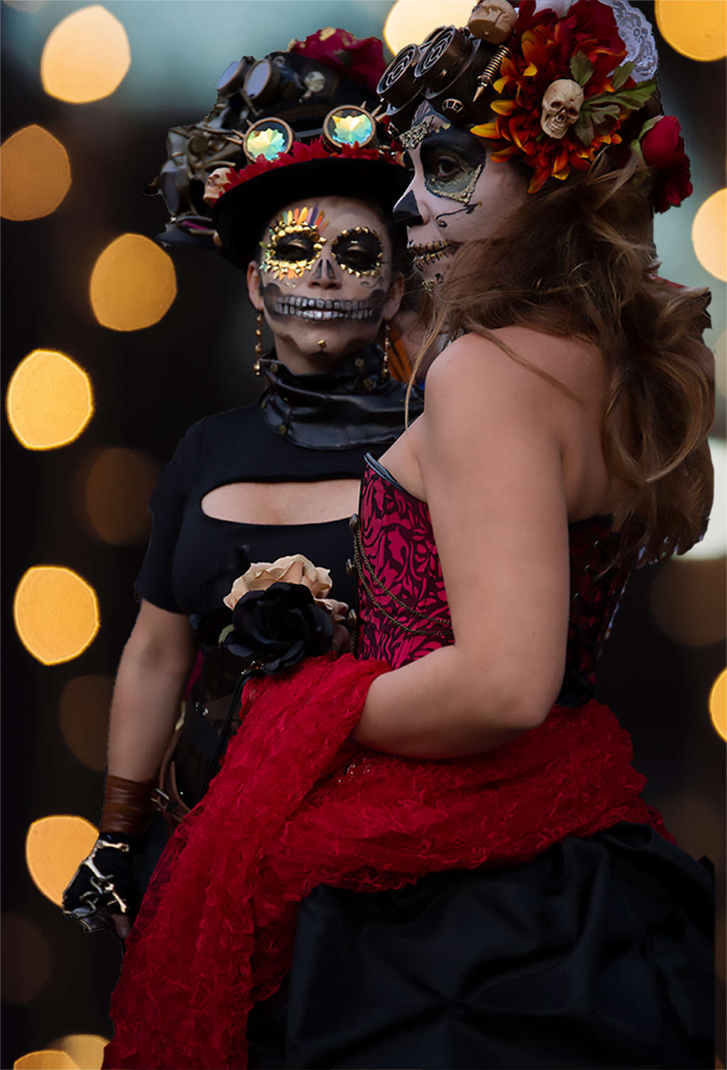
Dear Andrew,
Ha! I didn't know you were in another group as well as our group 40! It's like I discovered your double life!
As for this picture, I think black and white is a good medium for the topic. Right now it has a lot of realism, to me it suggests a newspaper photograph of Halloween decorations.
To me the image invites a more painterly treatment. I would suggest keeping it B&W but playing around with filters and also extreme contrast sliders, making the dark areas darker and the whites whiter. The tree in the middle bifurcates the frame, you could experiment with removing it. The architecture in the background has a pleasing Gothic feel that you could emphasize. You could also experiment with adding some spooky lights to the windows. There is a lot of fun to be had with this image. I hope you post any changes you make, I'll come back and see.
|
Aug 4th |
3 comments - 1 reply for Group 18
|
| 40 |
Aug 19 |
Reply |
Oh, that's too bad! I hope you can recover your laptop! What a pain!
|
Aug 26th |
| 40 |
Aug 19 |
Comment |
Jamie, I would love to see any revision you make.
I just posted a variant of my own picture in this round. |
Aug 26th |
| 40 |
Aug 19 |
Comment |
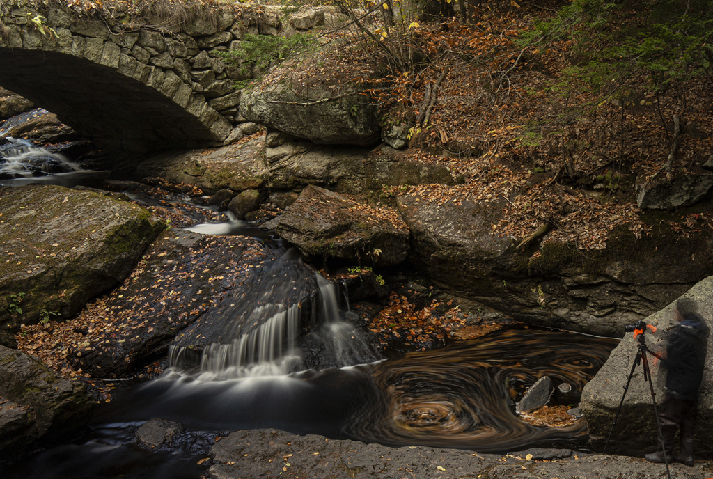
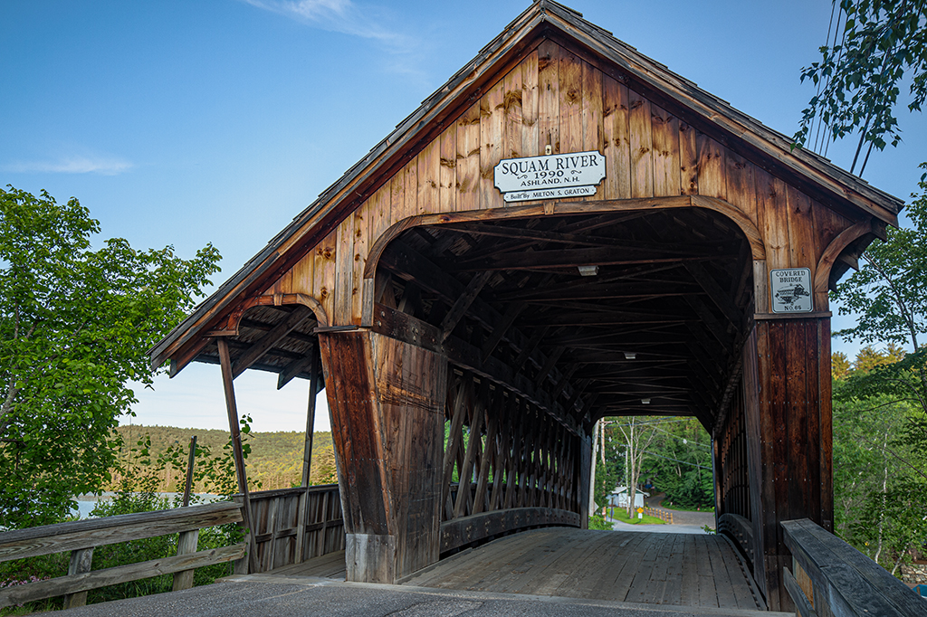
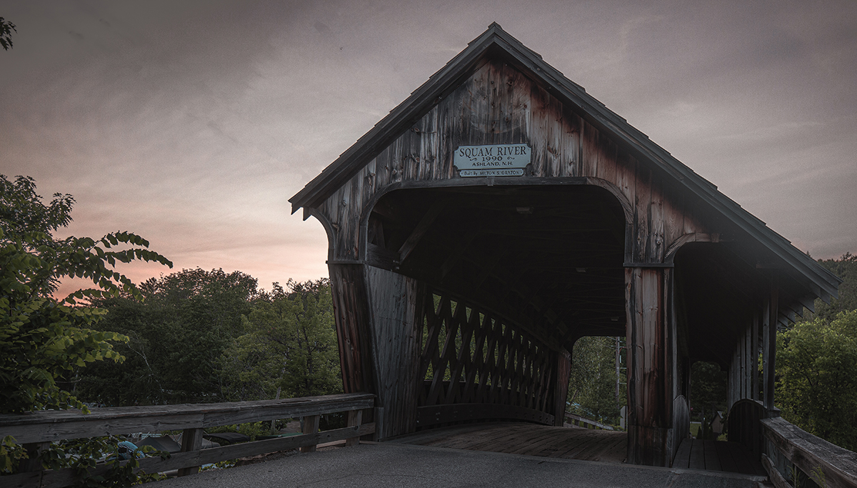
Here is another image I combined in HDR (using a different combination). Still not quite happy with is as we can't see the trestle inside but it does have at least one straight line and some atmosphere....this is the bridge from the other side at sunset. |
Aug 25th |
 |
| 40 |
Aug 19 |
Comment |
Dear Henry,
I love your version. I was thinking of taking out all the branches in that upper right corner as well as the wires, after I figured out how to straighten the lines a little. I'm in a conversation with someone in another group who is trying to teach me how to straighten the lines, but I haven't learned it yet.
Andrew, I do have some other bridge pictures, I'll post another one or two when I get a moment. It's the week before school starts here and things are a bit crazy.I agree with everyone's advice and look forward to applying it, but I have to learn how to do each thing! |
Aug 17th |
| 40 |
Aug 19 |
Reply |
Looking at it again it might just be a matter of playing with the contrast sliders, see what effect that has on the shadow areas that were dodged and burned. |
Aug 12th |
| 40 |
Aug 19 |
Reply |
Dear Andrew, thanks for the tips. I photographed several bridges during my vacation so I will try that technique as I refine other images. |
Aug 12th |
| 40 |
Aug 19 |
Comment |
Hi Jamie!
This would make a great postcard!This photo really shows what a good phone camera can do! As soon as I saw it I wanted to decorate some corner of my condo in a similar way.
The shelves of course create perfect thirds, and the white flowers lead our eyes up and down. I love it.
I don't know what the original crop was, but I kind of whish that the bottom layer of empty jars was less visible and the top row of flowers was more visible. I don't know what you started with, but maybe a little more play with cropping.
You might also want to play with bright reflections on the top row of jars, just bring them down a little and see how that looks. |
Aug 10th |
| 40 |
Aug 19 |
Comment |
Hi Henry! Wow I'm jealous, I have always wanted to see Mt. Rushmore.
I love the framing with trees, that worked well for me. The addition of clouds also worked well. I'm wondering though, if a different cloud pattern would work better. Right now that clouds you have act as leading lines to Lincoln's head. If that is your intention, that's fine.
It looks to me like you did some "dodging and burning" on Lincoln's face and Washington's Face. To me the work on Lincoln's face came out OK, though personally I preferred your original. I definitely preferred the original shadow on Washington's face.
Might be worth going back to your original layer and playing around with the shadows a little more.
|
Aug 10th |
| 40 |
Aug 19 |
Comment |
Even if you didn't tell us this was a building of religious and historical significance, your photograph conveys that quality to me. The almost ethereal light, the wide dynamic range of light, you captured it perfectly. For me B&W definitely the right choice, as it highlights the beauty of the composition and adds to the feeling of historicity.The B&W also vividly conveys the textures-the scratched on the plaster, the places where the plaster is worn away, the cracks between walk and wall.
I would like to know the tech specs and what kind of manipulation you did, for example, is this an HDR foto or did you take the photo and then make adjustements? And how hard was it to capture this space without anyone in it? |
Aug 10th |
| 40 |
Aug 19 |
Comment |
This is a very powerful photograph. The adult orangutan looks out at us with an expression full of intelligence and emotion. The young orangutan inspires the feelings of tenderness and protectiveness that images of young almost always do, at least for me. There is something about the way they are both chewing on twigs that is very endearing.
When I could wrest my eyes away from the adult ape's expression, the next thing that jumped out at me were the textures. I feel like I could reach out and touch the ape's hair. Also the contrasting texture of the grass. Although there is no real depth to the image, the background is blurry, almost bokeh but not quite. If you want to separate the apes more from their background, you could experiment with adding blur to the darker area at the top of the frame.
Some of the image's power comes from the use of the rule of thirds. The two tree trunks in the background emphasize the composition. If you were to play with anything, I would suggest selectively darkening just the tree trunks in Photoshop.
Another thing you could do is selectively lighten the eyes of the adult ape, and whiten the whites of her eyes, just as you might in the portrait of a person. I have links to a tutorial on how to do that, if you need it.
I really like this image. I wish I could meet this ape family myself. I lived in the Netherlands for five years, but I never knew about this Primate Park. |
Aug 4th |
| 40 |
Aug 19 |
Comment |
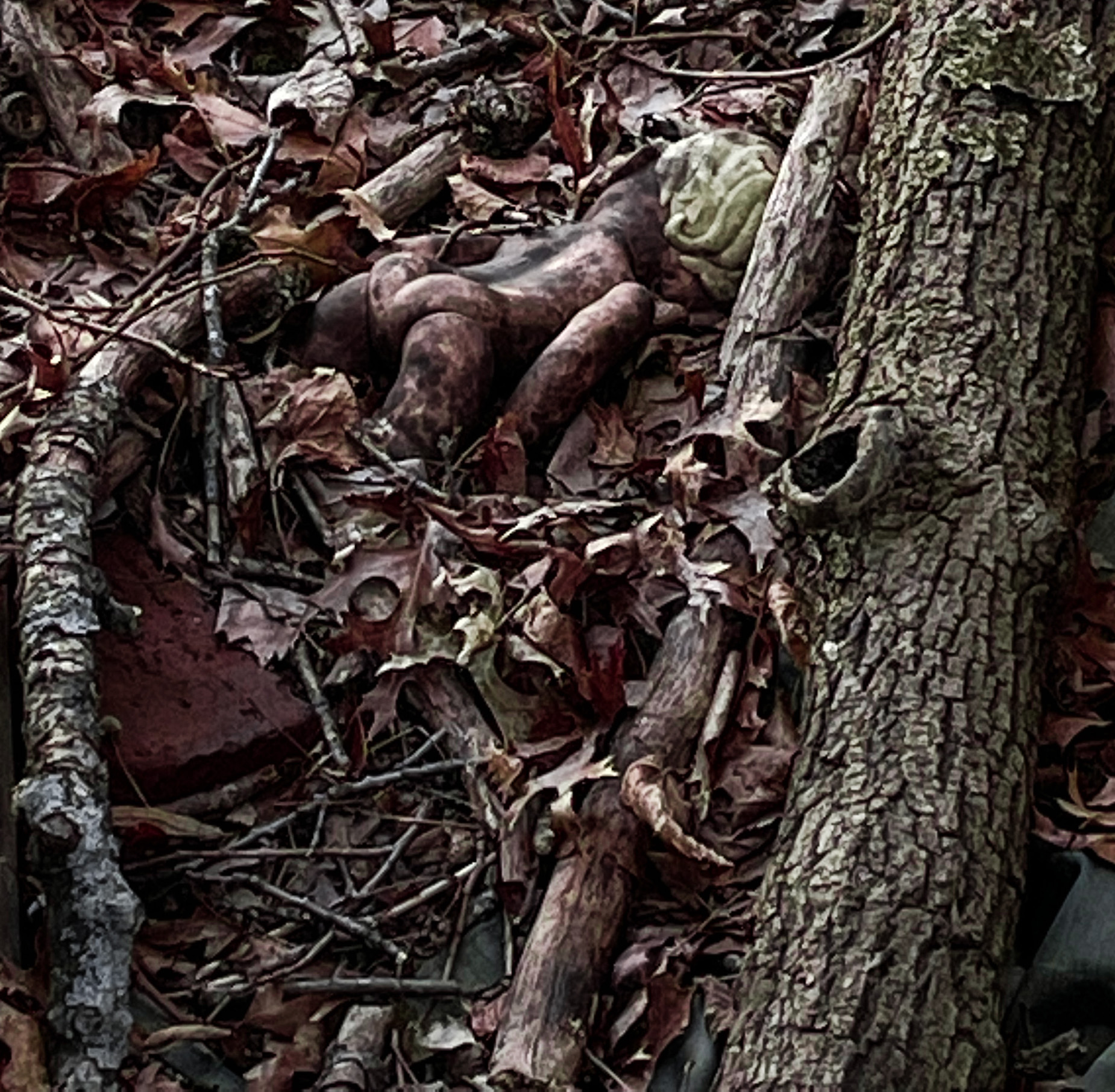
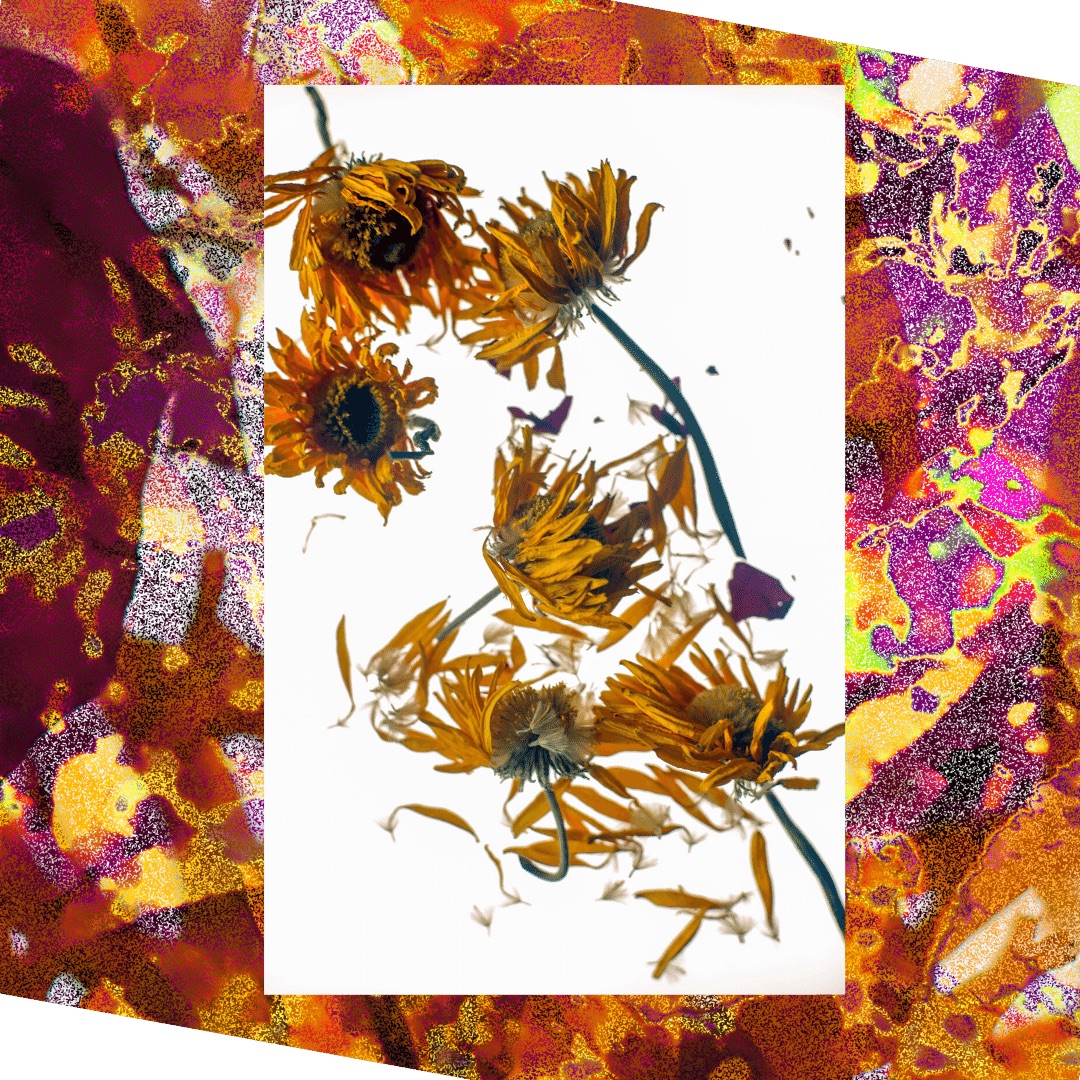
This photograph had a strong impact on me. Maybe because I've never been asked to critique an abstract photo before, so I was anxious about it! So first let me just tell what I observe.
The original in B&W is already an abstract. If you hadn't of told me it was sidewalk, I would not have known at first. When I enlarged and looked at it in close-up, I did understand that it was a closeup of the joint where three flagstones have been joined together.
The first thing I notice in your submitted photograph is the change from horizontal to vertical. But making it vertical, the lines (to me) look more like a rendering of a rocky valley or something like that. The addition of the green and even the pink and orange colors add to that impression for me. Some of the manipulations make the image look more like it was drawn and painted than photographed. I would not have known the final was a photograph unless I was told. I didn't mind that at all, I'm just letting you know that on it's own, I would have taken it as a painting or a colored drawing.
The image doesn't have a single point of interest. Rather the lines in the vertical layout led to my eyes traveling up and down. Only after I'd been studying it for a while did my eyes start following the yellow sections around in a clockwise motion. I'm not saying this is wrong or right, just reporting on what I experienced when I looked at it.
For me the image worked in many ways. It held my interest and stayed with me after I stopped looking at it. It suggested a story or stories to me- I could see it being a moving image, and the camera zooming in to show us that one of those lines is a road that moves through cliffs. In other words, the image to me spoke of a hidden life, and I started making up scenarios of what that life could be.
The choice of colors is the biggest challenge for me. The bright pink makes me think of a cartoon. The pink is the main source of the image's emotional impact. It makes me think of the landscape background in Maxfield Parrish paintings. So I would say the choice of colors worked for me too. Still, i fyou were going to play with anything, I would suggest playing with colors. But on the whole I would say you have really accomplished something here. I would like to see more work like this from you. I myself have never attempted anything like this.
You might find some inspiration in other groups labelled "creative." I was going through them while I was thinking about your picture and I discovered that Andrew is also in a creative group, Group 18. It's fun to go there and look at other work he does.
|
Aug 4th |
8 comments - 3 replies for Group 40
|
14 comments - 7 replies Total
|