|
| Group |
Round |
C/R |
Comment |
Date |
Image |
| 40 |
Jul 19 |
Comment |
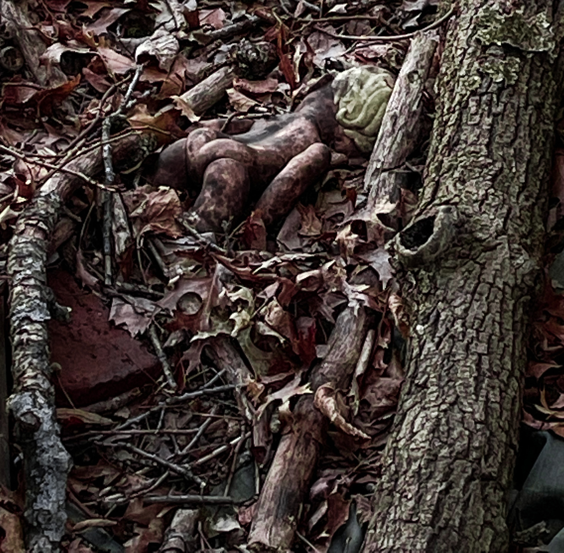
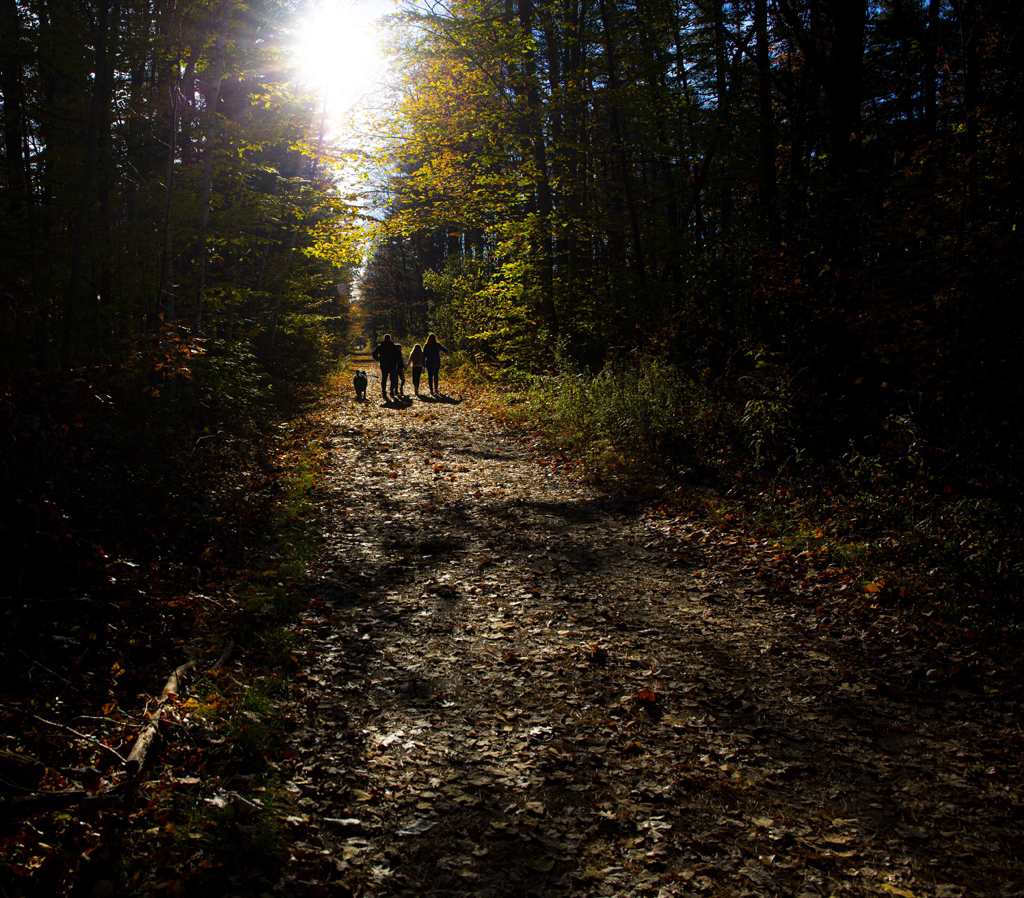
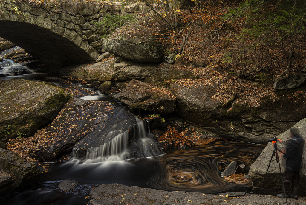
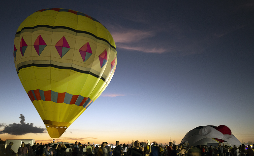
OK, I feel kind of embarrassed I didn't do this to begin with. Finally I looked up Varanasi. We should all know what Varanasi is. One of the oldest cities in the world, the cradle of Buddhism (Buddha gave his first sermon there about the wheel of Dharma), also where yoga was invented. It used to be called Banares which is a name more familiar to me. It has 23,000 temples. The orange cloth marks this man as a Buddhist monk (or it would if he were wearing it). The white powder on his face is actually holy ash, sandal paste, and other things. How the ash is applied, along with what other markings (other colors, red dots, etc) all has significance. I'm assuming that since his hands and feet are orange, he is working at dying these cloths. |
Jul 14th |
| 40 |
Jul 19 |
Reply |
Dear Andrew,
I was considering getting a teleconverter (we call them lens extenders here) myself for astrophotography (I have a goal to be ready, both equipment and skill-wise, to photograph the transition of Mercury across the sun in November). I don't have the money for one yet but I've read a lot about them, and all the photographers who use them say you can't trust your automatic focus if you have a teleconverter.
A 300mm lens is quite powerful, so if you go out to catch more sporting shots like this, try some with the teleconverter and some without. Don't trust your auto-focus, so for a shot like this you will need to set the camera to take multiple shots in quick succession and hope that at least one of them will come out in focus. HTH |
Jul 14th |
| 40 |
Jul 19 |
Reply |
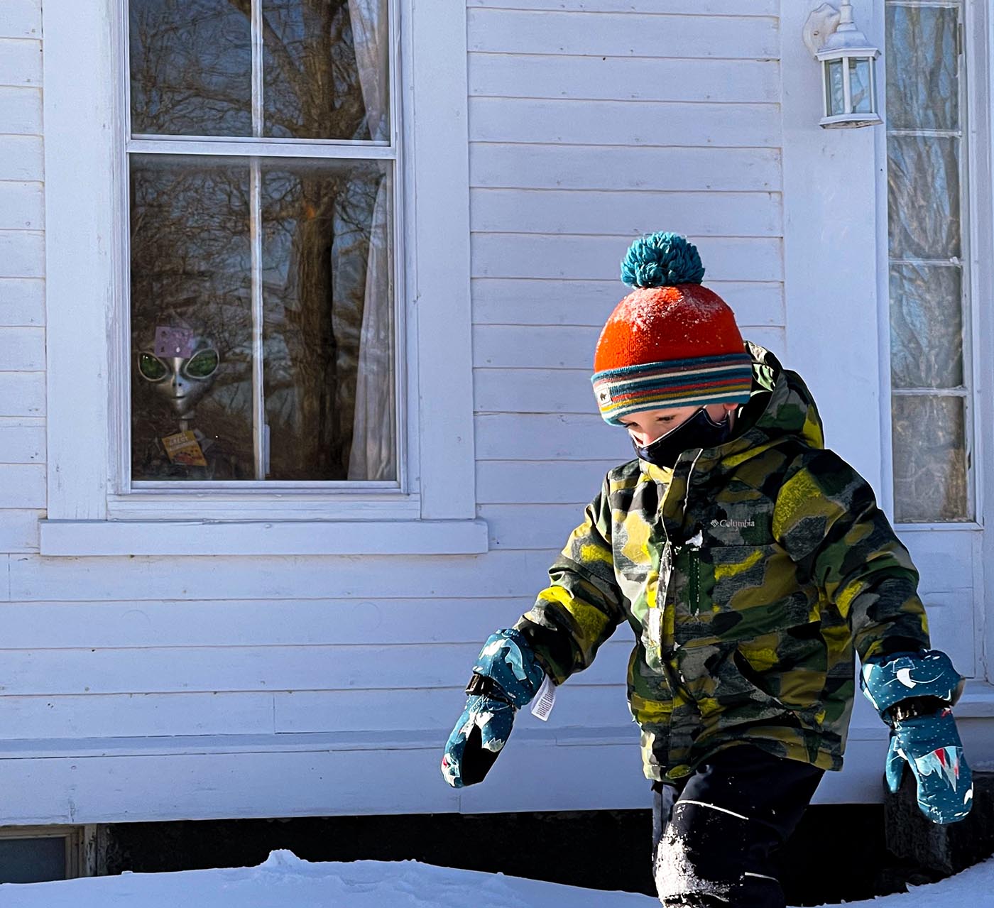
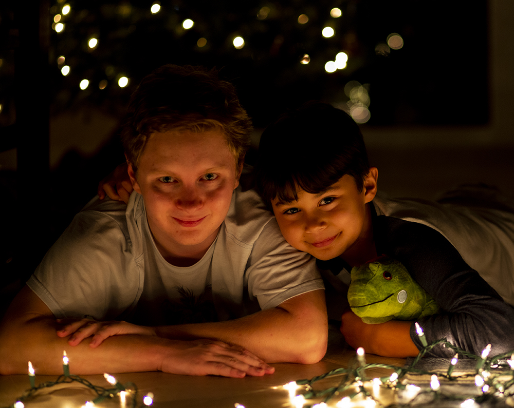
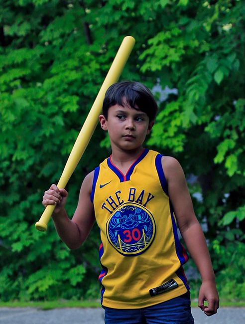
Another thing about Jack, which makes him an interesting photographic subject, is that he is very dark. His mother is from Nicaragua and he inherited her dark skin and hair.
I did take the test picture of the flowers and the picture of Jack at 6:30 in the morning, a few days apart. So same time, different days, but not by much. Maybe three days apart.
Here is another picture of Jack taken just moments before I took the one I submitted first. A much more "ordinary" picture... |
Jul 14th |
 |
| 40 |
Jul 19 |
Reply |
Here is a second portrait of Jack, taken in NH recently, which shows how different the light is here. This is the picture I allude to in my response to Manfred, which I had posted earlier but somehow got deleted. |
Jul 14th |
 |
| 40 |
Jul 19 |
Comment |
Dear Henry,
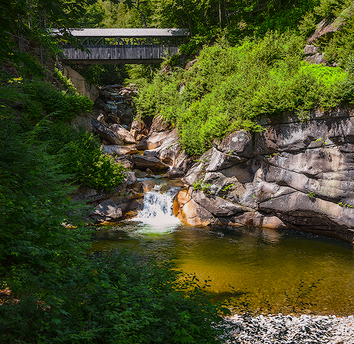
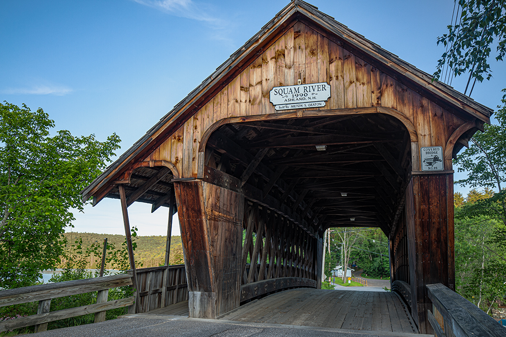
I have been taking some pictures of a covered bridge near where I am vacationing using the HDR function, which gives me three images. The camera combines them in a fourth image but I usually don't like what the camera has done. I would love to learn how to composite them myself. I have both PR and LR but I'm really very unskilled in both, so I would love to get those tutorials you mention. |
Jul 14th |
| 40 |
Jul 19 |
Comment |
Dear Jamie,
What beautiful history! How exciting to be part of it!
I'm pretty sure I visited both his studios the one time I was able to visit the Tetons in the mid-80s.The second studio wasn't identified as such, but I made friends with a couple of rangers who invited me to a party. I went to their cabins and from there we went to the party, held by the chief ranger at his house.
Looking at the pictures of Crandall's various studios, I know I read something about the first studio at Jenny Lake and I'm pretty sure the second studio was being used as ranger housing at the time. How incredible!
As I said in my comments, it's clear you are aware of the legacy of what came before you and that you are in conversation with it. That is the most necessary factor if you want to take great pictures of the Tetons. You have a great opportunity, with your lineage, to build a body of work on the park today. I look forward to seeing your other pictures of the Tetons!
About your lens, do you use the automatic focus? Because I have poor eyesight, I often take pictures with the AF and without. A picture like this requires you to choose if you want foreground or background in focus, or requires something like HDR in order for all to be in focus, or to stand back with a wider lens and then to crop to get the look you want.
I assume you are taking pictures in Raw. Instead of saving in jpeg after you make your adjustments, try saving them as tifs, which is a lossless format. It could also be that saving and re-saving has led to a loss of quality in the image. I love all of your pictures so I hope you can solve this issue... I hope that helps.
|
Jul 13th |
| 40 |
Jul 19 |
Reply |
Dear Manfred,
Thank you so much for dropping in to our group and commenting on my work! I really appreciate it!
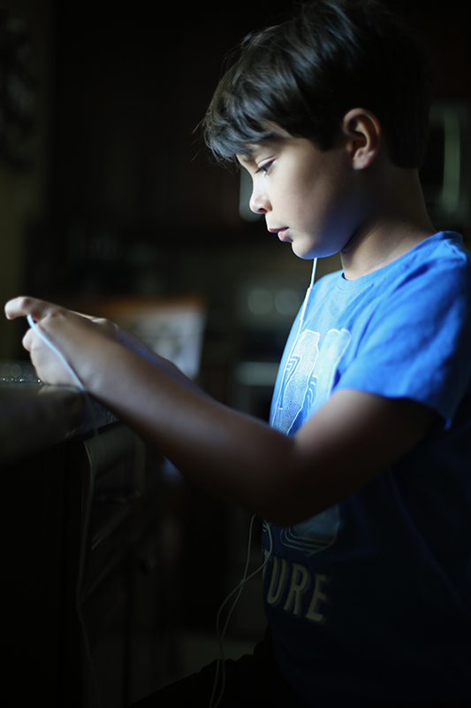
To answer your question, my condo building has windows that face west and east. The kitchen here faces directly east and I took the picture at 6:30 in the morning, so the light is as soft as it gets on that side. I've discovered that in South Florida, where I live, the light is so bright all day long that good, subtle, natural light mostly happens very early in the morning and in the last hour of light in the day. The rest of the day, at least at my beginner skill level, it's almost hopeless. In this picture there is also some light on his face from his phone.
I really like the changes you made. I will try to duplicate them myself so I internalize your teaching points.
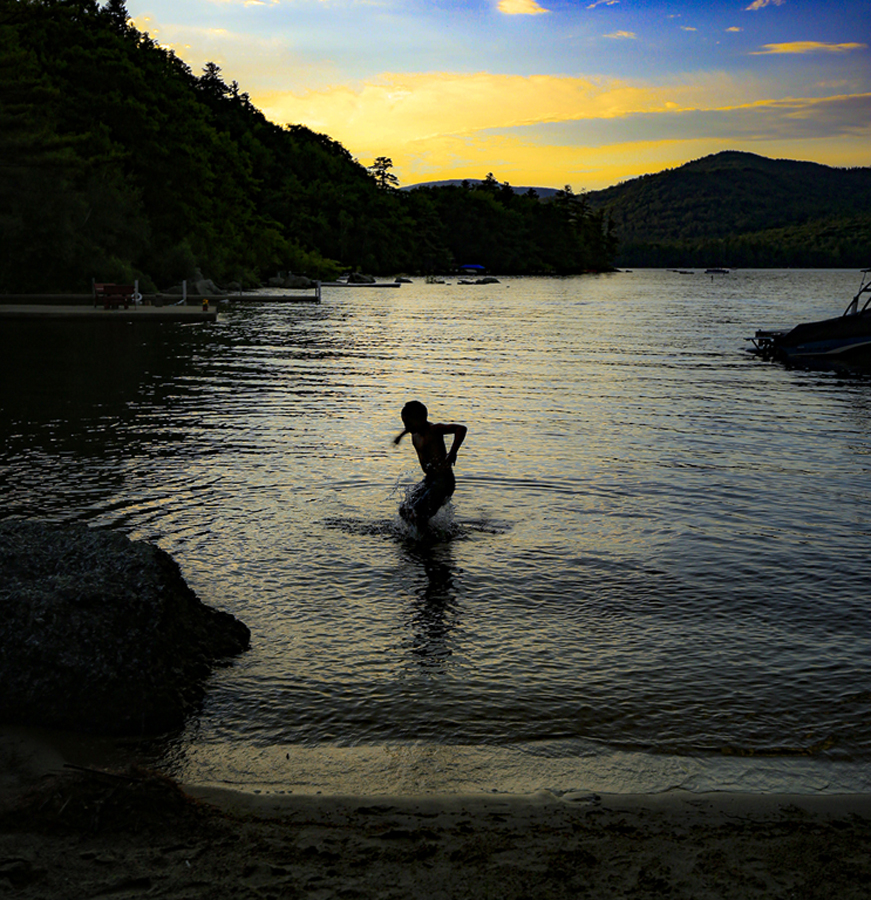
Right now I'm up north, in New Hampshire, for a few weeks, and I've discovered that the light here is completely different. I attach another portrait I took of Jack up here in NH. Taken in the mid-afternoon, what a difference!
|
Jul 12th |
| 40 |
Jul 19 |
Comment |
Very interesting to have two pictures like this to look at side by side this month, yours and Jamie's.
For me this picture is all about light. The contrast between the light of the sky, the reflected light of the sky on the water, and the lights from the car headlights on the bridge.
The contrast in light is emphasized by the contrast in colors.
We have all seen many pictures of this type where the exposure was longer and the carlights become ribbons. I like the contrast here to what we expect: you have the headlights as pinpoints, a different approach.
Based on what you say yourself about the picture, I get the feeling that it would be productive for you to return to this spot with a tripod and try HDR so that you can manipulate the different grounds separately.
|
Jul 12th |
| 40 |
Jul 19 |
Comment |
This is a really beautiful picture.
The challenge with photographing the Tetons is that you are in dialogue with so many photographers who have come before you, starting with Ansel Adams. I was first introduced to the idea that photography could be an art when I saw Ansel Adams' images in college, so they are kind of burned into my brain. I immediately saw this image as a response to Adams' "Grand Tetons-View of Mt. Moran" https://www.archives.gov/files/research/ansel-adams/images/aag05.jpg
Many photographers go to the Tetons and try to replicate the views that Adams took. I think some of the spots he photographed from are even marked for tourists, a deplorable practice, IMHO.
What you've done with the contrast between the monochromatic mountains in the background and the bright flowers in the foreground is respond to that "ur image" by saying "focus on the ephemeral in the park." The fact that you also tell us a story about the flowers being gone the next day adds to that effect.I love that you told a different story from the story photographers usually tell about the Tetons.
I also love the contrast in texture between the sky, mountains, and flowers.
Did you ever have your lens checked out by a reputable camera shop? The flowers seemed flat to me, their edges blurred, when I feel they should be sharp. There is still an overall softness to the image that is problematic. |
Jul 12th |
| 40 |
Jul 19 |
Comment |
I agree with Andrew, the cropping of the vase is too tight, as it cuts into the glass on the lower left corner. This tight cropping disturbs me as a viewer and takes away from the many things the picture offers.The crop of the original works better for me.
You clearly have a good eye for still life arrangement and selection; I hope you do more of these.
For me the picture is about the textures. It works wonderfully as a still life in that there is a beautiful contrast in textures: the smooth, mechanically achieved glass that contrasts with the organic elements. The contrast between water (in the vase), the rocks (my favorite part of the picture; I feel like I could reach in and pocket them), the stems magnified by the water, and the flower petals. The textures are further enhanced because of the contrast in colors, again, you have a great eye for that.
The bright light enhances all the textures and sharpens the color, and makes possible that ripple effect on the table that Andrew mentions, but it also causes some problems. The main issue for me is that the sky is very bright, and there is that large triangular area of bright sky just to the right of the flower that draws my eye because of its brightness.
You can try to correct this on Photoshop or LR by working with the sliders some more, take down whites and highlights.
You can also try masking the flower and the wooden railing with the stones so that you can just darken the background, but that is a difficult task. Andrew's suggestion to try taking the picture again might be easier.
It sounds like you were going for a "bokeh" effect (blurred background). There are many articles online on how to achieve this if that is what you want. Personally I have found Bokeh to be a simple concept but difficult to achieve.
Here are some articles I have found useful: creating bokeh in photoshop: https://phlearn.com/tutorial/bokeh-effects/
Here's how to achieve it in camera: https://digital-photography-school.com/how-to-achieve-nice-bokeh-in-plain-english/
If you prefer video demonstrations here is a good video: https://www.youtube.com/watch?v=0QhsmuYa6uQ
This one is more geared to still lifes and I really liked the guy's presentation: https://www.youtube.com/watch?v=4zBfBDNyGpA
I really hope you do more of these!
|
Jul 12th |
| 40 |
Jul 19 |
Comment |
I have to say, for me the fact that the bather is to one side of the frame is part of what makes the picture work. The fact that he is to the side implies movement of the photographer, but it also implies that the story of the picture is about him and the shallow, restrictive, space. The steep stone steps behind him really limit his space, as if he were in some kind of prison.
Now that you've posted several images taken in the same place, in these steep stone walks, I'm getting a little bit of a feel for it, but like in the last couple of pictures you posted, if you hadn't of told us these were at the river's edge I wouldn't know. I'm assuming these steps are well known to many people, but to those of us far from that world that meaning is eclipsed.
Since this is the third picture you've shown us of this place, I'm wondering if you are working on a collection, say something that could be exhibited all along a wall or in a gallery? Are these all details that once together will give us a larger picture of pilgrims to this river? If so, do you have other pictures that give us more of an overview of this space? It would help me to know how to comment if I had a better idea of your goal.
|
Jul 12th |
| 40 |
Jul 19 |
Comment |
Dear Andrew,
We are here to discuss everything about a photograph, so I did. But don't forget my original reaction (and I'm sure that after the holidays others will react too). The photograph is beautiful, the light perfect, it captures the personality of the sailor in a striking way, and the "8" ball adds a note of humor. That's a lot of good stuff going on for an image.
Maybe because my vision is pretty poor, and on top of that I have a Canon camera, known for its softer lenses, I often have images that are not quite in focus. I still value the portraits of people I capture that might be a little soft but show personality or capture a moment. Of course I would prefer they be sharp, but I value them nonetheless. So dont discard this! I like it. I could see making this guy a character in a story (your know I'm a writer, right?). |
Jul 4th |
| 40 |
Jul 19 |
Reply |
So, the software the PSA instructor uses (Steve Still), is Topaz AI. It's an expensive bundle but the sharpening software is available separately. He fixed a foto of mine with the software and it looks fantastic. I can attach the before and after if you are interested.
|
Jul 2nd |
| 40 |
Jul 19 |
Comment |
Love every change you made.The crop is perfect. The guy resembles "the world's most interesting man" and almost looks like it could be another one of those ads. The fact that he is "behind the 8 ball" adds a little humorous note. The magic hour light on the sail adds more magic.The water hitting the boat captures motion.
Tweaks: sadly, the man's face is out of focus. The instructor for the PSA portrait course says there is software that can correct soft focus, but he didn't tell me what it is. When I find out, it would be interesting to see if we could sharpen his face.
I also feel like it is still tilted, that the horizon line still isn't straight. We can't see it, but we can see the lines of movement, the ripples, in the water. |
Jul 2nd |
9 comments - 5 replies for Group 40
|
9 comments - 5 replies Total
|