|
| Group |
Round |
C/R |
Comment |
Date |
Image |
| 30 |
Feb 19 |
Comment |
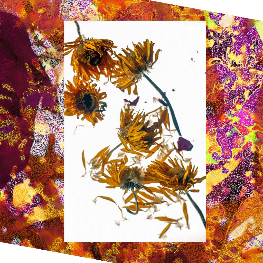
Hi Dorinda!
This image is very evocative. I am not familiar with Topaz but I like the effect. Straigtening the image worked well, but I think the cropping took something away.I would have cropped the top as you have done but left the space at the bottom of the image which adds a feeling of depth.
Lovely picture!
|
Feb 5th |
1 comment - 0 replies for Group 30
|
| 40 |
Feb 19 |
Comment |
Hey Andrew, can you talk about getting accepted by a salon? What does that mean and how does one go about it? |
Feb 24th |
| 40 |
Feb 19 |
Comment |
Yes, your changes solved the background problem well. |
Feb 7th |
| 40 |
Feb 19 |
Comment |
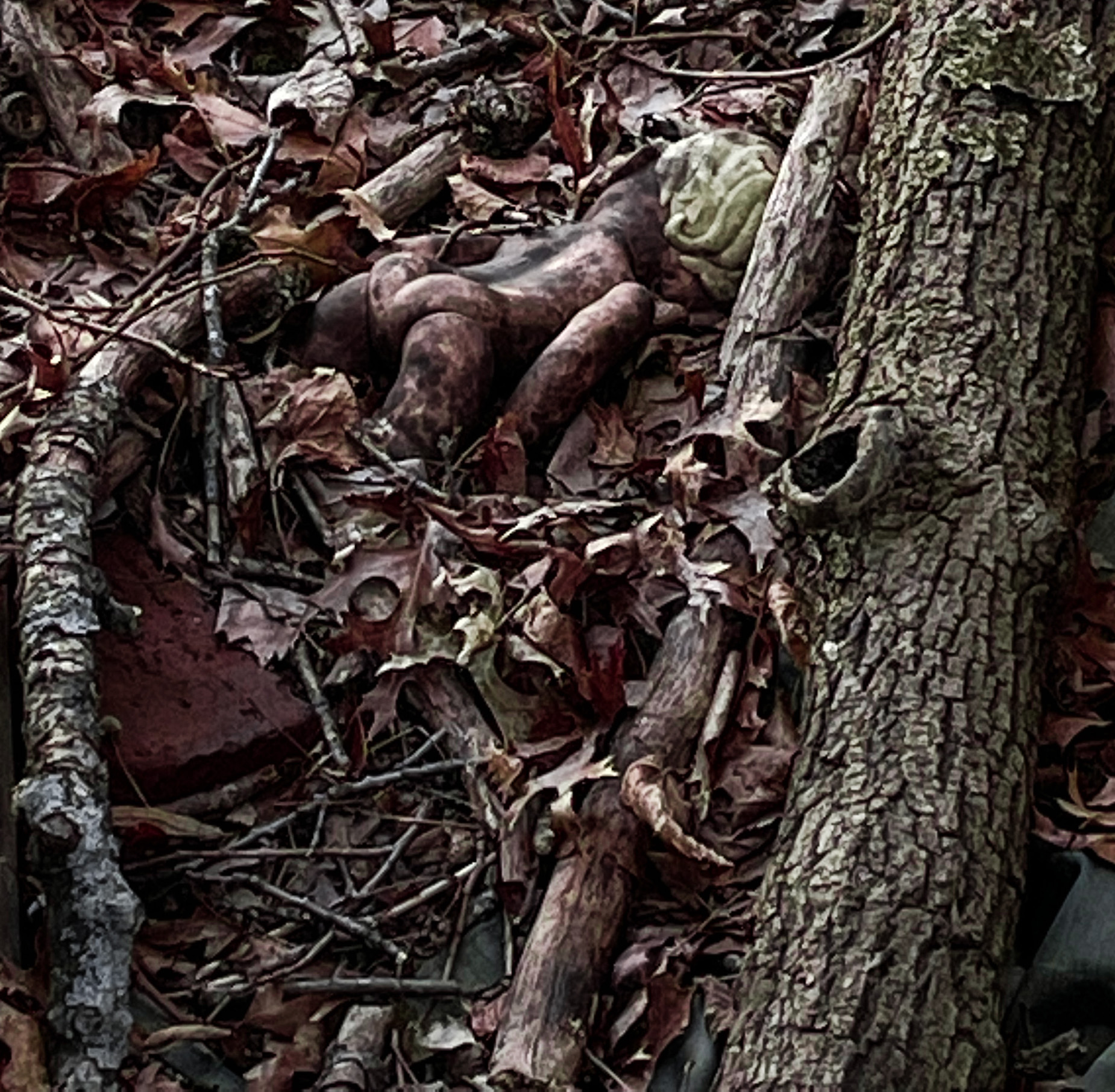
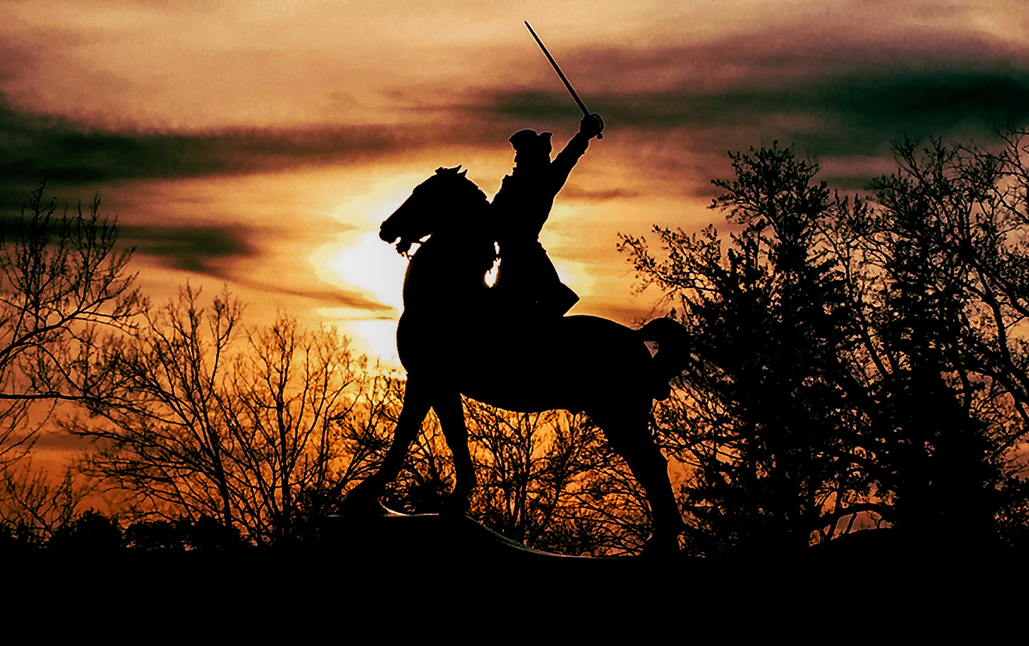
I'm intrigued by inversion effect. It gives it almost an infra-red effect and a 3D effect. This invited me in to the picture and I studied it for quite some time.
My only issue is that without looking at your description, I didn't know what it was. However, that has as much to do with the sculpture itself, which isn't all that recognizeable in the original photograph, as it does with the effects you applied later.Still, a slightly different angel (a little more profile) would make it easier to "read."
|
Feb 7th |
| 40 |
Feb 19 |
Comment |
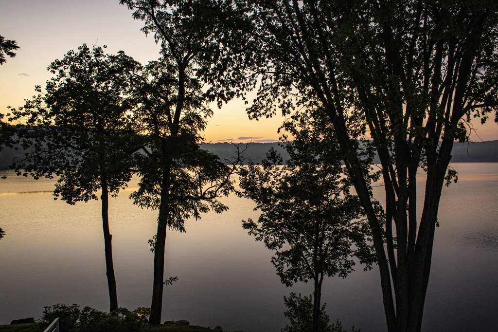
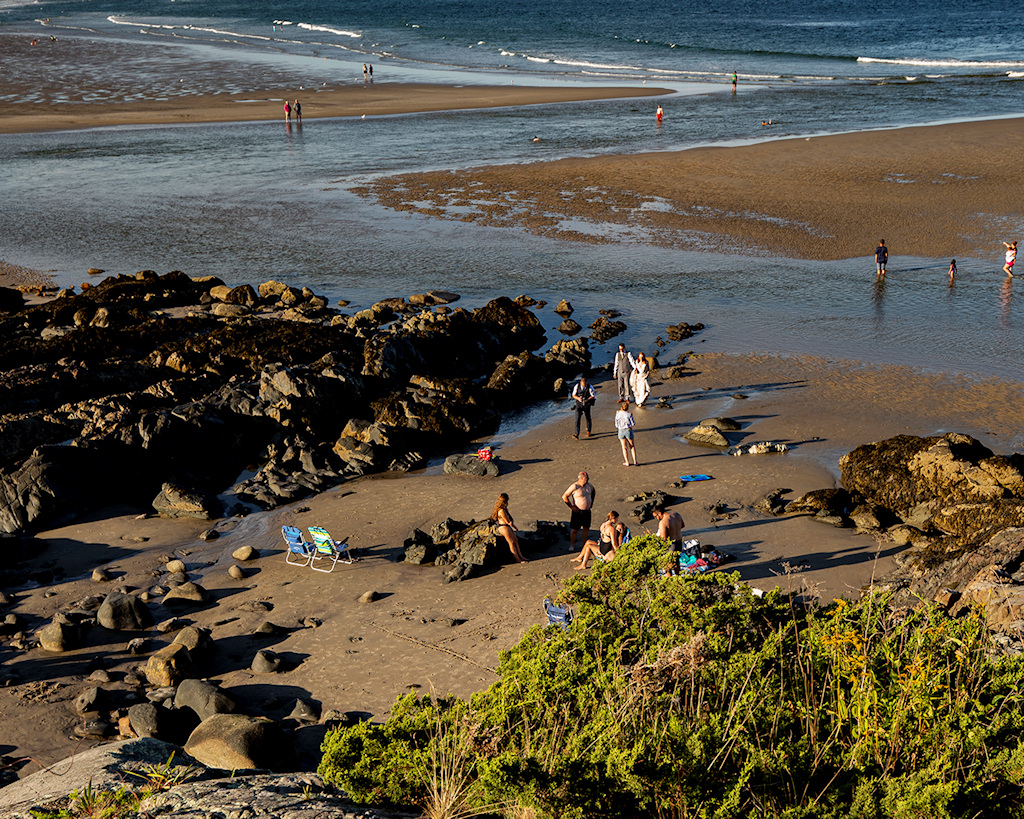
Really beautiful photograph, a perfect balance of opposing colors.
I have no problem with the horizon being right in the middle. The "theme" of the image is the exact duplication of the landscape in the reflection, so the theme is amplified by having it exactly in the middle. If you were to crop any off the top or bottom you would loose the blues, which would be a loss.
What does bother me that it is not quite horizontal.There's a way of straightening a horizon line in photoshop, I've forgotten what it is but it is easy to look up. You might want to play with that a little. Beautiful image. I'd love to see it huge, on a wall... |
Feb 7th |
| 40 |
Feb 19 |
Comment |
I thought that one was still distracting so I tried another one, also from a "mistake" blurry picture I took myself. |
Feb 5th |
 |
| 40 |
Feb 19 |
Reply |
OK, here's another with a dark green background. The background is from a picture I took in a garden, I snapped the picture by mistake so it's this dark green blur. |
Feb 5th |
 |
| 40 |
Feb 19 |
Reply |
I think you're right. I left a bit of quay in because it added another diagonal and something in the foreground, but honestly, there is so much going on in that picture already that it became superfluous. Your final is much better. |
Feb 5th |
| 40 |
Feb 19 |
Reply |
Hi Dorinda!
Yes, I agree, now that I've let a few hours go by I think the gold circles are too much. The image was given away freely by the photographer, but I will start trying to make my own collection of bokeh backgrounds, once I finally figure out how to do them.... I'll see if I can try something else.
I have no intention of competing any time soon, but it's good to know what the rules are! |
Feb 5th |
| 40 |
Feb 19 |
Comment |
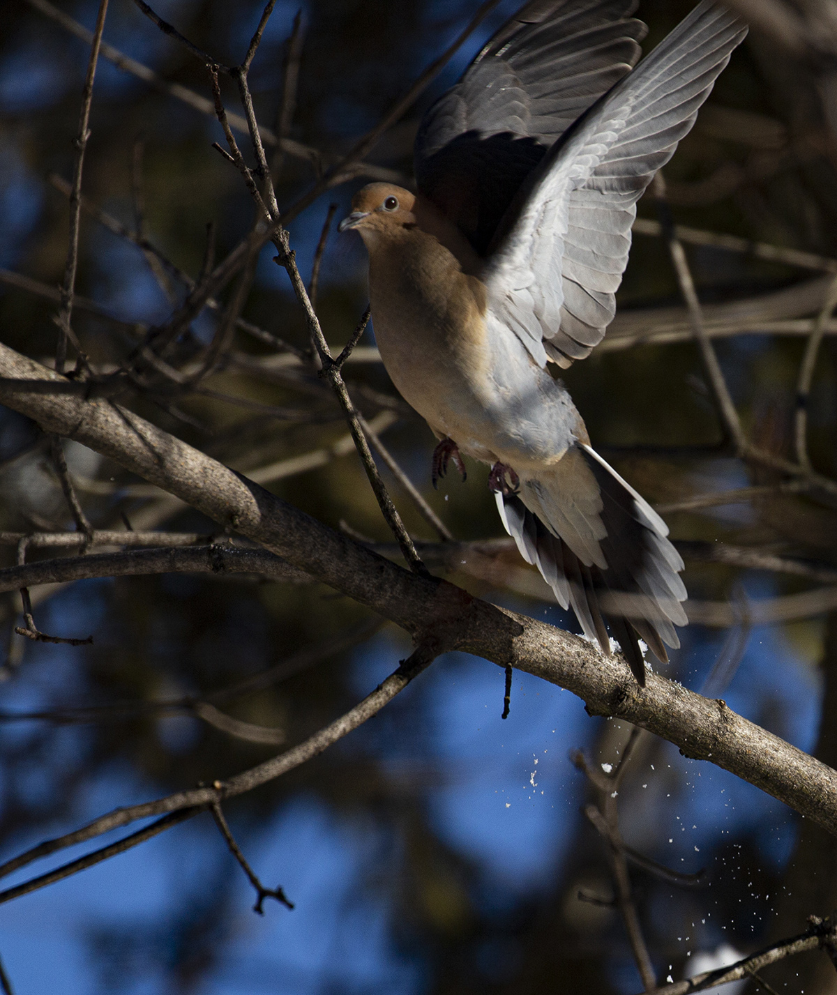
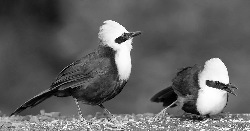
This is a beautiful image. I'm trying to learn how to achieve bokeh in my own practice, so far without much success, so that was the first thing I noticed about the image. There is the glint in the eye that the photographers in my local chapter say is essential to bird pictures. Each bird has their own personality, and the frozen motion of the bit of food flying into the beak of the bird on the right is a reward for the viewer who studies the image patiently.
The birds have beautiful colors so I think color is the right choice for this image. But the clean lines also made me wonder what it would look like in black&white. I just learned how to turn pictures to black and white so I tried it just to see. You can see I'm like a toddler playing with my photoshop toys.... |
Feb 5th |
 |
| 40 |
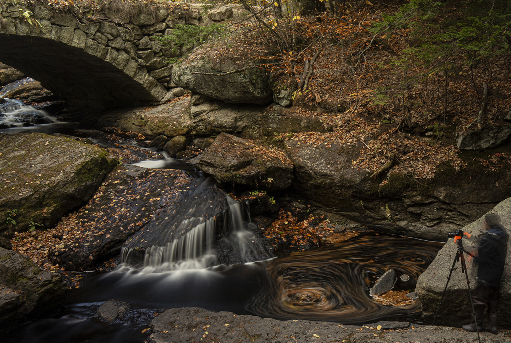
Feb 19 |
Comment |
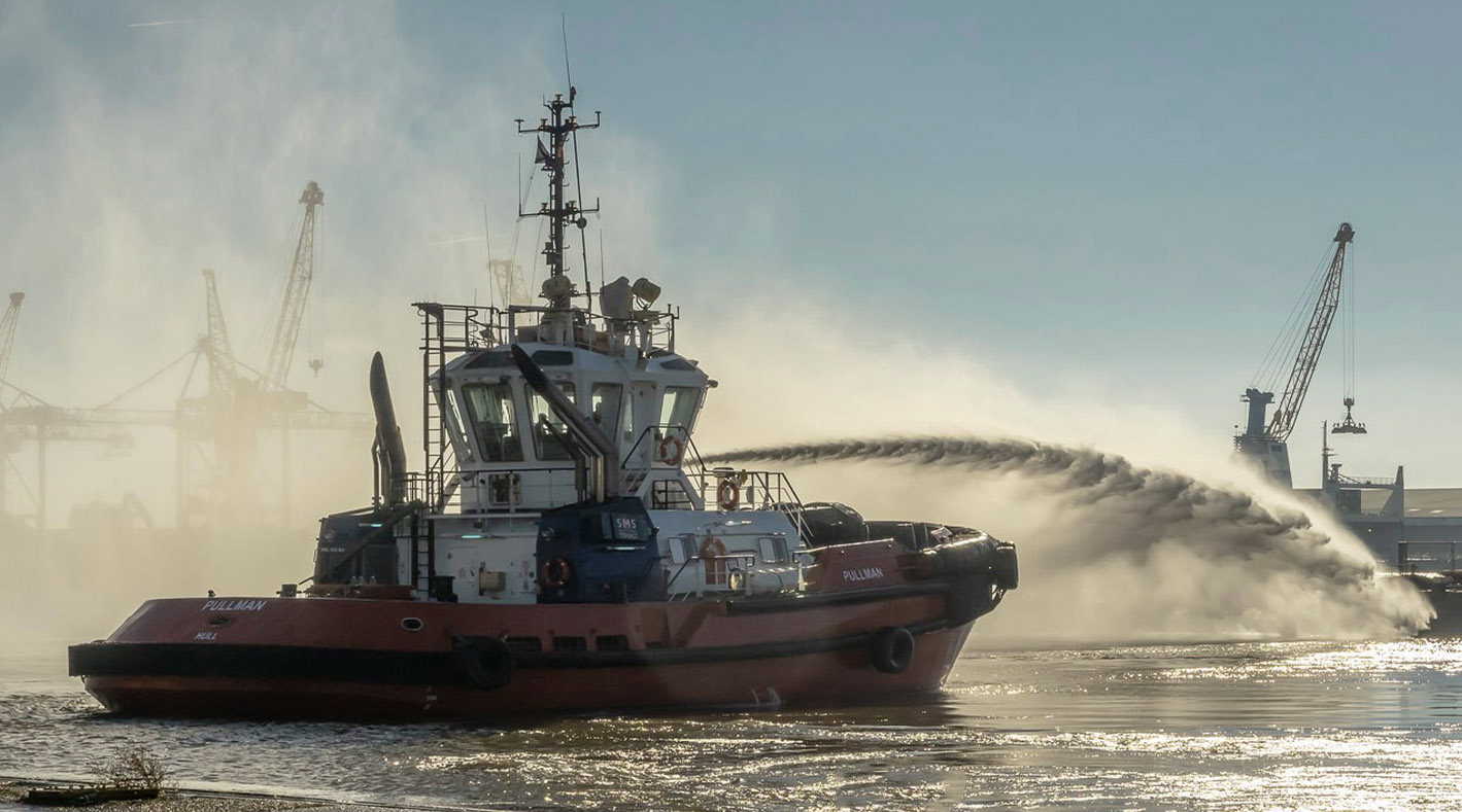
This is the kind of photograph that makes me feel envy. It's beautiful the way the motion of the jet of water is captured, and also the effect of the vapor on the left. The lighting changes are all spot-on.
What I might have done differently is to crop more of the quay foreground. The reason is, the quay foreground is really sharp, so sharp that we can see the boat's reflection in the puddle. This is a nice effect but I'm not sure it's worth keeping the foreground for it.
I was a bit confused by the foreground and the way it blends with the water- I didn't "read" that it was a quay at first, because of the monochrome.
The monochrome is a valuable effect overall so it seems to me cutting as much of the quay as possible would focus the viewer's attention on the water.
I would also have kept more of the image to the right, to give some sense of lateral movement to the image. To try to give that sense I tried re-sizing the image to make it more rectangular. I tried the crop and then removed the bollard with content-aware.
Once I'd done all that I thought having the sky be a little bluer would help make the motion of the water stand out so I played with that and with making the boat hull itself a bit redder.
|
Feb 5th |
 |
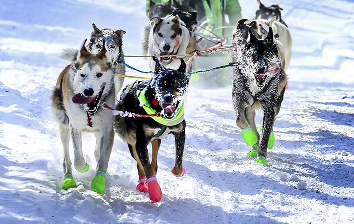
| 40 |
Feb 19 |
Comment |
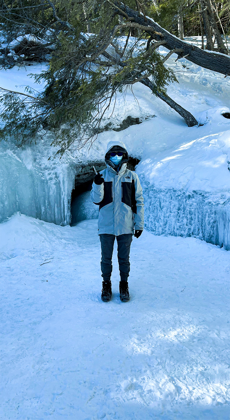
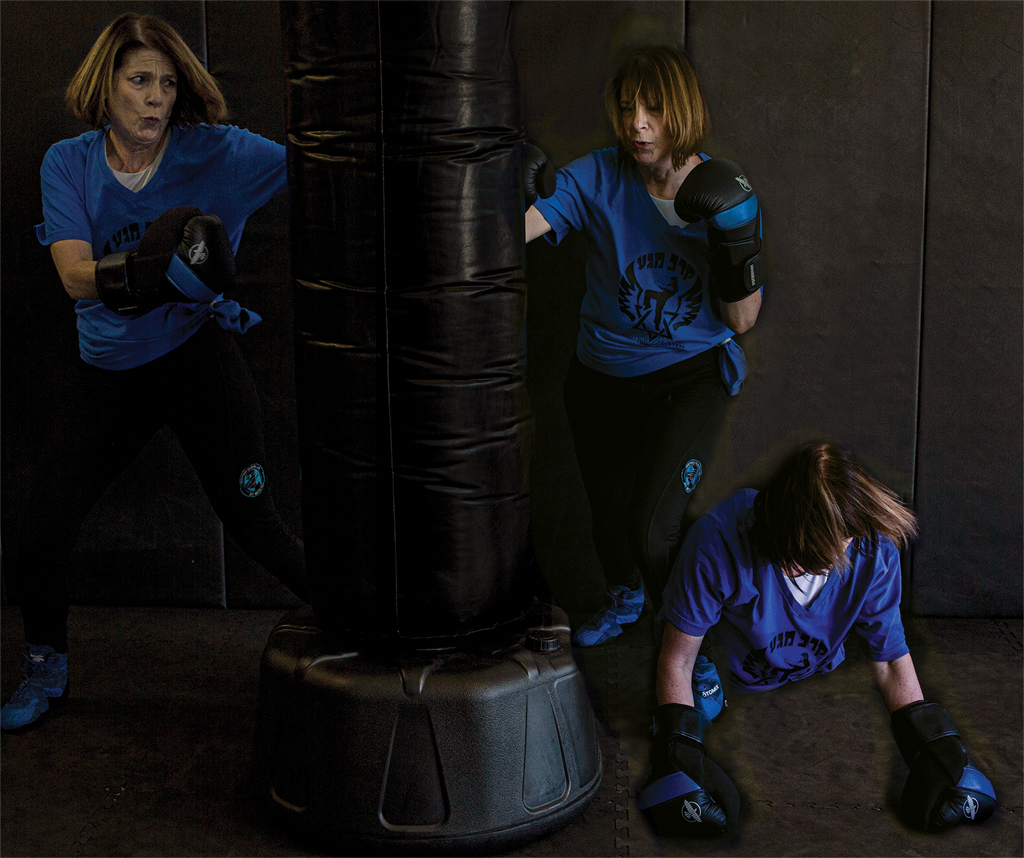
I cannot concieve of that level of cold! So I'm really glad I live in FL right now...
The cropping and the choice to increase the level of blue in the image were excellent decisions! Also the brightening of the green hue.
Usually dog teams like this are photographed from the side. The choice of location here enabled the full-frontal shot, which is unusual and makes it more powerful.
What I wish is that there was some indicator of their motion, like kicking up some snow. The front angle makes it harder to see that.
The most striking thing about this image is the frost on the dog's faces. The dogs are sharper than the musher, and we can't see the driver's eyes, so what if it were cropped to focus on the dogs? Also, maybe some sharpening to show the snow kicked up by the dog on the left?
I tried just the crop.
|
Feb 5th |
 |
8 comments - 3 replies for Group 40
|
9 comments - 3 replies Total
|