|
| Group |
Round |
C/R |
Comment |
Date |
Image |
| 29 |
Apr 26 |
Comment |
Hi Joel, Sharp, perfect exposure, texture you can feel, expertly balanced and delicate color. This would hang in the center of an art museum. Outstanding work. |
Apr 8th |
| 29 |
Apr 26 |
Comment |
Hi Karen, This image captures my mood perfectly. Red just jumps out at me, and the phoney is perfect. Parts of the sky create great lines, but I want the man to be the center of this image, and not the sky. I might consider flipping vertically so he is walking into the future, but the cloud may be an omen of things to come (especially if he can't put the phone down!)
Outstanding image and story. |
Apr 8th |
 |
| 29 |
Apr 26 |
Comment |
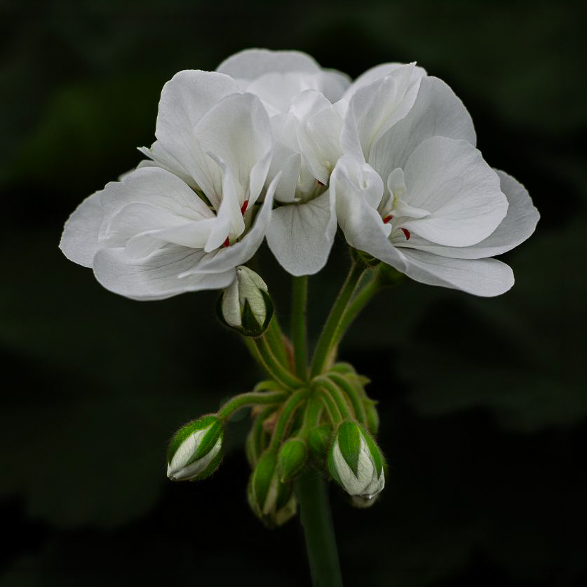
Hi Elaine, I have to defer to the K's on whether the image is sharp. It looks good to my old eyes, and I like a little glow on white flowers anyway. The color is terrific too. Spring will come soon, but I am definitely tired of winter. I think a square crop would work well for the image and still leave enough of the stem. Pretty image. |
Apr 8th |
 |
| 29 |
Apr 26 |
Reply |
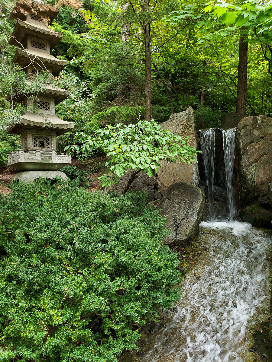
Thanks, Karen. I should probably have included the original, but I didn't. I'll include it here. My focus was the falls, and my composition was composed from them. The top of the pagoda was hidden by the dead branches so I never consider them in the frame. I need to learn my DJI Osmo stick to improve my cell photos. There was sun on the center leaves, but I can't see any green channel blow out. Maybe in another channel, as not all colors are RGB. Thanks for the encouragement. |
Apr 8th |
 |
| 29 |
Apr 26 |
Reply |
Thanks, Kathy. I had thought about what to do with the top of the tower, but I concentrated more on keeping the balance and making the falls the subject. I like what you did to the roof, although it might be an obvious edit to a familiar subject in Western Washington.
You have quite an eye to see any tilt and skew in the tower. Beyond my abilities, I'm afraid. I didn't think another element would be needed, but it is good of you to respond.
|
Apr 8th |
| 29 |
Apr 26 |
Comment |
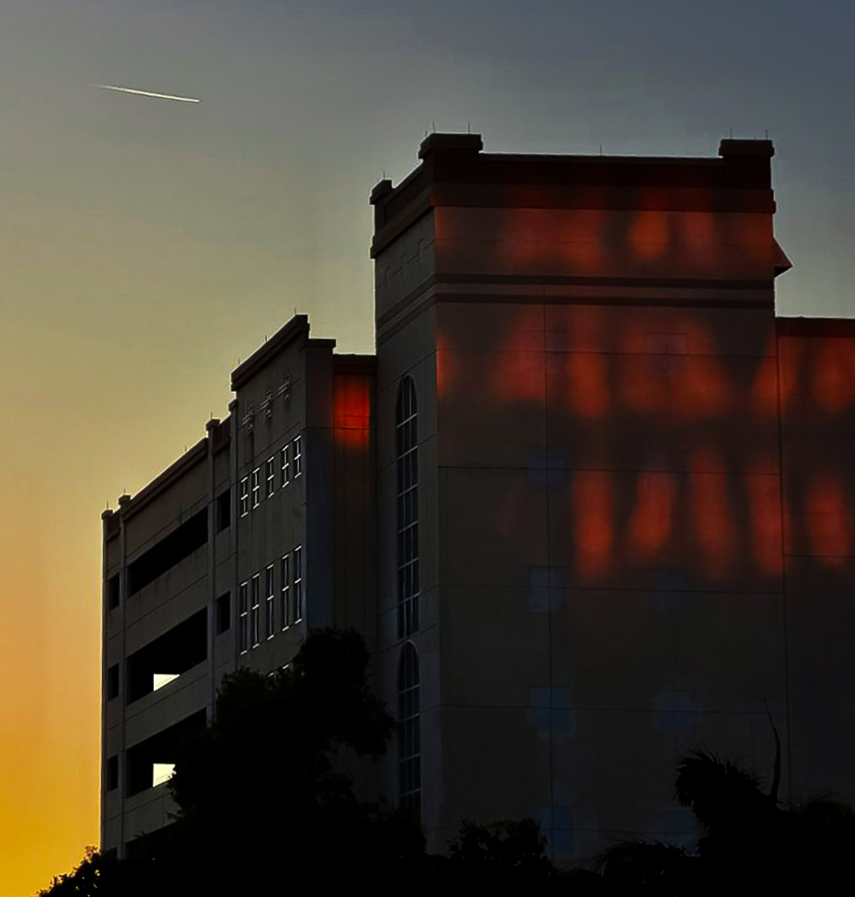
Welcome, Linda. I'm sure it feels like a long wait for you this month. There is a lot of detail in your image, so I think you should be happy with your gear. The color is great, and the image sharp. The subject is terrific. In LR you can use Auto Transform to straighten most images, and I too think you need that on this image. The contrail leads into your building, but I might crop some of the sky to make the line more prominent. I used the masking tool in LR to select the sky, building, sunset and reflections to add some slight adjustments, and the Point Color tool to target some slight tonal changes. Beautiful image. |
Apr 8th |
 |
| 29 |
Apr 26 |
Comment |
Hi Judy,
I like the story. I love Italy, and especially their food. Kathy did a nice job of defining the visual appeal. I wish Italians had more trees or were taller, so the chair would be larger in the frame. Just my wish. I would like it just a bit warmer, maybe because my winter has been so cold. I tried cropping some from the bottom but that didn't seem to make the chair larger. I could transform it in PS, but that might not be useful if Elements
doesn't have the tool. |
Apr 7th |
 |
| 29 |
Apr 26 |
Comment |
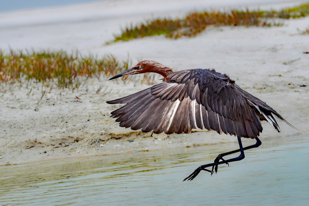
Flipped and expanded. Maybe you already have more to the left and can add it in to keep it for Nature Division. |
Apr 5th |
 |
| 29 |
Apr 26 |
Comment |
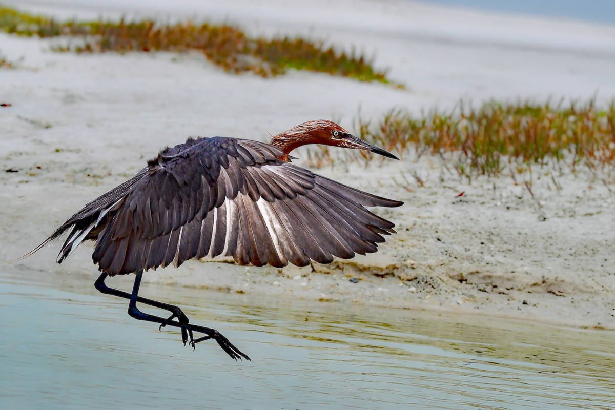
Great capture Kathy. I'm not a birder, but I know Reddish Egrets are now quite rare in Florida. Lots of Sandhill cranes near where my brothers lived in Bradenton. The eyesight is both panoramic and telescopic along the beak, so I don't think he was hunting, just landing. Their keen telescopic eyesight allows them to land softly, and from my experience with cranes and herons, quite elegantly.
The eye is sharp, the background is blurred nicely, and the color good. Since this is a general group, I would suggest a longer landing area for your egret. I used generative AI in PS to add more space, You could also try a horizontal flip to see if you like it flying into, rather than out of the frame. |
Apr 5th |
 |
7 comments - 2 replies for Group 29
|
| 34 |
Apr 26 |
Reply |
Nit-picky is what artists have to do. |
Apr 13th |
| 34 |
Apr 26 |
Reply |
You are a vast store of artists. |
Apr 13th |
| 34 |
Apr 26 |
Reply |
It does add depth. Also makes a good triangle shape, which I was trying to mimic. You usually make excellent choices and always have a goal in mind. I added a point curve which also adds a slight more bit of depth. You have been a good resource for me. You provide excellent comments and replies, which I don't take lightly, especially since you also work in 3D and must pay attention to depth.
|
Apr 13th |
 |
| 34 |
Apr 26 |
Reply |
Thanks, Steve, I appreciate the encouragement and advice you have provided. |
Apr 13th |
| 34 |
Apr 26 |
Comment |
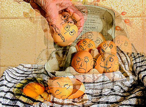
Hi Angela, I wouldn't even be able to do this without breaking all the eggs. As far as the image processing is concerned there isn't a lot for me to comment on. Cute idea to add the faces.
We were in DD20 for awhile, so I can tell you that there are some excellent composite resources in the group. I am learning a lot quickly. The more you experiment, the more quickly you'll gain confidence. I'm adding a spherical filter to add some to the sad "next" story. |
Apr 12th |
 |
| 34 |
Apr 26 |
Comment |
Hi Jan, I think your Picasso-ish composite is terrific, hardly silly. I like the more muted O2, only because my one experience at an exhibition with a century old Picasso seemed more muted in my waning memory. Your final is probably more appealing to all because it is more vibrant. Great work and explanation. |
Apr 12th |
| 34 |
Apr 26 |
Comment |
Hi Steve, Pretty out-there selfie. Good use of your phone. Just an artistic decision, but I decided to select some of the upper patter, flip it and cover the black hole that I assume was your brim. You may like that but it is an option to get rid of some black eye stopper. Other than that the image is pretty balanced and active. |
Apr 12th |
 |
| 34 |
Apr 26 |
Comment |
Hi Frans, Must be a "guy thing" but I love this image. It is an extremely warm and inviting scene. The symmetry is perfect, the lighting, except the one dancer, as already mentioned, is terrific. The triptych isn't even the focus of my eye, but I think the sequence looks proper to me. I'd hang this living room in my living room, and wish it was my living room. Outstanding work. |
Apr 12th |
| 34 |
Apr 26 |
Comment |
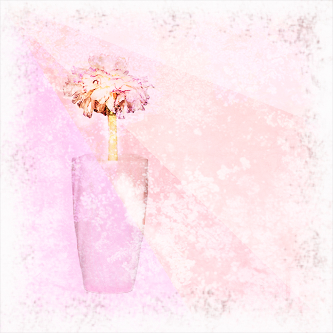
Hi Sylvia, I like both versions, and I agree with most of the others' comments. I like Jan's version of the vase, except for the color. The flower does look a bit old with the texture color additions. I tried using the Color and Vibrance adjustment then the Clarity and Dehaze adjustment in PS to work on the flower. Then In LR I used the local mask adjustments to add more color to just the bottom of the glass. The shadow adds gray to an otherwise nice pastel, and that throws me off a little. We get an advance course here from Jan. Nice image. |
Apr 12th |
 |
| 34 |
Apr 26 |
Reply |
I probably couldn't get a model release! |
Apr 3rd |
| 34 |
Apr 26 |
Reply |
Thanks, Jan.
"Bain mo bhean chéile?"
There is no way I can remove my wife from her Irish ancestral cemetery and live to tell about it. I like your flower blending much better. My erroneous thought was to add the rose in front(lighter and sharper), Then the photographer (slightly lighter, and less sharp,) then the cemetery to create depth, but obviously I didn't accomplish that goal. Your version does have depth.
The action I used created four different AI layers, which I used as separate masked layers providing what I hoped to be interest in a boring sky and church wall. I think I will mask the seat, and Brennan grave cross so that area is clear again.
It helps immensely that these monthly comments guide me to get a plan together to try to improve my work. |
Apr 2nd |
| 34 |
Apr 26 |
Reply |
Thank you, Angela. I hadn't noticed the sharpness in Dorinda, and I will work on that. I think that the stone bench hiding her lower legs got too much of the color to be recognizable, and that is I think where you are talking about. |
Apr 2nd |
| 34 |
Apr 26 |
Reply |
Thanks, Sylvia. I did have a hard time getting the roses to blend in better. I may have neutralized the cemetery image too much. Ireland inspires mysticism for me. I'm glad you found the face. Do you think it needs to be faded more? |
Apr 2nd |
5 comments - 8 replies for Group 34
|
12 comments - 10 replies Total
|


