|
| Group |
Round |
C/R |
Comment |
Date |
Image |
| 20 |
Mar 26 |
Comment |
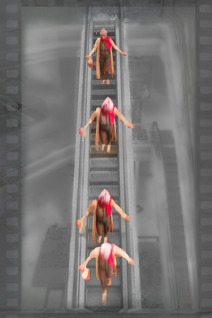
Hi Sylvia. What a very clever idea. The motion adds some interest too. I'm not sure if the texture and border help though. The up escalator merges with the border and the lower floor is busy, which I assume made it turn into a B&W. The woman's third position might work better if a little higher. You can drag rulers in PS to help position objects. I can't remove a texture, but I tried to keep the border, and did some object masking in LR to give you some idea of what could be consider for a terrific idea. |
Mar 16th |
 |
| 20 |
Mar 26 |
Comment |
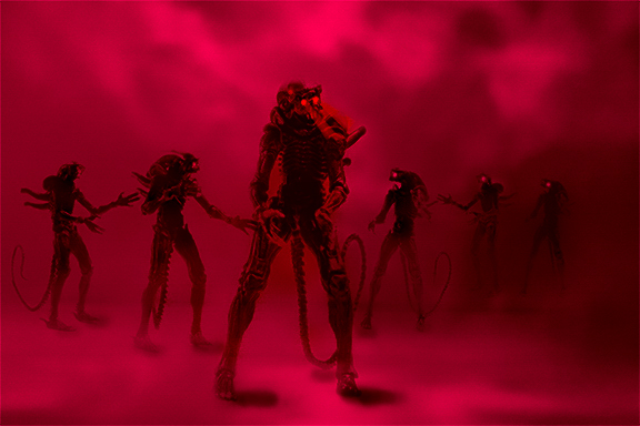
Hi Angela, your image evokes an eerie, otherworldly feeling, and is very well done. Red is a good color choice for aggression. I love the progressive size of the aliens, and their wedge/vee spacing. Evokes memories of my military training. My only concern is the brightness coming out about the center figures eyes. I think the eyes would show better if that area were darker. I added a couple of masks in LR to try to add more depth. Great project! |
Mar 16th |
 |
2 comments - 0 replies for Group 20
|
| 29 |
Mar 26 |
Reply |
Here is an abstract I made using PS filters. Eight layers. |
Mar 15th |
 |
| 29 |
Mar 26 |
Reply |
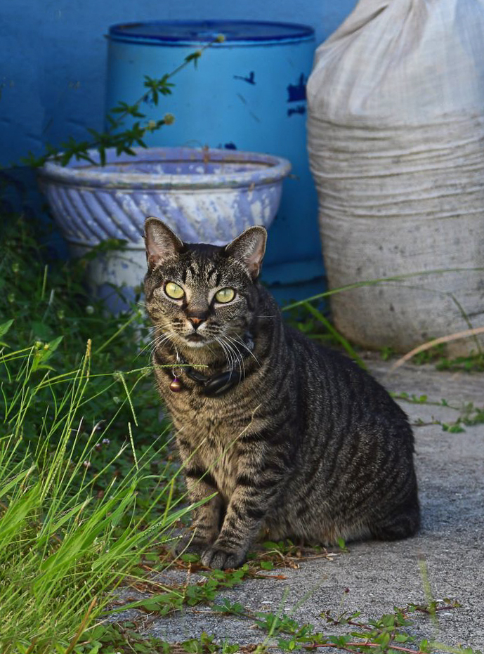
The last crop definitely makes it a cat portrait that could be a book cover. I made a couple more edits just as a nit. I removed the weed in the pot and some other grass strays, straightened the cat vertically, which also leveled the pot at the top, added a small radial gradient to the cat, and a light vignette to push the background further away. Good luck with your book, and I hope Scott Kelby was helpful. |
Mar 11th |
 |
| 29 |
Mar 26 |
Reply |
Thanks, Kathy. Funny and creative comment and I think I'll use the image you creatively produced to explore what I could do with this. It still belongs to Dorinda, but she seldom does any abstracts. She will love the fun image though. Great response and your image IS a pleasure. |
Mar 11th |
| 29 |
Mar 26 |
Reply |
If you like this version, I would say it is because of the colors I used for the non-white areas, I masked them each in LR and then simplified and unified the color palette to greens and blues to show off the white area. I also darkened them a little. I think of it as a white (mostly) subject needing a dark background to make it pop.
In photospeak it brings the white area forward and pushes the trees into the background. Standard processing in two-dimensional images to add the illusion of depth. It is hard to know for sure what elements were included in the frame, unless you have another image without the ICM.
I usually shoot a standard image before the ICM, in case I want to stack some areas. It's also nice to remind myself of what I caught my eye in the first place. |
Mar 9th |
| 29 |
Mar 26 |
Reply |
Thank you, Karen. Your comments are astute and helpful as always. |
Mar 9th |
| 29 |
Mar 26 |
Reply |
something like this? It would require the raw file to get enough detail before submitting it, |
Mar 9th |
 |
| 29 |
Mar 26 |
Reply |
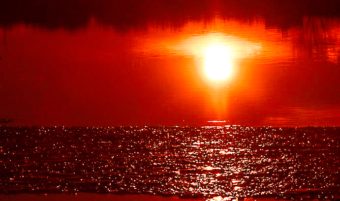
If that is the case, then I would change the crop, title, and make the image about the ice sparkles, rather than the sunset. IMO there are few photographers that don't have similar images as others, and it is usually the artistic vision, processing, element selections and current trends that make an image appeal to viewers.
Unfortunately we can only learn and control the first three parts of this artistic adventure. I don't know how you can make the viewer see ice crystals rather than as water reflection in this image. Maybe the image could have been a macro, or at least a very tight crop into the ice. I hope this helps, Karen. |
Mar 9th |
 |
| 29 |
Mar 26 |
Reply |
Maybe I should just attach it then! |
Mar 9th |
| 29 |
Mar 26 |
Comment |
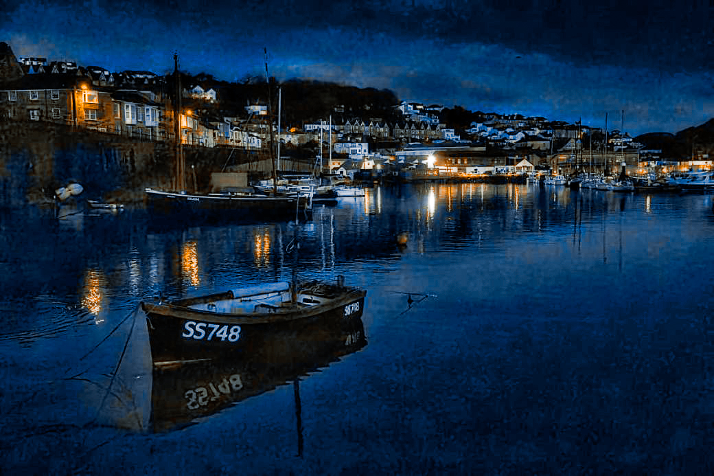
I am so sorry to see you leave us Tim. I'm sending this to my daughter, married in Lynton. It is a terrific image. I love your images and the fishing town is quite famous. I read that the Mayflower stopped for water (maybe tainted) before embarking to New England. I don't have the ability to take a sharp image like this, hand-held. All the detail of the stormy skies, the colorful fishing port houses are extraordinary. Truly a work of art. I might consider just a little more brightness. I added a black and bronze preset I have from Blake Rudis, |
Mar 9th |
 |
| 29 |
Mar 26 |
Comment |
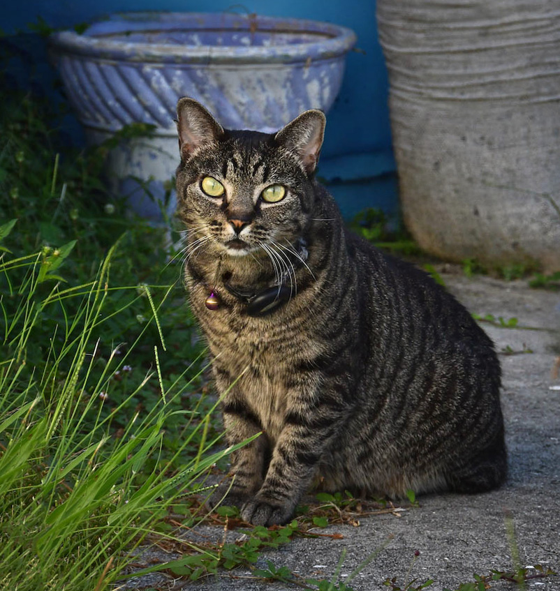
Hi Kathy, This is a very cool cat shot. The background is amazing. Colors are nicely brightened, and it is amazing the cat was curious enough to stick around for a portrait. Eyes are mice and sharp for me. I had a cat named Mika that was a tabby, and died of old age.
I removed the thing on the right and cropped the top off the bag. |
Mar 9th |
 |
| 29 |
Mar 26 |
Comment |
Hi Joel, Excellent job of capturing this winter scene. The image is crisp and sharp. The colors are lovely, and the branch leads the way. The light and shadows on the ground provide nice leading lines. The tree Elaine removed is a merger that is a slight distraction, so I would also consider removing it. Brrrr. |
Mar 9th |
| 29 |
Mar 26 |
Comment |
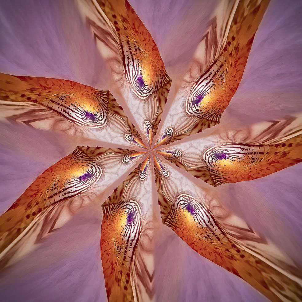
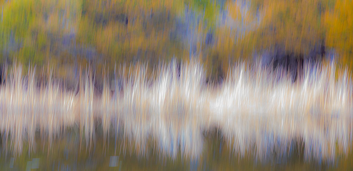
Hi Judy, your abstract looks like a swirl of colorful birds heads. Beautifully done. My version, since I have to play, is just adding brightness and some texture and clarity in LR. |
Mar 8th |
 |
| 29 |
Mar 26 |
Comment |
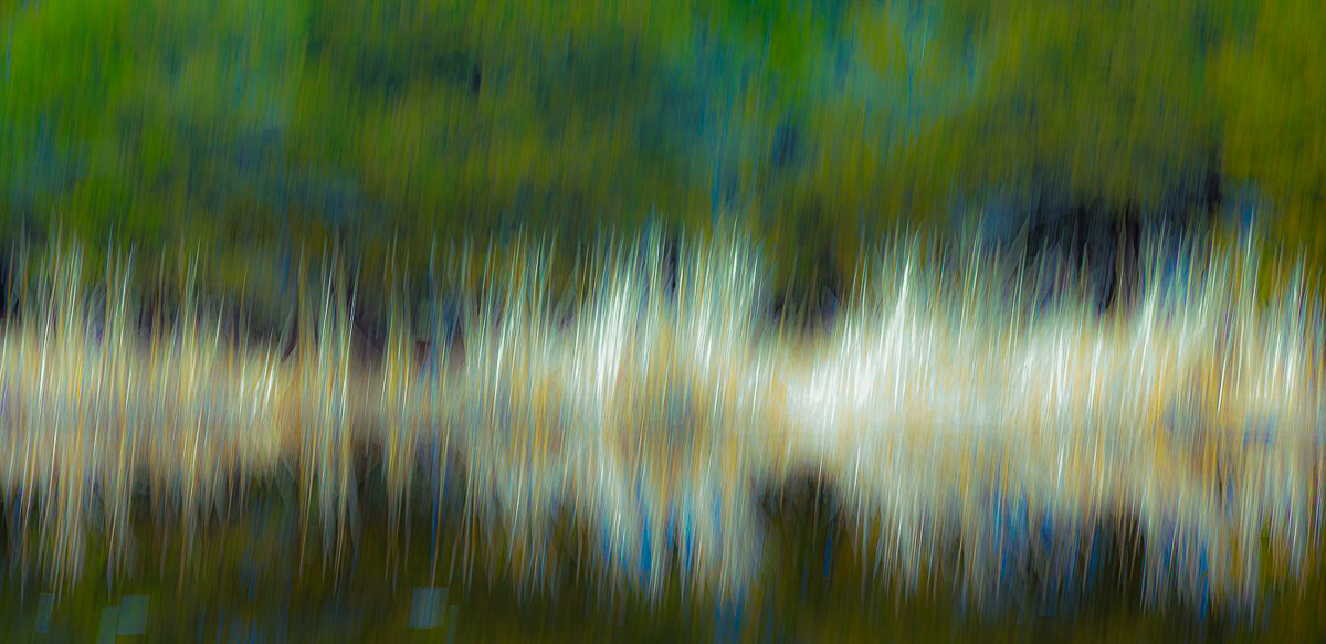
Hi Elaine, I like the ICM as you did it. I spent most of my life working in electronics and your image reminded me of oscilloscope waves. I edited in LR masking several areas and adding curves to change colors here and there, and clarify the "wave" I saw. More contrasty than others, but just gives you more options. Good job. |
Mar 8th |
 |
| 29 |
Mar 26 |
Comment |
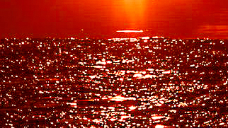
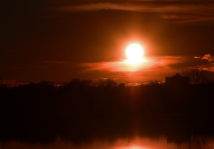
Hi Karen, Definitely a high contrast image. There really isn't much for us to edit except for the crop with the sun being so prominent and of course blown out. That being said, I think it is a creative shot, and am happy you had warm enough temperatures for a sunset image. I would consider another crop to play to the landscape more than an abstract reflection.
I masked the sun, then copied and inverted that mask, then added a radial mask to the reflection, then a color range and luminosity mask, all in LR, and then adjusted each mask to bring more or less contrast and a little color to the blacks and whites. Just a thought. Fun image to play with. |
Mar 8th |
 |
| 29 |
Mar 26 |
Reply |
Thank you, Judy. I seldom clone or use the patch tool anymore. The remove tool is so much better, even in LR. Not sure about Elements. |
Mar 8th |
| 29 |
Mar 26 |
Reply |
I can't retake it as the part and battery were replaced. Thanks for the image. I used the remove tool in LR on your image, getting rid of the last distraction, I hope. Good job Elaine. |
Mar 4th |
 |
| 29 |
Mar 26 |
Reply |
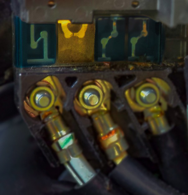
Thank you, Elaine. Did you have a suggestion you would like to show me? The images you work on are good, even if they aren't the best. The idea of adding a version is to show the creator what could be done differently and the area that you feel needs attention.
In my image the thumb is an element to the story I'm trying to tell, so what would your thought be to make it less distracting to you? |
Mar 4th |
| 29 |
Mar 26 |
Reply |
Thanks, Joel. My thumb was not in focus, and was in motion from trying to hold this steady, and my hands were freezing. If this were anything other than an image to tell my story to the group, I'd clean it up, remove the thumb, and actually use one of my own pics, if I had one. I agree that it isn't competition or wall quality. It was good enough for our son to get the correct part though. |
Mar 2nd |
| 29 |
Mar 26 |
Reply |
I like your comment Joel. I'm going to use it as a forum for what I would like from our group.
If you download the image, apply the edits you suggest and attach the results to your comment, it makes a good start for dialogue. The comment image needn't be perfect as we are working with jpeg images.
For Example-
I took this into LR, made a virtual copy, used a linear gradient to mask the trees and then both brightened and saturated them slightly. Just something to consider. (I would add this to my comment along with the image as I had edited it.
Thanks, Joel. Good comment image below. |
Mar 2nd |
 |
6 comments - 13 replies for Group 29
|
| 30 |
Mar 26 |
Reply |
Hi Judy. I am visiting from DD29. I am also the DDG Admin Advisor. I need to clarify that General Photography groups are not fine art groups, but could contain a fine art image for comment. Images of any subject matter originating from a film or digital device can be submitted. I appreciate your detailed comments. |
Mar 8th |
| 30 |
Mar 26 |
Comment |
Hi Leonid,
I'm visiting from DD29 and thought your original image is a terrific street scene, as well as the portrait you created from it. I cropped and turned it into a black and white, as are most successful street photos. What a great eye, and I like that he looked at you. Your final image does a great job of peeking through his sunglasses. |
Mar 2nd |
 |
1 comment - 1 reply for Group 30
|
| 34 |
Mar 26 |
Reply |
I'll keep trying. Rome.... |
Mar 25th |
| 34 |
Mar 26 |
Reply |
Than you, Jan. The color and shape of this bonsai in our neighborhood was what drew me to it in the first place. It is already larger than all the buildings, so maybe I just need to find a different home for the tree. |
Mar 25th |
| 34 |
Mar 26 |
Reply |
Thanks, Steve. Basic masks I know, but others will take some time and practice. The selection tools in PD for masking are getting better with AI. |
Mar 25th |
| 34 |
Mar 26 |
Reply |
Thank you, Steve. I used the same three images, just keeping them on their own transparent background layer allowed them to be resized, moved and edited independently. I don't know why I had such a hard time understanding the concepts. |
Mar 25th |
| 34 |
Mar 26 |
Comment |
Thank you for all the help. With a lot of help from Jan, on emails, I have really discovered working with layers. I also learned much from Colin Smith on YouTube. https://photoshopcafe.com/tutorials.htm I made and saved some versions of what I now am calling Tacoma Vision. I didn't save as often as I should have, and didn't pay enough attention to saving layers but I now have hope I'm on the right track. like it a lot better even though I probably overdid the pencil drawing. |
Mar 21st |
 |
| 34 |
Mar 26 |
Reply |
Thanks, Sylvia. Welcome to DD34. It ended up looking other worldly, although I didn't have a clear enough vision for this composite. My results match my indecision, and from that I will learn much. This image should make its way to my scrap heap. Bob, and I won't send you a Bill. |
Mar 17th |
| 34 |
Mar 26 |
Reply |
Thank you, Angela. Welcome to DD34. I will post a comment in DD20 this month, for sure. I think the rim has to go also, as well as transforming the size. Good suggestion. |
Mar 16th |
| 34 |
Mar 26 |
Reply |
I appreciate the offer, Frans. |
Mar 8th |
| 34 |
Mar 26 |
Reply |
I don't use AI generation either, but I do use backgrounds and skies I took images of myself. I want you to win a Hasselblad! |
Mar 7th |
| 34 |
Mar 26 |
Comment |
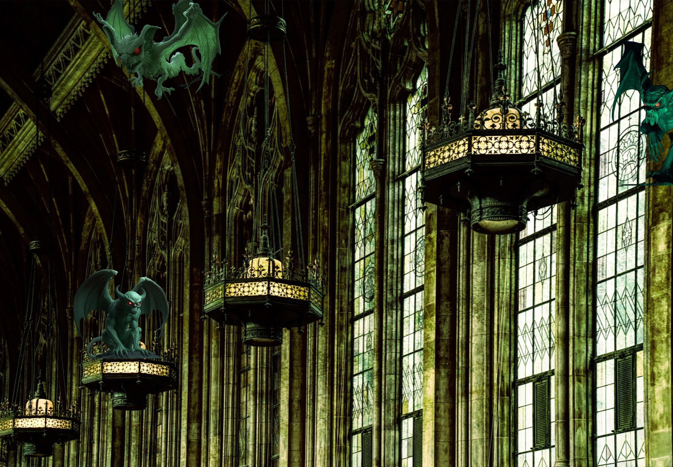
Hi Judy, Terrific composition idea. I agree with most comments. You achieved a dark and dreary image. The gargoyles help the mood, but there may be a little base showing on the left and right ones that could be cleaned up.. O2 shows that you probably used perspective warp, but lost it in the final. If you used smart object layers, it should be fixable (I think.) The wing pieces are distracting to me on the right. IMO the transform needs to be there again to make it more solid. |
Mar 7th |
 |
| 34 |
Mar 26 |
Reply |
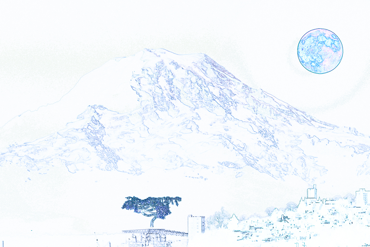
Thank you. Judi. Still needs a lot of work, but I'll get there. The tree was my actual starting point, so that was the element I wished to use most. I need to find something that works with it, and maybe I should not have used the Mt Rainier image at all. It is too much a stand alone image. You have me thinking more. |
Mar 7th |
| 34 |
Mar 26 |
Reply |
Thanks, Frans. I've set up my workspace tools so that the only tools showing are the ones I use. If an update adds a tool, I add it into the proper tool group, and I use the Reset All Tools on any tool icon at the top to keep them current. My thirst for knowledge outweighs my capacity to understand sometimes. |
Mar 7th |
| 34 |
Mar 26 |
Reply |
Thank you, Frans. I quickly looked at your link, and I think it could be of great benefit. I have followed Blake Rudis as far as learning PS, but I feel I am not getting what I need for compositing from him. I'll explore Tara closer in the future. I started compositing using Jan's site for inspiration, now I need more basics from my layers, and your reference is an outstanding resource for me now. |
Mar 6th |
| 34 |
Mar 26 |
Reply |
Thanks, Jan. O3 has won some awards locally and a large print of it hangs in our daughter's office at the Pierce County Council It doesn't need work so I wouldn't use it in a study group. I didn't have many PS skills then, didn't know layers and mainly cropped it and added some clouds and glow. I'm afraid it was probably mostly destructive editing and by todays standards, a big failure.
Yes, O1 was where I ran into all my problems. For three days I kept adding, moving, deleting and generally failing to resize my elements, move them where I wanted, and that Steve mentioned. You mentioned patience, and that seems to be in short supply for me at times. My PD tremors make my hands do strange things occasionally.
I finally decided I didn't want to play anymore without feedback. You guys all help immensely. |
Mar 4th |
 |
| 34 |
Mar 26 |
Reply |
Thanks, Jan. That was a helpful video. I have watched some of Aaron's videos before so I'm used to his pace. It was the right level for me. I'm at the point where I need more practice, more patience and a better idea of how to get what I want from my composites. I get to a point where I wish to make a change, try it out, and end up with too many steps to undo them all. I use the History panel and that is hit and miss because the step names don't relate to what I thought I'd done. Anyway, you are very helpful. and PHLearn is a good resource. Thanks |
Mar 3rd |
| 34 |
Mar 26 |
Reply |
That is very helpful. I have been trying to decide if I need to write a project out first, then cull for images before I start the processing. I'm also still struggling with basic layers management. Slows me down so much. Not sure if there are cheat sheets that would help me. My memory isn't enough anymore. |
Mar 3rd |
| 34 |
Mar 26 |
Comment |
Hi Jan, I did see the spines right away. This is an amazing amount of detailed work and matches what I consider your forte. It is whimsical, and the color is light and airy. A lot of elements, but not busy. The street lights are a nice touch and the street lamp adds depth. The pigeons are a nice lead in to the houses. You are the Lewis Carroll of DD. I wonder how long this project took. |
Mar 2nd |
| 34 |
Mar 26 |
Comment |
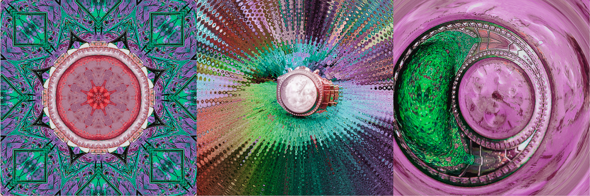
Hi Steve, Exceptional imagination. I like the combinations making up the composition. I'm not a big fan of yellow however, so I am including a color revision from PS, since that is the software I use mostly. I can't make out the watch in the first image. Was that by design? If not, I would consider adding it to your center area. Well done, Steve. |
Mar 2nd |
 |
| 34 |
Mar 26 |
Comment |
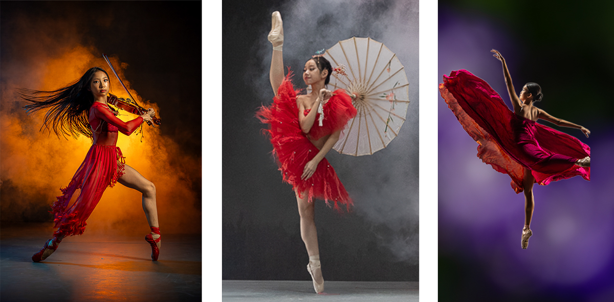
Hi Frans, I think you selection of dancers as your triptych theme is an excellent choice. When I look at the 2023 Masters winners, all are in color, which would be essential I think to convey a mood for your images. Each of your dancers are wearing bright red dress, so that would unify the triptych. The B&W and a lot of negative space don't convey a mood to me. O2 and maybe O3 might need a new background. I agree with Steve that the shadows would be a good place to harmonize. PS AI does help with that. |
Mar 2nd |
 |
| 34 |
Mar 26 |
Reply |
Thank you Steve. I agree with your comments. I wasn't able to reduce the moons size, not for lack of trying, but for lack of success. Every time I added a reduced moon, I left a black or full sized moon, no matter how I arranged the layers. I've still got a lot to learn about how layers and the move tool work, and which transform tool to use. Just like learning photography, learning PS takes a lot of practice, and the rapidly changing PS interface isn't helping me. I'm not at the level the rest of the group is, but getting your input is a big plus for me.
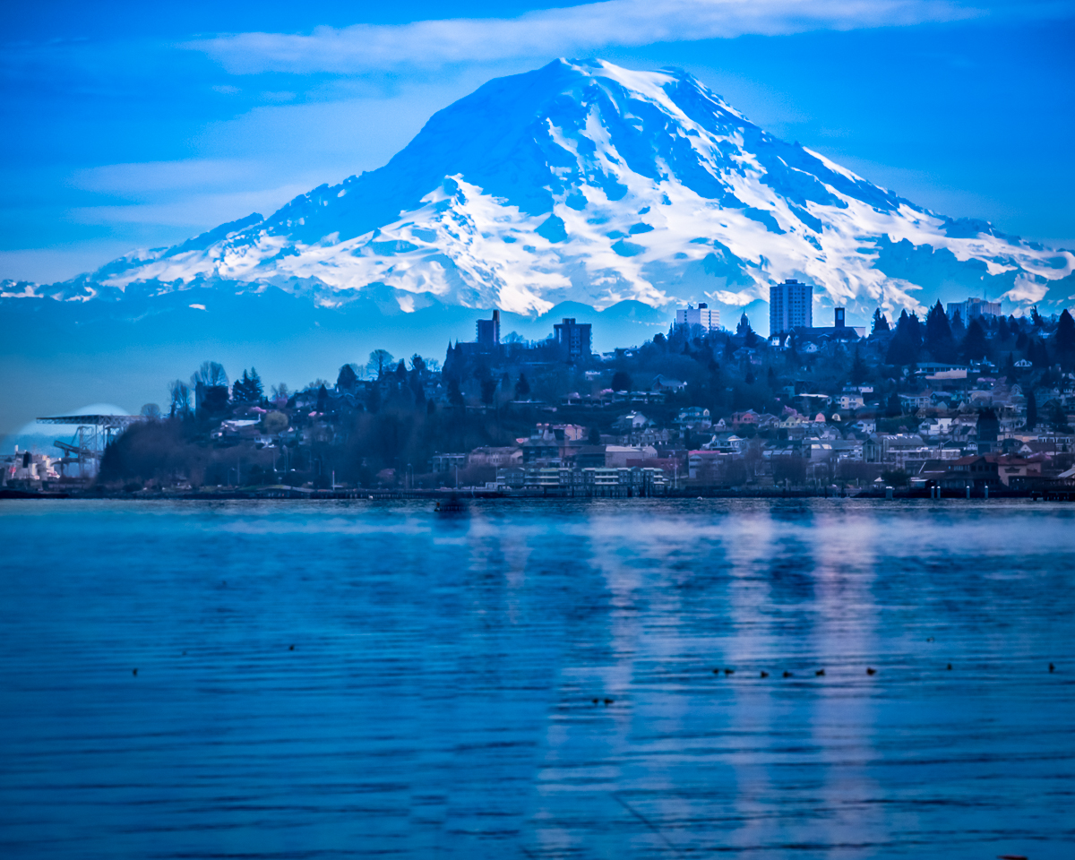
The mountain image ended up replacing the original sky background which is shown in the original image. The noise was actually added by one of the Photocopy filters, but isn't an issue for me to change. We have a view of the lunar eclipse tomorrow and if I can drag myself out of bed after 1 am, I will have some even more red moons to use. |
Mar 2nd |
5 comments - 15 replies for Group 34
|
14 comments - 29 replies Total
|


